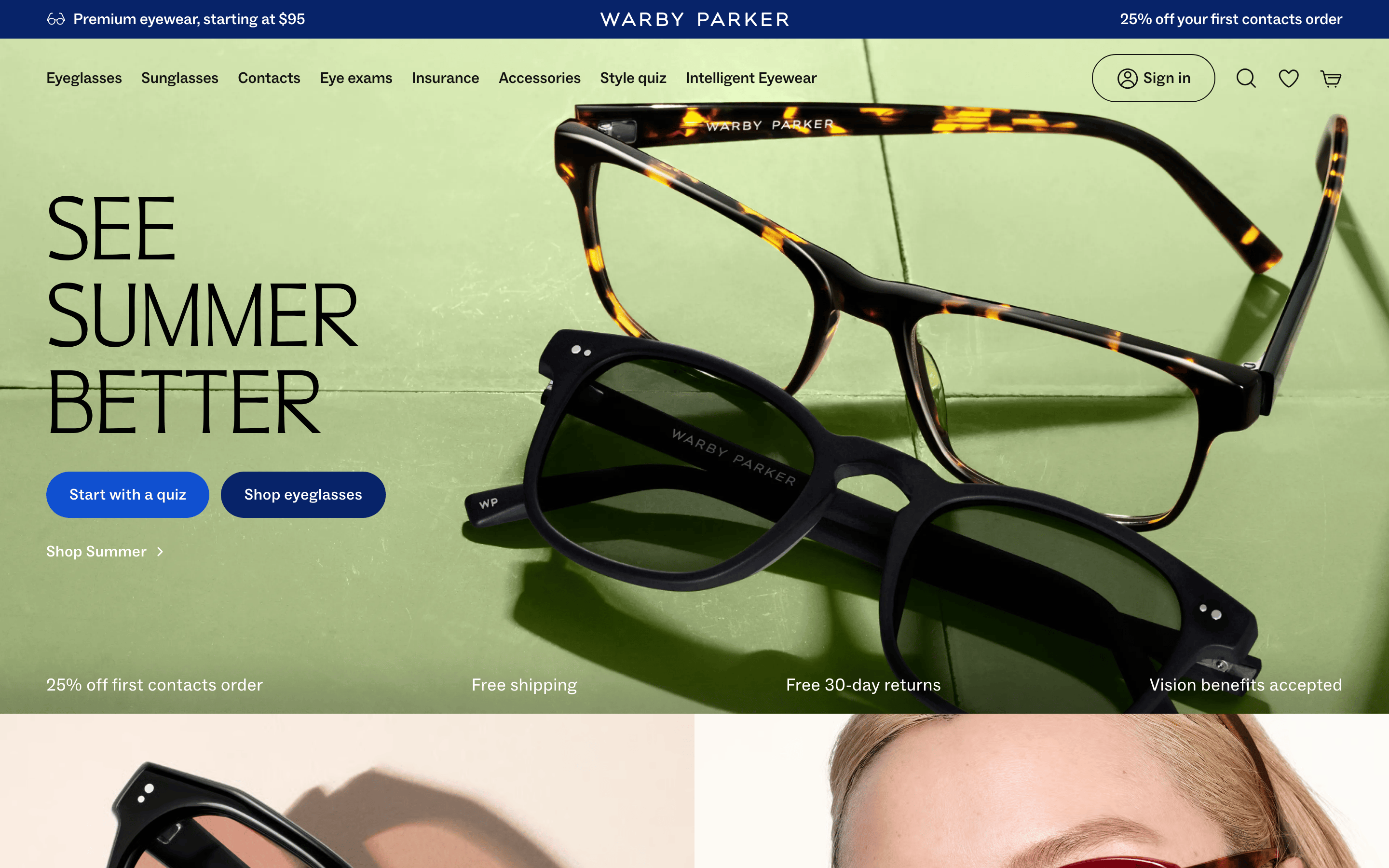
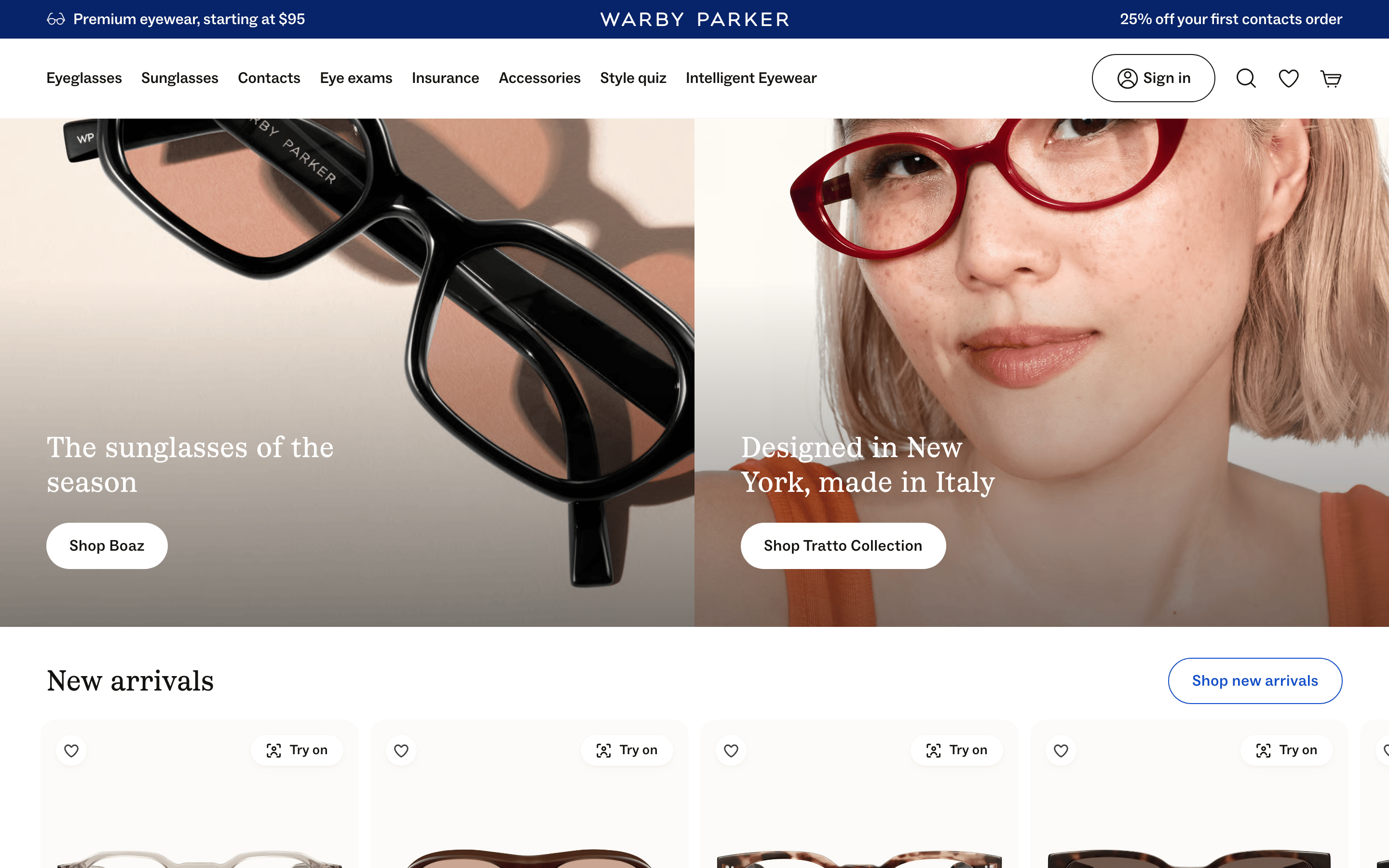
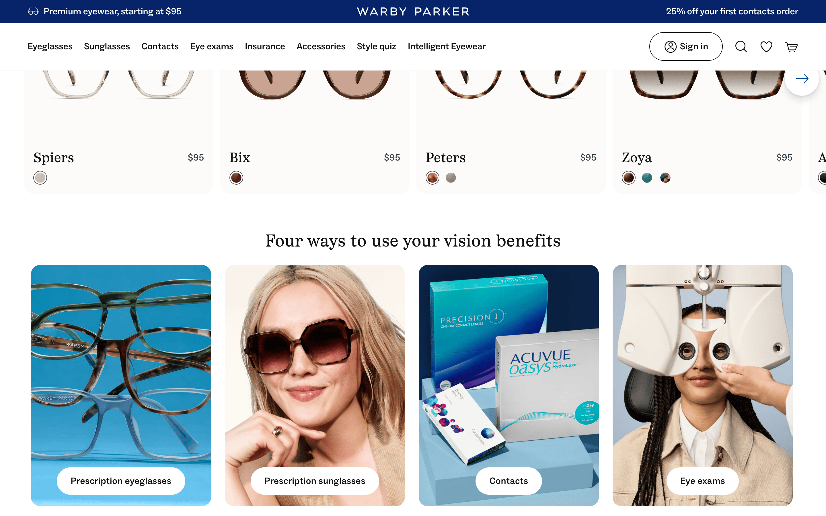
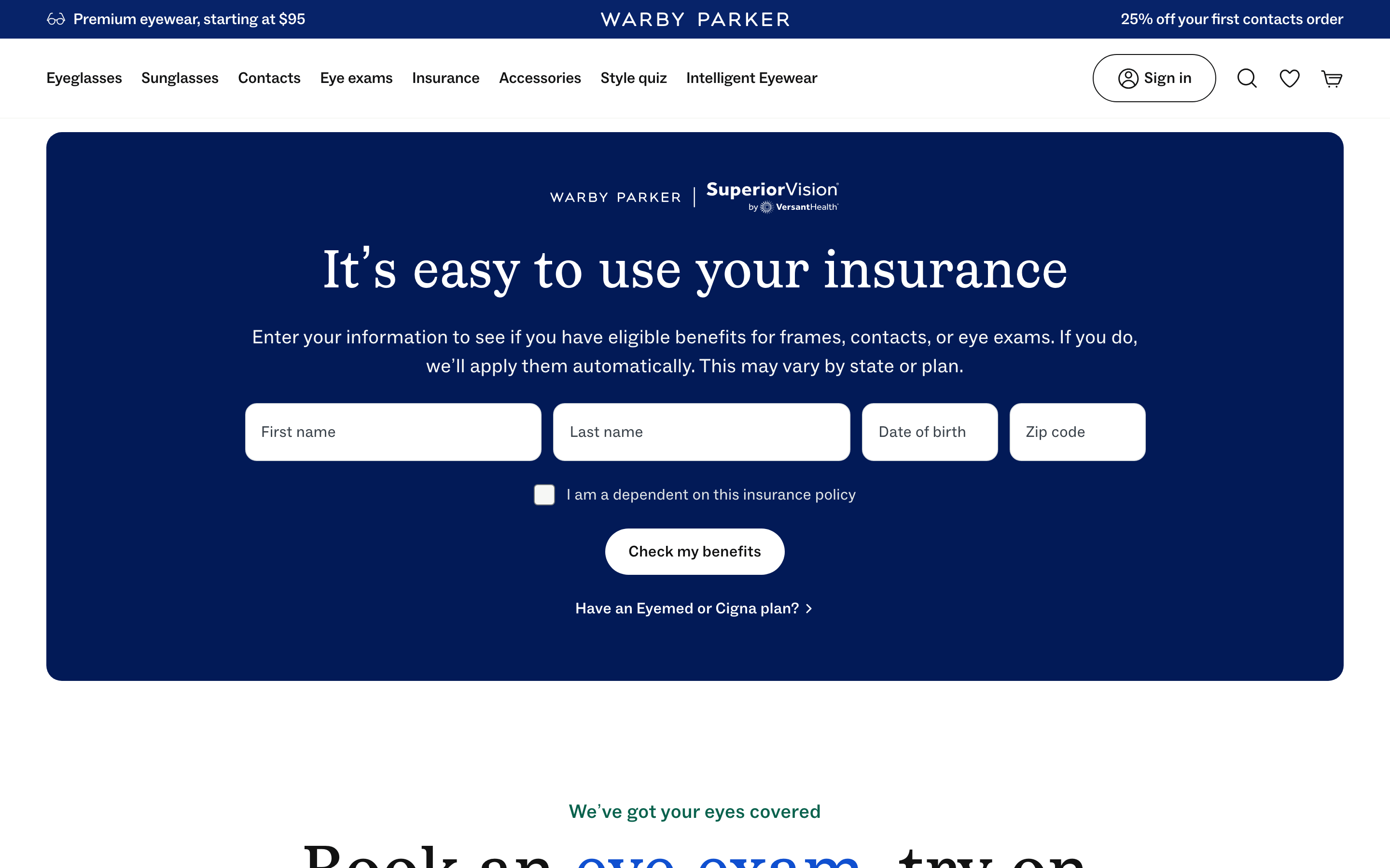
A refined, accessible boutique for modern essentials.
02
Color
#1050D0Accent
#121212Ink
#3A434CInk soft
#FCFBF9BG
#FFFFFFBG soft
#E1E5E6BG quiet
#072369Muted
rgba(18,18,18,0.12)Line
High-contrast base palette with deep navy and bright blue accents to guide actions.
03
Typography
transitional-serif · geometric-sans
display-lg56px · 400
display-sm40px · 400
body-lg18px · 400
body16px · 400
Use sans-serif for all functional text, navigation, and buttons. · Use serif only for primary editorial headlines. · Maintain generous line-height for readability.
04
Spacing
4px
8px
12px
16px
24px
32px
48px
64px
96px
Consistent 4px base grid with generous padding on interactive elements (13px 24px).
05
Surfaces
sm · 4px
md · 12px
lg · 16px
pill · 100px
Thin 1px solid borders used for outlines and dividers.
Captured from the live site · real computed styles
11
System prompt
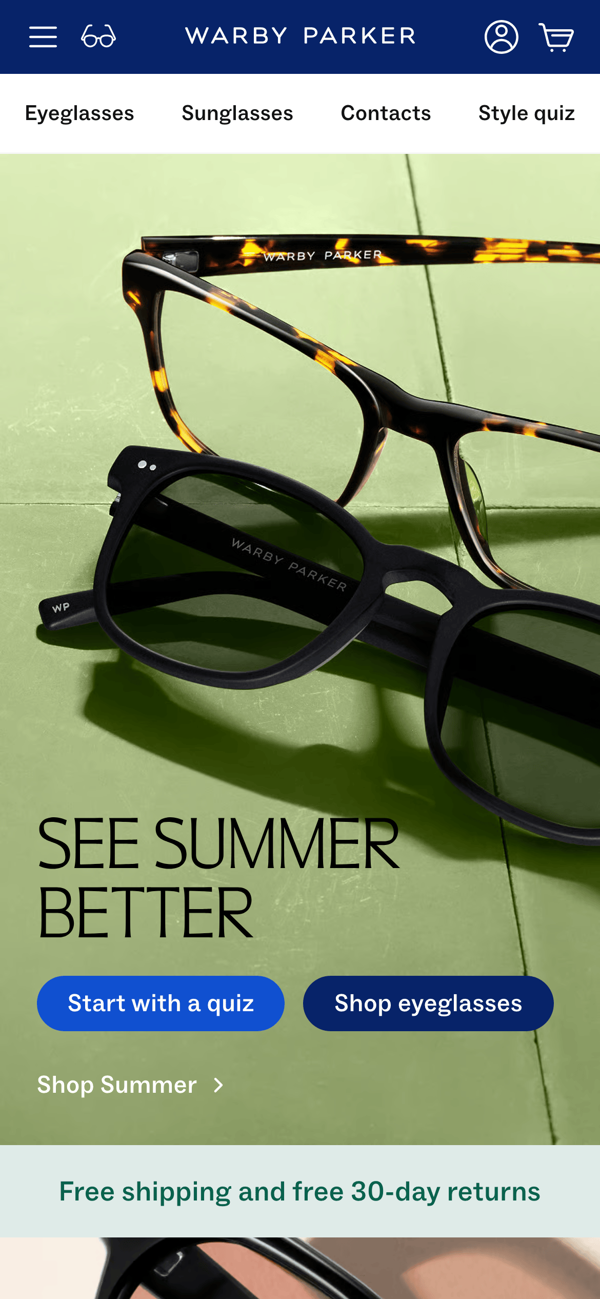
Warby Parker is a premium, direct-to-consumer eyewear brand with a clean, editorial, and approachable e-commerce interface. The design DNA is built on a palette of soft whites (#FCFBF9, #FFFFFF), light grays (#E1E5E6), deep ink (#121212), and deep navy (#072369) with a primary action blue (#1050D0). Typography features a humanist/geometric sans-serif for body and a transitional serif for display headlines. Key constraints: maintain generous white space and a 12-column grid; use large, high-quality photography; keep buttons pill-shaped and highly legible; avoid cluttered layouts and unnecessary decorative elements; and ensure high contrast for accessibility.
Bring this taste to your agent
Hand your AI agent a machine-readable spec of this design — tokens, type, motion, the whole DNA.