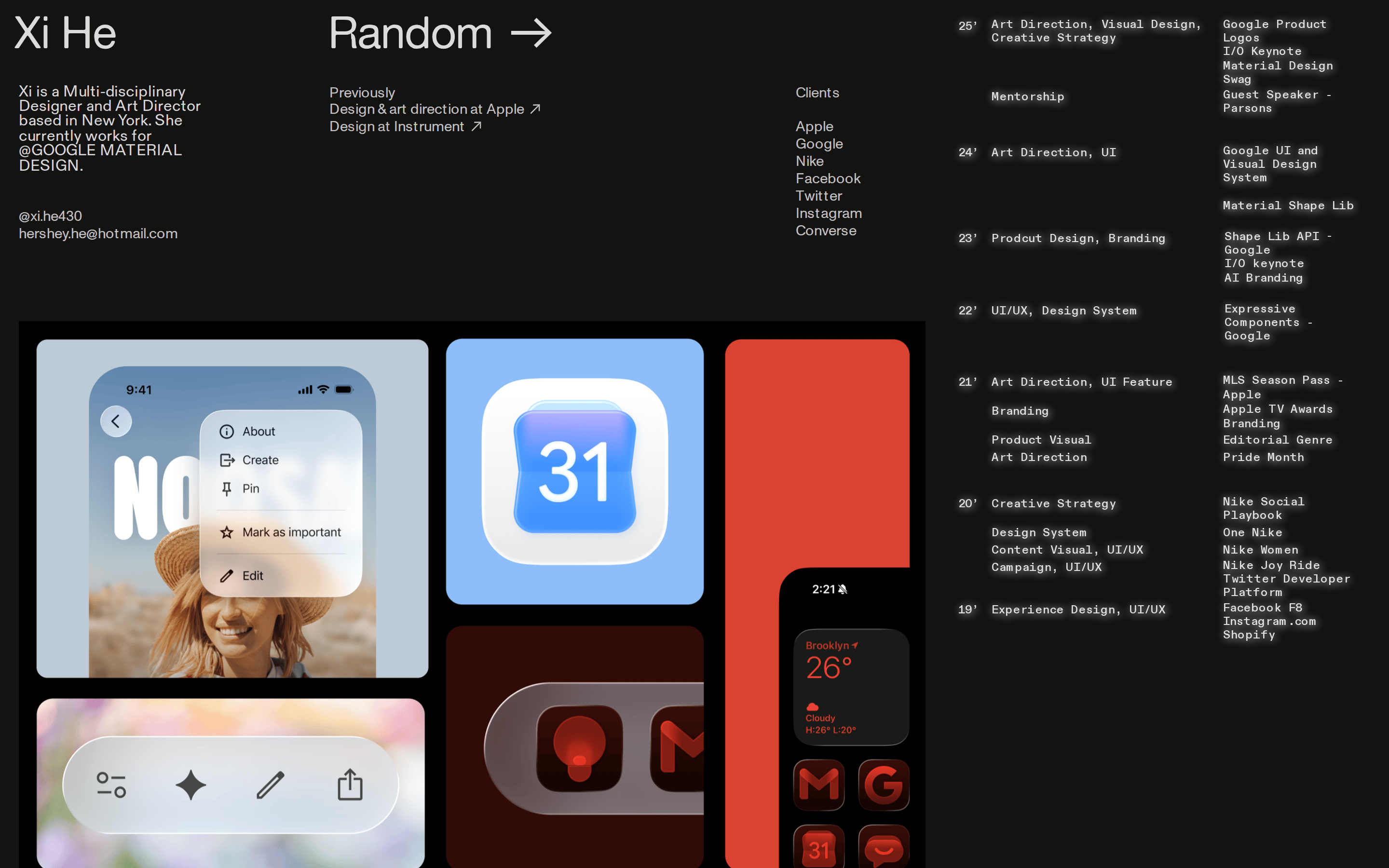
← OpenDesign CURATED · OPEN · FREE
Xihestudio
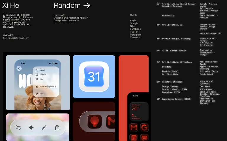
A minimal, dark-themed personal design portfolio showcasing high-profile agency work.
Portfolio Studio Bold Typography Premium Clean
01
Identity DNA
Portfolio Design Studio Art Direction Minimal Clean
A digital archive of a high-end design portfolio, presented as a stark, minimal interface.
02
Color
#FE2A2AAccent
#ffffffInk
rgba(255,255,255,0.75)Ink soft
#131312BG
rgba(255,255,255,0.1)Line
High-contrast dark mode with a single, sparse red accent to maintain focus on work.
03
Typography
geometric-sans · mono
display 46px · 400body 14px · 400caption 12px · 40004
Spacing
4px
8px
16px
24px
32px
48px
64px
96px
Strict grid with generous padding.
05
Surfaces
sm · 4px
md · 8px
lg · 12px
pill · 999px
1px solid rgba(255,255,255,0.1)
06
Layout
1400 container
12 columns
24px gutter
768 / 1024 breakpoints
Multi-column grid for text, large masonry-like layout for portfolio images.
07
Motion & Interaction
220ms micro
400ms small
800ms medium
cubic-bezier(0.4, 0, 0.2, 1) easing
Opacity transitions for hover states and page loads.
Subtle opacity changes on links and portfolio items. · Direct navigation to project detail pages.
08
Components
button Text links with directional arrows, minimal border or none. card Large image blocks with minimal padding, acting as the primary navigation. hero Large typography headline with a grid of portfolio thumbnails below. 09
Voice & Don'ts
Tone Professional, concise, and understated. Headlines Large, tight-kerned, all-caps or bold sentence case for impact. CTAs Subtle, directional arrows indicating movement to the next section. Don't use bright or neon colors — the screenshot shows a dark, almost black background with white text. Don't use decorative or script fonts — the typography is strictly geometric and monospaced sans-serifs. Don't use rounded, friendly UI elements — the layout uses sharp, clean, architectural grids. Don't add drop shadows or glassmorphism — the surfaces are completely flat and solid. Don't use multiple accent colors — the screenshot shows only a single red accent (#FE2A2A) used sparingly. Don't center all content — the layout relies on a strong left-aligned text grid. Avoid: Flashy animations Avoid: Loud colors Avoid: Dense paragraph text 10
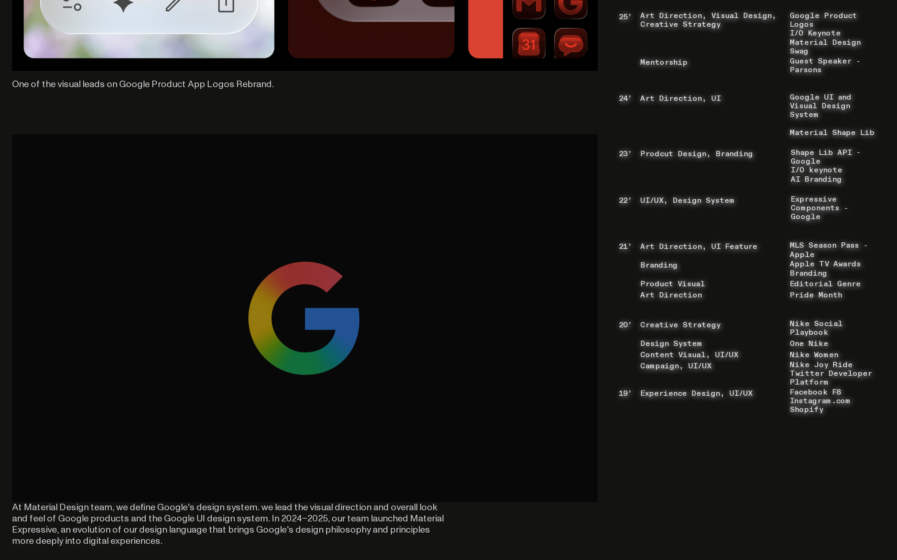
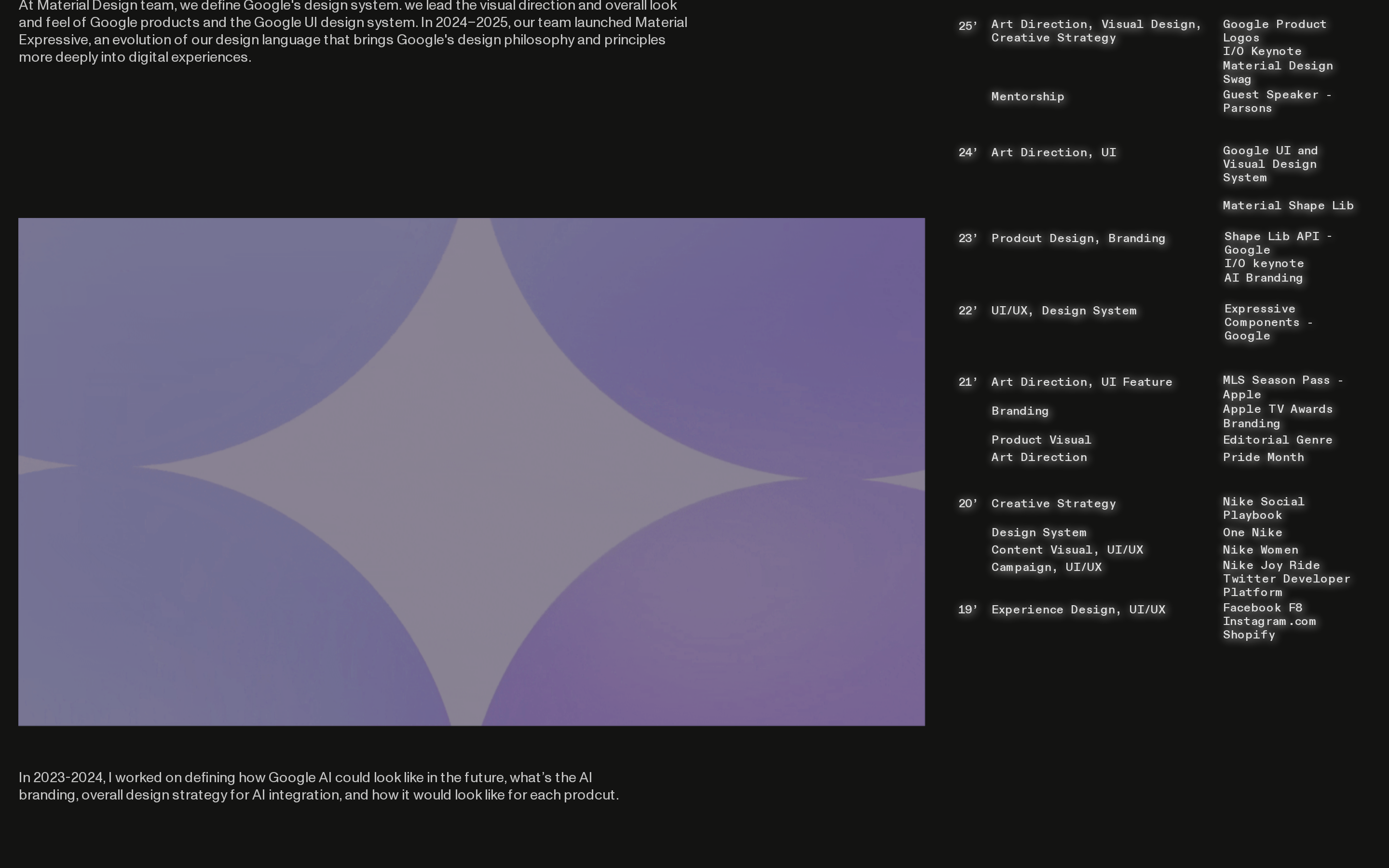
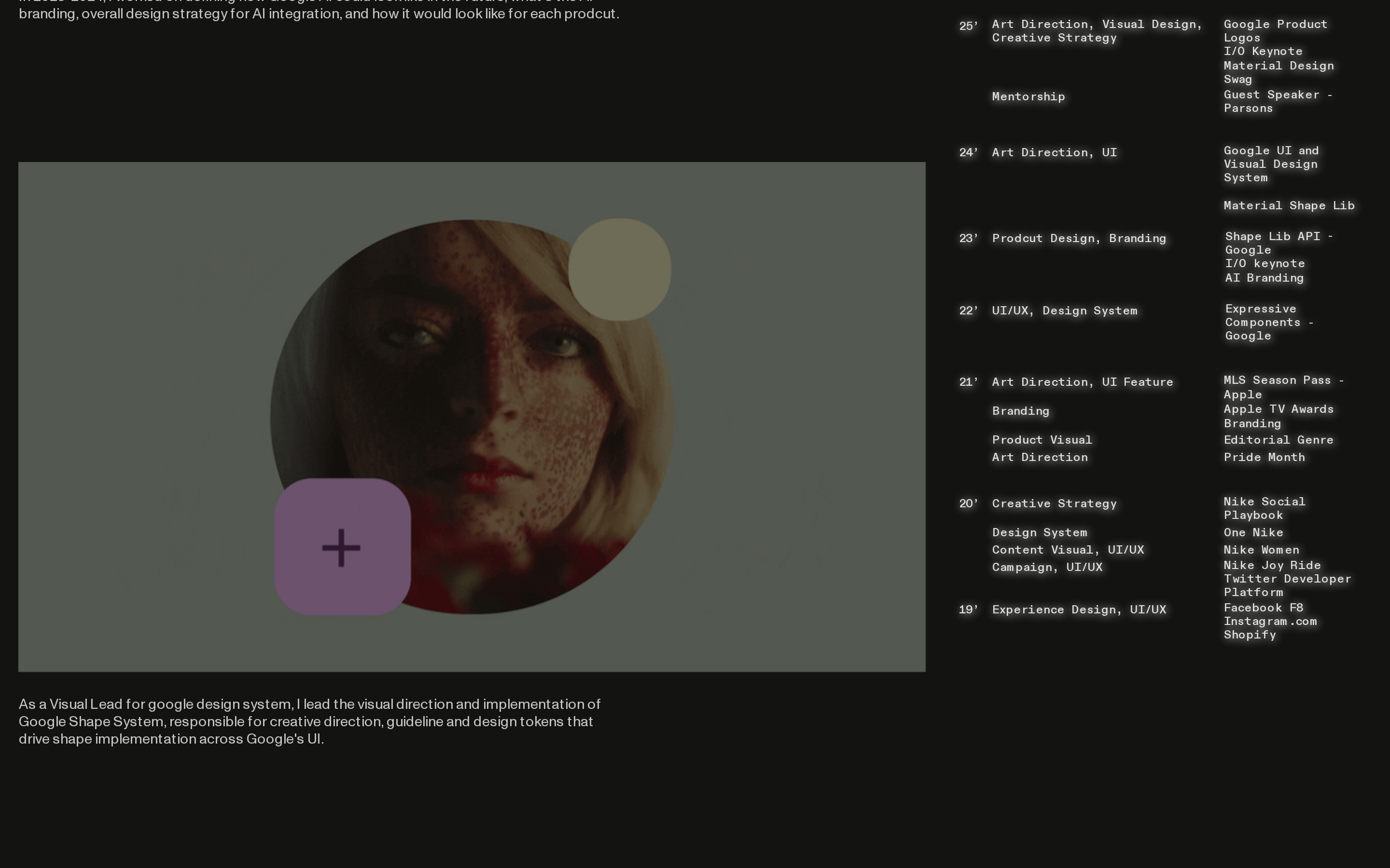
Inside the pack — real screenshots
桌面首屏(hero) 桌面滚动分段(90% viewport 步进,作为视觉证据) 桌面滚动分段(90% viewport 步进,作为视觉证据) 桌面滚动分段(90% viewport 步进,作为视觉证据) 桌面滚动分段(90% viewport 步进,作为视觉证据) 桌面滚动分段(90% viewport 步进,作为视觉证据) 桌面滚动分段(90% viewport 步进,作为视觉证据) 桌面滚动分段(90% viewport 步进,作为视觉证据) 桌面滚动分段(90% viewport 步进,作为视觉证据) 桌面滚动分段(90% viewport 步进,作为视觉证据) 桌面滚动分段(90% viewport 步进,作为视觉证据) 桌面滚动分段(90% viewport 步进,作为视觉证据) 移动首屏 Captured from the live site · real computed styles
11
System prompt
This is a high-end personal design portfolio for an Art Director. The design is a stark, dark-themed minimal interface (#131312) focusing on large geometric sans-serif typography (Monument Grotesk) and a strict grid of portfolio images. Text is primarily white (#ffffff) with a secondary muted white (rgba(255,255,255,0.75)). A single, high-chroma red accent (#FE2A2A) is used very sparingly. The layout is column-based with generous whitespace. Critical donts: Do not use bright backgrounds, do not use decorative fonts, do not use heavy drop shadows or complex animations, do not use multiple accent colors, do not use a dense or cluttered layout, and do not use centered text for the main content.
More from the library en · zh-CN · zh-TW · ja · ko
OpenDesign · curated web aesthetics for AI-readable design DNA · opendesign.cc
Why we curated this: This site is an excellent example of a premium design portfolio that uses extreme restraint and high-quality typography to showcase work without visual noise.