← OpenDesign CURATED · OPEN · FREE
Fritz Hansen
A premium, minimalist showcase for high-end furniture and design events.
furniture design
01
Identity DNA
premium scandinavian furniture design heritage
A refined Scandinavian design gallery.
02
Color
#D6E1B9Accent
#000000Ink
#333333Ink soft
#FFFFFFBG
#EFEEEBBG soft
#C6C6C6Muted
rgba(0,0,0,1)Line
Strict monochrome with a single muted pastel accent.
03
Typography
grotesque-sans
display 34px · 500body 14px · 400caption 11px · 400Uppercase text used for navigation and some labels. · Tight tracking on display sizes. · Clean, highly legible sans-serif throughout.
04
Spacing
4px
8px
16px
24px
32px
48px
64px
96px
Generous vertical padding with tight line-heights for headlines.
05
Surfaces
sm · 0px
md · 0px
lg · 0px
pill · 0px
1px solid #000000 used for structural separation.
06
Layout
1440 container
12 columns
24px gutter
768 / 1024 breakpoints
Asymmetric grids with high-quality photography.
07
Motion & Interaction
250ms micro
300ms small
500ms medium
cubic-bezier(0.25, 0.01, 0.25, 1) easing
Smooth fade-ins for content sections. · Subtle transform animations on scroll.
Subtle opacity or color change. · Immediate response, no bounce.
08
Components
button Solid black or light green background with sharp corners. card Image-heavy with thin bottom borders. chip Minimal, text-based selections. input Underline or thin border style with minimal chrome. hero Large-format imagery with bold text overlays. 09
Voice & Don'ts
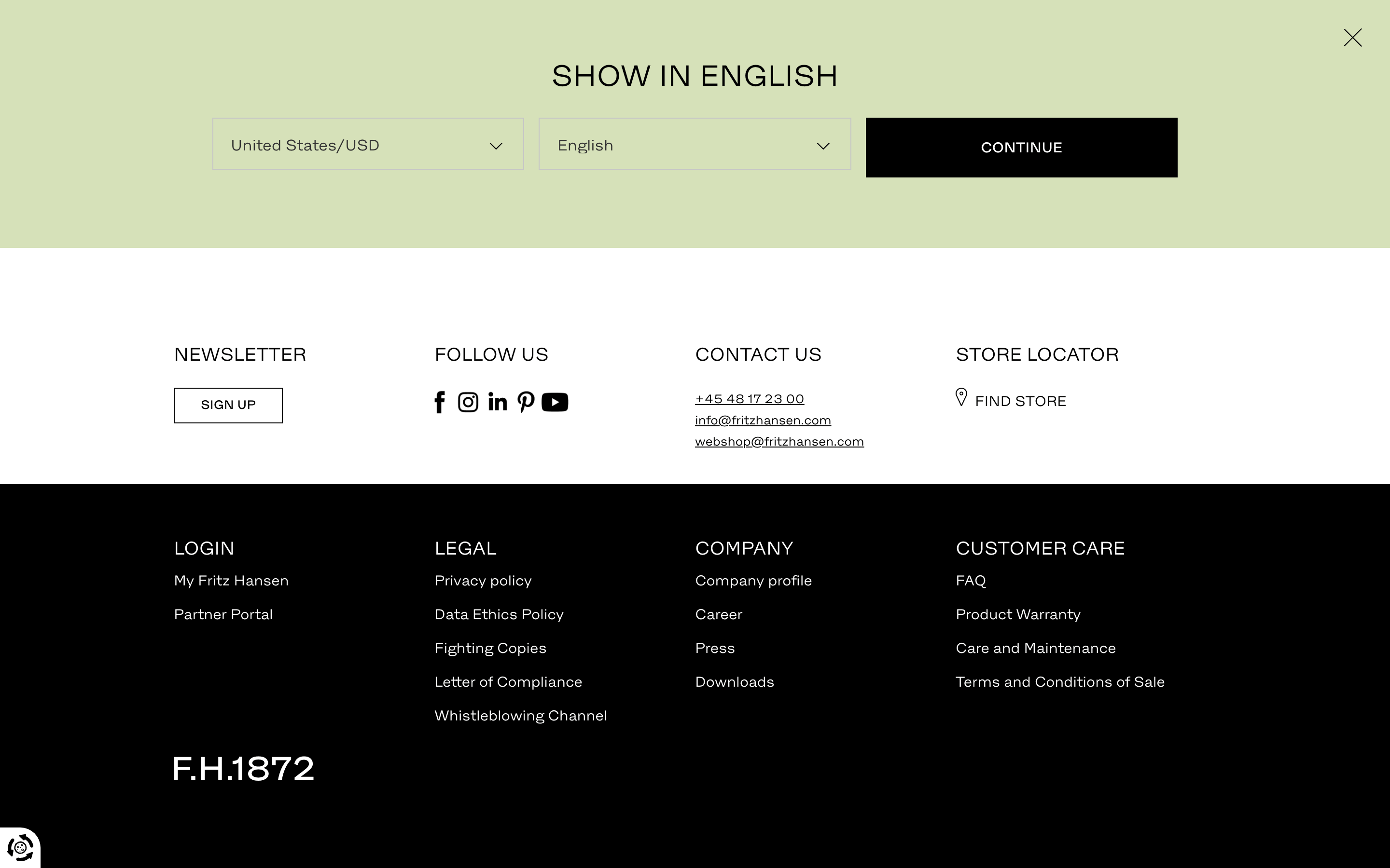
Tone Sophisticated, quiet, and authoritative. Headlines Bold, uppercase, and concise. CTAs Clear, direct, and often accompanied by an arrow. Don't use rounded corners — screenshot shows perfectly sharp edges. Don't use drop shadows — screenshot shows flat, border-separated surfaces. Don't use a vibrant primary color — screenshot shows a muted green and strict monochrome. Don't use a serif font — screenshot shows a clean, geometric sans-serif. Don't use decorative icons — screenshot shows minimal, functional UI elements. Don't clutter the layout — screenshot shows vast amounts of whitespace. Avoid: Vibrant colors Avoid: Playful language Avoid: Complex gradients Avoid: Rounded corners 10
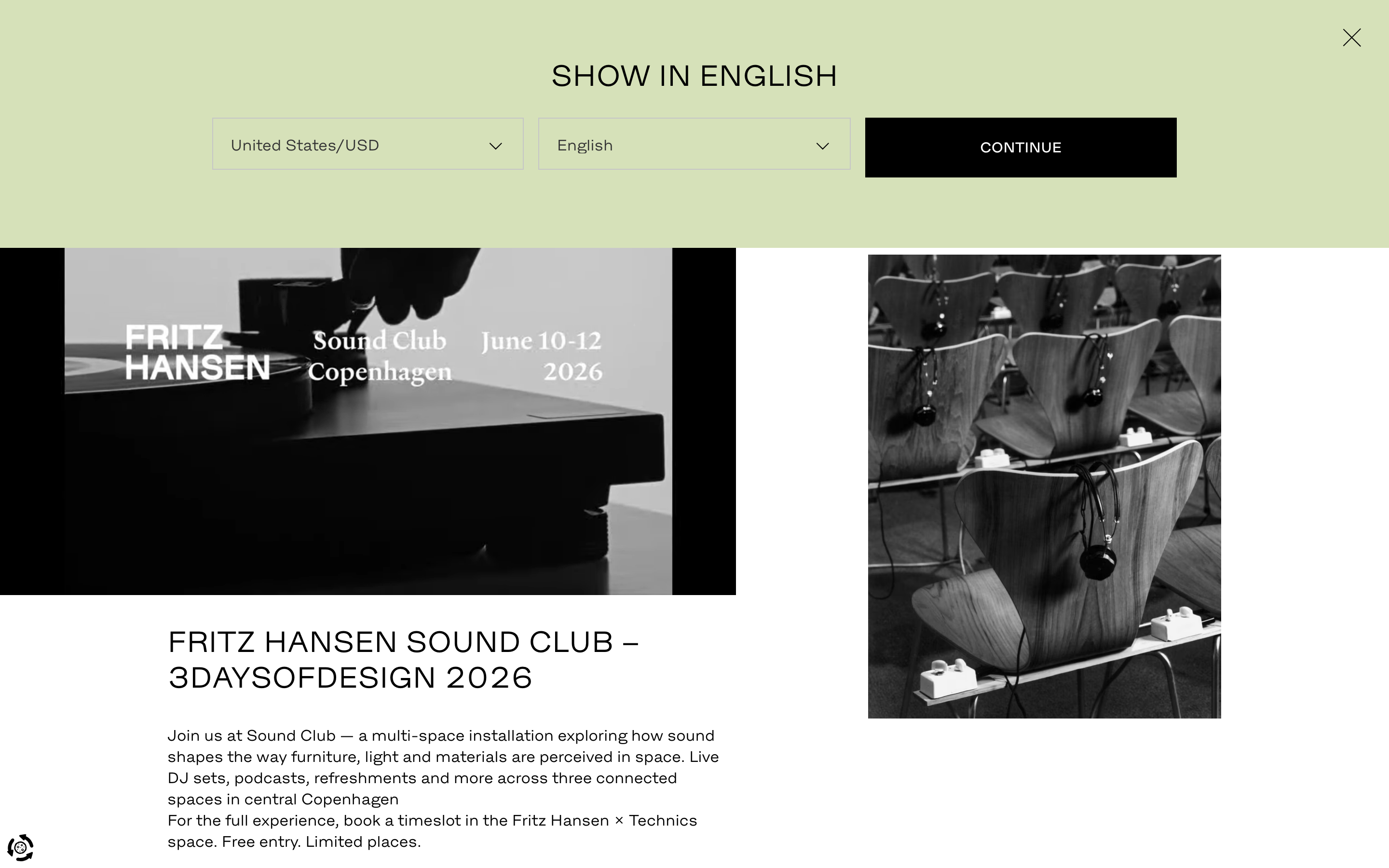
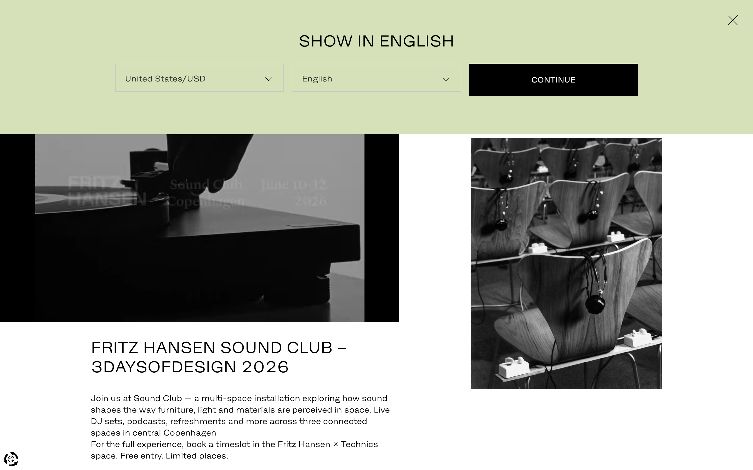
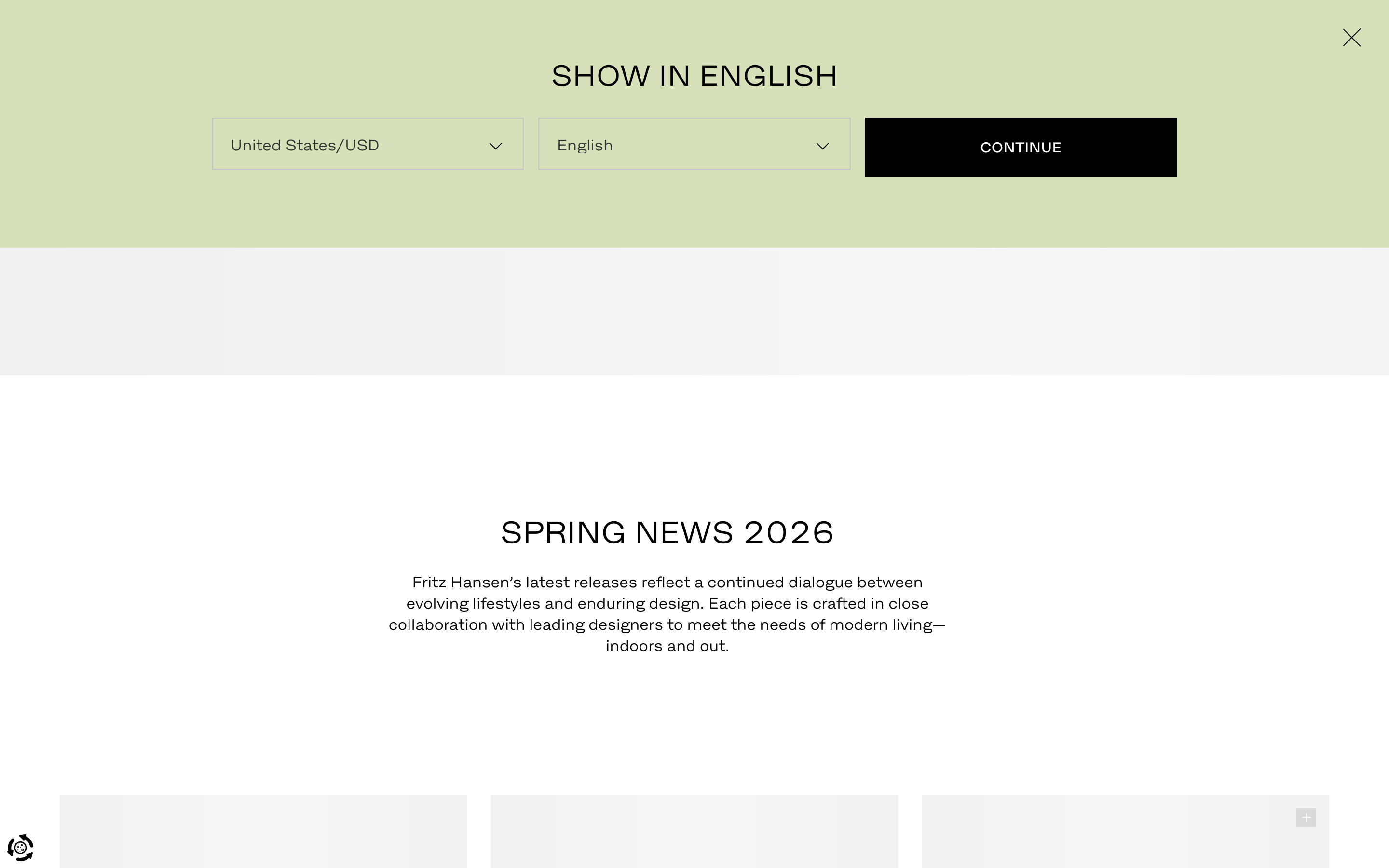
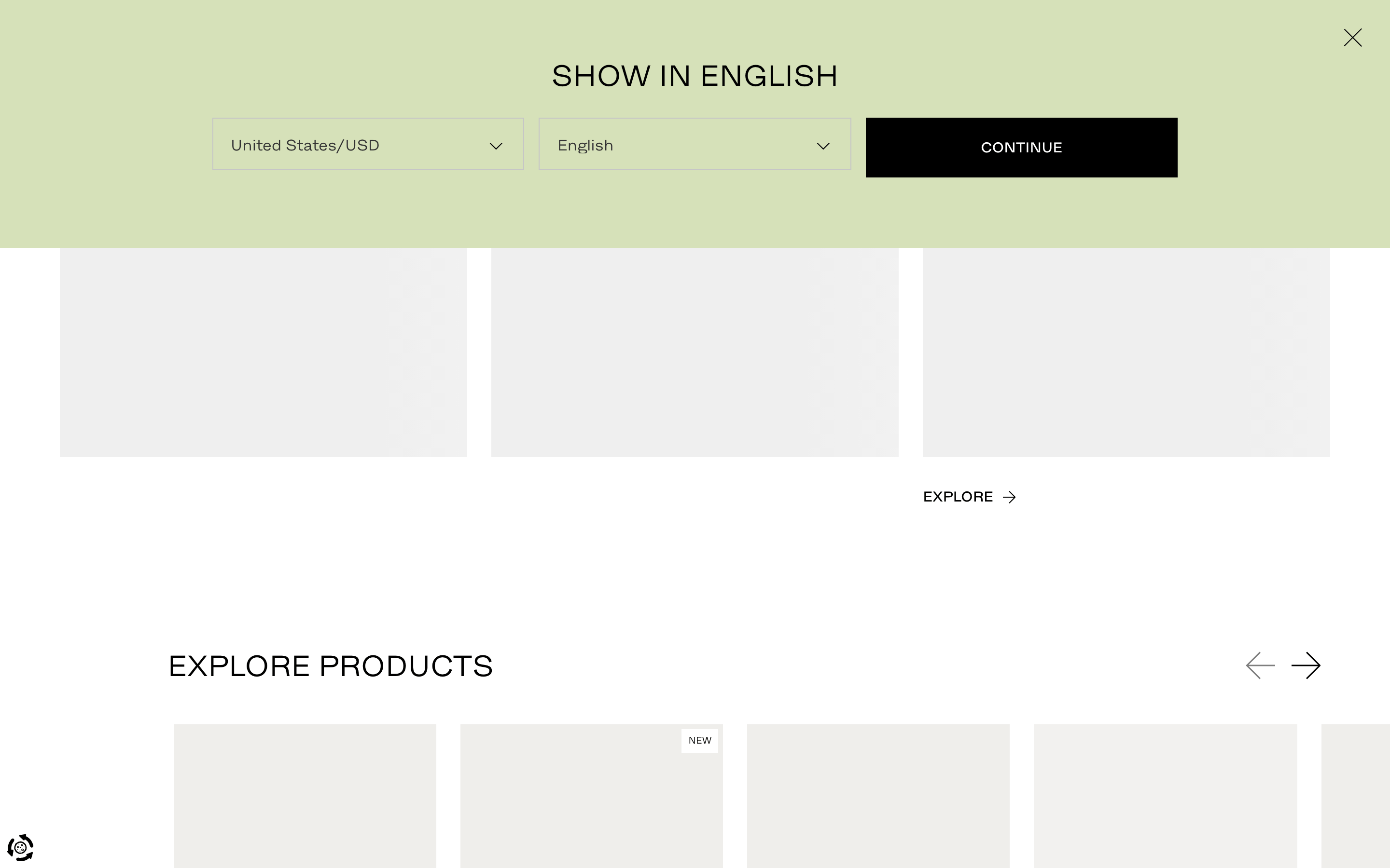
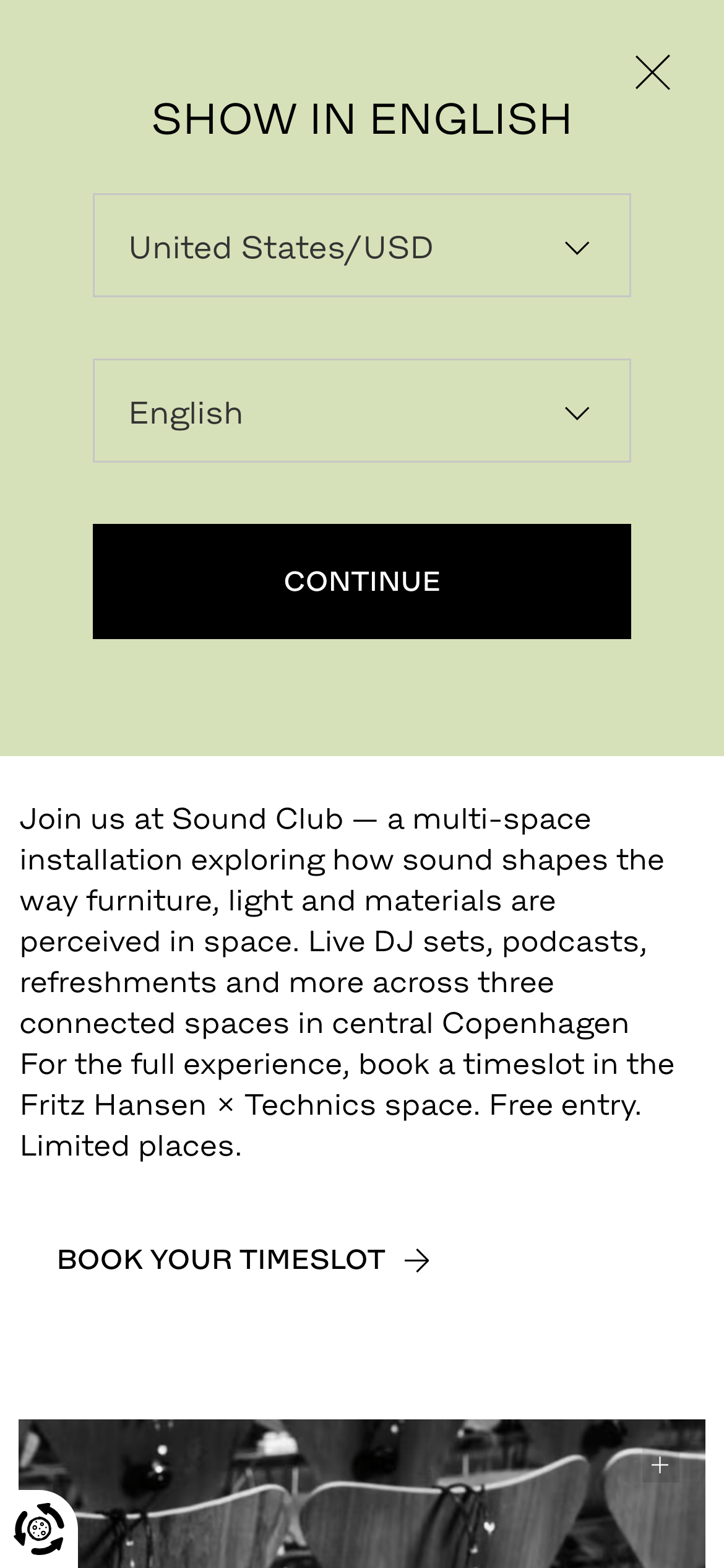
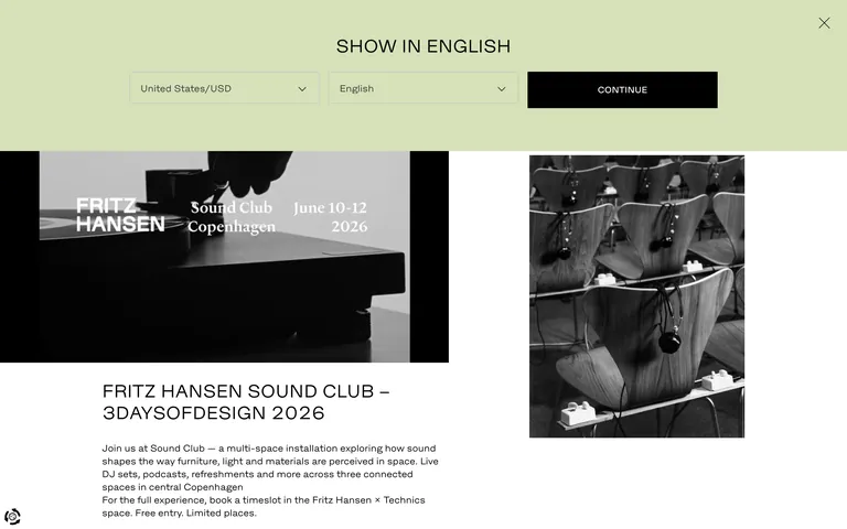
Inside the pack — real screenshots
桌面首屏(hero) 桌面滚动分段(90% viewport 步进,作为视觉证据) 桌面滚动分段(90% viewport 步进,作为视觉证据) 桌面滚动分段(90% viewport 步进,作为视觉证据) 桌面滚动分段(90% viewport 步进,作为视觉证据) 桌面滚动分段(90% viewport 步进,作为视觉证据) 桌面滚动分段(90% viewport 步进,作为视觉证据) 桌面滚动分段(90% viewport 步进,作为视觉证据) 桌面滚动分段(90% viewport 步进,作为视觉证据) 桌面滚动分段(90% viewport 步进,作为视觉证据) 移动首屏 Captured from the live site · real computed styles
11
System prompt
This design represents Fritz Hansen, a premium Scandinavian furniture brand. The identity is minimalist and sophisticated, relying on a monochrome palette (#000000 ink on #FFFFFF background) with a single muted pastel accent (#D6E1B9) for language selectors. Typography is a clean grotesque-sans, used with tight tracking for headlines and generous spacing for body text. The layout is spacious, emphasizing large-scale photography. Critical donts: never use rounded corners, avoid drop shadows, and don't introduce vibrant, high-saturation colors.
More from the library en · zh-CN · zh-TW · ja · ko
OpenDesign · curated web aesthetics for AI-readable design DNA · opendesign.cc
Why we curated this: A benchmark for high-end product sites, showing how restraint and typography can create a luxurious digital presence.
浙ICP备2021038972号-5