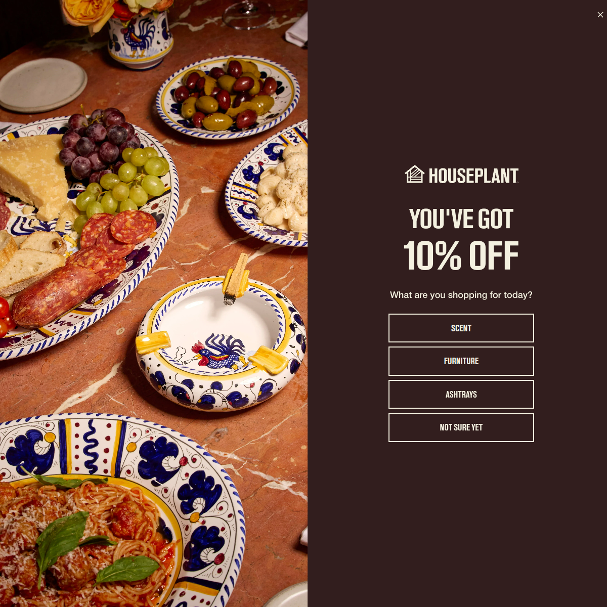
A high-end lifestyle brand offering a curated selection of home goods and accessories with a warm, inviting aesthetic.
02
Color
#FFFFFFInk
#2B2320BG
rgba(255, 255, 255, 0.3)Line
Warm, dark base with high-contrast white text for a luxurious, moody atmosphere.
03
Typography
condensed-sans · sans-serif
display64px · 500
Display headlines use a bold, condensed sans-serif for impact. · Body text uses a clean, standard sans-serif for readability. · All-caps used for button labels and secondary text.
04
Spacing
4px
8px
16px
24px
32px
48px
64px
96px
Consistent 4px base grid with generous spacing around key elements.
05
Surfaces
sm · 0px
md · 0px
lg · 0px
pill · 999px
1px solid rgba(255, 255, 255, 0.3)
06
Layout
1280container
12columns
24pxgutter
768 / 1024breakpoints
Split-screen layout with a large photographic panel on the left and a focused content panel on the right.
07
Motion & Interaction
220msmicro
400mssmall
800msmedium
cubic-bezier(0.4, 0, 0.2, 1)easing
Modal or overlay appearance
Subtle fill or border color change on buttons. · Immediate feedback on selection.
08
Components
buttonOutline style with sharp corners, uppercase text, and generous padding.
cardN/A
chipN/A
inputN/A
heroSplit-screen promotional overlay with full-bleed photography on one side and a dark, text-focused panel on the other.
09
Voice & Don'ts
ToneInviting, sophisticated, and direct.
HeadlinesBold, impactful, and concise (e.g., 'YOU'VE GOT 10% OFF').
CTAsClear, action-oriented, and category-specific (e.g., 'SCENT', 'FURNITURE').
Don't use soft or rounded UI elements — screenshot shows sharp, rectangular buttons.
Don't use a bright or neon accent color — screenshot shows a restrained, dark palette.
Don't use a decorative or script typeface — screenshot uses clean, condensed sans-serif fonts.
Don't clutter the layout — screenshot maintains generous white space and a focused split-screen structure.
Don't use playful or cartoonish illustrations — screenshot uses high-quality, realistic photography.
Don't use a light background — screenshot uses a deep, dark brown for the interactive panel.
Avoid: Overly technical jargon
Avoid: Loud, aggressive sales language
Avoid: Generic marketing fluff
11
System prompt
Houseplant is a premium lifestyle e-commerce brand focusing on home goods and curated accessories. The design DNA is anchored by a deep, warm dark brown (#2B2320) background contrasted with crisp white text. Typography relies on a bold, condensed sans-serif for impactful display headlines and a clean sans-serif for body copy. The layout is a clean split-screen with a large photographic panel and a focused, dark content area. Key don'ts: avoid rounded corners, avoid bright neon accents, avoid cluttered layouts. The overall vibe is sophisticated, warm, and inviting.
Bring this taste to your agent
Hand your AI agent a machine-readable spec of this design — tokens, type, motion, the whole DNA.