← OpenDesign CURATED · OPEN · FREE
Fly By Jing
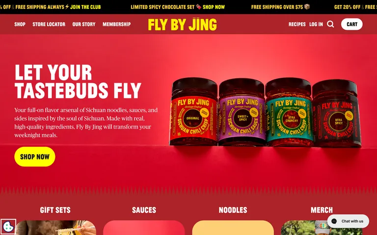
Premium Sichuan pantry staples with bold, expressive, and unapologetically spicy branding.
food dtc
01
Identity DNA
Spicy Bold Sichuan Flavorful Modern Heritage
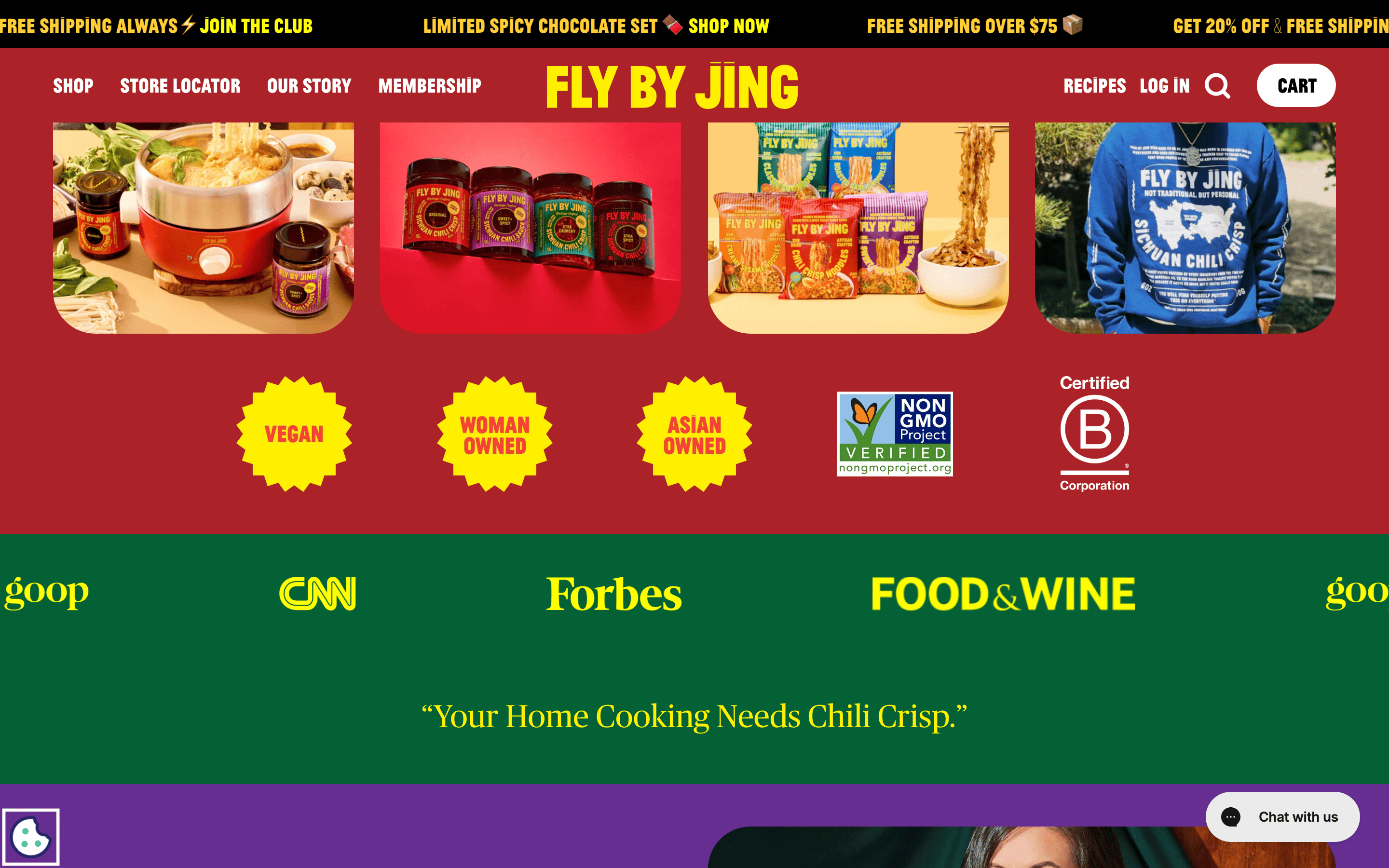
A vibrant, bold street food market stall elevated with premium packaging and modern DTC branding.
02
Color
#FFCD35Accent
#FFFFFFInk
#E52228BG
#F2F2F2Muted
rgba(0,0,0,1)Line
High-chroma, spicy-inspired color palette using vibrant reds, yellows, and bold blacks to convey flavor and energy.
03
Typography
grotesque-sans · transitional-serif
display 88px · 700heading 44px · 700body 22px · 400Uppercase all primary navigation and action labels · Use high-contrast white text on red backgrounds · Maintain a tight, bold typographic hierarchy
04
Spacing
4px
8px
16px
24px
32px
48px
64px
96px
Generous vertical padding (44px) in sections to let large typography and photography breathe.
05
Surfaces
sm · 4px
md · 8px
lg · 12px
pill · 9999px
Minimal visible borders, relying on color contrast and typography for separation.
rgb(204, 204, 204) 0px 0px 2px 2px
06
Layout
1280 container
12 columns
24px gutter
768 / 1024 breakpoints
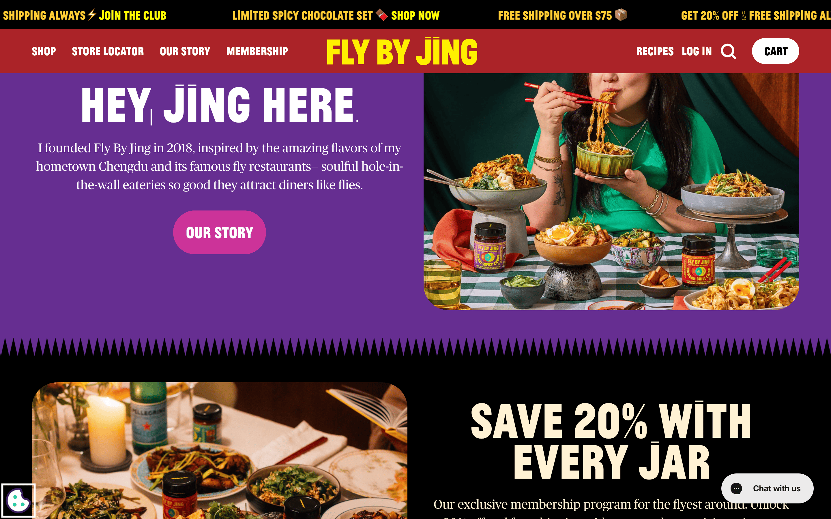
Full-width hero sections with centered typography or side-by-side image/text layouts, transitioning to stacked columns on mobile.
07
Motion & Interaction
150ms micro
200ms small
300ms medium
cubic-bezier(0.4, 0, 0.2, 1) easing
Smooth color and background-color transitions on interactive elements · Subtle scale and transform effects on hover/click
Color changes or subtle background shifts on buttons and links. · Immediate visual feedback via subtle transforms or state changes.
08
Components
button Bold, uppercase text labels, often with pill-shaped (large border-radius) or rectangular backgrounds with high-contrast colors. card Simple containers with generous internal padding, often showcasing food photography. chip N/A input Simple text fields with subtle borders. hero Immersive, full-bleed background colors or large product photography with massive, bold, centered or left-aligned headlines. 09
Voice & Don'ts
Tone Confident, bold, expressive, and slightly playful. Headlines Short, punchy, imperative, and highly visual. CTAs Direct, action-oriented, and always uppercase. Don't use thin or light font weights for headlines — the screenshot shows thick, bold, 700-weight grotesque-sans for all major titles. Don't use small, understated typography — the screenshot shows massive, tightly set display type (88px+). Don't rely on a neutral, monochromatic palette — the screenshot is dominated by high-chroma red (#E52228) and yellow (#FFCD35). Don't use elegant, high-contrast serif fonts for display — the screenshot uses a bold grotesque-sans for headlines. Don't use standard casing for navigation — the screenshot shows all uppercase text for menu items and category links. Don't use thin, 1px borders for primary separation — the screenshot relies on solid blocks of vibrant color. Avoid: Subtle or muted language Avoid: Small, delicate typography Avoid: Understated color palettes Avoid: Complex, multi-word headlines Avoid: Cursive or elegant serif fonts for display Avoid: Lots of empty white space without bold color 10
Inside the pack — real screenshots
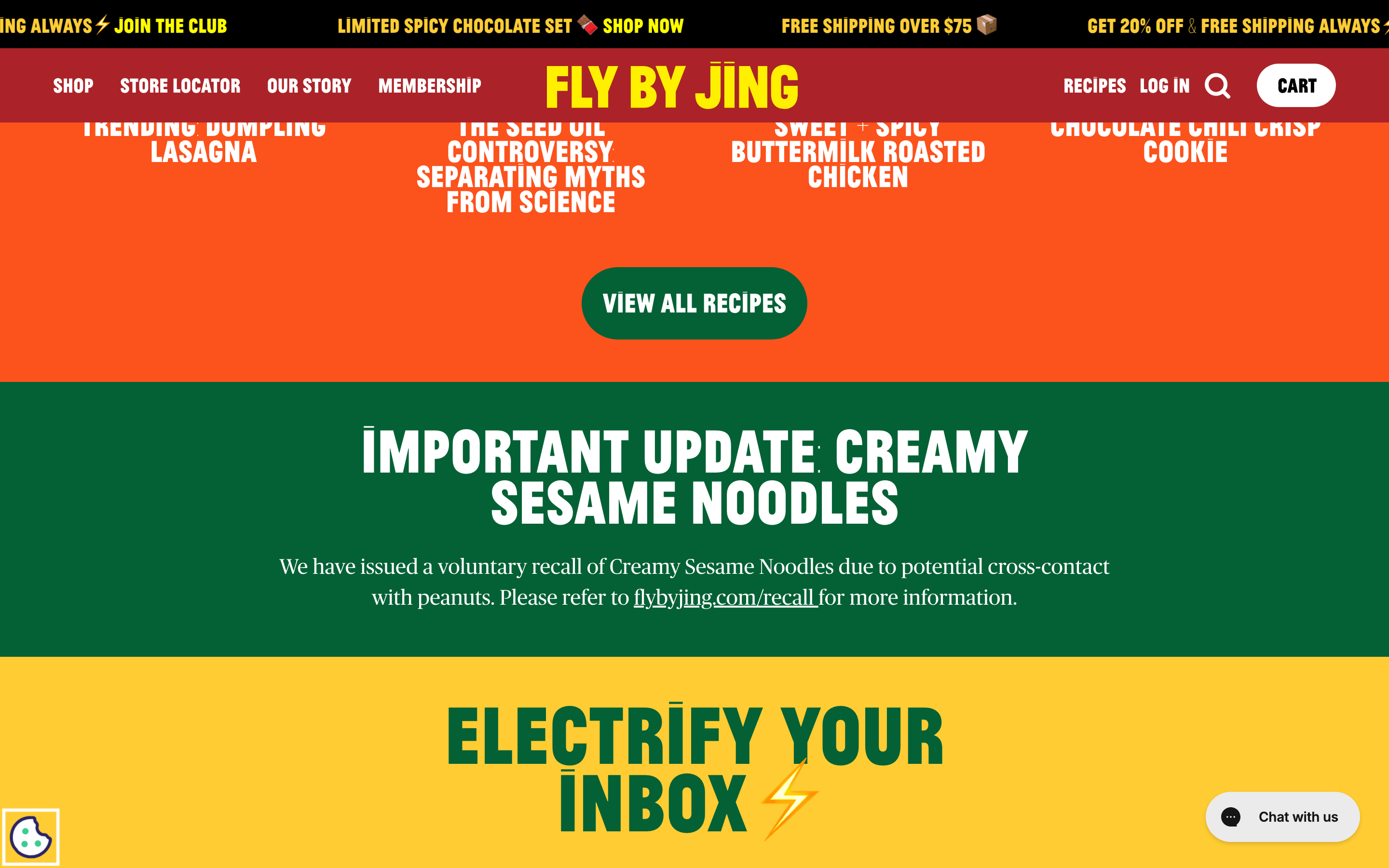
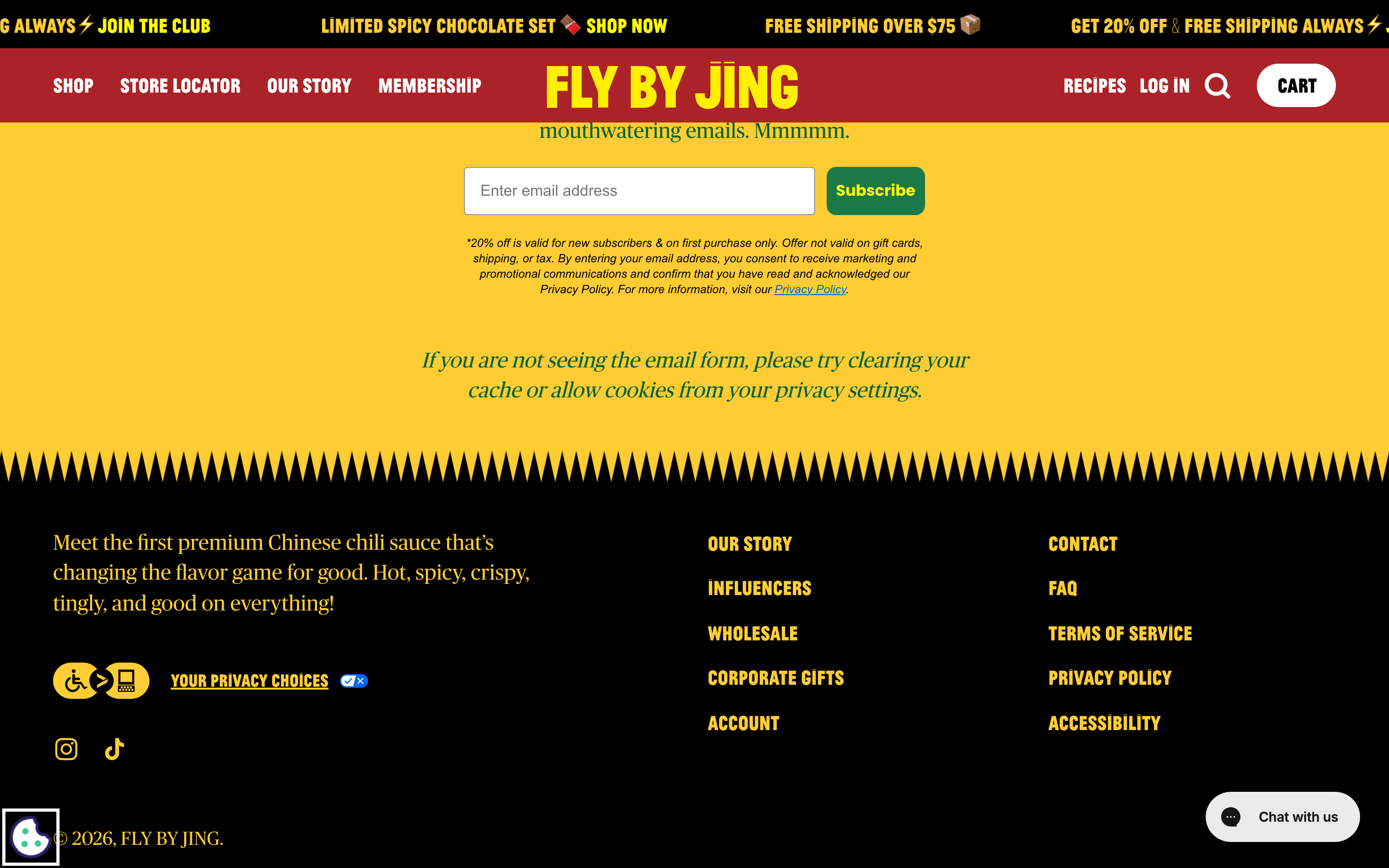
桌面首屏(hero) 桌面滚动分段(90% viewport 步进,作为视觉证据) 桌面滚动分段(90% viewport 步进,作为视觉证据) 桌面滚动分段(90% viewport 步进,作为视觉证据) 桌面滚动分段(90% viewport 步进,作为视觉证据) 桌面滚动分段(90% viewport 步进,作为视觉证据) 桌面滚动分段(90% viewport 步进,作为视觉证据) 移动首屏 Captured from the live site · real computed styles
11
System prompt
Fly By Jing is a premium, direct-to-consumer brand for Sichuan chili crisp and pantry staples. Its design DNA is defined by an unapologetically bold, high-chroma palette centered around a vibrant spicy red (#E52228) and a punchy, high-visibility yellow (#FFCD35). The typography pairs a thick, bold grotesque-sans for massive display headlines with a sturdy transitional-serif for body copy. The layout is immersive, featuring full-bleed color blocks and large product photography. Critical constraints: never use thin or light font weights for headlines; avoid small, understated typography; and do not use a muted or monochromatic color palette. The brand voice is confident, direct, and expressive, always using uppercase for primary actions and navigation.
More from the library en · zh-CN · zh-TW · ja · ko
OpenDesign · curated web aesthetics for AI-readable design DNA · opendesign.cc
Why we curated this: Worth including for its masterful use of bold, expressive typography and a highly distinctive, high-chroma color system that perfectly matches the brand's spicy product identity.
浙ICP备2021038972号-5