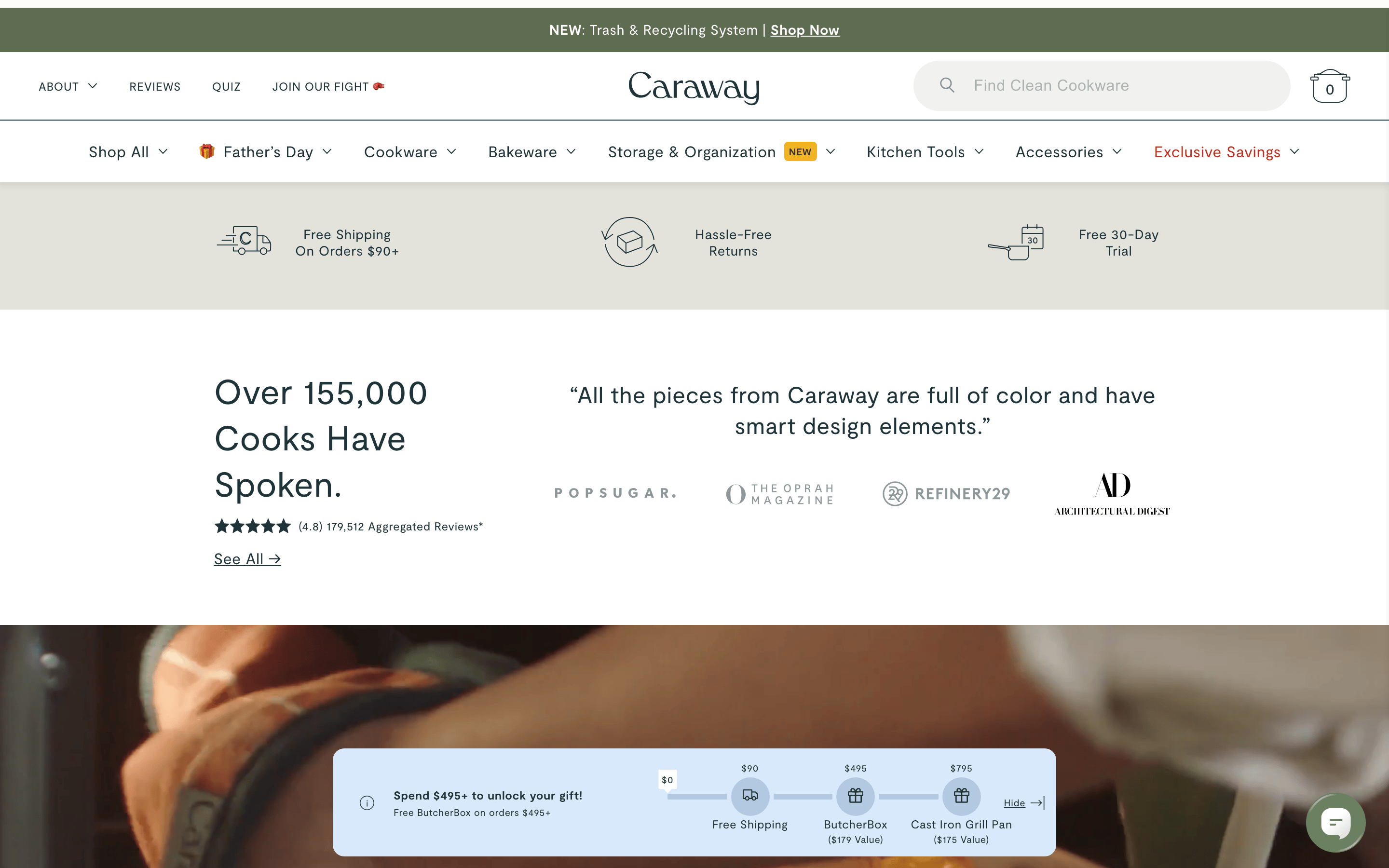
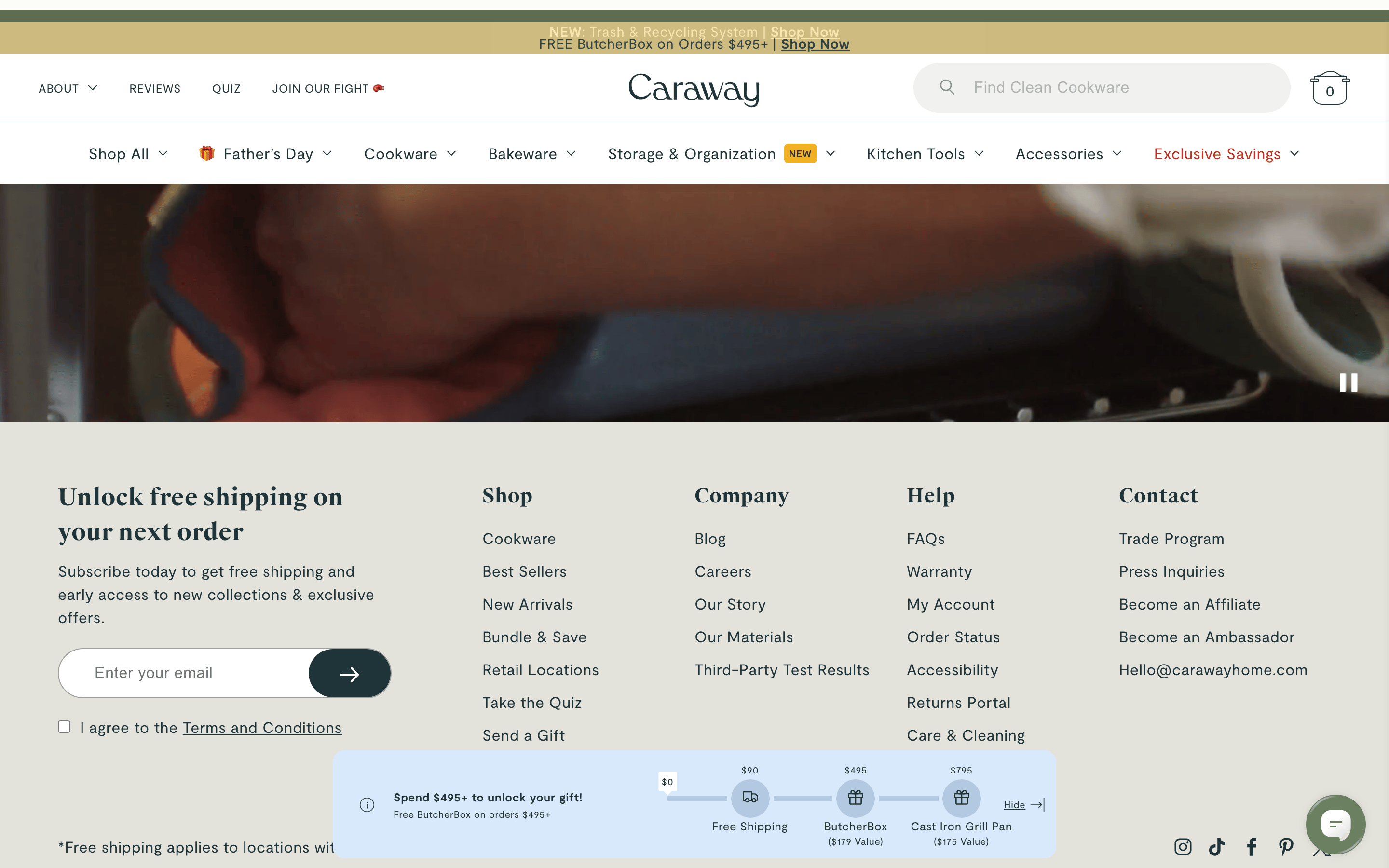
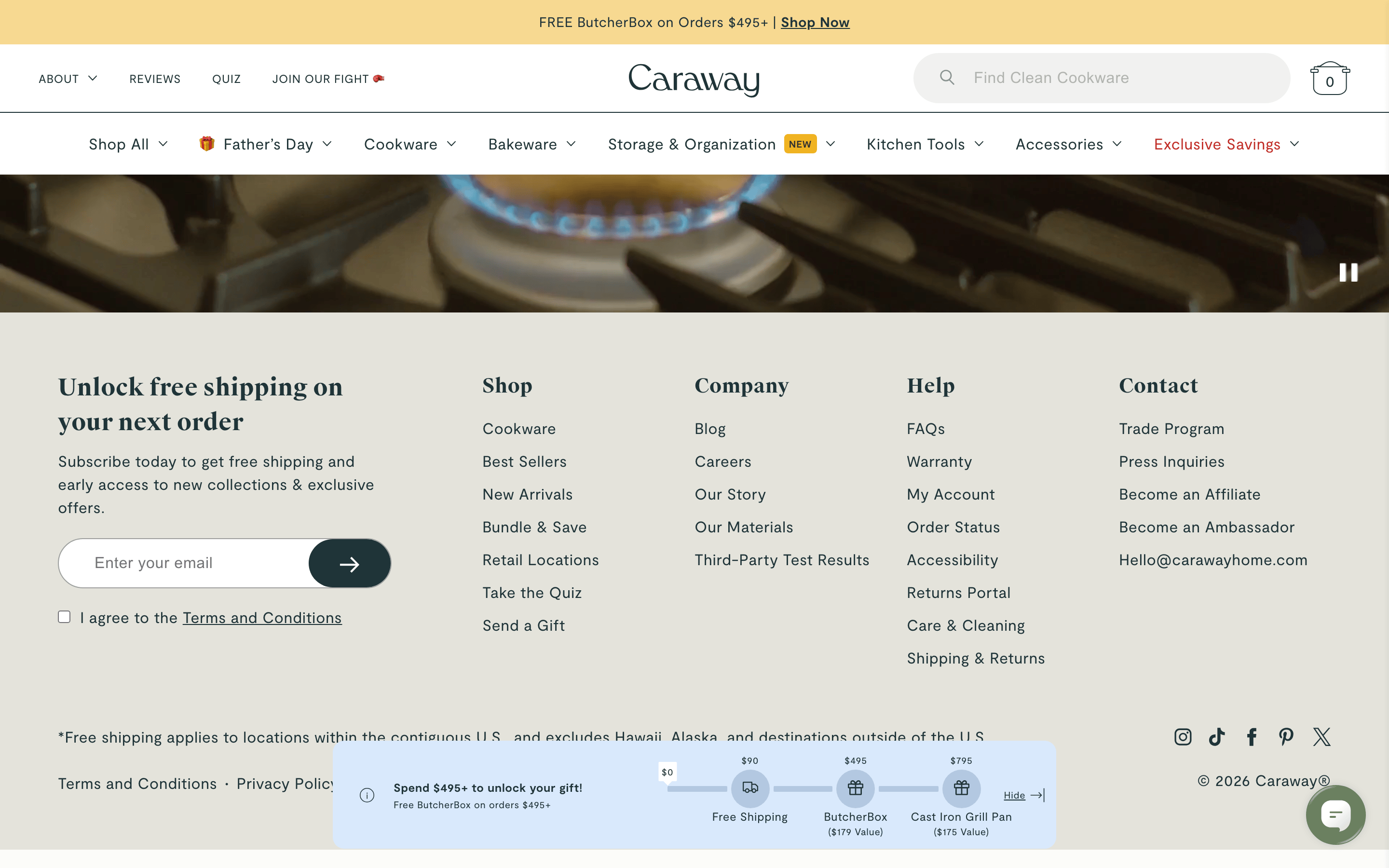
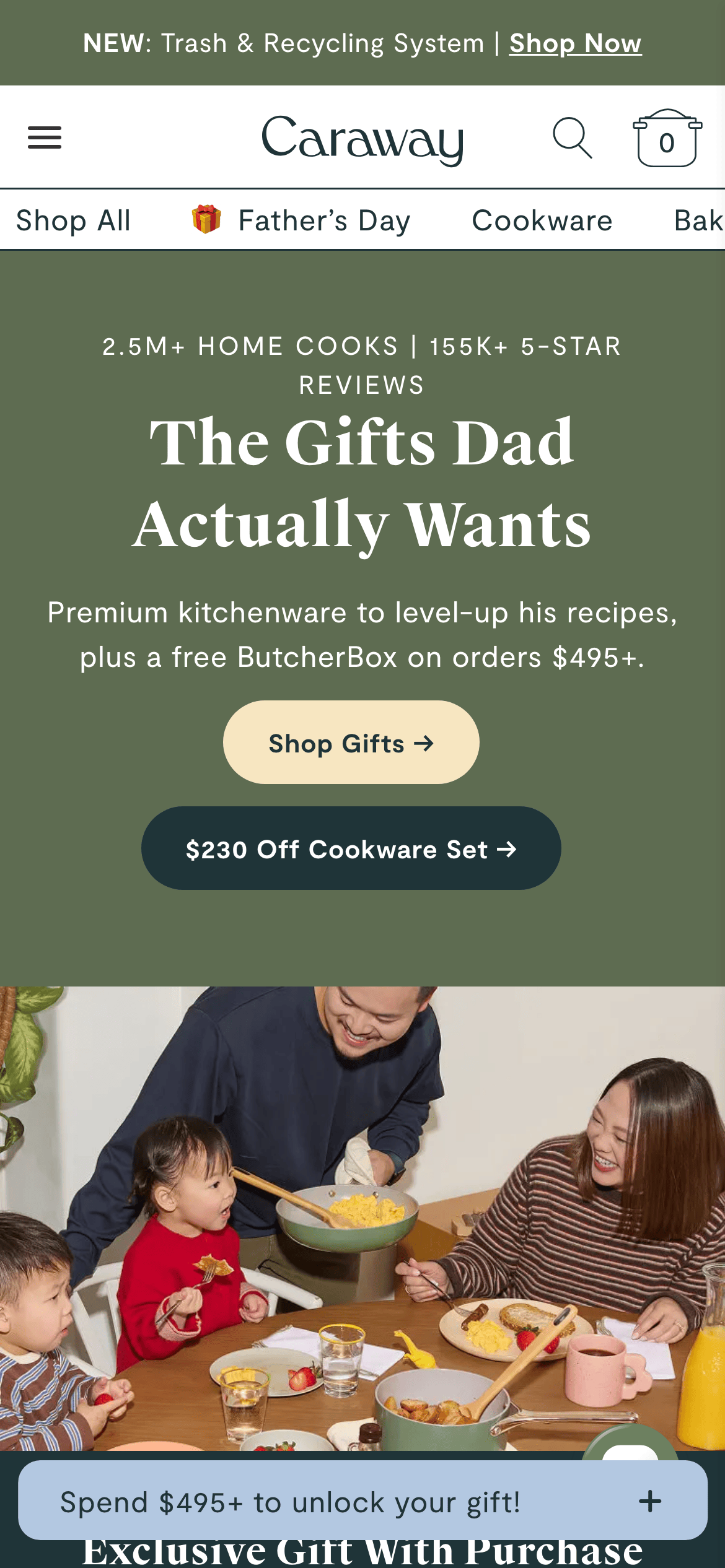
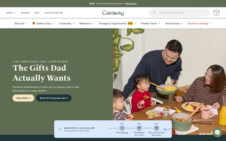
A premium, non-toxic cookware brand focused on modern home life.
02
Color
#1F3438Ink
#333333Ink soft
#FFFFFFBG
#E4E3DBBG soft
#B3C8E1BG quiet
#737373Muted
rgba(31,52,56,1.0)Line
A restrained palette with earthy, muted tones, relying on high-quality photography for visual impact.
03
Typography
transitional-serif · humanist-sans
display56px · 700
body16px · 400
small12px · 400
Use transitional-serif for impactful headlines and humanist-sans for all functional text. · Maintain a consistent letter-spacing of 0.4px across body text for readability.
04
Spacing
4px
8px
16px
24px
32px
48px
64px
96px
A 4px base grid with consistent 11px and 8px gaps between UI elements.
05
Surfaces
sm · 4px
md · 8px
lg · 40px
pill · 9999px
1px solid #1F3438
rgba(0, 0, 0, 0.05) 0px 4px 5px 2px
06
Layout
1280container
12columns
24pxgutter
768 / 1024breakpoints
A wide, image-heavy layout with full-bleed hero sections and alternating background colors.
07
Motion & Interaction
180msmicro
250mssmall
300msmedium
cubic-bezier(0.3, 1, 0.75, 1)easing
Subtle transitions on hover for buttons and links. · Smooth scroll or page transitions.
Smooth color or opacity transitions on interactive elements. · Immediate visual feedback, likely a slight scale or color change.
08
Components
buttonHighly rounded (40px), pill-shaped buttons with solid backgrounds or outlines.
cardMinimalist cards, primarily defined by large, high-quality product or lifestyle photography.
chipSmall, rounded badges used for status (e.g., 'NEW').
inputFull-width search bar with rounded ends and an integrated search icon.
Captured from the live site · real computed styles
11
System prompt
Caraway is a premium DTC e-commerce site for non-toxic kitchenware. Its design DNA is defined by a clean, spacious layout, a restrained palette featuring deep teal (#1F3438), olive green (#5E6C51), and soft blue (#B3C8E1), and a mix of transitional-serif (for display) and humanist-sans (for body) typography. The site emphasizes high-quality lifestyle photography and a sense of modern, healthy living. Critical don'ts: avoid neon colors, don't use square buttons, and avoid all-caps for headlines. The layout is wide and image-heavy, focusing on trust and product quality.
Bring this taste to your agent
Hand your AI agent a machine-readable spec of this design — tokens, type, motion, the whole DNA.