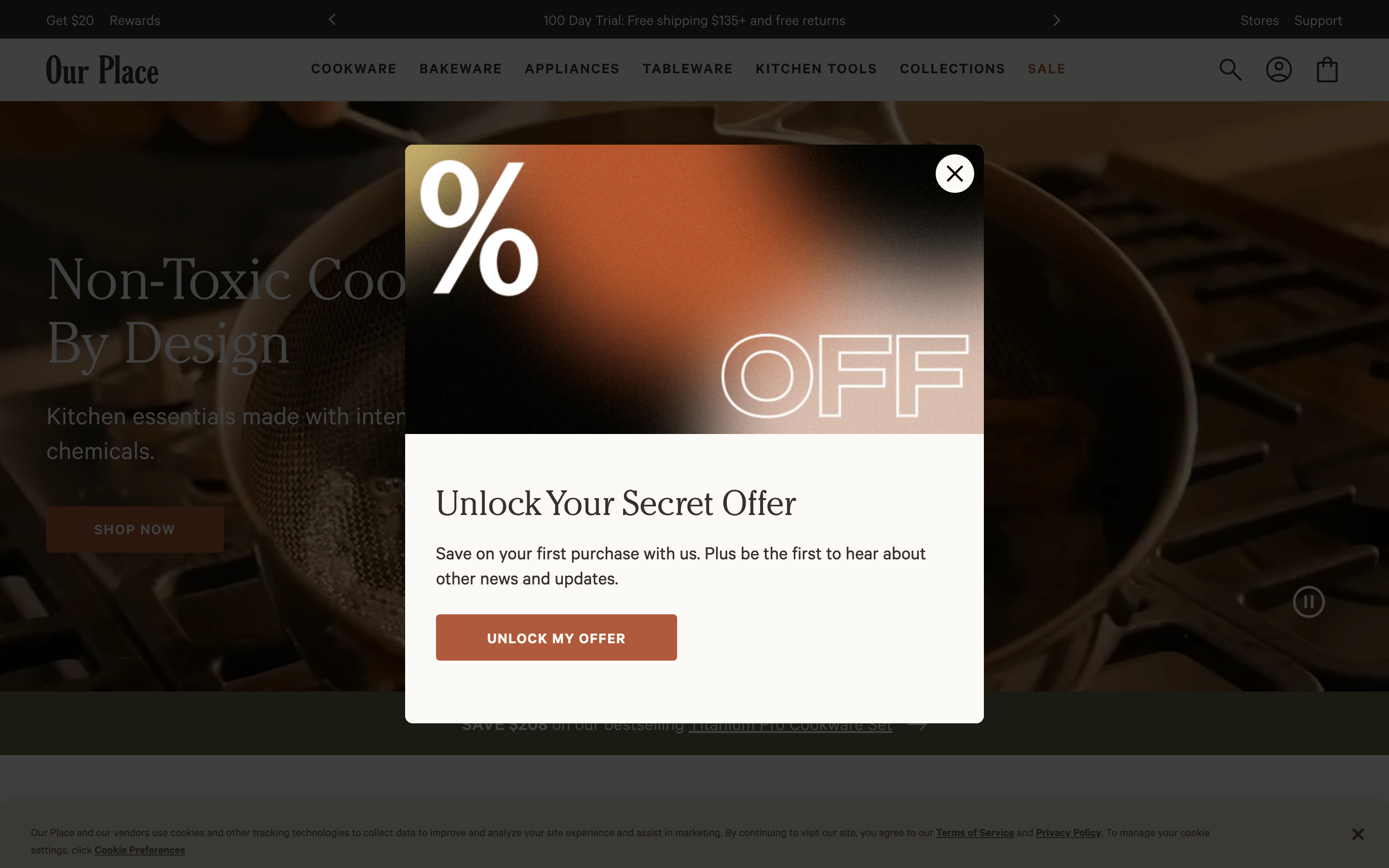
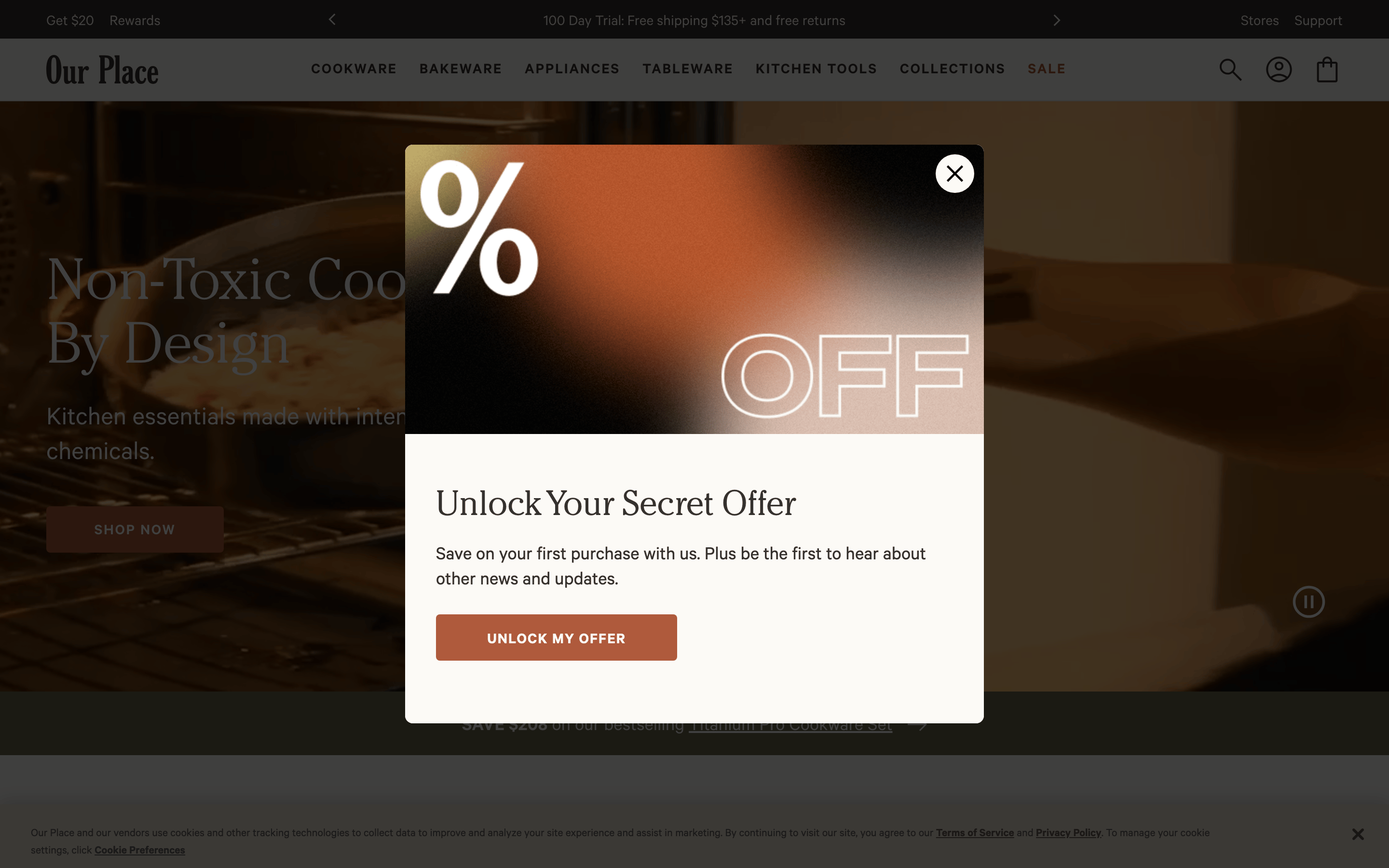
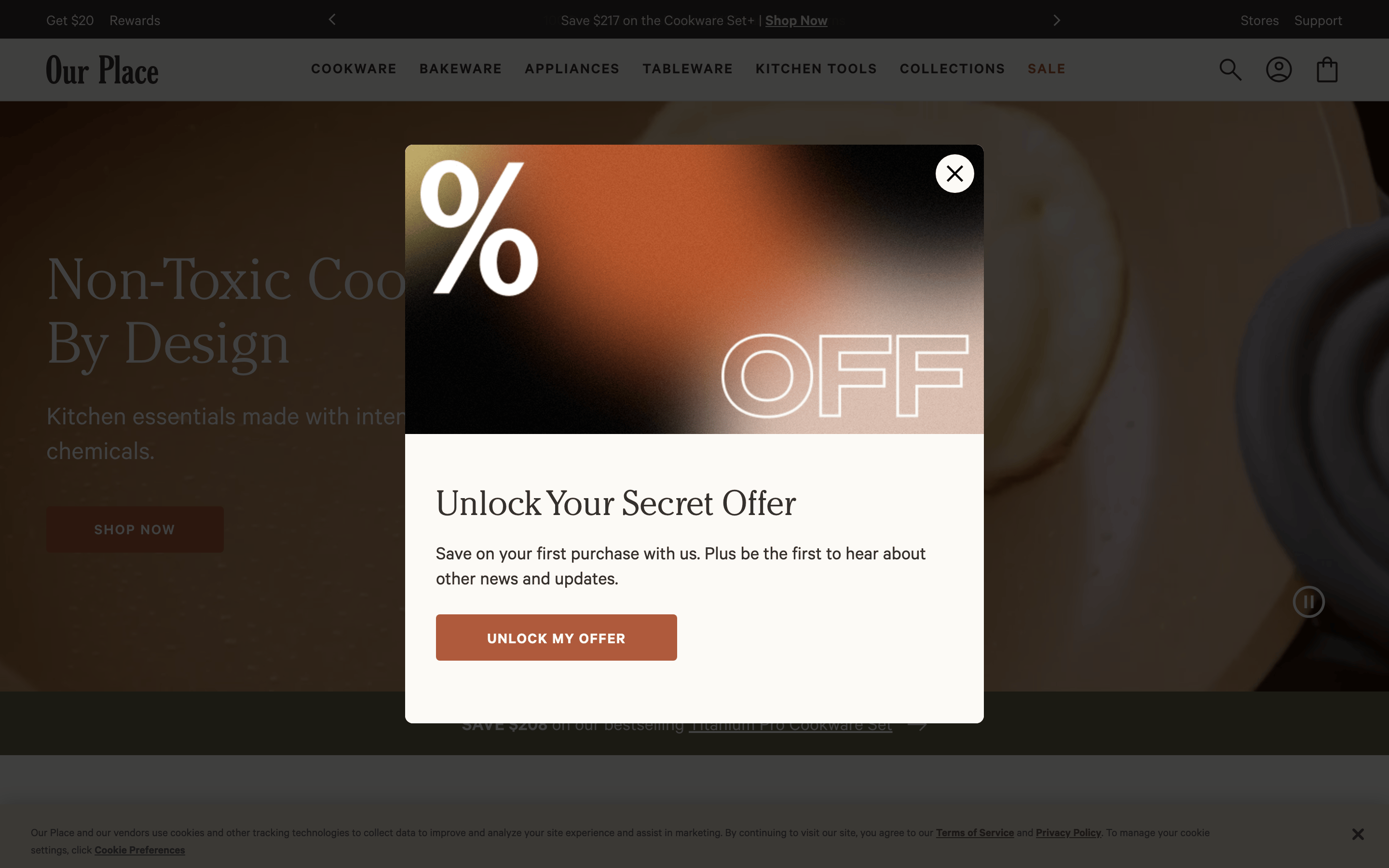
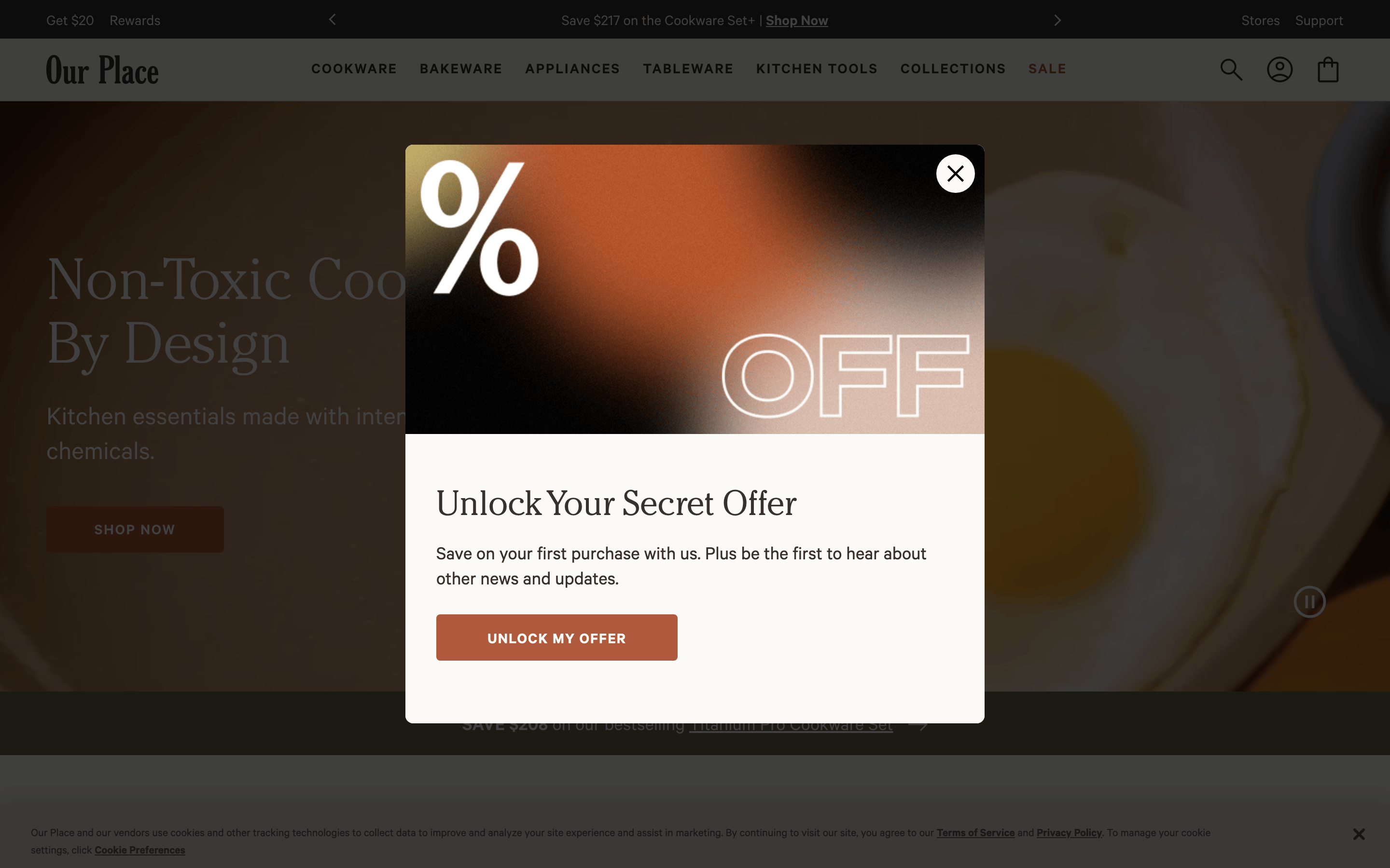
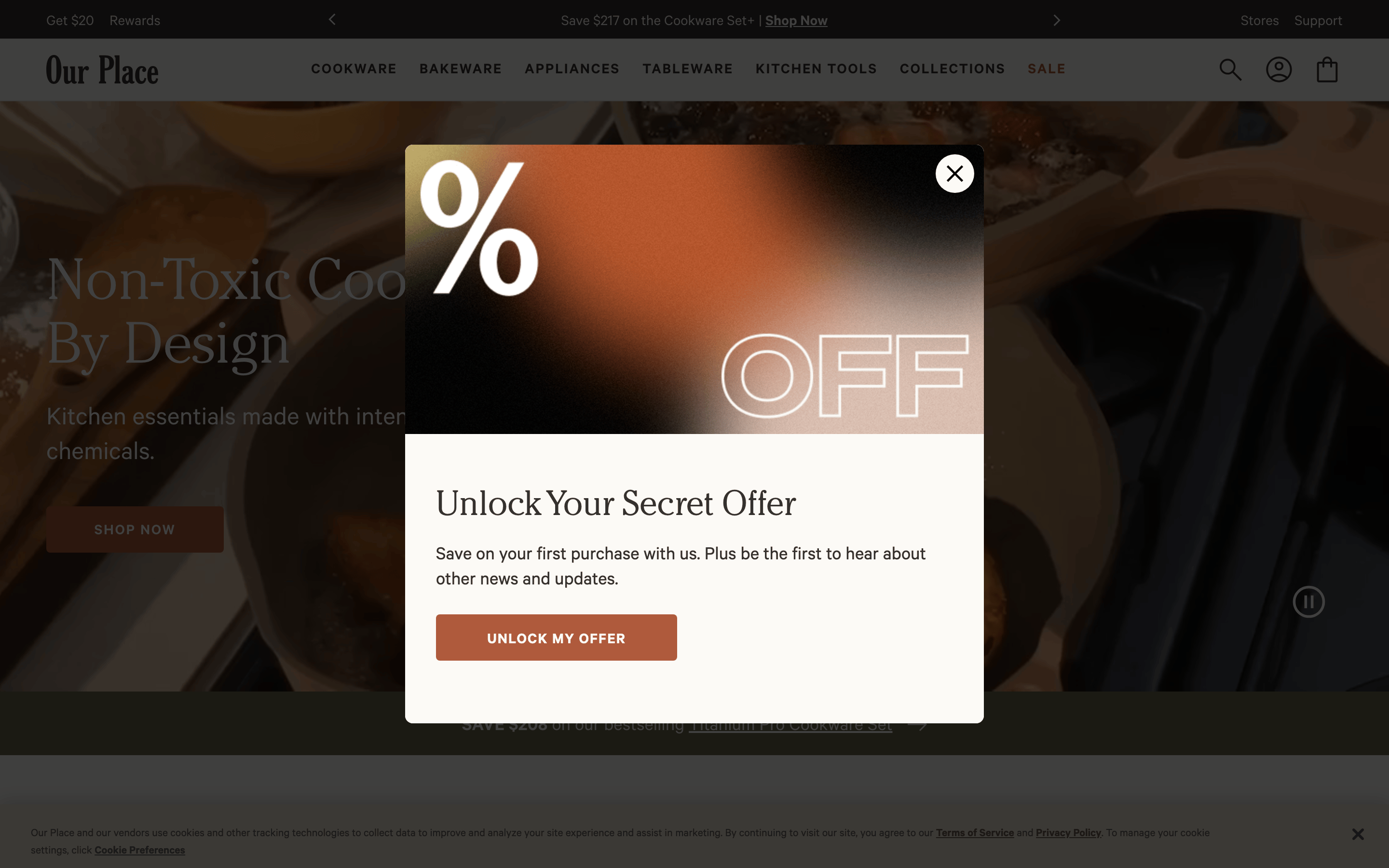
A premium home-goods brand blending rustic warmth with modern, clean lines.
02
Color
#af5a3cAccent
#35312eInk
#60605eInk soft
#fcfaf6BG
#f6f3ebBG soft
#ebe5d4BG quiet
#5a5854Muted
rgba(53,49,46,0.2)Line
Warm, earthy neutrals form the foundation, punctuated by a muted terracotta accent for CTAs.
03
Typography
transitional-serif · grotesque-sans
display48px · 400
h228px · 600
body16px · 400
caption12px · 400
Navigation text uses uppercase, wide letter-spacing, and a smaller font size. · Display headlines use a refined transitional serif for a premium feel. · Body text uses a highly legible, neutral grotesque sans-serif.
04
Spacing
4px
8px
16px
24px
32px
48px
64px
96px
A consistent 4px base unit creates a steady vertical rhythm, with generous padding around interactive elements.
05
Surfaces
sm · 4px
md · 8px
lg · 12px
pill · 9999px
1px solid rgba(53,49,46,0.2)
rgba(0, 0, 0, 0.2) 0px 0px 18px 0px
06
Layout
1440container
12columns
24pxgutter
768 / 1024breakpoints
A standard 12-column grid with a max-width container, centered content, and flexible spacing.
07
Motion & Interaction
150msmicro
400mssmall
800msmedium
cubic-bezier(0.4, 0, 0.2, 1)easing
Opacity and color transitions on hover for interactive elements. · Smooth linear transitions for complex UI state changes like carousels.
Subtle color transitions on links and buttons, with a 0.15s ease-in-out duration. · Standard pointer cursor on interactive elements.
08
Components
buttonSolid, rectangular buttons with slightly rounded corners (4px) and uppercase text. Primary CTAs use the muted terracotta accent.
cardMinimalist product cards with generous whitespace and clean typography.
chipSimple text links or small uppercase tags used for navigation.
inputClean, border-bottom style inputs or simple outlined fields.
heroFull-width photographic hero sections with overlaid serif headlines and a primary CTA button.
09
Voice & Don'ts
ToneWarm, confident, and premium. It speaks to quality and conscious living.
HeadlinesClean, elegant serif headlines that are often short and punchy.
CTAsDirect, action-oriented, and uppercase.
Don't use neon or highly saturated colors — the screenshot shows a muted, earthy palette.
Don't use harsh, heavy drop shadows — the screenshot shows very subtle or no shadows.
Don't use playful, rounded fonts for headlines — the screenshot shows a refined transitional serif.
Don't use all-lowercase for navigation — the screenshot shows wide-tracked uppercase text.
Don't use a stark black and white palette — the screenshot uses warm off-whites and dark greys.
Don't use complex, busy backgrounds — the screenshot relies on clean photography and solid colors.
Avoid: Avoid overly casual or slangy language.
Avoid: Avoid cluttering the interface with too many competing elements.
Captured from the live site · real computed styles
11
System prompt
Our Place is a premium DTC kitchenware brand with a warm, refined, and modern aesthetic. The design system is built on a foundation of earthy neutrals (off-white #fcfaf6, dark grey #35312e) with a muted terracotta accent (#af5a3c). Typography pairs a clean, transitional serif for headlines with a neutral grotesque sans-serif for body text. The layout is spacious, using a standard 12-column grid and generous whitespace. Key critical donts include: do not use harsh shadows, avoid neon colors, and never use heavy, playful fonts. Interactions are smooth with subtle color transitions. The overall feeling is one of premium quality, warmth, and thoughtful, modern design.
Bring this taste to your agent
Hand your AI agent a machine-readable spec of this design — tokens, type, motion, the whole DNA.