personal financewealth trackingminimalistorganized
A sleek, dark-themed financial cockpit for personal wealth management
02
Color
#1C6CFFAccent
#FFFFFFInk
#11263BInk soft
#000F24BG
#F5F7FABG soft
#597CAAMuted
rgba(0,0,0,0.07)Line
Deep navy dark mode with crisp white typography and vibrant blue accents for primary actions
03
Typography
geometric-sans · humanist-sans · sans-serif
display80px · 600
heading32px · 500
body16px · 400
Display text uses tight letter-spacing for impact · Body text maintains comfortable line-height for readability · Numerical data uses consistent weight for visual hierarchy
04
Spacing
4px
8px
12px
16px
20px
24px
32px
40px
48px
64px
80px
Consistent 4px grid system with generous whitespace for premium feel
05
Surfaces
sm · 8px
md · 12px
lg · 16px
xl · 24px
pill · 999px
Subtle 1px borders with low opacity for card definitions
0 3px 5.4px -3px rgba(0,0,0,0.05) · 0 4px 10.4px -2px rgba(0,0,0,0.04) · Inset shadows for depth on buttons and cards
06
Layout
1200container
12columns
24pxgutter
768 / 1024breakpoints
Flexible grid that collapses to single column on mobile with stacked cards
07
Motion & Interaction
200msmicro
300mssmall
600msmedium
cubic-bezier(0.44, 0, 0.56, 1)easing
Smooth transitions on all interactive elements · Floating category pills with gentle animation · Chart data points with subtle movement
Color transitions with 0.4s duration for links and buttons · Immediate visual feedback with subtle scale or opacity changes
08
Components
buttonRounded pill-shaped primary buttons with blue background and white text
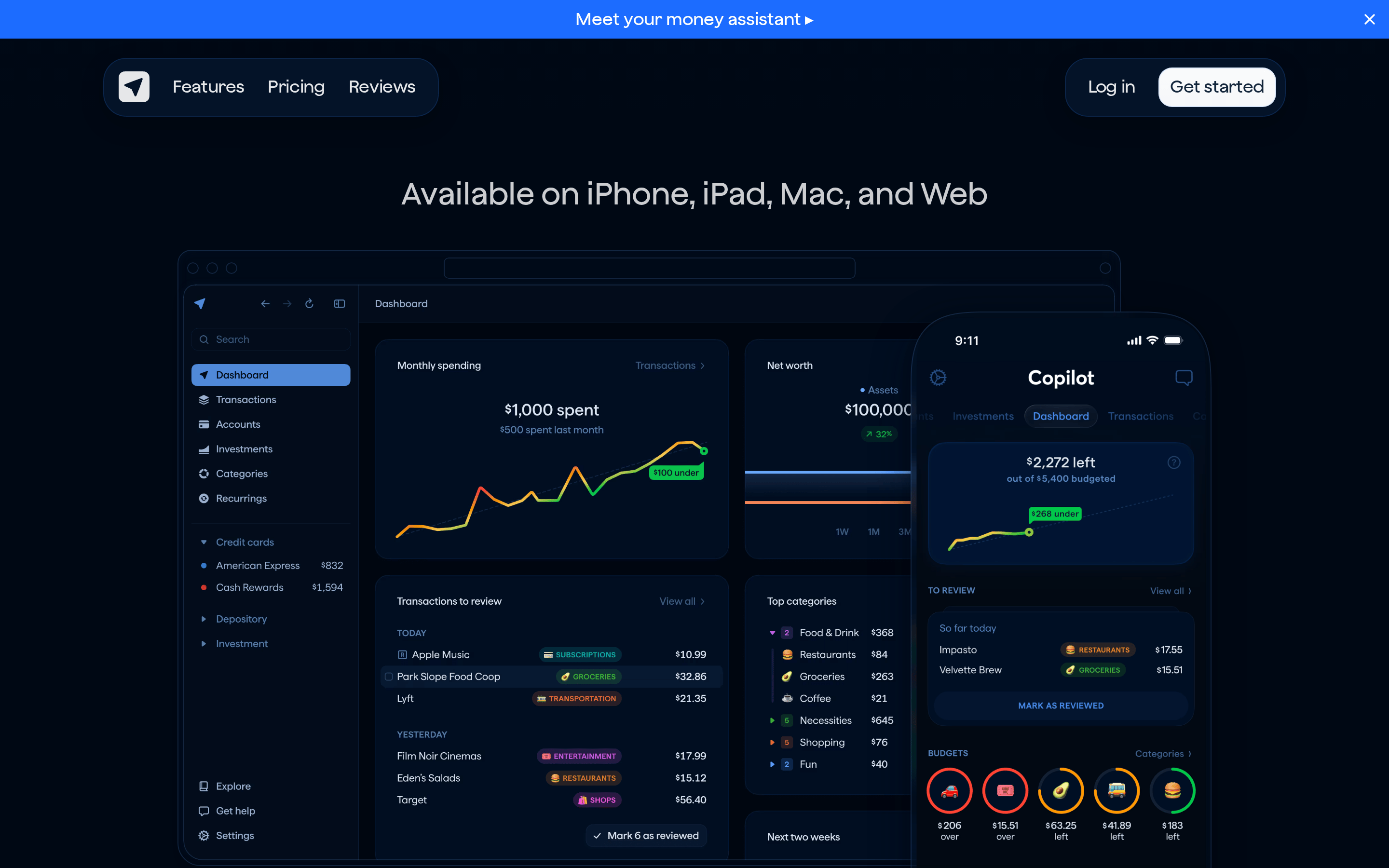
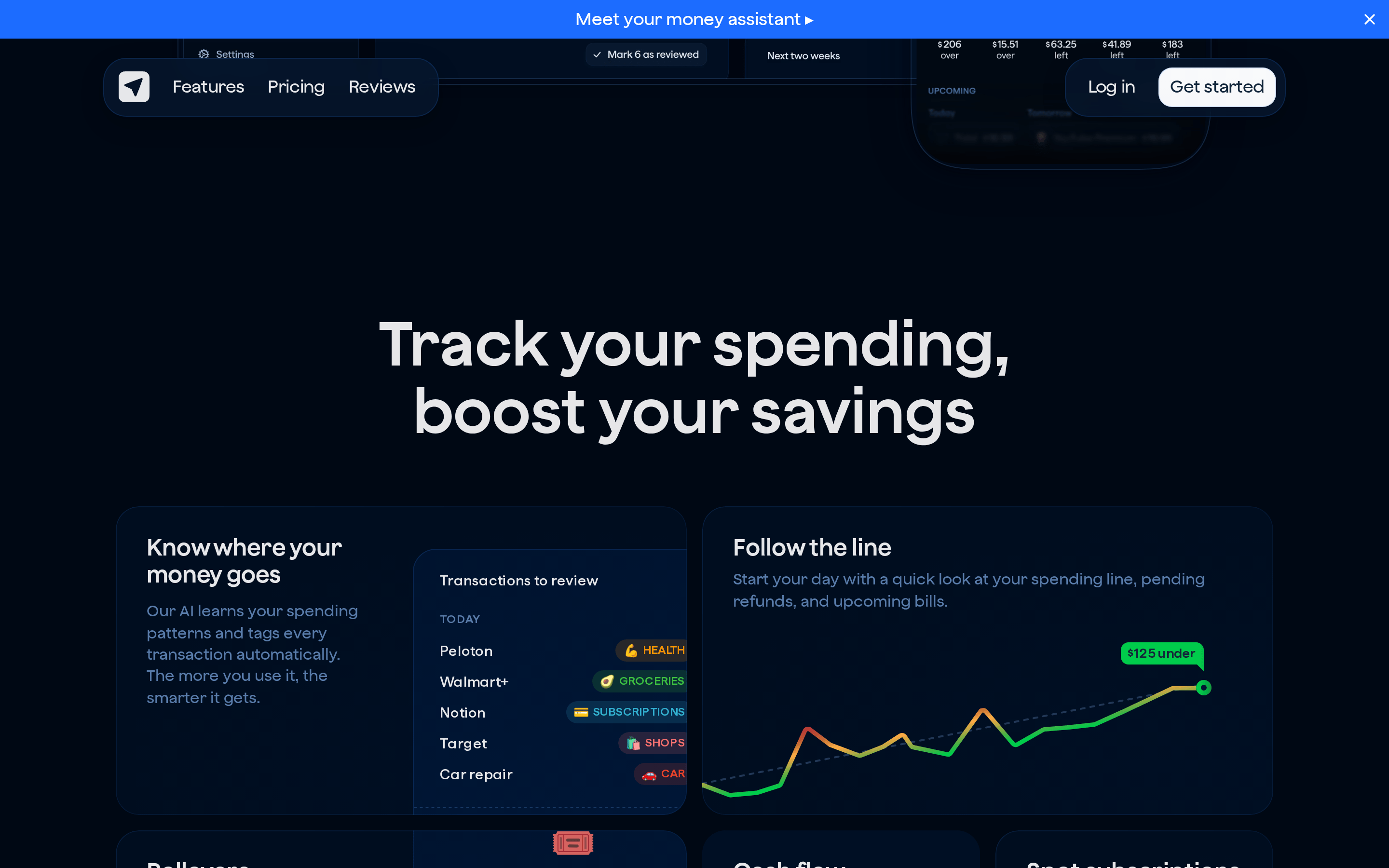
cardLight background cards with subtle shadows and rounded corners on dark sections
chipCategory tags with pill shape and vibrant colors for different spending categories
inputClean input fields with subtle borders and rounded corners
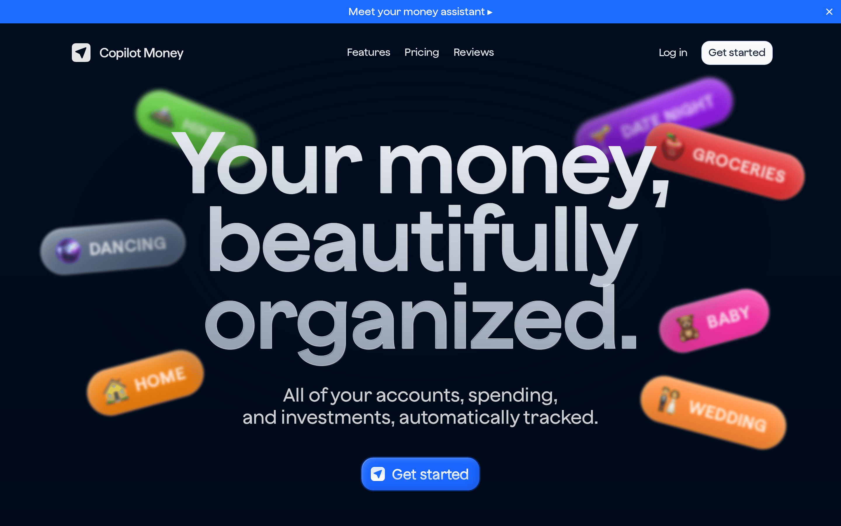
heroFull-width dark background with large typography, floating 3D category pills, and centered CTA
09
Voice & Don'ts
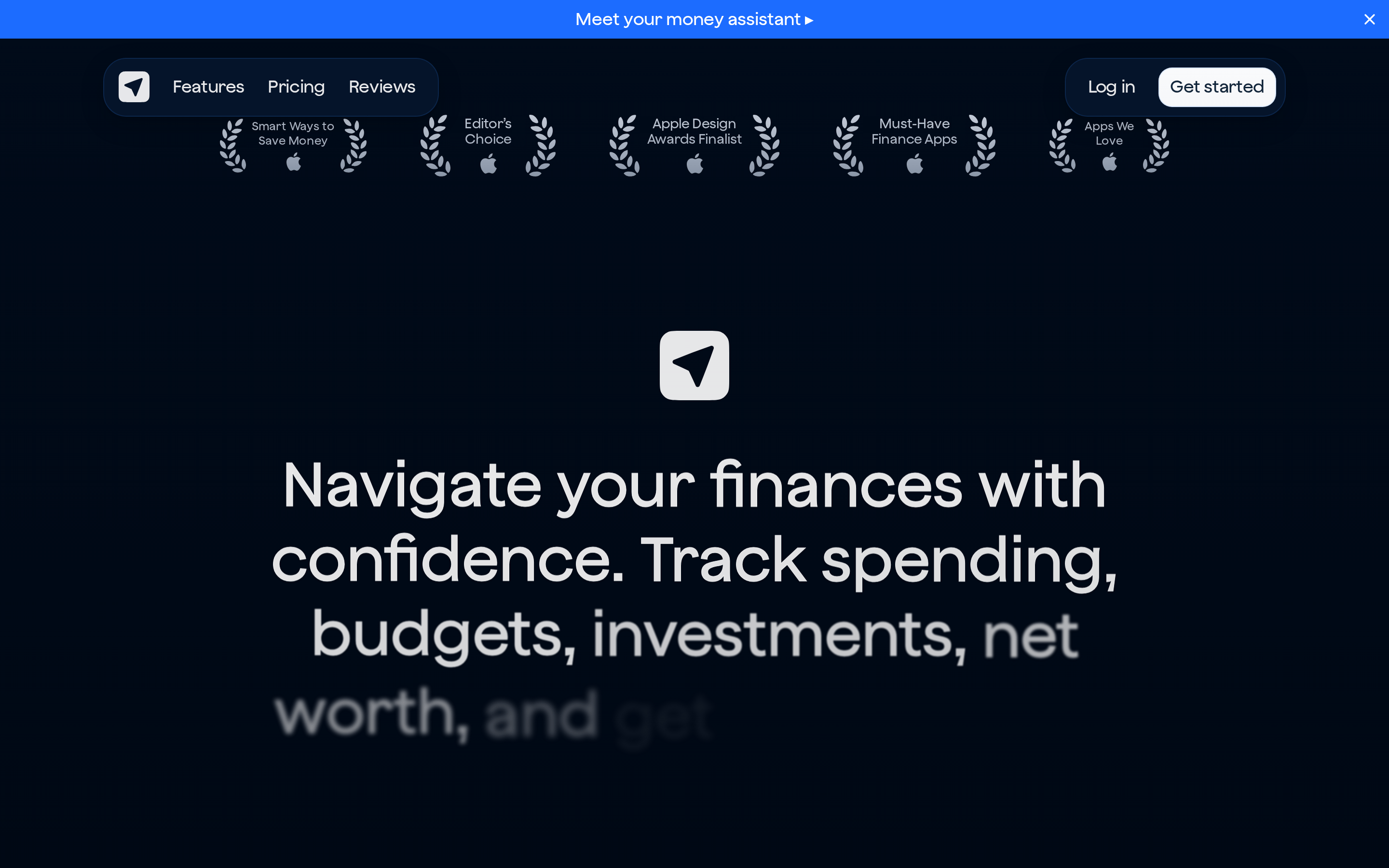
ToneConfident, clear, and reassuring about financial organization
HeadlinesShort, punchy statements that emphasize simplicity and control
CTAsAction-oriented with 'Get started' as primary call-to-action
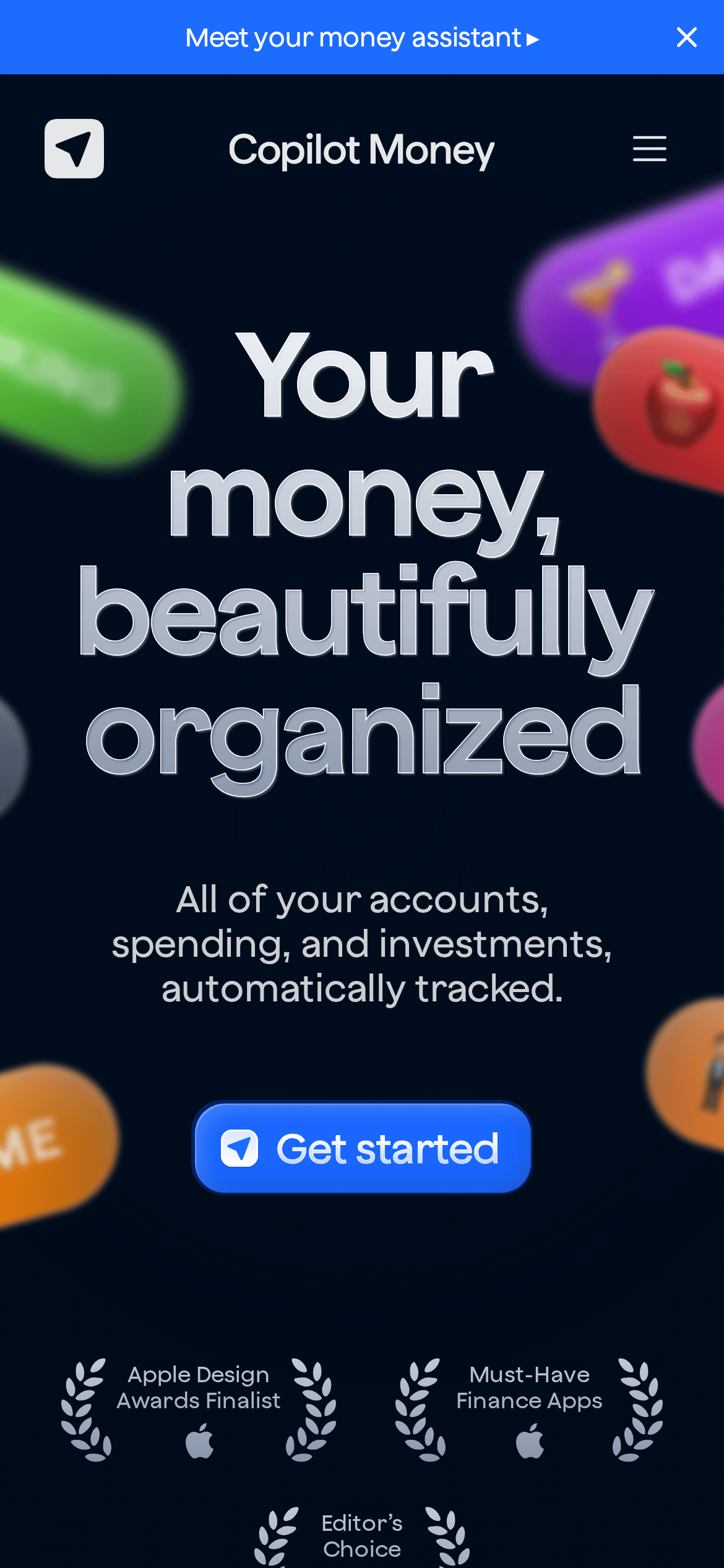
Don't use bright white backgrounds on dark sections — screenshot shows dark navy background (#000F24) with light text
Don't use multiple accent colors for primary CTAs — screenshot shows single blue (#1C6CFF) for all main buttons
Don't use decorative fonts for headlines — screenshot shows clean geometric sans-serif typefaces
Don't clutter the interface with dense information — screenshot shows generous whitespace and card-based layout
Don't use sharp corners on interactive elements — screenshot shows rounded corners (24px) on buttons and cards
Don't use low-contrast text for important information — screenshot shows high contrast white text on dark backgrounds
Don't add unnecessary borders to card components — screenshot uses subtle shadows instead of hard borders
Captured from the live site · real computed styles
11
System prompt
This is a premium fintech application for personal finance tracking and wealth management. The design DNA features a deep navy dark mode (#000F24) as the primary background, with crisp white typography for high readability. The accent color is a vibrant blue (#1C6CFF) used for primary actions like the 'Get started' button. Typography uses geometric sans-serif fonts for headlines and humanist sans-serif for body text, maintaining a clean, modern aesthetic. The layout employs generous whitespace, rounded corners (24px radius), and card-based components with subtle shadows. Critical donts include: never use bright white backgrounds on dark sections, avoid multiple accent colors for CTAs, don't use decorative fonts, and maintain generous spacing between elements. The interface prioritizes clarity and organization, reflecting the product's core value proposition of making financial data 'beautifully organized'.
Bring this taste to your agent
Hand your AI agent a machine-readable spec of this design — tokens, type, motion, the whole DNA.