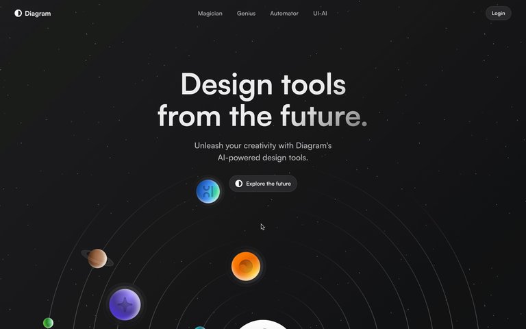
A gallery of unrendered primitives or a conceptual 'under the hood' view of software.
02
Color
#000000Ink
#FFFFFFBG
rgba(0,0,0,1.0)Line
Absolute high-contrast minimalism using only pure black and pure white to convey structure and essence.
03
Typography
transitional-serif
body16px · 400
Use the same transitional serif font for all text roles. · Maintain a consistent 16px base size with a standard weight of 400. · Apply transitions to all elements for subtle state changes.
04
Spacing
4px
8px
16px
24px
32px
48px
64px
96px
Not visibly defined; relies on absolute positioning or spacing primitives.
05
Surfaces
sm · 0px
md · 0px
lg · 0px
pill · 0px
1px solid rgb(0, 0, 0) applied to structural boundaries.
07
Motion & Interaction
220msmicro
400mssmall
800msmedium
cubic-bezier(0.4, 0.0, 0.2, 1)easing
Smooth state transitions applied universally via a global 'all' transition.
Subtle state changes facilitated by the global transition property. · Standard pointer interactions on primitive elements.
08
Components
buttonNot observed as a standard component; interactions are primitive state changes.
heroA sparse, abstract composition of basic elements on a white background.
09
Voice & Don'ts
ToneNeutral, clinical, and foundational.
HeadlinesNo distinct headline style; text is uniform and functional.
CTAsNo distinct CTA style; interactions are understated.
don't use multiple font families — screenshot shows a single transitional serif typeface used everywhere.
don't introduce color accents — screenshot shows a strictly monochromatic black and white palette.
don't add decorative borders or shadows — screenshot shows only thin, solid black structural lines.
don't use rounded corners — screenshot shows sharp, 90-degree angles on all elements.
don't apply complex animations — screenshot implies a simple 'all' transition for state changes.
don't clutter the layout — screenshot shows vast white space and minimal, isolated components.
Avoid: decorative flourishes
Avoid: brand-specific typography
Avoid: high-chroma color accents
Avoid: shadows or depth effects
11
System prompt
Diagram is a minimalist, experimental design system that strips digital interfaces down to their essential black-and-white structural primitives. The visual language is defined by a stark monochromatic palette (ink #000000, background #FFFFFF) and the consistent use of a single transitional serif typeface at a standard 16px size. Interactions are handled by a subtle, universal transition on all properties. The layout feels like an abstract gallery of bare UI components. Critical constraints: Never introduce high-chroma accent colors. Do not use multiple font categories or decorative typography. Avoid adding shadows, depth, or rounded corners to any element.
Bring this taste to your agent
Hand your AI agent a machine-readable spec of this design — tokens, type, motion, the whole DNA.