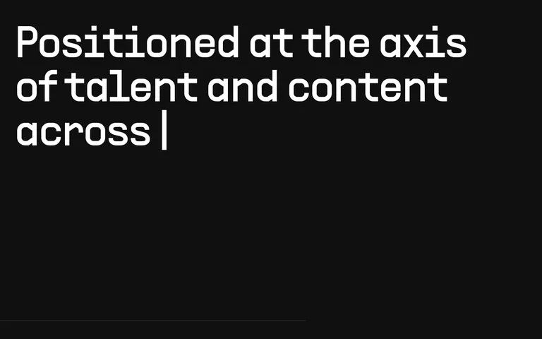
Extreme contrast: pure white type on a near-black field, with subtle grey accents for secondary UI elements.
03
Typography
geometric-sans · monospace
display118px · 400
body15px · 400
caption10px · 400
The primary sans-serif is geometric, clean, and highly legible. · The monospace font is used for specific UI elements and labels. · All typography is set at regular weight (400).
04
Spacing
4px
8px
12px
16px
24px
32px
48px
64px
A simple 4px base grid governs all spacing, with generous padding (40px-48px) for section containers.
05
Surfaces
sm · 0px
md · 12px
lg · 50px
pill · 999px
Thin, low-opacity white borders or dark solid borders are used sparingly.
A subtle neumorphic effect using inset and outset shadows creates depth on cards and buttons. · Shadows use low-opacity blacks and greys to blend with the dark background.
06
Layout
1280container
12columns
24pxgutter
768 / 1024breakpoints
A clean, column-based layout with generous whitespace and a focus on vertical rhythm.
07
Motion & Interaction
220msmicro
300mssmall
500msmedium
cubic-bezier(0.4, 0, 0.2, 1)easing
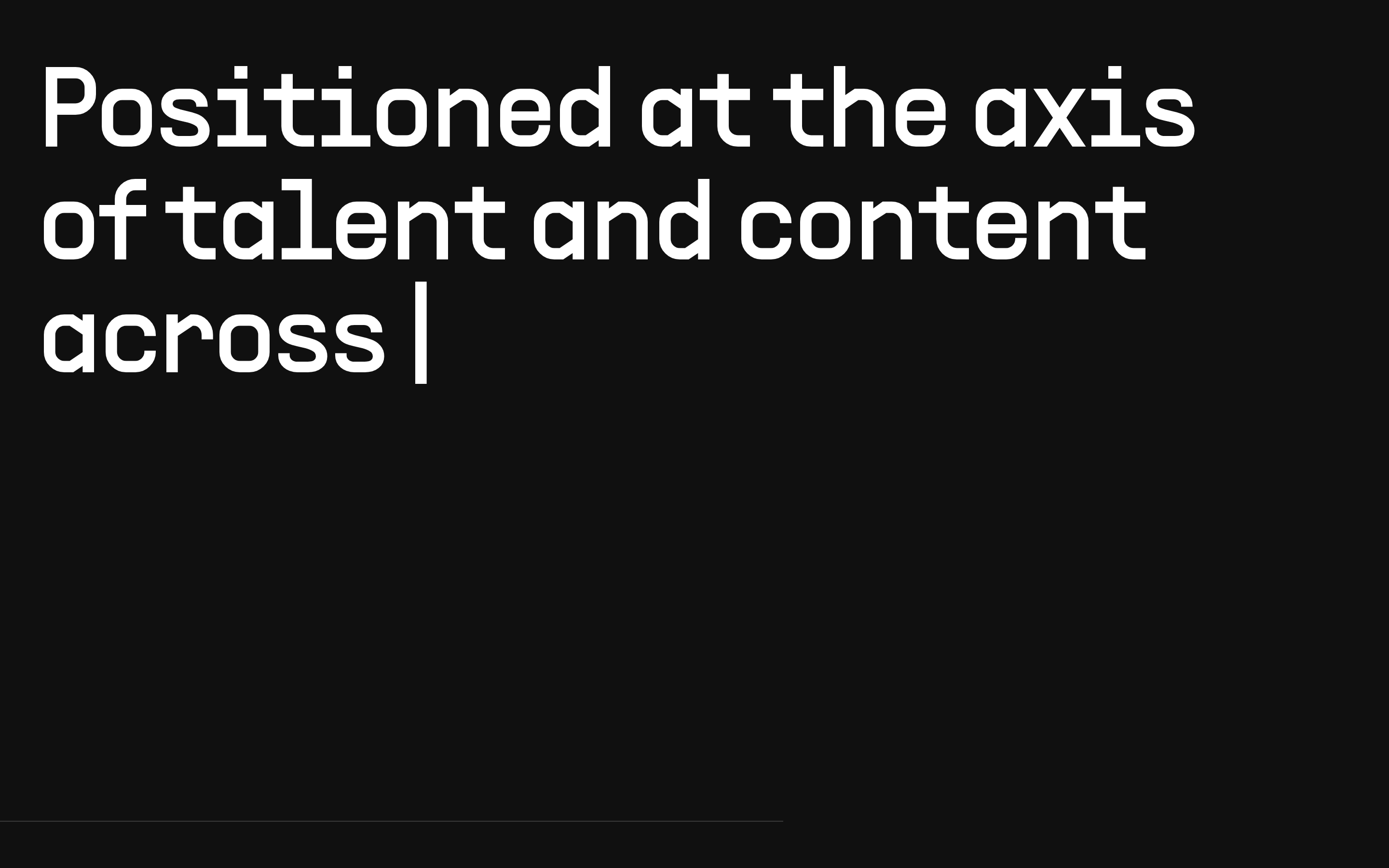
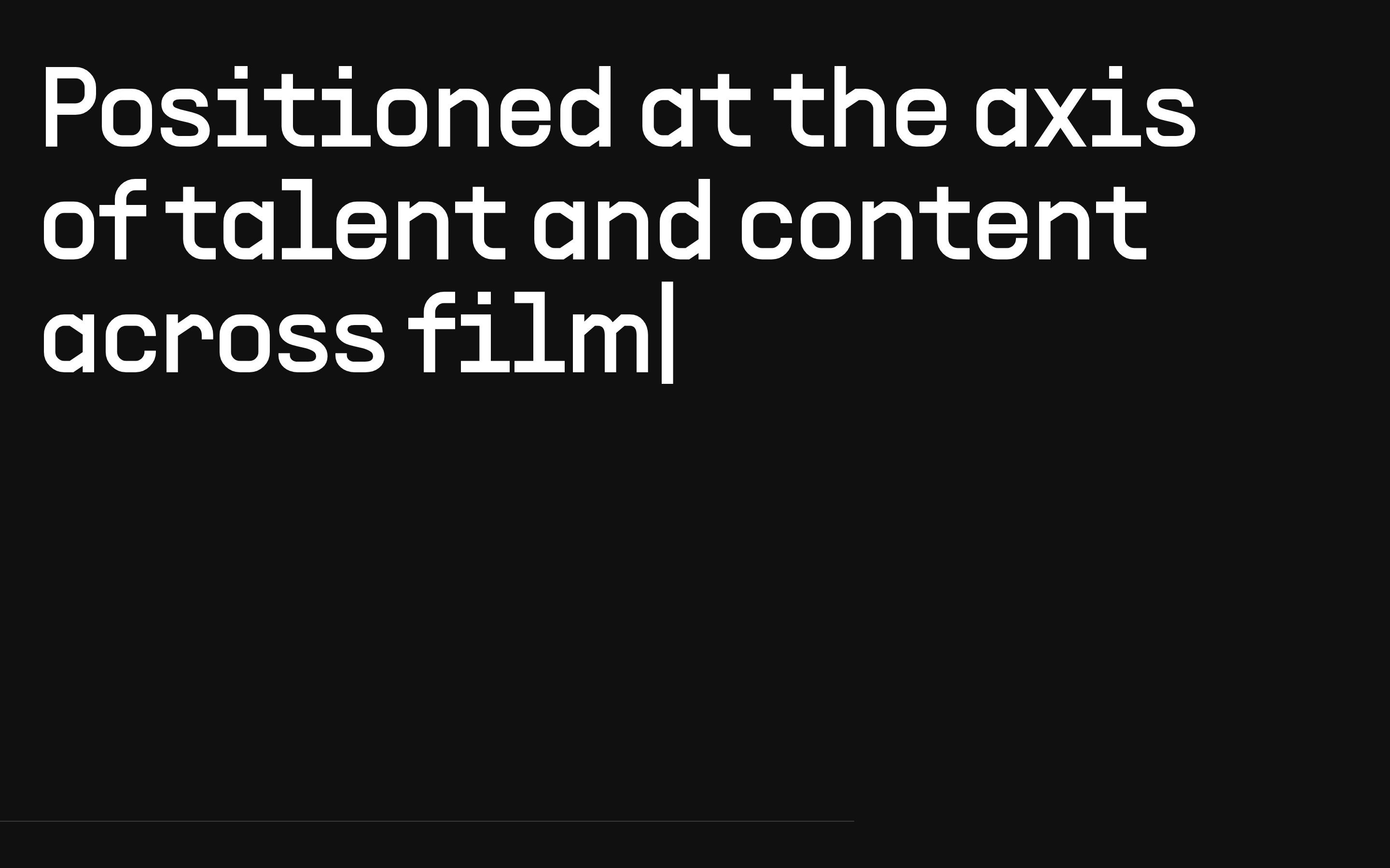
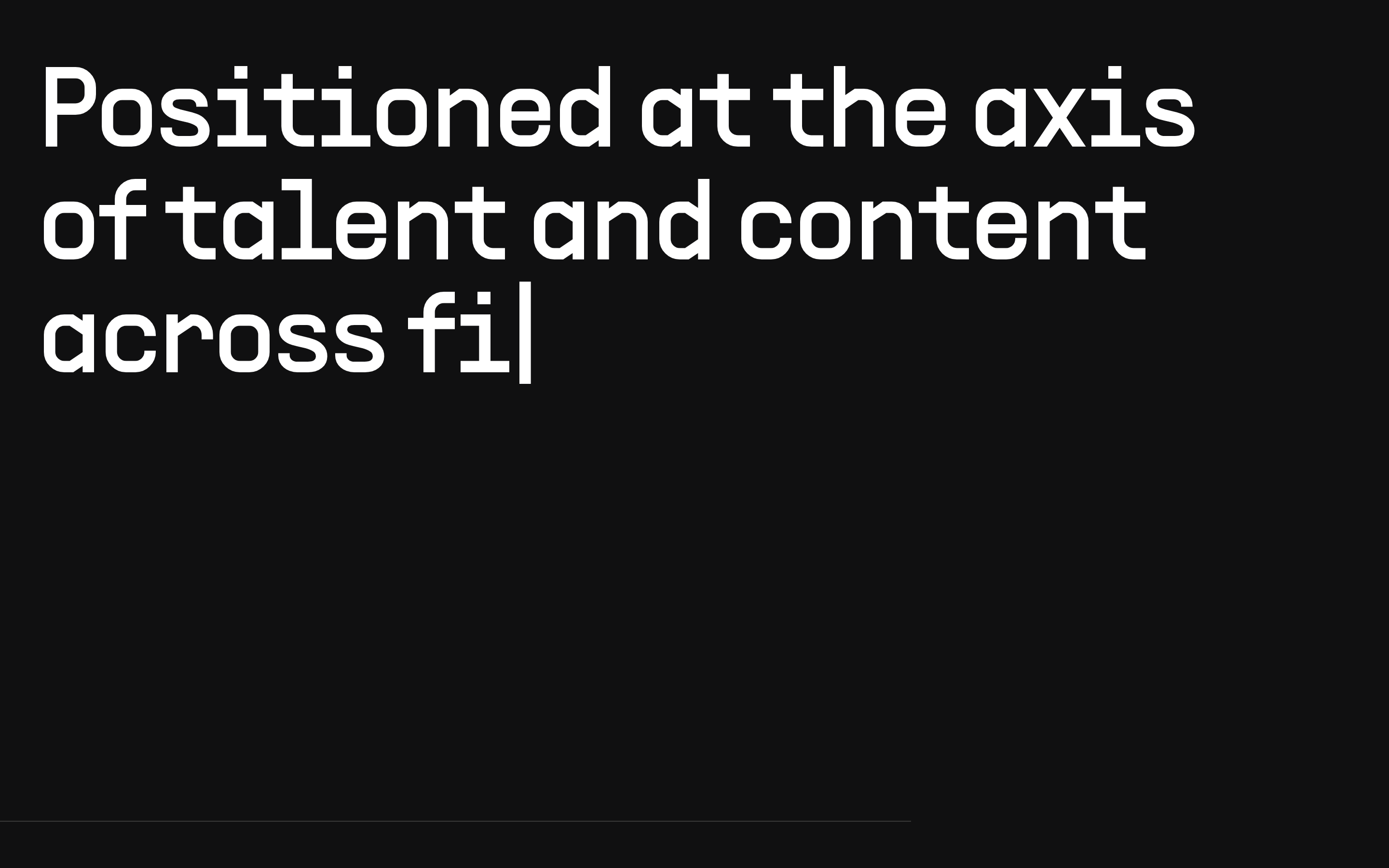
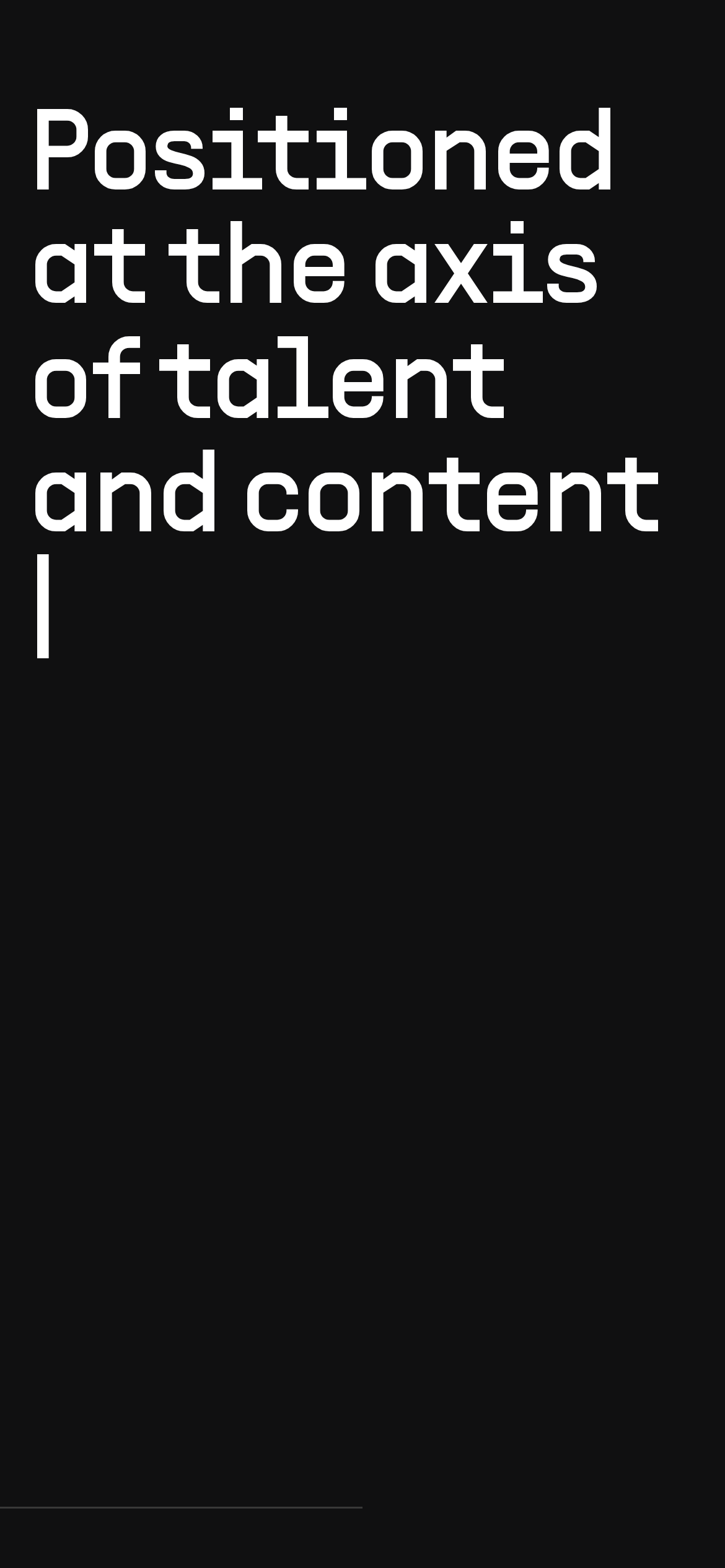
The hero headline appears to have a typing or reveal animation. · Transforms and transitions are used for interactive states.
Subtle changes in shadow depth or color intensity on interactive elements. · A subtle scale or transform effect on buttons and links.
08
Components
buttonNeumorphic dark buttons with subtle highlights and shadows, often featuring a 50% border-radius for pill shapes.
cardDark cards with subtle neumorphic shadows and 12px border-radius.
chipNot prominently visible in the provided screenshots.
inputNot prominently visible in the provided screenshots.
heroA full-screen, dark hero section dominated by a massive, left-aligned headline that types out or is revealed.
09
Voice & Don'ts
ToneConfident, direct, and minimalist.
HeadlinesMassive, bold, and declarative, using a 'statement' style.
CTAsSubdued and integrated into the neumorphic design system.
Don't use bright, saturated accent colors — the screenshot shows a strictly monochrome palette.
Don't use decorative serifs — the screenshot shows a clean, geometric sans-serif for all text.
Don't use heavy, opaque drop shadows — the screenshot shows subtle, neumorphic shadow techniques.
Don't create cluttered layouts — the screenshot shows a minimalist, high-contrast design with vast empty space.
Don't use bold or heavy font weights — the screenshot shows all text at a regular (400) weight.
Don't use rounded, soft corners everywhere — the screenshot shows a mix of sharp and highly rounded (50%) radii.
Captured from the live site · real computed styles
11
System prompt
This is a minimalist, dark-mode design system for a premium editorial or talent platform. The palette is strictly monochrome: a near-black background (#101011) with pure white (#FFFFFF) for headlines and a medium grey (#717172) for muted text. Typography is the primary feature, using a clean, geometric sans-serif in a massive scale (up to 118px) at regular weight. Layouts are spacious and column-based. Key donts: Never use bright accent colors, never use decorative serif fonts, and avoid heavy, opaque drop shadows in favor of subtle neumorphic effects. The system prioritizes stark contrast, generous whitespace, and a confident, declarative typographic voice.
Bring this taste to your agent
Hand your AI agent a machine-readable spec of this design — tokens, type, motion, the whole DNA.