A high-performance engine room for AI, combining industrial precision with accessible developer tooling.
02
Color
#F43E01Accent
#2D2F33Ink
#69695DInk soft
#E8E8DEBG
#F3F3EEBG soft
#9C9C90Muted
rgba(45, 47, 51, 1)Line
Warm, muted neutrals provide a calm canvas for high-contrast orange accents and dark, legible typography.
03
Typography
geometric-sans · monospace
display46px · 500
body15px · 400
caption12px · 400
Headlines use a weight of 500 for subtle emphasis. · Uppercase text uses 12px with 1.2px tracking for technical labels. · Body copy uses 15px for optimal readability.
04
Spacing
4px
8px
16px
24px
32px
48px
64px
96px
Standard 4px base with generous 32-48px horizontal padding and vertical gaps.
05
Surfaces
sm · 4px
md · 8px
lg · 12px
pill · 999px
1px solid rgb(45, 47, 51) used for subtle card and input outlines.
06
Layout
1280container
12columns
24pxgutter
768 / 1024breakpoints
Standard centered container with full-width hero blocks and side-by-side feature cards.
07
Motion & Interaction
150msmicro
250mssmall
800msmedium
cubic-bezier(0.68, -0.55, 0.27, 1.55)easing
Color and transform transitions on interactive elements. · Background-size animations for hover states. · Visibility and opacity for modal or overlay transitions.
Subtle background-size or color transition on 150ms ease-in-out. · Immediate visual feedback via transform or color shift.
08
Components
buttonHigh-contrast orange (#F43E01) with white text, pill-shaped (border-radius: 999px) for primary actions.
cardLight background (#F3F3EE) with 12px border-radius and no visible drop shadow.
chipInline uppercase labels with monospace styling for category tags.
inputStandard text input with minimal styling, likely using muted borders.
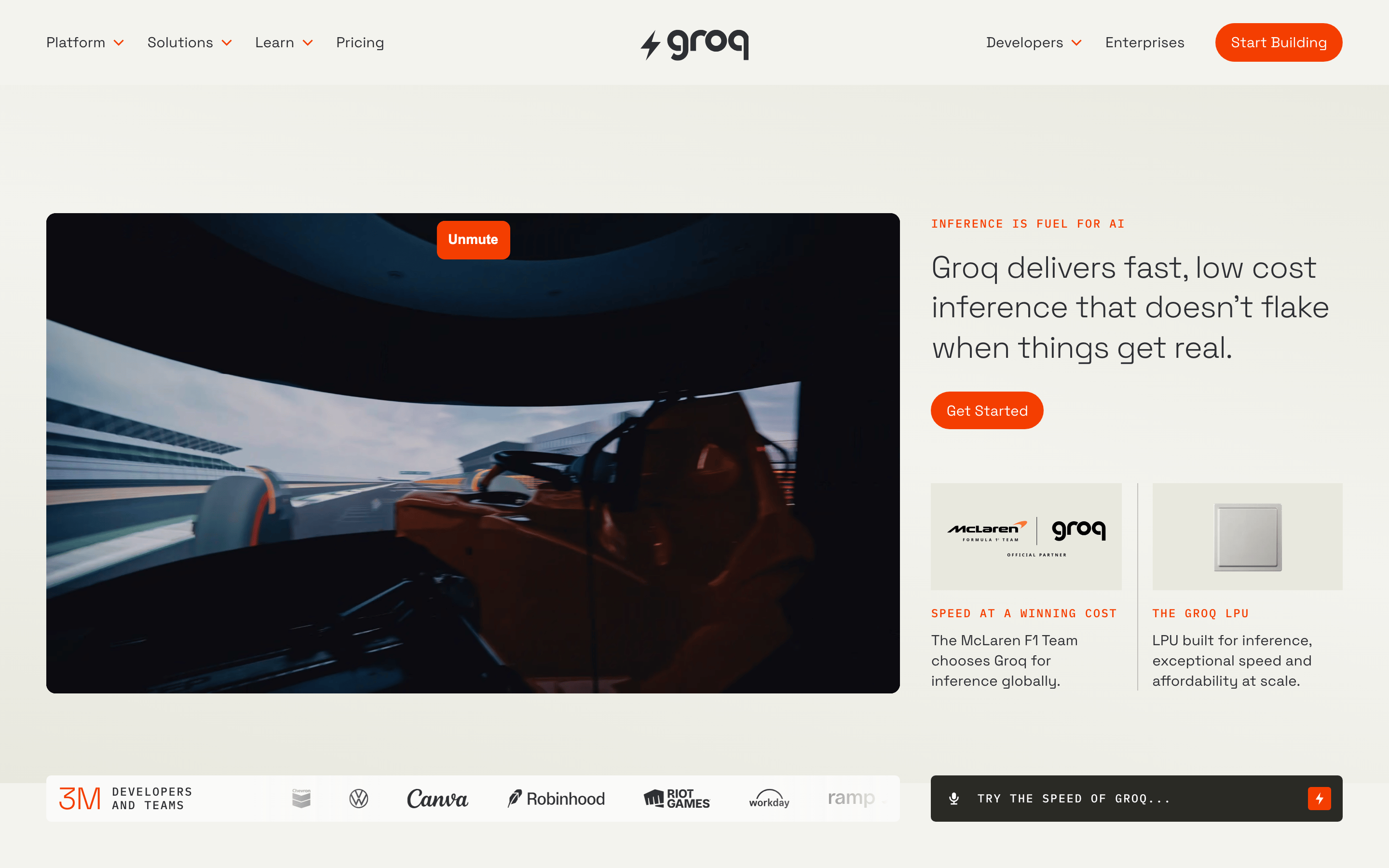
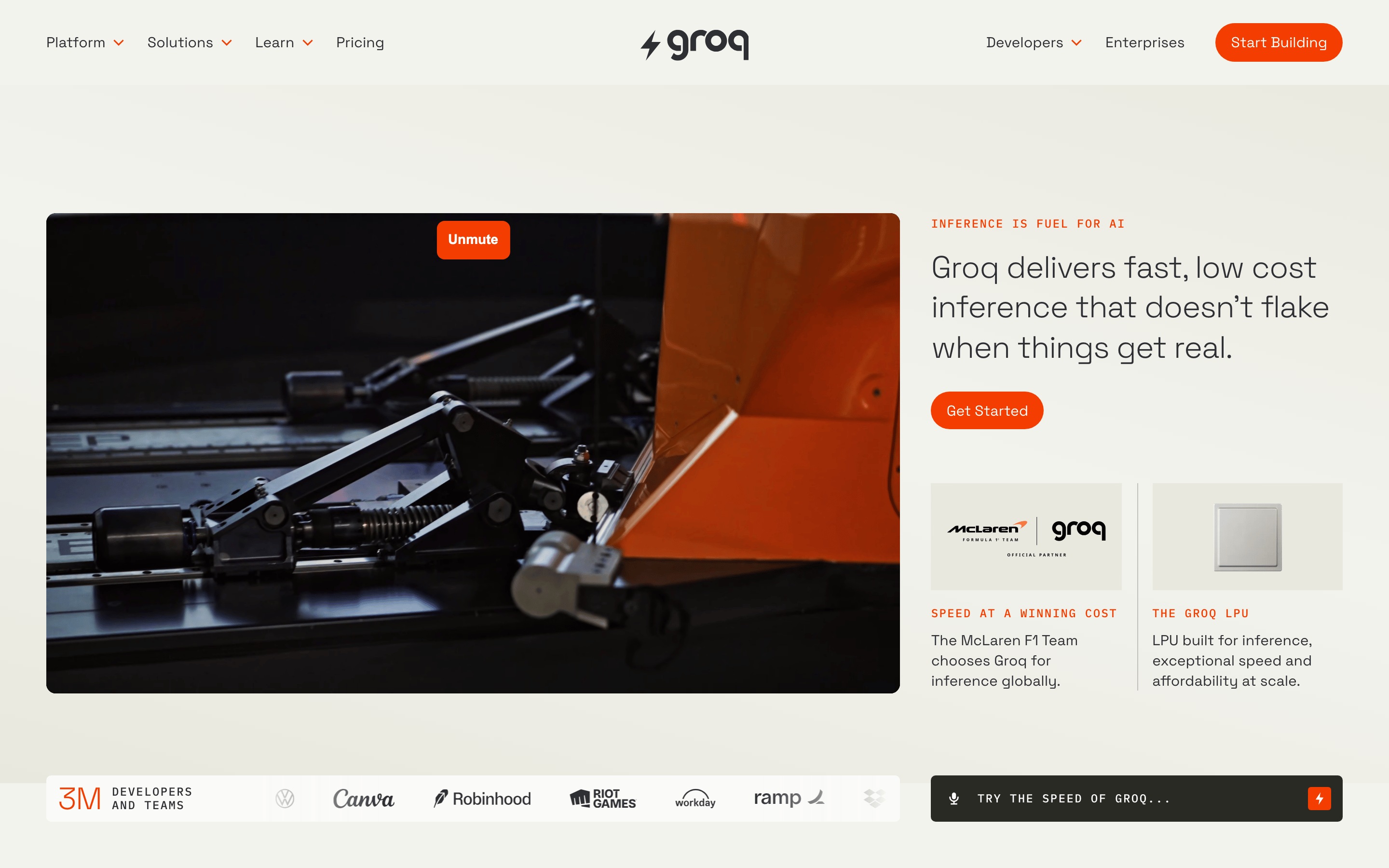
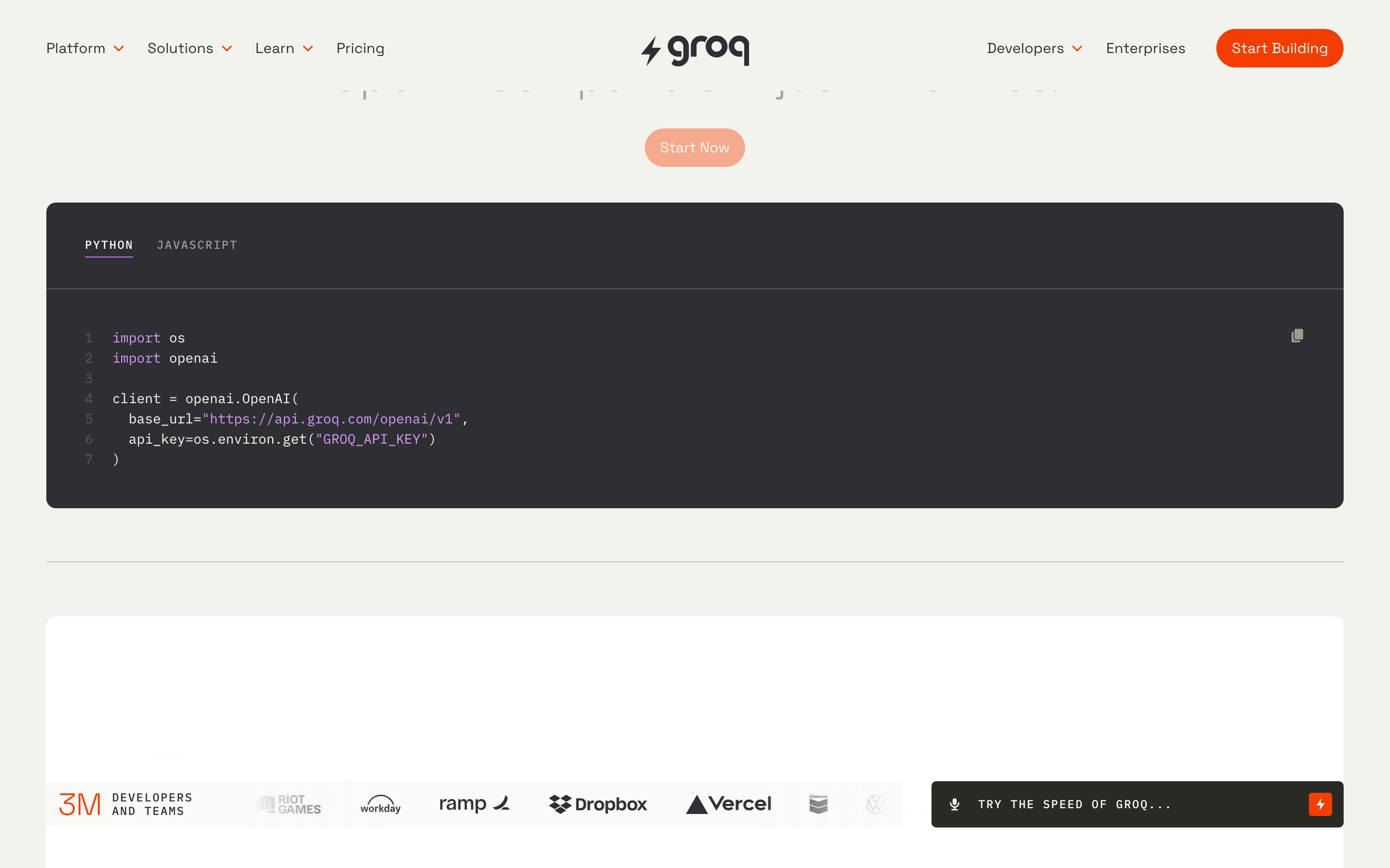
heroSplit-screen layout on desktop with large typography on the left and video on the right.
09
Voice & Don'ts
ToneConfident, technical, and performance-oriented.
HeadlinesDirect and punchy, focusing on speed and reliability.
CTAsAction-oriented verbs like 'Get Started' and 'Start Building'.
Don't use pure black (#000000) for backgrounds — screenshot shows a warm, muted beige (#E8E8DE) instead.
Don't use bright reds for accents — screenshot shows a specific vibrant orange (#F43E01) instead.
Don't use wide, multi-column text layouts — screenshot shows a constrained ~680px paragraph width instead.
Don't use heavy drop shadows on cards — screenshot shows flat surfaces with minimal or no shadow instead.
Don't use lowercase for technical labels — screenshot shows uppercase with wide letter-spacing instead.
Don't use aggressive, dark mode aesthetics — screenshot shows a light, warm-toned interface instead.
Captured from the live site · real computed styles
11
System prompt
Groq is a high-performance AI inference platform targeting developers and enterprises. The design system relies on a warm, muted neutral palette (#E8E8DE, #F3F3EE) with a high-contrast vibrant orange (#F43E01) accent. Typography uses geometric-sans (Space Grotesk) for headings and body, and monospace (IBM Plex Mono) for technical labels. Critical design constraints: avoid pure black backgrounds (use the warm beige instead), avoid heavy drop shadows on UI elements, and never use lowercase for technical kicker text or labels. The layout is clean and spacious, prioritizing legibility and performance over decorative complexity.
Bring this taste to your agent
Hand your AI agent a machine-readable spec of this design — tokens, type, motion, the whole DNA.