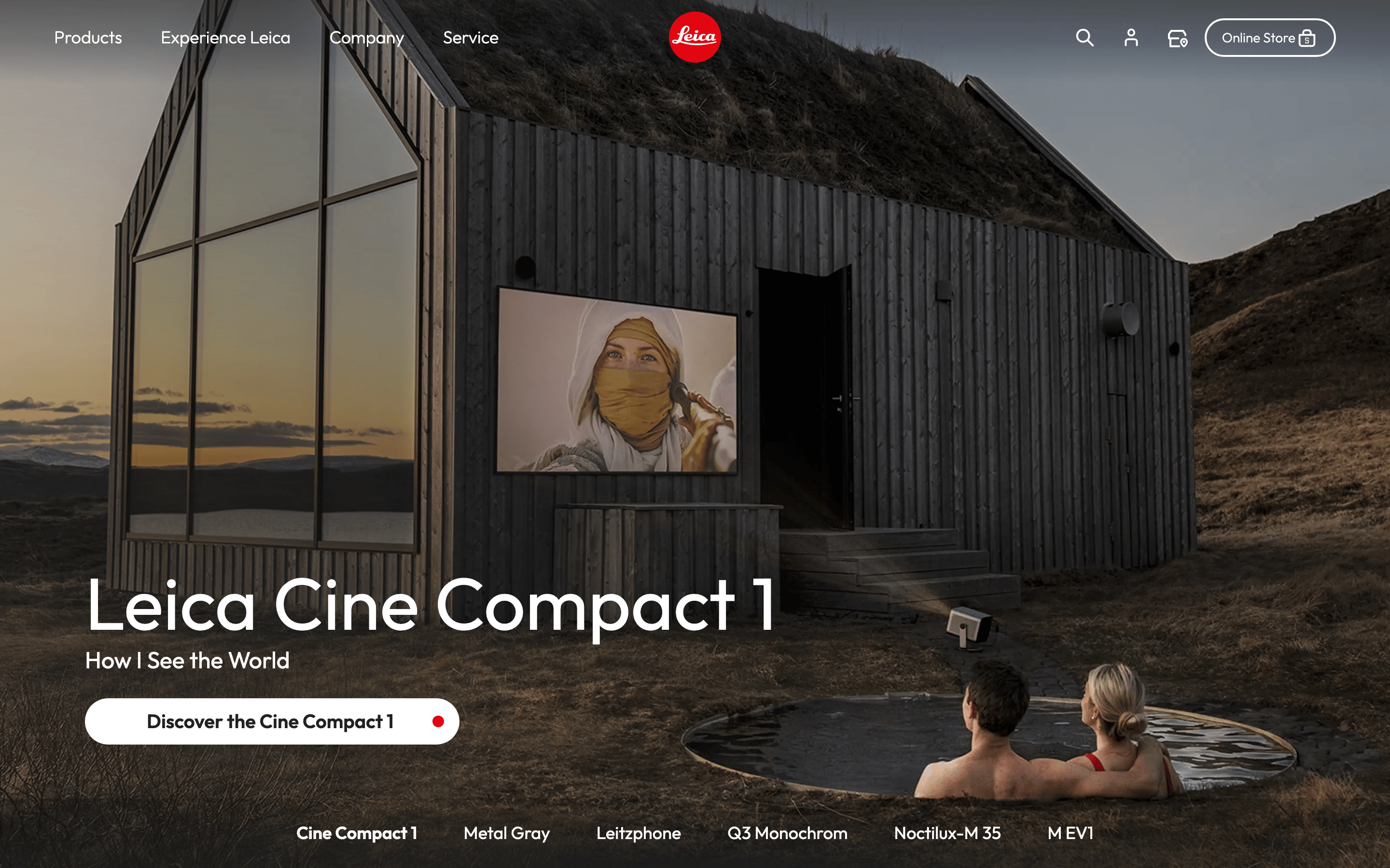
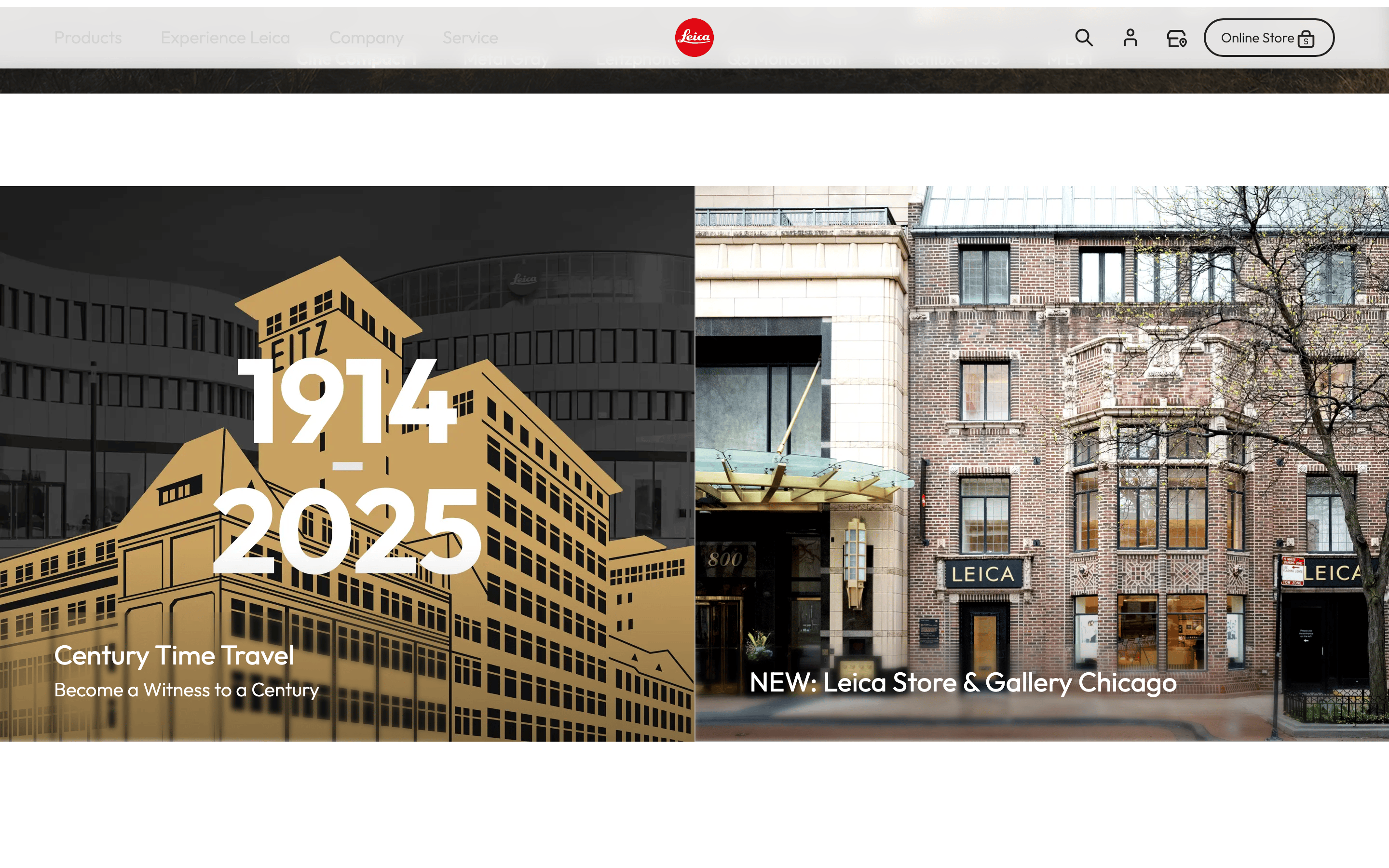
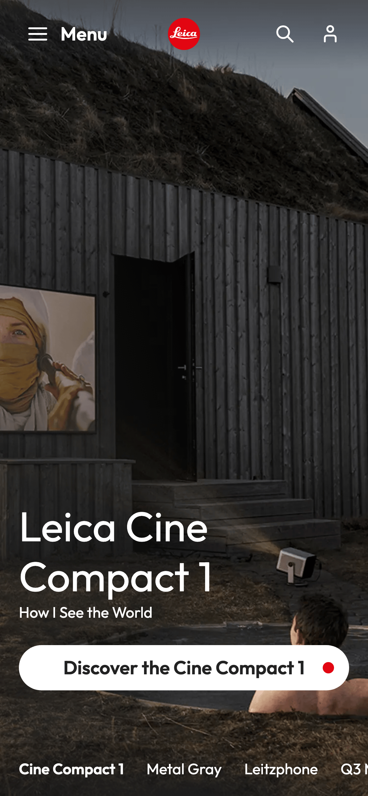
Neutral backgrounds with high-contrast text and a signature red brand anchor.
03
Typography
humanist-sans
display32px · 600
body16px · 400
caption12px · 400
Use a clean, humanist sans-serif for all primary interfaces. · Maintain generous line-height for readability in long-form descriptions. · Use uppercase sparingly for small utility labels.
04
Spacing
4px
8px
12px
16px
24px
32px
48px
56px
64px
80px
88px
96px
A clear vertical rhythm based on 4px increments with significant breathing room (96px) between major content blocks.
05
Surfaces
sm · 4px
md · 8px
lg · 24px
pill · 9999px
Subtle 1px or 2px borders in dark neutral or light gray tones.
06
Layout
1280container
12columns
24pxgutter
768 / 1024breakpoints
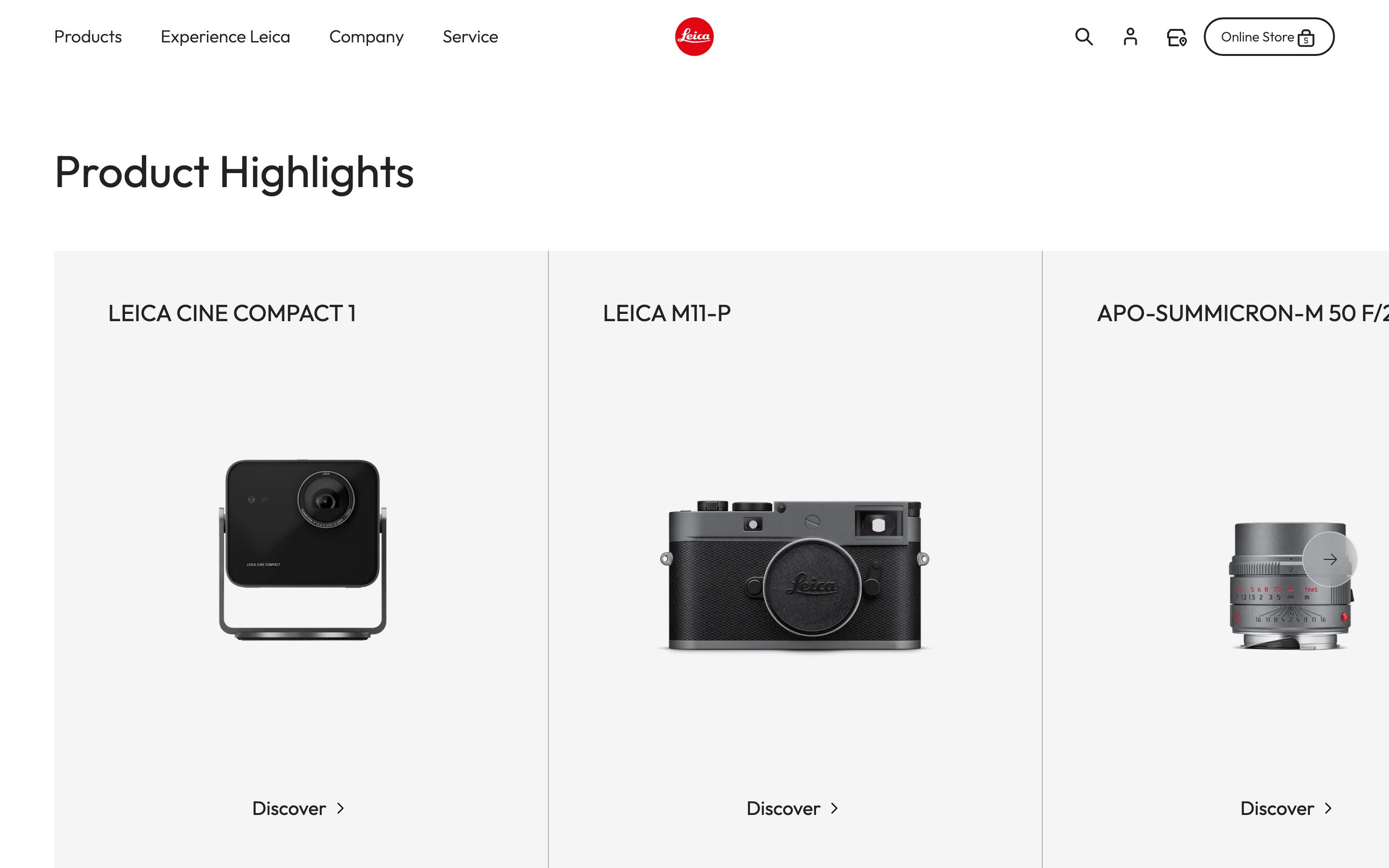
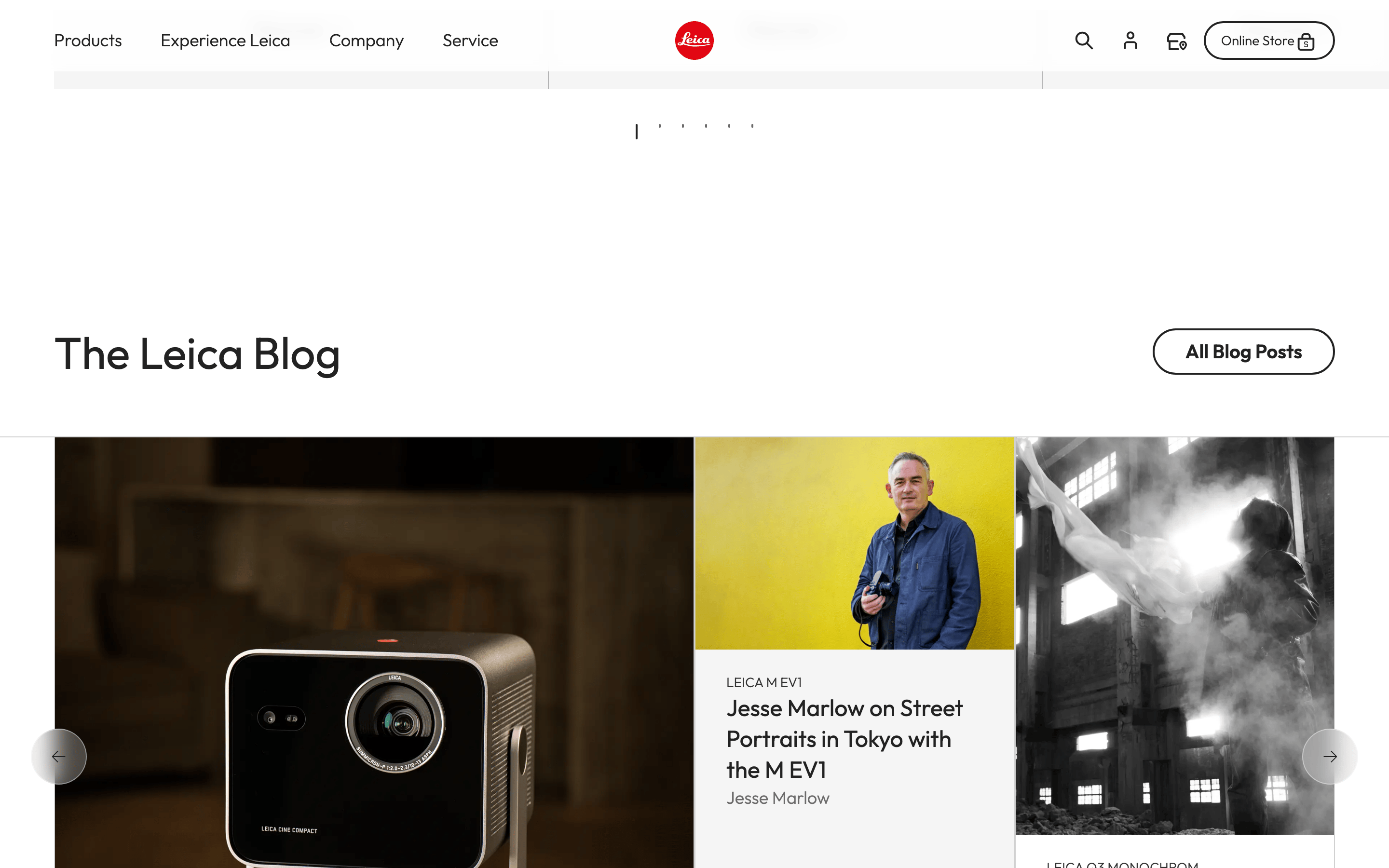
A responsive 12-column grid that transitions from full-width hero imagery to multi-column card layouts.
07
Motion & Interaction
150msmicro
300mssmall
500msmedium
cubic-bezier(0.4, 0, 0.2, 1)easing
Smooth color and background-color transitions on hover. · Elegant fade-ins for primary content sections.
Subtle color shifts or opacity changes, maintaining a refined feel. · Direct navigation or expansion of primary content cards.
08
Components
buttonPill-shaped (radius: 9999px) with high contrast, often containing a small brand-colored dot indicator.
cardImagery-heavy with subtle or no visible borders, using generous internal padding.
chipMinimal, often text-based links in the footer navigation.
inputClean, minimal fields with subtle borders.
heroFull-viewport immersive photography with overlaid typography and a prominent call-to-action.
09
Voice & Don'ts
ToneAuthoritative, refined, and deeply focused on the craft of photography.
HeadlinesBold, clear, and descriptive, often highlighting specific product names or artistic themes.
CTAsDirect and action-oriented, frequently using the signature red dot as a visual anchor.
Don't use vibrant gradients — screenshot shows a flat, high-contrast neutral palette.
Don't use heavy drop shadows — screenshot shows almost no shadows, favoring clean edges.
Don't use a dark-mode default — screenshot shows a predominantly light (#F5F5F5/#FFFFFF) theme.
Don't use decorative fonts — screenshot shows a consistent, functional humanist-sans-serif.
Don't use loud or multi-colored UI elements — screenshot shows red as the only high-chroma accent.
Don't use cluttered grids — screenshot shows large, breathing room between high-quality photographic assets.
Avoid: Flashy or neon colors
Avoid: Playful or overly casual language
Avoid: Cluttered layouts that distract from the imagery
Captured from the live site · real computed styles
11
System prompt
This is the official website for Leica Camera, a premium manufacturer of photographic hardware. The design DNA is characterized by a 'premium, restrained' aesthetic that prioritizes large-scale photographic content over dense UI. The primary palette is neutral (ink: #222222, bg: #F5F5F5) with a single, iconic brand-red (#D50000) used for the logo and small accents. Typography is strictly functional, using a clean humanist-sans-serif (Outfit/Noto Sans) at a 16px base size. The layout uses a generous 12-column grid with significant vertical spacing (96px) to let the photography breathe. Critical constraints: never use neon or saturated multi-color schemes; maintain large, empty spaces around visual assets; and avoid decorative or playful UI elements that would distract from the precision-engineered brand image.
Bring this taste to your agent
Hand your AI agent a machine-readable spec of this design — tokens, type, motion, the whole DNA.