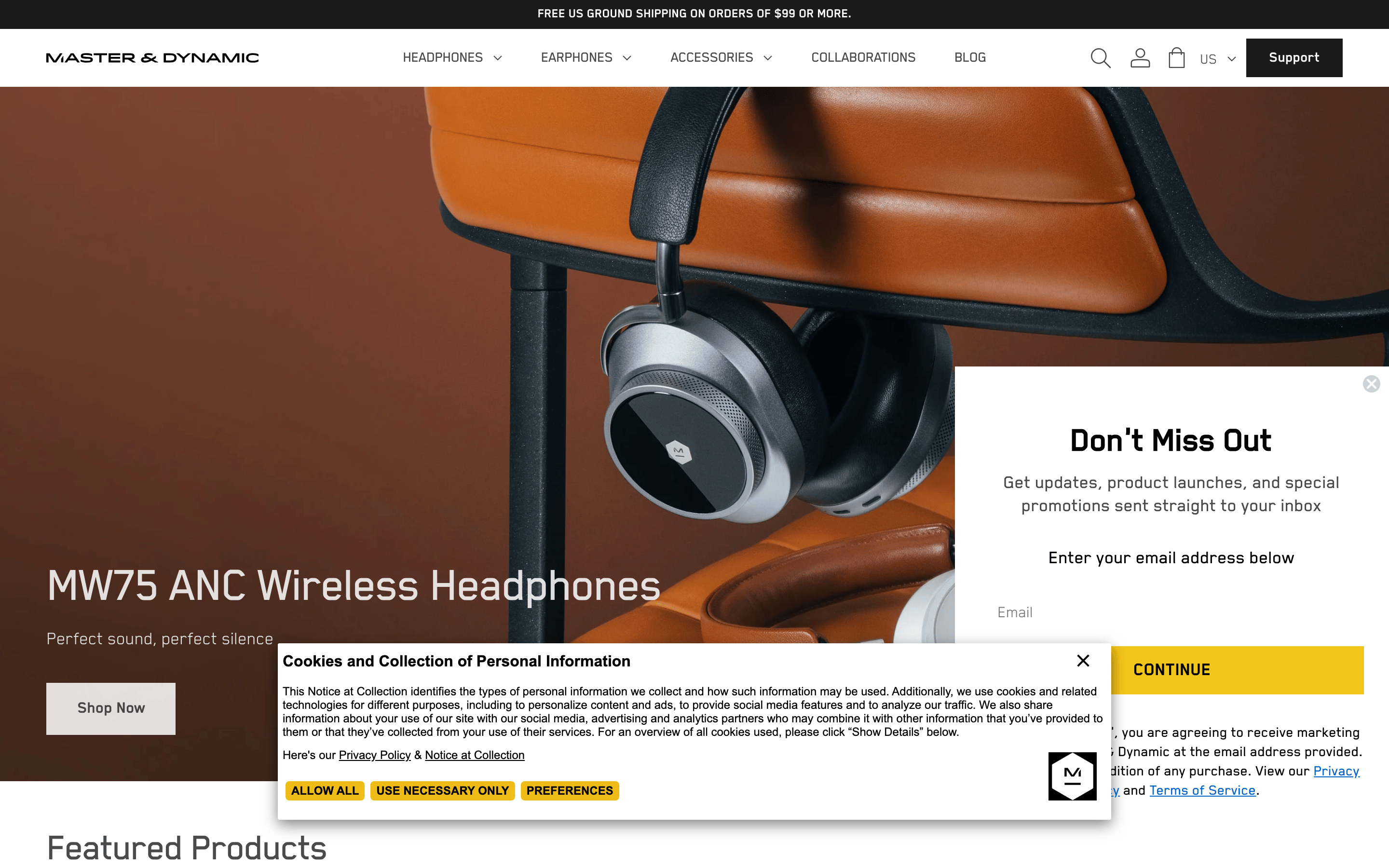
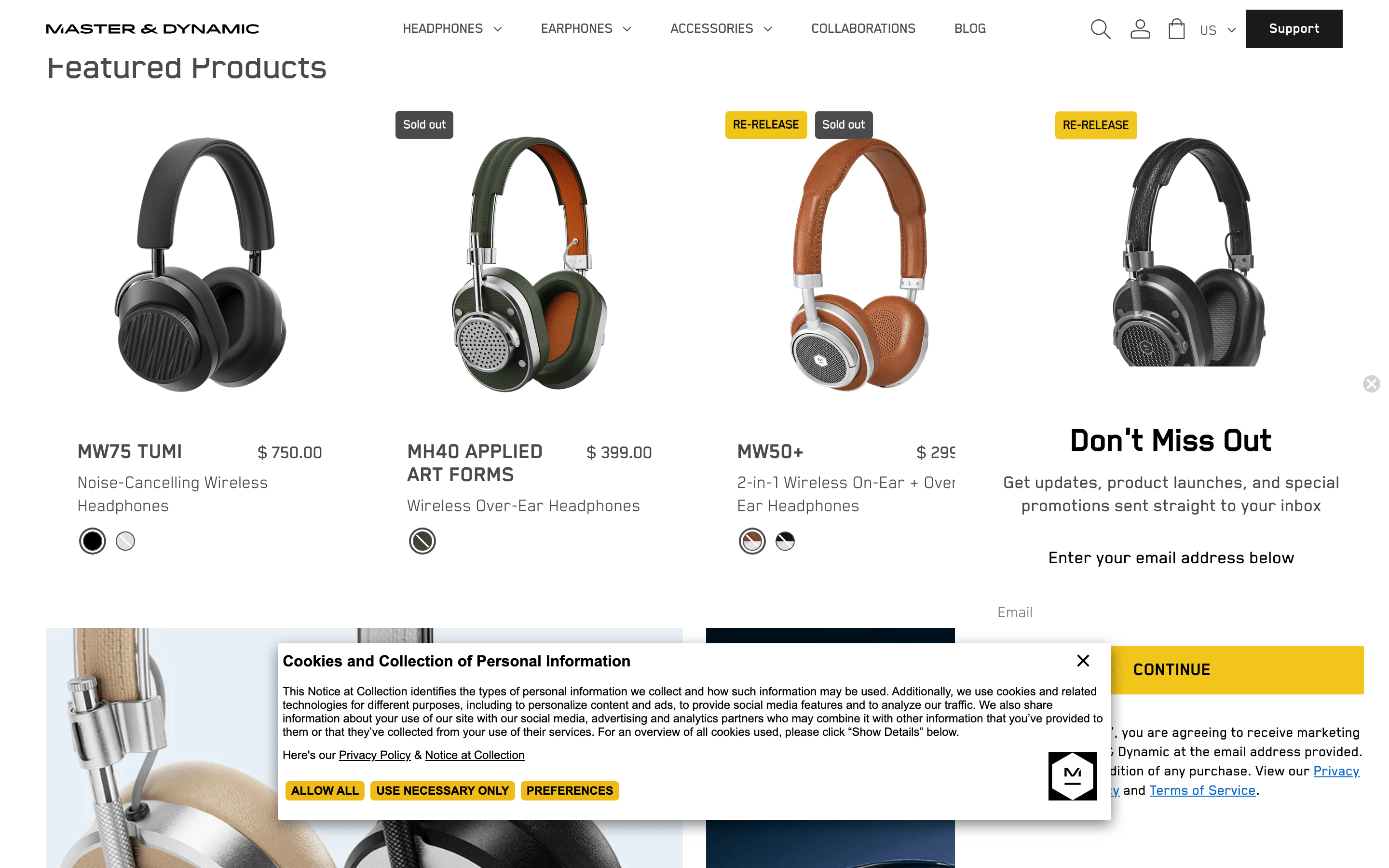
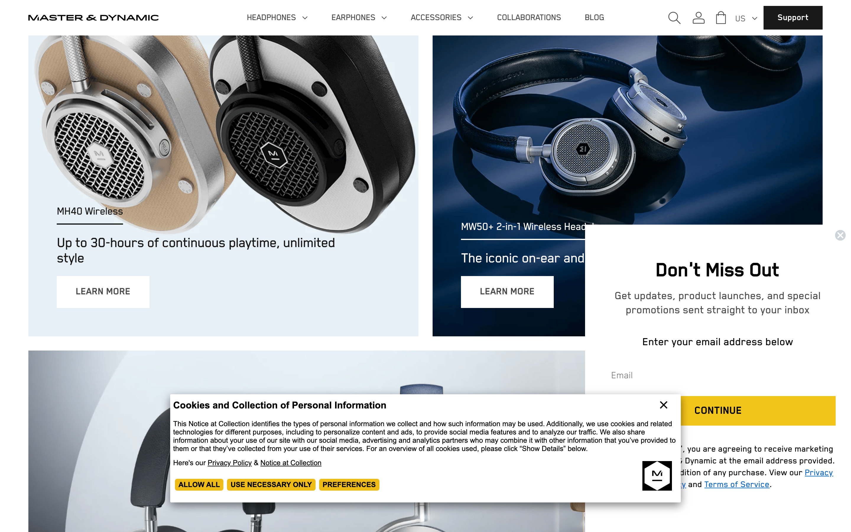
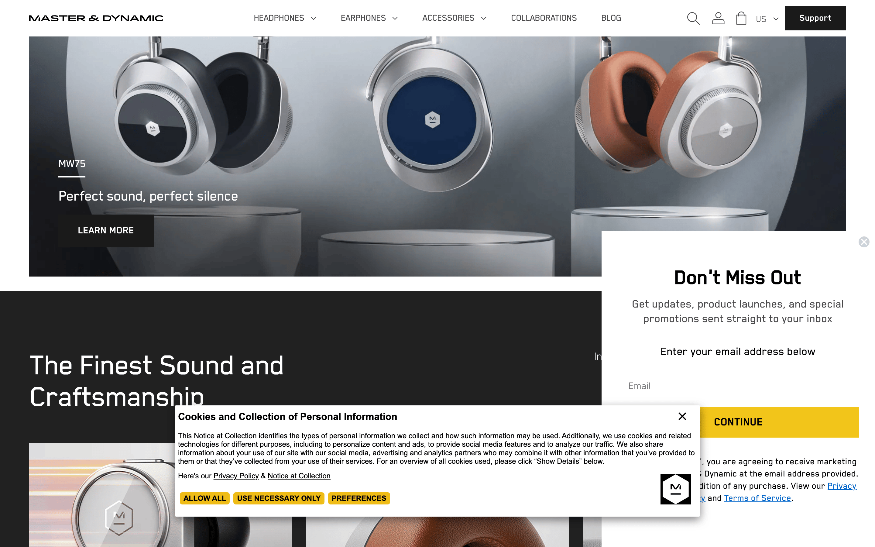
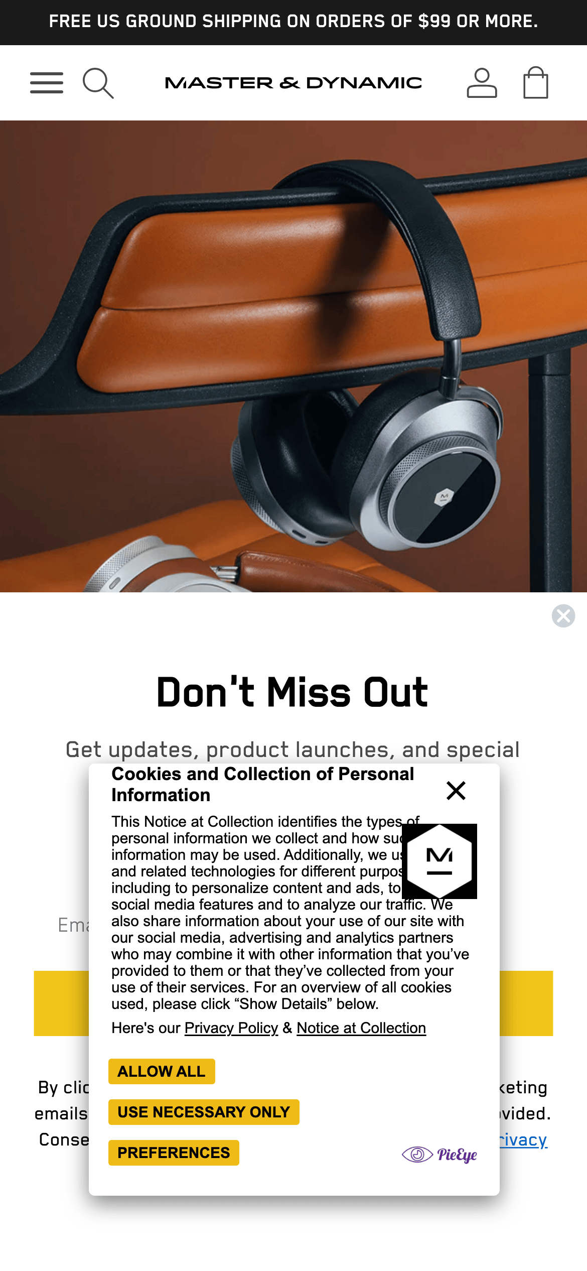
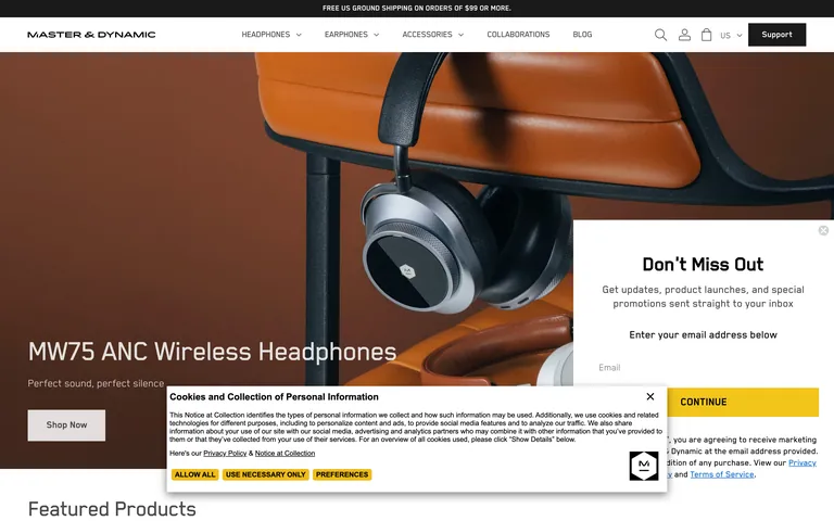
A high-end design gallery showcasing meticulously crafted audio hardware
02
Color
#4A4A4AInk
#FFFFFFBG
#F2F2F2BG soft
rgba(74, 74, 74, 0.12)Line
Minimalist black, white, and gray palette that lets high-quality product photography drive the visual experience
03
Typography
grotesque-sans · geometric-sans
display52px · 400
heading41px · 700
body-lg20px · 400
body18px · 400
body-sm16px · 400
Uppercase transform for navigation and category labels · Tight letter spacing throughout (negative tracking) · Line height matches font size for single-line text elements
04
Spacing
4px
8px
16px
20px
24px
30px
48px
96px
Base 4px with multipliers primarily at 4x (16px), 6x (24px), and 12x (48px)
05
Surfaces
sm · 4px
md · 7px
lg · 8px
pill · 9999px
1px solid rgba(74, 74, 74, 0.12)
rgba(0, 0, 0, 0.5) 0px 5px 15px 0px
06
Layout
1440container
12columns
24pxgutter
768 / 1024breakpoints
Full-width hero imagery with centered text overlay; 3-column feature grid; content-aligned text sections
07
Motion & Interaction
150msmicro
200mssmall
300msmedium
ease-in-outeasing
Fade transitions for menu and overlay interactions · Smooth color and background-size transitions on interactive elements · Subtle hover state changes with 150ms timing
Background color, color, box-shadow, and border transitions with 150ms ease-in-out · Subtle scale or opacity feedback
08
Components
buttonPill-shaped buttons with dark fill and white text, or outlined with dark border; uppercase text
cardMinimal cards with edge-to-edge product photography, no visible borders or shadows on image-based cards
chipSmall pill-shaped filters with border and uppercase text
inputClean text inputs with subtle bottom border, minimal styling
heroFull-bleed high-quality product photography with left-aligned text overlay on the image
09
Voice & Don'ts
ToneConfident, premium, and concise; focuses on product qualities and brand philosophy
HeadlinesDirect product names and benefit statements, often in uppercase or tight-tracked display type
CTAsSimple, action-oriented verbs like 'Shop Now', 'Learn More', 'Continue' in pill-shaped buttons
Don't use decorative serifs — screenshot shows a clean grotesque/geometric sans-serif system for all display and body text
Don't use high-saturation accent colors — screenshot shows a strictly monochromatic palette of black, white, and grays
Don't use heavy drop shadows or borders on cards — screenshot shows edge-to-edge product photography with minimal surface treatment
Don't use rounded or playful border radii — screenshot shows consistent tight radii (4-8px) or pill shapes (9999px)
Don't use wide letter spacing — screenshot shows tight negative tracking across all text sizes
Don't crowd the layout with text — screenshot shows generous whitespace and large hero imagery dominating the visual hierarchy
Don't use multiple font weights — screenshot shows predominantly regular (400) weight with minimal bold (700) usage
Don't use decorative backgrounds — screenshot shows flat white, black, or gray backgrounds letting product photography provide visual interest
Captured from the live site · real computed styles
11
System prompt
Master & Dynamic is a premium audio hardware brand using a clean, minimal e-commerce design. The site uses a monochromatic palette (#FFFFFF background, #4A4A4A text, #000000 for dark sections) with no accent colors. Typography is a custom grotesque sans-serif with tight negative tracking and minimal weight variation (mostly 400). Layout is spacious with full-bleed product photography driving the visual experience. Key donts: never use decorative serifs, avoid high-saturation accents, never add heavy shadows to product cards, don't use wide letter spacing, and never crowd layouts with text. The system prioritizes restraint and lets product imagery speak, using uppercase transforms and pill-shaped buttons for interactive elements.
Bring this taste to your agent
Hand your AI agent a machine-readable spec of this design — tokens, type, motion, the whole DNA.