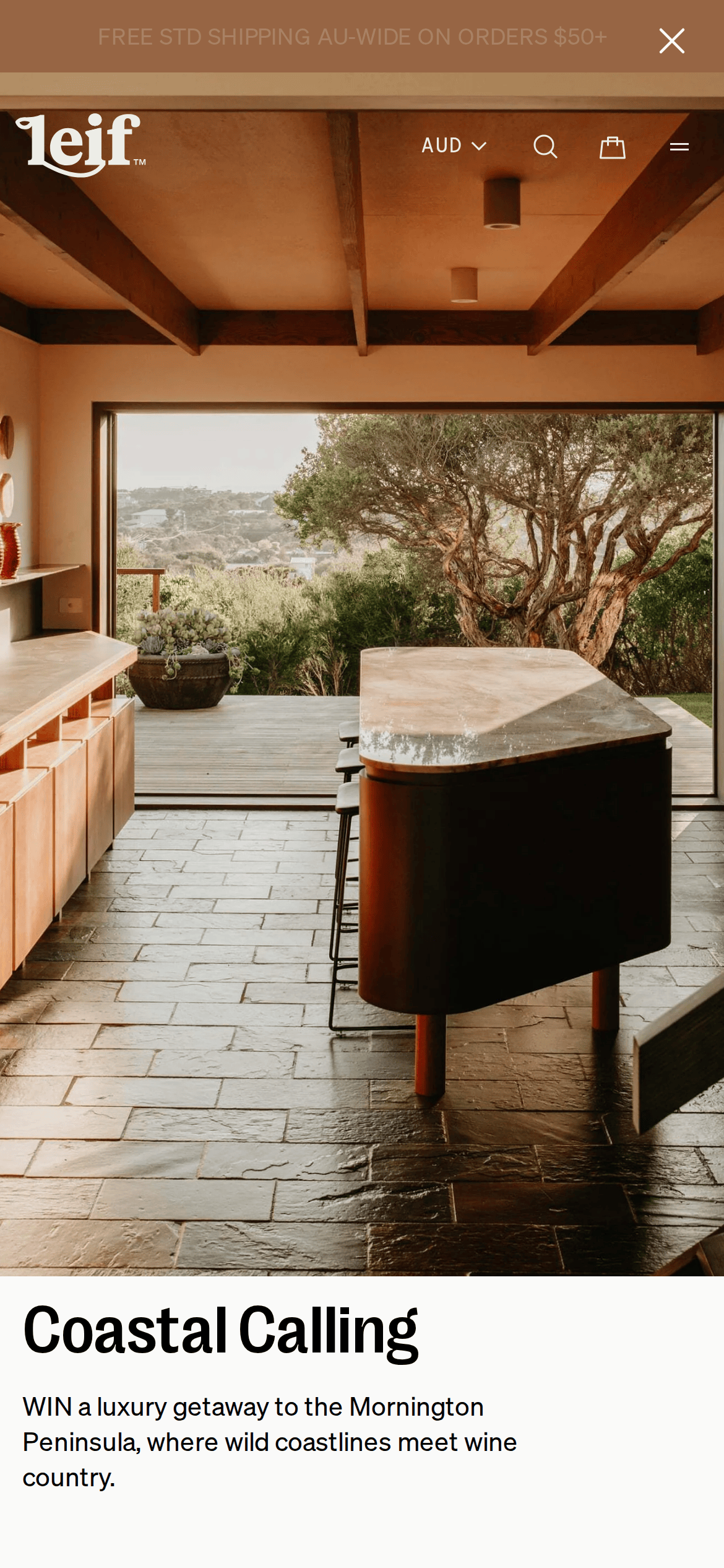
A curated botanical journal meets a coastal luxury retreat.
02
Color
#000000Ink
#262525Ink soft
#FAFAF9BG
#B2B2B2Muted
rgb(214, 209, 199)Line
High-contrast neutrals (black, off-white, muted grays) serve as a clean canvas to let the earthy, natural photography take center stage.
03
Typography
geometric-sans · grotesque-sans · monospaced
display52px · 500
body16px · 500
caption12px · 500
Use uppercase with wide tracking for navigation and category labels. · Maintain tight negative tracking on large display headings. · Use monospaced typography for descriptive scent notes and categorizations.
04
Spacing
4px
8px
12px
16px
20px
24px
32px
48px
64px
113px
A combination of 4px base increments and generous 113px vertical padding creates a distinct, airy rhythm.
05
Surfaces
sm · 0px
md · 6px
lg · 8px
pill · 999px
1px solid rgb(214, 209, 199) or rgb(38, 37, 37)
rgba(0, 0, 0, 0.1) 0px 2px 20px 0px
06
Layout
1280container
12columns
24pxgutter
768 / 1024breakpoints
A clean, multi-column asymmetric grid that favors large photographic blocks paired with generous whitespace and tight text blocks.
07
Motion & Interaction
220msmicro
300mssmall
500msmedium
cubic-bezier(0.4, 0, 0.2, 1)easing
0.3s transitions for hover states and interactive elements. · 0.5s transitions for broader UI state changes.
Subtle opacity or color shifts on interactive elements. · State changes indicated by filled/unfilled radio buttons.
08
Components
buttonSolid black rectangular buttons with uppercase white text.
cardImage-centric cards with minimal text overlays and subtle borders.
chipRadio-style circular selectors with uppercase text labels.
inputMinimal inputs with subtle bottom borders and monospaced text.
heroSplit-screen layout with a dominant full-height image and a dedicated text column.
09
Voice & Don'ts
ToneCalm, evocative, and sophisticated.
HeadlinesShort, evocative phrases that set a mood or location.
CTAsDirect, uppercase, and action-oriented commands.
Don't use bright or saturated accent colors — screenshot shows a strictly neutral, monochromatic palette.
Don't use decorative or highly stylized fonts — screenshot shows clean geometric and grotesque sans-serifs.
Don't overcrowd the layout — screenshot shows generous whitespace and large breathing room between elements.
Don't use heavily rounded corners everywhere — screenshot shows sharp edges or very subtle 6-8px border radii.
Captured from the live site · real computed styles
11
System prompt
Leif Products is a refined Australian botanical brand utilizing an editorial, photography-driven design to convey calm and natural luxury. The palette relies on high-contrast neutrals, featuring an off-white background (#FAFAF9), pure black text (#000000), and subtle warm grays (#EDEDE7). Typography alternates between a geometric sans for display, a grotesque sans for body text, and a monospaced font for descriptive details, maintaining a clean and structured hierarchy. Critically, avoid using vibrant accent colors, overuse of rounded corners, or cluttered layouts; instead, prioritize generous whitespace, large photographic focal points, and sharp, minimalist UI components with subtle 0.3s transitions.
Bring this taste to your agent
Hand your AI agent a machine-readable spec of this design — tokens, type, motion, the whole DNA.