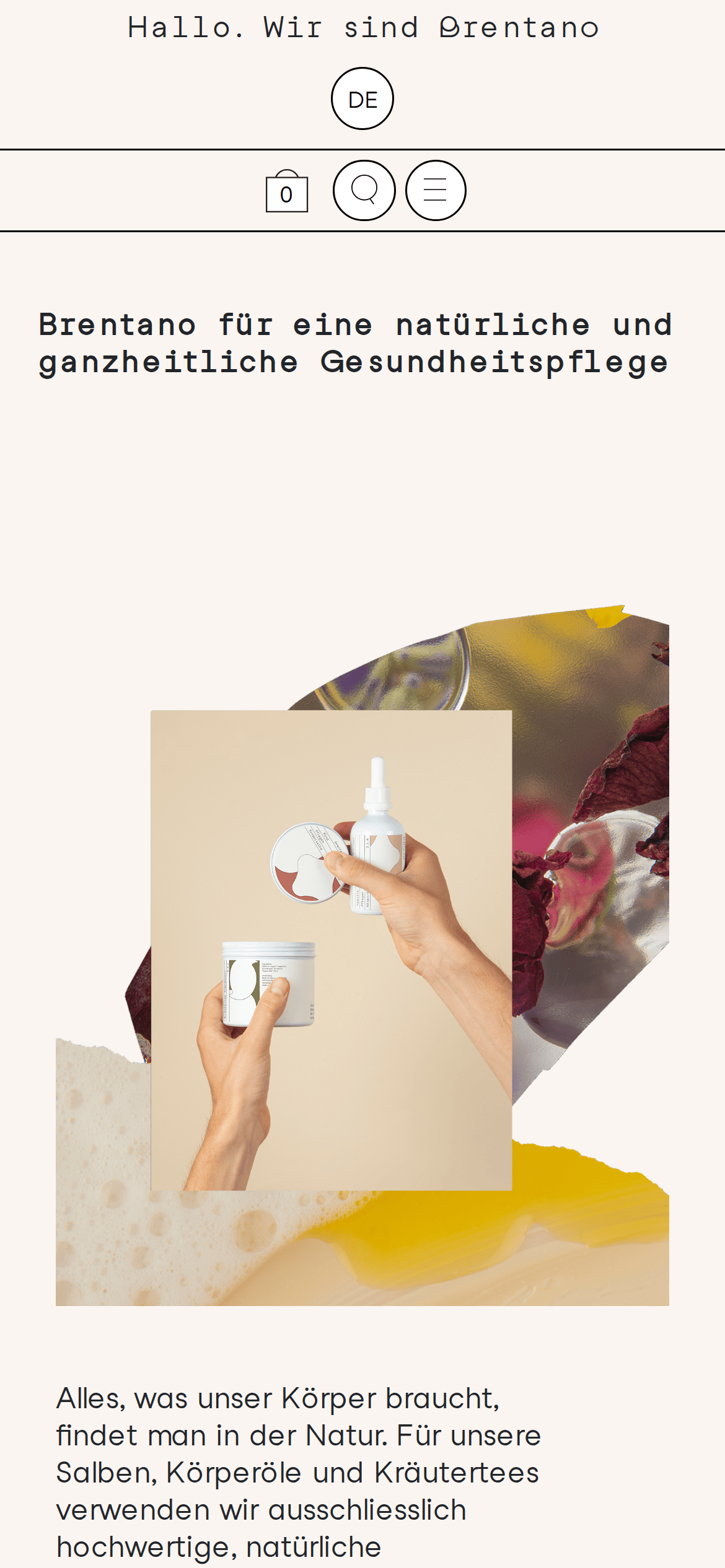
A modern, digital-native apothecary blending clean aesthetics with organic warmth.
02
Color
#212529Ink
#FBF5F1BG
rgba(33,37,41,1.0)Line
High-contrast natural palette with warm beige and dark ink.
03
Typography
monospaced-sans · sans-serif
display60px · 400
h130px · 400
body18px · 400
small15px · 400
All typography uses a clean, geometric sans-serif family. · Headlines utilize a monospaced variant for technical precision. · Font weight is consistently regular (400) across all text.
04
Spacing
4px
8px
16px
24px
32px
48px
64px
96px
Generous white space with standard 4px base unit.
05
Surfaces
sm · 4px
md · 0px
lg · 0px
pill · 999px
Thin 1px solid black borders used for structure and division.
06
Layout
1440container
12columns
24pxgutter
768 / 1024breakpoints
Grid-based with a top navigation bar and a stacked vertical flow for content.
07
Motion & Interaction
200msmicro
300mssmall
800msmedium
cubic-bezier(0.25, 0.1, 0.25, 1.0)easing
Smooth transform transitions on hover states · Gentle easing on page transitions
Subtle opacity or color shifts on interactive elements. · Standard pointer cursor on all clickable areas.
08
Components
buttonMinimal outline buttons with pill-shaped language toggles and circular icon buttons.
cardClean product cards with thin borders, aligned text, and no background color.
chipSimple text-based language toggles inside pill shapes.
inputBottom-bordered input fields without visible background.
heroLarge, left-aligned monospaced headline with an organic, overlapping photo collage.
09
Voice & Don'ts
ToneProfessional yet approachable and informative.
HeadlinesDirect, clear, and slightly technical due to the monospaced font.
CTAsSimple and direct, often just a word like 'Kaufen' (Buy).
Don't use drop shadows — screenshot shows flat, border-based design.
Don't use gradient backgrounds — screenshot shows a solid warm beige background.
Don't use rounded corners on containers — screenshot shows sharp, square corners.
Don't use bold font weights for emphasis — screenshot shows consistently regular weight.
Don't use a bright, high-chroma accent color — screenshot shows a restrained black-and-beige palette.
Don't use centered layouts for main content — screenshot shows a strong left-aligned grid.
Captured from the live site · real computed styles
11
System prompt
This website is a digital apothecary for natural healthcare products, using a clean, editorial layout. The palette relies on a warm beige background (#FBF5F1) and dark ink (#212529). Typography mixes a monospaced-sans for headlines with a clean sans-serif for body text. Critical donts: avoid drop shadows, avoid gradient backgrounds, and avoid rounded corners on containers. The design relies on thin black borders and generous whitespace for structure.
Bring this taste to your agent
Hand your AI agent a machine-readable spec of this design — tokens, type, motion, the whole DNA.