A clean, image-focused palette where vibrant red acts as the sole high-chroma accent against neutral backgrounds.
03
Typography
geometric-sans
display48px · 900
heading38px · 700
body16px · 400
caption12px · 400
Use high-contrast black or near-black for all primary text. · Maintain tight letter-spacing on large display text. · Navigation items are medium weight and sentence case.
04
Spacing
4px
8px
16px
24px
32px
48px
64px
96px
Generous vertical padding (100px) separates major page sections, creating a rhythmic, breathable flow.
05
Surfaces
sm · 8px
md · 16px
lg · 32px
pill · 999px
Generally borderless, with soft borders appearing only on form inputs and occasionally as 1px lines.
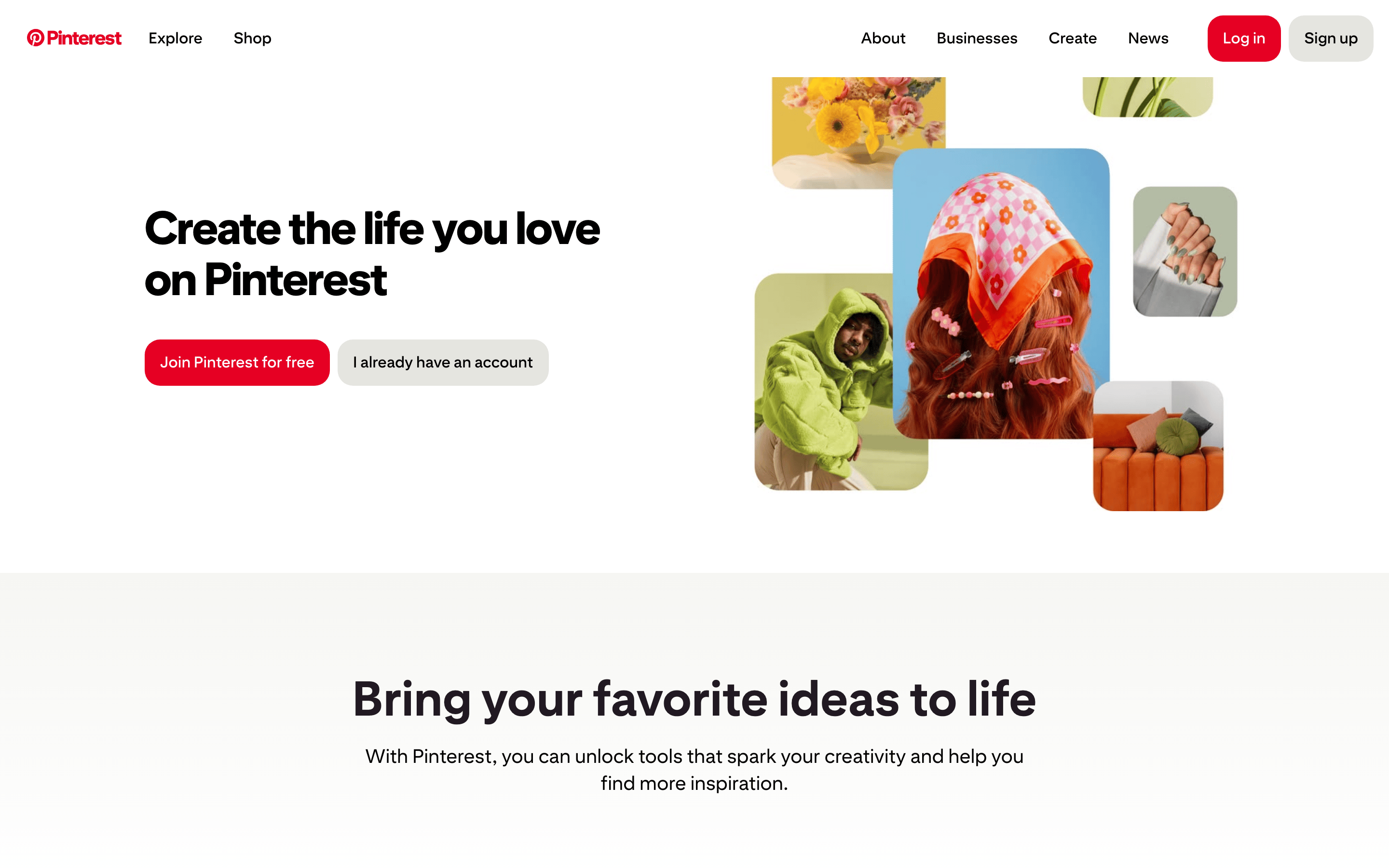
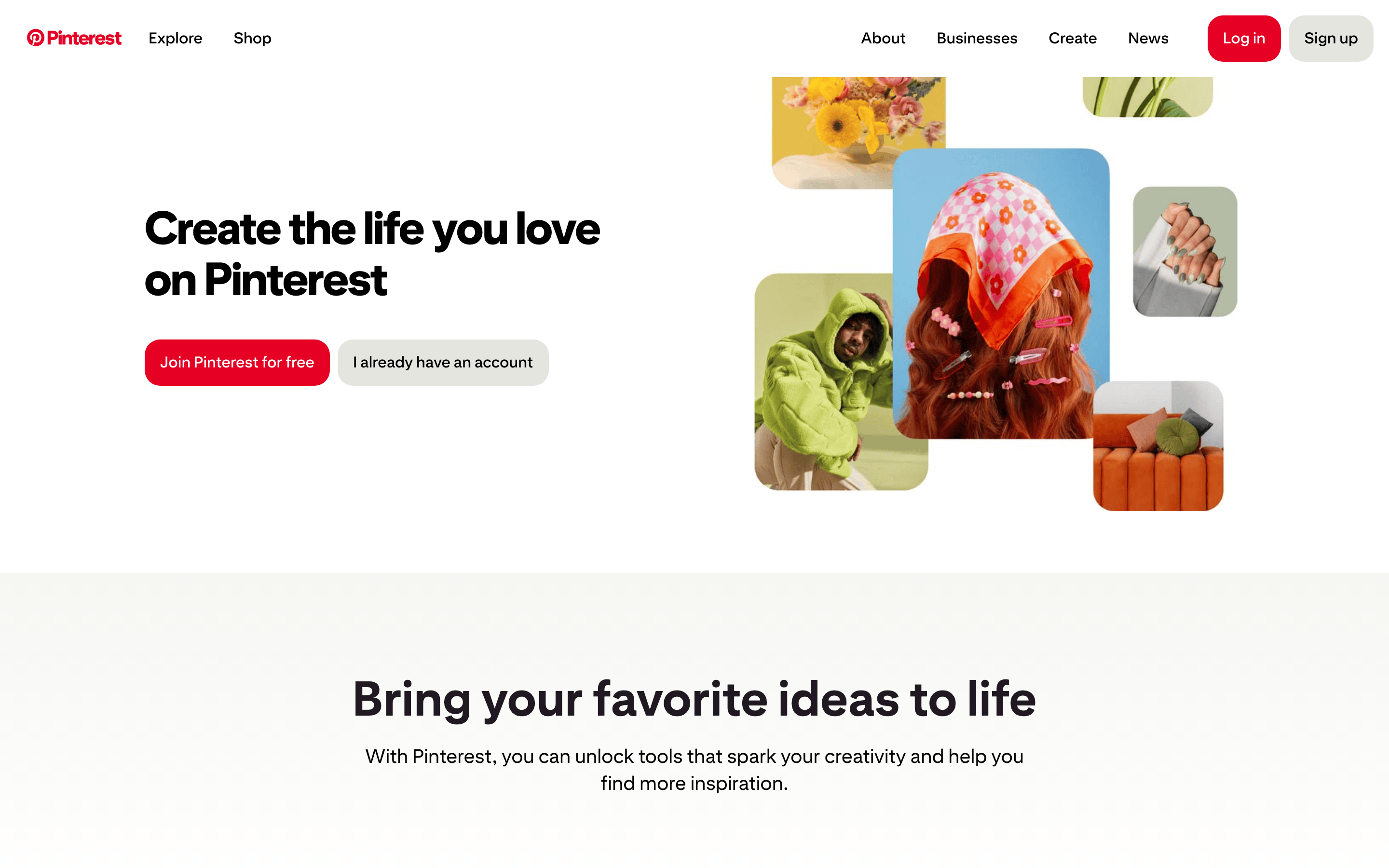
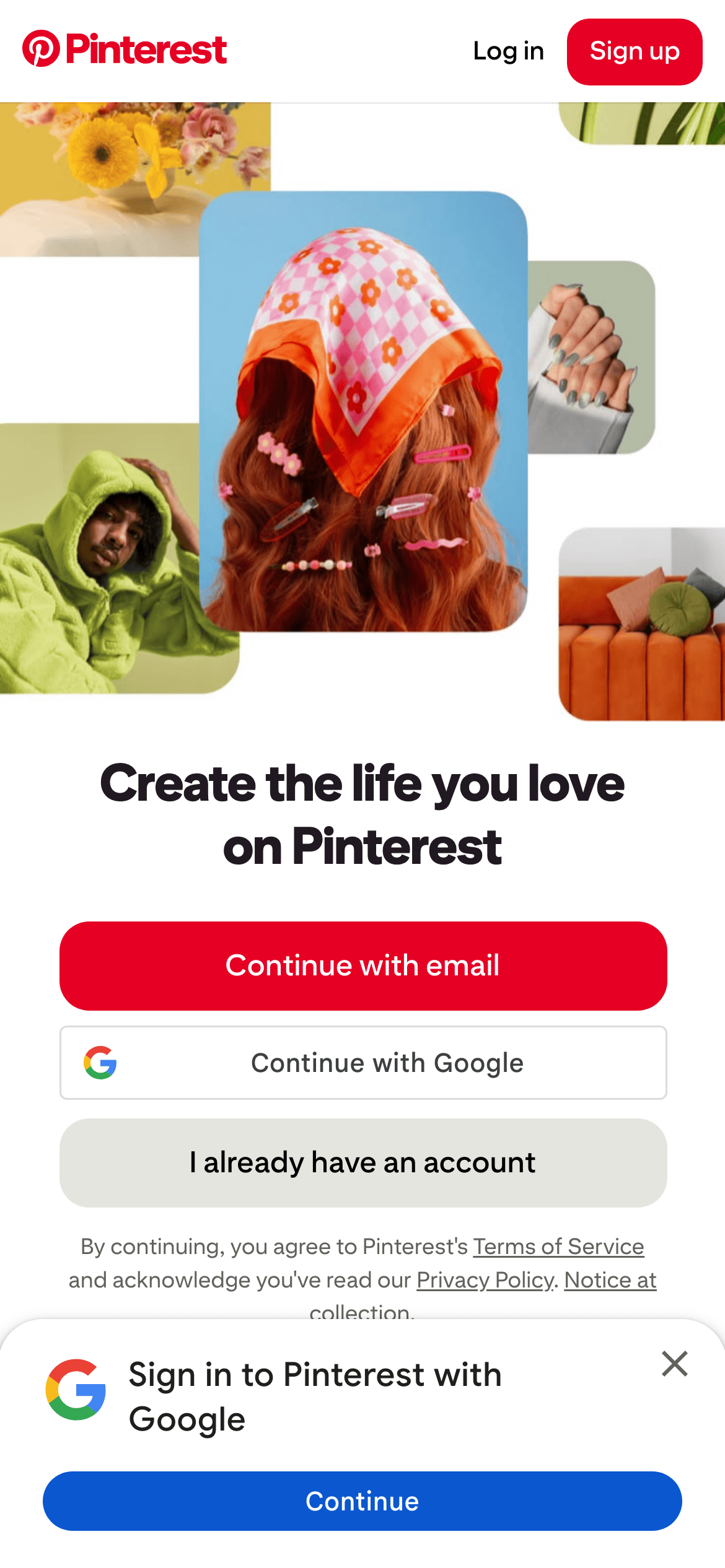
A two-column split for the hero (text left, floating image collage right) that collapses to a stacked vertical layout on mobile.
07
Motion & Interaction
85msmicro
220mssmall
400msmedium
ease-outeasing
Rapid transform transitions (0.085s) for subtle hover effects. · Smooth sliding transitions for menus and drawers.
Subtle scale transforms on interactive elements like image cards and buttons. · Immediate visual feedback via transform properties.
08
Components
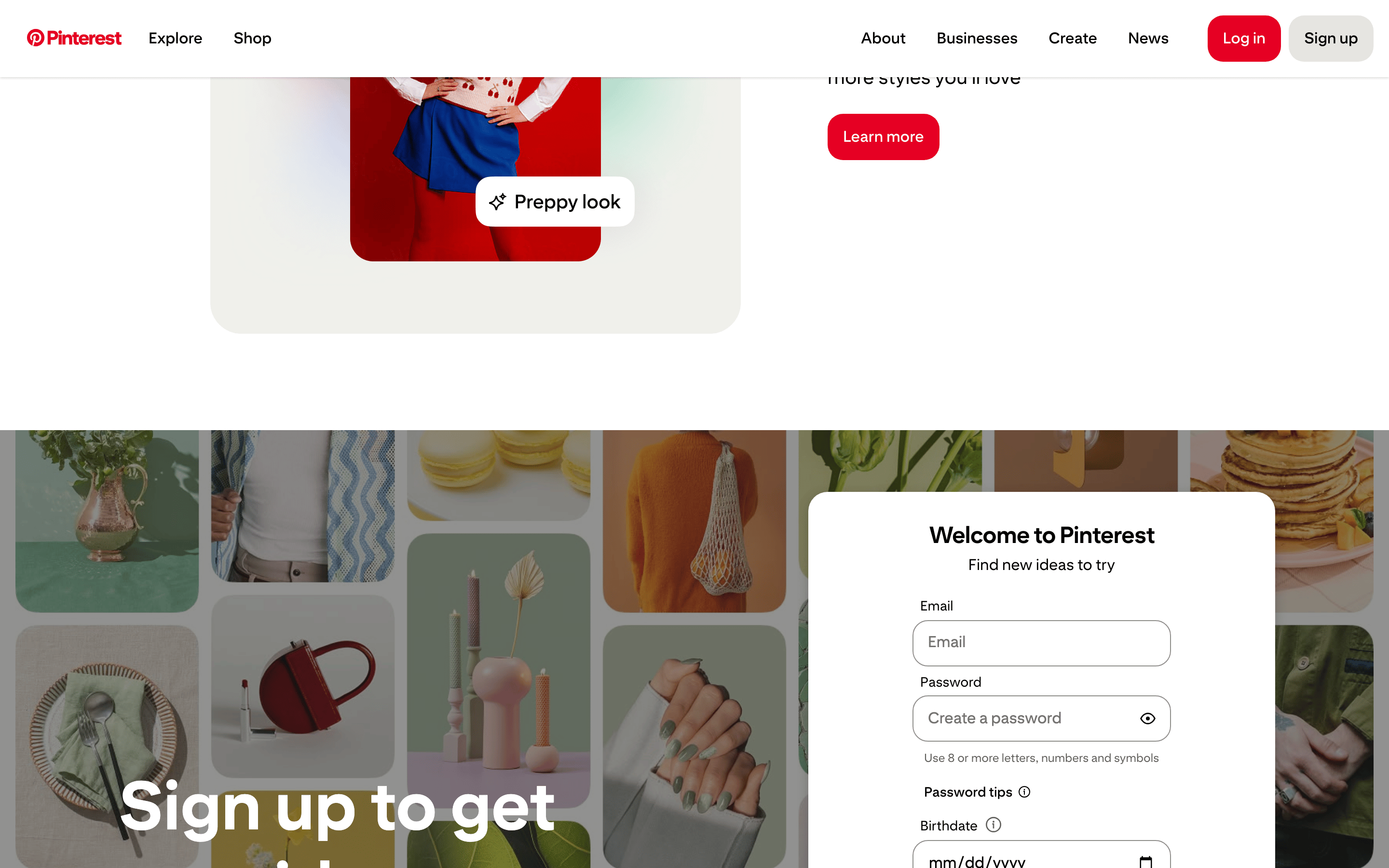
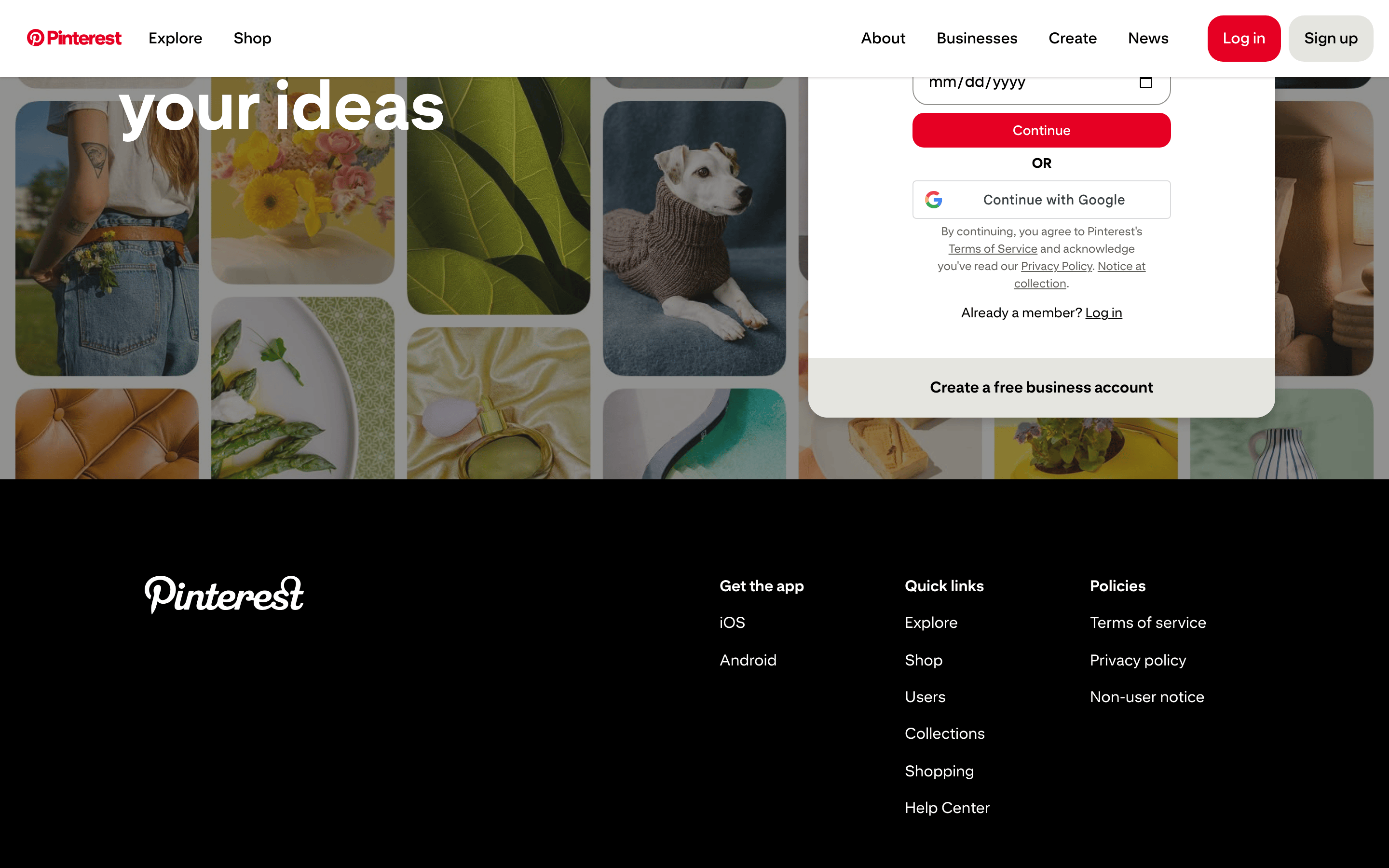
buttonPrimary buttons are solid red (#E60023) with white text and fully rounded pill shapes. Secondary buttons are light gray (#E5E5E0) with black text, also pill-shaped.
cardImage-heavy cards with large, consistent border-radius (16px) and soft drop shadows.
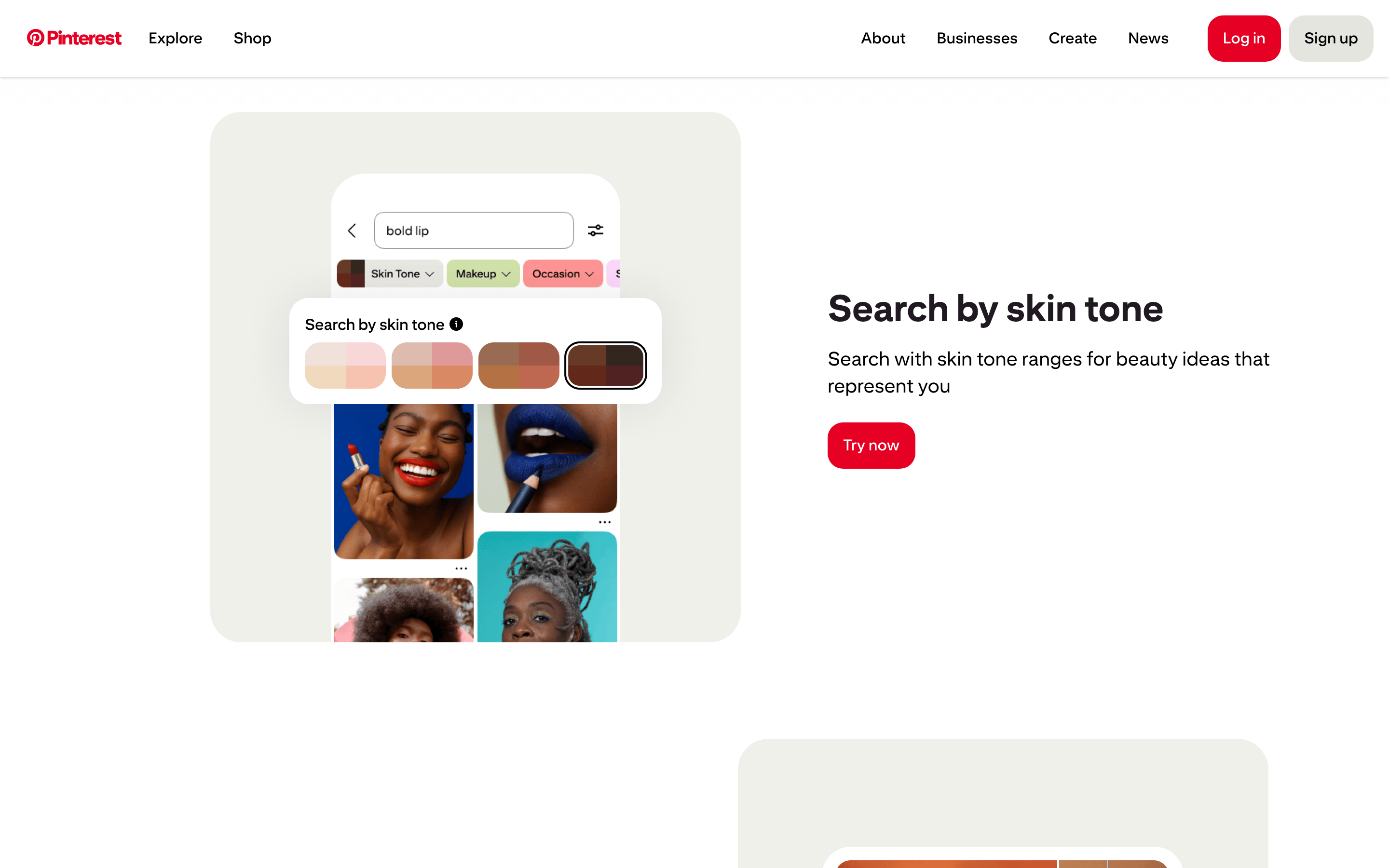
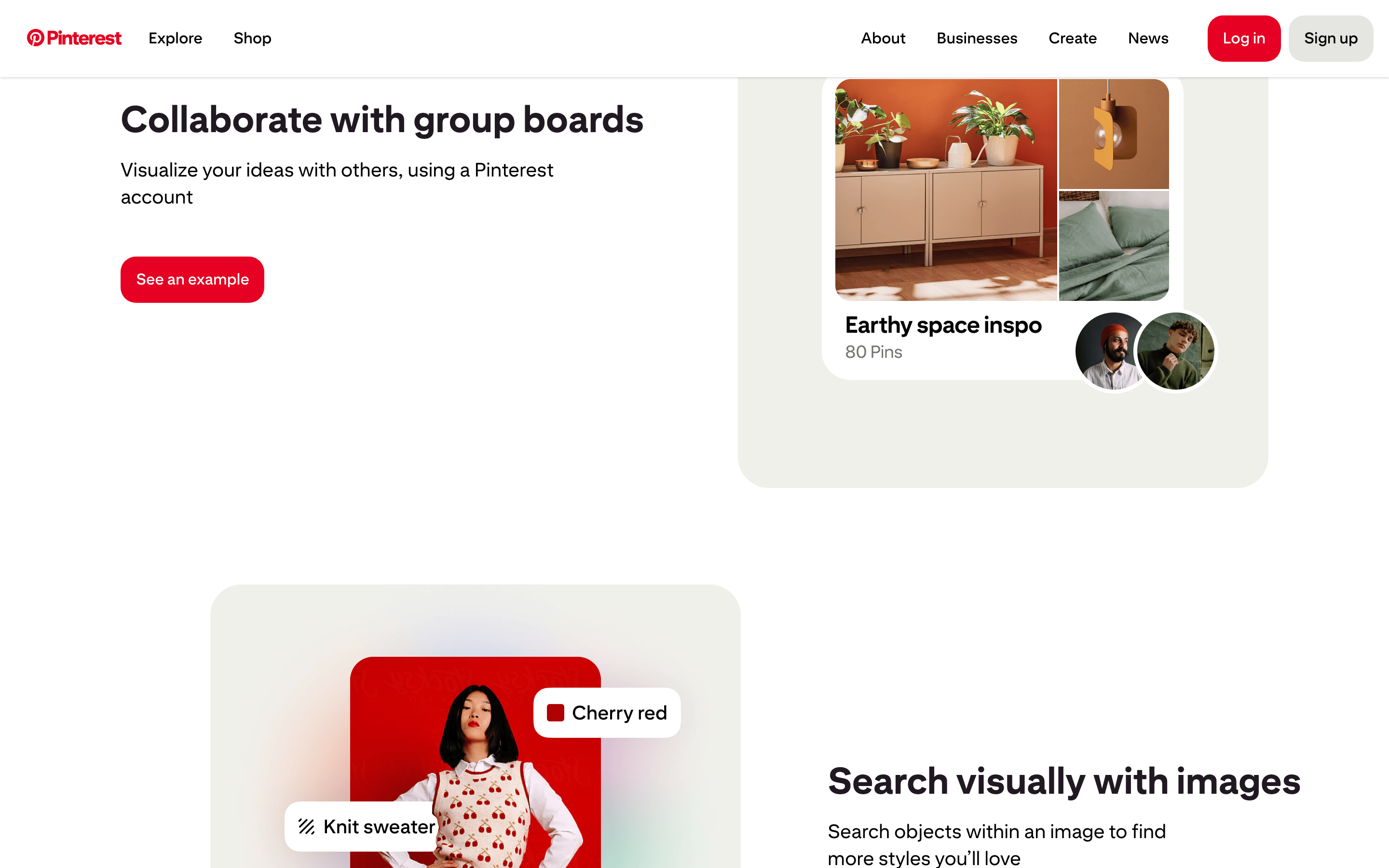
chipSmall, rounded white chips (e.g., 'Preppy look') that float over images, featuring subtle shadows.
inputSimple, unstyled-looking inputs with a light gray background (#F6F6F3) and slightly rounded corners (8px).
heroA massive, bold text block paired with a dynamic collage of overlapping photographic cards.
09
Voice & Don'ts
ToneInspiring, encouraging, and highly approachable.
HeadlinesDirect, action-oriented imperatives ('Create the life you love').
CTAsSimple, benefit-driven calls to action ('Join Pinterest for free').
don't use dark mode — screenshot shows a bright, predominantly white and light gray (#F6F6F3) interface.
don't use serif fonts — screenshot shows a clean, geometric sans-serif typeface across all elements.
don't use heavy borders — screenshot shows mostly borderless elements, relying on background color and shadows for separation.
don't use multiple accent colors — screenshot shows red (#E60023) as the single dominant high-chroma accent.
don't use complex data visualizations — screenshot shows a purely visual, photographic layout with minimal text.
don't use sharp, rectangular corners — screenshot shows large border-radius (16px to 32px) on all cards and buttons.
Avoid: Avoid overly technical or corporate jargon.
Avoid: Avoid small, dense paragraphs of text.
Avoid: Avoid dark mode or overly aggressive color schemes.
Captured from the live site · real computed styles
11
System prompt
This is the design DNA for Pinterest, a visual discovery platform. The identity is built on a clean, image-first approach with a high-contrast palette of white (#FFFFFF), light gray (#F6F6F3), and near-black (#211922), punctuated by a single vibrant red accent (#E60023). Typography utilizes a geometric sans-serif category with heavy weights (up to 900) for bold headlines and standard weights for body text. The layout features a spacious, two-column hero that collapses on mobile, with image cards using large 16px border-radius. Critical donts: do not use dark mode (the interface is light), do not introduce serif fonts (keep it strictly sans-serif), and do not rely on multiple accent colors (red is the only high-chroma color used for emphasis).
Bring this taste to your agent
Hand your AI agent a machine-readable spec of this design — tokens, type, motion, the whole DNA.