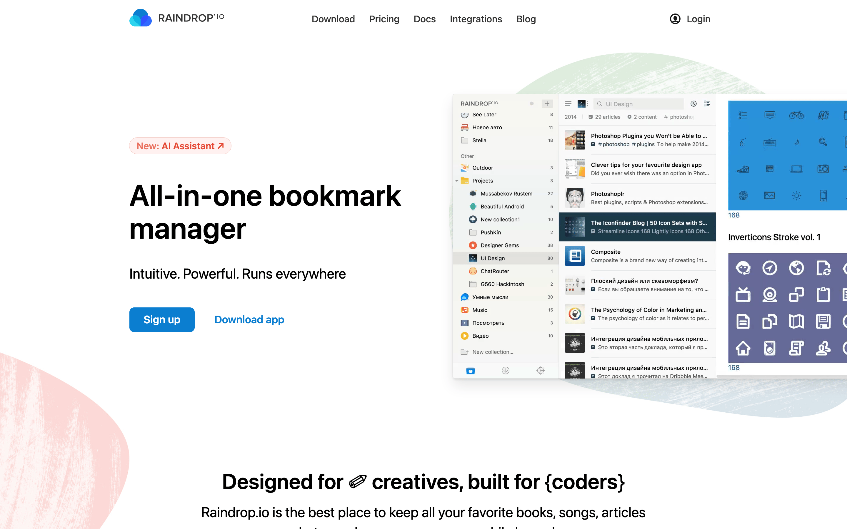
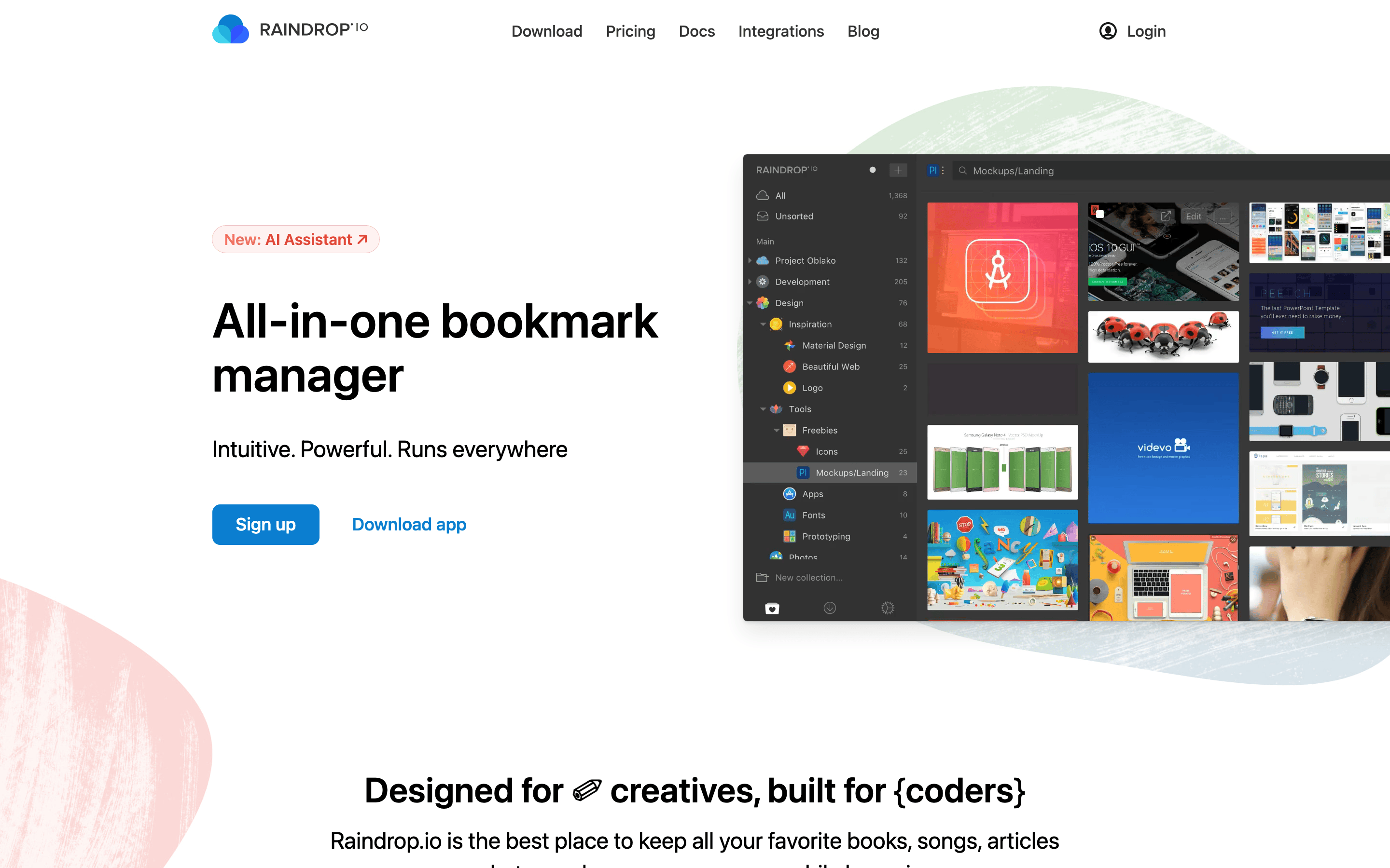
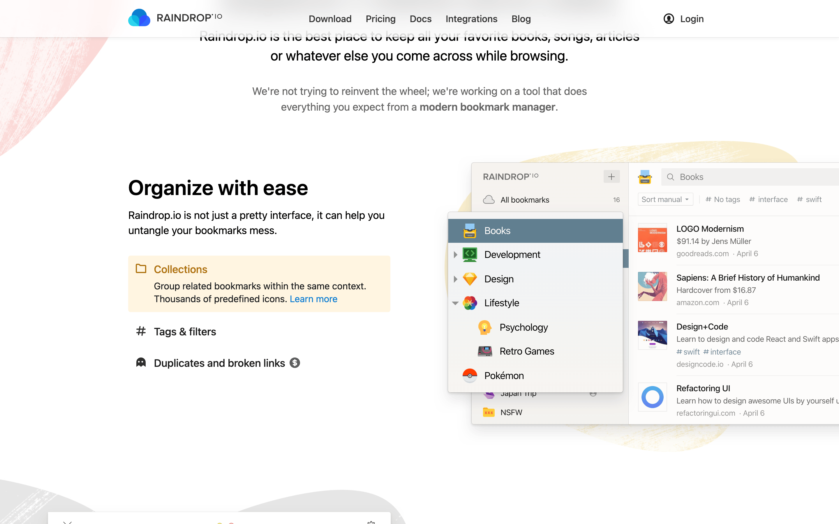
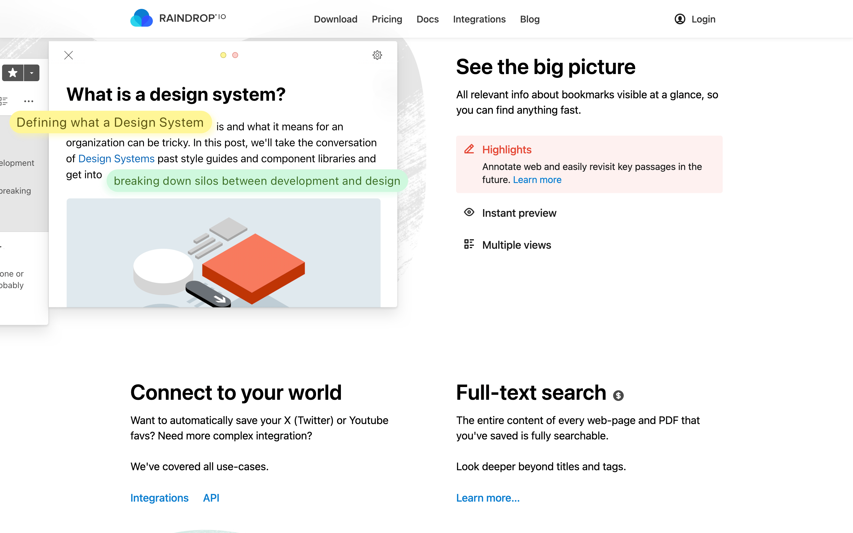
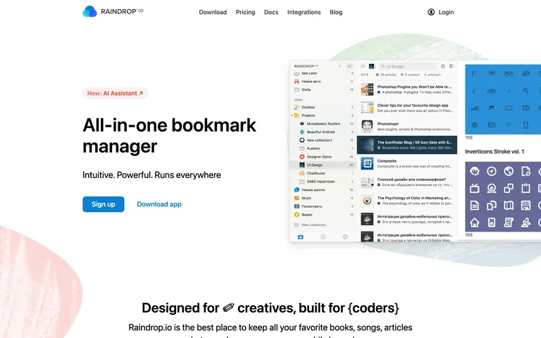
Clean white surfaces with a primary blue accent and muted dark text
03
Typography
system-ui · monospace
display50px · 500
h236px · 600
body18px · 400
small16px · 400
Use system-ui or Segoe UI for a native, clean look · Headlines are tight, clean, and slightly bold · Maintain high contrast for readability against white backgrounds
04
Spacing
4px
8px
16px
24px
32px
48px
64px
96px
Generous vertical padding (50px) in hero sections, with a consistent 30px horizontal padding
05
Surfaces
sm · 4px
md · 8px
lg · 12px
pill · 999px
1px solid rgba(0,0,0,0.1) for containers and inputs
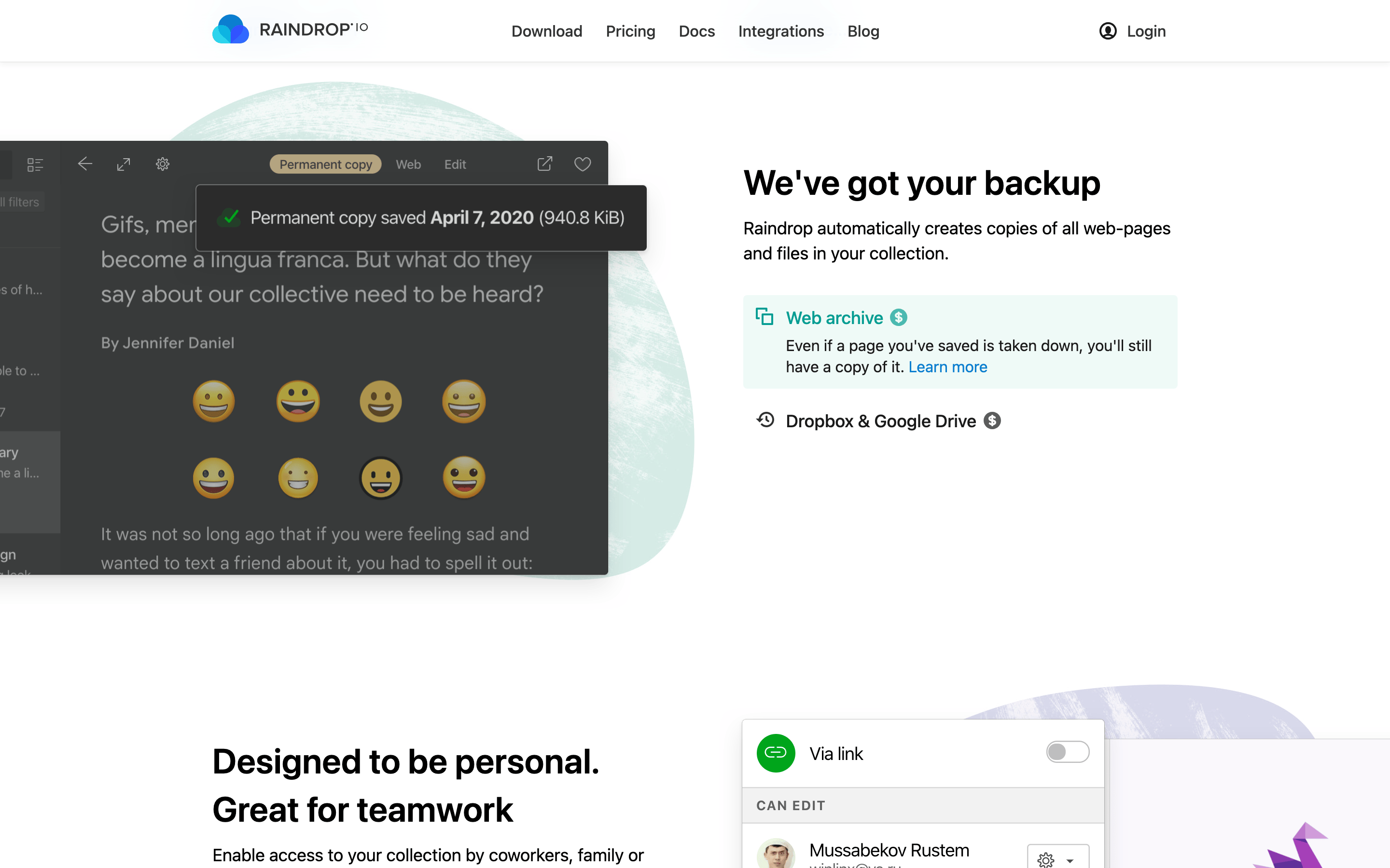
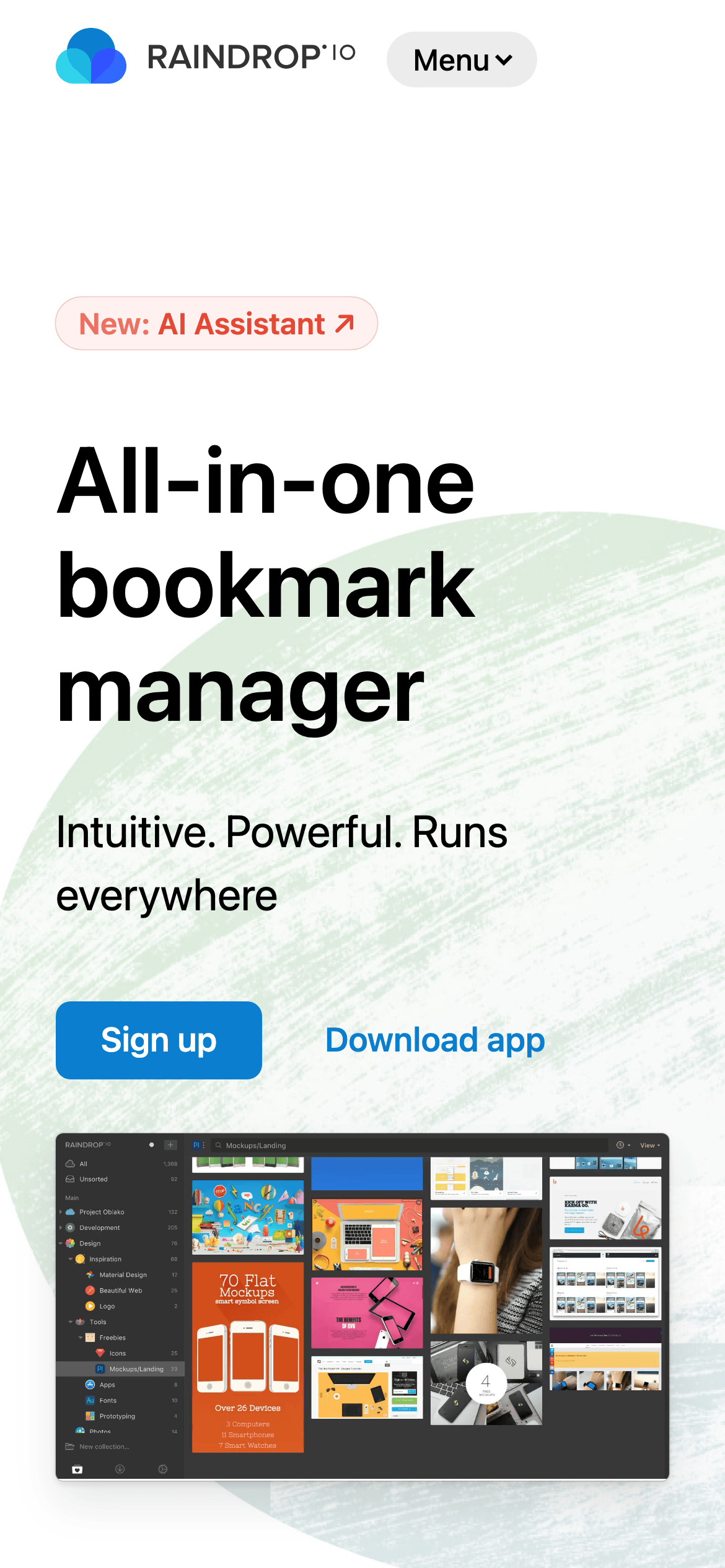
Split hero layout with copy on the left and overlapping product screenshots on the right, using organic background blobs for visual interest
07
Motion & Interaction
150msmicro
200mssmall
400msmedium
ease-in-outeasing
Smooth opacity and transform transitions for hover states · Subtle background-color shifts on interactive elements
Subtle background color changes or opacity shifts · Minimal physical feedback, relying on state changes
08
Components
buttonPrimary buttons are filled with a bright blue and rounded with a small radius; secondary buttons are transparent text links
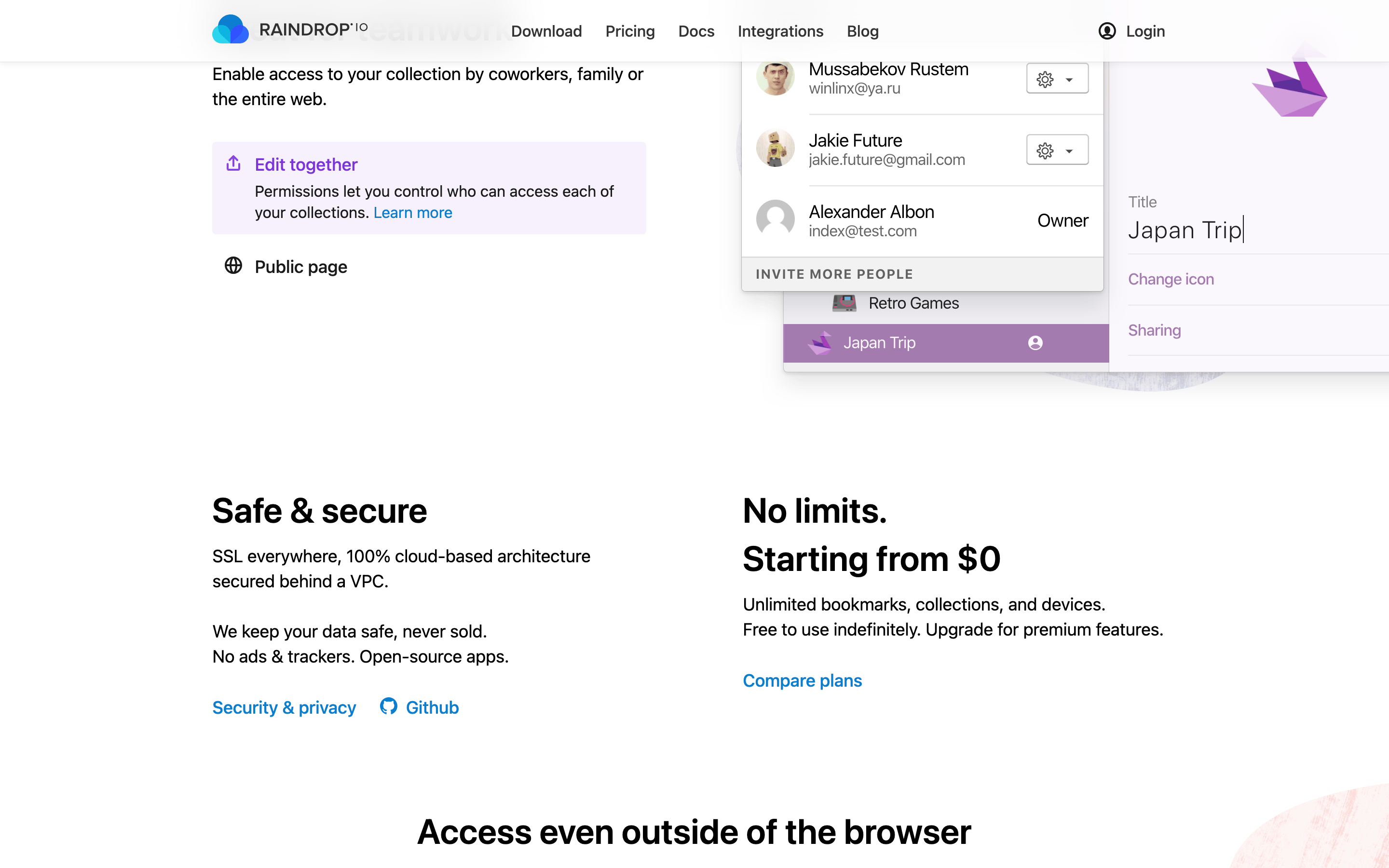
cardSoft shadow and light border for containers and feature cards
chipRounded pill-shaped tags with a soft background (like the 'New: AI Assistant' pill)
inputClean, minimal inputs with subtle borders and 4px radius
heroLarge bold display text on the left, multi-layered product screenshots on the right, set against a white background with colorful abstract organic shapes
09
Voice & Don'ts
ToneProfessional, helpful, and straightforward
HeadlinesShort, declarative, and benefit-oriented
CTAsDirect and action-focused (Sign up, Download app)
Don't use dark mode as the primary background — screenshot shows a predominantly white background
Don't use harsh neon accents — screenshot uses a clean, bright blue (#0B7ED0)
Don't use heavy, ornate serif fonts — screenshot uses clean, native system fonts
Don't make the layout rigidly boxy — screenshot incorporates organic, soft background blobs
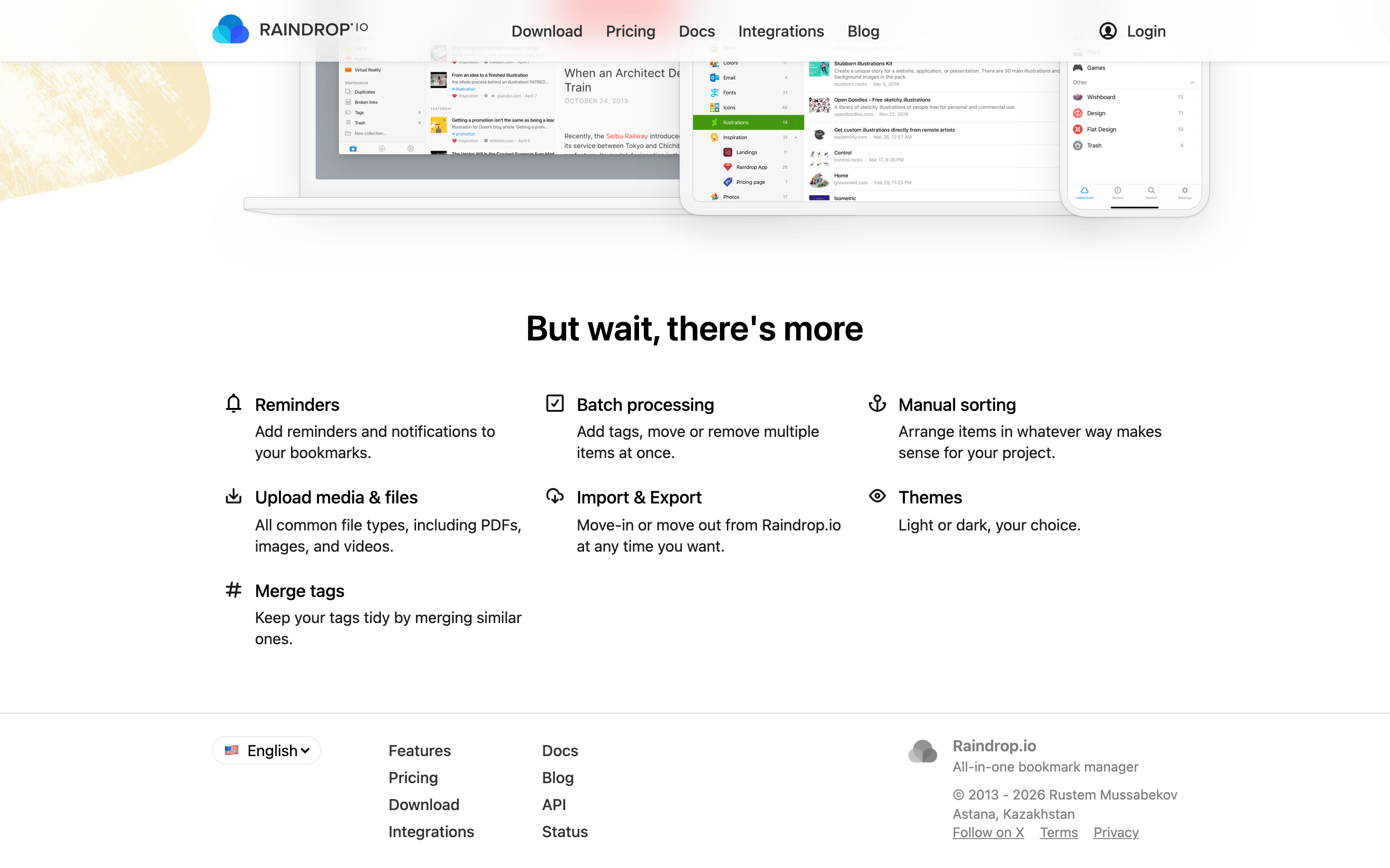
Don't clutter the interface with too many borders — screenshot uses whitespace and subtle shadows
Don't use a dark primary text color — screenshot uses a softer, slightly less harsh dark gray (#1A1A1A)
Avoid: Overly casual slang
Avoid: Aggressive or hyperbolic marketing language
Captured from the live site · real computed styles
11
System prompt
Raindrop.io is a professional, intuitive bookmark manager with a clean, spacious layout. Its design DNA relies on a white background, soft organic background shapes, and a primary blue accent (#0B7ED0) to guide the user's eye. Typography uses native system fonts for maximum performance and readability. Key donts include: avoiding dark mode as the default, avoiding harsh neon colors, and keeping the layout breathable rather than cluttered. The overall feel is calm, refined, and highly functional.
Bring this taste to your agent
Hand your AI agent a machine-readable spec of this design — tokens, type, motion, the whole DNA.