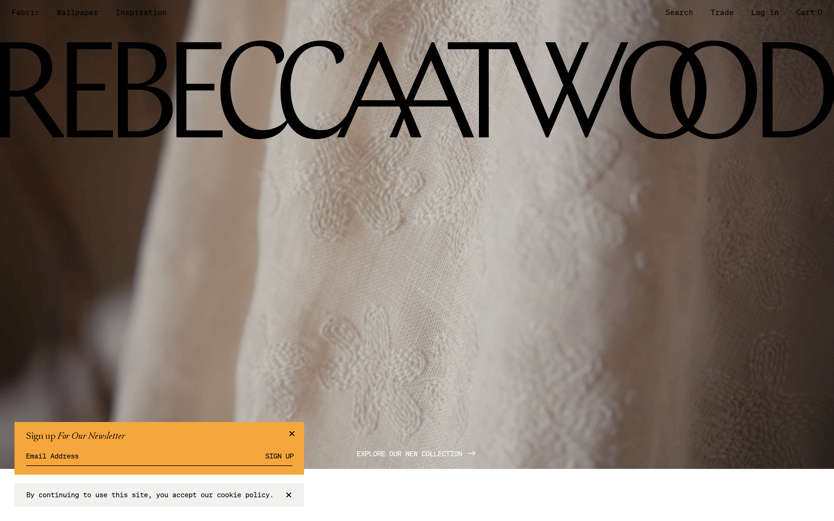
A sun-drenched artisan studio where organic textures meet editorial typography.
02
Color
#F5A73CAccent
#000000Ink
#F5F5F5BG
#F1F1F0BG soft
#6084B5Muted
rgba(0,0,0,1)Line
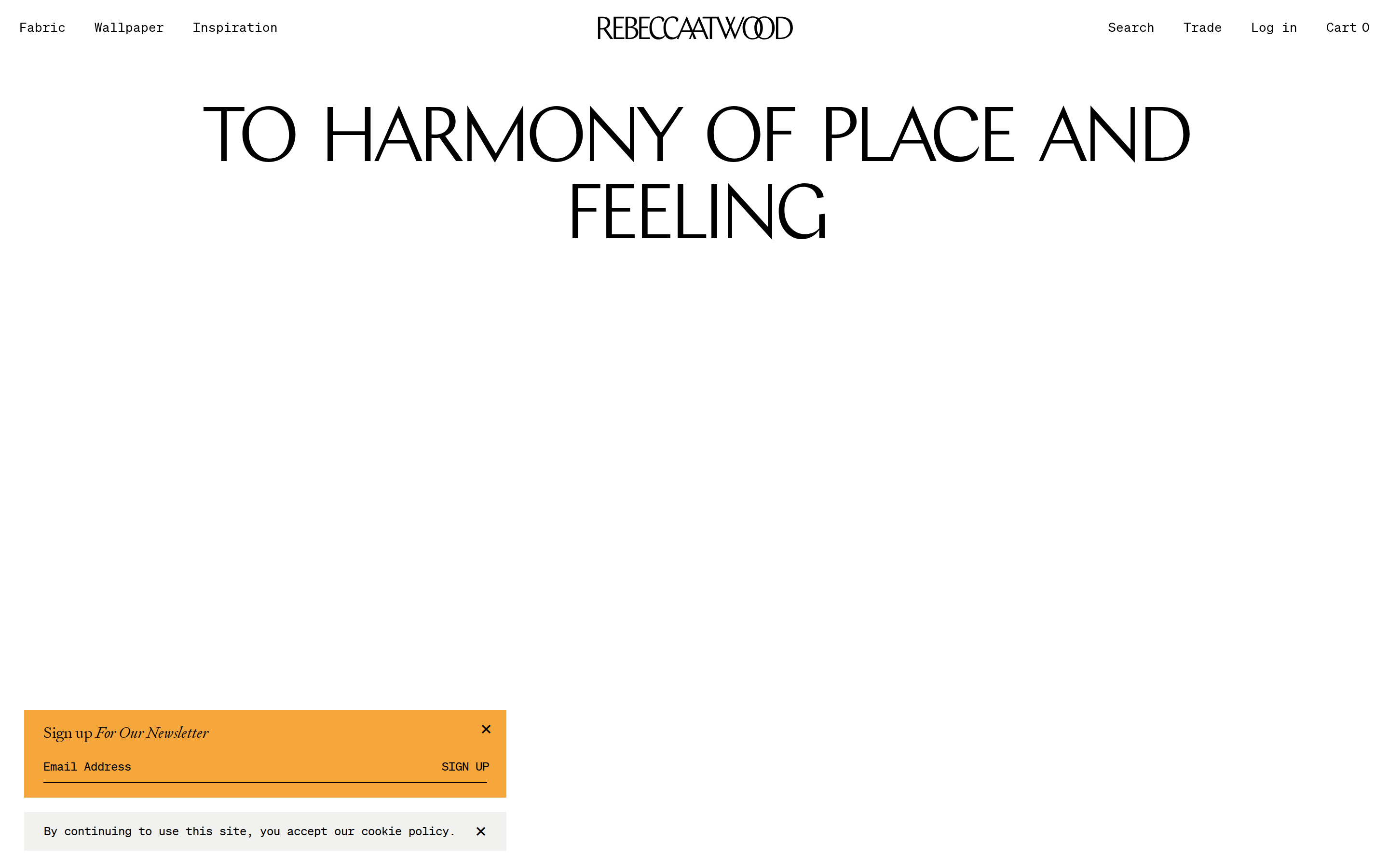
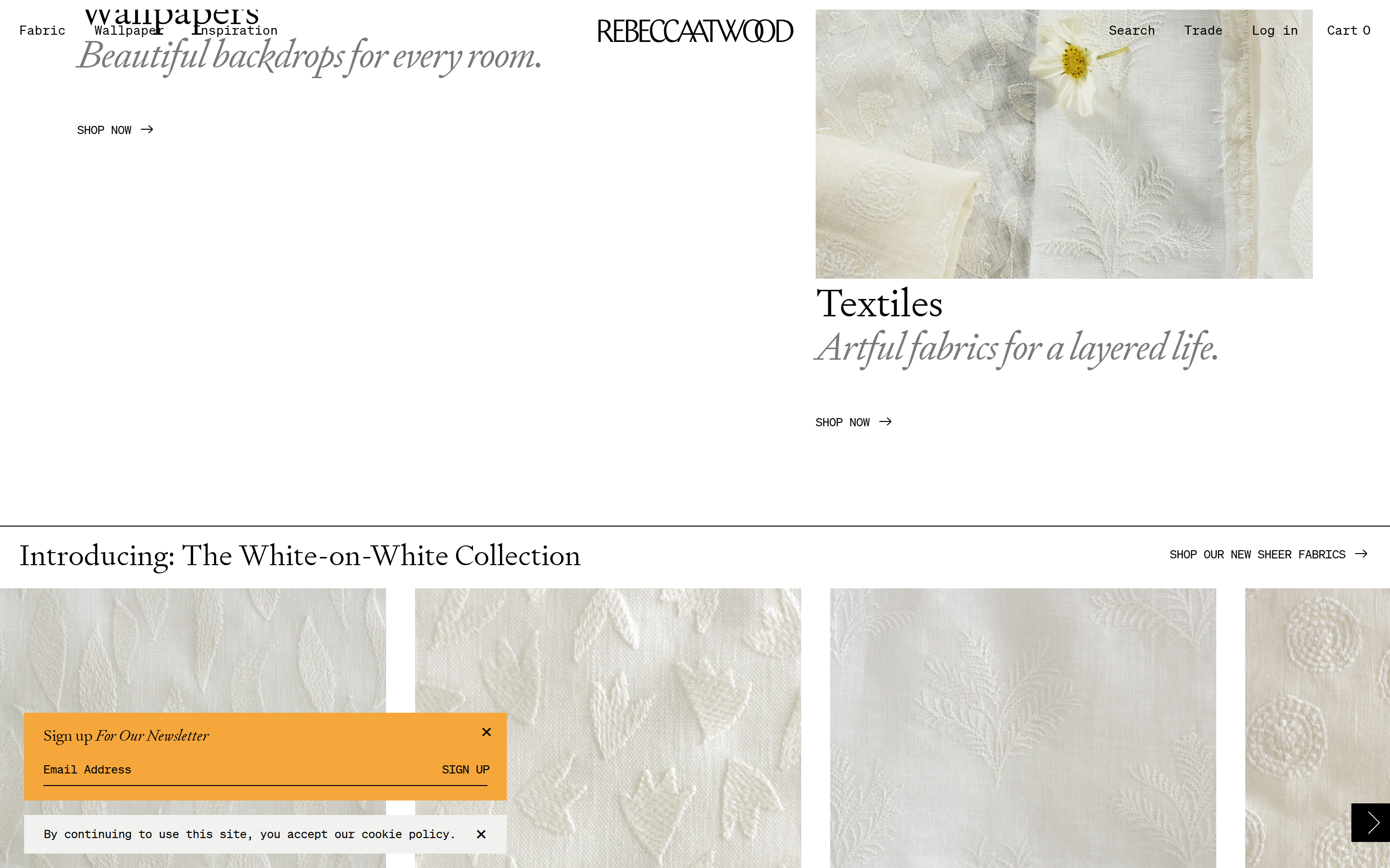
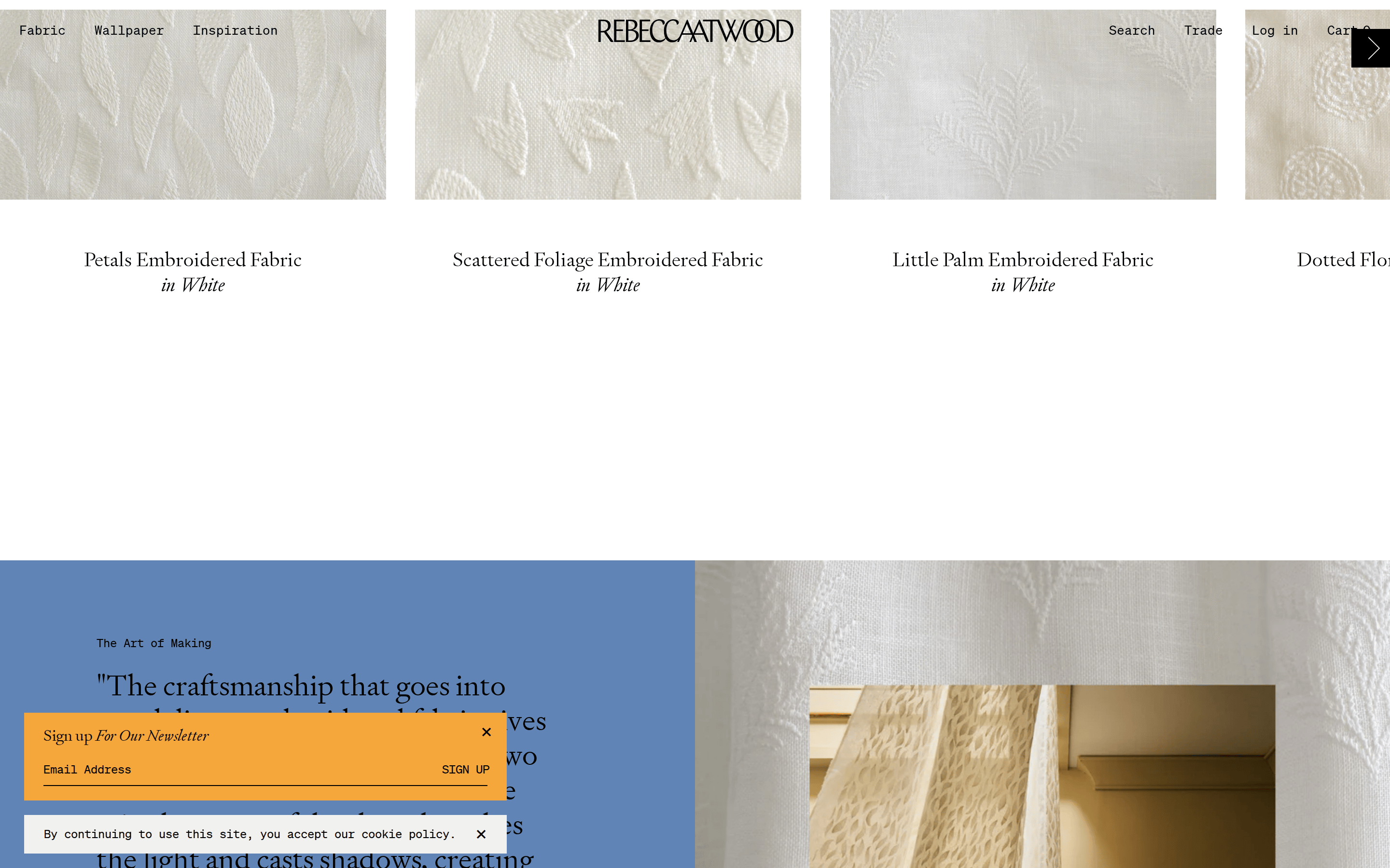
A restrained, neutral palette of whites and warm earth tones, allowing the vibrant, high-chroma orange accent to serve as a singular, energetic focal point against organic photography.
03
Typography
transitional-serif · monospace
display40px · 400
h224px · 400
body16px · 400
caption12px · 400
Use Signifier for all primary headings and brand identity. · Use monospace for functional UI elements like navigation links, button text, and labels.
04
Spacing
4px
8px
16px
24px
32px
48px
64px
96px
Generous padding and large gaps between sections to let the imagery breathe.
05
Surfaces
sm · 0px
md · 0px
lg · 0px
pill · 999px
Minimal to non-existent; relies on spacing and background color shifts for separation.
06
Layout
1280container
12columns
24pxgutter
768 / 1024breakpoints
Full-bleed photography with overlaid typography, transitioning to clean white grids for product display.
07
Motion & Interaction
220msmicro
400mssmall
800msmedium
cubic-bezier(0.25, 0.46, 0.45, 0.94)easing
Smooth opacity and background-color transitions over 0.5s. · Subtle height changes for reveal animations.
Subtle cursor pointer state with potential opacity or color shifts. · Standard pointer state.
08
Components
buttonText-only button with monospace font, underlined on hover, no background.
cardClean white background with centered product photography and stacked serif typography.
chipNone visible.
inputMinimal text input with a single bottom border.
heroFull-bleed photographic background with massive, tightly-tracked serif brand name overlaid.
09
Voice & Don'ts
ToneArtisanal, personal, and inviting.
HeadlinesElegant, tightly-tracked serif typography that commands attention.
CTAsUnderstated, functional monospace text, often capitalized.
Don't use aggressive, high-chroma colors — screenshot shows a restrained, earthy palette.
Don't use rounded corners or soft borders — screenshot shows sharp, zero-radius edges.
Don't use heavy drop shadows — screenshot relies on spacing and image contrast.
Don't use sans-serif fonts for headlines — screenshot uses transitional-serif for display.
Don't clutter the layout with dense UI elements — screenshot prioritizes generous white space.
Don't use monospace fonts for primary headings — screenshot reserves them for functional UI.
Captured from the live site · real computed styles
11
System prompt
This site is a premium, artisanal textile brand e-commerce platform. The design DNA is defined by a restrained, warm neutral palette (#F1F1F0, #F5F5F5) that lets high-quality botanical photography breathe. The typography is a mix of refined transitional-serif (Signifier) for display and body text, and a clean monospace (SohneMono) for functional UI elements like navigation and buttons. A single, high-chroma orange accent (#F5A73C) is used sparingly for newsletter popups. Key critical donts: Never use aggressive or neon colors, never use rounded corners or drop shadows, and always prioritize generous spacing over cluttered layouts. The overall aesthetic is editorial and refined, leaning heavily on photographic storytelling.
Bring this taste to your agent
Hand your AI agent a machine-readable spec of this design — tokens, type, motion, the whole DNA.