Responsive grid with a prominent center-aligned hero section followed by alternating content blocks.
07
Motion & Interaction
150msmicro
250mssmall
500msmedium
cubic-bezier(0.25, 0.1, 0.25, 1)easing
Subtle fade-in and transform transitions for elements entering the viewport. · Color and stroke transitions for interactive elements on hover.
Subtle color shifts or brightness changes on primary buttons; slight scaling or shadow lift on cards. · Immediate visual feedback with scale or opacity changes.
08
Components
buttonRounded pill shape (999px radius) with high contrast; primary actions use solid blue background, secondary use outline.
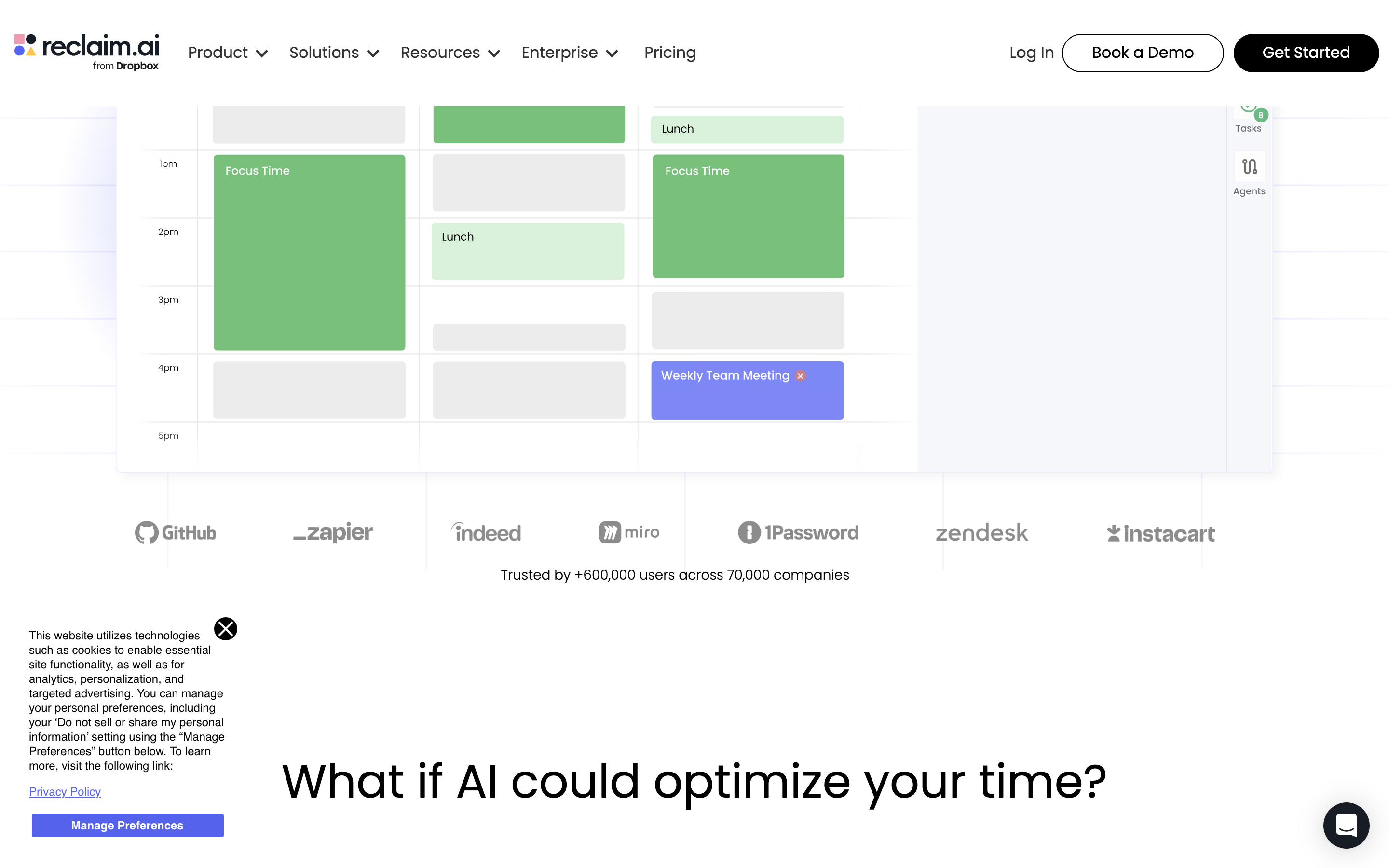
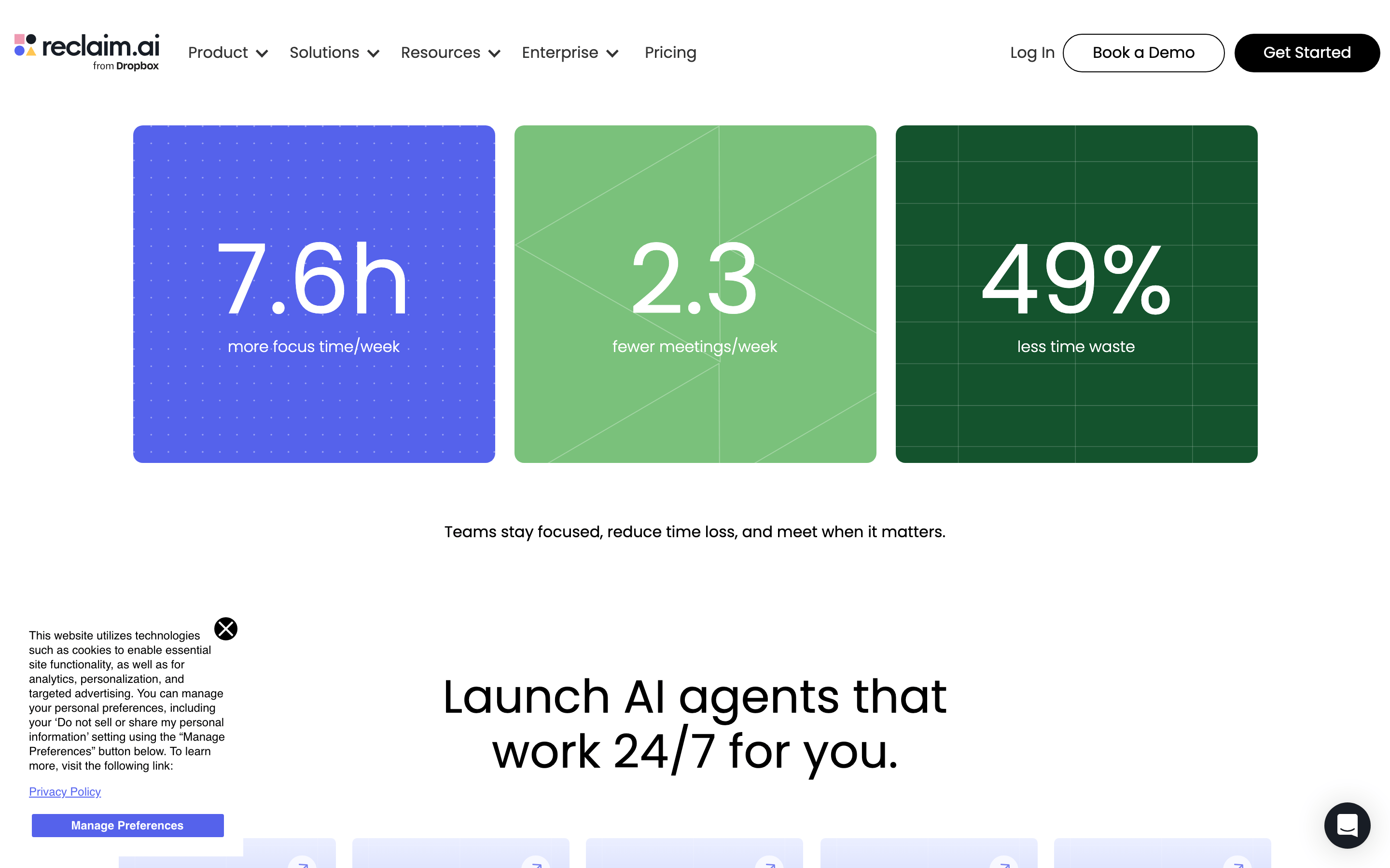
cardSubtle rounded corners (12px) with light background colors (blue, green, dark) and integrated imagery.
chipSmall rounded tags or badges used for status or feature highlights.
inputStandard rounded inputs with subtle borders, often used in forms or search interfaces.
heroMassive typography paired with a product mockup or lifestyle imagery, heavily utilizing white space.
09
Voice & Don'ts
ToneProfessional, confident, and helpful.
HeadlinesDirect, benefit-driven, and emphasizes the 'AI' and 'automated' nature of the product.
CTAsAction-oriented and encouraging, often using 'Get started' or 'Book a demo'.
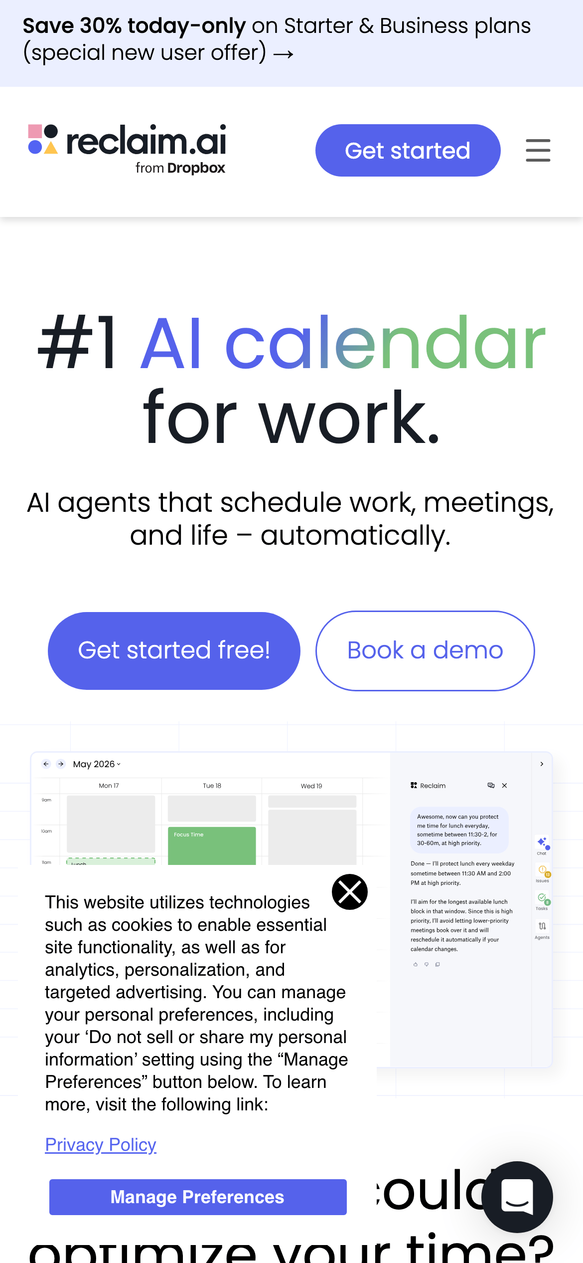
Don't use a dark mode as the primary interface — screenshot shows a predominantly light, white-based theme.
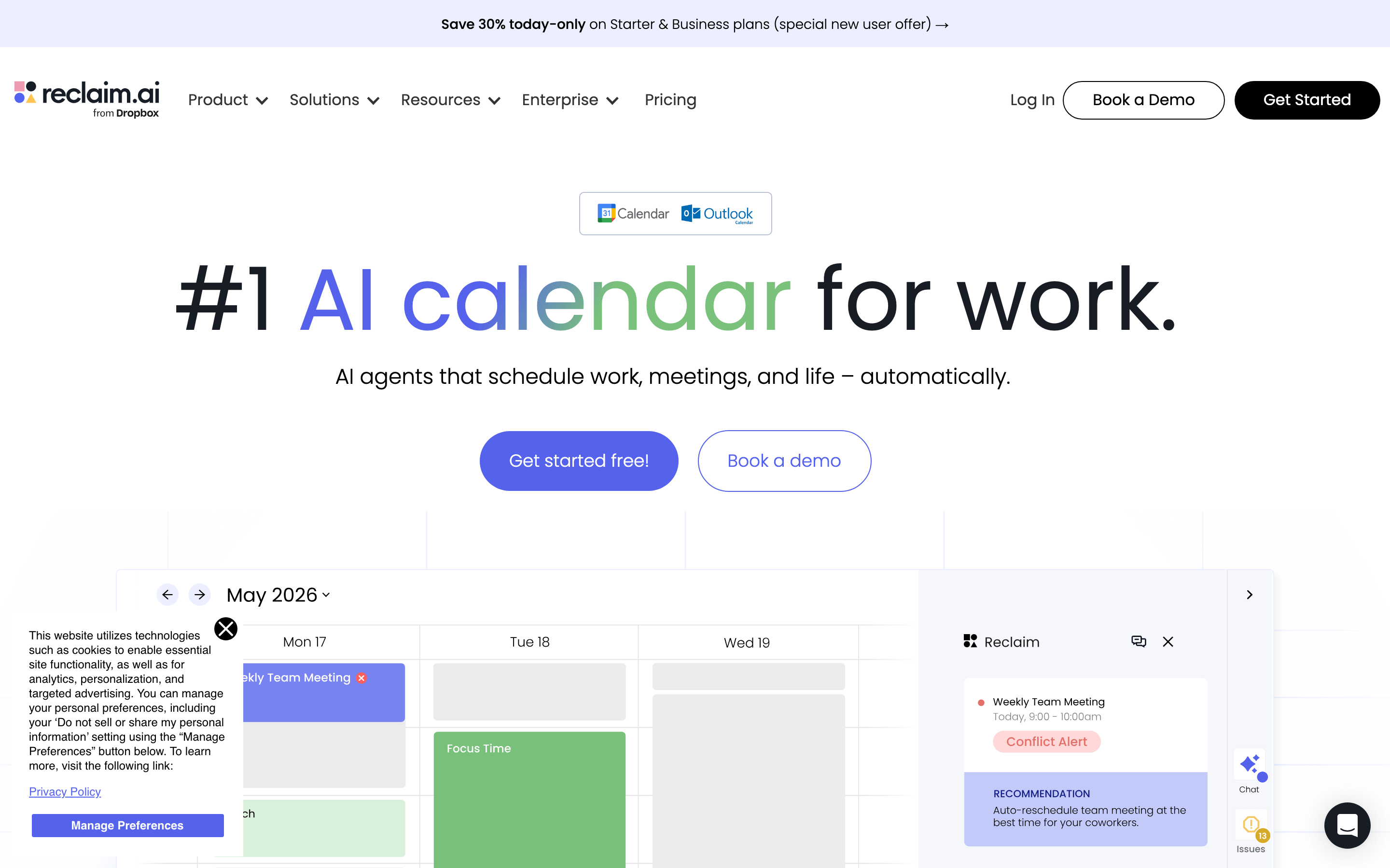
Don't use a single-color gradient for headlines — screenshot shows a multi-color gradient (blue to green) for the word 'calendar'.
Don't use sharp, square corners on primary elements — screenshot shows widely used pill shapes (999px radius) for buttons.
Don't use a crowded or dense layout — screenshot shows generous white space and large typography for clarity.
Don't use decorative or serif fonts for UI text — screenshot shows clean, modern sans-serif fonts throughout.
Don't use muted or low-contrast colors for primary actions — screenshot uses a high-vibrancy blue for main buttons.
Captured from the live site · real computed styles
11
System prompt
Reclaim.ai is an AI-powered productivity SaaS tool focused on automated calendar management. The visual system uses a clean, light-themed aesthetic with a primary accent color of #5562EB (vibrant blue) and a secondary green of #7AC17B. Typography is a mix of geometric and humanist sans-serif fonts, creating a modern and highly readable interface. Key elements include massive, benefit-driven headlines and generous white space. Critical design rules: Do not use sharp square corners on buttons (use pill shapes); do not use dark mode as the primary UI; do not use complex gradients on non-headline text; ensure high contrast for all primary CTAs; maintain a generous amount of whitespace to avoid a cluttered feel.
Bring this taste to your agent
Hand your AI agent a machine-readable spec of this design — tokens, type, motion, the whole DNA.