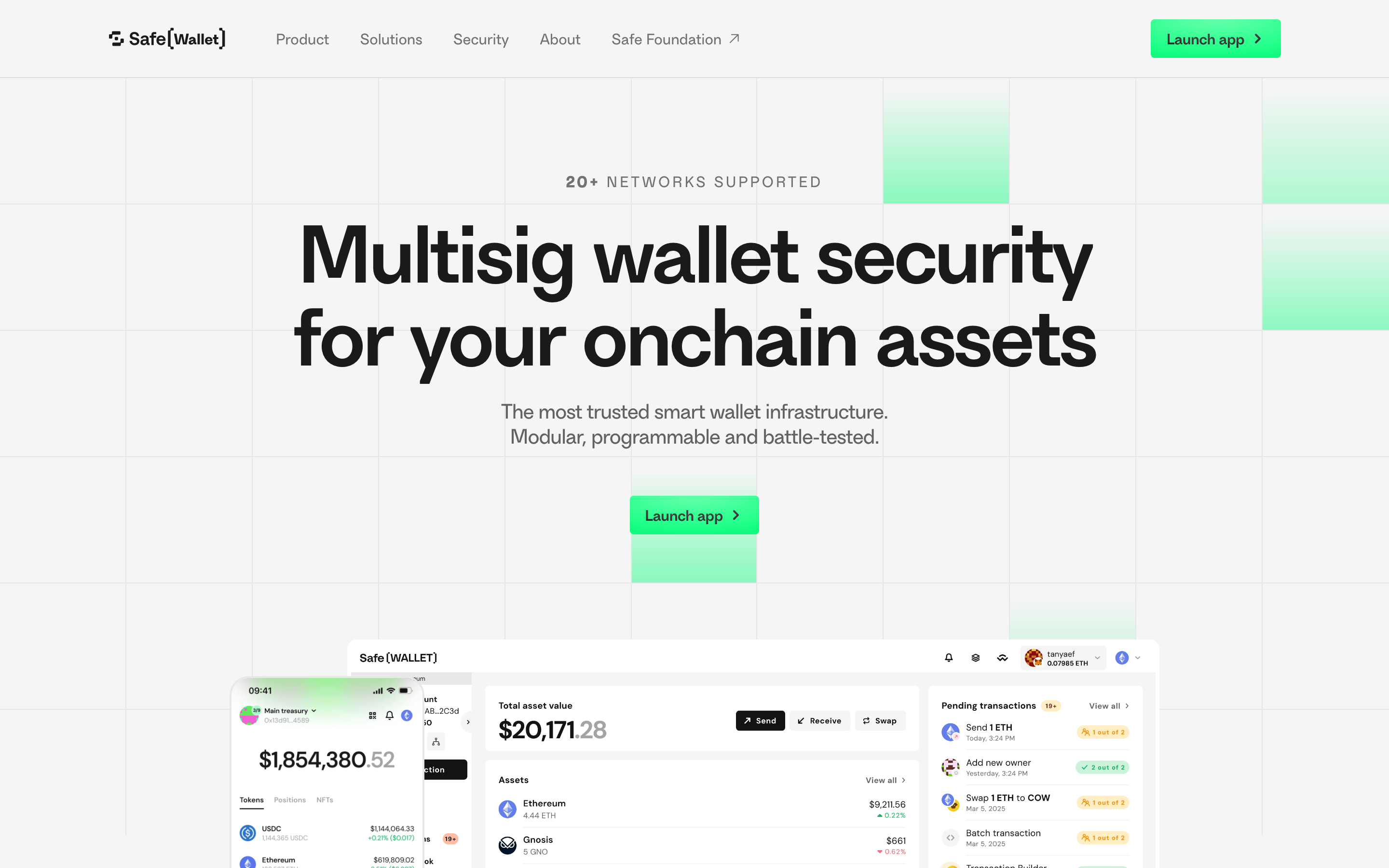
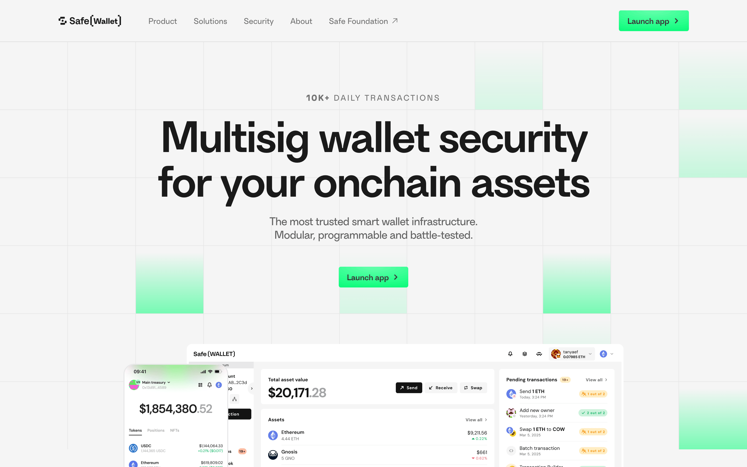
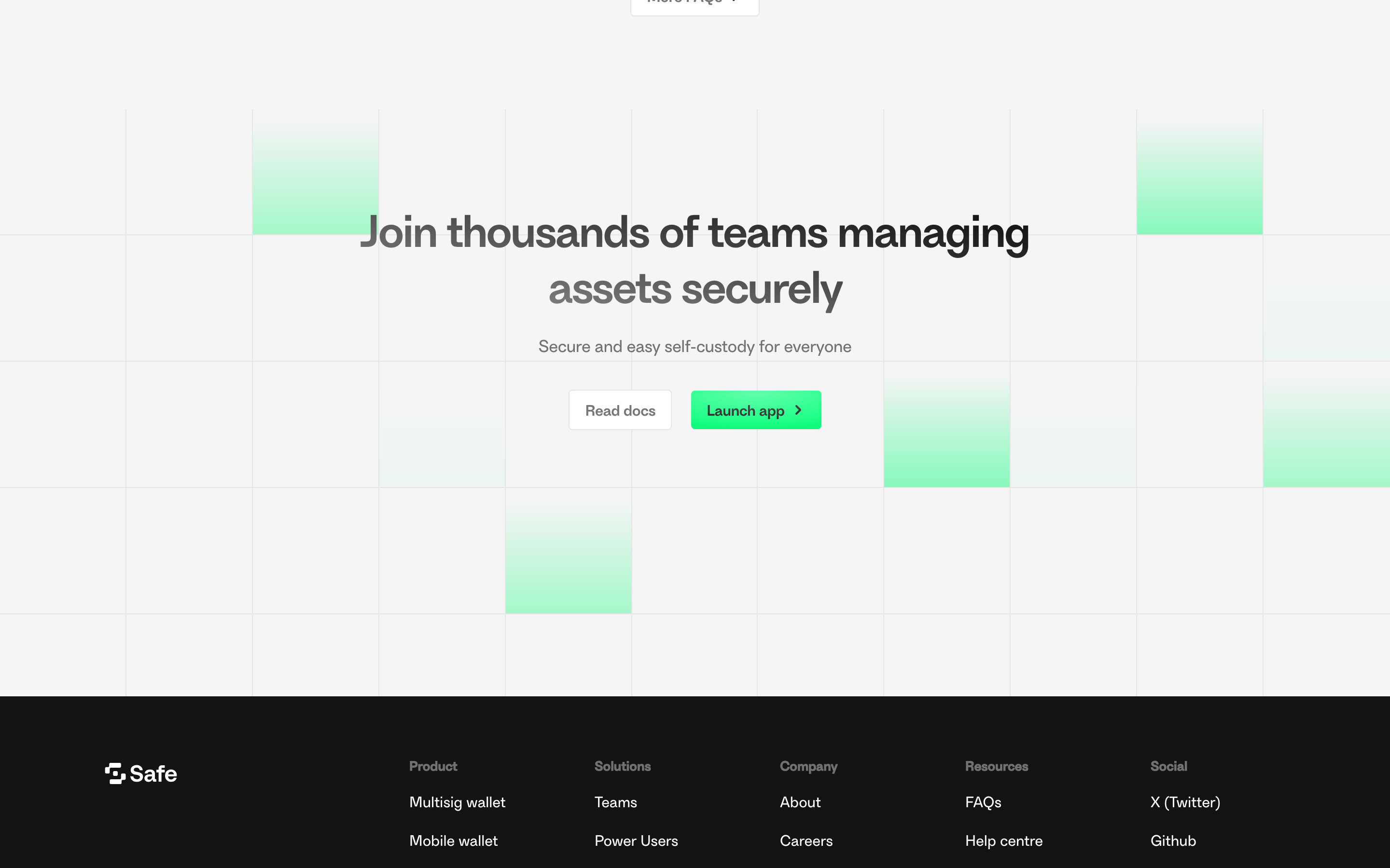
Industrial-grade vault for digital assets, expressed through a clean, clinical interface.
02
Color
#12FF80Accent
#1A1A1AInk
rgba(26,26,26,0.6)Ink soft
#F5F5F5BG
#FFFFFFBG soft
#999999Muted
rgba(26,26,26,0.1)Line
High-contrast light UI anchored by a neon green accent.
03
Typography
geometric-sans · sans-serif
display72px · 500
h240px · 400
body16px · 400
Primary font is a geometric sans-serif with tight tracking on large display sizes. · Text color is almost pure black (#1A1A1A) against light backgrounds. · Secondary text uses reduced opacity for visual hierarchy.
04
Spacing
4px
8px
16px
24px
32px
48px
64px
96px
Generous vertical padding and consistent 4px grid-based spacing.
05
Surfaces
sm · 4px
md · 8px
lg · 16px
pill · 999px
Thin 1px borders in subtle black or white for structural separation.
0px 4px 4px 0px rgba(0,0,0,0.06)
06
Layout
1280container
12columns
24pxgutter
768 / 1024breakpoints
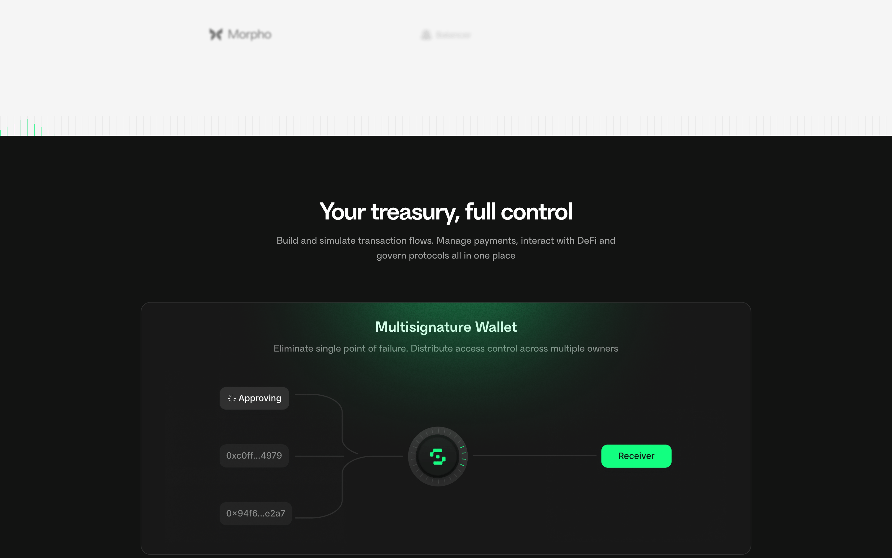
Centered content with a maximum width, transitioning to full-width dark sections.
07
Motion & Interaction
150msmicro
200mssmall
400msmedium
cubic-bezier(0.4, 0, 0.2, 1)easing
Subtle fade-ins for UI elements · Smooth transitions on hover for buttons and links · Cascading animations for data presentation
Background color shift for buttons; opacity change for text links. · Subtle scale or opacity adjustment.
08
Components
buttonPill-shaped primary buttons with bright green background and black text; secondary buttons with thin borders.
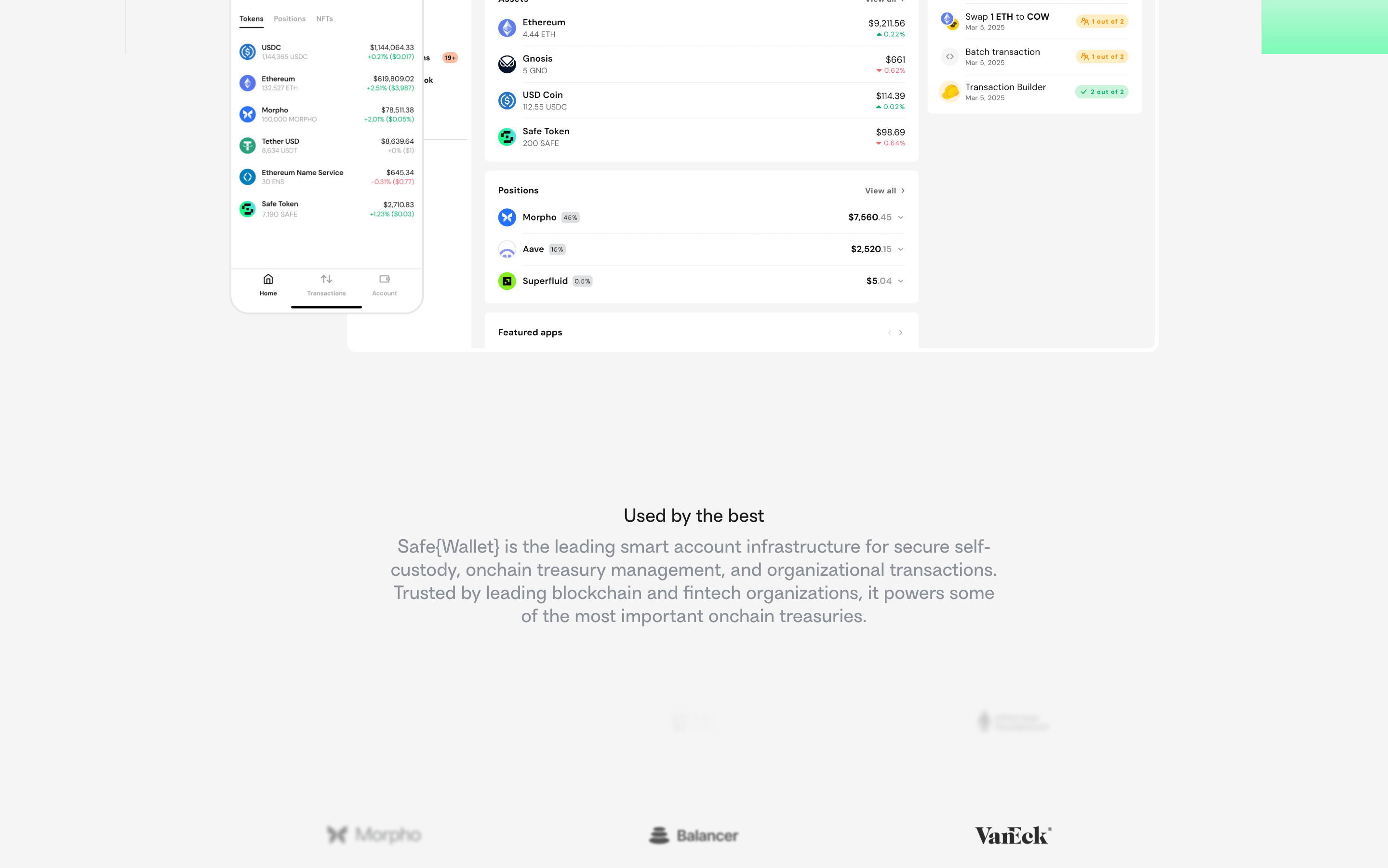
cardMinimal cards with subtle shadows or thin borders, often containing complex UI mockups.
chipSmall, rounded labels for network or status indicators.
inputClean, unbordered or subtly bordered input fields with large padding.
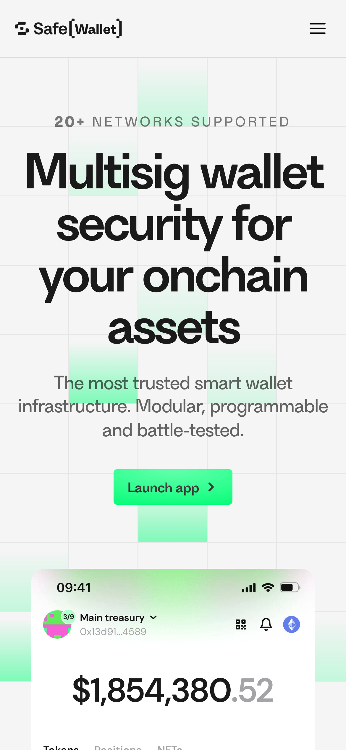
heroMassive typography centered above a floating app interface mockup.
09
Voice & Don'ts
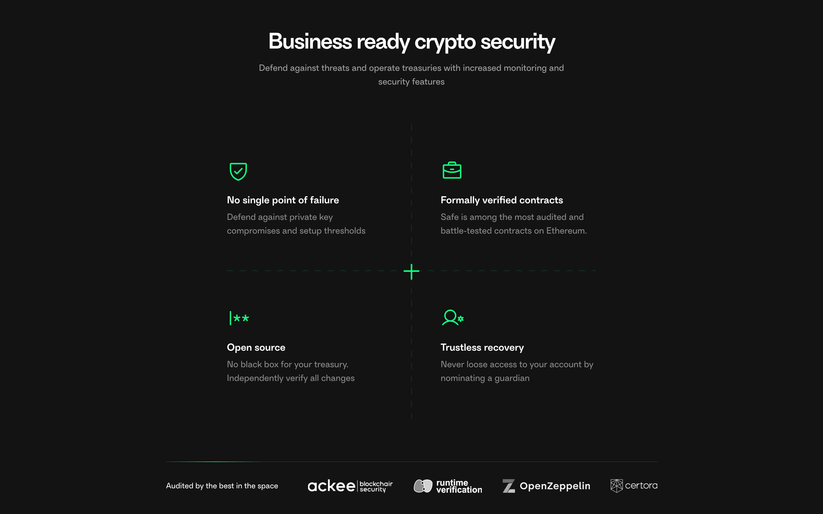
ToneAuthoritative, secure, and technically precise.
HeadlinesBold, declarative statements focusing on security and infrastructure.
CTAsDirect and action-oriented, often just 'Launch app' or 'Get started'.
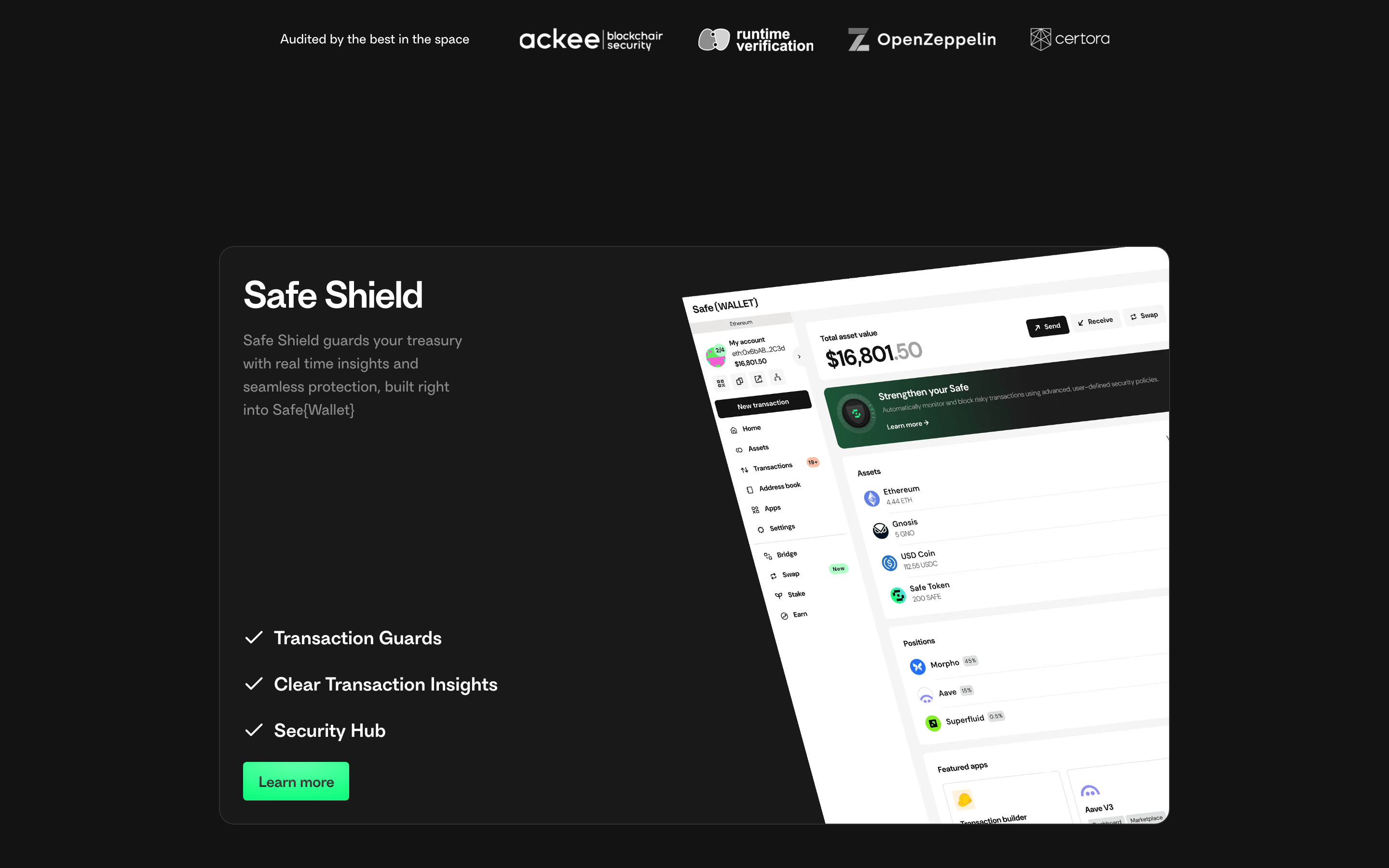
Don't use a dark theme for the primary hero section — the screenshot shows a light grey (#F5F5F5) background.
Don't apply rounded corners to the main buttons — the screenshot shows pill-shaped (fully rounded) buttons.
Don't use thin, light fonts for headlines — the screenshot shows a heavy, geometric sans-serif for display text.
Don't use a multi-colored accent palette — the screenshot shows a single dominant neon green (#12FF80) accent.
Don't use heavy box shadows on cards — the screenshot shows very subtle, almost flat surface depth.
Don't use wide letter-spacing on headlines — the screenshot shows tight, negative tracking on large display text.
Captured from the live site · real computed styles
11
System prompt
This design represents a secure, high-end fintech infrastructure platform (Safe). It uses a clean, light-colored UI (#F5F5F5 background) anchored by a vibrant neon green accent (#12FF80). Typography is a geometric sans-serif, used with tight tracking on large headlines to create a bold, authoritative feel. The layout is centered and spacious, transitioning from a bright hero into deeper, data-rich sections. Key constraints: never use a dark mode for the primary hero, always use the pill-shaped button style, and maintain the high-contrast pairing of black (#1A1A1A) and neon green.
Bring this taste to your agent
Hand your AI agent a machine-readable spec of this design — tokens, type, motion, the whole DNA.