← OpenDesign CURATED · OPEN · FREE
Arbitrum
A premium, bold, and high-contrast fintech platform identity.
web3 infra
01
Identity DNA
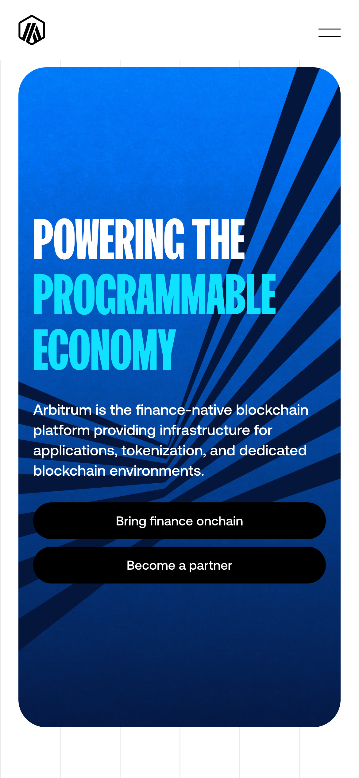
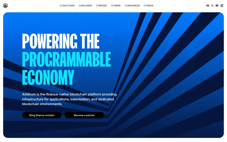
blockchain infrastructure finance programmable economy
A bold, high-contrast fintech dashboard with a futuristic, geometric edge.
02
Color
#10E1FFAccent
#05163DInk
rgba(0, 0, 0, 0.5)Ink soft
#FFFFFFBG
#F2F2F2BG soft
rgba(0, 0, 0, 0.1)Line
High-contrast, bold typography dominates, with a primary blue-cyan accent against deep navy and stark white.
03
Typography
grotesque-sans · geometric-sans · monospace
display 56px · 500h2 40px · 500body 16px · 500small 14px · 500caption 12px · 500All text is uppercase by default · Body text uses a geometric sans-serif · Hero text uses a bold grotesque sans-serif
04
Spacing
4px
8px
16px
24px
32px
48px
64px
96px
Generous padding (40px) and gaps (16px) create a spacious feel.
05
Surfaces
sm · 5px
md · 5px
lg · 20px
pill · 40px
1px solid rgba(0, 0, 0, 0.1)
0px 1px 2px 0px rgba(0, 0, 0, 0.05)
06
Layout
1280 container
12 columns
24px gutter
768 / 1024 breakpoints
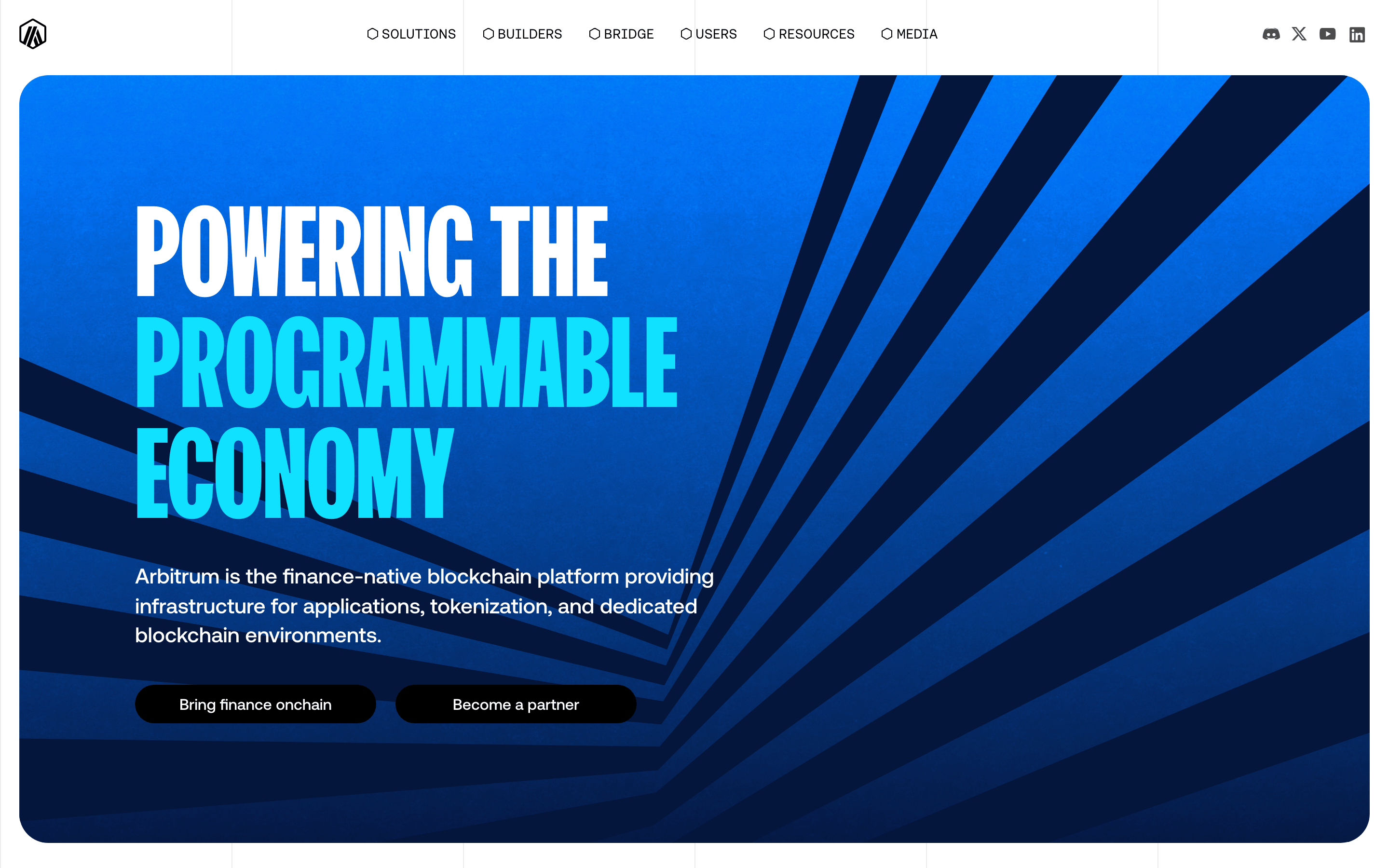
A clean, grid-based layout with generous whitespace and a strong left-aligned hero.
07
Motion & Interaction
220ms micro
300ms small
800ms medium
cubic-bezier(0.4, 0, 0.2, 1) easing
Smooth transitions on all interactive elements · Background color and fill transitions
Subtle background-color or opacity changes · Immediate feedback with slight opacity reduction
08
Components
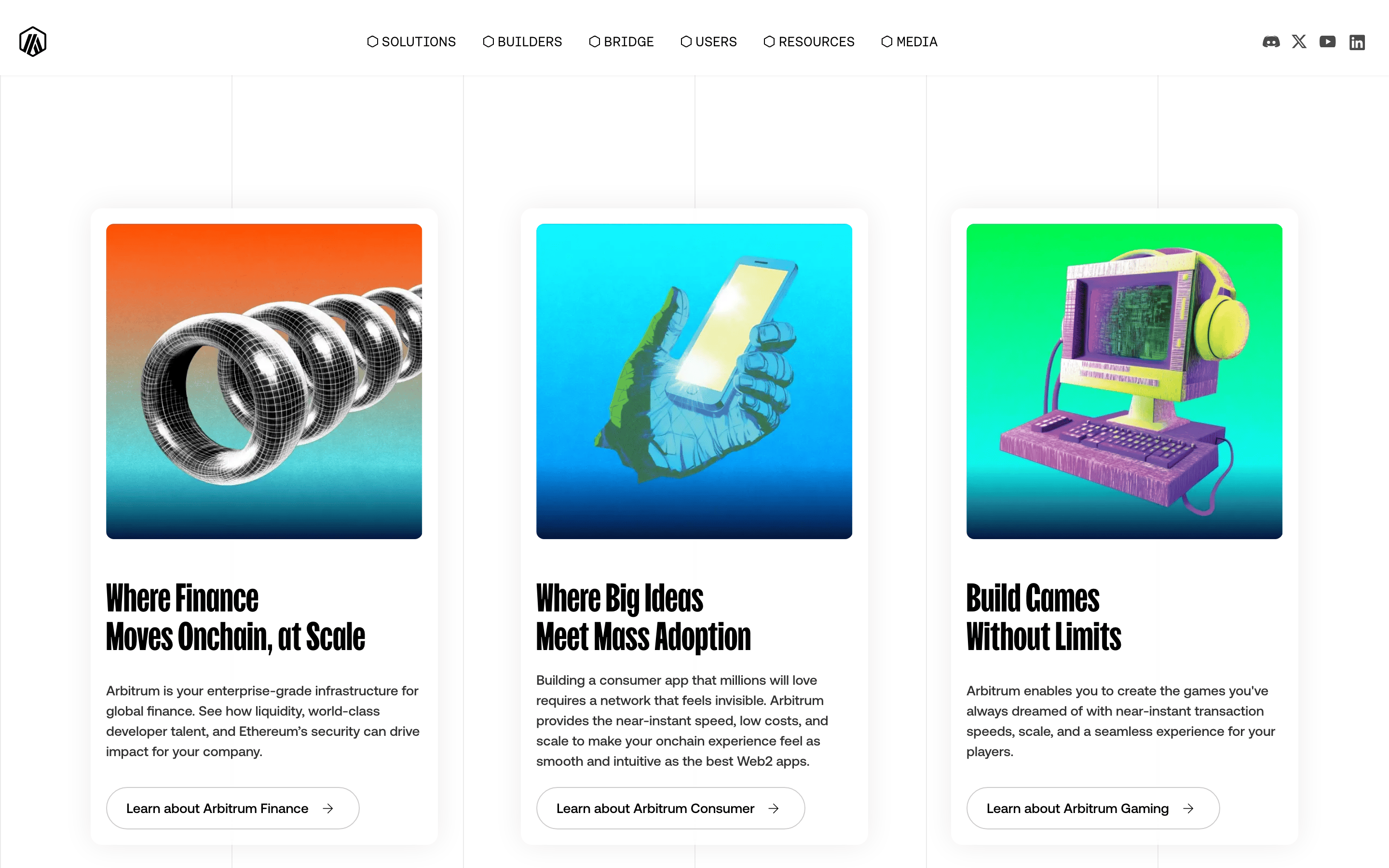
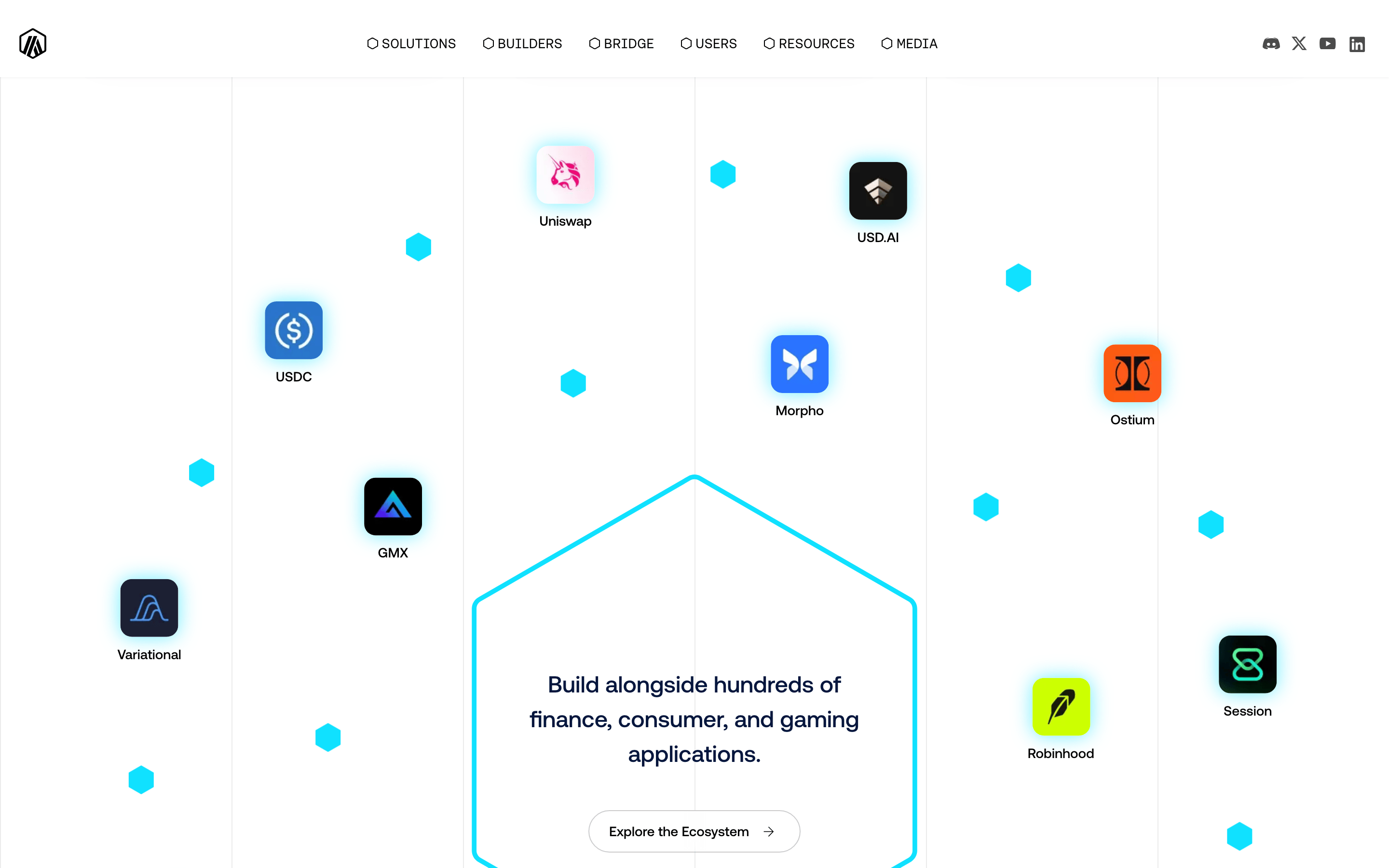
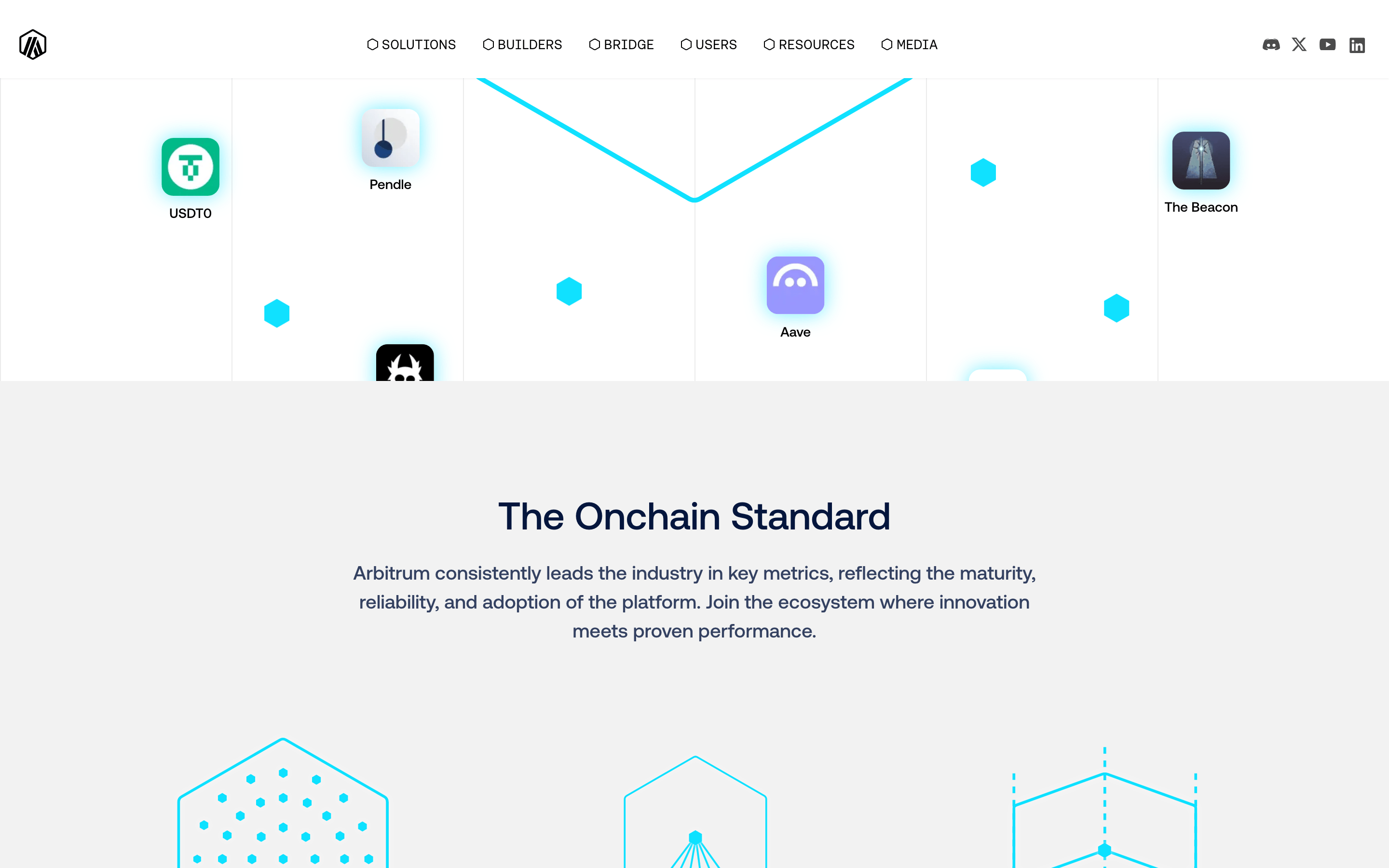
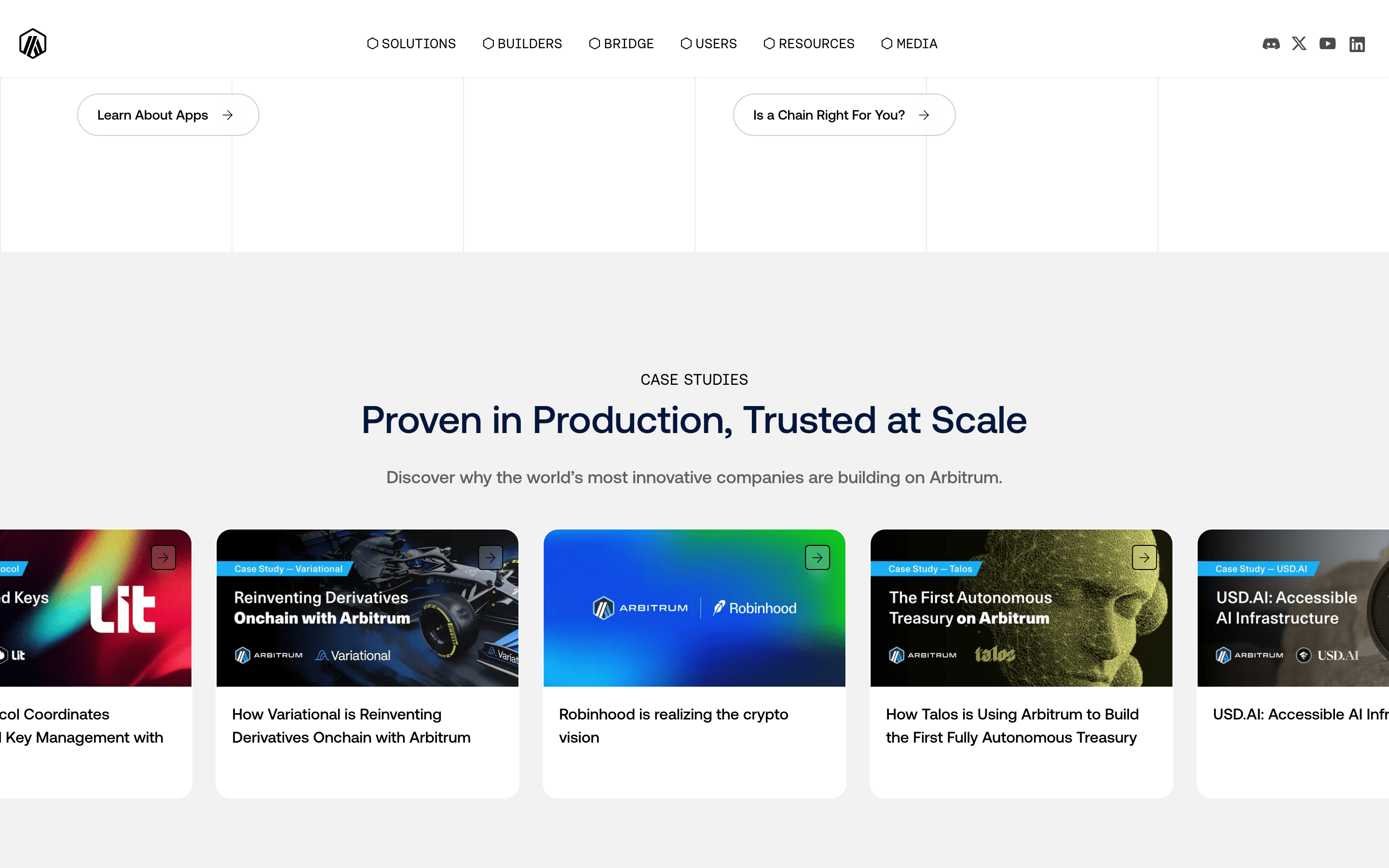
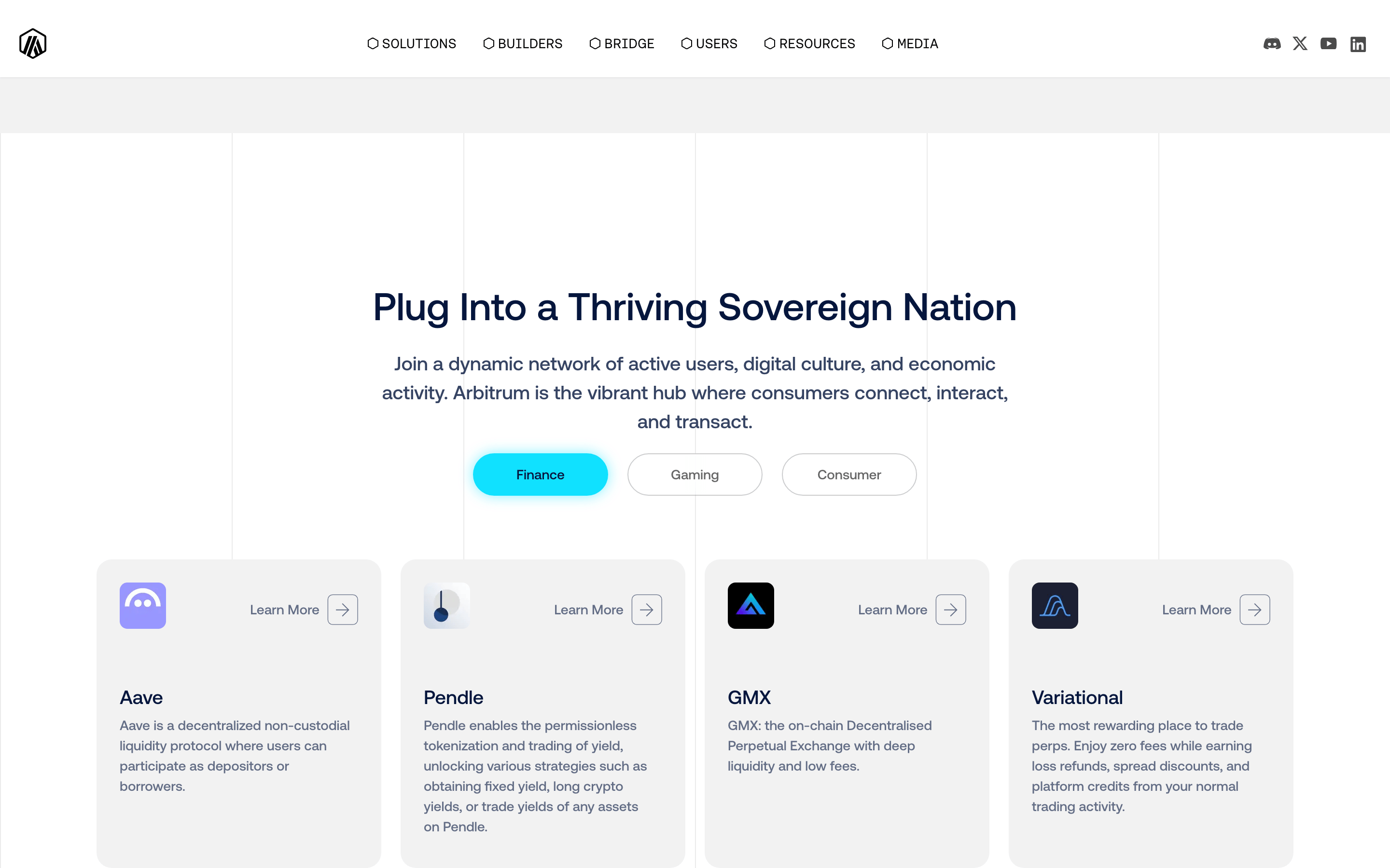
button Pill-shaped buttons with dark backgrounds and white text, or outlined versions with dark text. card Case study cards with rounded corners, a dark background for the image area, and white text below. chip N/A input N/A hero A full-width, deep navy container with a bold, oversized headline and a high-contrast background graphic. 09
Voice & Don'ts
Tone Confident, authoritative, and forward-looking Headlines Bold, uppercase, and declarative CTAs Direct and action-oriented Don't use lowercase for navigation — screenshot shows all-uppercase labels like 'SOLUTIONS' and 'BUILDERS' Don't use thin or light font weights — screenshot shows exclusively medium (500) and semibold (600) weights Don't use rounded corners on primary buttons — screenshot shows pills (40px) for buttons, but sharp (5px) or small (20px) radius for other elements Don't use a soft or pastel color palette — screenshot shows high-contrast navy, white, and a vivid cyan accent Don't use serif fonts — screenshot shows exclusively sans-serif typefaces for all text Don't use a cluttered layout — screenshot shows generous whitespace and a clear, left-aligned hierarchy Avoid: Passive or hesitant language Avoid: Overly casual or playful tone Avoid: Complex jargon without context 10
Inside the pack — real screenshots
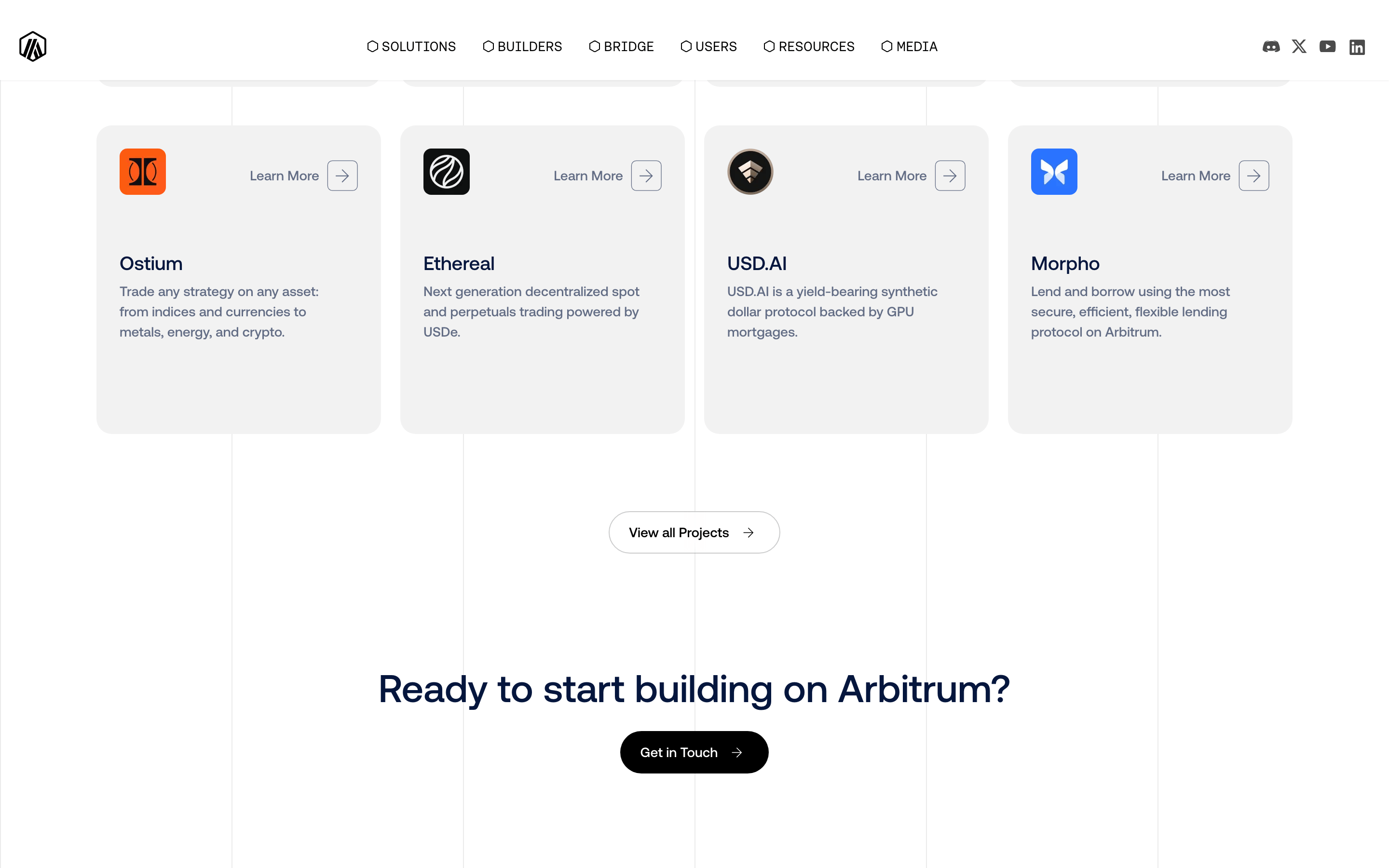
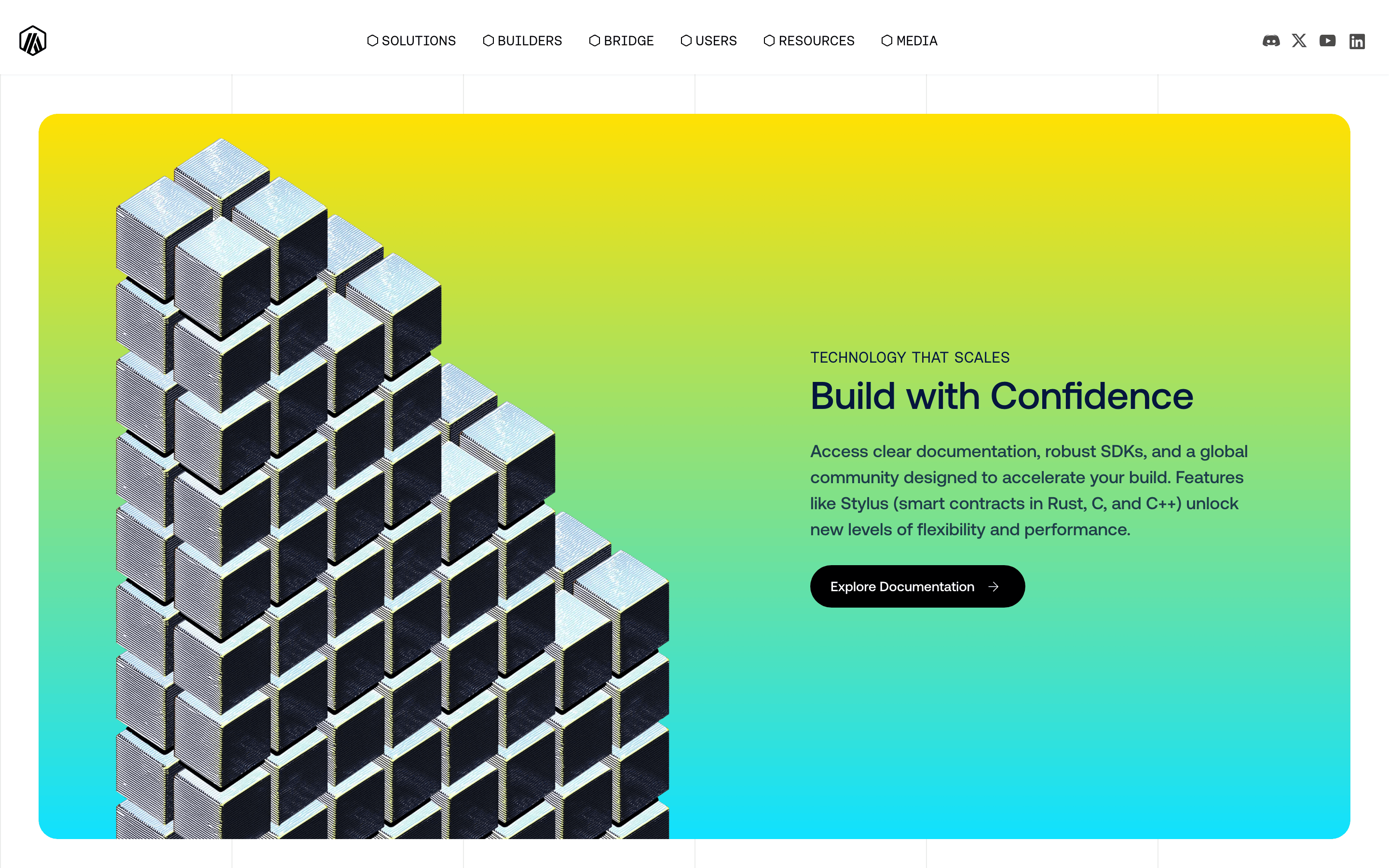
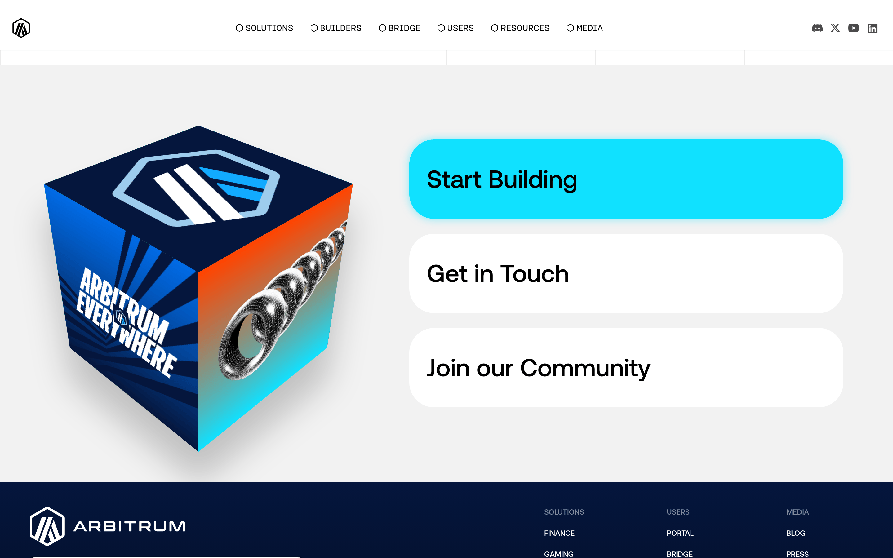
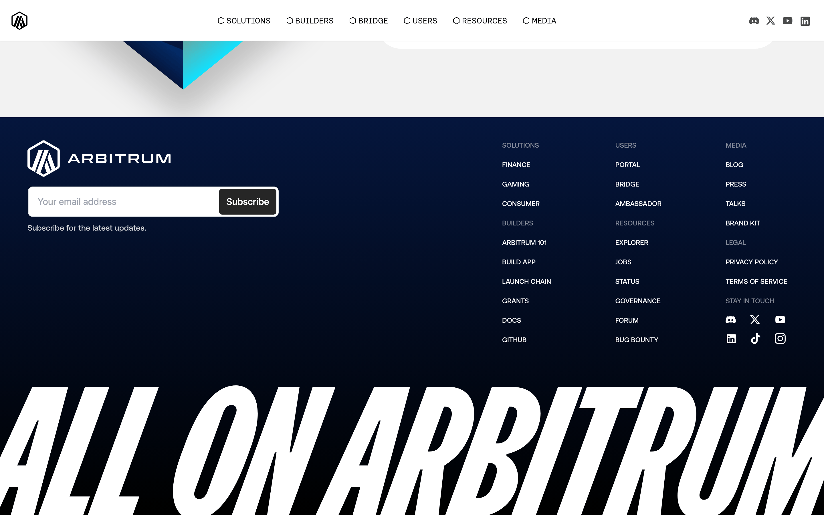
桌面首屏(hero) 桌面滚动分段(90% viewport 步进,作为视觉证据) 桌面滚动分段(90% viewport 步进,作为视觉证据) 桌面滚动分段(90% viewport 步进,作为视觉证据) 桌面滚动分段(90% viewport 步进,作为视觉证据) 桌面滚动分段(90% viewport 步进,作为视觉证据) 桌面滚动分段(90% viewport 步进,作为视觉证据) 桌面滚动分段(90% viewport 步进,作为视觉证据) 桌面滚动分段(90% viewport 步进,作为视觉证据) 桌面滚动分段(90% viewport 步进,作为视觉证据) 桌面滚动分段(90% viewport 步进,作为视觉证据) 桌面滚动分段(90% viewport 步进,作为视觉证据) 桌面滚动分段(90% viewport 步进,作为视觉证据) 桌面滚动分段(90% viewport 步进,作为视觉证据) 移动首屏 Captured from the live site · real computed styles
11
System prompt
Arbitrum's design is a premium, high-contrast fintech identity defined by bold, uppercase typography and a stark navy-and-white palette. The primary accent is a vivid cyan (#10E1FF), used for emphasis against a deep navy (#05163D) background. The typography is exclusively sans-serif, with a grotesque-sans display font for hero sections and a geometric-sans for body text, all set in medium (500) or semibold (600) weights and uppercase by default. Layouts are spacious and grid-based, with generous padding and clear hierarchy. Key donts: do not use lowercase navigation, do not use light font weights, do not use a pastel palette, do not use serif fonts, do not use cluttered layouts, and do not use thin borders or outlines without sufficient contrast.
More from the library en · zh-CN · zh-TW · ja · ko
OpenDesign · curated web aesthetics for AI-readable design DNA · opendesign.cc
Why we curated this: A strong example of a modern, premium fintech identity that uses bold typography and high contrast to convey authority and innovation.
浙ICP备2021038972号-5