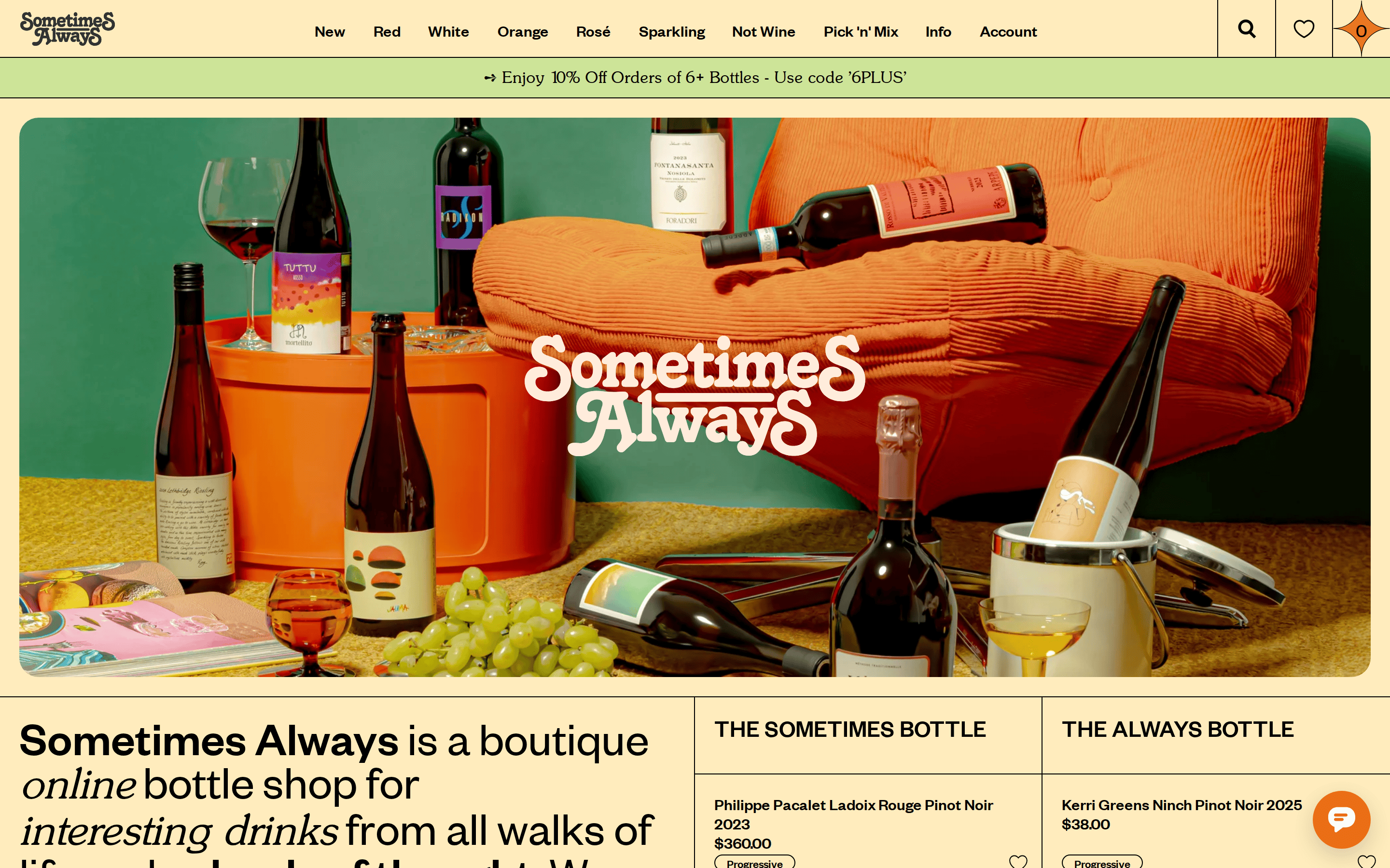
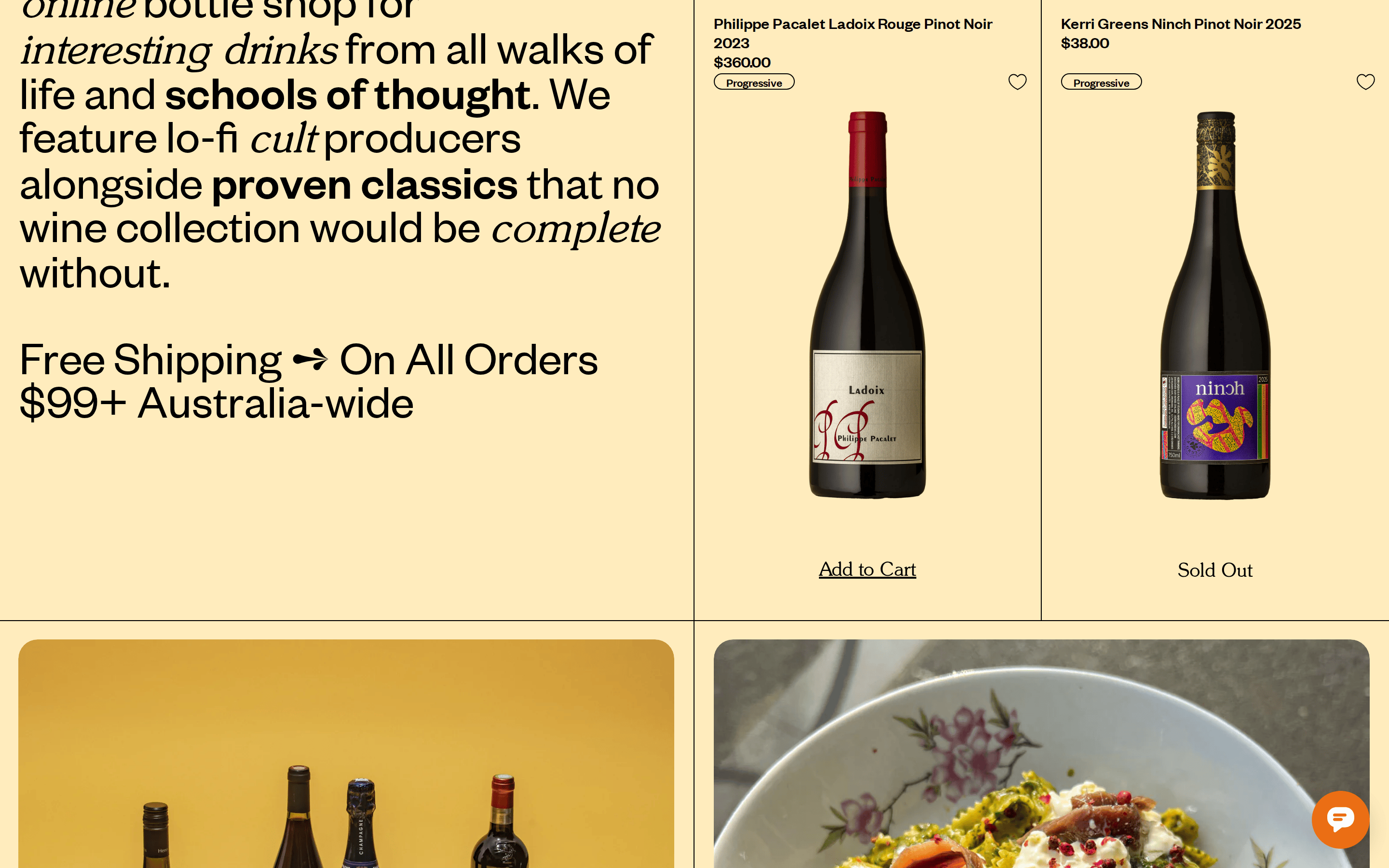
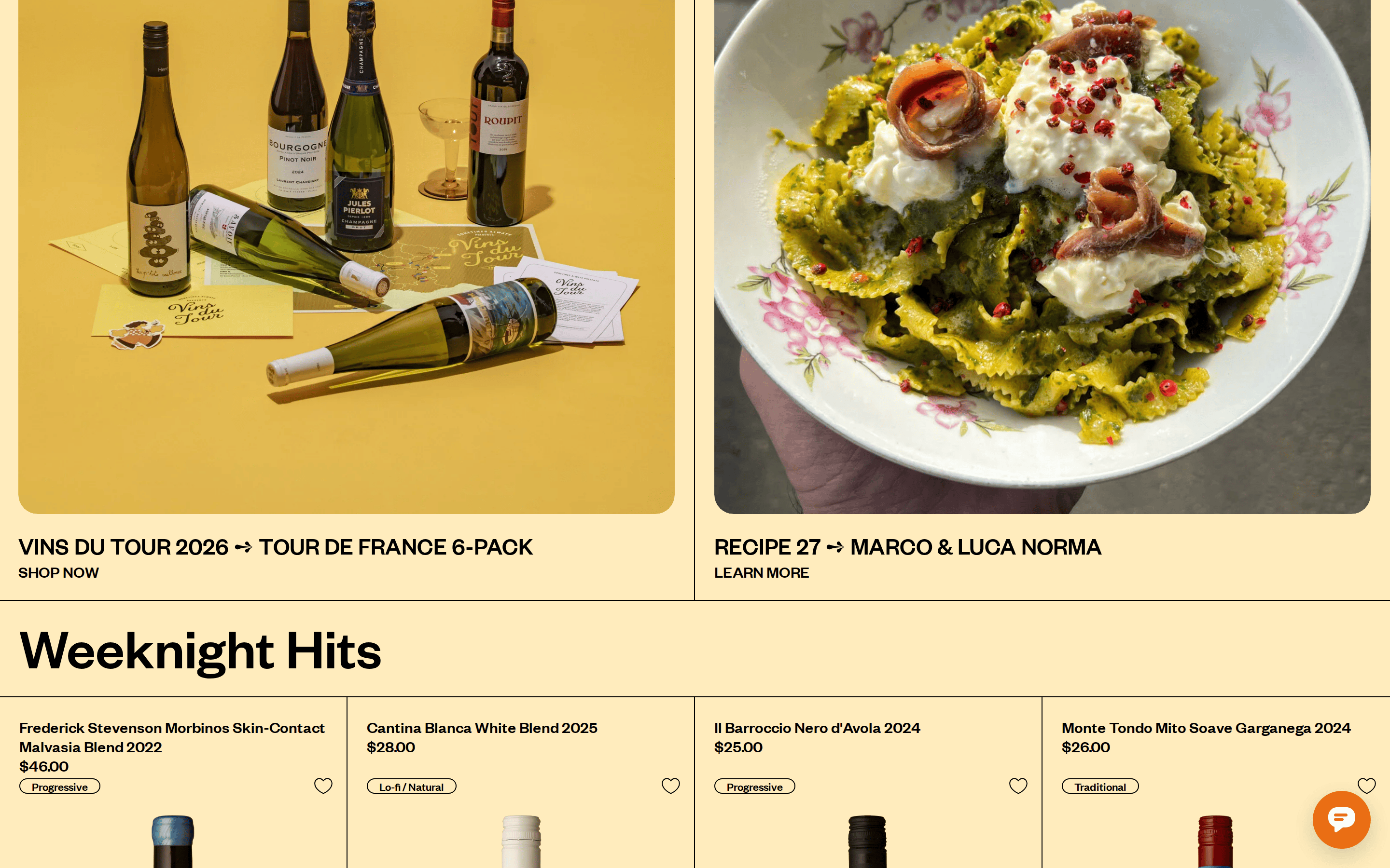
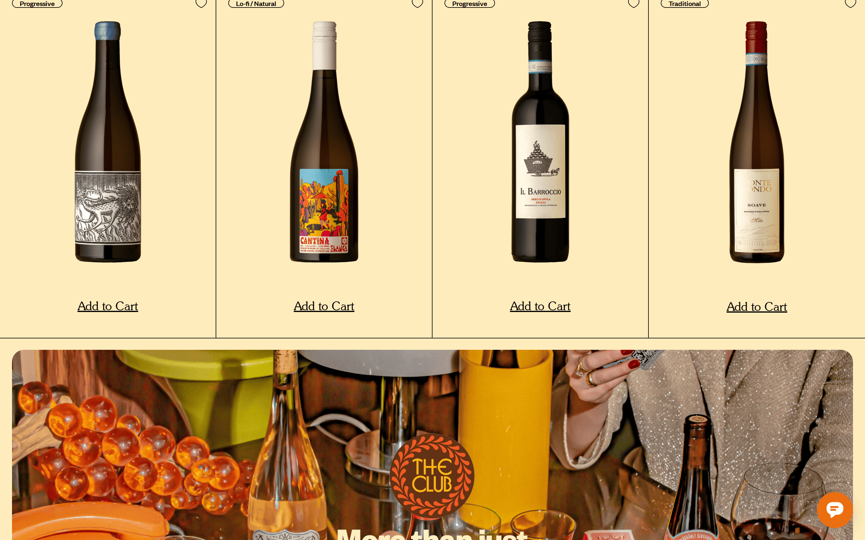
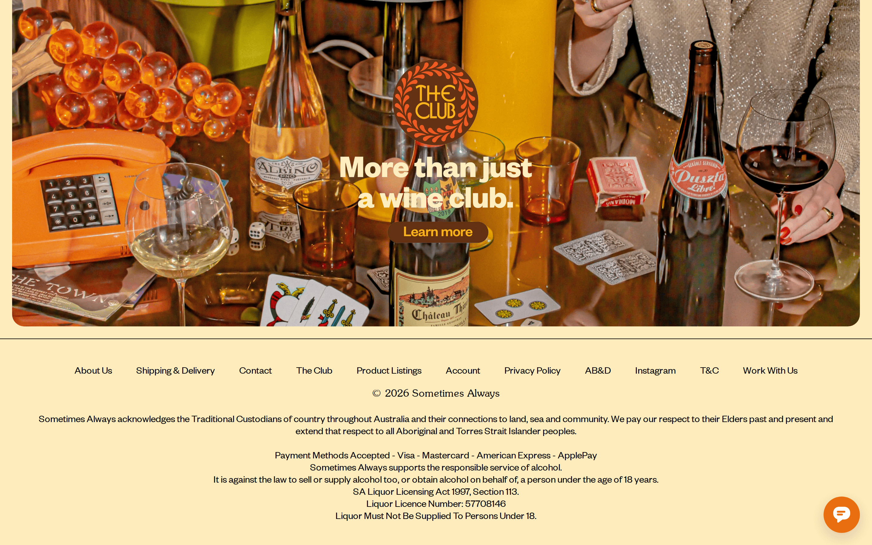
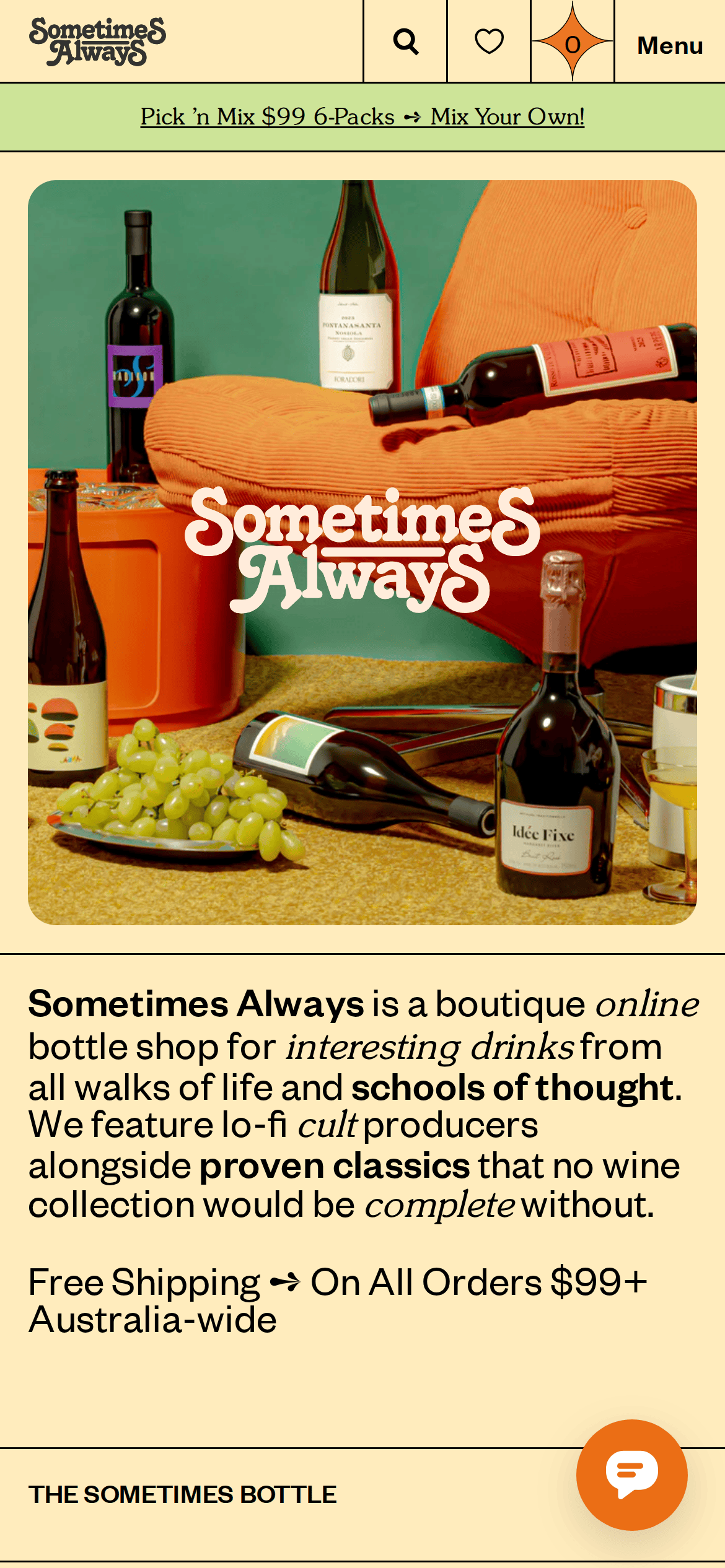
A friendly local bottle shop with a curated, editorial aesthetic.
02
Color
#EBA900Accent
#000000Ink
#333333Ink soft
#FFE9C7BG
#555555Muted
rgba(0,0,0,0.1)Line
Warm, earthy background with high-contrast black typography and a vibrant orange accent for interactive elements.
03
Typography
didone-serif · grotesque-sans
display50px · 400
h140px · 400
body20px · 400
caption12px · 400
Use SunsetSerial-Light for the main display logo and serif accents. · Use Founders Grotesk for all body text, navigation, and UI elements. · Apply bold weight sparingly, mainly for emphasis within sentences.
04
Spacing
4px
8px
16px
20px
24px
32px
48px
64px
Generous padding (20px) on interactive elements and consistent gaps (20px) in grid layouts.
Captured from the live site · real computed styles
11
System prompt
This is a boutique online bottle shop for interesting drinks. The design DNA is warm, playful, and editorial, centered around a soft peach background (#FFE9C7) and crisp black typography. It uses a combination of a playful serif (SunsetSerial) for the logo and display text, and a clean grotesque sans (Founders Grotesk) for all body copy and UI elements. A vibrant orange (#EBA900) serves as the primary accent. Critical don'ts: Don't use cold, clinical white backgrounds; instead, use warm, earthy tones. Don't use sharp corners; screenshots show large 20px or 40px rounded corners on all cards and images. Don't use rigid, corporate layouts; the design is image-forward and editorial. The layout is responsive, featuring full-width promotional banners and a grid-based product display. Interactive elements have generous padding and subtle transitions.
Bring this taste to your agent
Hand your AI agent a machine-readable spec of this design — tokens, type, motion, the whole DNA.