A robust, developer-focused toolkit for building secure identity layers, balancing technical depth with enterprise-grade reliability.
02
Color
#1D1D1DInk
#525151Ink soft
#FBFAF9BG
#F2F0EEBG soft
#CECECEMuted
rgba(29,29,29,0.15)Line
High-contrast monochrome palette with a warm white base, prioritizing legibility and professional restraint.
03
Typography
humanist-sans · monospace
display64px · 700
headline48px · 700
body16px · 400
code14px · 400
Use Booton/BootonUncommon for hero displays and major headings. · Use Chivo Mono for all body text, navigation, buttons, and technical elements. · Maintain tight letter-spacing (-1px to -2px) for large display type.
04
Spacing
4px
8px
16px
24px
32px
48px
64px
96px
Consistent 4px-based spatial rhythm with generous padding in hero sections (48px).
05
Surfaces
sm · 4px
md · 8px
lg · 12px
pill · 999px
1px solid borders using ink and muted tones, often applied directionally (bottom/right).
rgba(0, 0, 0, 0.5) 0px 8px 10px 0px
06
Layout
1280container
12columns
24pxgutter
768 / 1024breakpoints
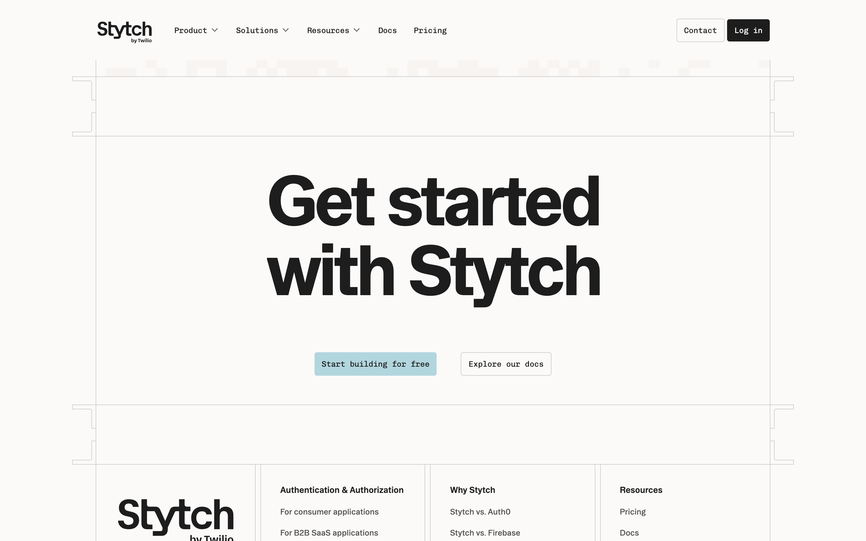
Centered content container with a clean, single-column flow for hero sections.
07
Motion & Interaction
150msmicro
300mssmall
800msmedium
cubic-bezier(0.87, 0, 0.13, 1)easing
Subtle transform transitions for interactive elements. · Smooth easing curves for hover states and focus changes.
Subtle opacity or background color shifts. · Minimal visual feedback, relying on state changes.
08
Components
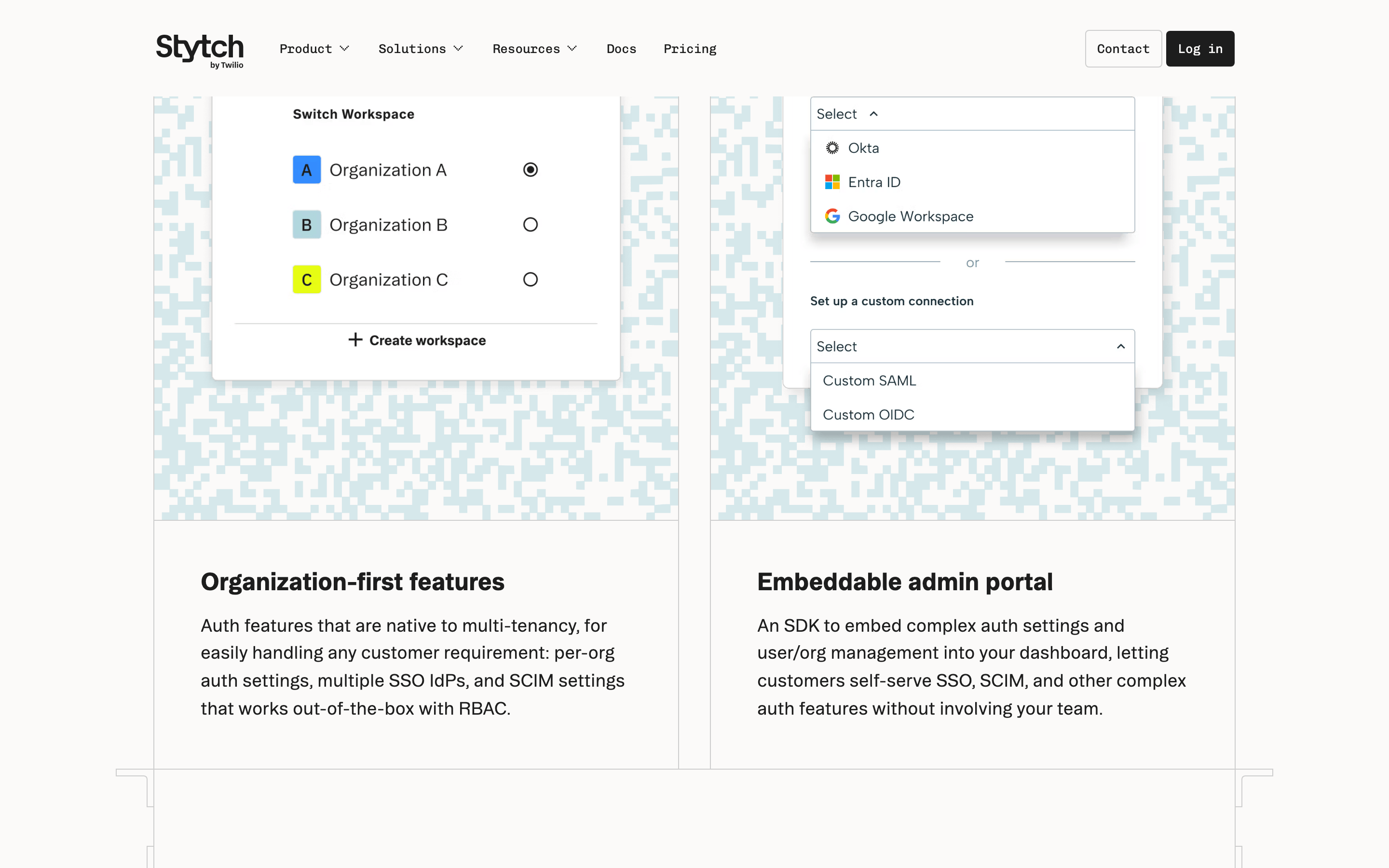
buttonMonochrome buttons with solid fills (ink or white), subtle 4px radius, and monospace text.
cardClean, bordered containers with subtle background shifts (bgSoft) and directional corner accents.
chipSmall monospace text labels with subtle borders.
inputStandard text inputs with light borders.
heroMassive centered typography with a high-contrast ink color against a warm white background.
09
Voice & Don'ts
ToneProfessional, direct, and technically precise.
HeadlinesBold, large-scale typography with negative letter-spacing.
CTAsAction-oriented, monospace text on high-contrast buttons.
Don't use vibrant gradients — screenshot shows a monochrome, flat color palette instead.
Don't use a playful or rounded serif font — screenshot uses a geometric/monospace-heavy system.
Don't use large, colorful icons — screenshot relies on typography and subtle borders.
Don't use dark mode as the default — screenshot shows a light, warm-white background.
Don't use decorative illustrations — screenshot focuses on code snippets and clean UI.
Don't use excessive shadows — screenshot shows very minimal, flat layering.
Avoid: Avoid overly decorative or whimsical language.
Avoid: Avoid complex gradients or vibrant color accents.
Captured from the live site · real computed styles
11
System prompt
Stytch is a professional, developer-focused identity platform using a high-contrast monochrome palette. The primary colors are a warm white (#FBFAF9) and near-black ink (#1D1D1D), with muted grays (#525151, #CECECE) for secondary text. Typography is dominated by a humanist-sans for display (Booton) and a clean monospace (Chivo Mono) for body and technical UI. Avoid vibrant color accents, complex gradients, or playful, whimsical elements. Critical design constraints: prioritize monospace typography for all functional text, use 4px-based spacing with generous padding in hero sections, and maintain a strictly flat, high-contrast visual language. Ensure all UI components remain clean, bordered, and legible.
Bring this taste to your agent
Hand your AI agent a machine-readable spec of this design — tokens, type, motion, the whole DNA.