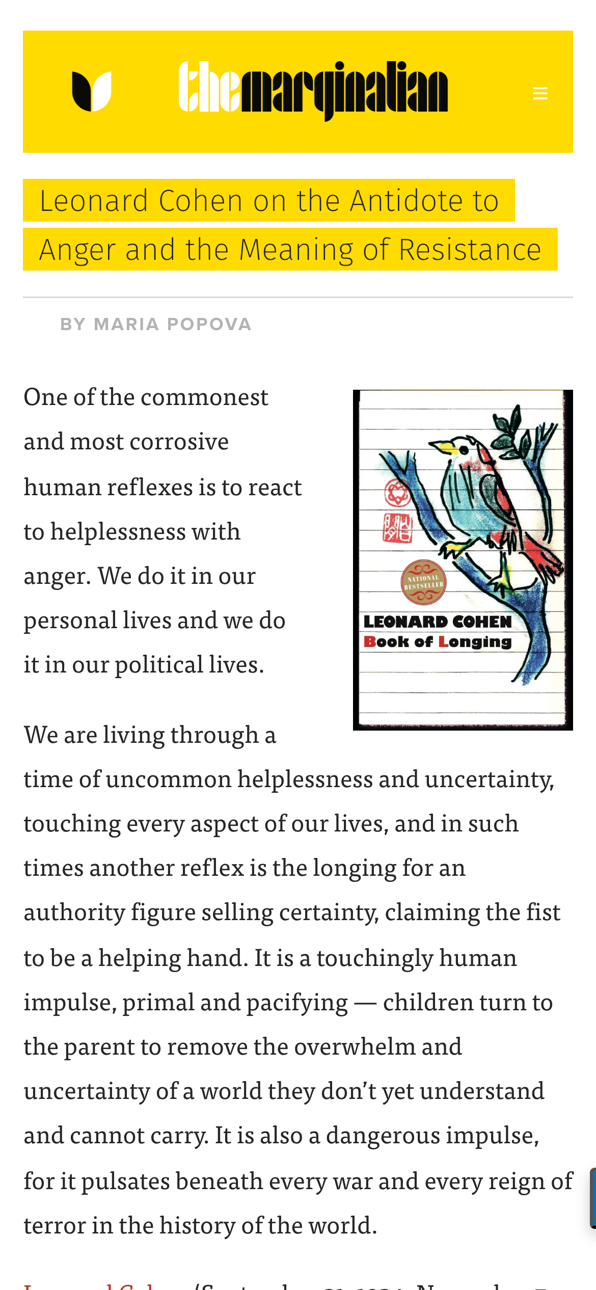
Body text uses a highly legible transitional serif (ff-tisa-web-pro / Georgia) with generous line-height. · Headlines often feature bold yellow rectangular highlights. · Captions and labels use a clean geometric sans-serif with uppercase transformation and tracked spacing.
04
Spacing
4px
8px
12px
16px
24px
32px
48px
64px
A vertical rhythm based on generous line-heights (1.8) for the primary body text.
05
Surfaces
sm · 3px
md · 8px
lg · 25px
pill · 999px
Solid borders in muted grey or primary ink color.
rgba(0, 0, 0, 0.2) 0px 4px 10px 0px
06
Layout
1024container
12columns
24pxgutter
768 / 1024breakpoints
Three-column grid on desktop with a wide main content area, flanked by a sidebar for related content or callouts.
07
Motion & Interaction
220msmicro
300mssmall
500msmedium
cubic-bezier(0.4, 0, 0.2, 1)easing
Smooth scrolling for longform content · Subtle fades for image and section transitions.
Color shift on links and subtle opacity changes on sidebar items. · Standard text selection and navigation.
08
Components
buttonText-based links or rounded pills, often using uppercase tracking.
cardText-heavy sidebar cards with thin top/bottom borders.
chipNo standard chips; emphasis is created through bold yellow background highlights.
inputMinimalist text inputs with subtle bottom borders.
heroFull-width yellow header with a large, stylized black logotype.
09
Voice & Don'ts
ToneIntellectual, humanistic, reflective, and deeply curated.
HeadlinesDescriptive and philosophical, often formatted with bold yellow highlights.
CTAsSupportive and mission-driven, focusing on the value of human labor and patronage.
Don't use stark geometric fonts for body text — the screenshot shows a traditional, highly readable serif instead.
Don't use a complex multi-column grid for articles — the screenshot shows a single, narrow column for optimal reading flow.
Don't use neutral, desaturated palettes — the screenshot prominently features a vibrant, high-chroma yellow.
Don't use heavy drop shadows — the screenshot shows flat surfaces with minimal depth.
Don't use tight line-heights — the screenshot uses a very generous line-height of 1.8 for body text.
Don't use cluttered navigation — the screenshot shows a clean, minimal header with a focus on the brand identity.
Captured from the live site · real computed styles
11
System prompt
The Marginalian is a digital magazine focused on multidisciplinary storytelling, combining science, philosophy, and art with a warm, intellectual tone. The visual system is defined by a signature vibrant yellow (#FFDB00) used for headers and text highlights, paired with a clean white background (#FFFFFF) and high-contrast ink (#262626). Typography relies on humanist and transitional serifs for a refined, book-like feel. The layout is strictly text-first, prioritizing longform readability over flashy visuals. Key constraints: don't use sans-serifs for body text, don't use tight line spacing, and don't use complex, cluttered UI components. The design must feel like a curated library, emphasizing clarity, human-centric content, and intellectual depth over modern digital noise.
Bring this taste to your agent
Hand your AI agent a machine-readable spec of this design — tokens, type, motion, the whole DNA.