High-contrast dark mode with a single, vibrant neon green accent for focus.
03
Typography
humanist-sans · monospace
display64px · 400
h148px · 400
body16px · 400
caption14px · 400
Headlines use tight tracking (-1px) and standard weights. · Body text is clean and highly legible in light gray on dark backgrounds. · Monospaced font is used for technical terms, tags, and developer-focused UI elements.
04
Spacing
4px
8px
16px
24px
32px
48px
64px
96px
Consistent 8px and 16px increments create a tight, efficient grid.
05
Surfaces
sm · 4px
md · 8px
lg · 12px
pill · 999px
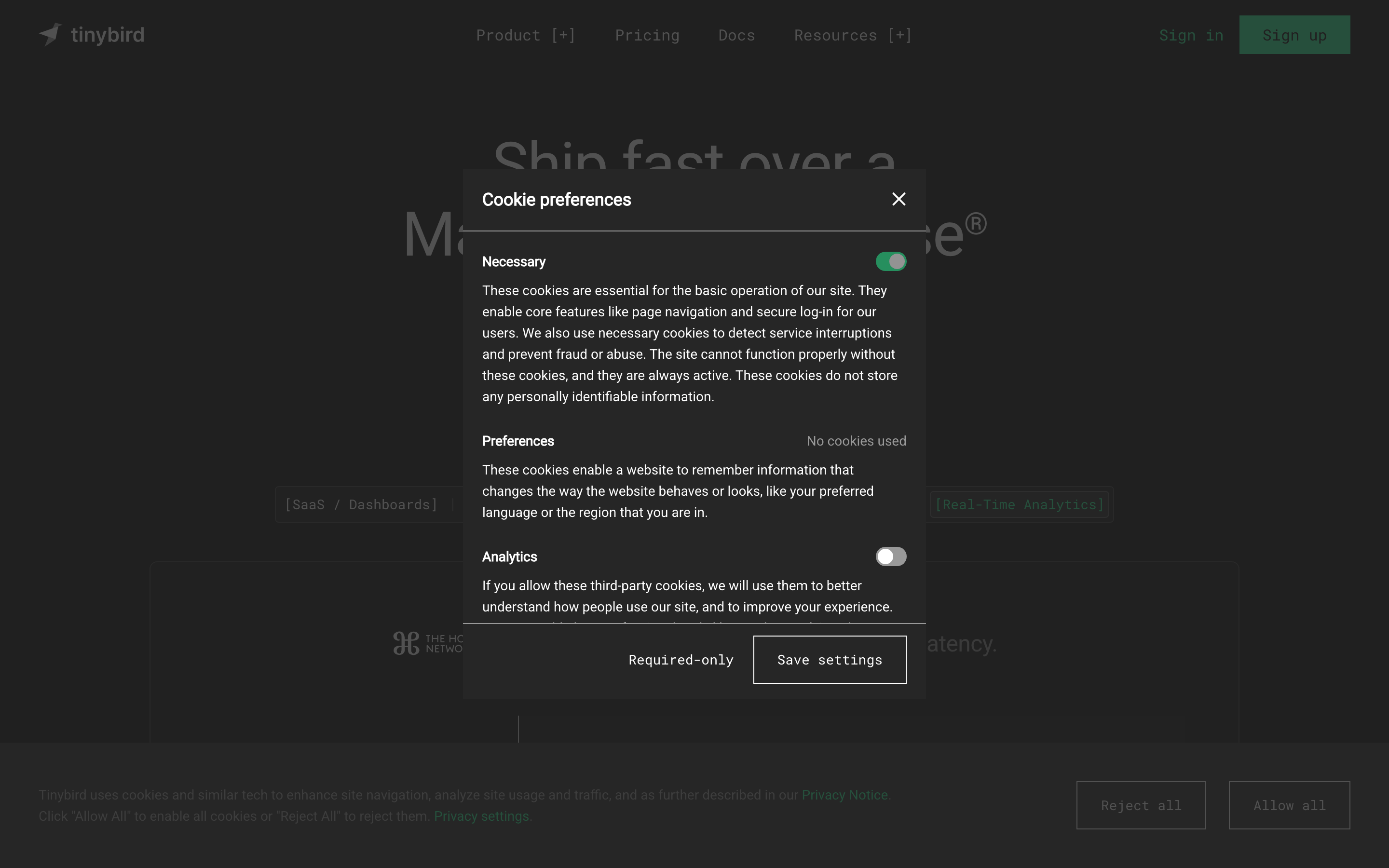
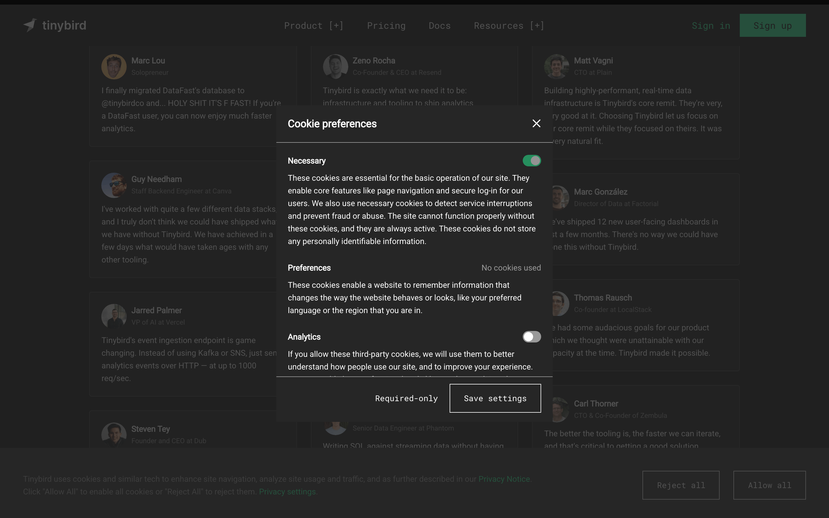
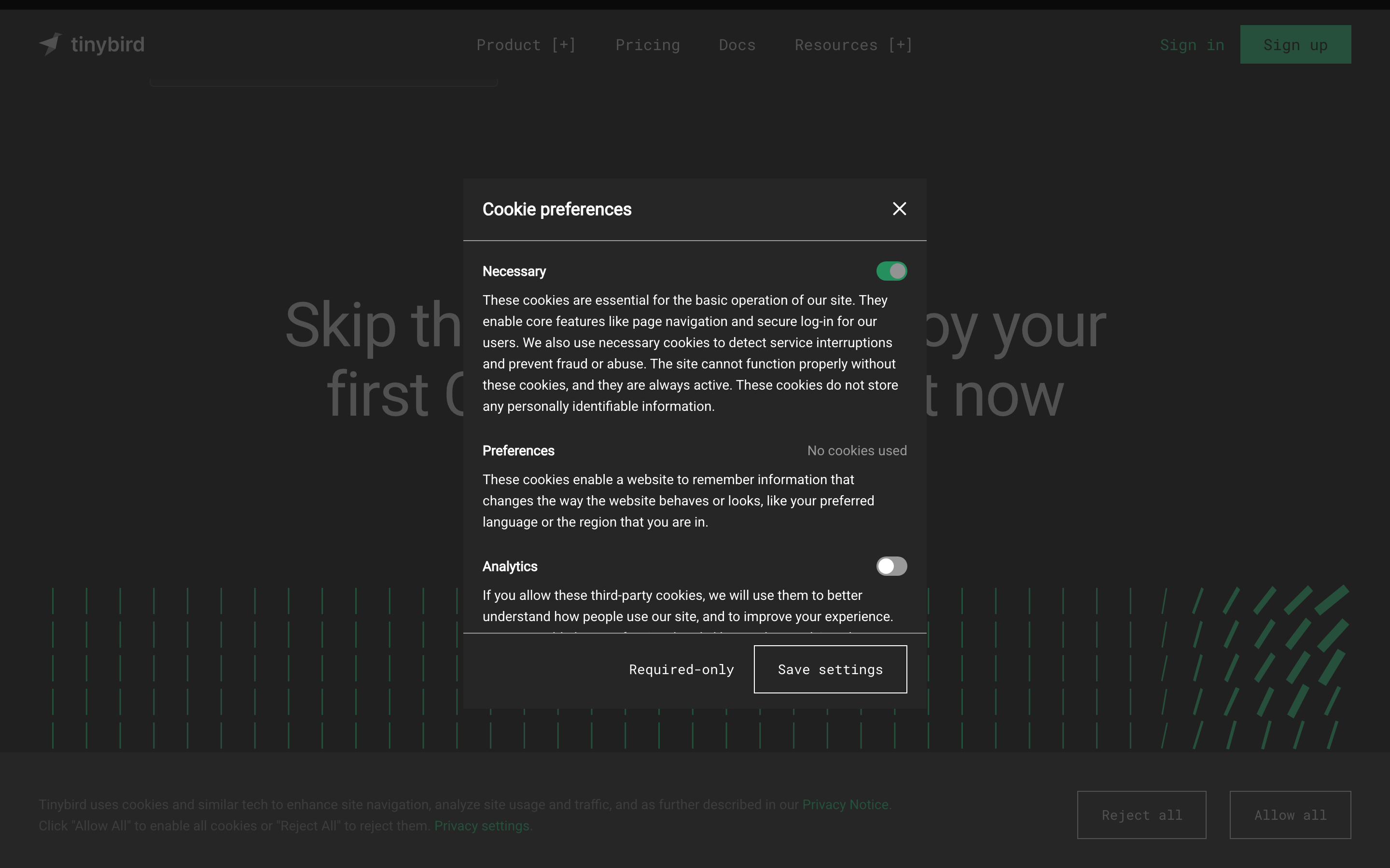
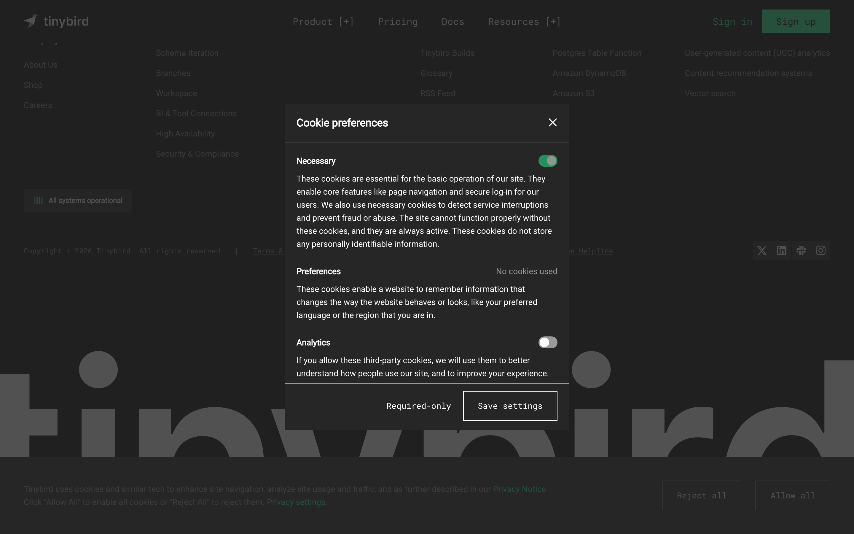
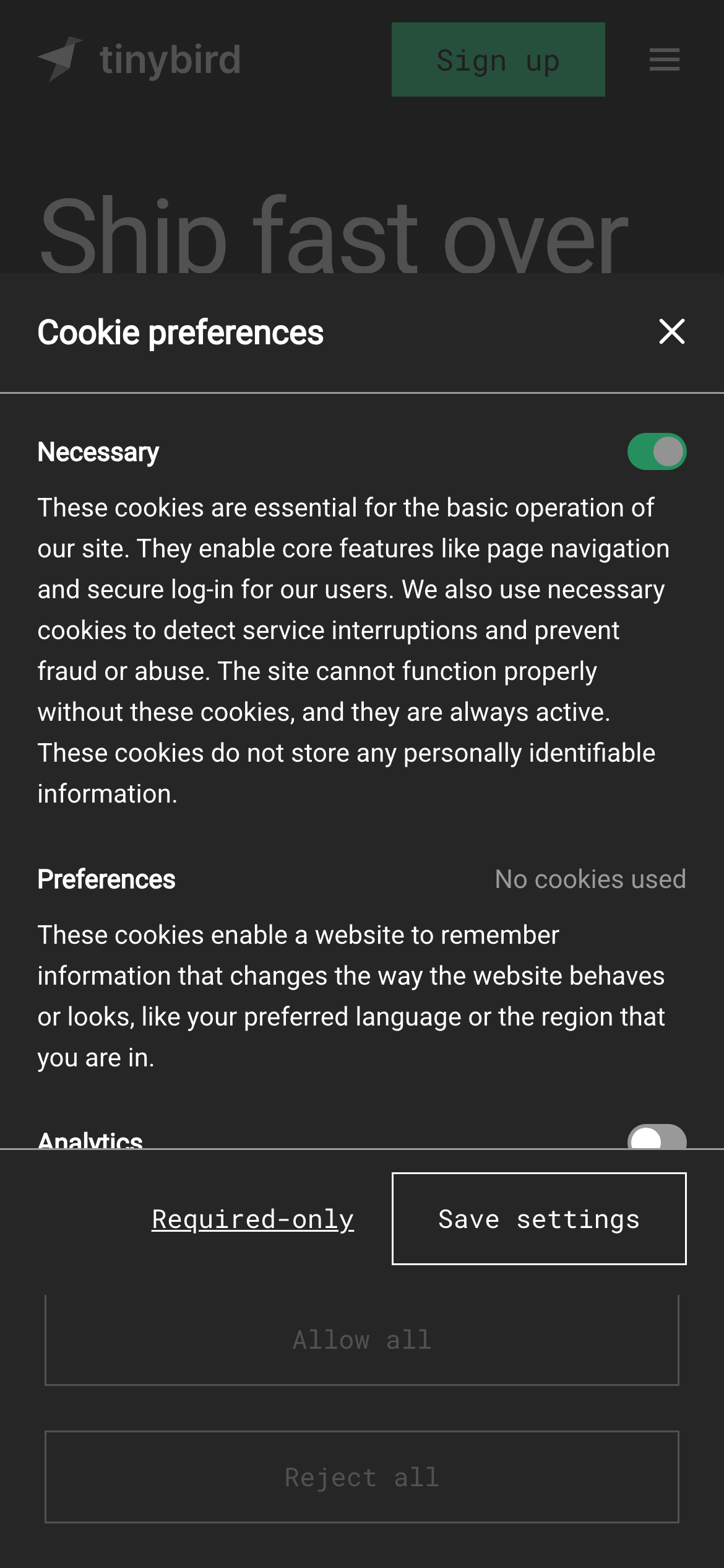
Thin, low-opacity white borders define elevated surfaces like the cookie modal and cards.
06
Layout
1280container
12columns
24pxgutter
768 / 1024breakpoints
Standard 12-column grid with generous whitespace for content readability.
07
Motion & Interaction
150msmicro
300mssmall
300msmedium
cubic-bezier(0.4, 0, 0.2, 1)easing
Subtle, smooth transitions for background colors and text states. · Minimal scale or transform animations on interactive elements.
Subtle color shifts or opacity changes on interactive elements. · Immediate feedback through color transitions.
08
Components
buttonPrimary buttons use the vibrant green accent; secondary and ghost buttons use monospaced text or subtle borders.
cardCards use dark backgrounds with thin, low-opacity borders and minimal padding.
chipTags and labels use monospaced text in square brackets, often with a subtle background.
inputForm inputs and toggles follow the standard dark-mode styling with clean borders.
heroThe hero section features massive, tight-tracked typography centered on the page.
09
Voice & Don'ts
ToneTechnical, confident, and direct.
HeadlinesConcise, action-oriented, and often uses large-scale typography for impact.
CTAsClear and functional, often using monospaced text or the vibrant green accent.
Don't use multiple accent colors — screenshot shows a single dominant neon green accent.
Don't use serif fonts — screenshot shows a clean sans-serif for display and body text.
Don't use heavy drop shadows — screenshot shows flat, elevated surfaces with thin borders.
Don't use complex gradients — screenshot shows solid dark backgrounds with minimal texture.
Don't use rounded corners excessively — screenshot shows sharp or very slightly rounded corners on most components.
Don't use all-caps for body text — screenshot uses standard sentence case for readability.
Captured from the live site · real computed styles
11
System prompt
Tinybird is a developer-focused real-time data platform with a dark-mode-first design. The palette is dominated by deep blacks and grays (#0A0A0A, #151515) with a single vibrant neon green accent (#27F795). Typography relies on clean humanist sans-serifs for display and body text, with monospaced fonts for technical elements. Key don'ts: avoid using multiple accent colors, don't use serif fonts, and don't add heavy drop shadows. The layout is a standard 12-column grid with generous whitespace, emphasizing large, tight-tracked headlines for impact. Interactions are smooth with subtle color transitions, maintaining a high-performance, technical feel.
Bring this taste to your agent
Hand your AI agent a machine-readable spec of this design — tokens, type, motion, the whole DNA.