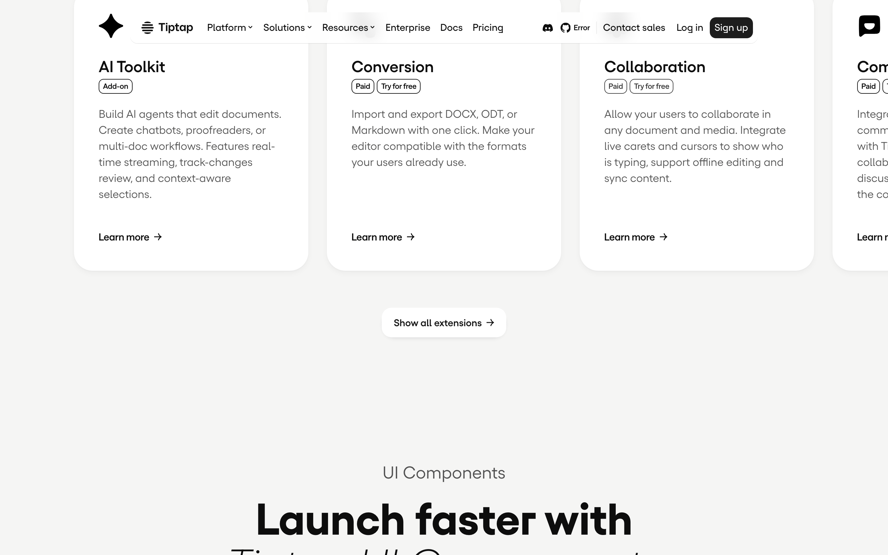
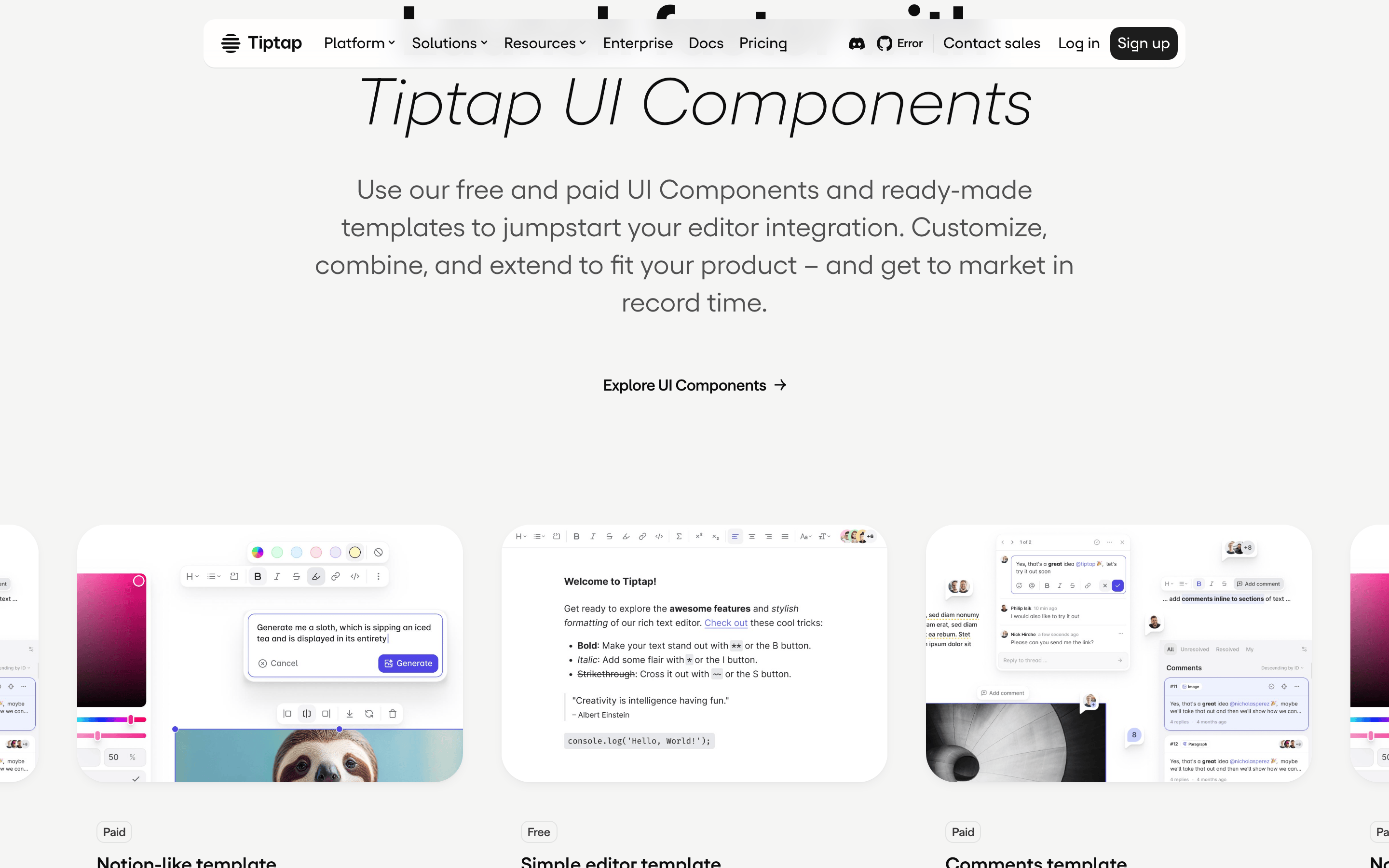
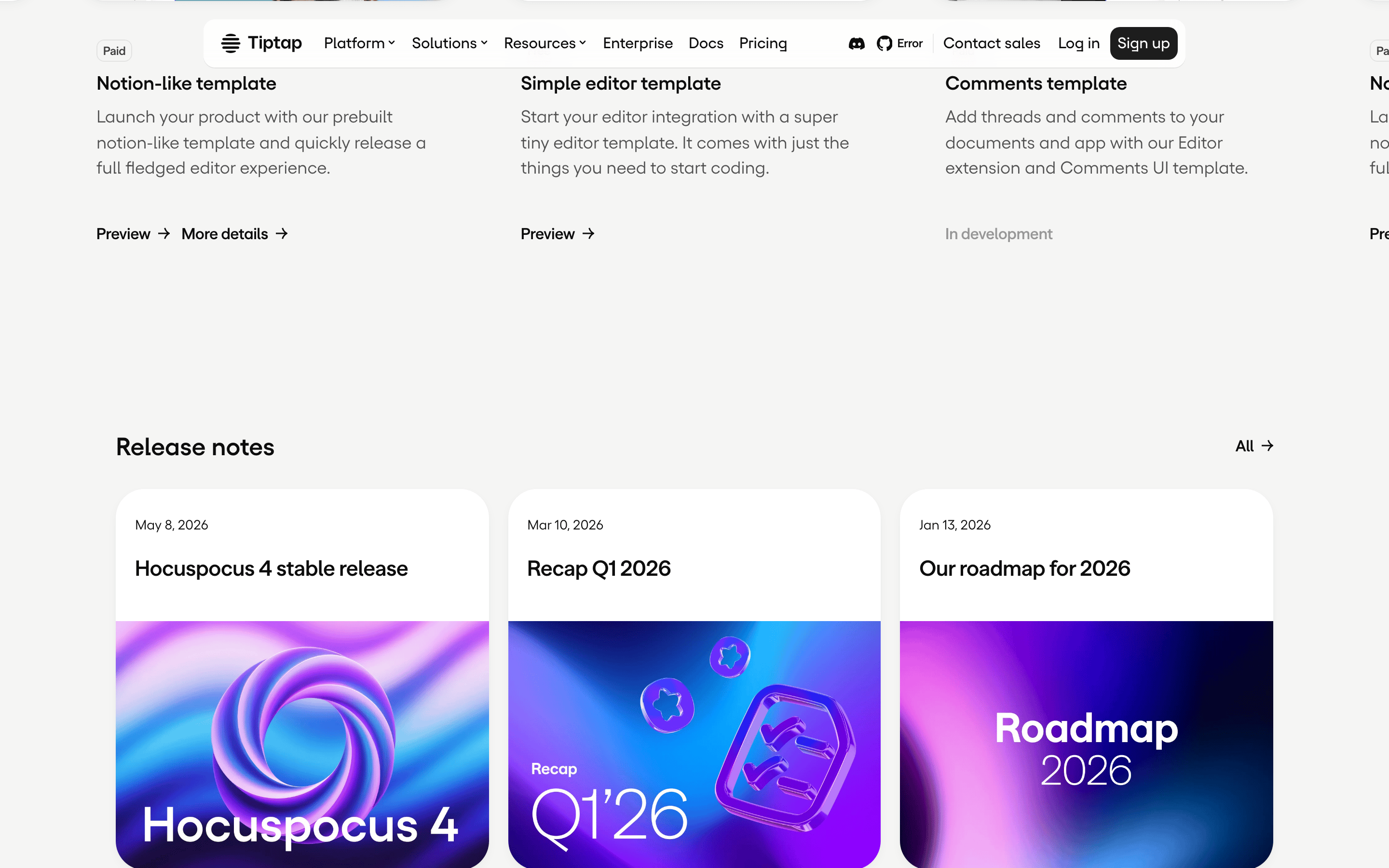
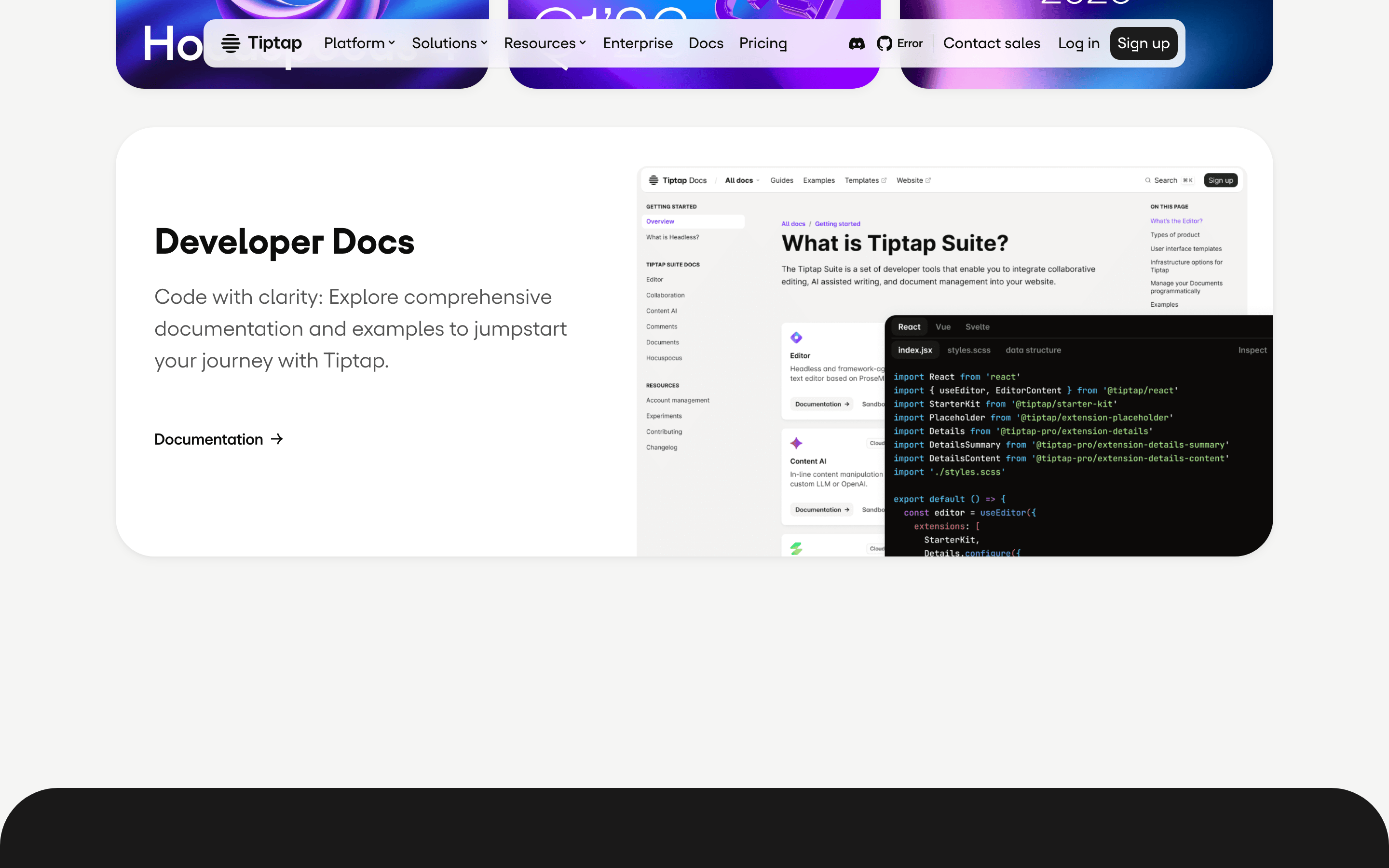
A sleek, professional toolkit for building modern text editors.
02
Color
#0d0d0dInk
rgba(13,13,13,0.6)Ink soft
#ffffffBG
#f5f5f4BG soft
rgba(13,13,13,0.4)Muted
rgba(0,0,0,0.1)Line
High-contrast monochrome with vibrant gradient accents for emphasis.
03
Typography
geometric-sans · humanist-sans · monospace
display96px · 700
h156px · 700
body22px · 400
small16px · 400
caption12px · 400
Use geometric-sans for large, impactful headlines. · Use humanist-sans for readable body copy and navigation. · Keep body text weight at 400 for maximum legibility.
04
Spacing
4px
8px
16px
24px
32px
40px
48px
64px
96px
8px base grid with 4px sub-grid for fine-tuning.
05
Surfaces
sm · 8px
md · 12px
lg · 16px
pill · 999px
1px solid rgba(0,0,0,0.1) or solid 1px border-color: rgb(13, 13, 13)
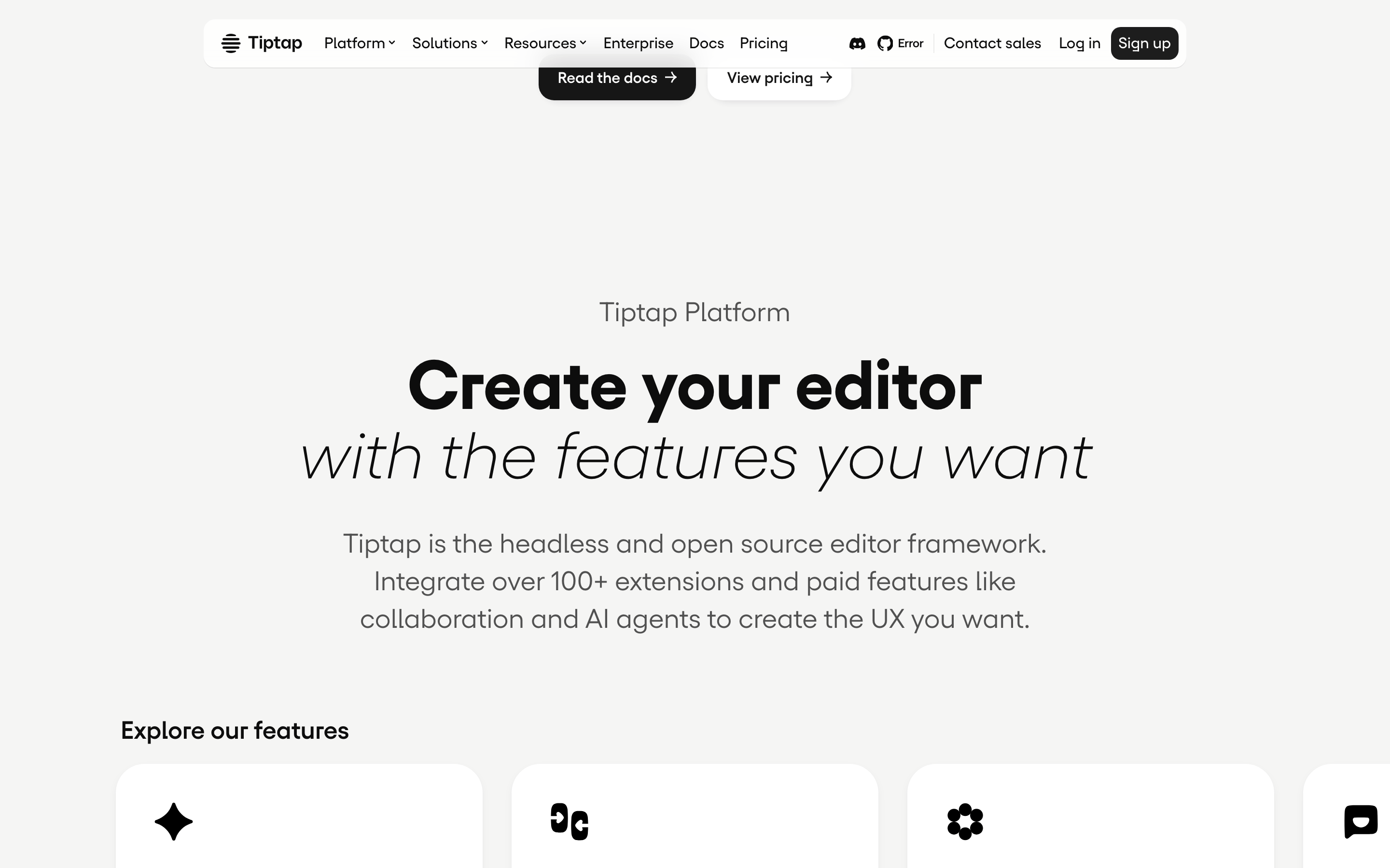
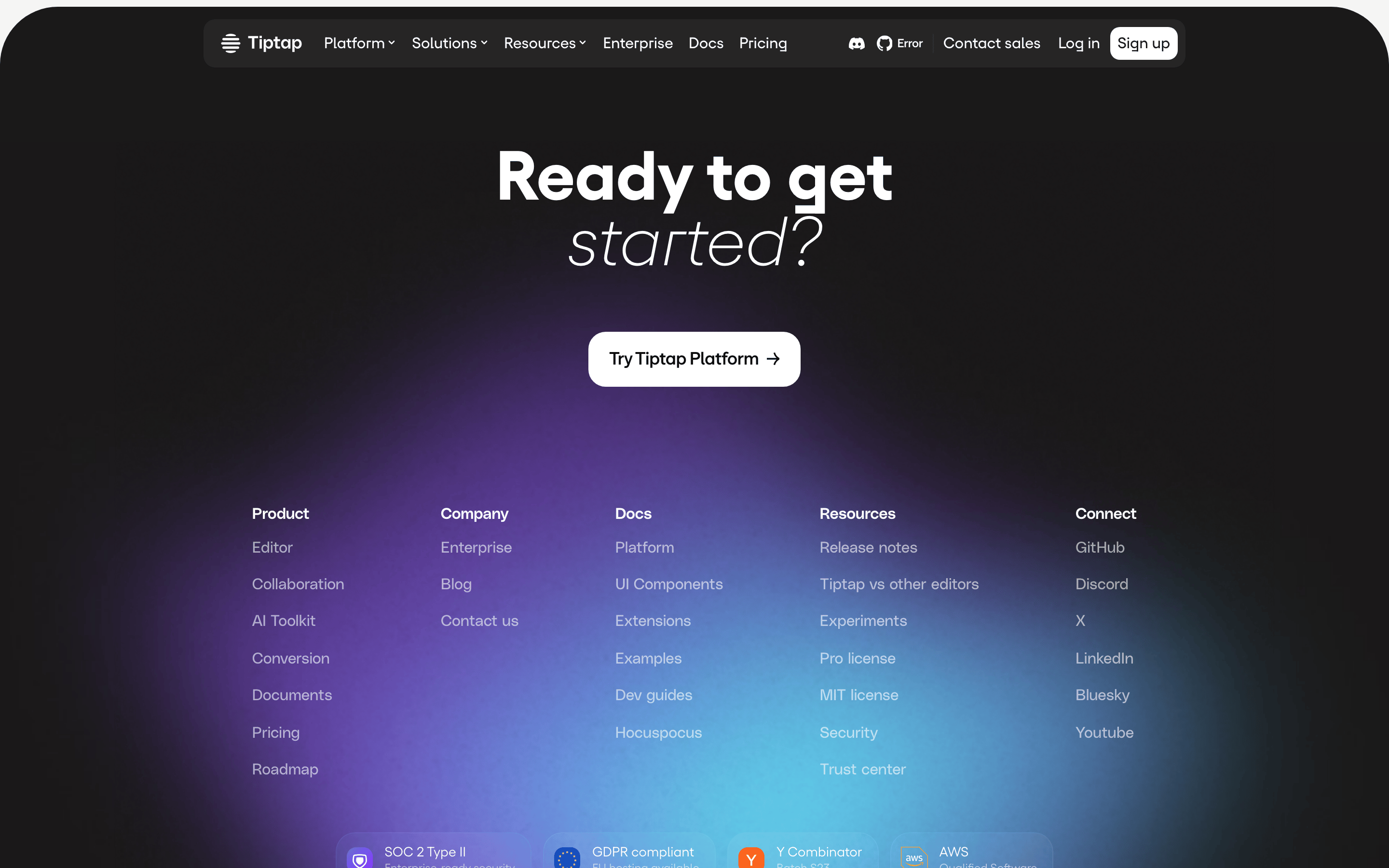
12-column grid with a max-width container, large margins, and stacked sections on mobile.
07
Motion & Interaction
250msmicro
300mssmall
400msmedium
cubic-bezier(0.65, 0, 0.35, 1)easing
Smooth transitions for color, transform, and border-radius. · Scale animations for interactive elements. · Consistent easing across all interactive states.
Subtle background-color change or transform on hover. · Scale down or opacity change on click.
08
Components
buttonHigh-contrast solid buttons with pill radius for primary actions.
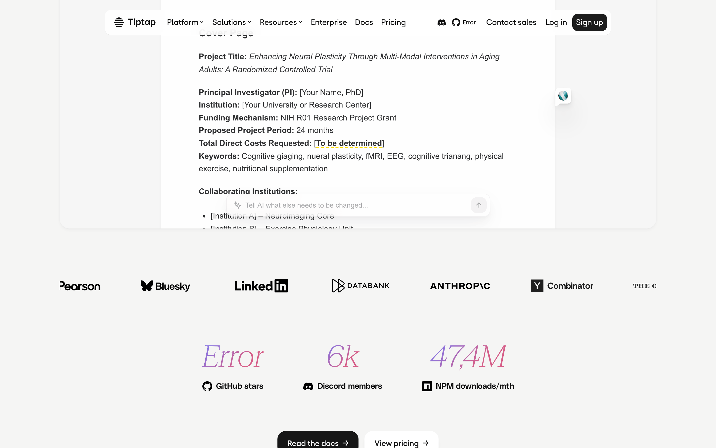
cardClean cards with subtle shadows and rounded corners for showcasing templates.
chipSmall tags with pill radius for categorization (e.g., 'Paid', 'Free').
inputClean, bordered inputs with rounded corners.
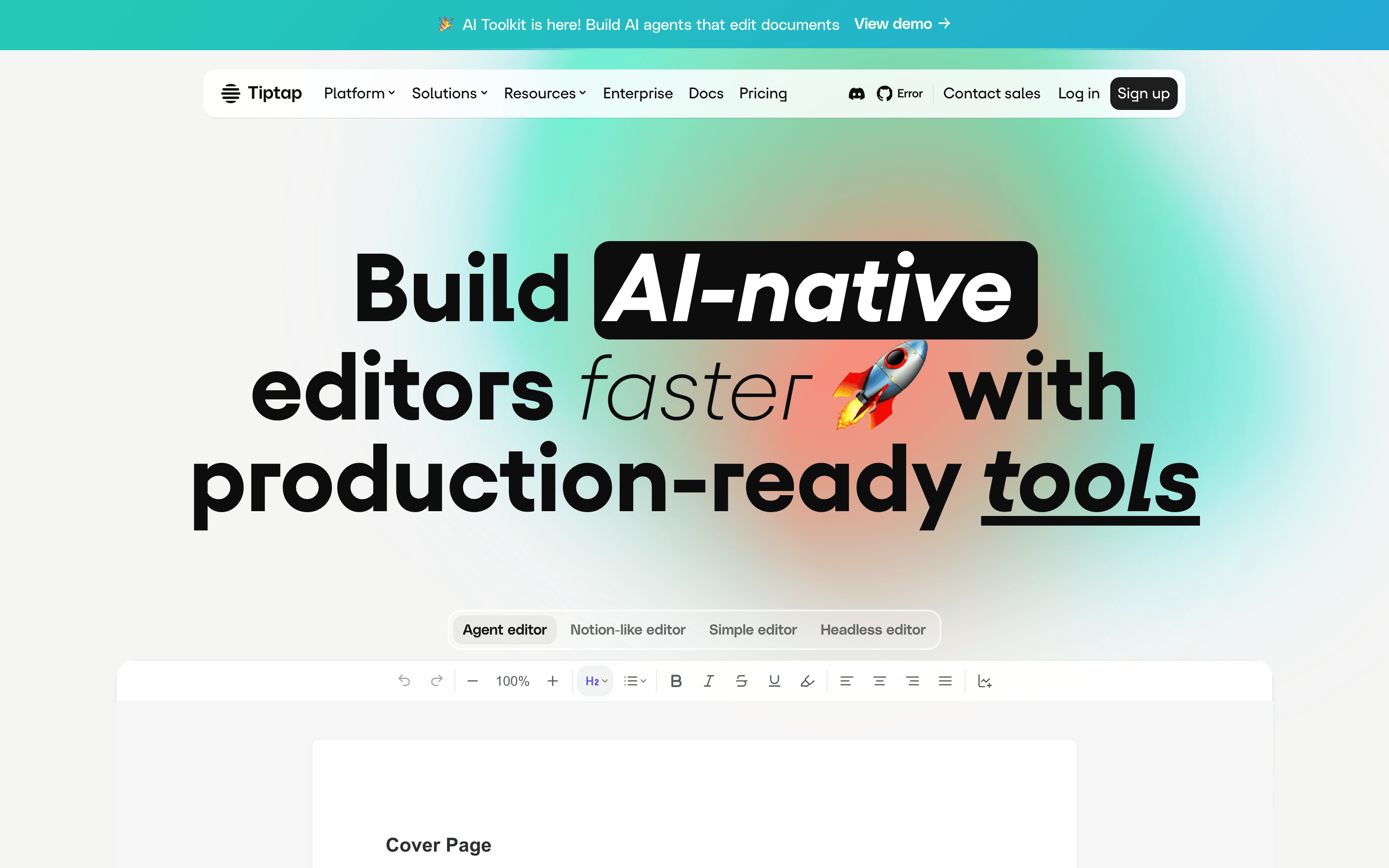
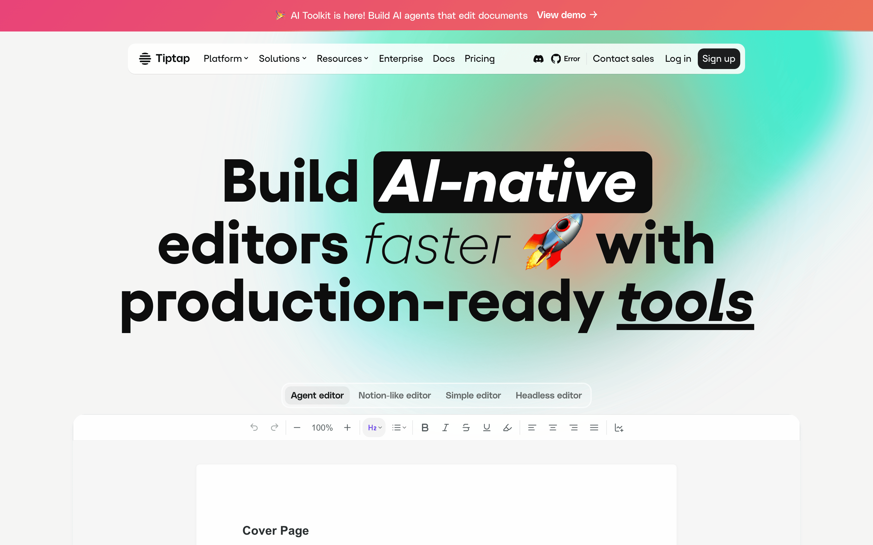
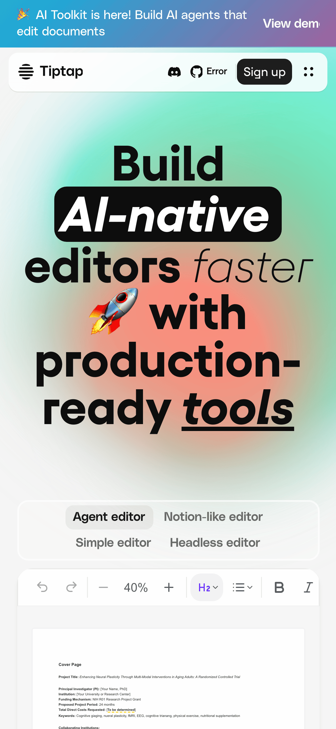
heroLarge, bold typographic headline with a vibrant gradient background and embedded editor UI.
09
Voice & Don'ts
ToneProfessional, confident, and developer-focused.
HeadlinesDirect, action-oriented, and bold.
CTAsClear and concise, emphasizing speed and production-readiness.
Don't use a dark mode — screenshot shows a predominantly light background.
Don't use serif fonts — screenshot shows sans-serif typography for all text.
Don't use low-contrast text — screenshot shows dark text on light backgrounds for high legibility.
Don't use complex, busy layouts — screenshot shows clean, centered, and well-spaced sections.
Don't use a single solid background color — screenshot shows vibrant gradient backgrounds.
Don't use sharp, square corners — screenshot shows rounded corners (8-16px) on all surfaces.
Avoid: Overly casual or playful language.
Avoid: Jargon that isn't standard in developer communities.
Captured from the live site · real computed styles
11
System prompt
Tiptap is a premium developer platform for building AI-native text editors. The design is clean and professional, using a high-contrast monochrome palette (ink #0d0d0d, bg #ffffff) with vibrant gradients for emphasis. Typography is a mix of geometric and humanist sans-serifs, with bold, large headlines for impact. Key elements include a clean navigation, a hero section with an integrated editor preview, and a grid of component templates. Critical donts: never use a dark theme, avoid serif fonts, and never use low-contrast text. The overall feel is modern, trustworthy, and production-ready.
Bring this taste to your agent
Hand your AI agent a machine-readable spec of this design — tokens, type, motion, the whole DNA.