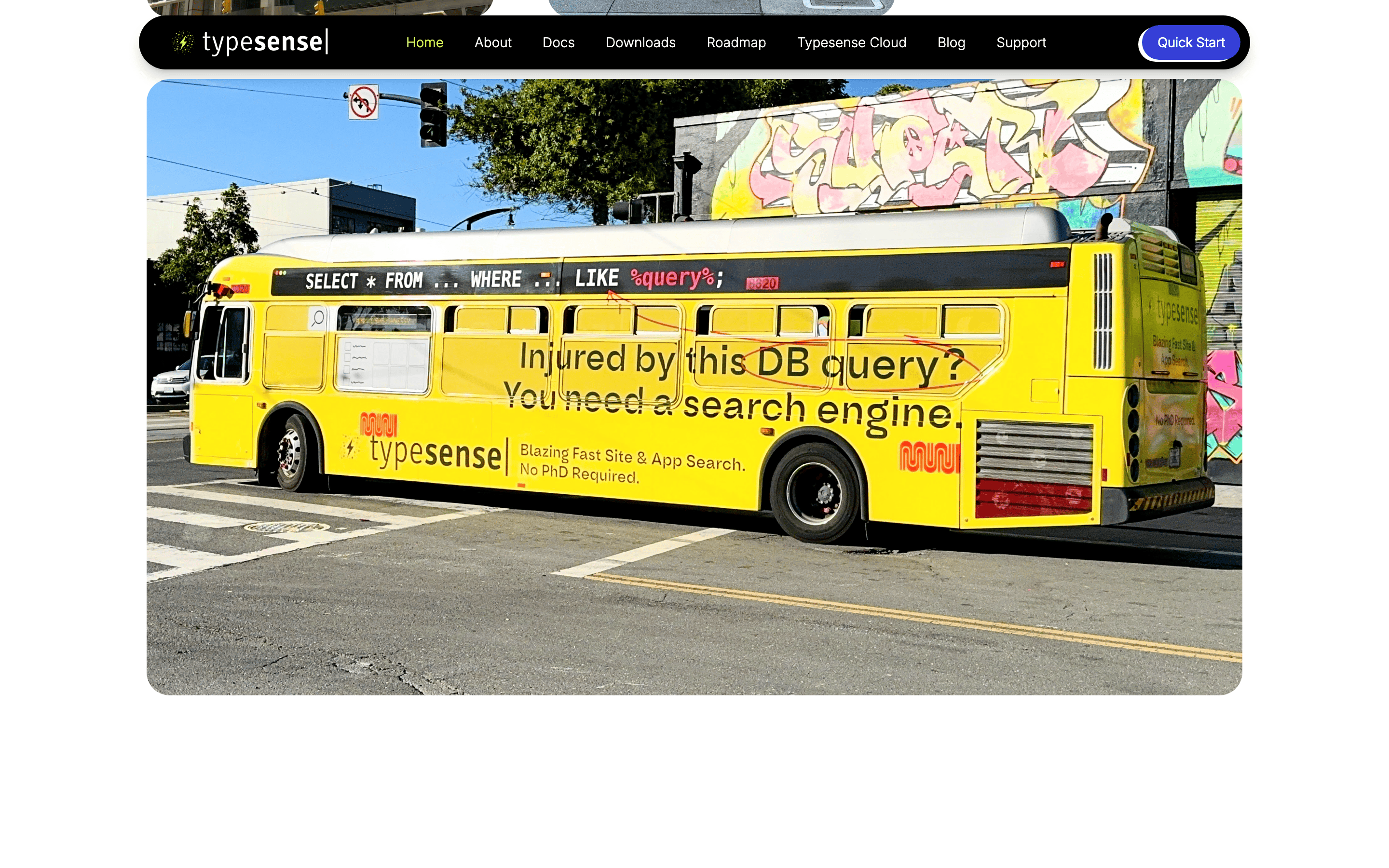
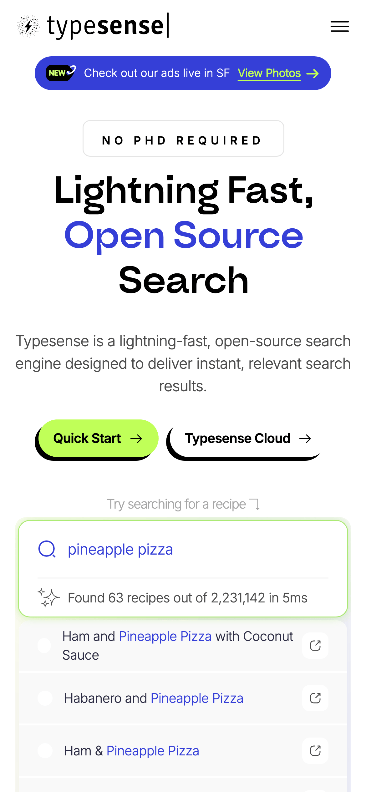
A sharp, no-nonsense toolkit for developers who want search without the headaches.
02
Color
#353FD7Accent
#000000Ink
#4D4D4DInk soft
#FAFAFABG
#FFFFFFBG soft
#F1F1F1BG quiet
#999999Muted
rgba(229,231,235,1)Line
A high-contrast, mostly monochromatic palette grounded in black and light gray, punctuated by a vibrant indigo accent and a signature high-chroma lime green for interactive elements.
03
Typography
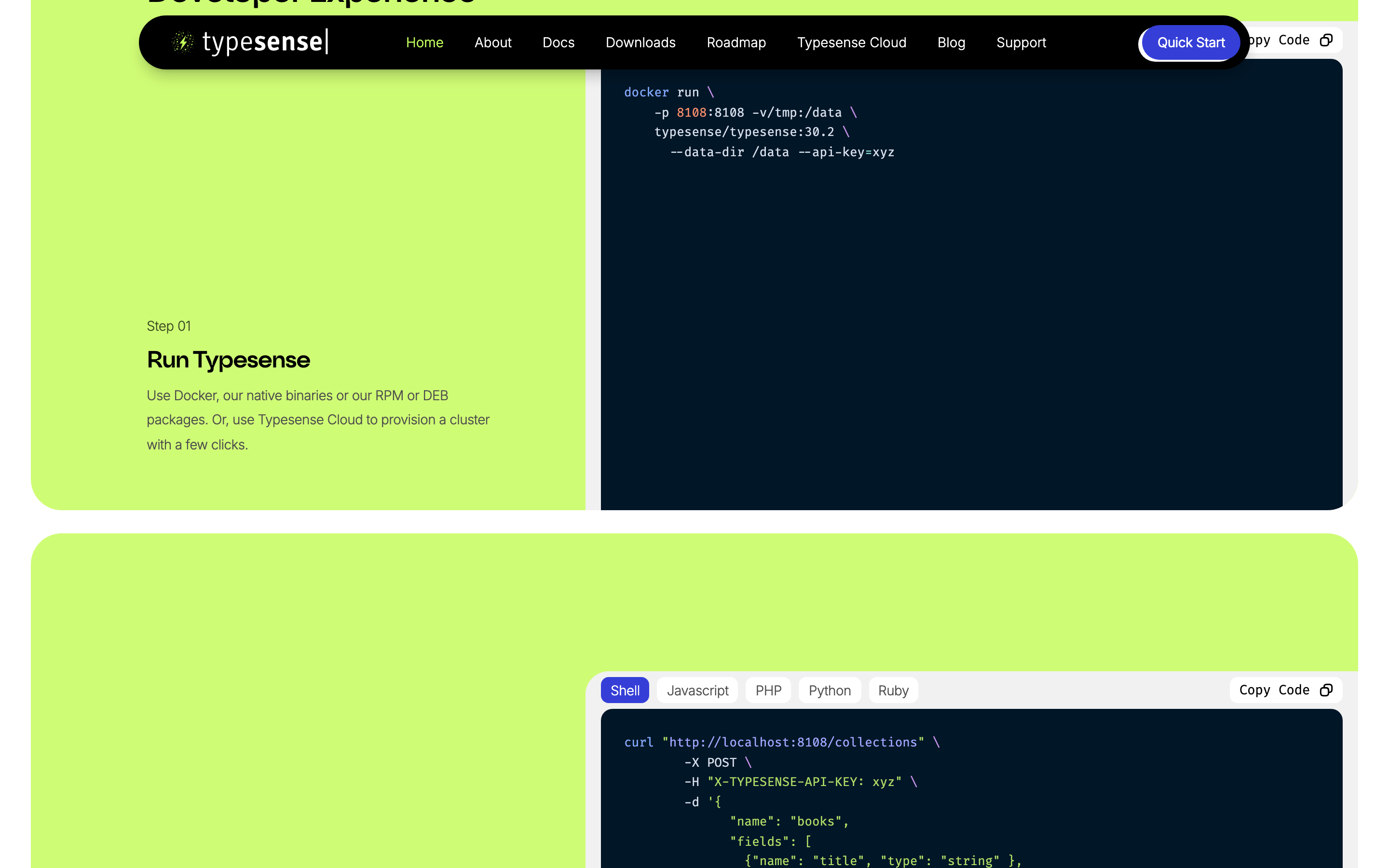
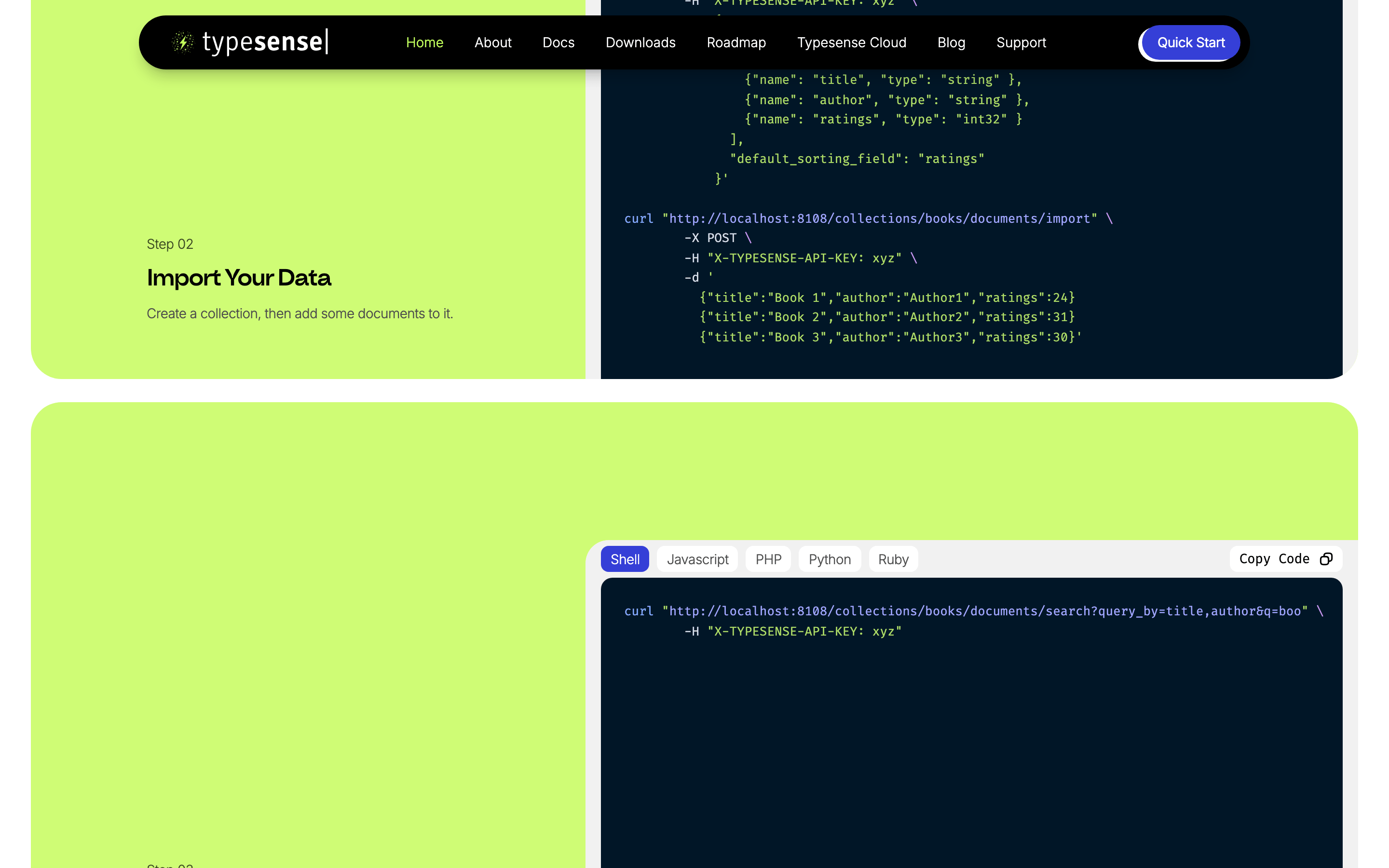
geometric-sans · humanist-sans · monospace
display56px · 500
h248px · 500
body16px · 300
caption14px · 300
Use a bold geometric sans for display headlines. · Use a clean humanist sans for body text with light weight. · Reserve monospace for code snippets and technical highlights.
04
Spacing
4px
8px
12px
16px
20px
24px
32px
48px
64px
96px
A consistent 4px base grid is used extensively for internal component spacing (paddings and gaps).
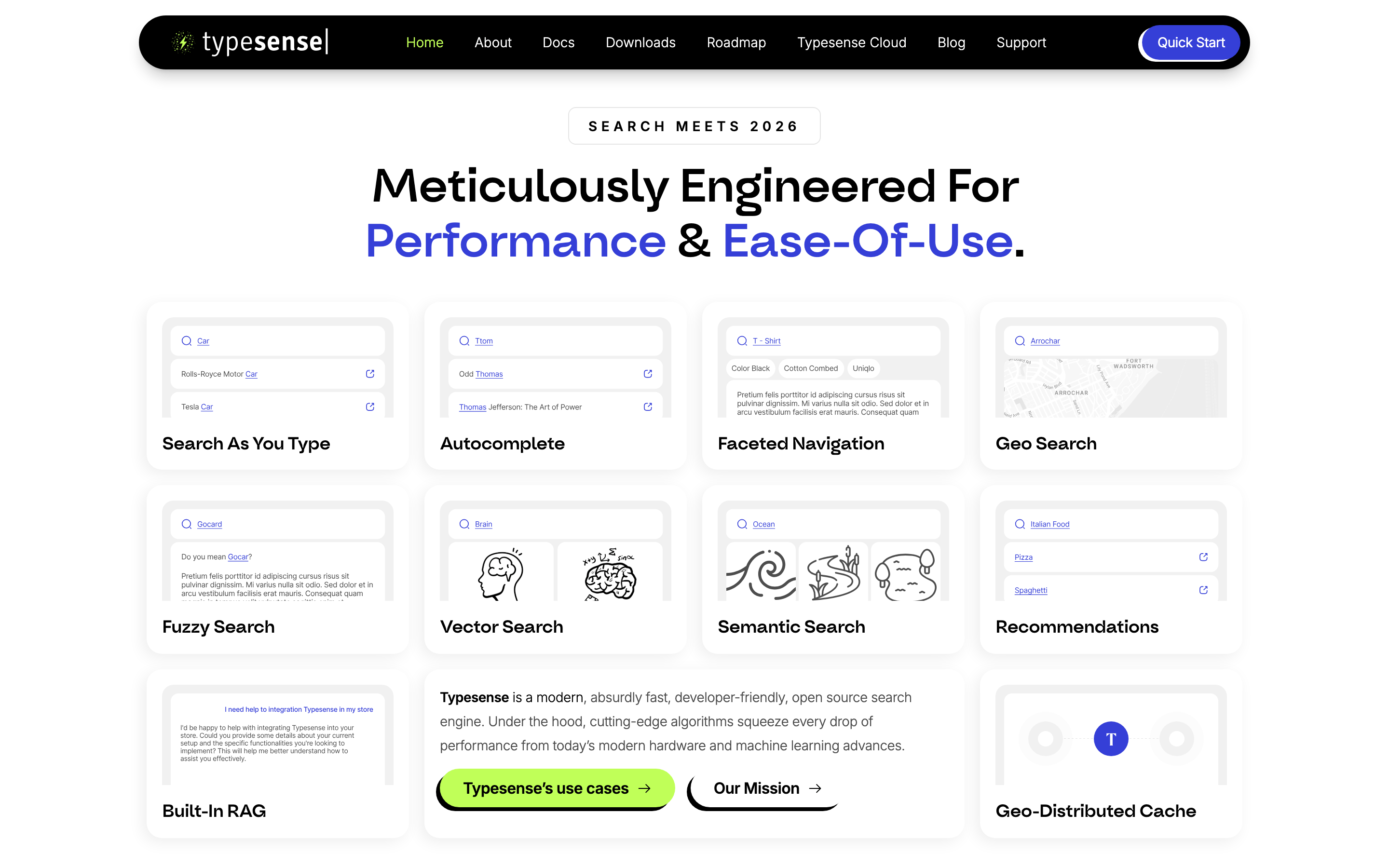
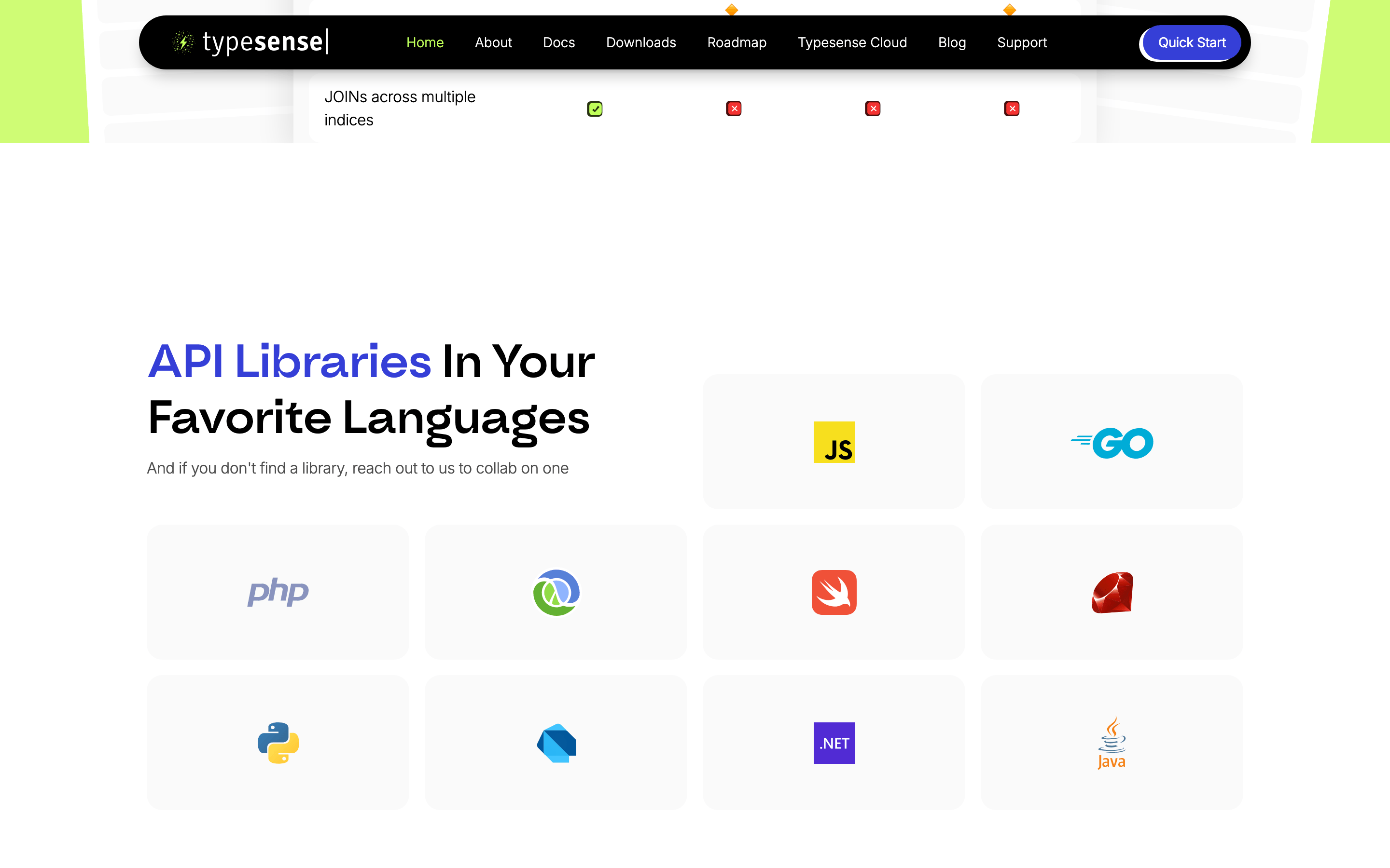
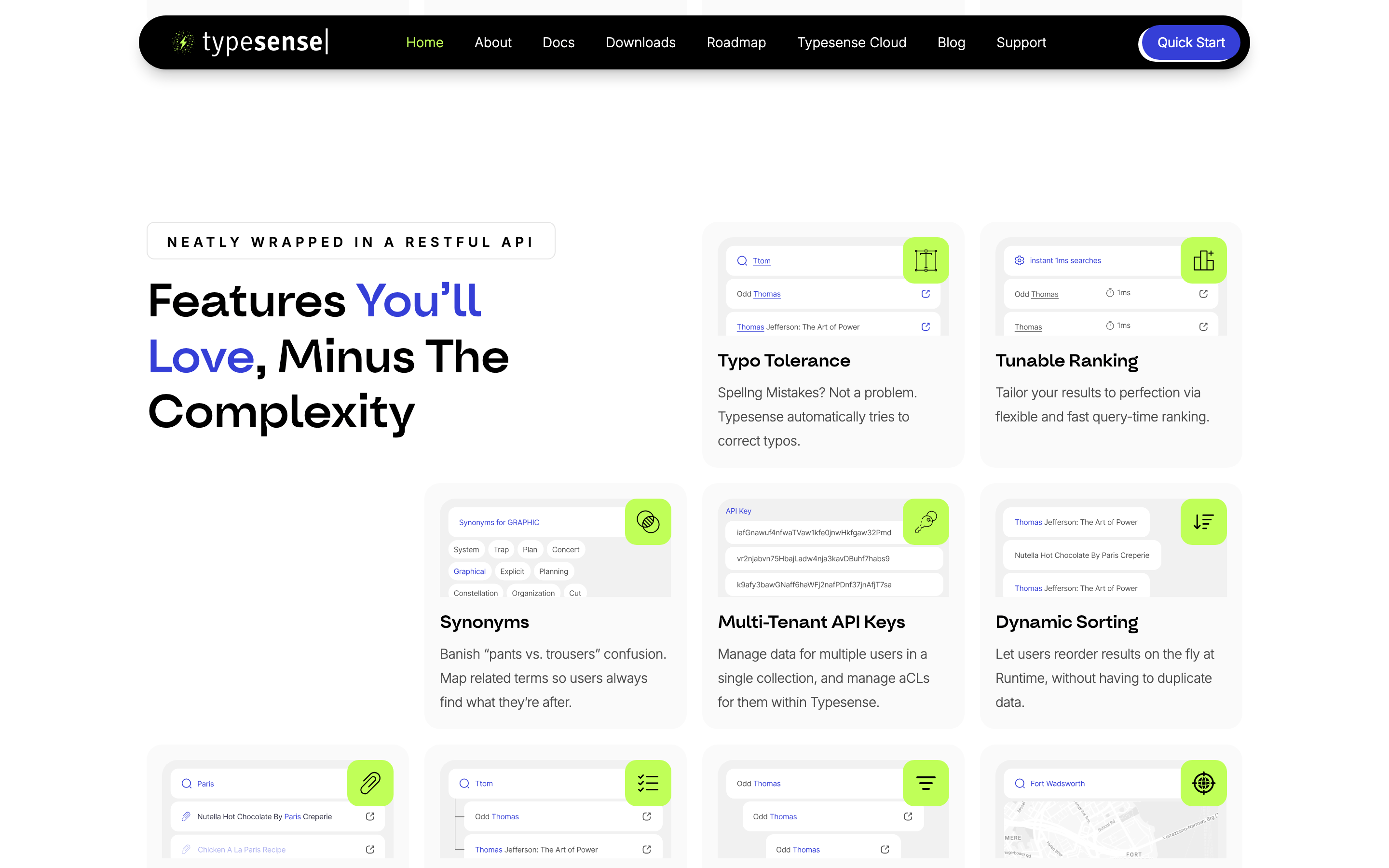
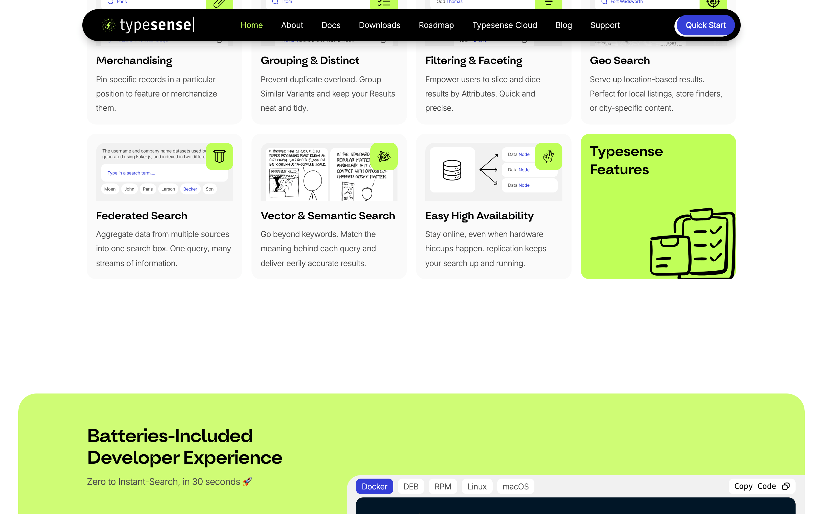
A centered, single-column main content area with generous whitespace, transitioning to a multi-column grid for feature cards.
07
Motion & Interaction
150msmicro
200mssmall
500msmedium
cubic-bezier(0.4, 0, 0.2, 1)easing
Smooth color and background transitions on interactive elements. · Clipping path animations for menu or element reveals. · Subtle hover transforms on primary action buttons.
Color shifts, subtle background changes, or slight upward translation on interactive elements. · Standard pointer cursor with immediate visual feedback.
08
Components
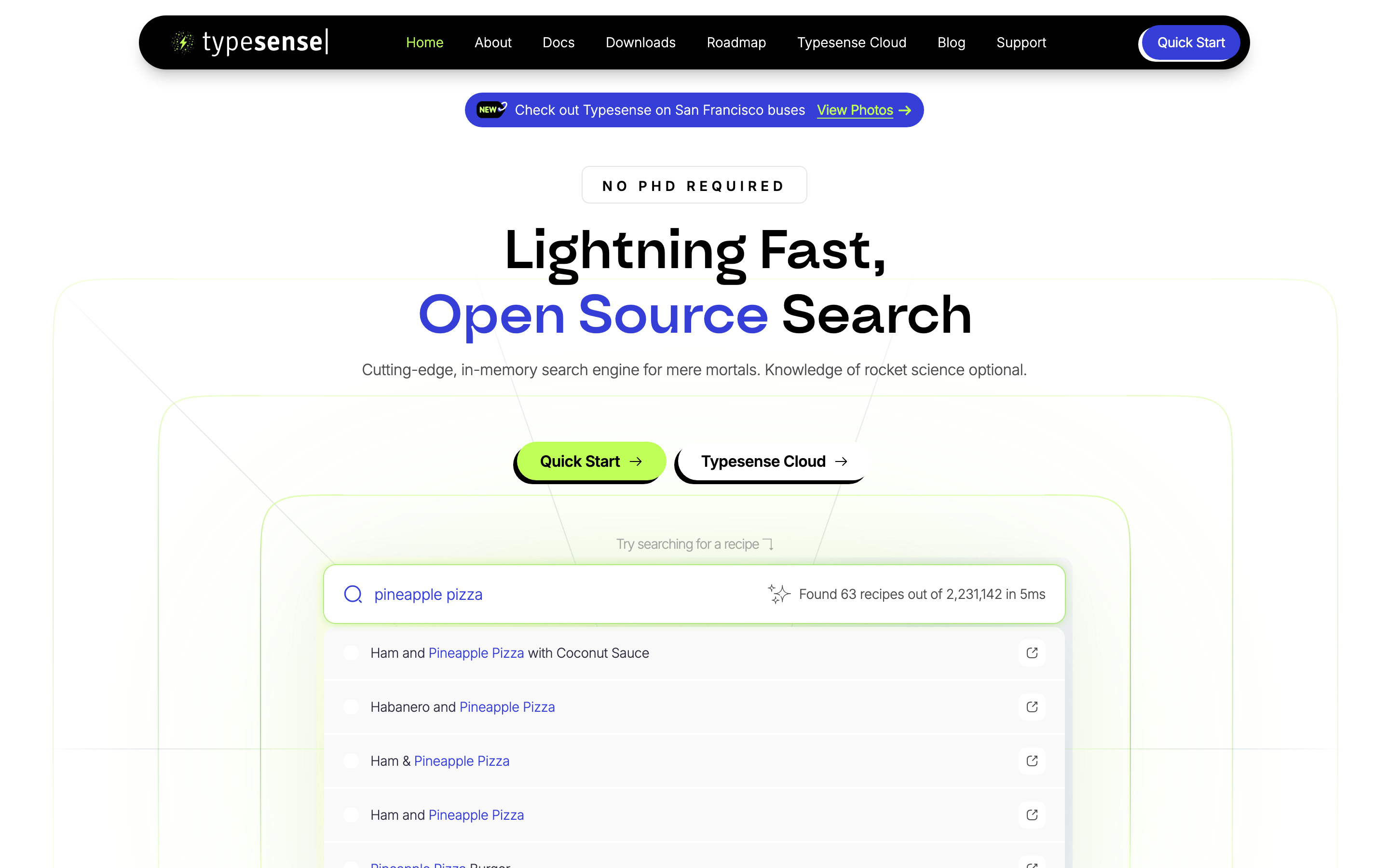
buttonPill-shaped or highly rounded rectangles with solid fills (lime green) or high-contrast strokes (black), featuring hard drop shadows or soft glows.
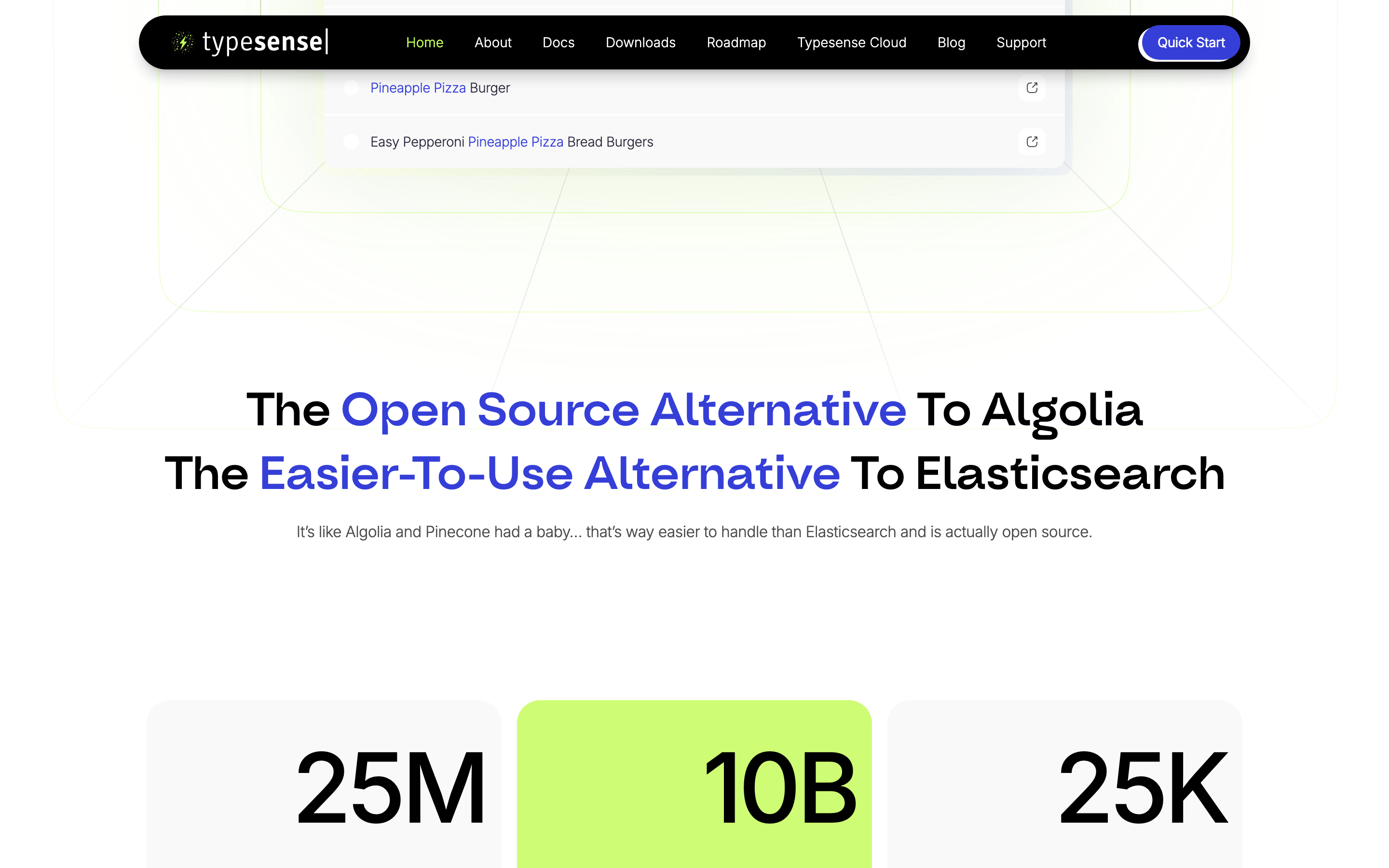
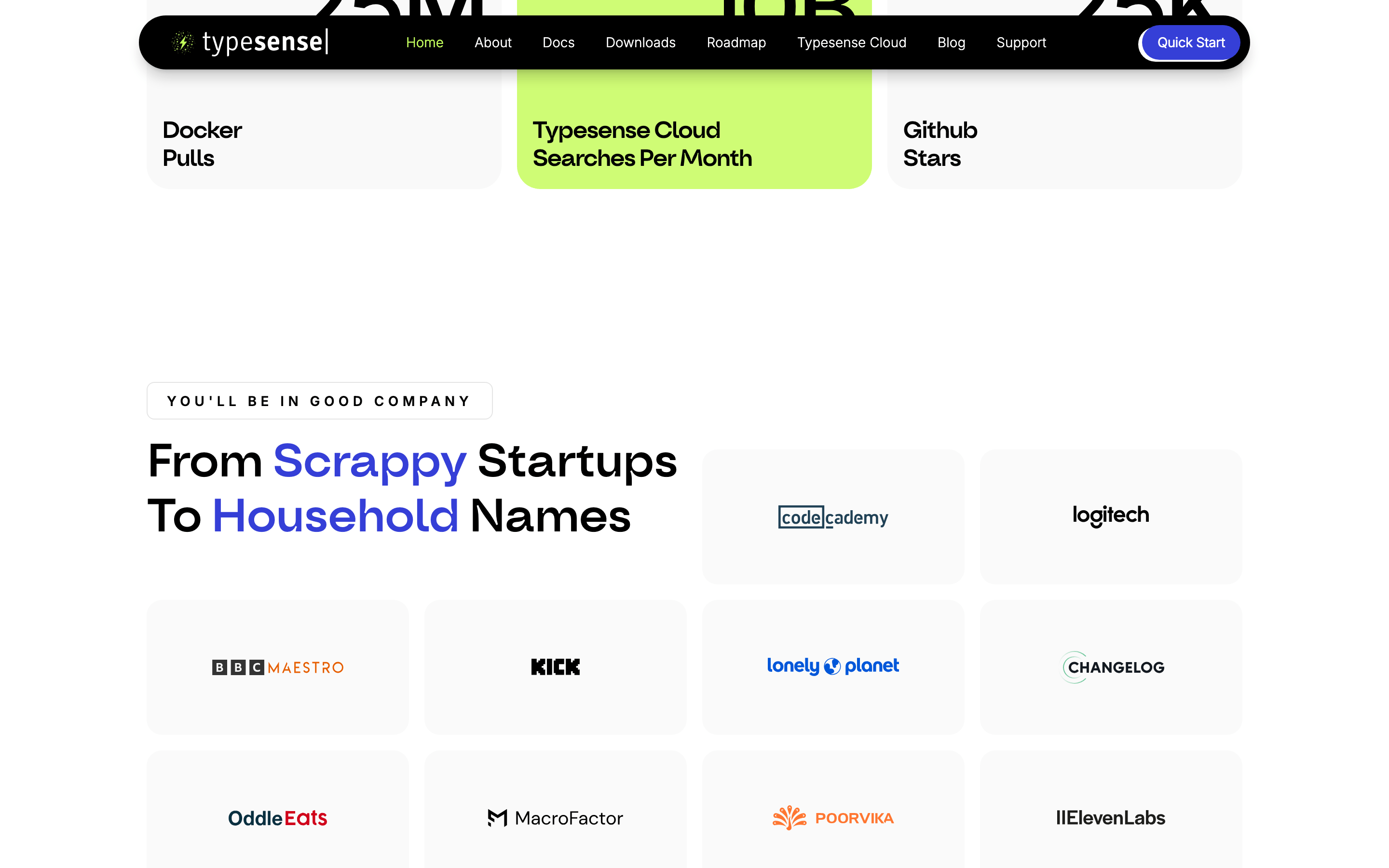
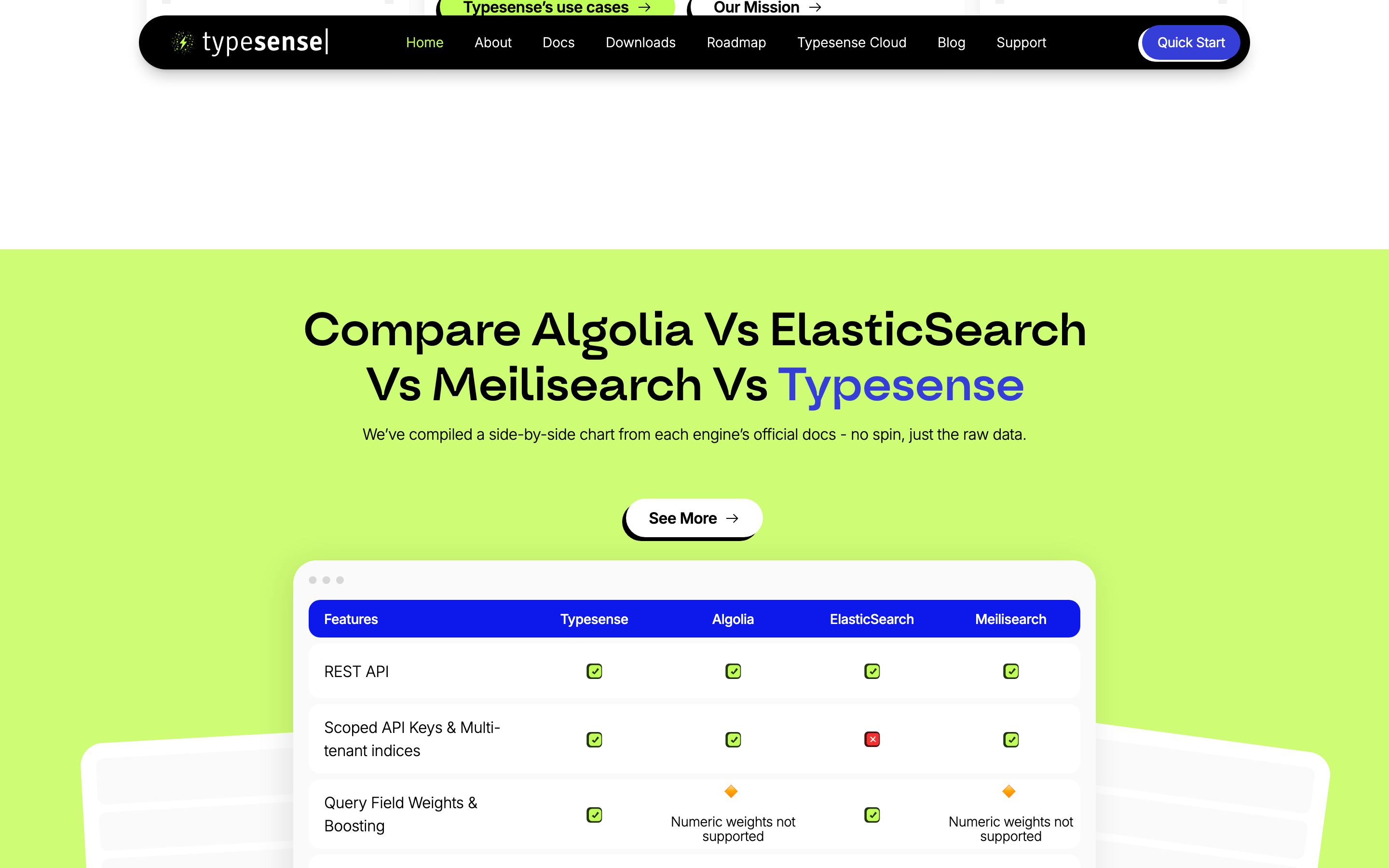
cardLightly bordered or shadowed rectangles with generous internal padding, used to group feature descriptions.
chipSmall, rounded border tags used for categories or labels.
inputHighly rounded search bar with a prominent border, designed as a central interactive element.
heroA massive, centered text block with a prominent accent color and a large interactive search component below.
09
Voice & Don'ts
ToneConfident, approachable, and slightly playful, positioning complex technology as accessible.
HeadlinesLarge, bold, and direct, often using contrasting colors for emphasis.
CTAsAction-oriented and encouraging, using playful punctuation or clear directives.
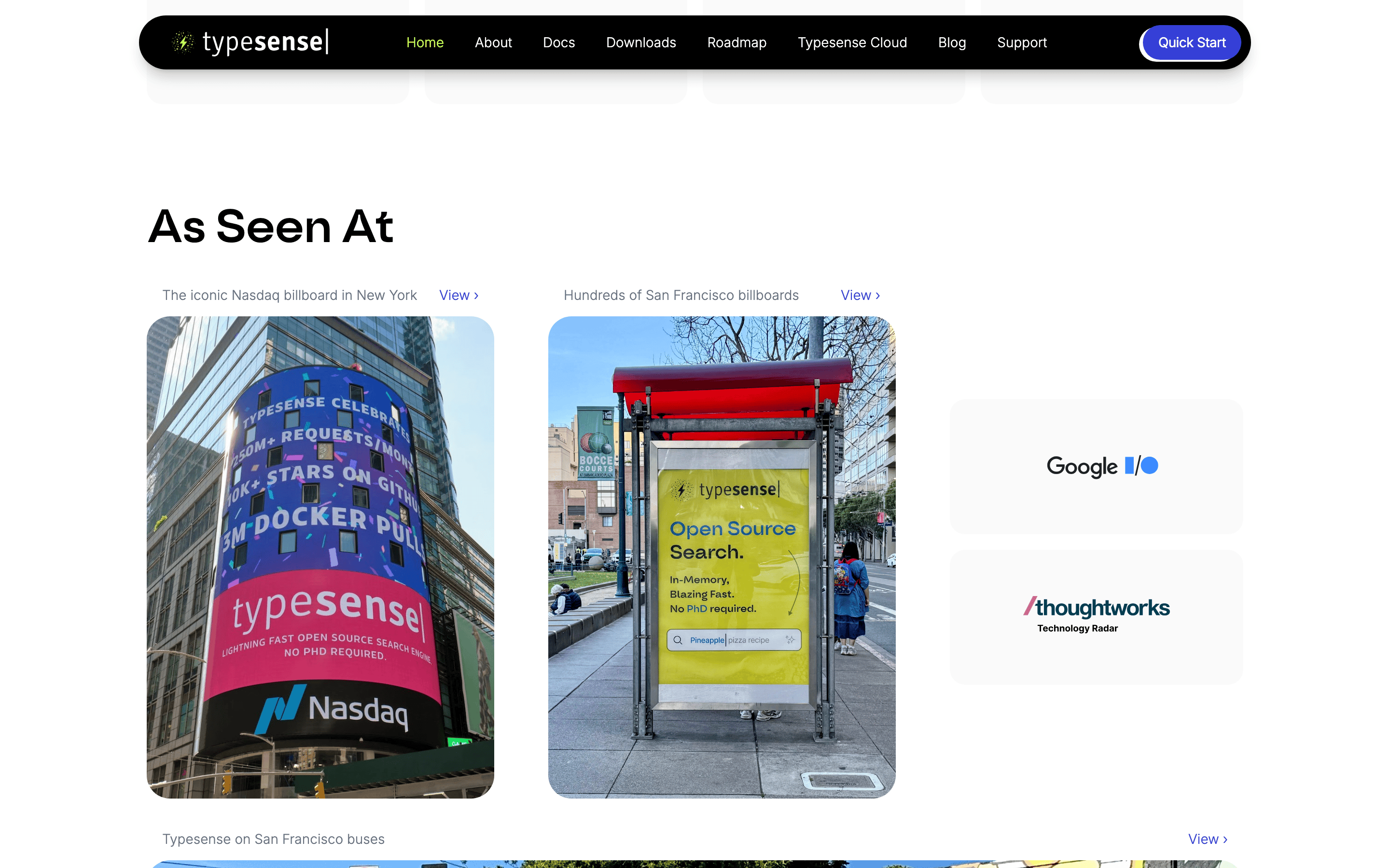
Don't use a complex or busy background — screenshot shows a clean, mostly solid light background.
Don't use a heavy or formal serif font for headlines — screenshot shows a bold geometric sans-serif.
Don't use a muted or desaturated palette — screenshot features a vibrant lime green and a strong indigo accent.
Don't use sharp, square corners for primary elements — screenshot consistently uses rounded or pill-shaped borders.
Don't use dark mode as the default — screenshot shows a predominantly light theme.
Don't use thin, weak typography — screenshot uses large, bold weights for key messaging.
Captured from the live site · real computed styles
11
System prompt
This is a developer-focused SaaS landing page for an open-source search engine. The visual identity is clean, confident, and slightly playful, using a predominantly light background with high-contrast typography. Key colors include a solid black (#000000) for primary ink, a vibrant indigo (#353FD7) for accents, and a signature high-chroma lime green (#C0FF58) for primary actions and interactive highlights. The typography features a bold geometric sans for display text and a clean humanist sans for body copy. Critical design constraints: Never use a dark background as the primary canvas; avoid sharp, square corners on interactive elements; and refrain from using muted, low-contrast colors that would reduce the interface's sharpness and clarity.
Bring this taste to your agent
Hand your AI agent a machine-readable spec of this design — tokens, type, motion, the whole DNA.