A refined, well-curated library for typography enthusiasts.
02
Color
#2e2c2cInk
#443235Ink soft
#e6dddeBG
#f8f5f5BG soft
#654a4eMuted
rgba(101, 74, 78, 0.3)Line
Warm, muted earthy palette anchored by deep brownish-ink, using white cards and subtle shadows for layered depth.
03
Typography
transitional-serif · humanist-sans
display72px · 700
heading-132px · 400
heading-228px · 400
body16px · 400
label13px · 900
Use transitional-serif for all major display and heading text to maintain the refined editorial aesthetic. · Use humanist-sans for navigation labels, small meta text, and uppercase UI elements. · Maintain tight negative letter-spacing for large display text and navigation labels.
04
Spacing
4px
8px
16px
24px
32px
48px
64px
96px
Consistent spacing based on a 4px grid, providing ample breathing room between sections and within components.
05
Surfaces
sm · 4px
md · 0px
lg · 0px
pill · 999px
1px solid rgba(101, 74, 78, 0.3)
rgba(145, 106, 112, 0.15) 0px 6px 24px 0px
06
Layout
1280container
12columns
24pxgutter
768 / 1024breakpoints
A centered, single-column layout with a prominent header, followed by a responsive 2-column grid of content cards.
07
Motion & Interaction
220msmicro
400mssmall
800msmedium
cubic-bezier(0.25, 0.1, 0.25, 1.0)easing
Smooth background and color transitions on hover states. · Subtle elevation changes via box-shadow transitions.
Subtle changes in background color or text color to indicate interactivity. · Immediate visual feedback with smooth transitions.
08
Components
buttonTypically uppercase humanist-sans text links with bold weight and tight letter-spacing, often separated by horizontal rules.
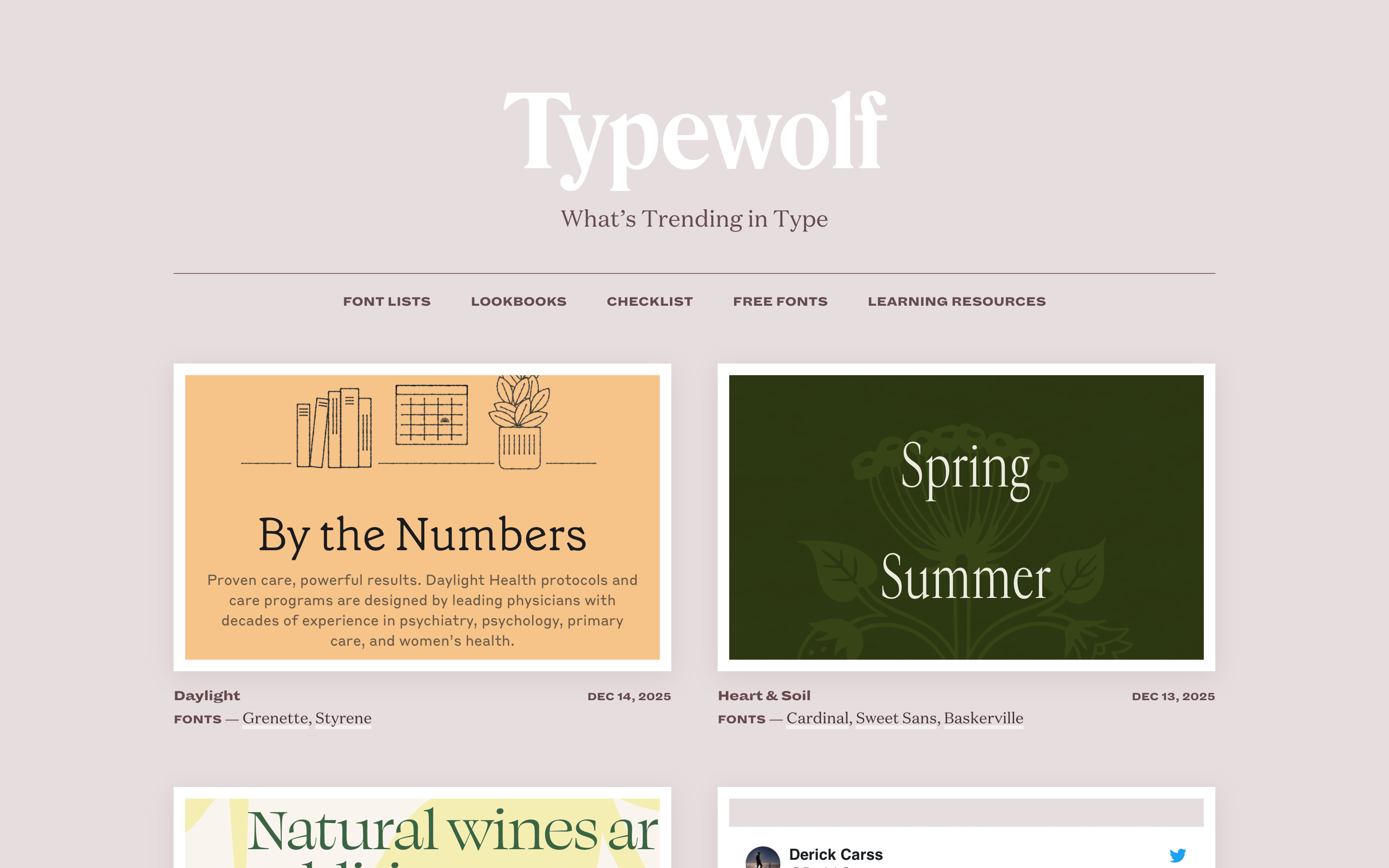
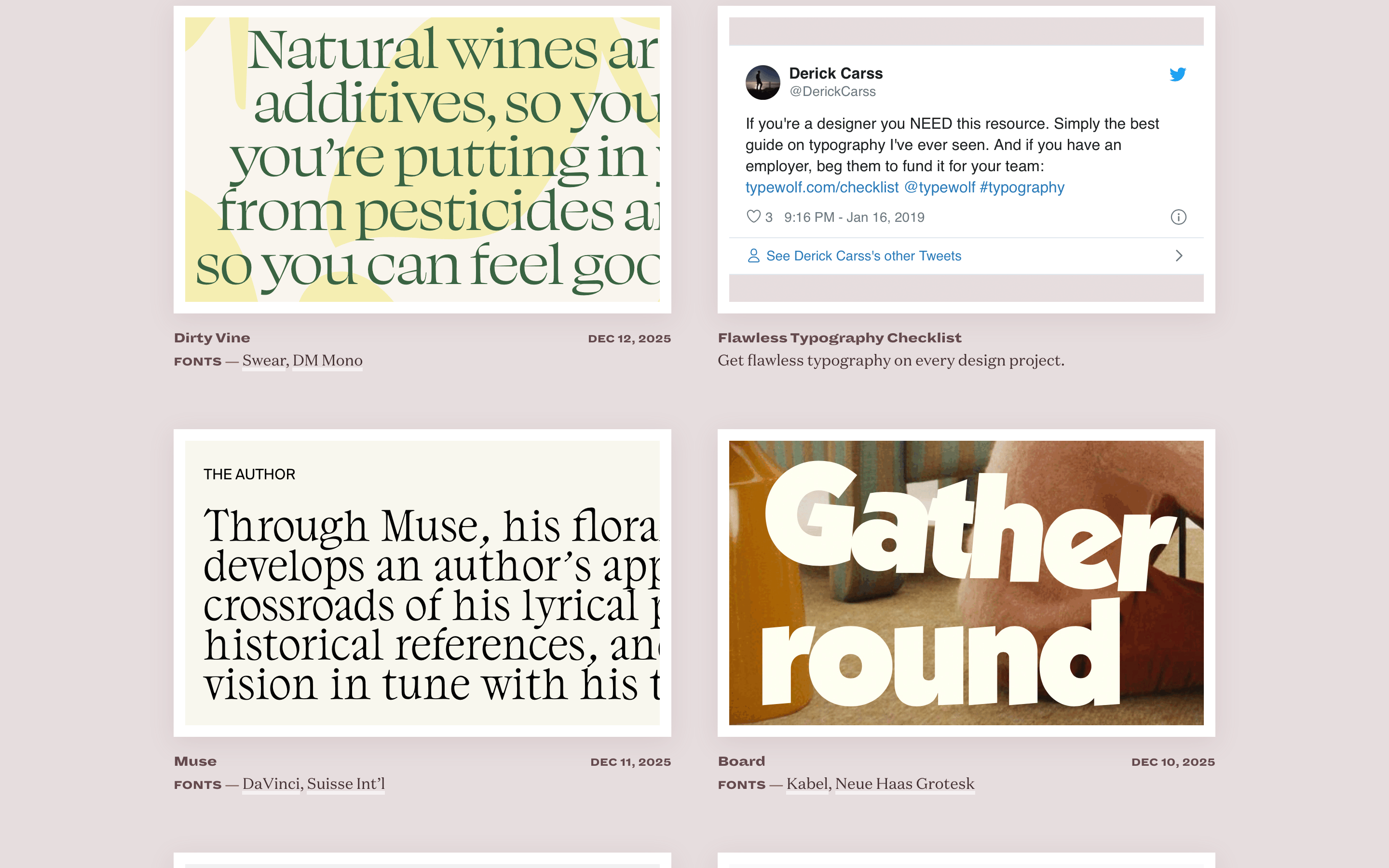
cardClean white rectangular cards containing an image at the top and typography/meta information below, elevated by subtle warm shadows.
chipSimple, uppercase sans-serif text labels separated by a long dash.
inputNot prominently featured, but implied text inputs would follow the minimalist aesthetic.
heroA large, centered typographic logo in a transitional-serif font on a warm, muted background, paired with a concise tagline.
09
Voice & Don'ts
ToneKnowledgeable, refined, and authoritative, speaking directly to a design-literate audience.
HeadlinesElegant, often using transitional-serif fonts with tight letter-spacing.
CTAsUnderstated, using bold, uppercase sans-serif text links rather than prominent buttons.
Don't use vibrant, high-saturation colors — the palette relies on warm, muted, desaturated earth tones.
Don't use geometric sans-serif for all text — the primary display font is a transitional serif.
Don't use heavy drop shadows or 3D effects — elevation is achieved through very subtle, warm box-shadows.
Don't use a strictly strict, rigid grid — the layout feels editorial and slightly organic despite the underlying structure.
Don't use uppercase for body copy — uppercase is reserved strictly for small navigation labels and meta tags.
Don't center all text alignment — while the hero is centered, much of the subsequent content uses left or mixed alignment.
Captured from the live site · real computed styles
11
System prompt
This is a refined editorial platform focused on typography curation and discovery. The design DNA is anchored by a warm, muted, desaturated earthy palette, using a soft grayish-pink background and deep brownish-ink for text. The primary typography relies heavily on a transitional serif for elegant display headings, contrasted with a bold humanist sans for uppercase navigation and metadata. White card components with subtle warm shadows create layered depth without harsh borders. Key critical donts: do not use vibrant neon colors, do not use geometric sans-serifs for primary display text, do not use heavy 3D effects, do not use uppercase for body copy, do not create overly dense layouts. The overall aesthetic is sophisticated, quiet, and highly focused on readability and typographic excellence.
Bring this taste to your agent
Hand your AI agent a machine-readable spec of this design — tokens, type, motion, the whole DNA.