← OpenDesign CURATED · OPEN · FREE
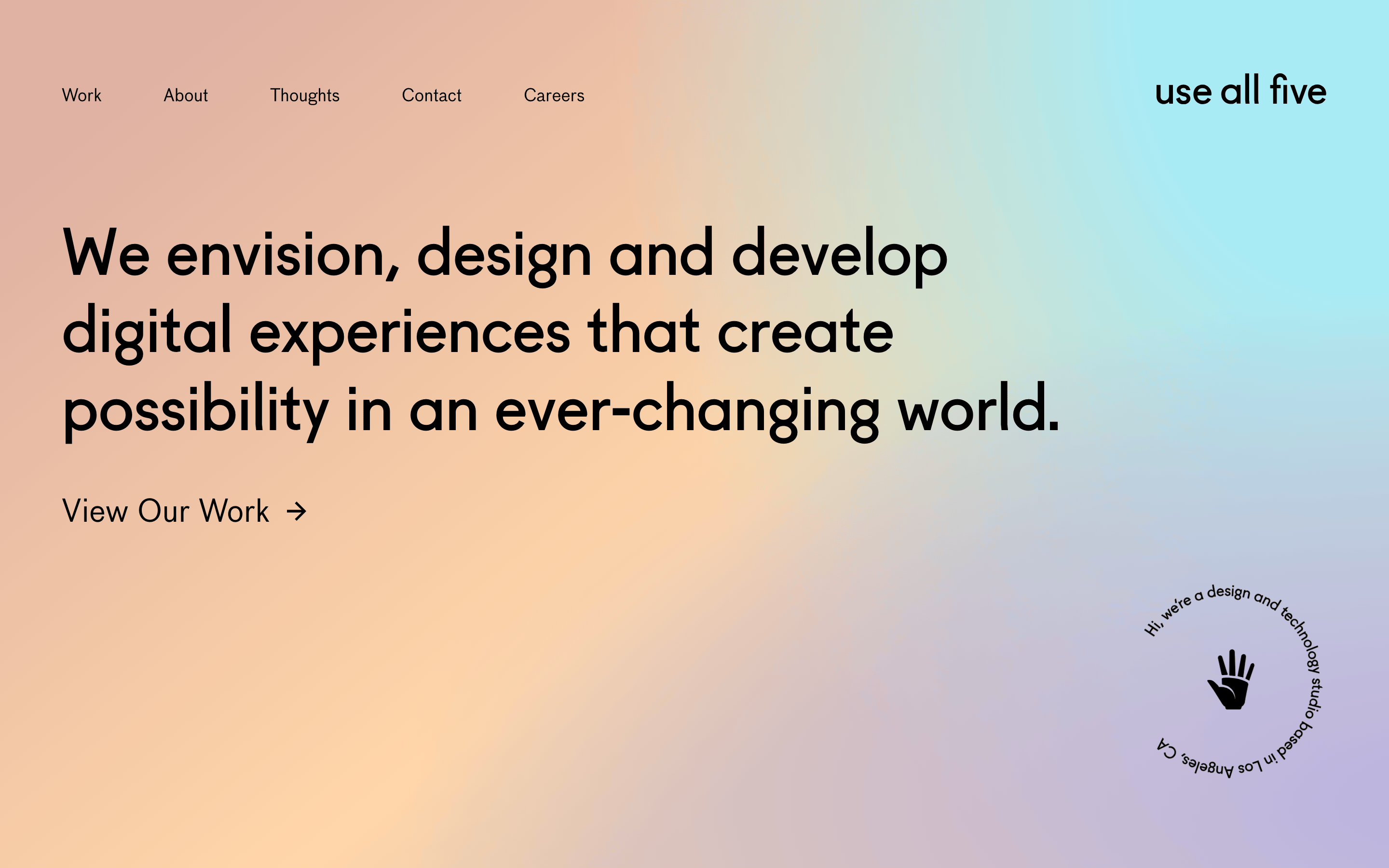
Use All Five
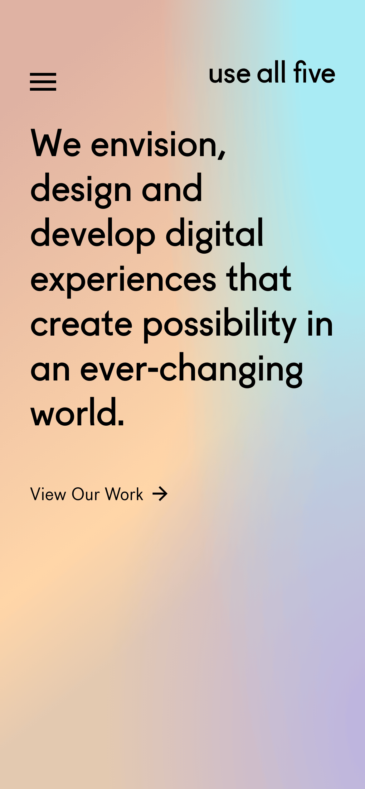
A premium digital design and technology studio site with expansive gradients and bold typography.
studio digital
01
Identity DNA
digital agency design studio technology creative innovation
a high-end design studio portfolio that blends bold typography with ethereal gradients
02
Color
#000000Ink
#FFFFFFBG
#969696Muted
rgba(0,0,0,1.0)Line
High-contrast black text on white or soft pastel gradients.
03
Typography
geometric-sans
display 67px · 500h1 40px · 400body 18px · 400Use tight negative letter spacing for large display type. · Keep body text highly readable with generous line-height.
04
Spacing
4px
8px
16px
24px
32px
48px
64px
96px
Generous whitespace and padding to emphasize large typography and imagery.
05
Surfaces
sm · 0px
md · 0px
lg · 0px
pill · 999px
Minimal to none; relies on color contrast and spacing.
06
Layout
1280 container
12 columns
24px gutter
768 / 1024 breakpoints
Asymmetric, split-column layouts with massive type on one side and content/images on the other.
07
Motion & Interaction
220ms micro
400ms small
800ms medium
cubic-bezier(0.25, 0.1, 0.25, 1) easing
Fade-ins for text and images on scroll. · Smooth transition on hover states for links.
Subtle opacity change or simple underline/arrow animation. · Immediate state change.
08
Components
button Simple text-based links with arrows, no solid backgrounds. card Image-centric case study blocks with large gaps between title and description. hero Full-screen, typography-focused hero on a soft, multi-stop pastel gradient background. 09
Voice & Don'ts
Tone Confident, professional, visionary. Headlines Bold, declarative statements about possibility and creation. CTAs Simple text links with arrows ('View Our Work →'). don't use solid background colors for sections — screenshot shows expansive pastel gradients. don't use heavily weighted, condensed fonts — screenshot shows a regular/medium weight geometric sans. don't use small, tightly packed grids — screenshot shows expansive, open layouts with generous whitespace. don't use primary-colored buttons — screenshot shows simple text links with arrows. don't use drop shadows on elements — screenshot shows flat surfaces with minimal to no borders. don't use complex multi-column text layouts — screenshot shows single, clear columns or split layouts. Avoid: Avoid jargon or overly technical buzzwords. Avoid: Avoid cluttered layouts or busy backgrounds. Avoid: Avoid small, hard-to-read text. Avoid: Avoid multiple accent colors competing for attention. Avoid: Avoid heavy shadows or 3D effects. Avoid: Avoid standard UI patterns like solid buttons. 10
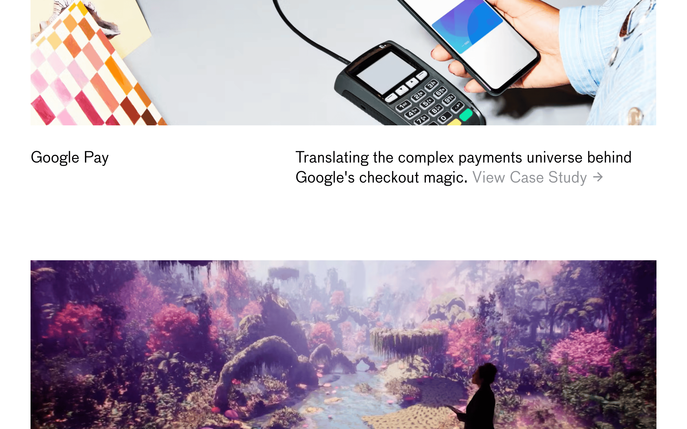
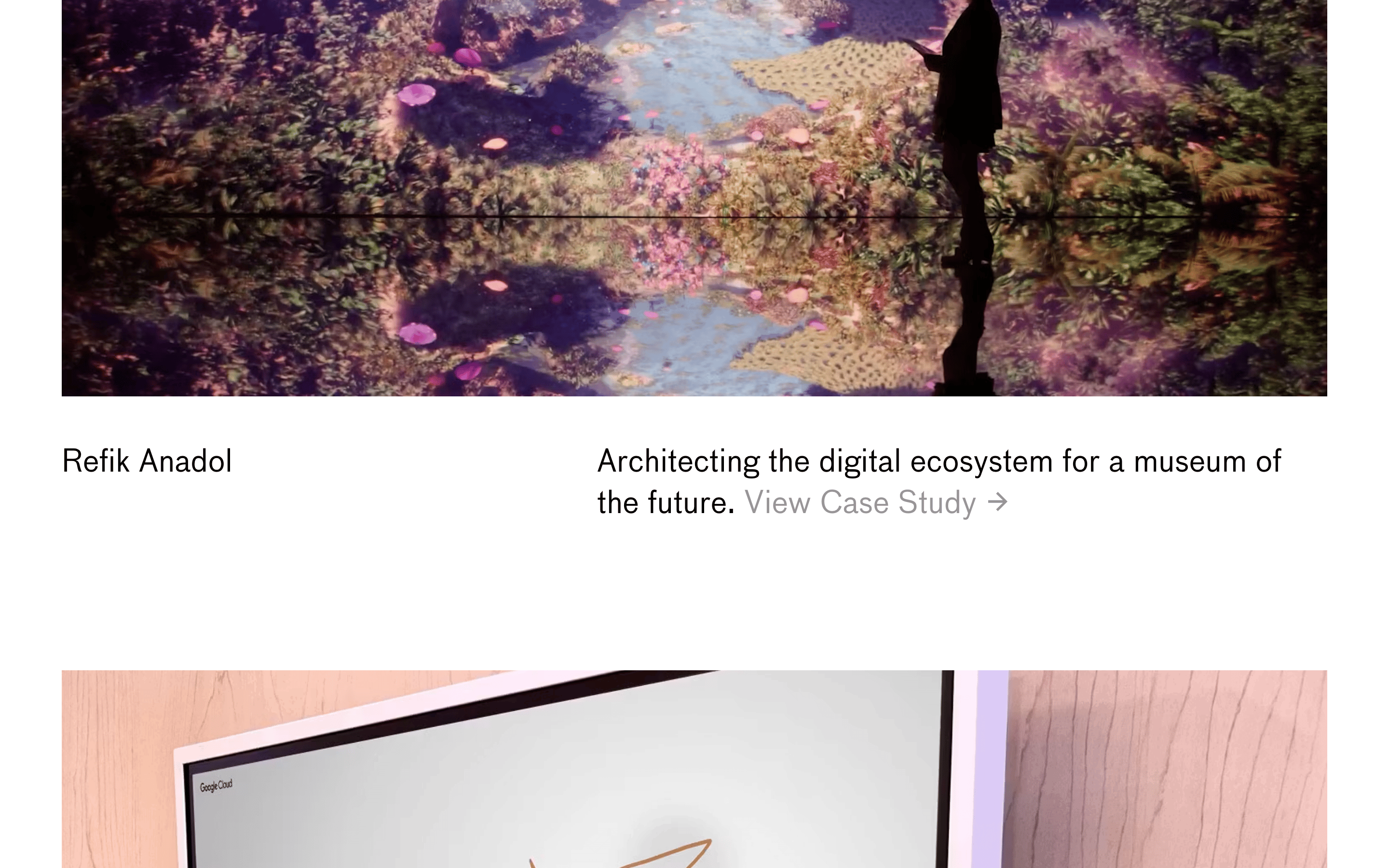
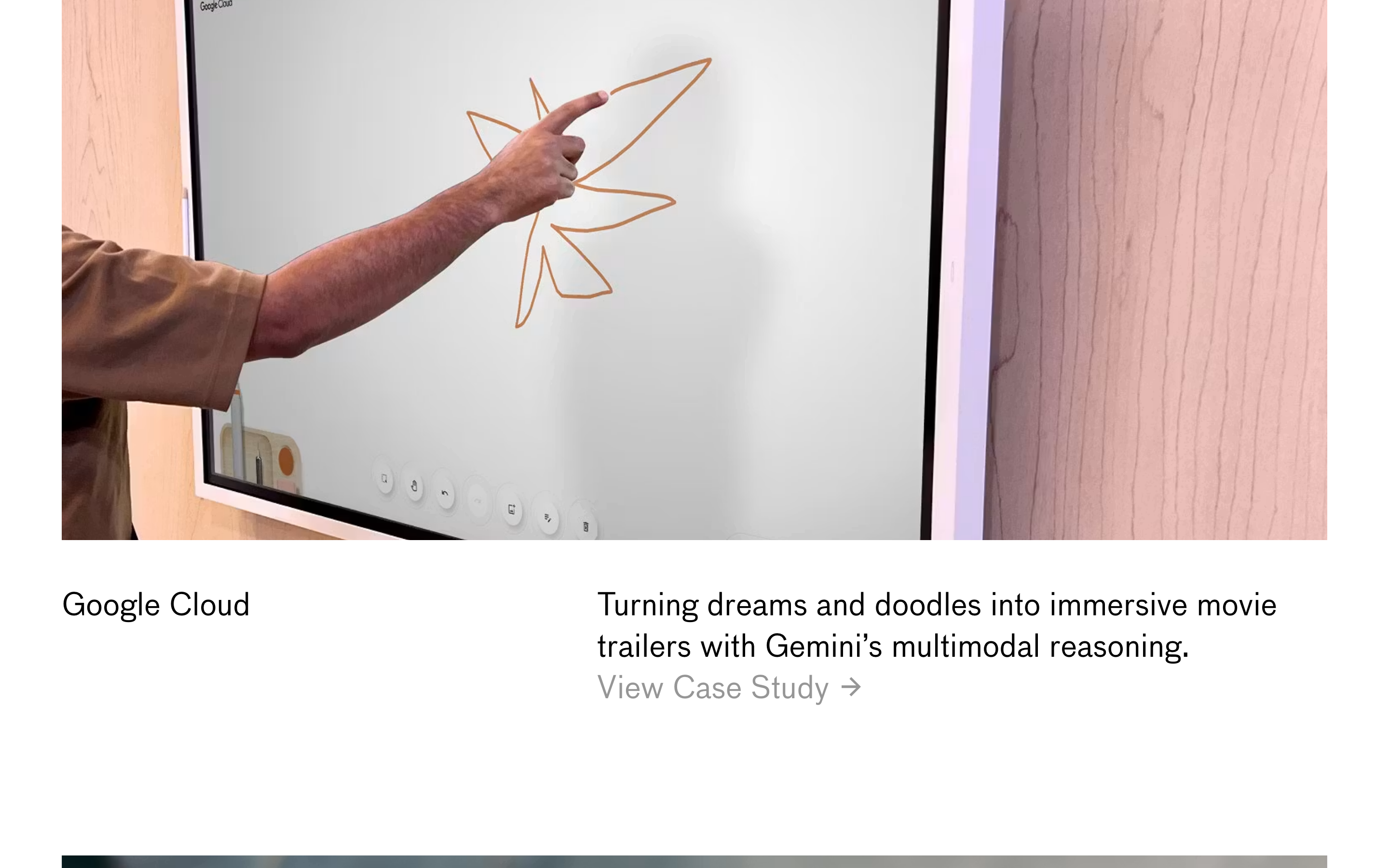
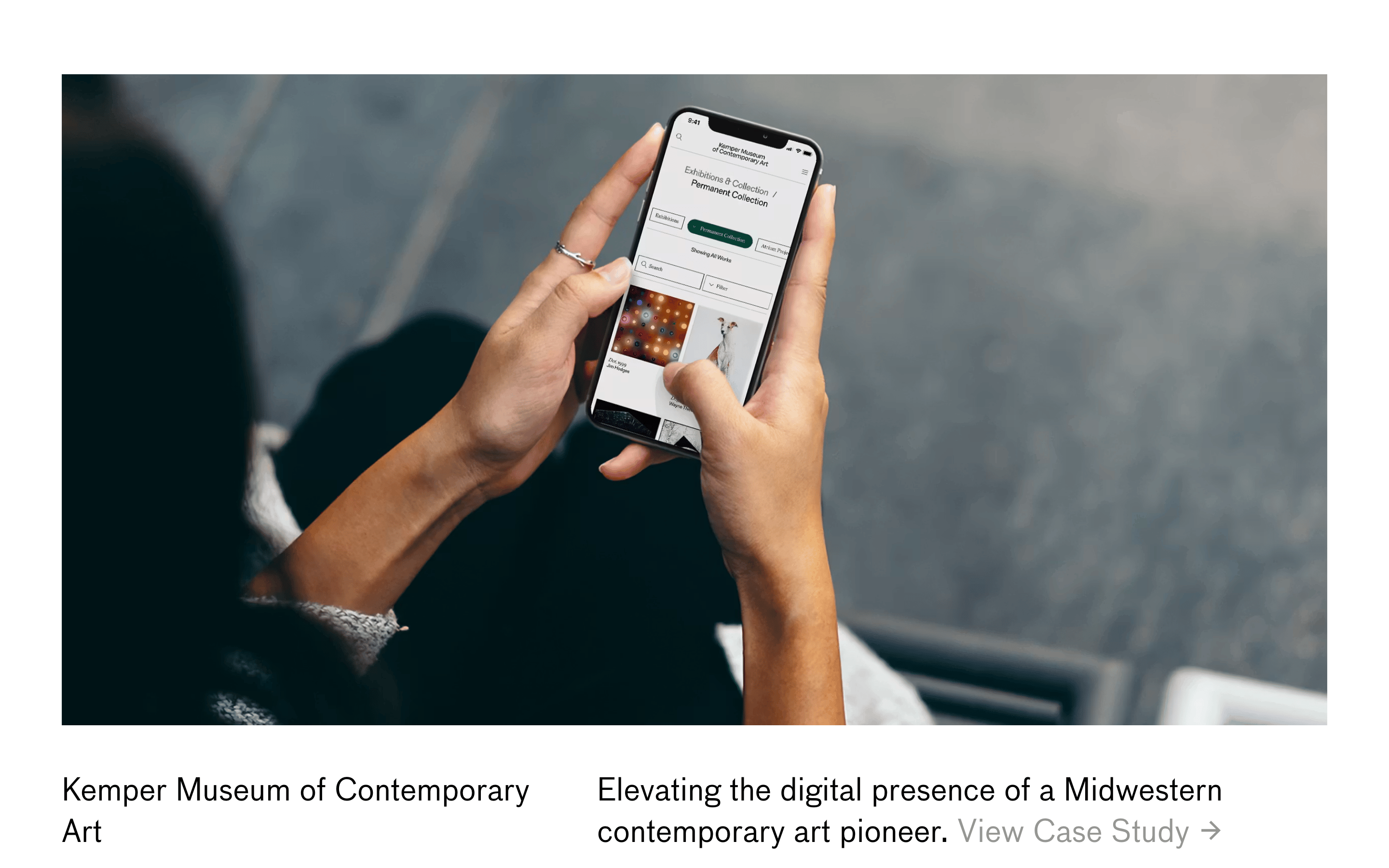
Inside the pack — real screenshots
桌面首屏(hero) 桌面滚动分段(90% viewport 步进,作为视觉证据) 桌面滚动分段(90% viewport 步进,作为视觉证据) 桌面滚动分段(90% viewport 步进,作为视觉证据) 桌面滚动分段(90% viewport 步进,作为视觉证据) 桌面滚动分段(90% viewport 步进,作为视觉证据) 桌面滚动分段(90% viewport 步进,作为视觉证据) 桌面滚动分段(90% viewport 步进,作为视觉证据) 桌面滚动分段(90% viewport 步进,作为视觉证据) 桌面滚动分段(90% viewport 步进,作为视觉证据) 桌面滚动分段(90% viewport 步进,作为视觉证据) 桌面滚动分段(90% viewport 步进,作为视觉证据) 桌面滚动分段(90% viewport 步进,作为视觉证据) 移动首屏 Captured from the live site · real computed styles
11
System prompt
A premium digital design and technology studio portfolio. Key features are expansive, multi-stop pastel gradients (soft peach, cyan, lavender) and bold, black geometric-sans typography. Layout is highly asymmetric and whitespace-heavy. No solid color buttons or drop shadows are used; calls to action are simple text links. Critical donts: don't use solid background sections, don't use heavy weights, and don't use standard UI buttons.
More from the library en · zh-CN · zh-TW · ja · ko
OpenDesign · curated web aesthetics for AI-readable design DNA · opendesign.cc
Why we curated this: Worth including as a prime example of high-end, contemporary digital agency portfolio design focusing on large-scale typography and ethereal gradients.