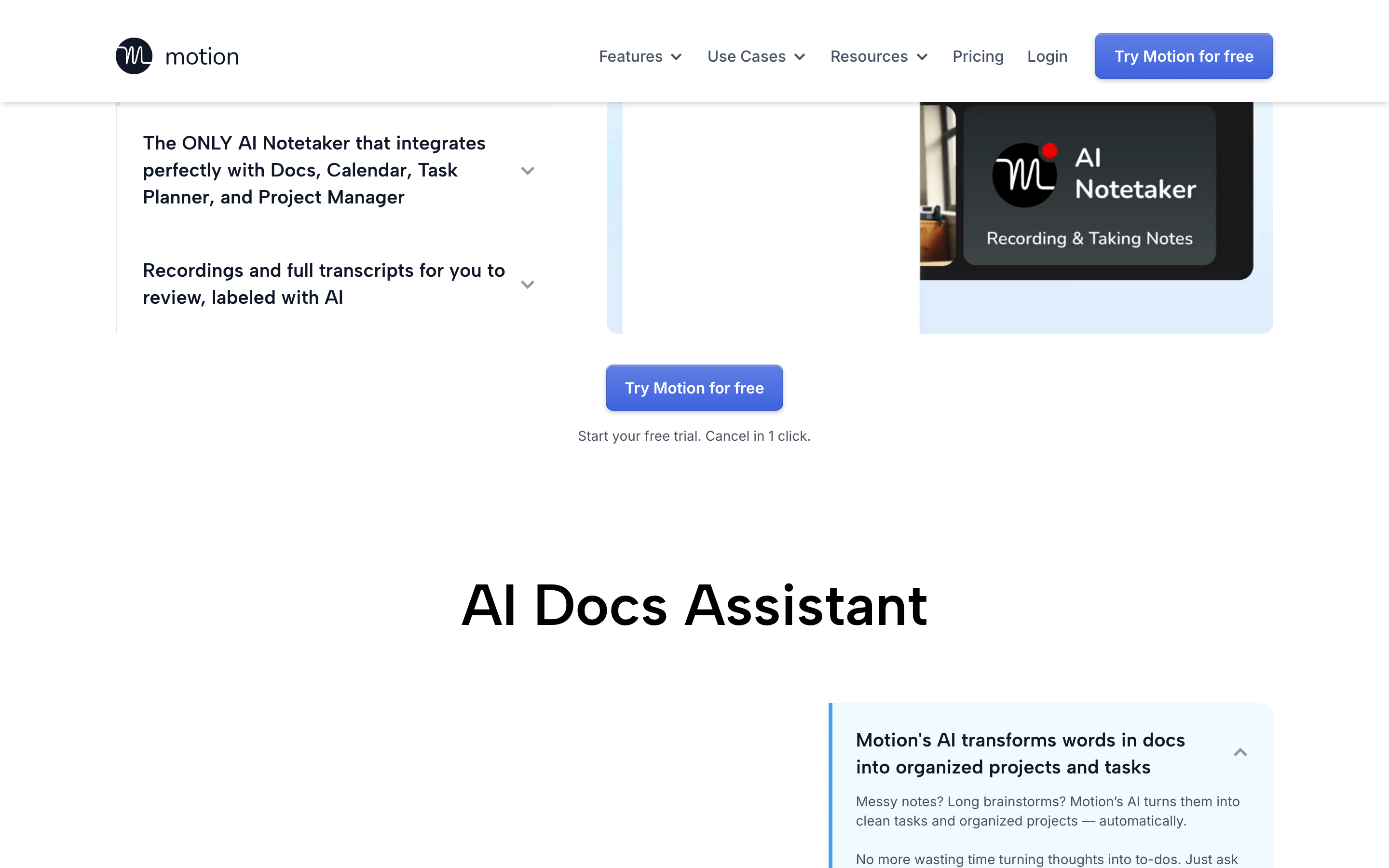
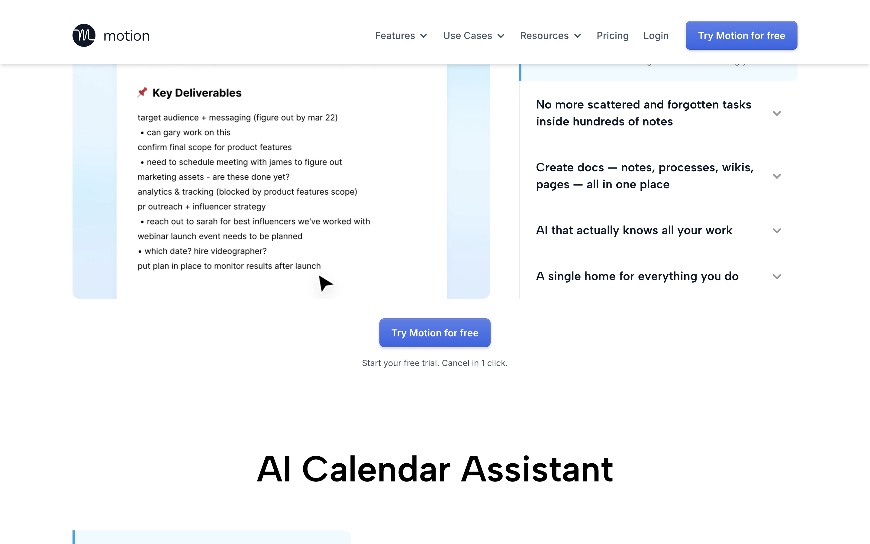
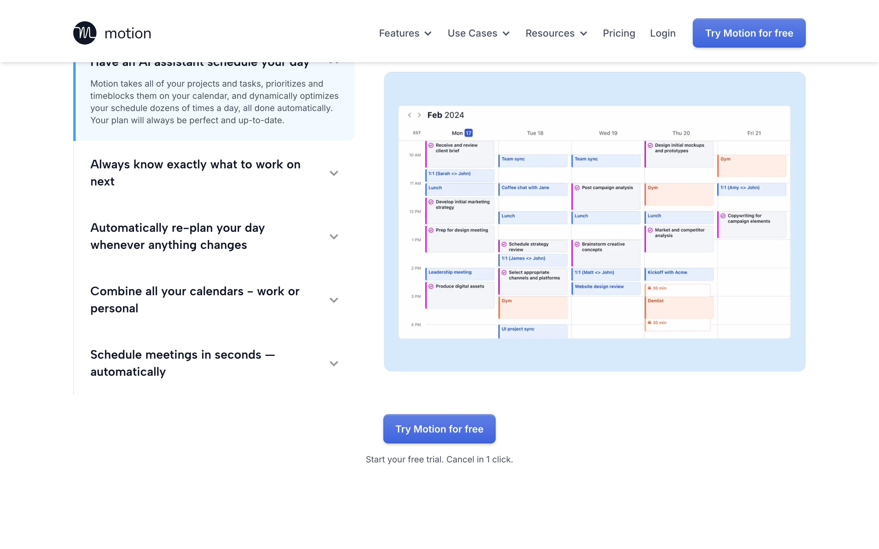
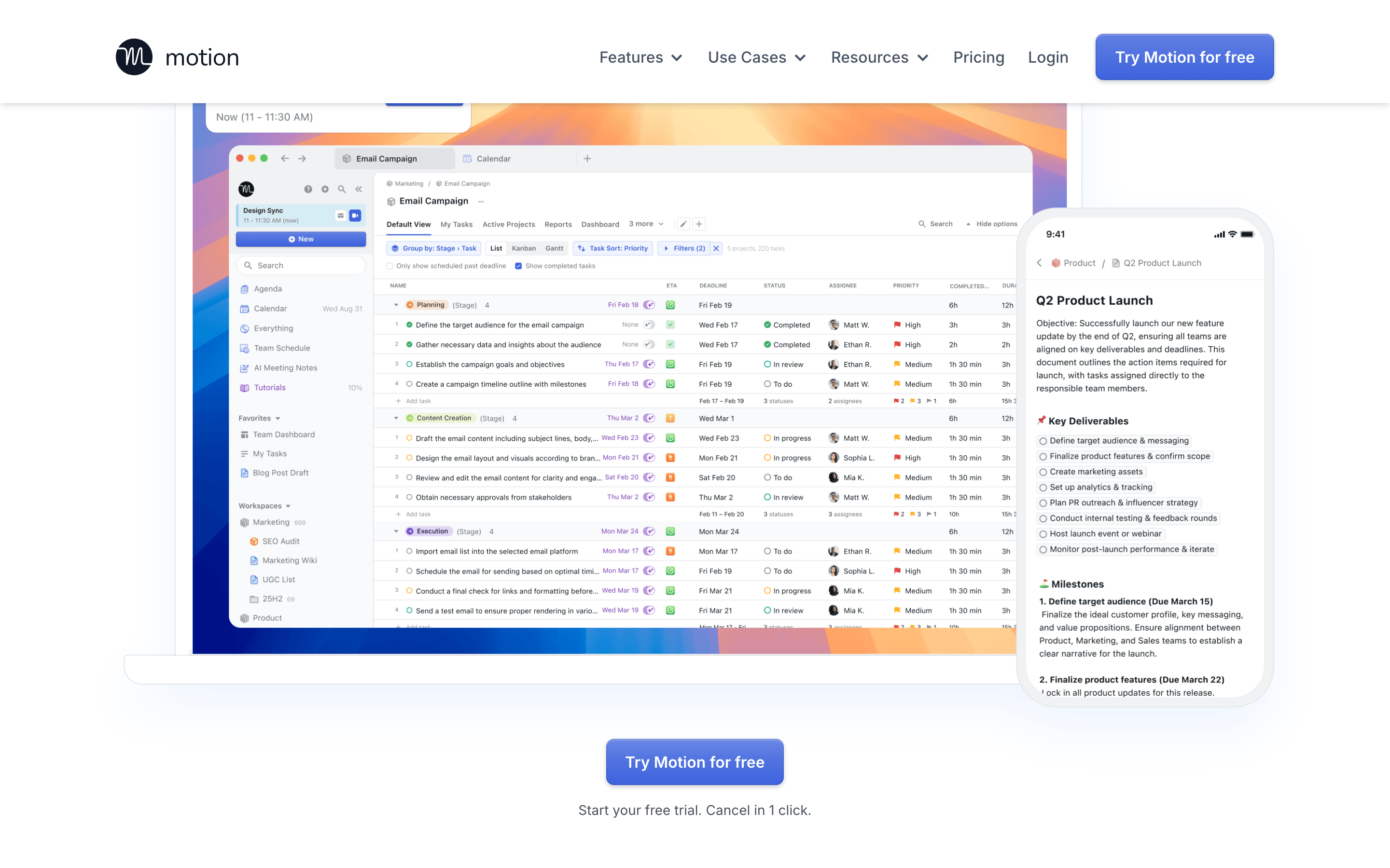
A sleek, efficient digital workspace that combines calendar, notes, and tasks into one AI-powered hub.
02
Color
#2c77e7Accent
#101828Ink
#475467Ink soft
#ffffffBG
#f0f4f8BG soft
#f7f8fbBG quiet
#787f86Muted
rgba(71, 84, 103, 0.1)Line
Clean white backgrounds with subtle gray accents and a vibrant blue primary action color.
03
Typography
humanist-sans · monospace
display64px · 700
headline40px · 700
body16px · 400
small14px · 400
label12px · 600
Use Inter for body text and UI elements · Use Albert Sans for larger display headlines · Maintain tight letter spacing for display text · Use semibold weight for emphasis and labels
04
Spacing
4px
8px
12px
16px
24px
32px
40px
48px
64px
96px
Consistent 4px grid system with generous whitespace for readability
Centered single-column layout for hero, transitioning to multi-column feature sections
07
Motion & Interaction
150msmicro
150mssmall
150msmedium
cubic-bezier(0.4, 0, 0.2, 1)easing
Smooth transitions on all interactive elements (150ms) · Color transitions for hover states · Transform transitions for scale and movement · Box shadow transitions for depth effects
Subtle color darkening and shadow enhancement · Slight scale reduction (0.98) for buttons
08
Components
buttonSolid blue (44, 119, 231) with white text, rounded corners (8px), subtle shadow, and hover state transitions
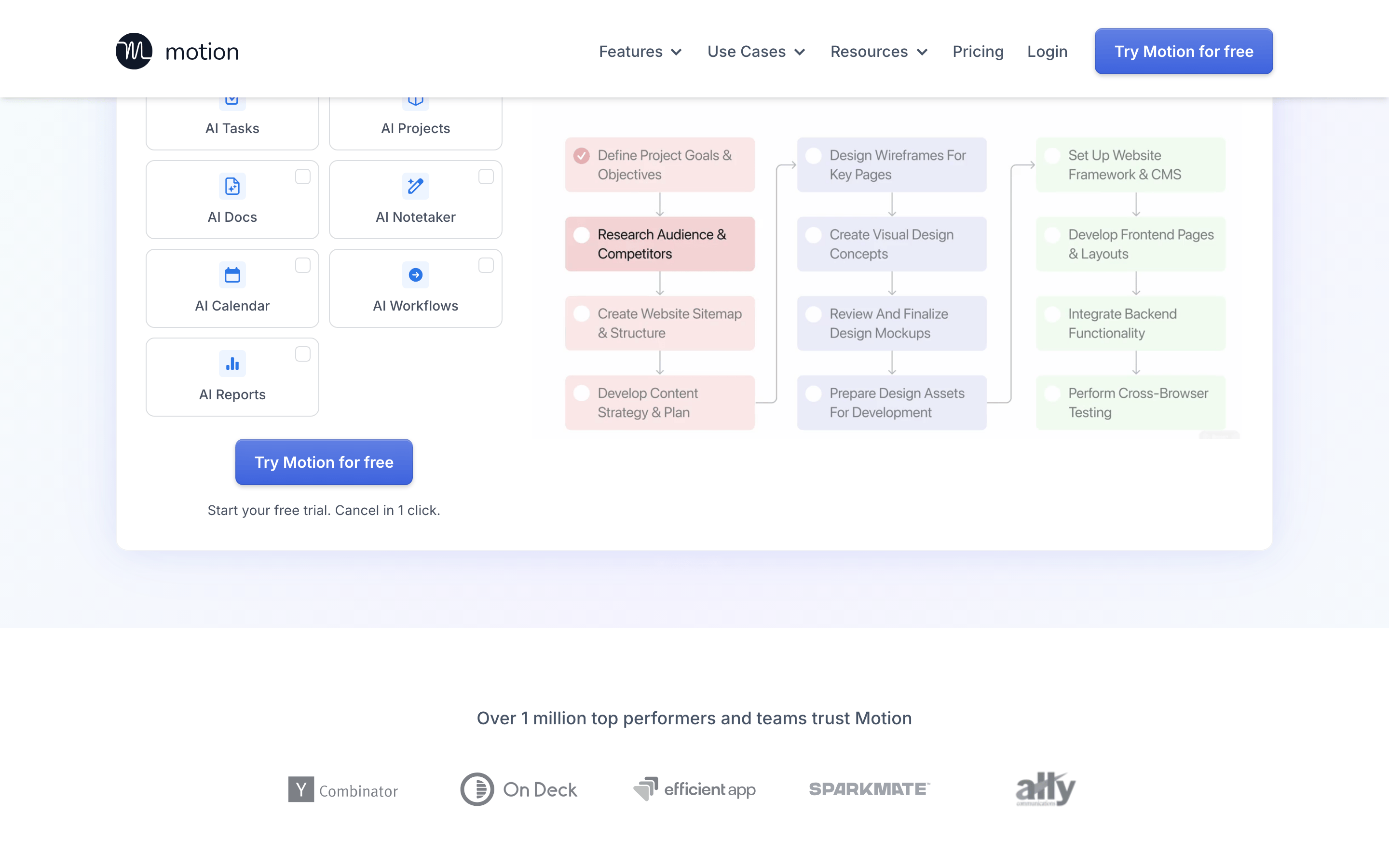
cardWhite background with subtle border, rounded corners (8-12px), and soft shadow
chipSmall rounded labels with light background and subtle border
inputWhite input with subtle border, rounded corners (8px), and placeholder text
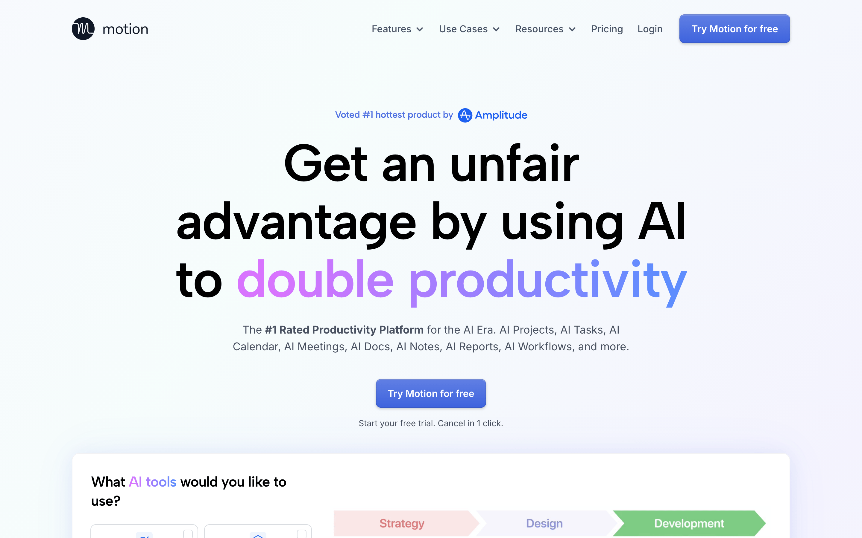
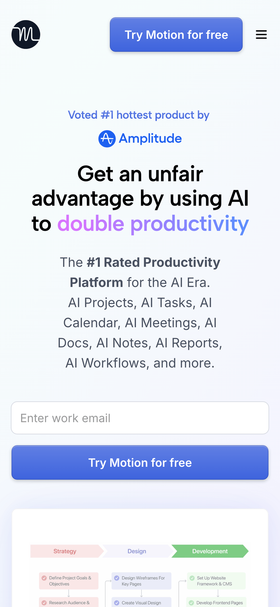
heroLarge centered headline with gradient text emphasis, supporting subtext, and prominent CTA button
09
Voice & Don'ts
ToneConfident, professional, and results-oriented
HeadlinesBold, direct statements emphasizing benefits and advantages
CTAsAction-oriented with clear value proposition (e.g., 'Try Motion for free')
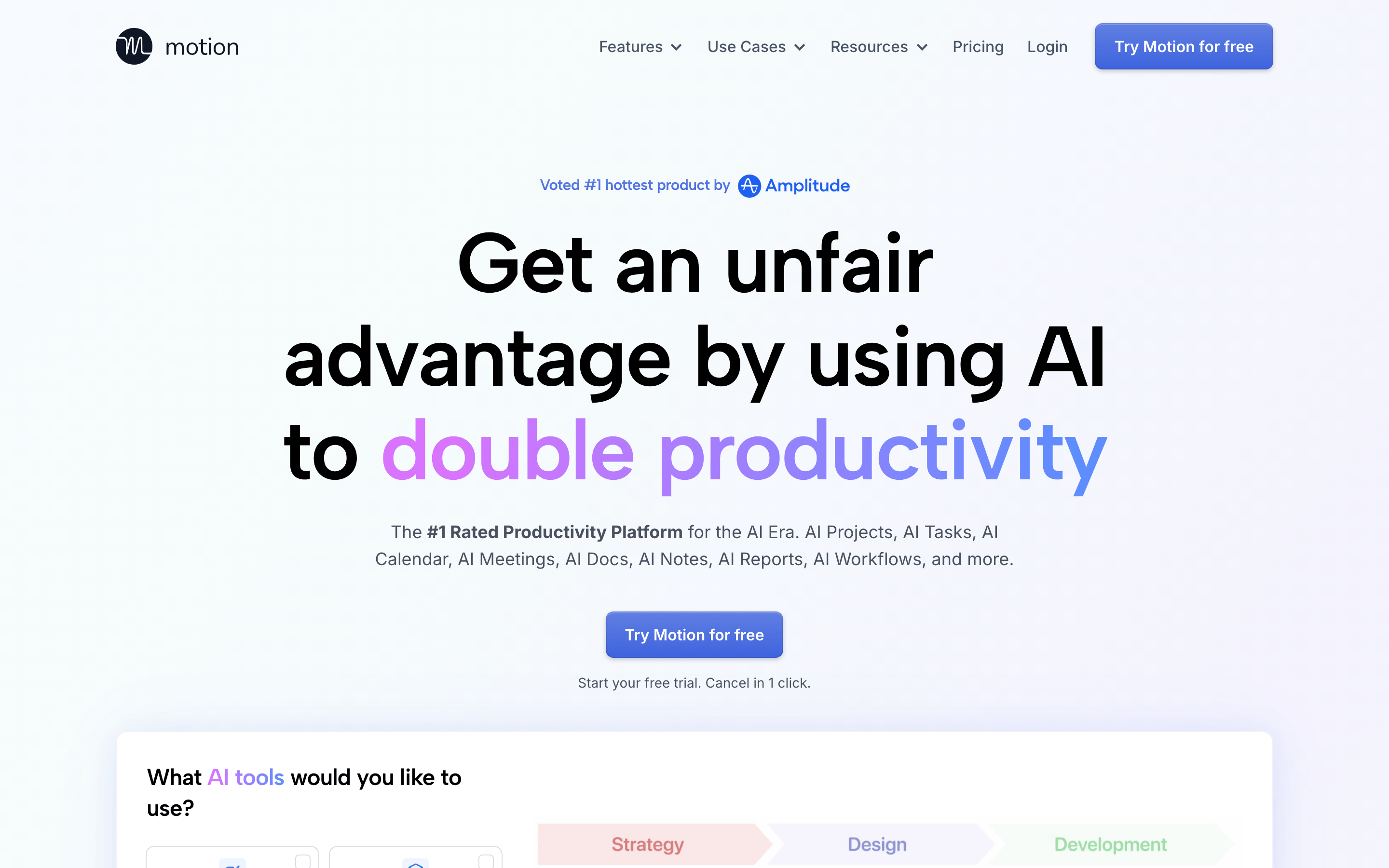
Don't use bright gradients everywhere — screenshot shows subtle gradients only on specific text highlights
Don't clutter with multiple CTAs — screenshot shows one primary 'Try Motion for free' button per section
Don't use heavy borders — screenshot shows very subtle 1px borders with low opacity
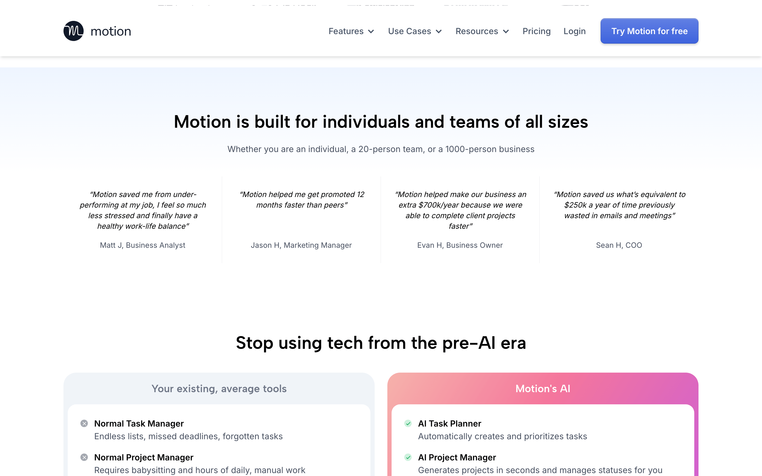
Don't overload with colors — screenshot shows predominantly blue accent with neutral grays
Captured from the live site · real computed styles
11
System prompt
This is a premium SaaS productivity platform called Motion, positioned as an AI-powered workspace that doubles productivity. Key design elements include a clean white background (#ffffff) with subtle gray accents (#f0f4f8, #787f86) and a vibrant blue primary color (#2c77e7). Typography uses humanist sans-serif fonts (Inter and Albert Sans) with large, bold headlines (64px at 700 weight) and clean body text (16px at 400 weight). Critical design constraints: avoid using heavy shadows or borders, maintain generous whitespace, keep CTAs prominent but not overwhelming, and ensure all text maintains strong contrast ratios. The design emphasizes clarity and professionalism while using gradient text effects sparingly for emphasis on key benefit statements.
Bring this taste to your agent
Hand your AI agent a machine-readable spec of this design — tokens, type, motion, the whole DNA.