← OpenDesign CURATED · OPEN · FREE
Wgsn
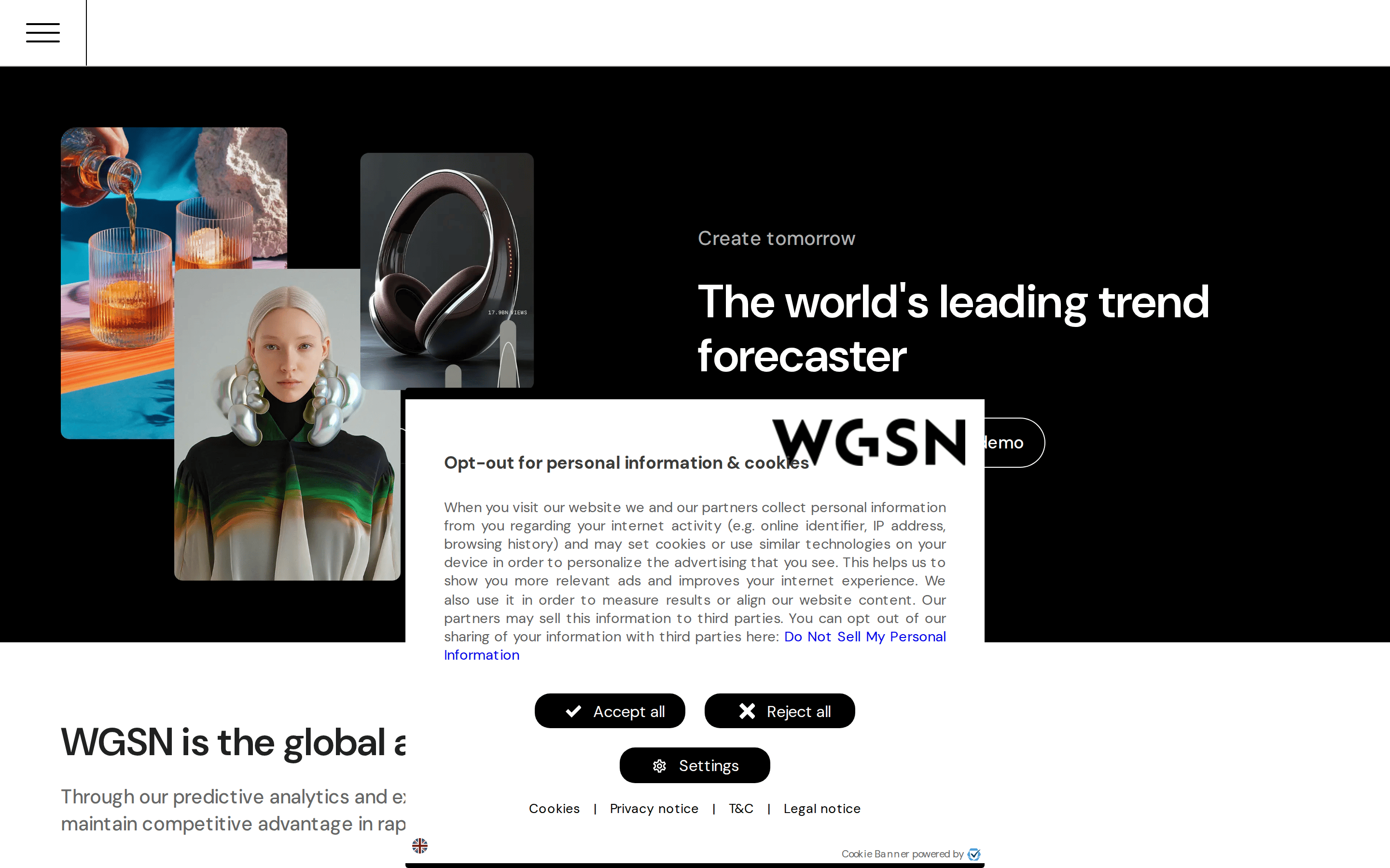
The world's leading trend forecaster.
Premium Editorial Productivity Curation Agency
01
Identity DNA
trend forecasting future insight premium
A high-end fashion editorial meets enterprise SaaS dashboard.
02
Color
#000000Ink
rgba(0,0,0,0.6)Ink soft
#FFFFFFBG
#F5F5F5BG soft
#999999Muted
Monochromatic base with high-contrast black and white, allowing imagery to provide the primary color.
03
Typography
humanist-sans · monospace
display 56px · 700h2 48px · 400body 18px · 400Use DM Sans for all text layers. · Keep body text legible with generous line-height. · Use tight letter-spacing for large display text.
04
Spacing
4px
8px
16px
24px
32px
48px
64px
96px
Generous whitespace to reflect premium positioning.
05
Surfaces
sm · 4px
md · 16px
lg · 40px
pill · 999px
Thin 1px borders in rgba(0,0,0,0.6).
rgb(0, 0, 0) 0px 0px 0px 1px inset
06
Layout
1280 container
12 columns
24px gutter
768 / 1024 breakpoints
Standard centered container with split-screen hero layout.
07
Motion & Interaction
220ms micro
400ms small
800ms medium
cubic-bezier(0.25, 0.1, 0.25, 1) easing
Smooth background-color transitions on interactive elements.
Background color shifts for buttons and links. · Immediate visual feedback.
08
Components
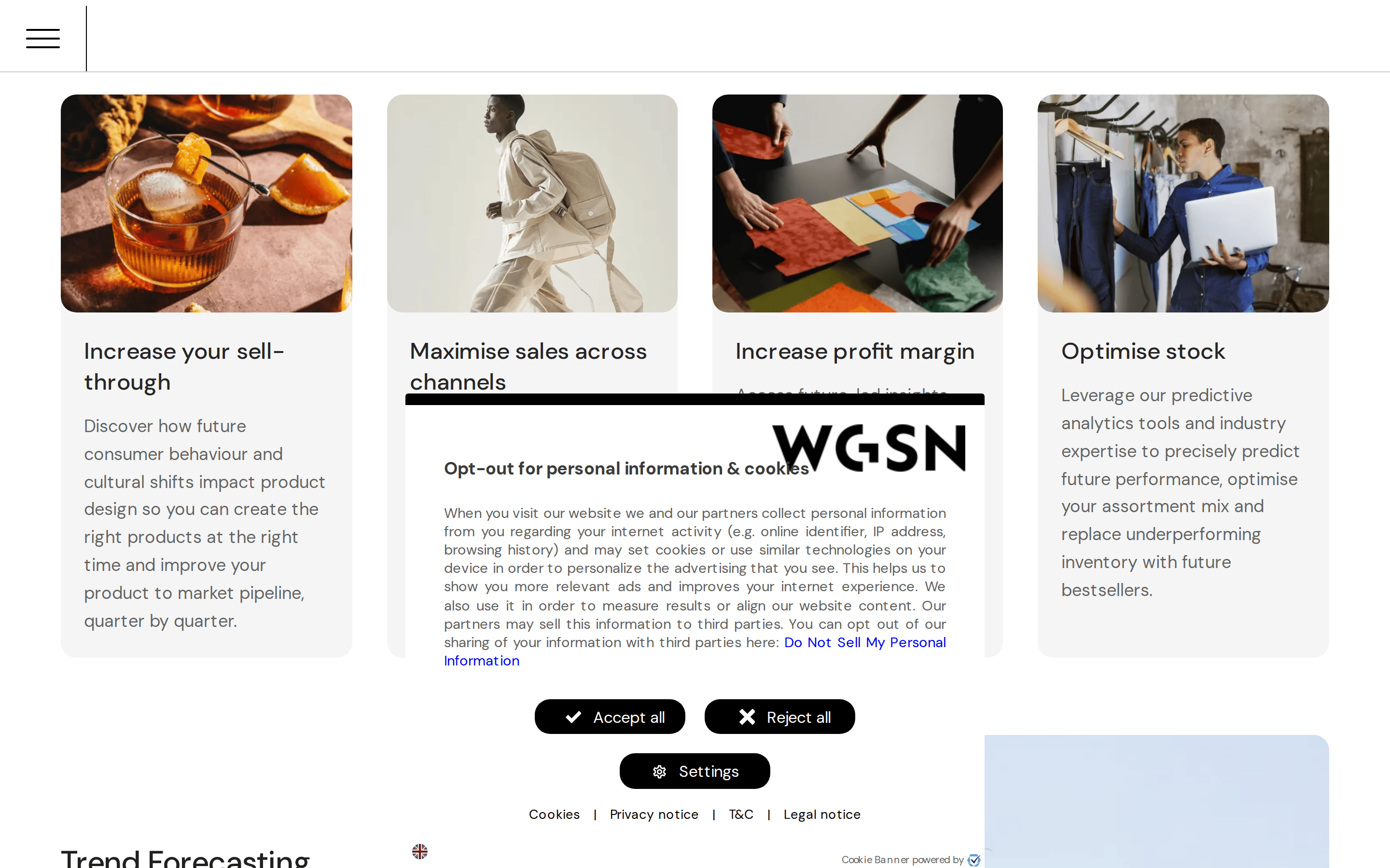
button Pill-shaped buttons with 40px border-radius and high contrast (black on white or white on black). card Rounded rectangles (16px radius) containing imagery and text overlays. chip N/A input N/A hero Large split layout featuring a collage of trend imagery on one side and bold typography on the other. 09
Voice & Don'ts
Tone Authoritative, visionary, and professional. Headlines Short, punchy, and forward-looking (e.g., 'Create tomorrow'). CTAs Direct and action-oriented (e.g., 'Request a demo'). Don't use bright neon colors — screenshot shows a strictly monochromatic black/white base. Don't use sharp 0px corners — screenshot shows pill buttons (40px) and rounded cards (16px). Don't use wide letter-spacing in headlines — screenshot shows tight tracking (-1px). Don't use thin font weights for headlines — screenshot shows bold/semi-bold display text. Don't use busy backgrounds — screenshot uses solid black, white, or light gray for sections. Don't use small, cramped text — screenshot uses generous 18px body text with high line-height. Avoid: Casual slang Avoid: Passive voice Avoid: Overly technical jargon 10
Inside the pack — real screenshots
桌面首屏(hero) 桌面滚动分段(90% viewport 步进,作为视觉证据) 桌面滚动分段(90% viewport 步进,作为视觉证据) 桌面滚动分段(90% viewport 步进,作为视觉证据) 桌面滚动分段(90% viewport 步进,作为视觉证据) 桌面滚动分段(90% viewport 步进,作为视觉证据) 桌面滚动分段(90% viewport 步进,作为视觉证据) 桌面滚动分段(90% viewport 步进,作为视觉证据) 桌面滚动分段(90% viewport 步进,作为视觉证据) 移动首屏 Captured from the live site · real computed styles
11
System prompt
WGSN is a premium B2B trend forecasting platform that uses a refined, editorial design language. The color palette is strictly monochromatic, using pure black (#000000) and white (#FFFFFF) with semi-transparent blacks for hierarchy and gray (#999999) for muted elements. Typography is exclusively DM Sans, a humanist sans-serif, ranging from bold 56px headlines to 18px body text. Buttons are pill-shaped (40px radius) with high-contrast fills. The layout is spacious and centered, emphasizing large trend imagery. Critical constraints: never use accent colors, never use sharp corners on buttons, and never let text become cramped. Maintain an authoritative yet visionary tone throughout all copy.
More from the library en · zh-CN · zh-TW · ja · ko
OpenDesign · curated web aesthetics for AI-readable design DNA · opendesign.cc
Why we curated this: WGSN is a perfect reference for premium editorial SaaS design, demonstrating how a restrictive color palette and strong typography can convey high-end authority.