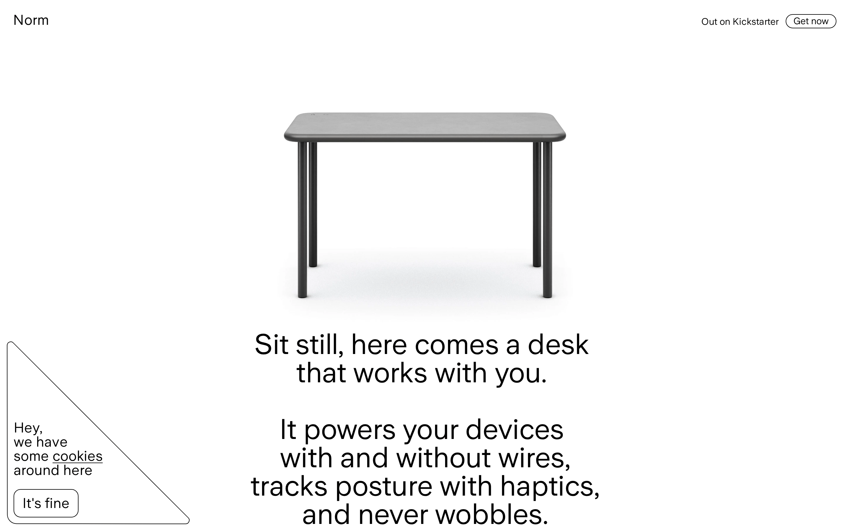
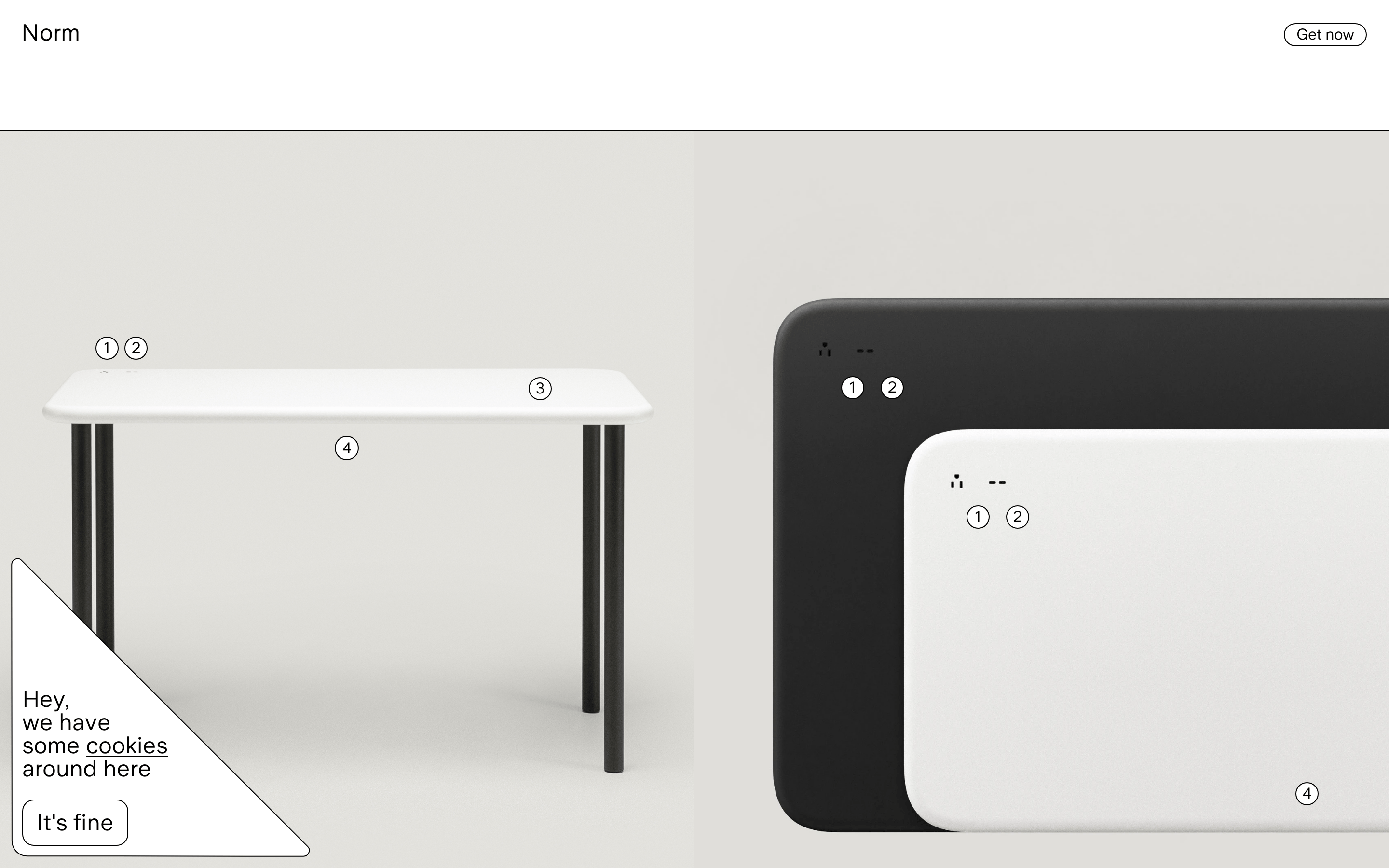
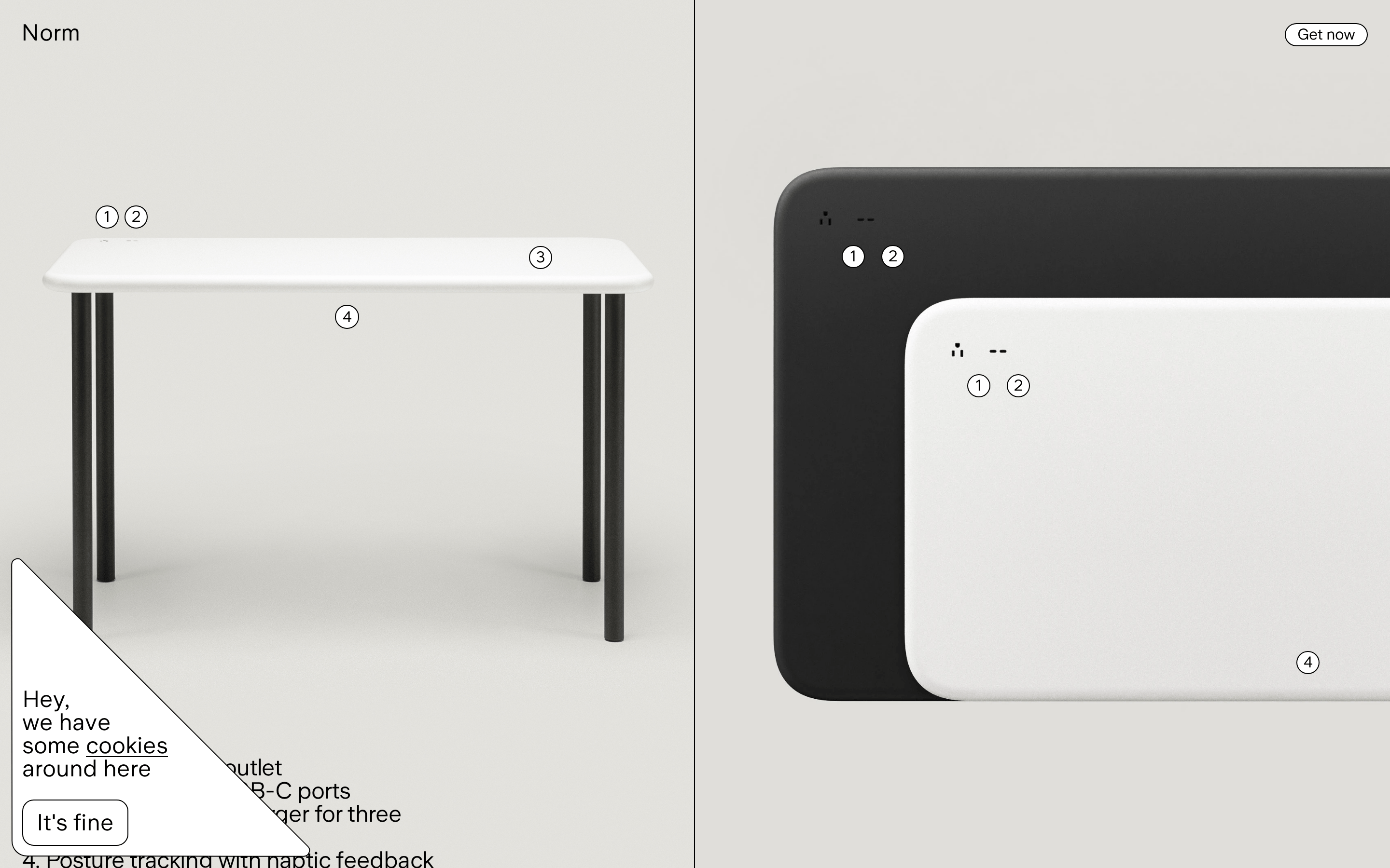
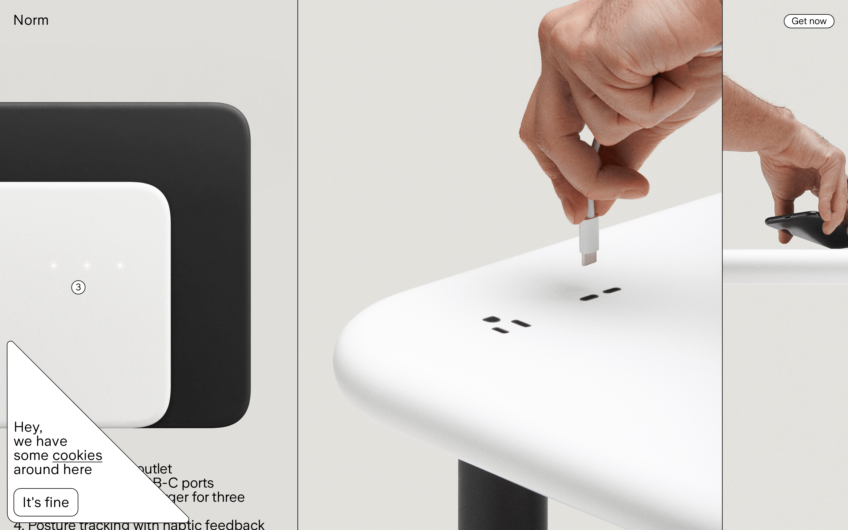
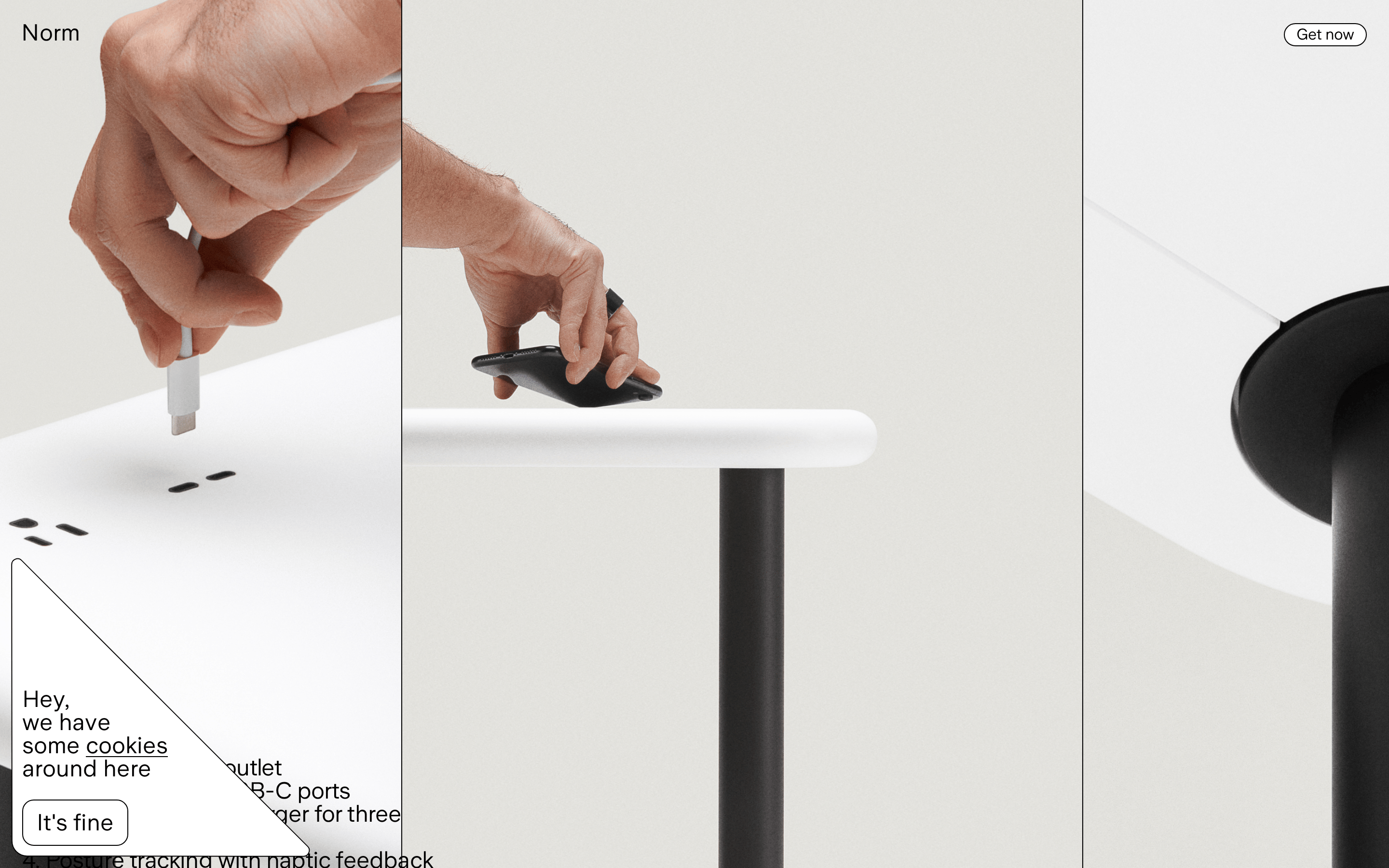
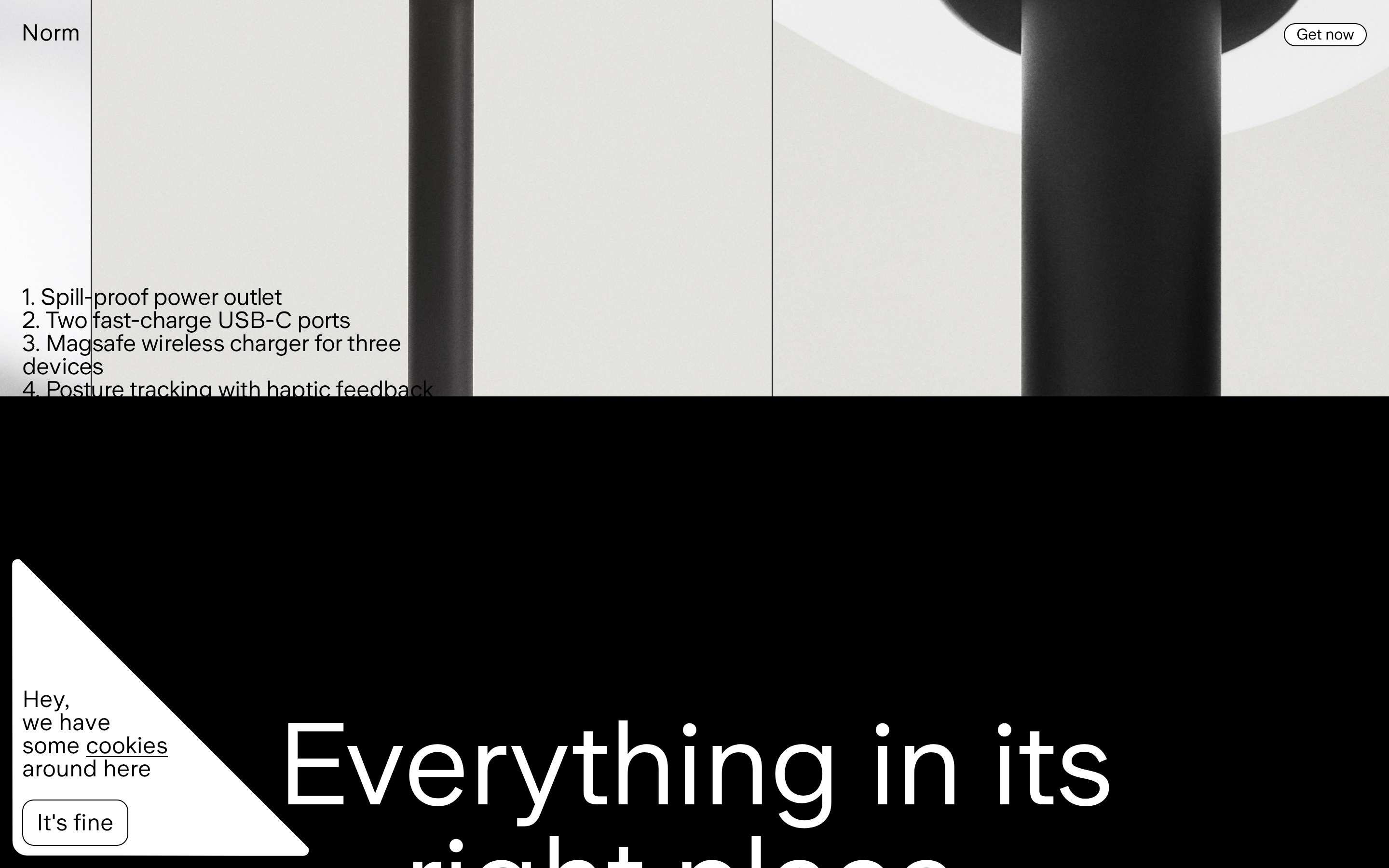
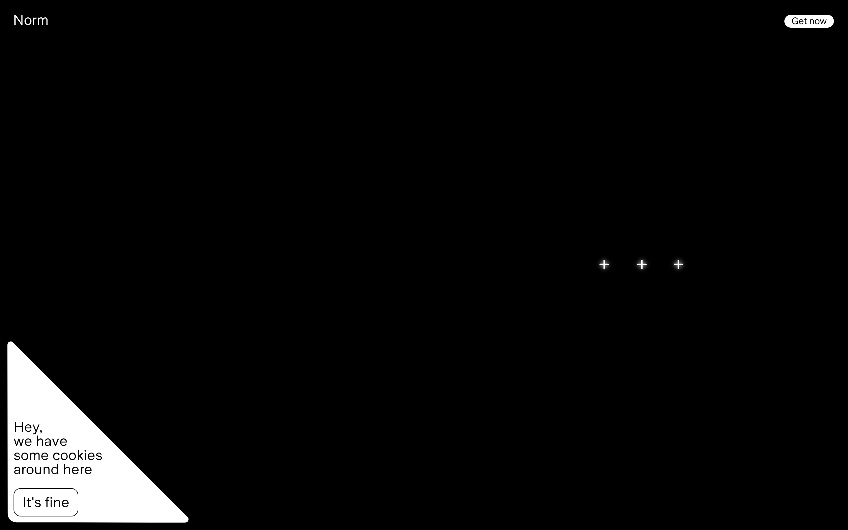
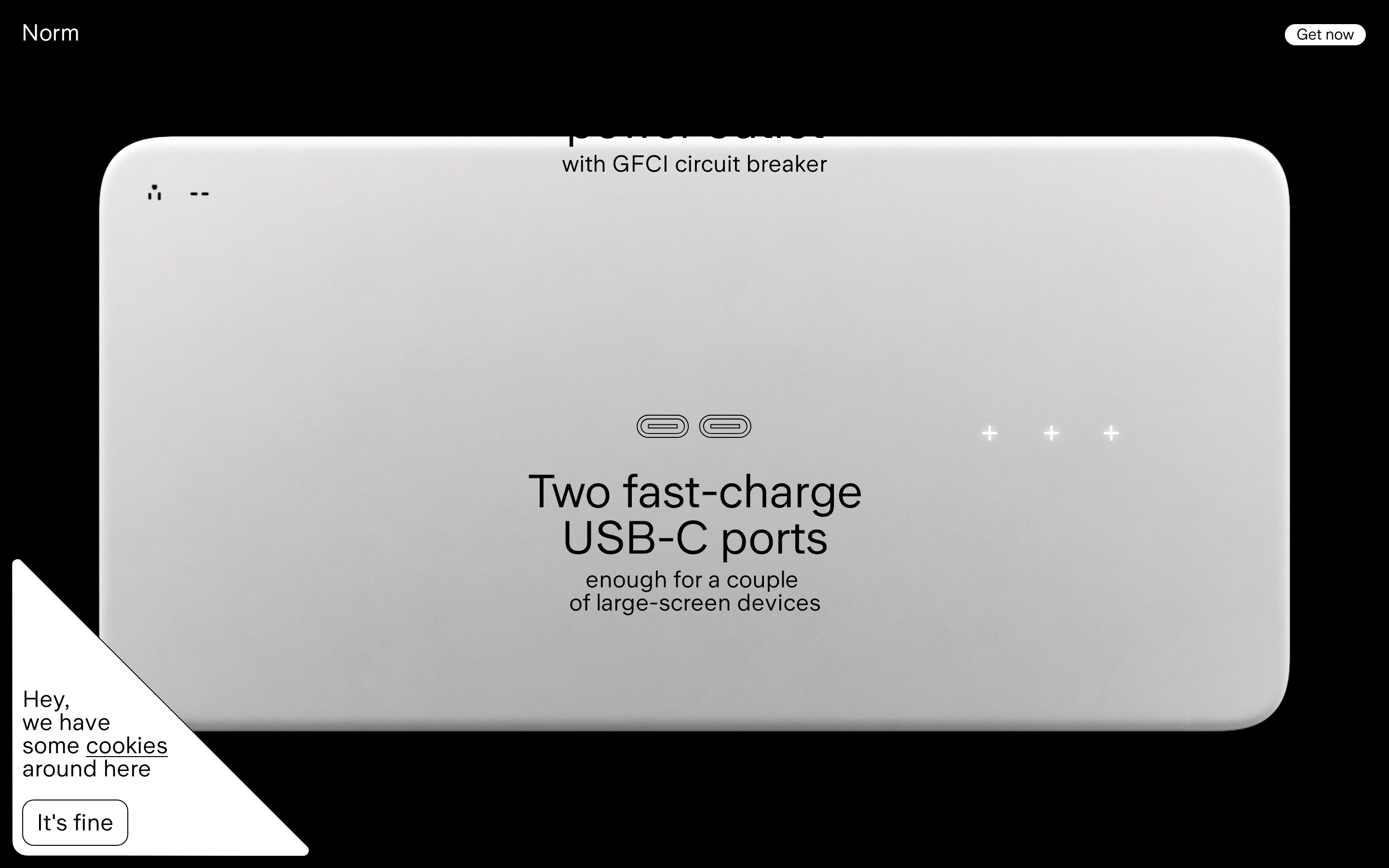
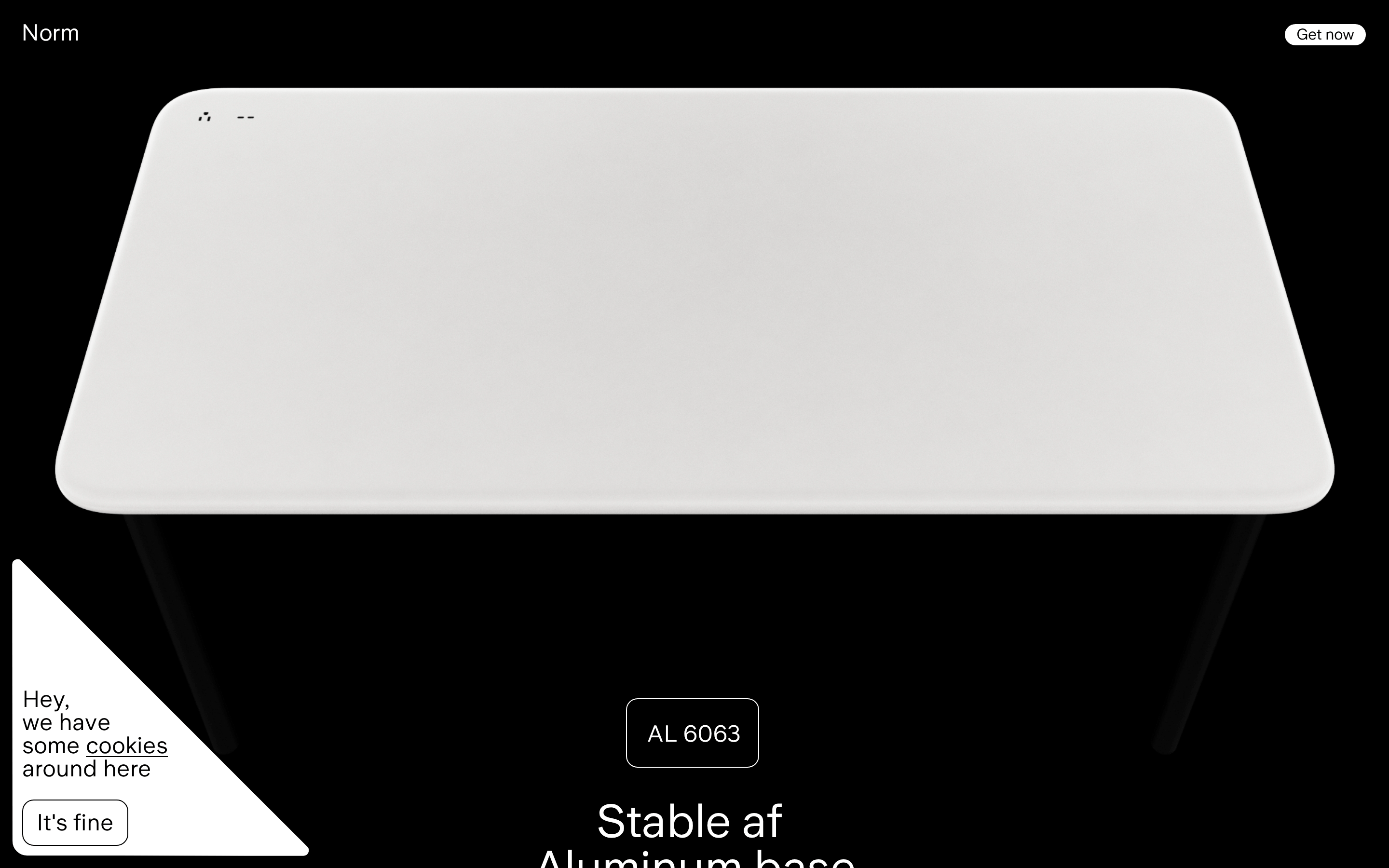
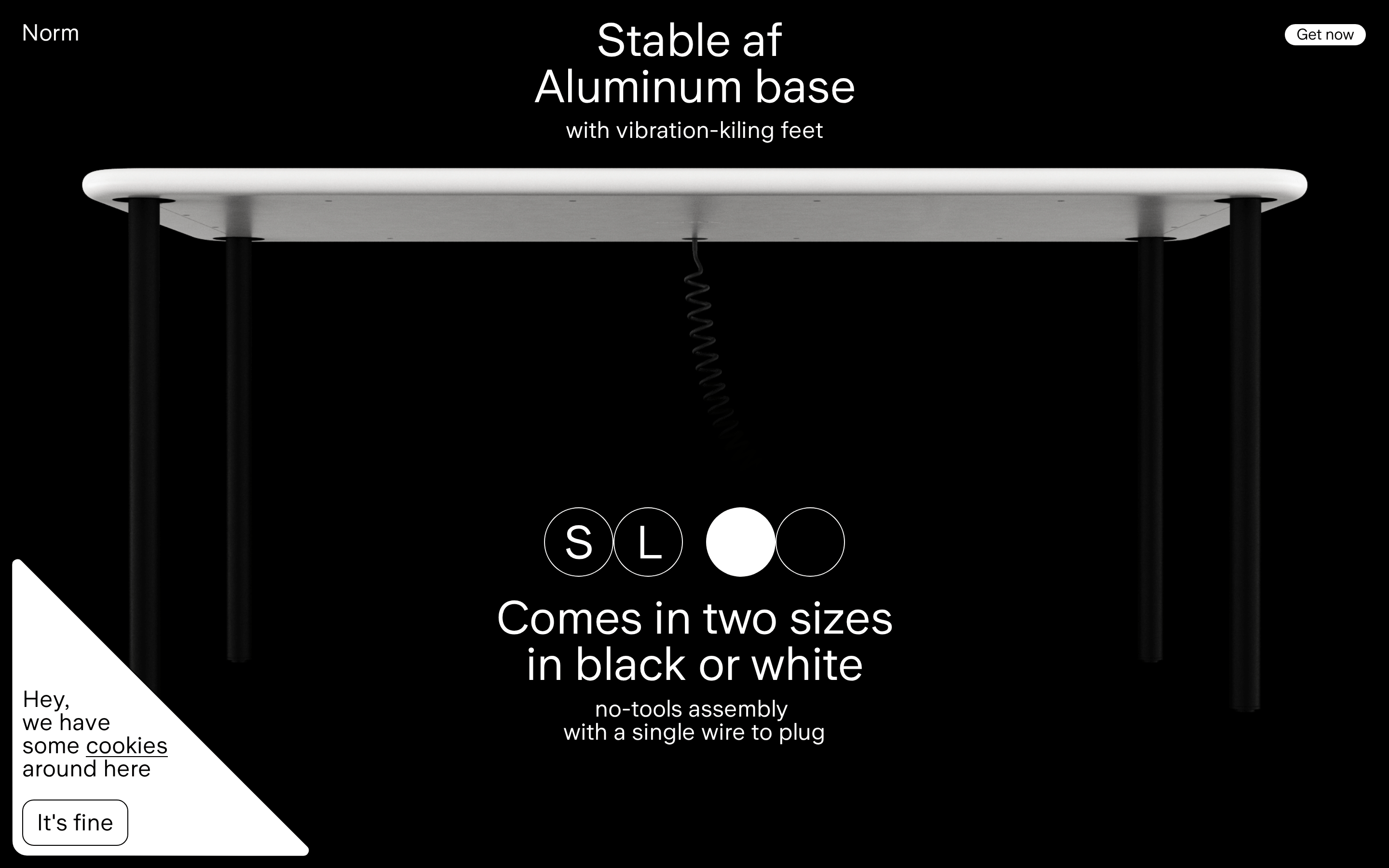
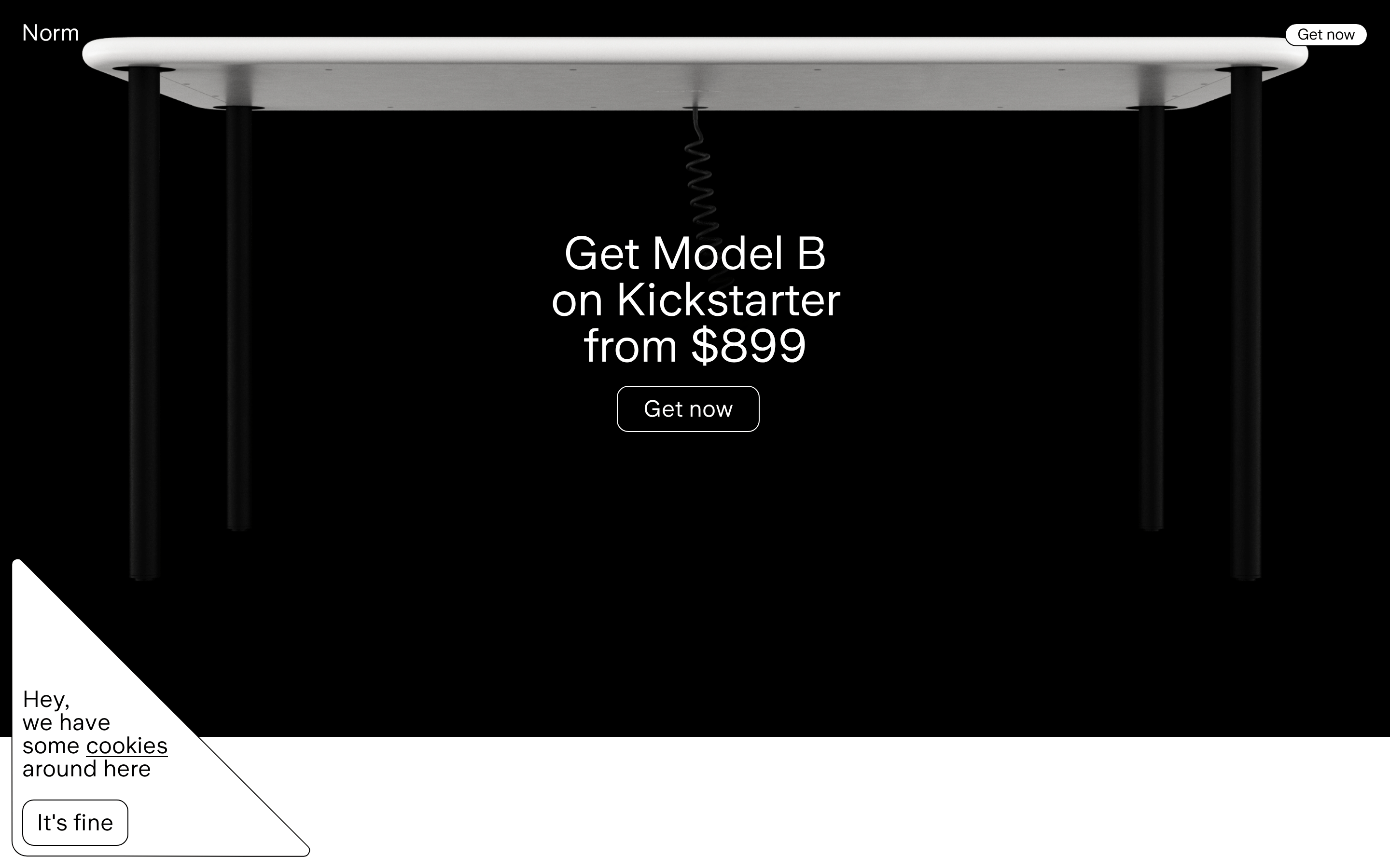
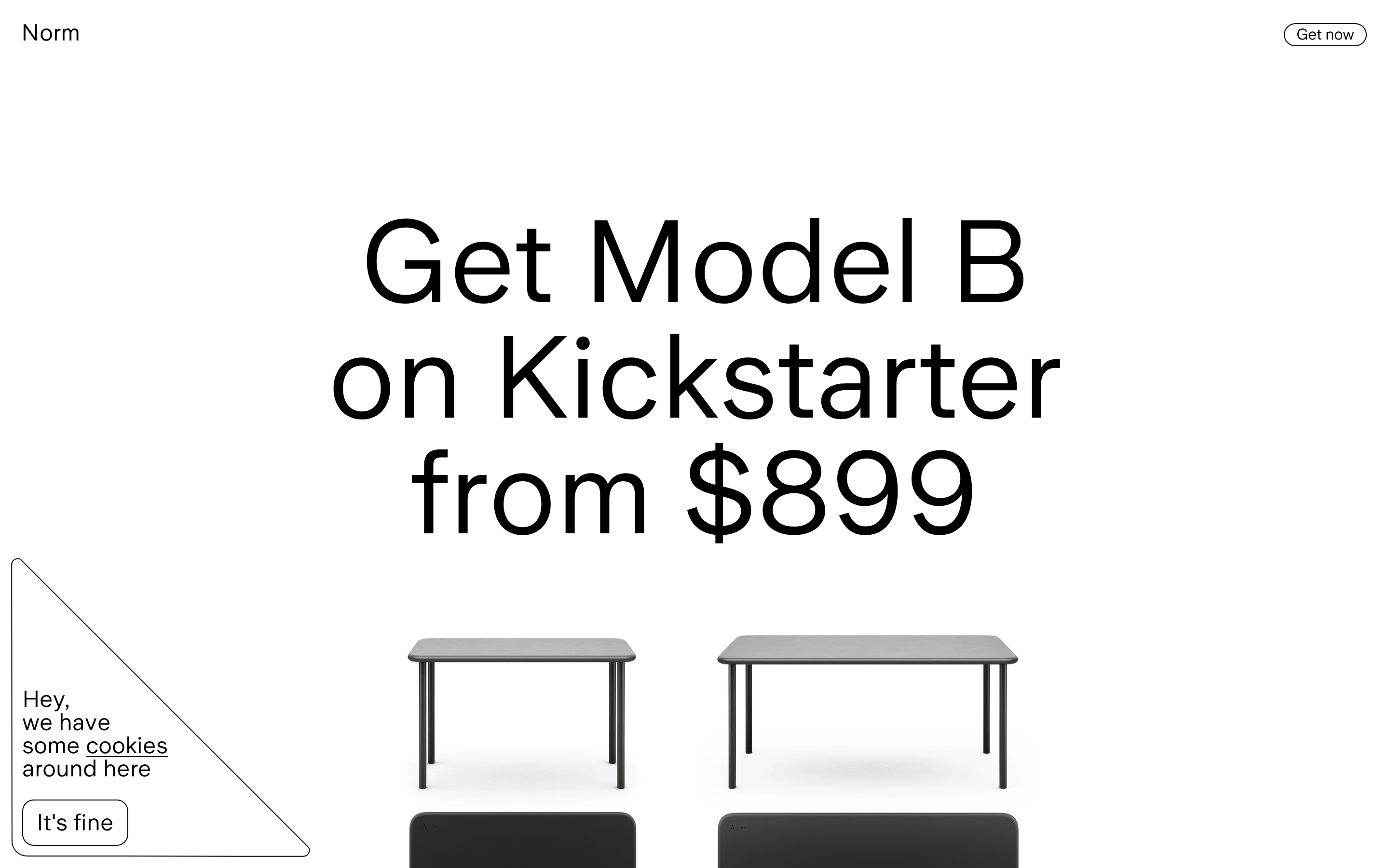
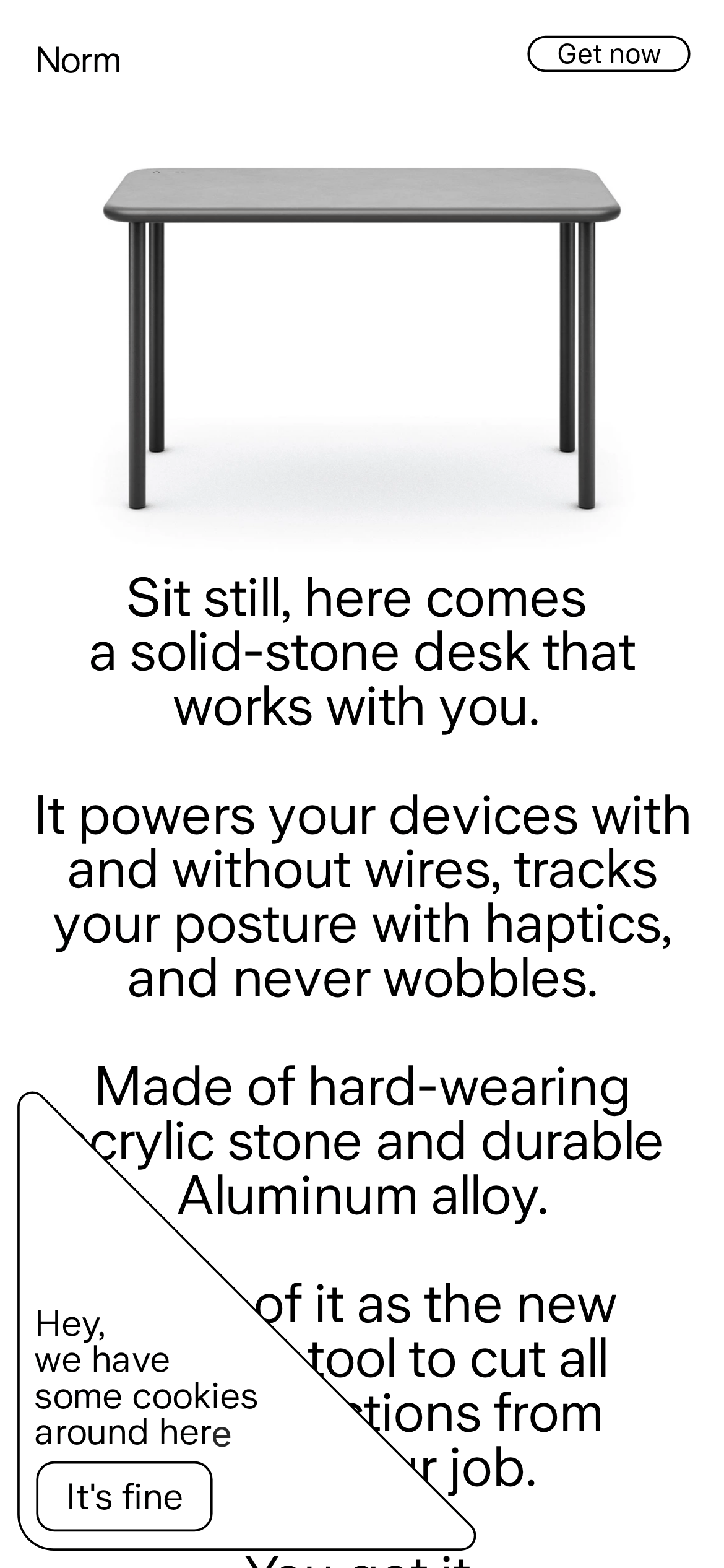
A piece of architectural hardware disguised as furniture
02
Color
#282828Ink
#ffffffBG
rgba(40,40,40,0.1)Line
Strict monochrome palette relying on pure black, white, and near-black text to emphasize product form.
03
Typography
geometric-sans · humanist-sans
display48px · 400
body16px · 400
Typography relies heavily on generous negative space rather than weight contrast · Headlines use a tight line-height of 1.0 for a dense, architectural feel · Letter spacing is slightly negative to maintain a tight, premium appearance
04
Spacing
4px
8px
16px
24px
32px
48px
64px
96px
Generous, asymmetric spacing that prioritizes breathing room for the product photography
05
Surfaces
sm · 0px
md · 12px
lg · 0px
pill · 999px
1px solid rgba(40,40,40,1) for interactive elements like the 'Get now' button and cookie consent
06
Layout
1280container
12columns
24pxgutter
768 / 1024breakpoints
A vertical, centered single-column layout that heavily utilizes whitespace to frame the product
07
Motion & Interaction
220msmicro
400mssmall
800msmedium
cubic-bezier(0.25, 0.1, 0.25, 1)easing
Subtle opacity and background-color transitions on interactive elements · Visibility toggles for state changes
Subtle background-color shifts on buttons · Immediate visual feedback via standard pointer events
08
Components
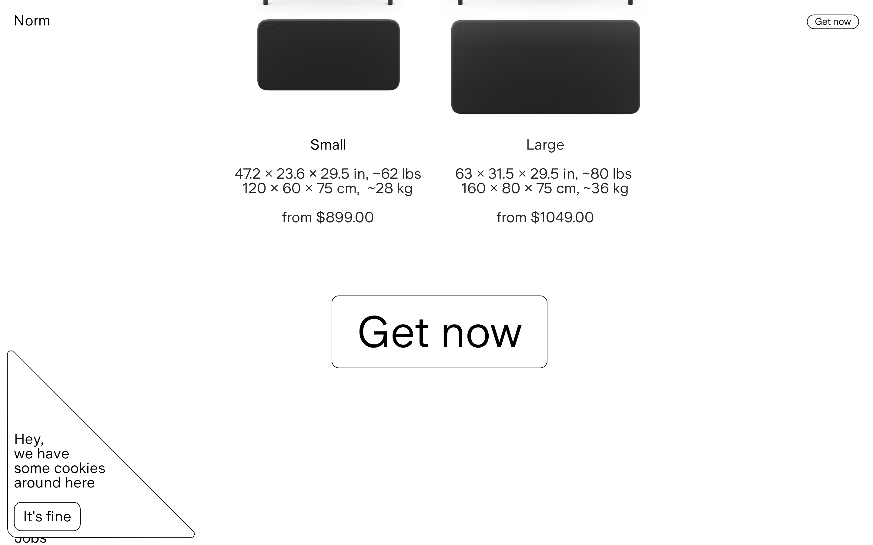
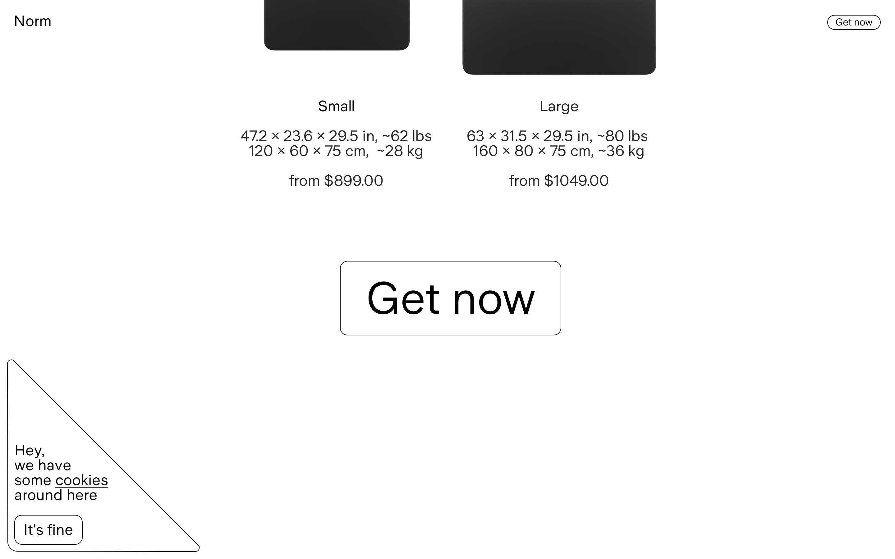
buttonPill-shaped with 1px solid border, transparent background, and uppercase or standard text
cardNo traditional cards; layout relies on full-bleed photography and massive typography
chipNone visible
inputNone visible
heroFull-width, vertically stacked layout featuring a large product cutout followed by massive centered typography
09
Voice & Don'ts
ToneConfident, minimalist, and slightly quirky (e.g., the cookie consent)
HeadlinesShort, punchy, and feature-focused statements that read like architectural specs
CTAsDirect and transactional, using standard pill buttons
don't use drop shadows — screenshot shows perfectly flat product photography with no UI shadows
don't use bold or heavy font weights — screenshot shows exclusively regular (400) weight typography
don't use colorful accents — screenshot shows a strictly monochrome palette of black, white, and near-black
don't clutter with multiple columns — screenshot shows a strictly centered, single-column layout
don't use sharp rectangular buttons — screenshot shows a pill-shaped 'Get now' button with a 999px radius
don't use justified text alignment — screenshot shows all text centered or left-aligned within its container
Avoid: Avoid loud marketing jargon or excessive exclamation points
Avoid: Avoid cluttering the interface with multiple competing calls to action
Avoid: Avoid using secondary colors or gradients that distract from the product form
Captured from the live site · real computed styles
11
System prompt
This design DNA describes a premium, minimalist product site for a smart desk. It utilizes a strictly monochrome palette of pure white (#ffffff), near-black text (#282828), and a secondary off-black for borders. Typography is exclusively sans-serif, relying on geometric and humanist-sans categories with a tight letter spacing of -0.4px and a massive display scale of 48px+ to create a confident, architectural feel. Key critical donts: never use bold font weights (everything is regular 400), never introduce colorful accents or gradients, and never use drop shadows or heavy UI chrome that would distract from the product photography. The layout is a spacious, centered single-column structure that prioritizes whitespace and large product cutouts over traditional grid-based card UI.
Bring this taste to your agent
Hand your AI agent a machine-readable spec of this design — tokens, type, motion, the whole DNA.