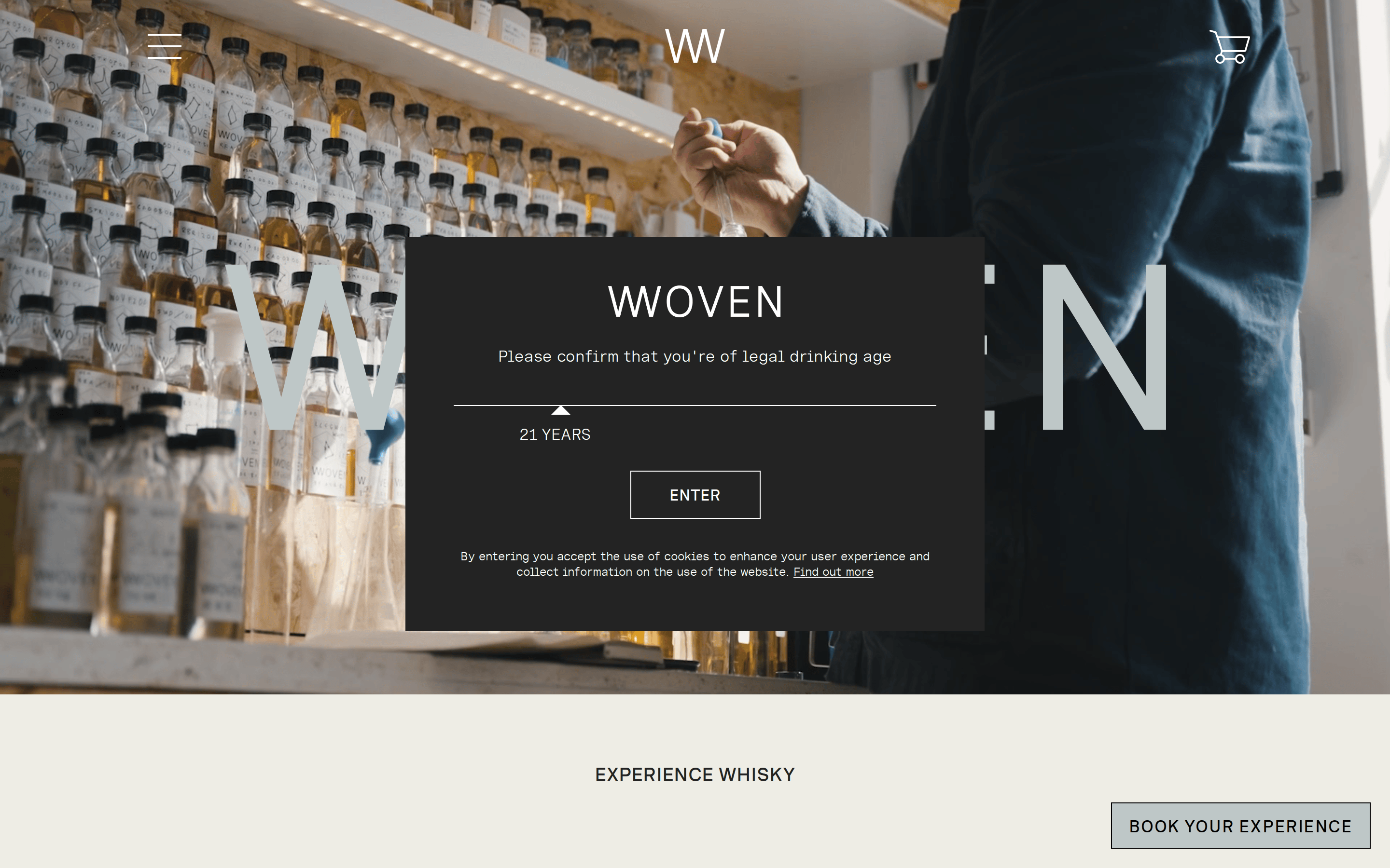
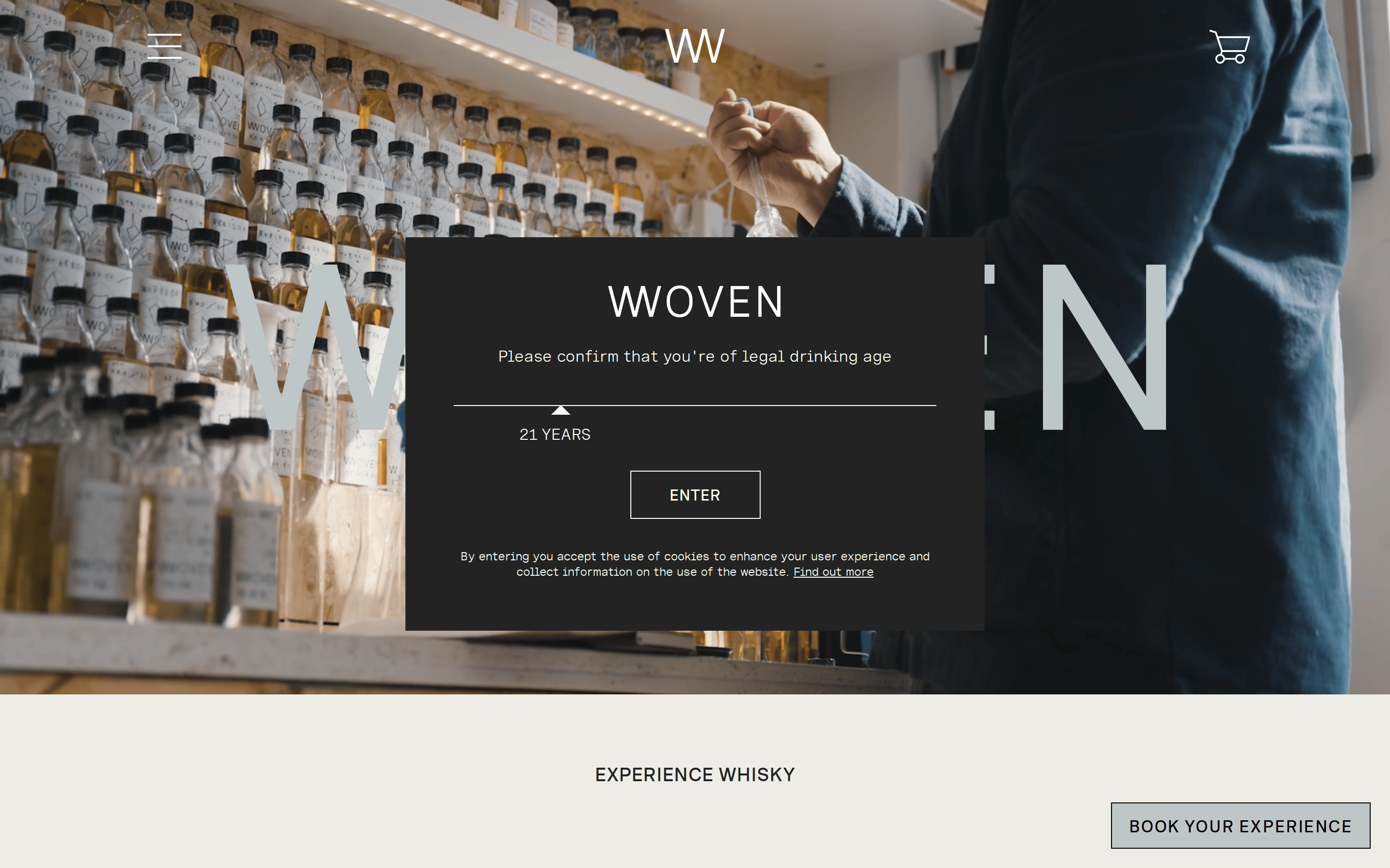
A modern apothecary meets a high-end boutique studio.
02
Color
#232323Ink
#4A4A4AInk soft
#FFFFFFBG
#ECEDE5BG soft
rgba(35,35,35,1)Line
Warm neutrals grounded in dark charcoal, relying on high-quality photography to provide visual warmth.
03
Typography
transitional-serif · geometric-sans · monospaced
display56px · 400
heading20px · 400
body16px · 400
caption12px · 400
Uppercase all section headings and UI labels with generous letter-spacing. · Maintain a strict typographic hierarchy using size and weight rather than color. · Use a clean monospaced font for product pricing and technical details.
04
Spacing
4px
8px
16px
24px
32px
48px
64px
96px
8px baseline grid
05
Surfaces
sm · 0px
md · 0px
lg · 0px
pill · 999px
1px to 2px solid borders, primarily using the primary ink color for sharp, defined edges.
06
Layout
1280container
12columns
24pxgutter
768 / 1024breakpoints
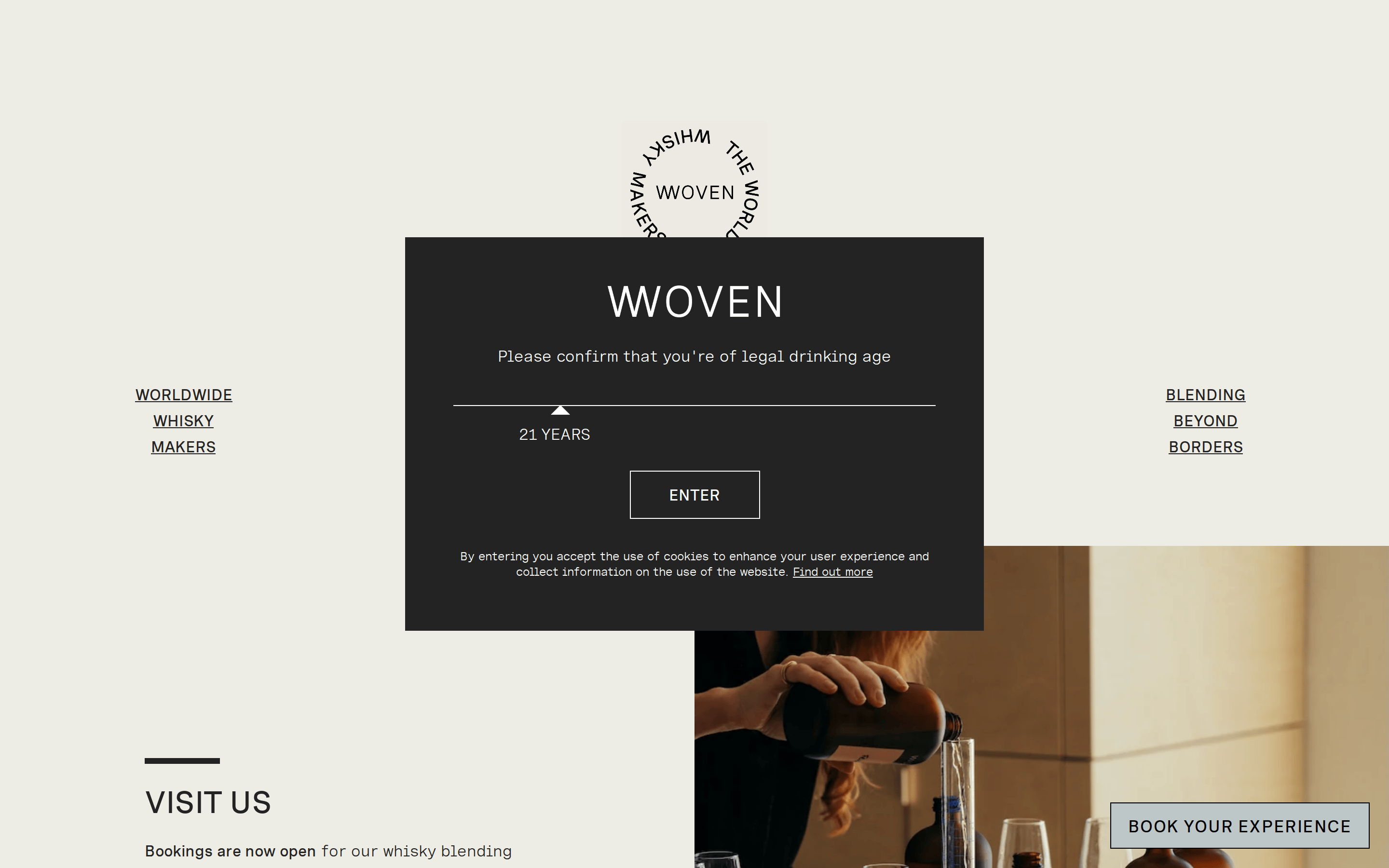
A clean, centered layout with a prominent photographic hero followed by structured grid sections.
07
Motion & Interaction
150msmicro
250mssmall
500msmedium
cubic-bezier(0.25, 0.0, 0.25, 1.0)easing
Subtle fade-in and transform transitions for modals and dropdowns. · Smooth opacity transitions for hover states on interactive elements.
Subtle opacity change or color inversion for interactive elements. · Immediate feedback with slight scaling or color shift.
08
Components
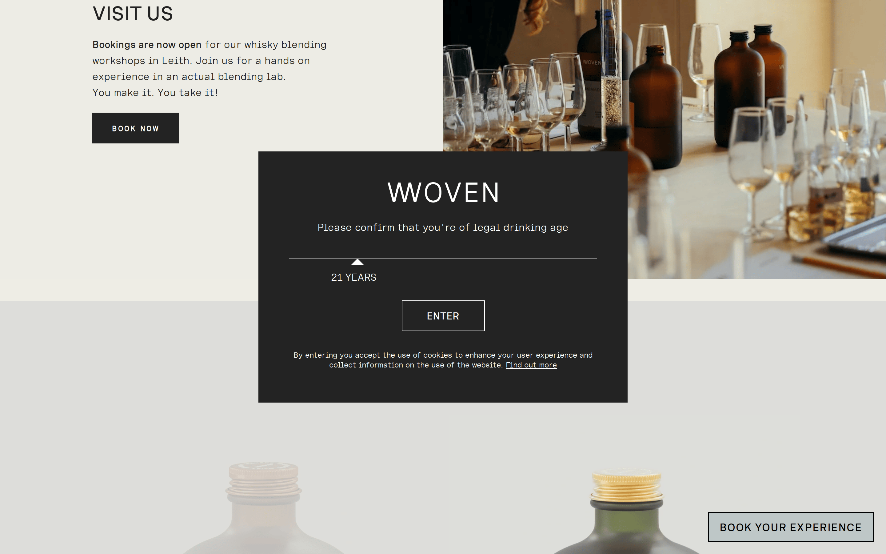
buttonRectangular with a solid dark border and uppercase monospaced text; ghost style in the modal, solid light grey in the sticky footer.
cardClean, borderless product cards with generous white space and centered typography.
chipN/A
inputN/A
heroFull-viewport photographic background with centered, high-contrast text and a primary call-to-action.
09
Voice & Don'ts
ToneArtisanal, premium, and inviting, yet restrained and sophisticated.
HeadlinesUppercase, widely-spaced, and clear, focusing on the experience and the craft.
CTAsDirect and action-oriented, presented in a clean, boxed format.
Don't use bright, saturated colors — the palette is strictly limited to warm neutrals and dark charcoal.
Don't use rounded corners on buttons or cards — the design strictly favors sharp, rectangular geometry.
Don't use drop shadows or 3D effects — surfaces are flat and rely on borders and photography for depth.
Don't use playful or whimsical typography — text is always clean, structured, and often monospaced.
Don't use cluttered layouts — maintain generous white space and a clear visual hierarchy.
Don't use aggressive, flashing animations — interactions are subtle, smooth, and functional.
Avoid: Avoid overly casual or slang-heavy language.
Avoid: Avoid cluttered layouts or aggressive promotional graphics.
Avoid: Avoid bright, neon, or overly saturated color palettes.
Captured from the live site · real computed styles
11
System prompt
This is a premium, artisanal whisky brand site that blends modern minimalism with craft heritage. The design relies on high-quality photography and a restrained color palette of warm whites (#FFFFFF, #ECEDE5) and dark charcoal (#232323). Typography mixes a transitional serif for display and a geometric sans or monospaced font for body and UI elements, often set in uppercase with wide letter-spacing. Critical constraints: maintain sharp rectangular geometry with no border-radius, avoid cluttered layouts in favor of generous white space, and never use bright or saturated colors that would disrupt the sophisticated, calm atmosphere.
Bring this taste to your agent
Hand your AI agent a machine-readable spec of this design — tokens, type, motion, the whole DNA.