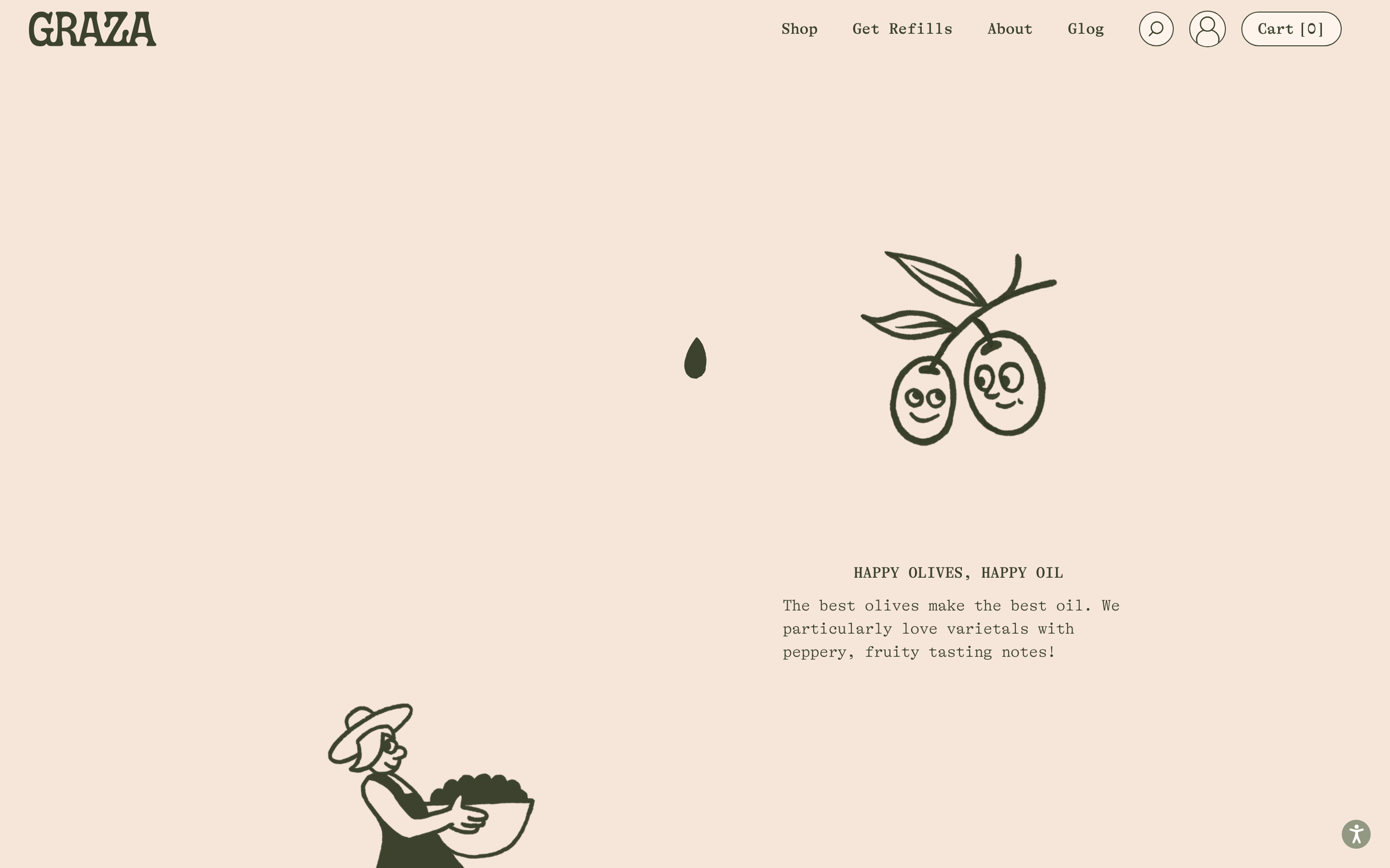
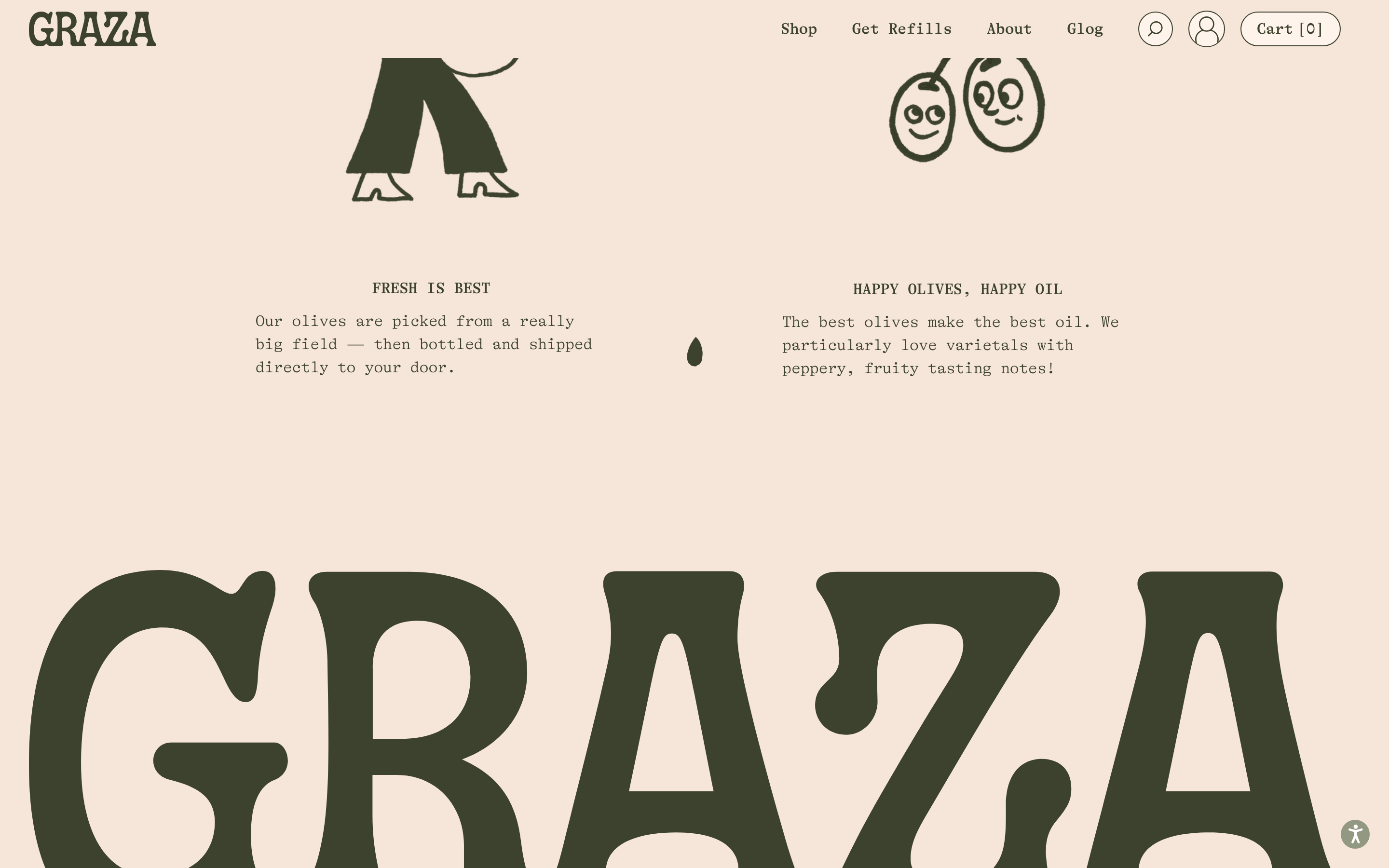
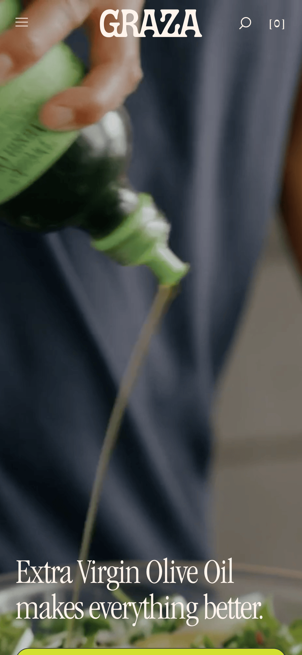
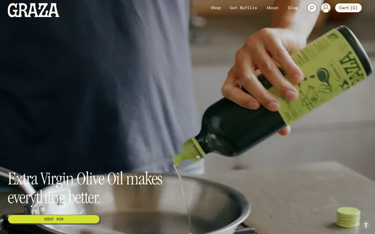
A high-end artisanal food brand with a playful, tactile edge.
02
Color
#D1E030Accent
#3C422EInk
#F6E6D9BG
#4E5340Muted
rgba(60, 66, 46, 1)Line
Earthy, warm base palette dominated by dark olive green and soft peach, punctuated by a vibrant chartreuse accent.
03
Typography
transitional-serif · typewriter
display72px · 500
body16px · 400
04
Spacing
4px
8px
16px
24px
32px
48px
64px
96px
Vertical spacing uses generous gaps, often 35px or 68px, to let large imagery and bold typography breathe.
05
Surfaces
sm · 10px
md · 20px
lg · 20px
pill · 9999px
Borders are used primarily for outlines and separation, typically 1px solid dark green.
06
Layout
1280container
12columns
24pxgutter
768 / 1024breakpoints
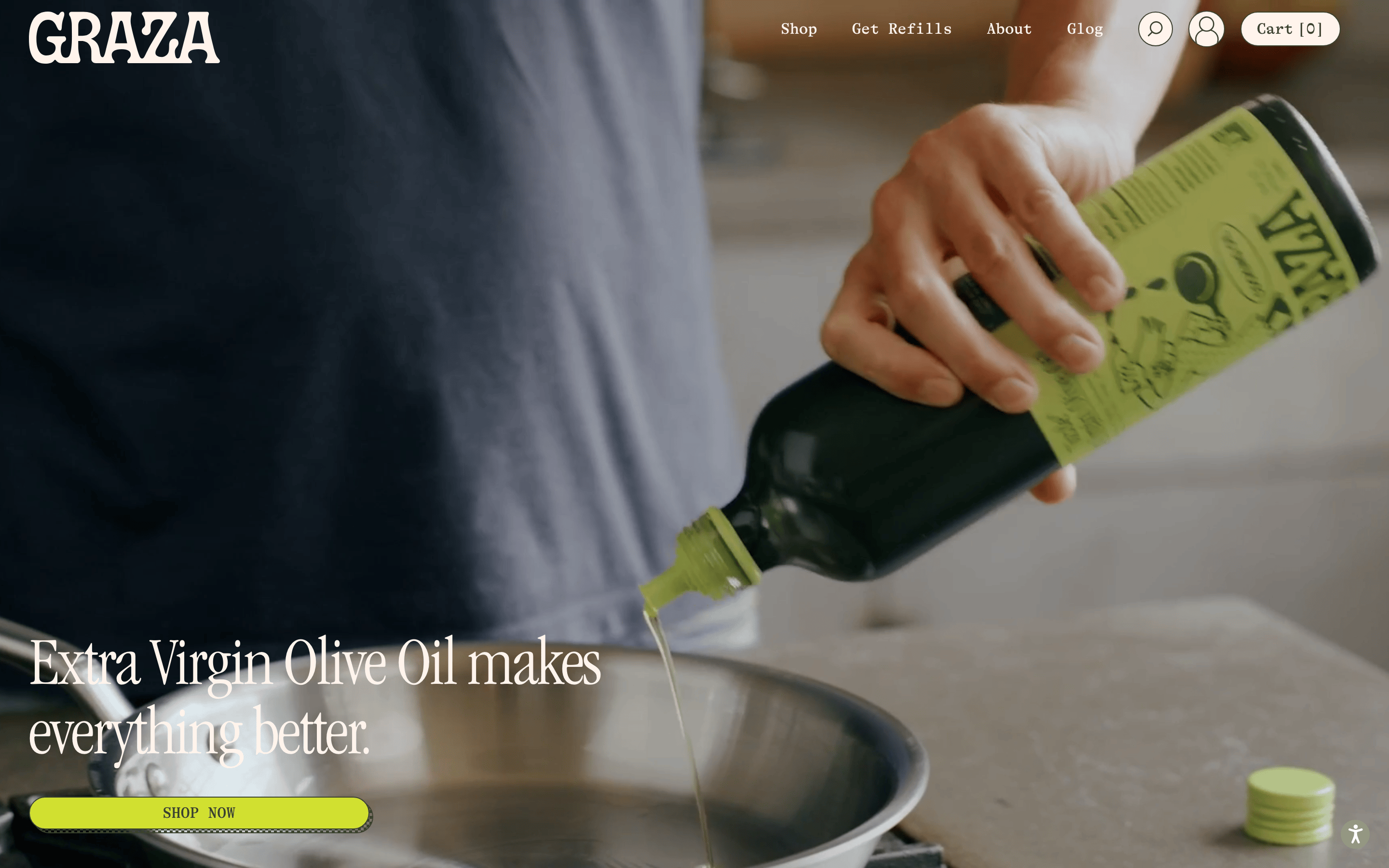
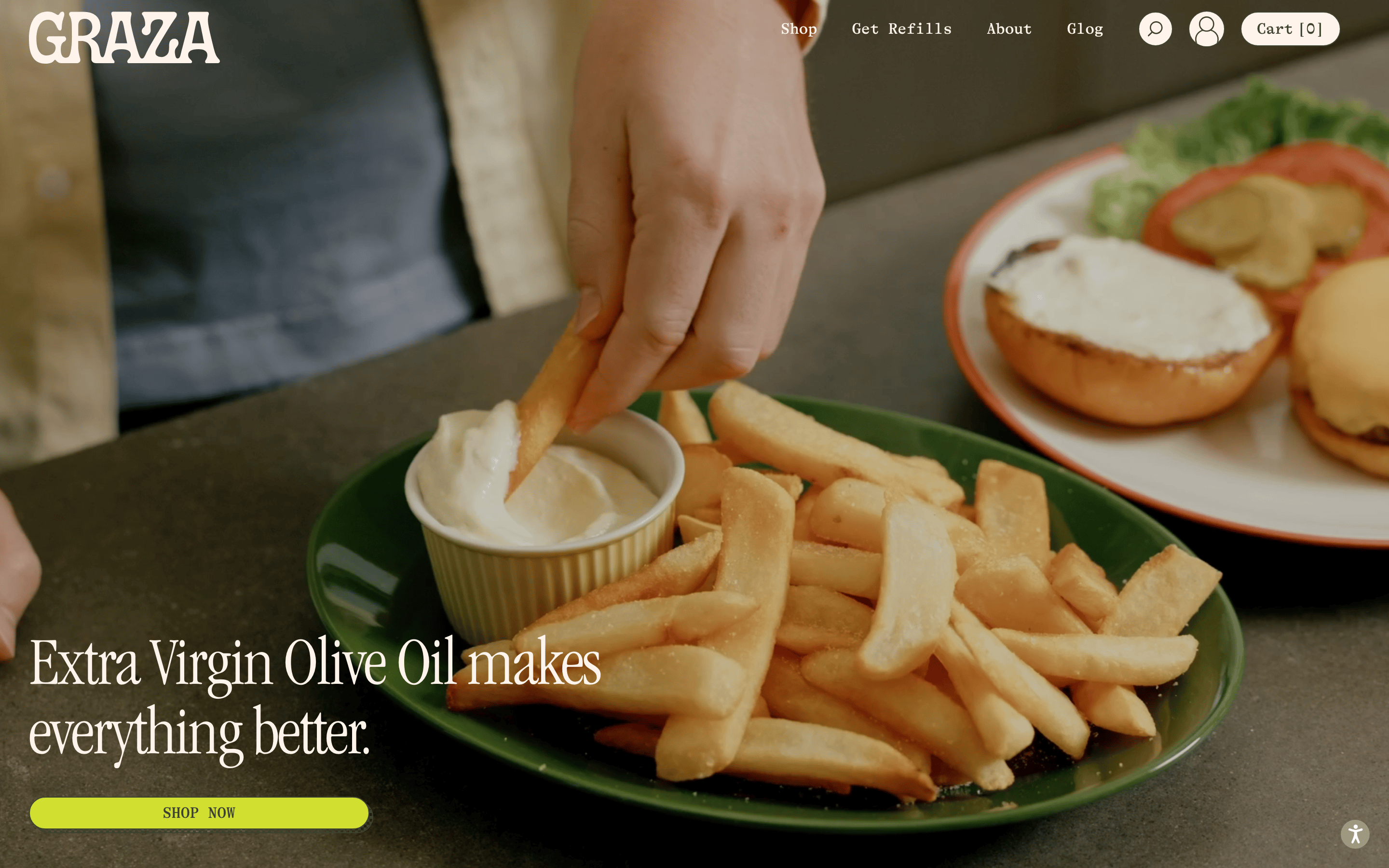
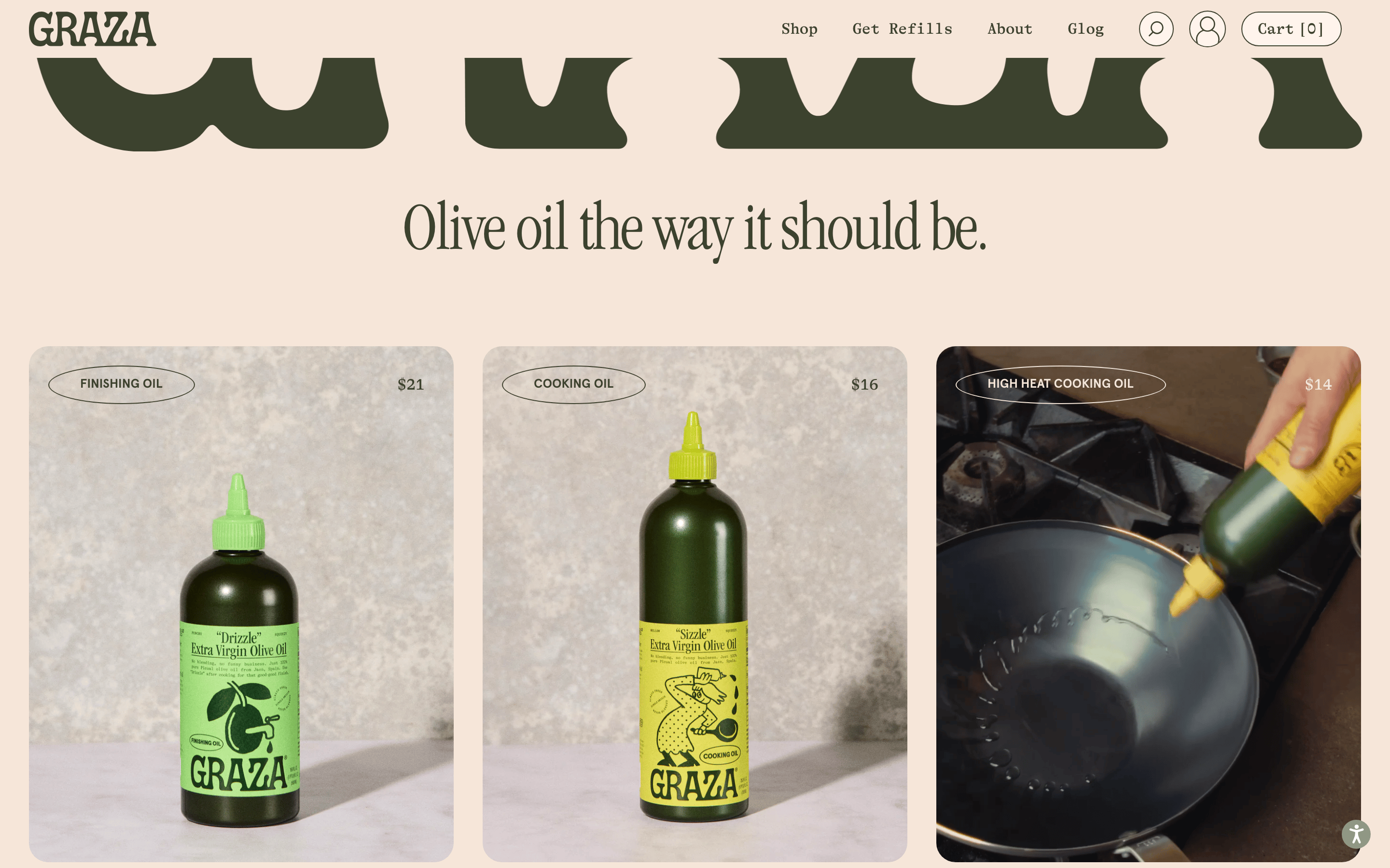
Full-width photographic hero sections followed by generous grid layouts for product cards.
07
Motion & Interaction
250msmicro
250mssmall
400msmedium
cubic-bezier(0.25, 0.1, 0.25, 1)easing
Smooth background-color and opacity transitions for interactive elements. · Transform transitions for hover states.
Elements like buttons and links change background-color, border-color, or transform slightly. · Immediate feedback via background-color or transform changes.
08
Components
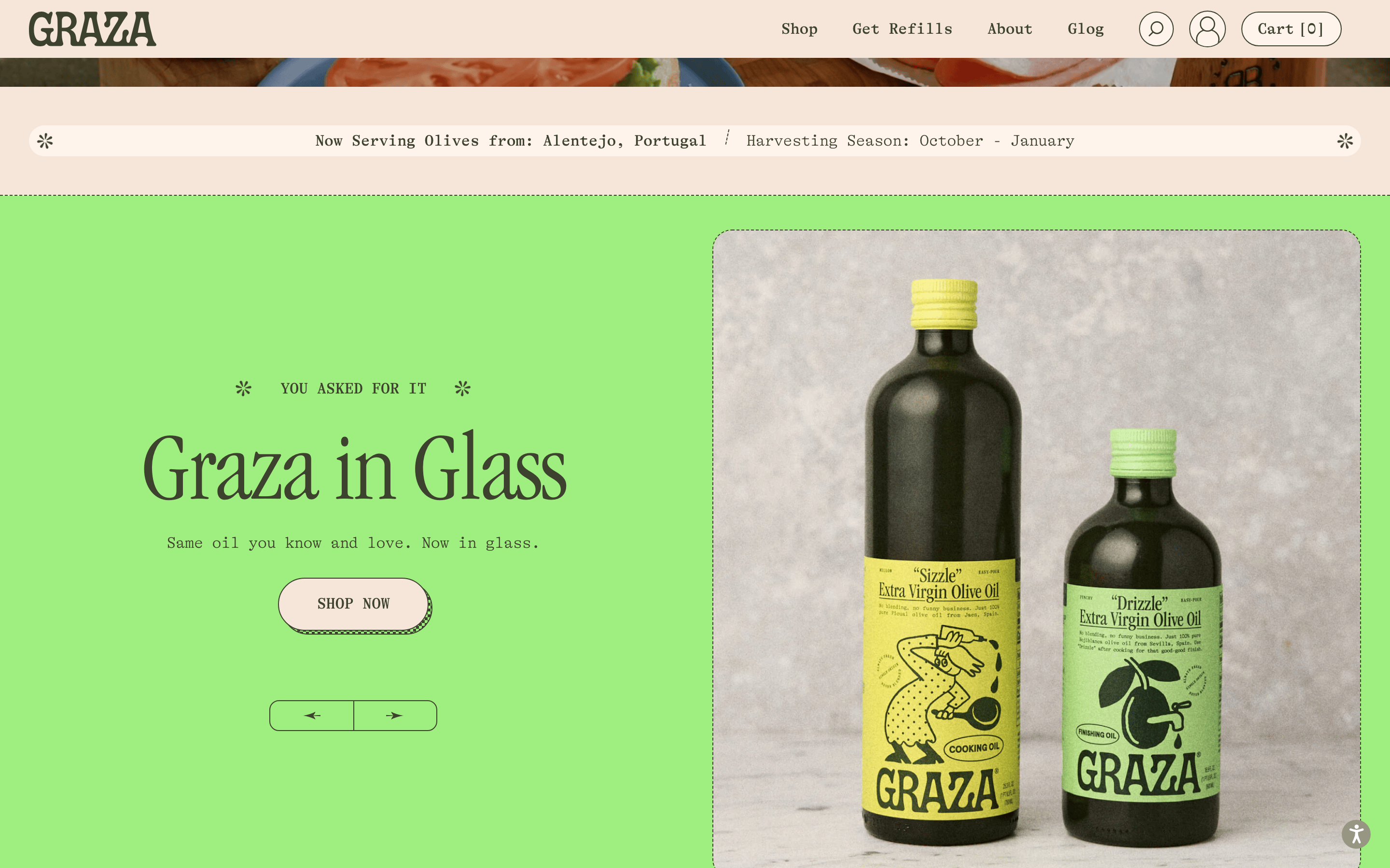
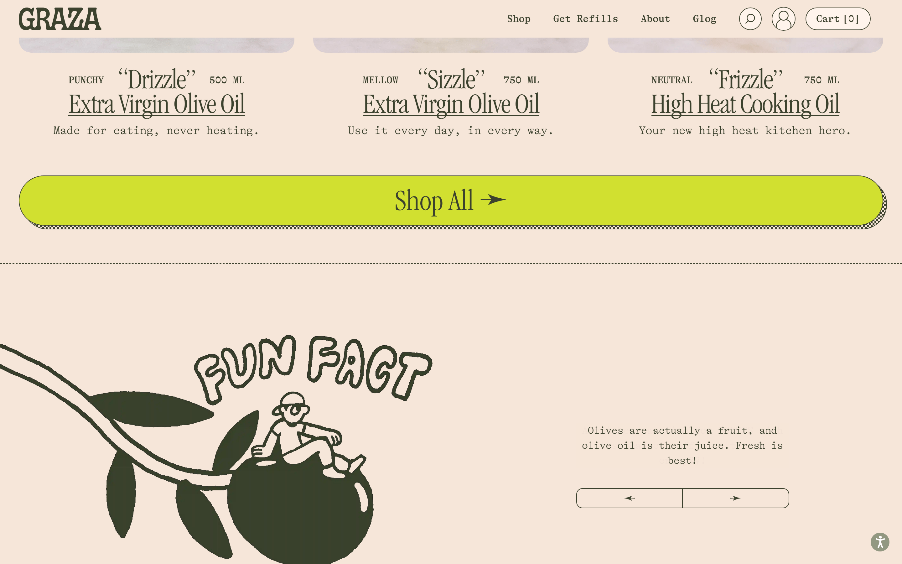
buttonBold, pill-shaped buttons with strong accent colors and uppercase text.
cardProduct cards feature large imagery with subtle rounded corners and clear price/category labels.
chipN/A
inputN/A
heroFull-bleed photographic backgrounds with large, left-aligned serif headlines overlaid.
09
Voice & Don'ts
ToneConfident, approachable, and slightly irreverent.
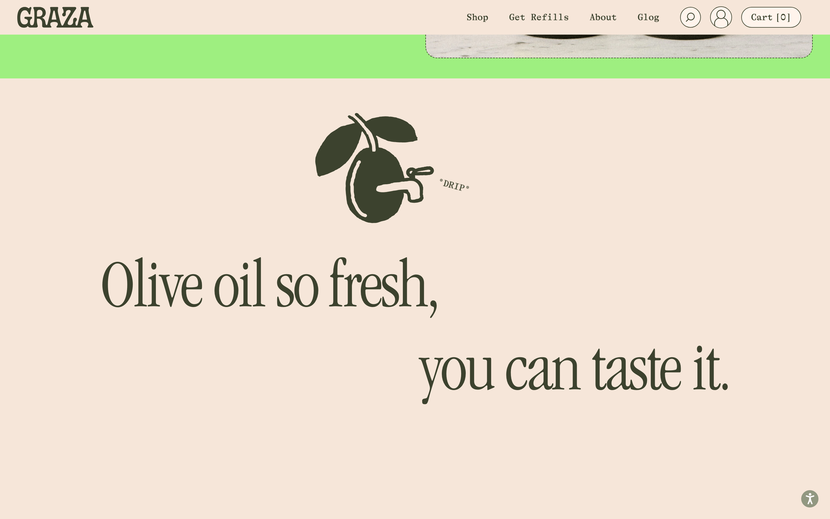
HeadlinesLarge, elegant serif typography, often with sentence case or lowercase.
CTAsDirect, uppercase, and often set in a high-contrast pill shape.
don't use a dark background — screenshot shows a light, warm peach background (#F6E6D9)
don't use sans-serif for main headlines — screenshot shows a transitional-serif font for display text
don't use subtle or muted accent colors — screenshot shows a vibrant chartreuse accent (#D1E030)
don't use sharp, square corners everywhere — screenshot shows rounded corners (20px) and pill shapes
don't use dense, small text for key messages — screenshot shows large, bold typography (72px)
don't use cold, grey-toned neutrals — screenshot shows earthy, warm tones like dark olive green (#3C422E)
Avoid: avoid cold, corporate language — screenshot shows a warm, conversational tone
Avoid: avoid dense text blocks — screenshot shows generous spacing and large imagery
Avoid: avoid dark mode — screenshot shows a consistently light, warm background
Captured from the live site · real computed styles
11
System prompt
Graza is a premium, playful olive oil brand targeting consumers who value quality and design. The site uses a warm, earthy palette centered on soft peach (#F6E6D9) and dark olive green (#3C422E), with a vibrant chartreuse accent (#D1E030) for calls to action. Typography mixes elegant transitional-serif display fonts with typewriter-style body text. Critical donts: avoid dark mode, avoid sans-serif for headlines, avoid muted accents, avoid sharp corners, avoid dense text, avoid cold neutrals. The layout relies on large, full-bleed photography and generous whitespace to create an editorial, premium feel.
Bring this taste to your agent
Hand your AI agent a machine-readable spec of this design — tokens, type, motion, the whole DNA.