← OpenDesign CURATED · OPEN · FREE
Oatly
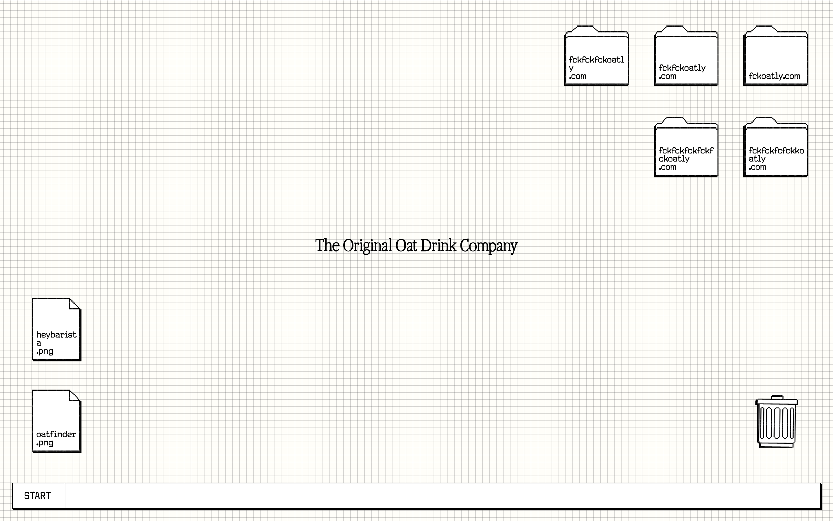
Oatly uses a playful, sketch-like aesthetic with a limited palette and expressive typography to convey a quirky, transparent brand personality.
brand food quirky
01
Identity DNA
Playful Ironic Disruptive Anti-Design Direct
A rebellious, sketchy brand that feels like a doodle on a napkin.
02
Color
#000000Ink
#F5F5F5BG
rgba(0,0,0,1)Line
High-contrast black-and-white with a minimal, functional grid.
03
Typography
transitional-serif · sans-serif · monospaced
display 32px · 400body 16px · 400Use a transitional serif for primary headlines. · Use a sans-serif for body text. · Use a monospaced font for labels or UI elements.
04
Spacing
4px
8px
16px
24px
32px
48px
64px
96px
Consistent 4px base with generous whitespace.
05
Surfaces
sm · 0px
md · 0px
lg · 0px
pill · 999px
1px solid black
2px 2px 0px 0px rgb(0, 0, 0)
06
Layout
1280 container
12 columns
24px gutter
768 / 1024 breakpoints
Grid-based layout with a mix of centered and scattered elements.
07
Motion & Interaction
220ms micro
400ms small
800ms medium
cubic-bezier(0.25, 0.1, 0.25, 1) easing
Hover states with a 0.3s translate transition.
Elements shift slightly on hover. · N/A
08
Components
button Simple, outlined, with a 2px black drop shadow. card White background with a 1px black border and a 2px black drop shadow. chip N/A input N/A hero Centered headline with scattered, interactive-looking elements. 09
Voice & Don'ts
Tone Playful, direct, and slightly irreverent. Headlines Conversational and often humorous. CTAs Simple and action-oriented. Don't use a complex color palette — the screenshot shows a strict black-and-white scheme. Don't use decorative serif fonts — the screenshot shows a mix of clean sans-serif and a single transitional serif. Don't use rounded corners on UI elements — the screenshot shows sharp, square edges. Don't use subtle shadows — the screenshot shows bold, hard-edged 2px black drop shadows. Don't use a busy background — the screenshot shows a clean, minimal grid on a white/off-white background. Don't use intricate icons — the screenshot uses simple, hand-drawn or flat SVG-style icons. Avoid: Corporate jargon Avoid: Overly formal language Avoid: Cluttered layouts 10
Inside the pack — real screenshots
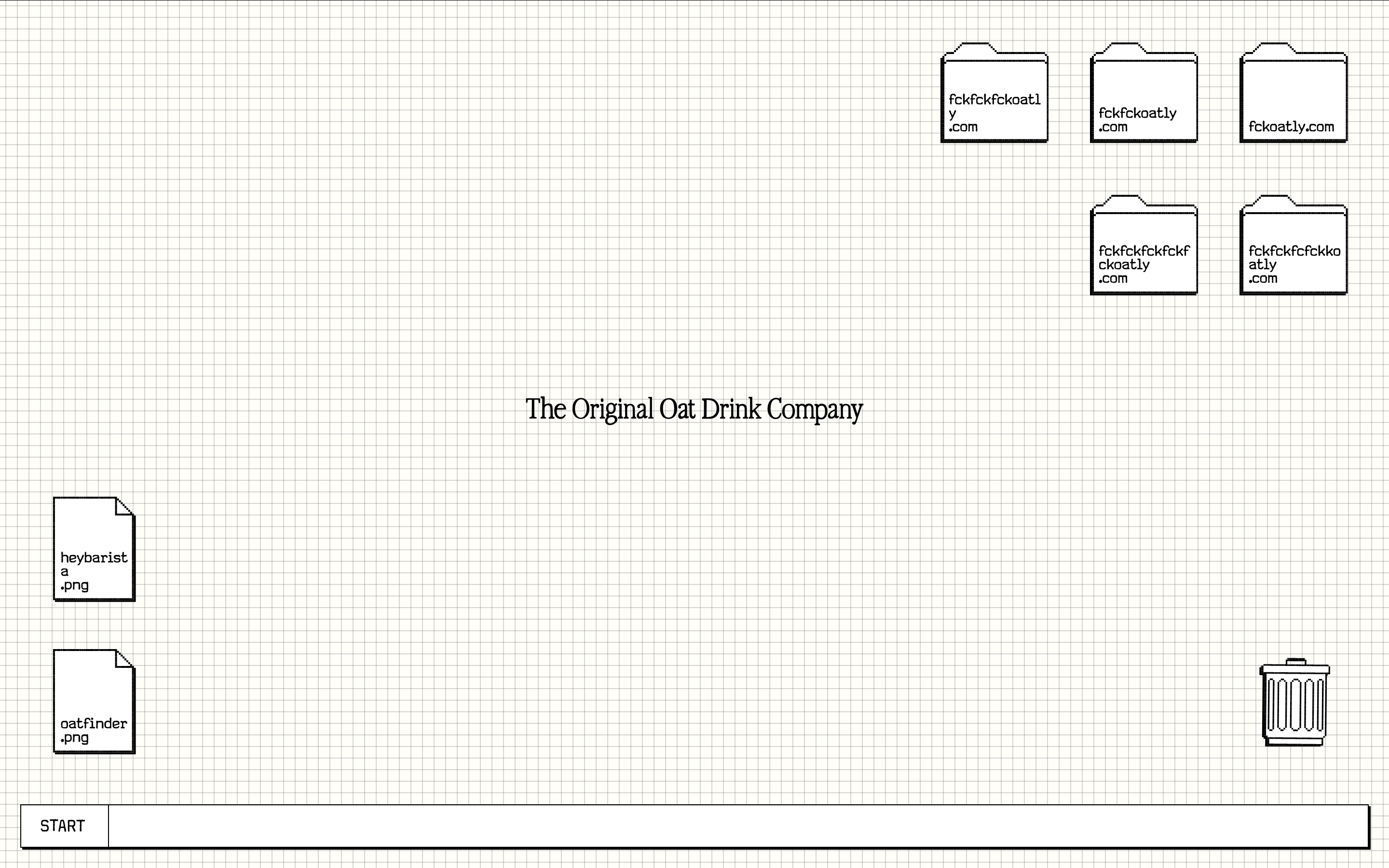
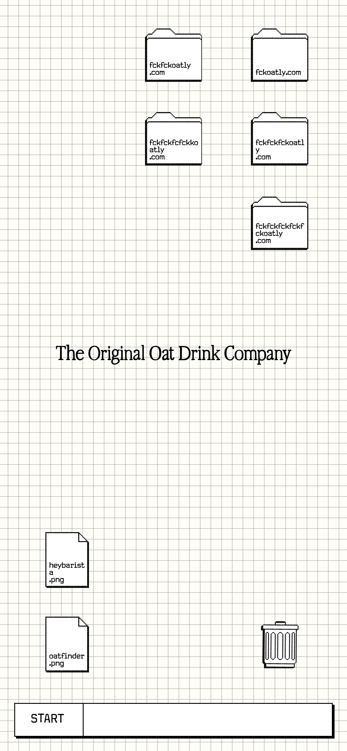
桌面首屏(hero) 桌面滚动分段(90% viewport 步进,作为视觉证据) 桌面滚动分段(90% viewport 步进,作为视觉证据) 移动首屏 Captured from the live site · real computed styles
11
System prompt
Oatly is a disruptive, playful brand that uses a sketchy, hand-drawn aesthetic. The design relies on a stark black-and-white color palette (#000000, #FFFFFF, #F5F5F5) and a mix of serif, sans-serif, and monospaced typography. The layout is clean and grid-based but feels spontaneous. Critical donts: avoid complex color schemes, rounded corners on primary UI, and overly polished or corporate visuals. Embrace the raw, illustrative style with hard-edged shadows and bold outlines.
More from the library en · zh-CN · zh-TW · ja · ko
OpenDesign · curated web aesthetics for AI-readable design DNA · opendesign.cc
Why we curated this: This site is a great example of a brand that successfully uses an anti-design aesthetic to stand out and convey a unique, authentic personality.
浙ICP备2021038972号-5