A vibrant, nostalgic cereal brand reimagined for health-conscious adults.
02
Color
#9100EDAccent
#3F0791Ink
#5D23DDInk soft
#FFFFFFBG
#DAD9FFBG soft
#F5F3FFBG quiet
rgba(63,7,145,0.2)Line
High-contrast purple identity on clean white, accented by vibrant pastels from product photography.
03
Typography
geometric-sans · humanist-sans
display48px · 900
heading24px · 700
body16px · 400
caption13px · 400
Typography primarily uses Poppins for display and body, with Mabry for brand logo elements. · Text is heavily transformed to uppercase for headers and calls-to-action. · Body text maintains a neutral 400 weight for readability against the vibrant palette.
04
Spacing
4px
8px
16px
24px
32px
48px
64px
96px
Standard 4px base grid with tight spacing in navigation and generous padding in hero sections.
Standard e-commerce structure: announcement bar, sticky nav, full-width hero with split layout, followed by product grids.
07
Motion & Interaction
150msmicro
300mssmall
900msmedium
cubic-bezier(0.25, 1, 0.5, 1)easing
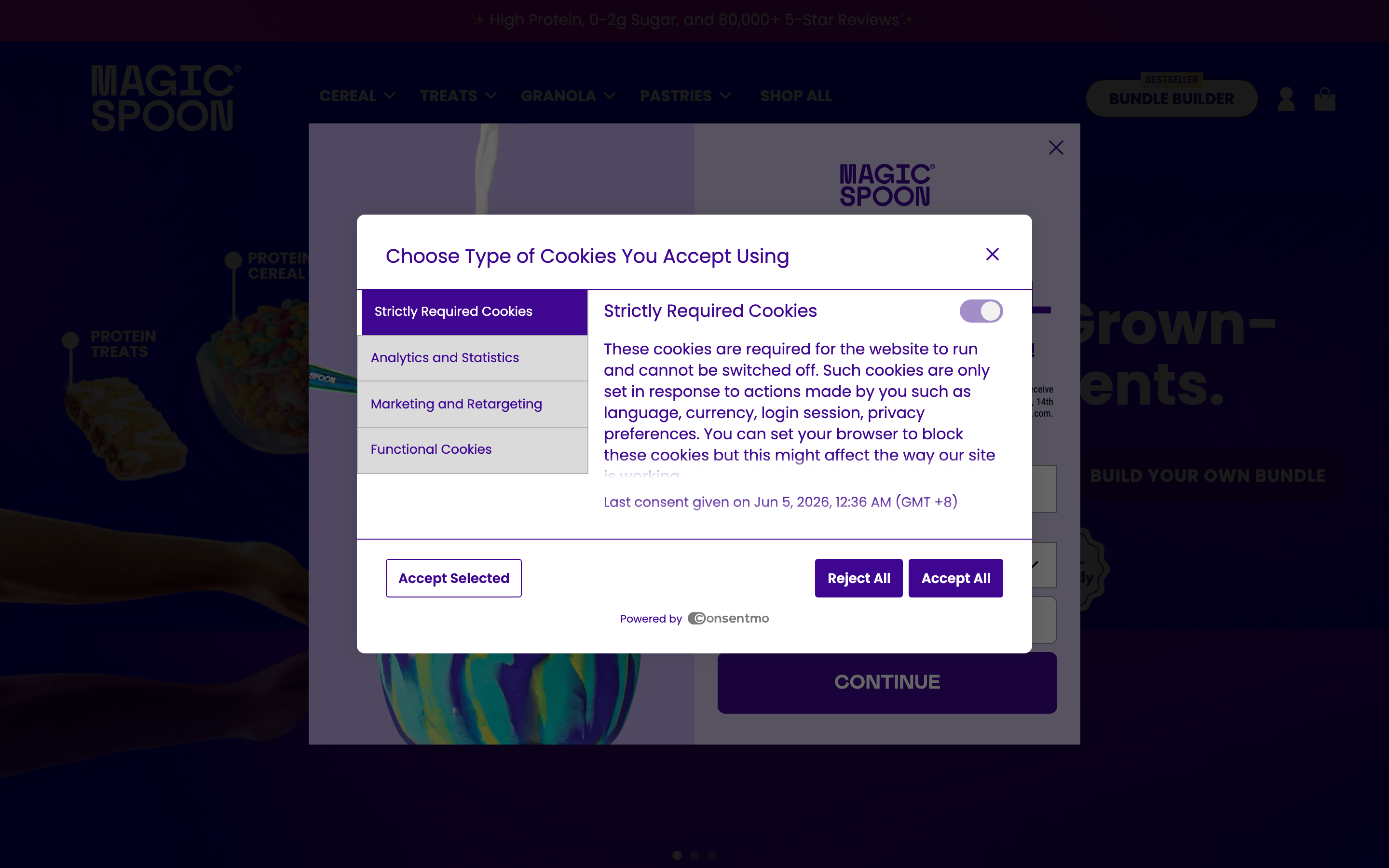
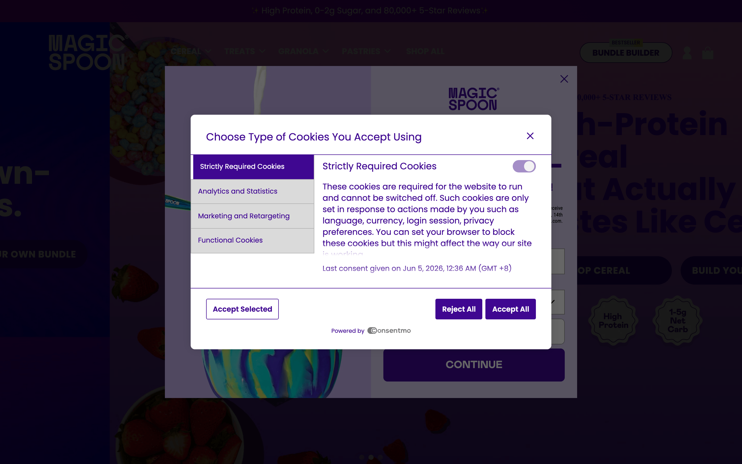
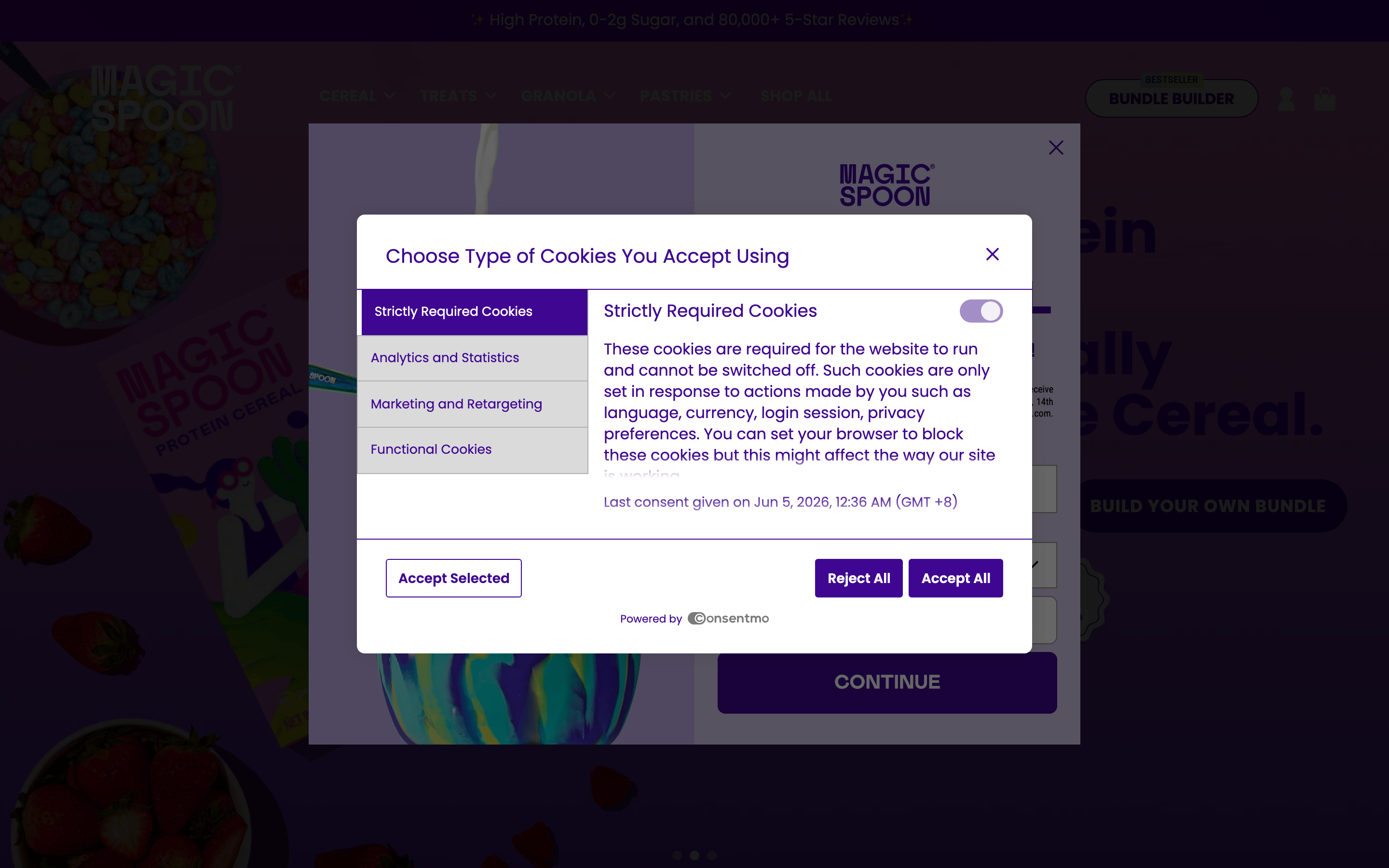
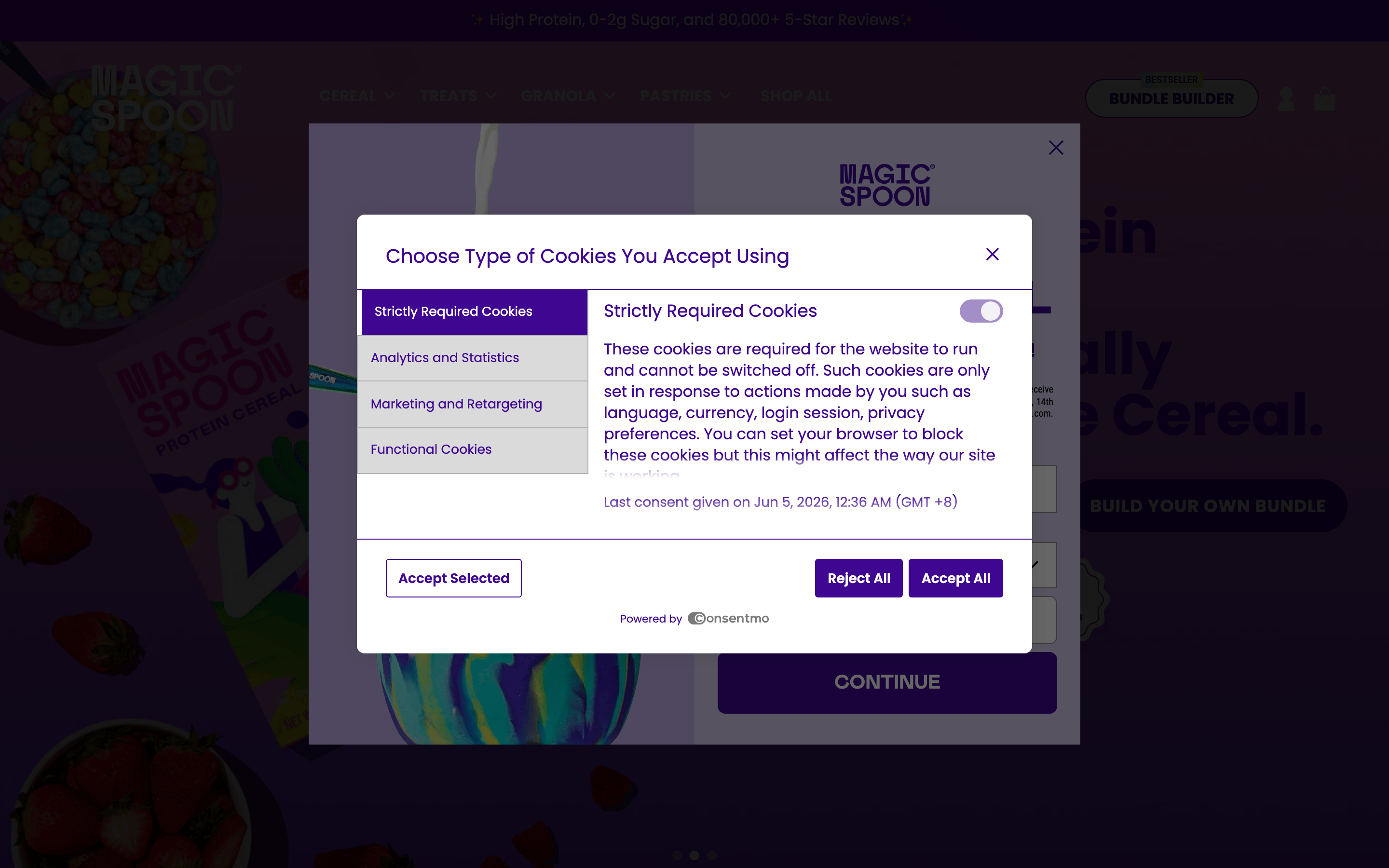
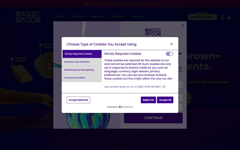
Smooth fade-in and slide-up for modal windows like the cookie consent. · Floating, parallax-like movement for product imagery in the hero section. · Immediate background and color transitions on button hover states.
Color inversion or subtle opacity shifts on buttons, accompanied by rapid 0.15s background transitions. · Visual depression or scale transform on interactive elements like 'BUILD YOUR OWN BUNDLE'.
08
Components
buttonPill-shaped buttons with solid purple fills or transparent backgrounds with purple borders, utilizing uppercase bold typography.
cardProduct cards featuring soft rounded corners (28px) and subtle drop shadows, often containing floating product imagery.
chipSmall, rounded pill badges used for labels like 'BESTSELLER' with solid background fills.
inputClean rectangular input fields with subtle borders, transitioning to a highlighted state on focus.
heroFull-width split layout featuring a massive typography headline on one side and floating, dynamically positioned product imagery on the other.
09
Voice & Don'ts
ToneConfident, playful, and health-conscious.
HeadlinesBold, uppercase, and punchy, often using massive font sizes to dominate the visual hierarchy.
CTAsAction-oriented and imperative, presented in all-caps pill buttons.
Don't use delicate serif fonts — the screenshot shows bold geometric and humanist sans-serifs.
Don't flatten the layout into a strict grid — the screenshot shows overlapping floating product imagery.
Don't use a monochromatic or muted color scheme — the screenshot shows vibrant purples and colorful product photos.
Don't rely on lowercase sentence-case for headers — the screenshot shows aggressive uppercase text transform.
Don't use sharp, unrounded corners for interactive elements — the screenshot shows generous pill shapes.
Don't avoid color in the primary navigation — the screenshot shows a dark background with vibrant text and accents.
Avoid: Small, delicate serif typography.
Avoid: Muted, monochromatic, or entirely grayscale color palettes.
Avoid: Rigid, grid-heavy layouts without overlapping or floating elements.
Captured from the live site · real computed styles
11
System prompt
Magic Spoon is a playful, premium DTC cereal brand for health-conscious adults. The visual identity is defined by a vibrant deep purple primary color (#3F0791) contrasted against clean white backgrounds, often accented by bright pastels from product photography. Key font categories include geometric and humanist sans-serifs, displayed in bold, uppercase transformations. Critical design constraints: avoid delicate serifs, maintain high contrast, and ensure generous, playful border radii. The layout frequently uses overlapping, floating imagery rather than rigid grids, creating a dynamic, retro-modern e-commerce experience.
Bring this taste to your agent
Hand your AI agent a machine-readable spec of this design — tokens, type, motion, the whole DNA.