← OpenDesign CURATED · OPEN · FREE
Omsom
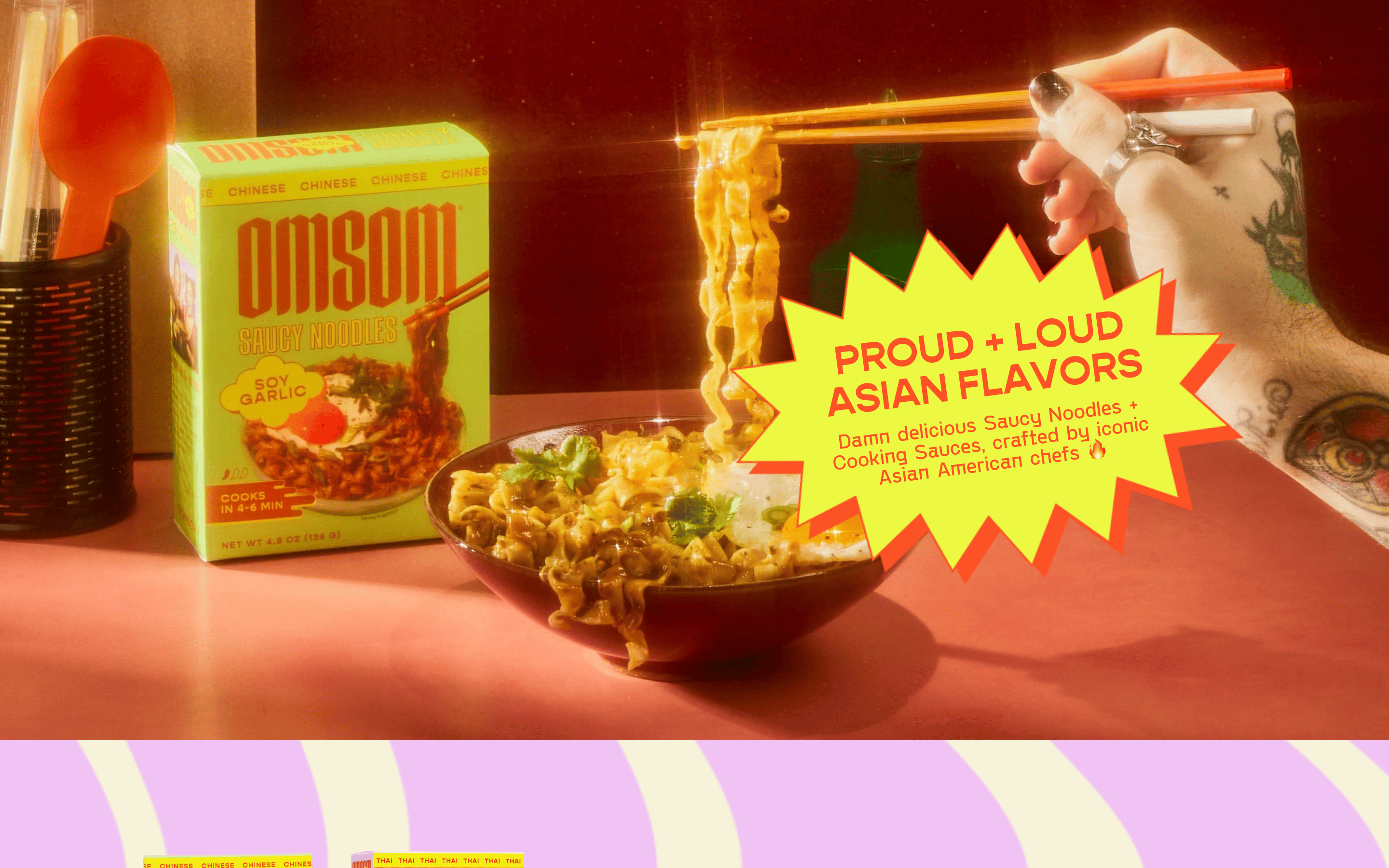
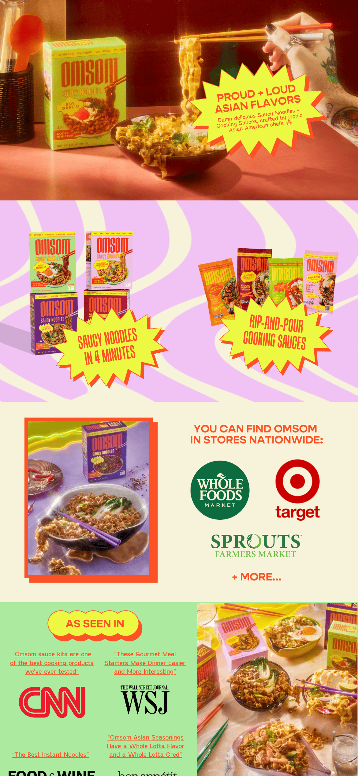
Vibrant, loud, and unapologetic Asian food brand with a comic-book aesthetic.
brand food
01
Identity DNA
bold loud flavorful playful authentic
A bold, comic-book-style food brand that unapologetically celebrates Asian flavors.
02
Color
#FD5225Accent
#000000Ink
#FCF3DABG
#AC9F9FBG soft
#D69C8CBG quiet
rgba(0,0,0,1)Line
High-chroma orange and yellow accents against warm, muted photography and soft pastel backgrounds.
03
Typography
display-serif · sans-serif
display 64px · 500headline 42px · 500body 16px · 400Headlines use a bold, condensed display serif. · Body text uses a clean sans-serif. · Frequent use of uppercase for emphasis.
04
Spacing
4px
8px
16px
24px
32px
48px
64px
96px
Generous spacing between sections to allow bold visuals and typography to breathe.
05
Surfaces
sm · 0px
md · 0px
lg · 0px
pill · 999px
Thin black borders around imagery and a thick, comic-book-style starburst shape for callouts.
06
Layout
1280 container
12 columns
24px gutter
768 / 1024 breakpoints
Full-width hero imagery followed by a grid of product shots and editorial quotes.
07
Motion & Interaction
220ms micro
400ms small
800ms medium
cubic-bezier(0.4, 0, 0.2, 1) easing
Smooth transitions for hover states · Dynamic transform effects on scroll
Cursor changes to pointer; subtle scale or color shifts on interactive elements. · Immediate visual feedback with active states.
08
Components
button Bold, uppercase text links or solid color buttons. card Product packaging presented as high-quality photography without strict bounding boxes. chip Comic-book-style starburst callouts with high-contrast text. hero Full-width lifestyle photography featuring the product in a realistic setting with a prominent starburst overlay. 09
Voice & Don'ts
Tone Confident, bold, and enthusiastic. Headlines Proud + Loud CTAs Direct and action-oriented. Don't use muted pastels as the primary palette — screenshot shows vibrant, high-chroma orange and yellow. Don't use a standard geometric sans-serif for headlines — screenshot shows a bold, condensed display serif. Don't use subtle drop shadows — screenshot shows hard, comic-book-style graphic elements. Don't use a minimalist layout — screenshot shows dense, expressive imagery and text. Don't avoid uppercase text — screenshot shows frequent use of uppercase for emphasis. Don't use a neutral color scheme — screenshot shows a warm, energetic palette. Avoid: Tone down the flavor profile Avoid: Use overly corporate language Avoid: Be subtle with colors 10
Inside the pack — real screenshots
桌面首屏(hero) 桌面滚动分段(90% viewport 步进,作为视觉证据) 桌面滚动分段(90% viewport 步进,作为视觉证据) 移动首屏 Captured from the live site · real computed styles
11
System prompt
Omsom is a bold, expressive food brand that uses a 'Proud + Loud' aesthetic to celebrate Asian flavors. The design features high-chroma orange (#FD5225) and yellow accents against warm photography and soft pastel backgrounds like cream (#FCF3DA). Typography relies on a bold, condensed display serif for headlines and a clean sans-serif for body text. Critical don'ts: avoid muted pastels as the primary palette, avoid standard geometric sans-serifs for headlines, avoid subtle drop shadows, avoid minimalist layouts, avoid lowercase-only text, and avoid neutral color schemes. The overall feel is playful, confident, and highly energetic.
More from the library en · zh-CN · zh-TW · ja · ko
OpenDesign · curated web aesthetics for AI-readable design DNA · opendesign.cc
Why we curated this: A great example of a bold, expressive brand identity that uses comic-book aesthetics and high-contrast elements to stand out.