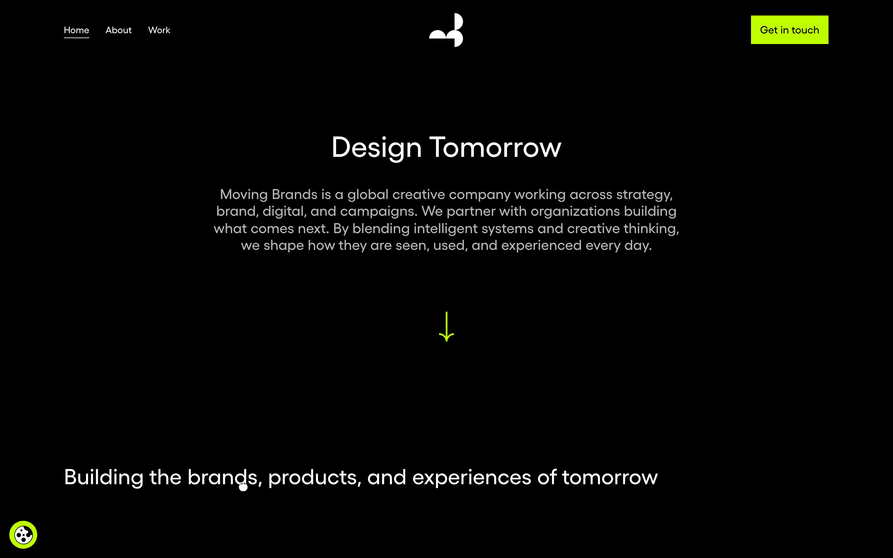
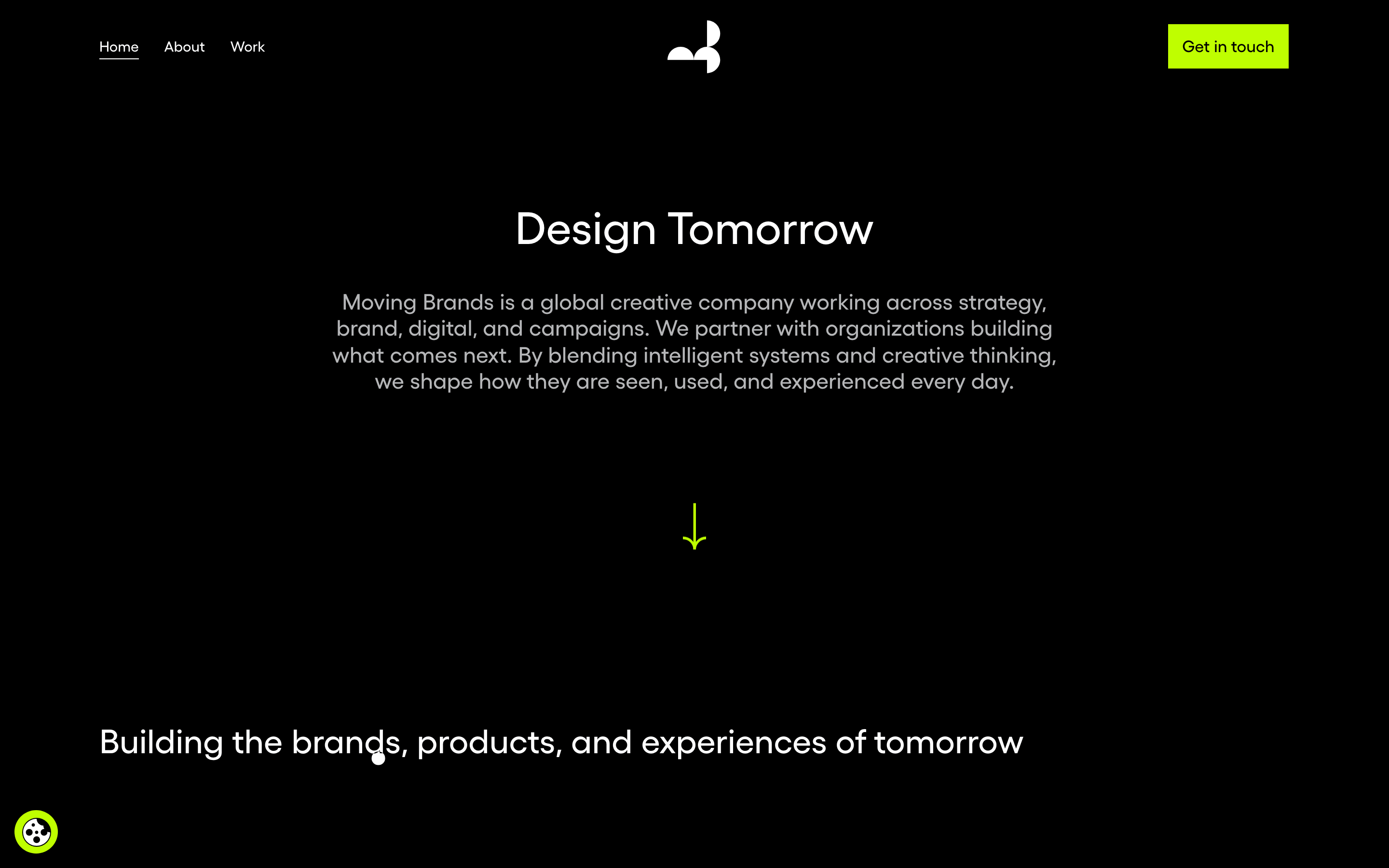
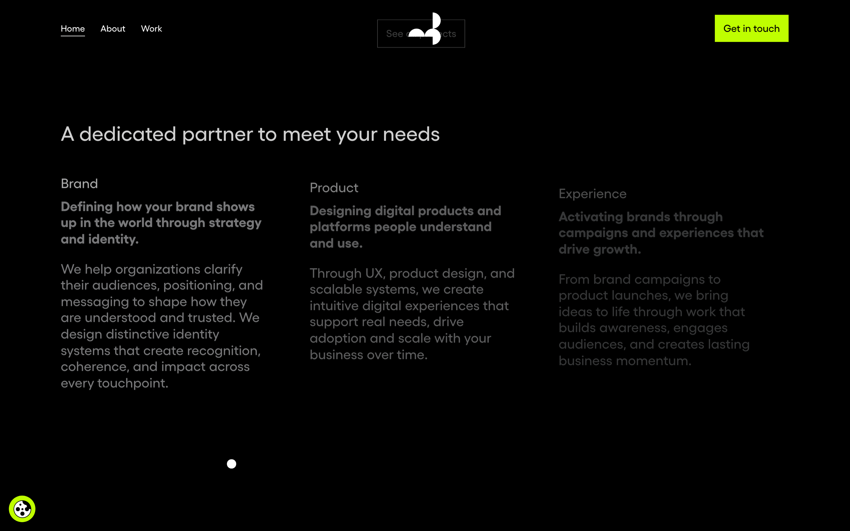
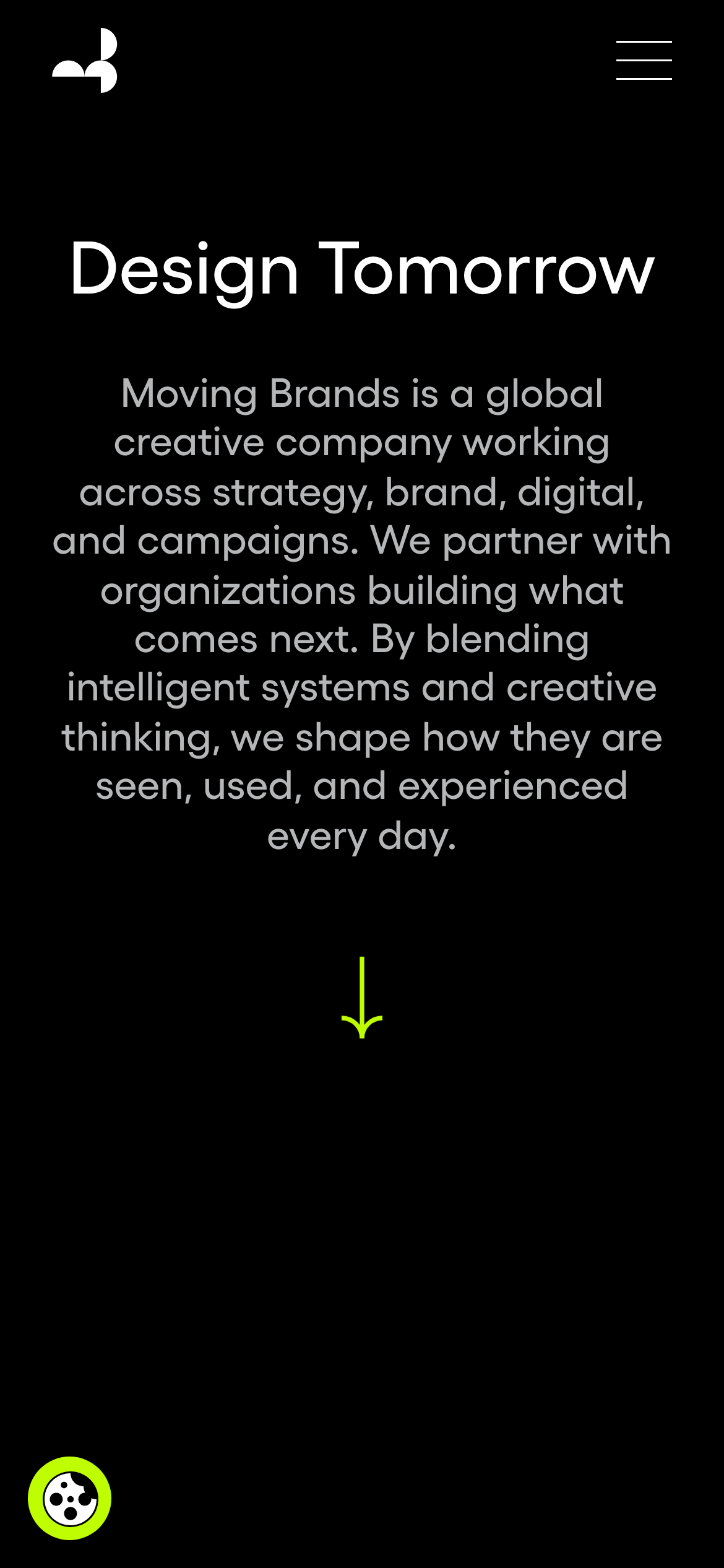
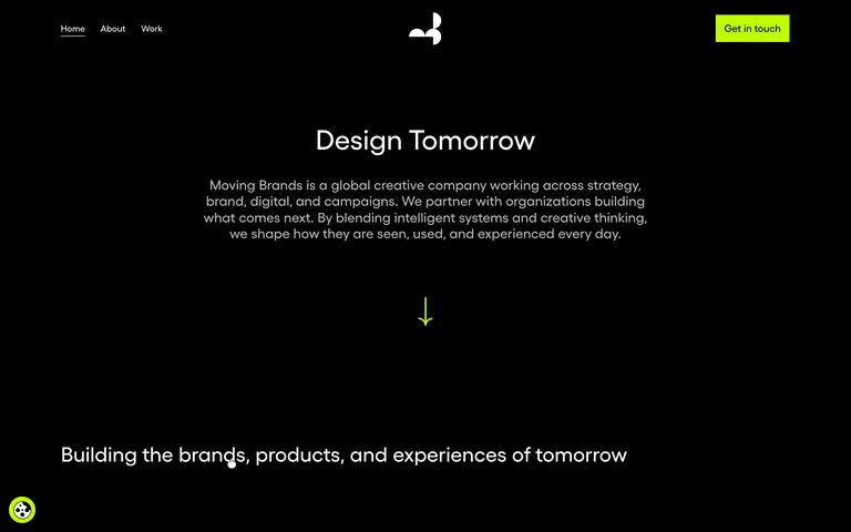
A midnight design studio with a striking neon accent.
02
Color
#BFFE00Accent
#FFFFFFInk
#D0D0D0Ink soft
#000000BG
#212121BG soft
#B5B6B8Muted
rgba(181, 182, 184, 1.0)Line
High-contrast monochrome base with a single, aggressive neon chartreuse accent for critical actions.
03
Typography
humanist-sans
display56px · 400
display-md32px · 400
body-lg23px · 400
body19px · 400
body-sm15px · 400
label15px · 500
Display and body typography should use the same humanist sans-serif family for a cohesive, modern feel. · Maintain generous line heights for readability against the dark background. · Use weight 500 sparingly for interactive labels and secondary emphasis.
04
Spacing
4px
8px
16px
24px
32px
48px
64px
96px
Generous vertical rhythm emphasizes the expansive, premium feel of the dark canvas.
05
Surfaces
sm · 0px
md · 0px
lg · 10px
pill · 999px
Minimal and invisible; relies heavily on spacing and color contrast for separation.
0px 32px 68px rgba(0, 0, 0, 0.3)
06
Layout
1280container
12columns
24pxgutter
768 / 1024breakpoints
Generous single-column centered content for hero, expanding to multi-column grids for services.
07
Motion & Interaction
250msmicro
750mssmall
750msmedium
cubic-bezier(0, 0.25, 0.53, 1.01)easing
Smooth page transitions and background-position shifts. · Subtle fade-ins for content sections.
Smooth background-color or color transitions. · Immediate visual feedback with slight scale or color shift.
08
Components
buttonHigh-contrast solid block with neon background and dark text; sharp or slightly rounded corners.
cardTypically borderless, relying on generous spacing and typography hierarchy on a dark surface.
heroMassive centered typography with a clear, concise value proposition and a directional cue.
09
Voice & Don'ts
ToneConfident, forward-thinking, and professional.
HeadlinesDirect, action-oriented, and expansive.
CTAsSimple, clear, and highly visible.
Don't use a serif typeface — screenshot shows a clean, humanist sans-serif throughout.
Don't use multiple bright accent colors — screenshot shows a single, dominant neon chartreuse.
Don't use a light or white background — screenshot shows a deep black background as the primary canvas.
Don't overcrowd the layout with UI elements — screenshot shows generous whitespace and minimal components.
Don't use soft, low-contrast text colors — screenshot maintains high contrast with pure white and light grays.
Don't use complex, overlapping decorative elements — screenshot shows a highly restrained, text-focused design.
Captured from the live site · real computed styles
11
System prompt
This is a premium creative agency website. Positioning is forward-thinking and global, built on a stark, high-contrast canvas. Key colors are a deep black (#000000) background, pure white (#FFFFFF) and light gray (#D0D0D0) text, with a single aggressive neon chartreuse (#BFFE00) accent for primary calls to action. Typography uses a clean humanist-sans category for both display and body, ensuring cohesion. Critical donts: Never use a serif font, never use multiple bright accent colors, and never crowd the layout with unnecessary UI elements or borders.
Bring this taste to your agent
Hand your AI agent a machine-readable spec of this design — tokens, type, motion, the whole DNA.