← OpenDesign CURATED · OPEN · FREE
Liquid Death
Rebellious, irreverent beverage brand using gothic punk aesthetics to sell healthy hydration.
brand bold ecommerce
01
Identity DNA
rebellious irreverent punk hydration counter-culture
A punk rock energy drink brand selling water
02
Color
#8A6D35Accent
#000000Ink
#151515Ink soft
#E6E6E6BG
#F5F5F5BG soft
#040404BG quiet
#737373Muted
rgba(227, 227, 227, 1.0)Line
High-contrast palette alternating between light grays, deep blacks, and a distinctive metallic gold accent for brand mark.
03
Typography
geometric-sans · humanist-sans
display 40px · 700heading 32px · 700subheading 24px · 700body 16px · 400caption 14px · 400Use uppercase for all navigation links · Use tight letter spacing for large display headlines · Maintain bold weight (700) for all primary headings
04
Spacing
4px
8px
12px
16px
24px
32px
48px
64px
96px
150px
8px base grid with generous vertical padding (150px top / 56px bottom) for hero sections.
05
Surfaces
sm · 2px
md · 5px
lg · 10px
pill · 999px
1px solid rgba(0, 0, 0, 0.15) for inputs; 1px solid rgb(0, 0, 0) for buttons
0px 4px 12px 0px rgba(0, 0, 0, 0.15) · 0px 0px 18px 0px rgba(0, 0, 0, 0.2)
06
Layout
1280 container
12 columns
24px gutter
768 / 1024 breakpoints
Centered content with large, full-width hero banners and prominent overlay modals.
07
Motion & Interaction
220ms micro
500ms small
800ms medium
cubic-bezier(0, 0, 0.2, 1) easing
Smooth fade and transform transitions on hover states · Subtle opacity transitions for modal overlays
Color changes and subtle transforms on interactive elements. · Immediate visual response on buttons.
08
Components
button Transparent background with thick black border and uppercase text; no border-radius. card Product imagery without visible container borders. input White background with thin black border and placeholder text. hero Full-width background imagery with large, bold typography and a clear call-to-action button. 09
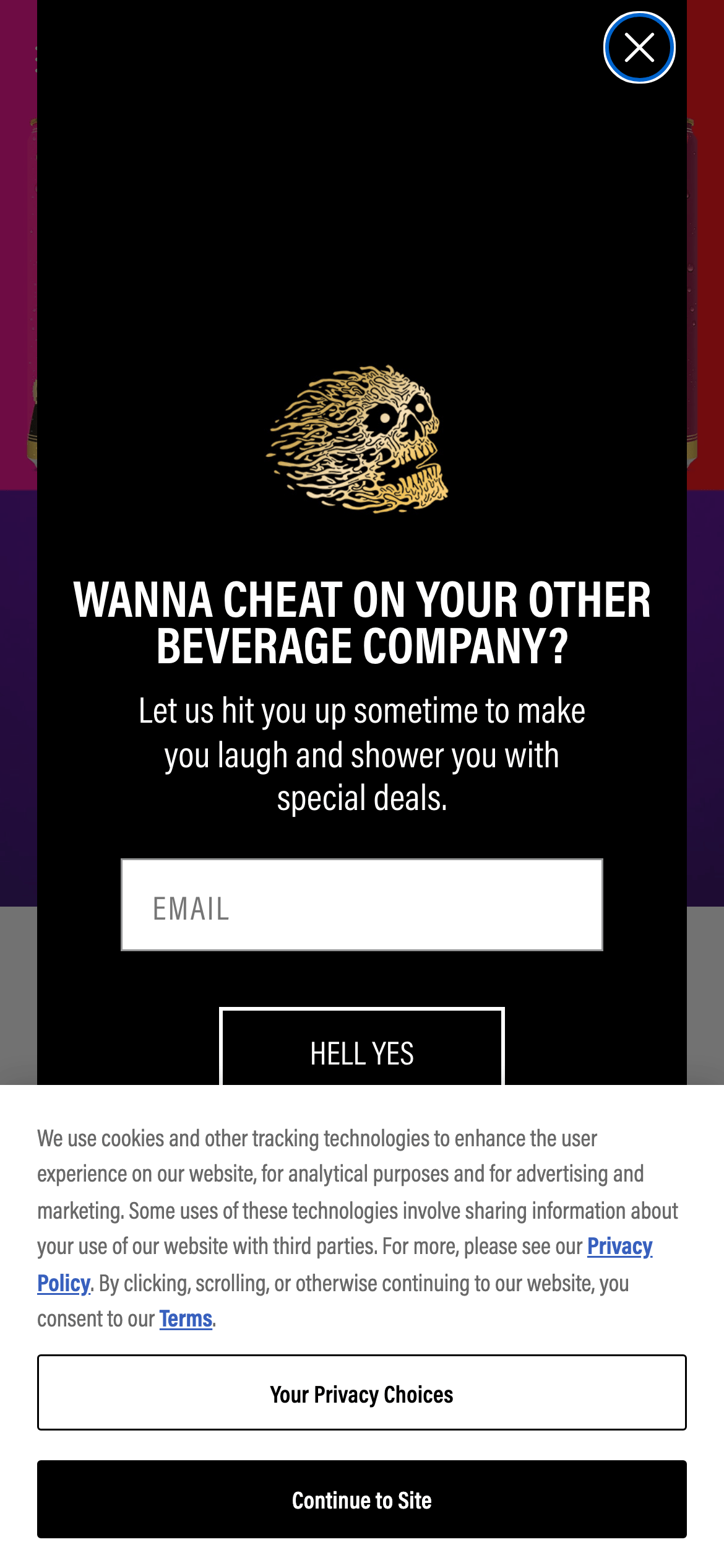
Voice & Don'ts
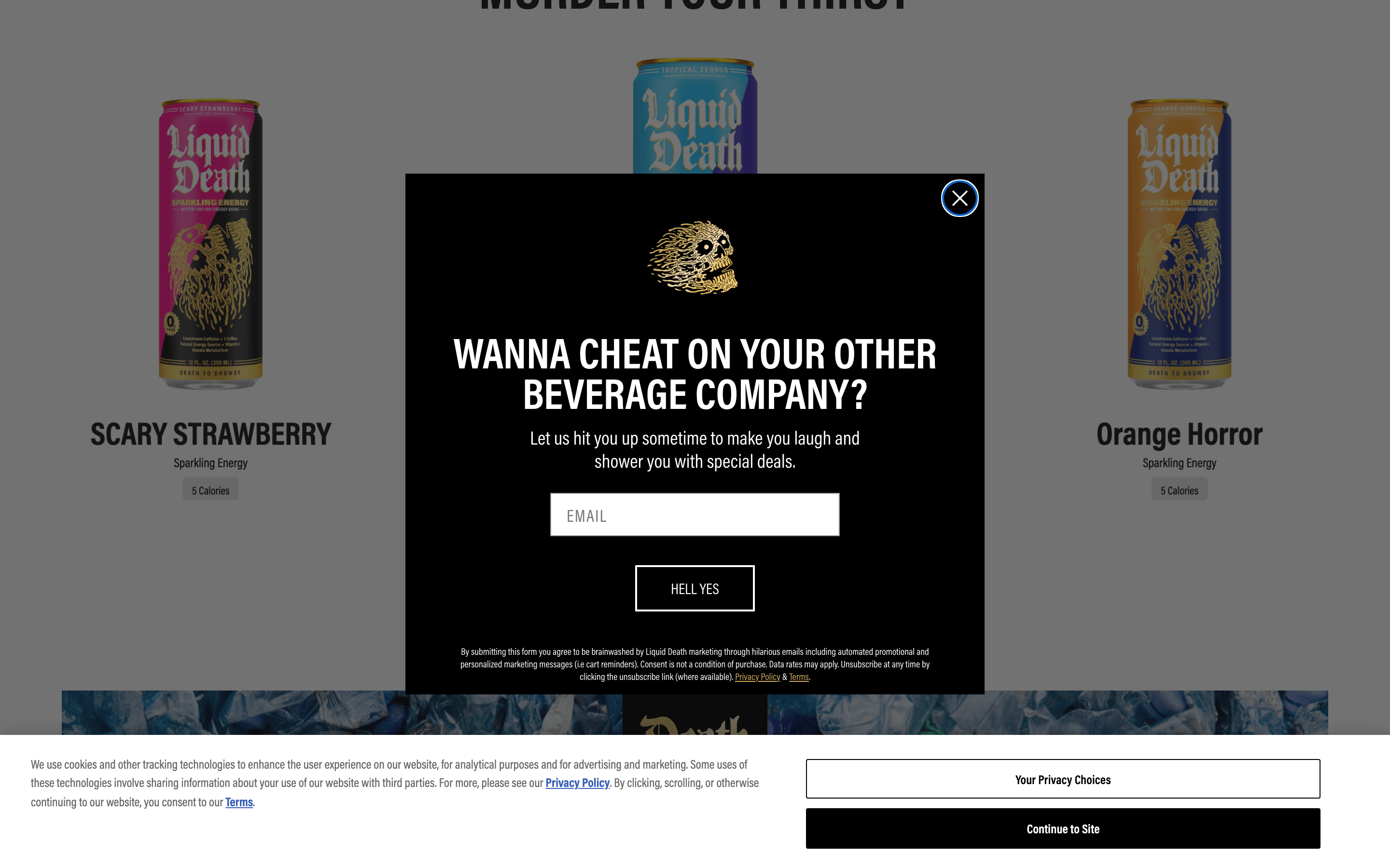
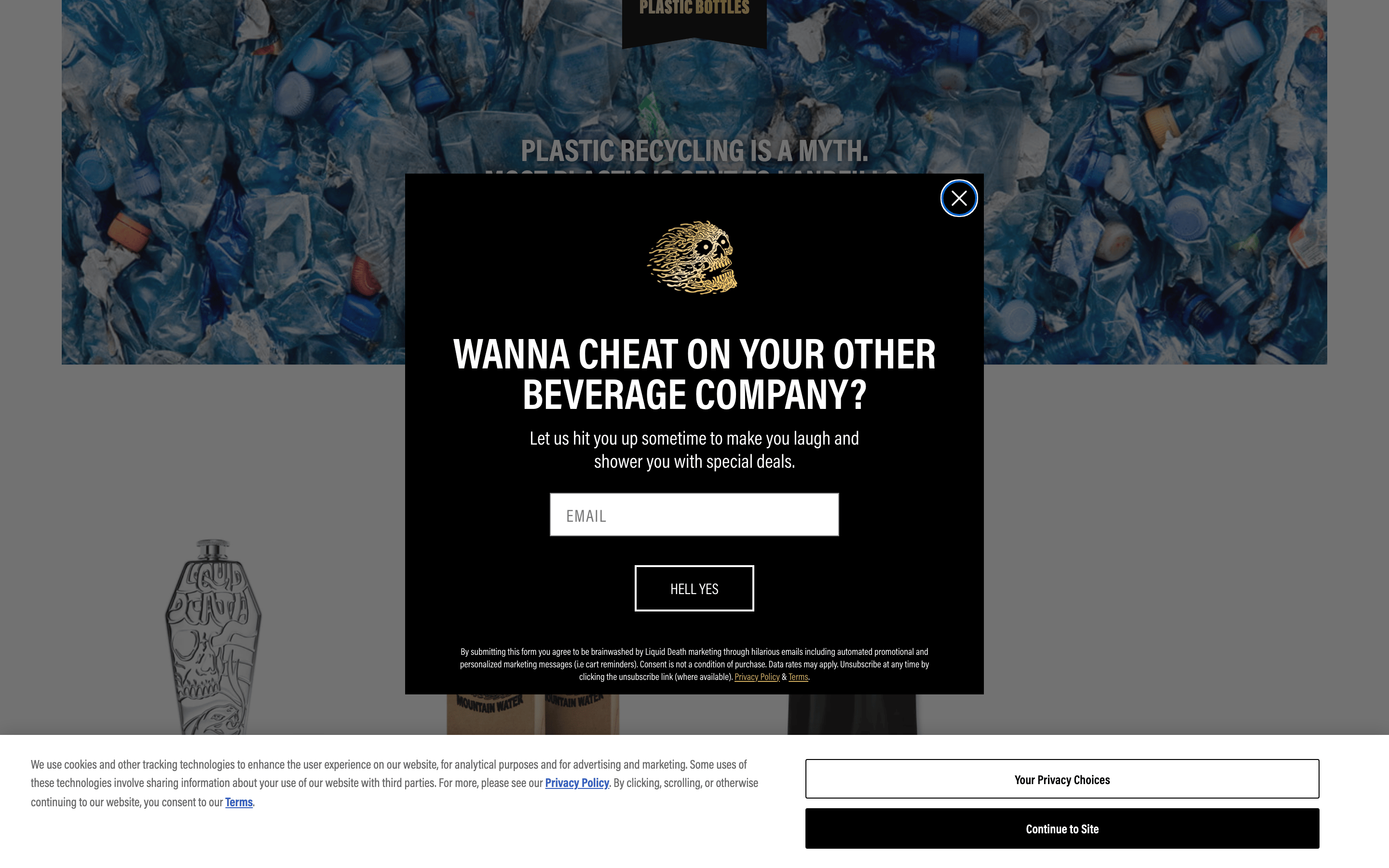
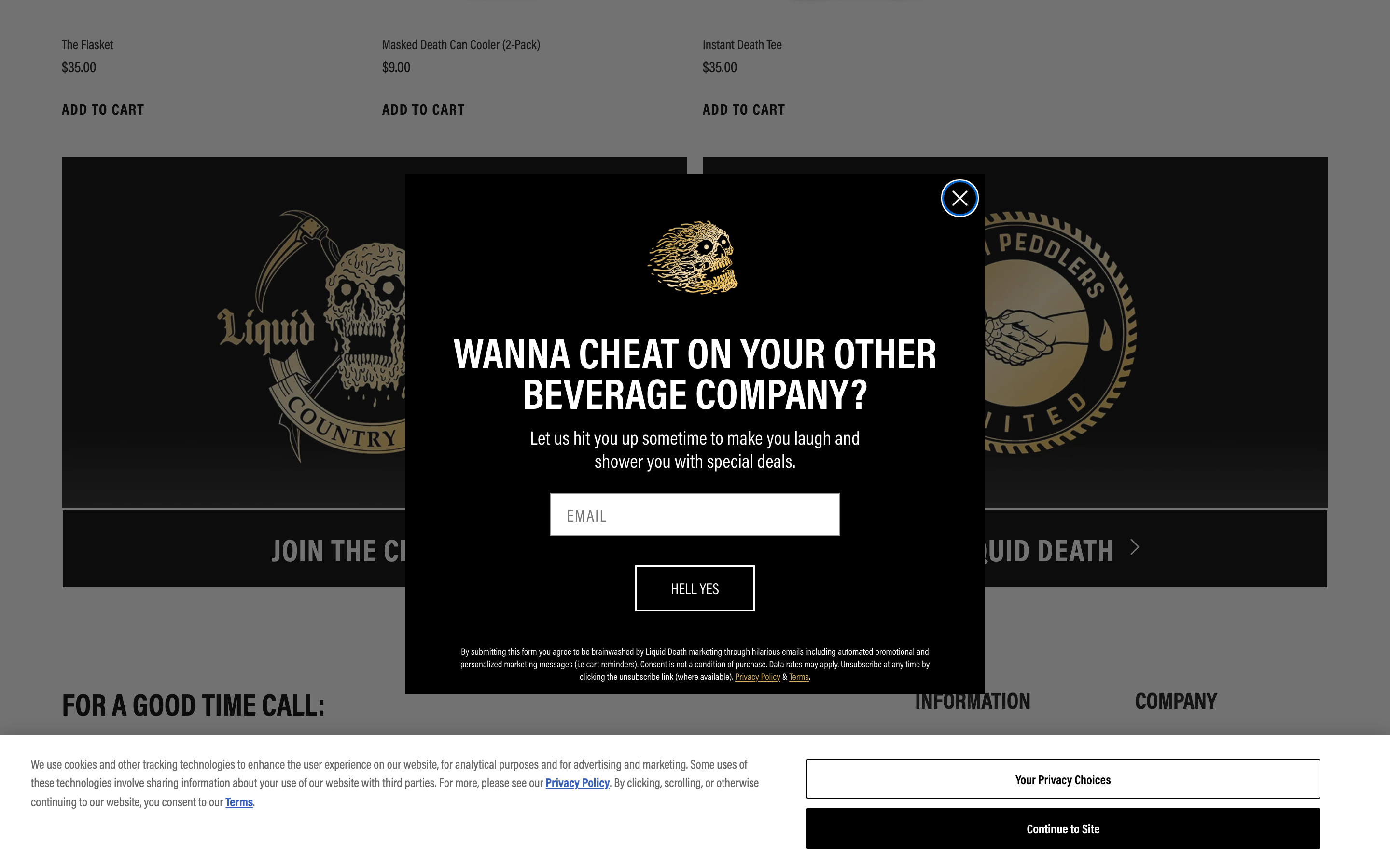
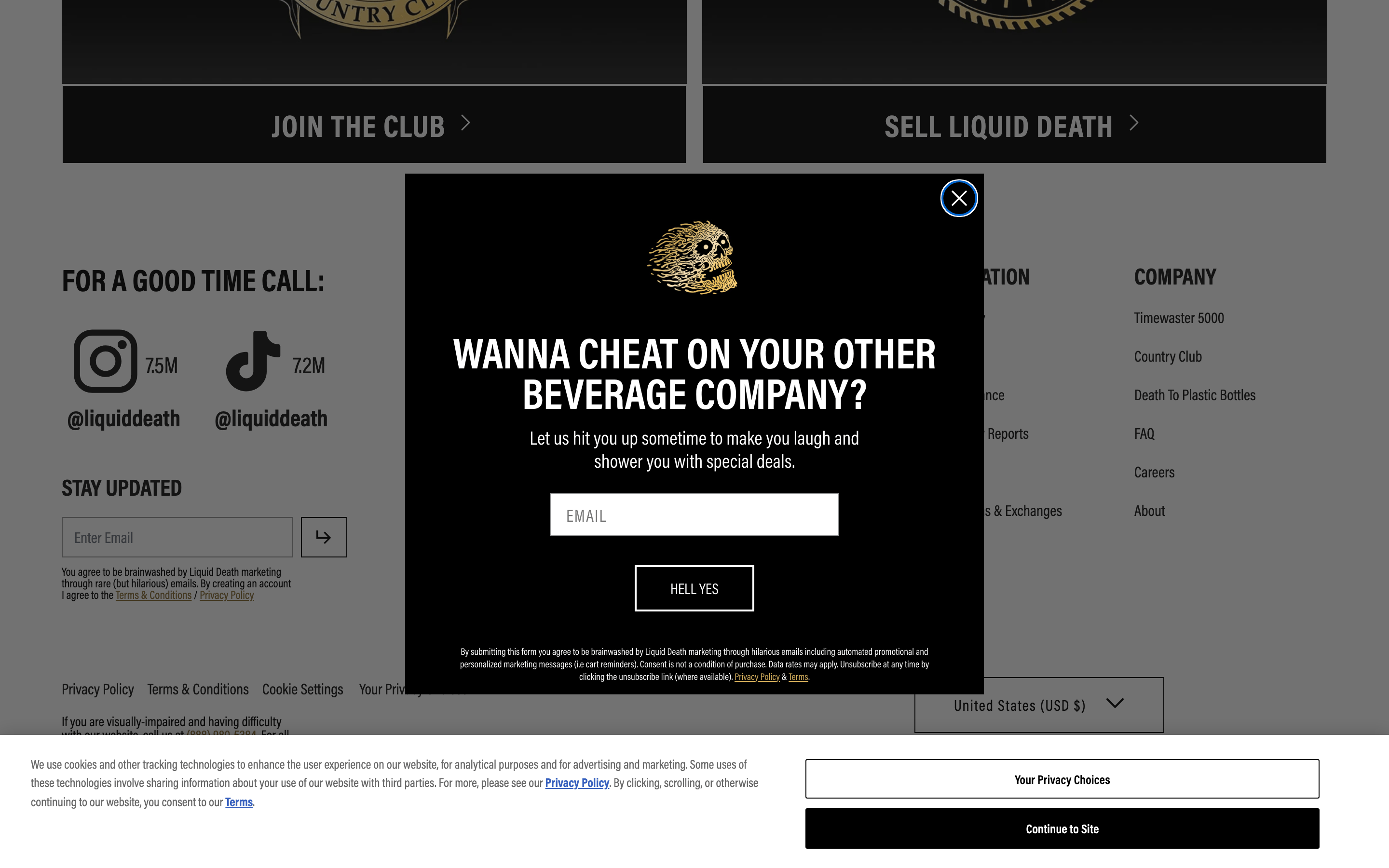
Tone Irreverent, humorous, and slightly aggressive. Headlines Short, punchy, and often sarcastic statements. CTAs Informal and bold phrases like 'HELL YES' or 'SHOP NOW'. Don't use rounded corners on primary buttons — screenshot shows square/rectangular shapes instead Don't use a subtle or muted typography — screenshot shows bold, high-contrast headlines instead Don't use a colorful, playful palette — screenshot shows a strictly monochromatic base with a single gold accent instead Don't use small, delicate UI elements — screenshot shows large, chunky inputs and buttons instead Don't use a clean, empty aesthetic — screenshot shows dense, photorealistic backgrounds and busy imagery instead Don't use friendly, lowercase headlines — screenshot shows aggressive, uppercase text instead Avoid: Formal corporate language Avoid: Overly technical jargon Avoid: Gentle or passive phrasing 10
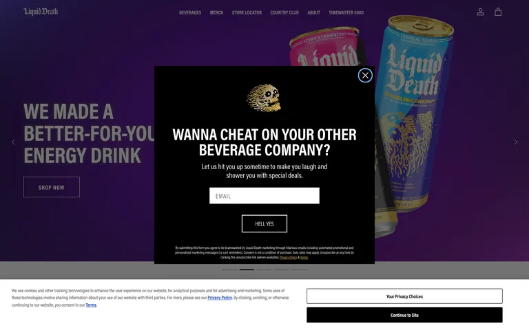
Inside the pack — real screenshots
桌面首屏(hero) 桌面滚动分段(90% viewport 步进,作为视觉证据) 桌面滚动分段(90% viewport 步进,作为视觉证据) 桌面滚动分段(90% viewport 步进,作为视觉证据) 桌面滚动分段(90% viewport 步进,作为视觉证据) 桌面滚动分段(90% viewport 步进,作为视觉证据) 移动首屏 Captured from the live site · real computed styles
11
System prompt
Liquid Death uses a rebellious, punk-inspired aesthetic characterized by high-contrast black and white imagery, bold uppercase typography, and a distinctive gold metallic accent. The layout centers on immersive, full-width product photography and aggressive messaging. Key colors include a light gray background (#E6E6E6), deep blacks (#000000), and a metallic gold (#8A6D35) for brand elements. Typography relies heavily on geometric sans-serif fonts in bold weights with uppercase transforms. Critical design rules: avoid rounded corners on interactive elements, maintain aggressive and humorous copy, and utilize large, punchy headlines over subtle or delicate text.
More from the library en · zh-CN · zh-TW · ja · ko
OpenDesign · curated web aesthetics for AI-readable design DNA · opendesign.cc
Why we curated this: This site is an excellent example of building a strong, irreverent brand identity through consistent use of bold typography and a restricted, high-impact color palette.
浙ICP备2021038972号-5