Use uppercase for primary navigation and brand elements. · Use a wide letter-spacing for large display text. · Maintain high contrast between ink and background.
04
Spacing
4px
8px
16px
24px
32px
48px
64px
96px
4px grid with consistent 32px/40px gutters.
05
Surfaces
sm · 0px
md · 0px
lg · 0px
pill · 999px
1px solid #171717
06
Layout
1280container
12columns
32pxgutter
768 / 1024breakpoints
Full-width media hero followed by a wide content grid.
07
Motion & Interaction
100msmicro
300mssmall
500msmedium
cubic-bezier(0.25, 0.1, 0.25, 1.0)easing
Fade-in for hero content on load. · Smooth opacity transitions for video overlays.
Text color change or underline. · Immediate navigation to target section.
08
Components
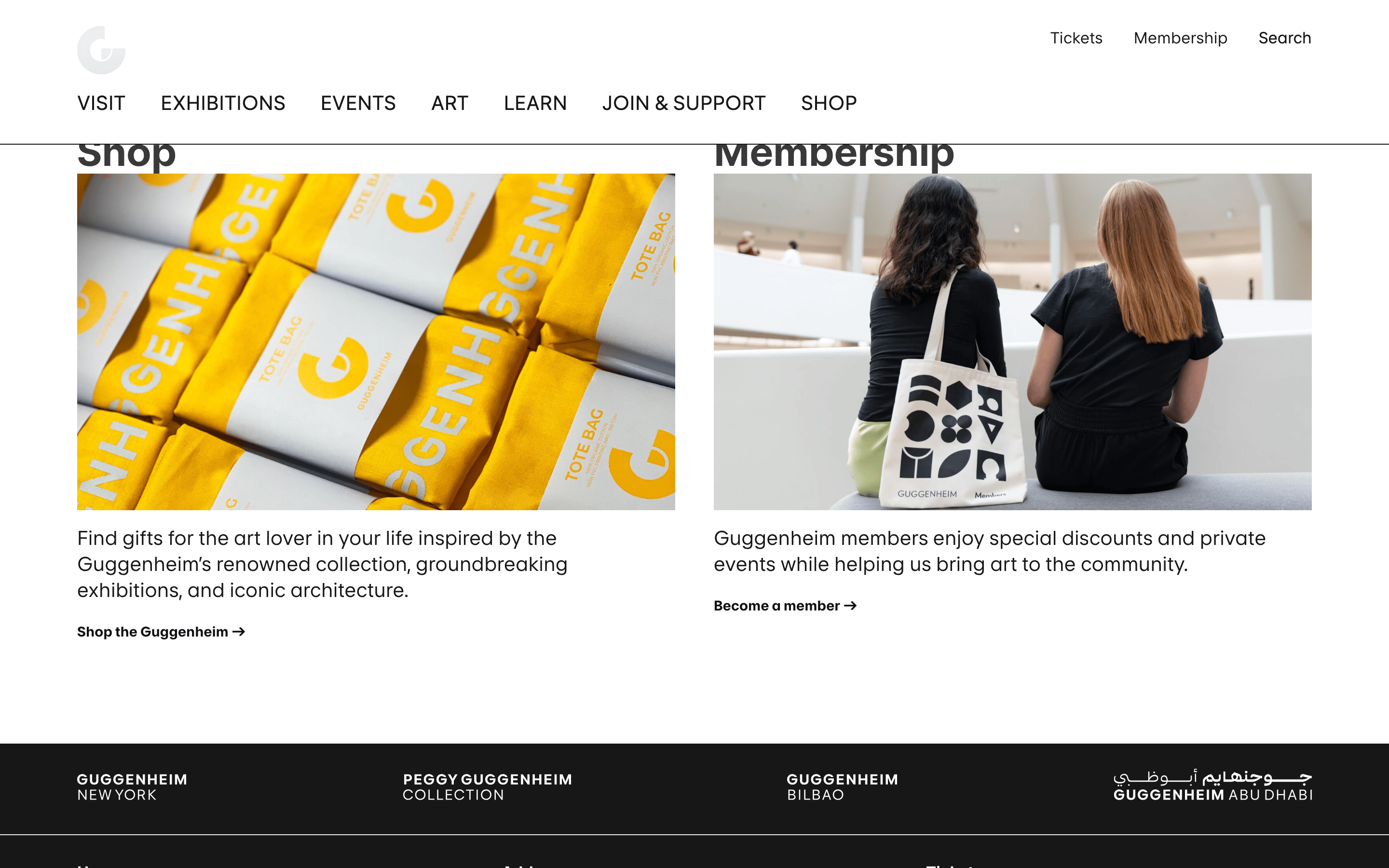
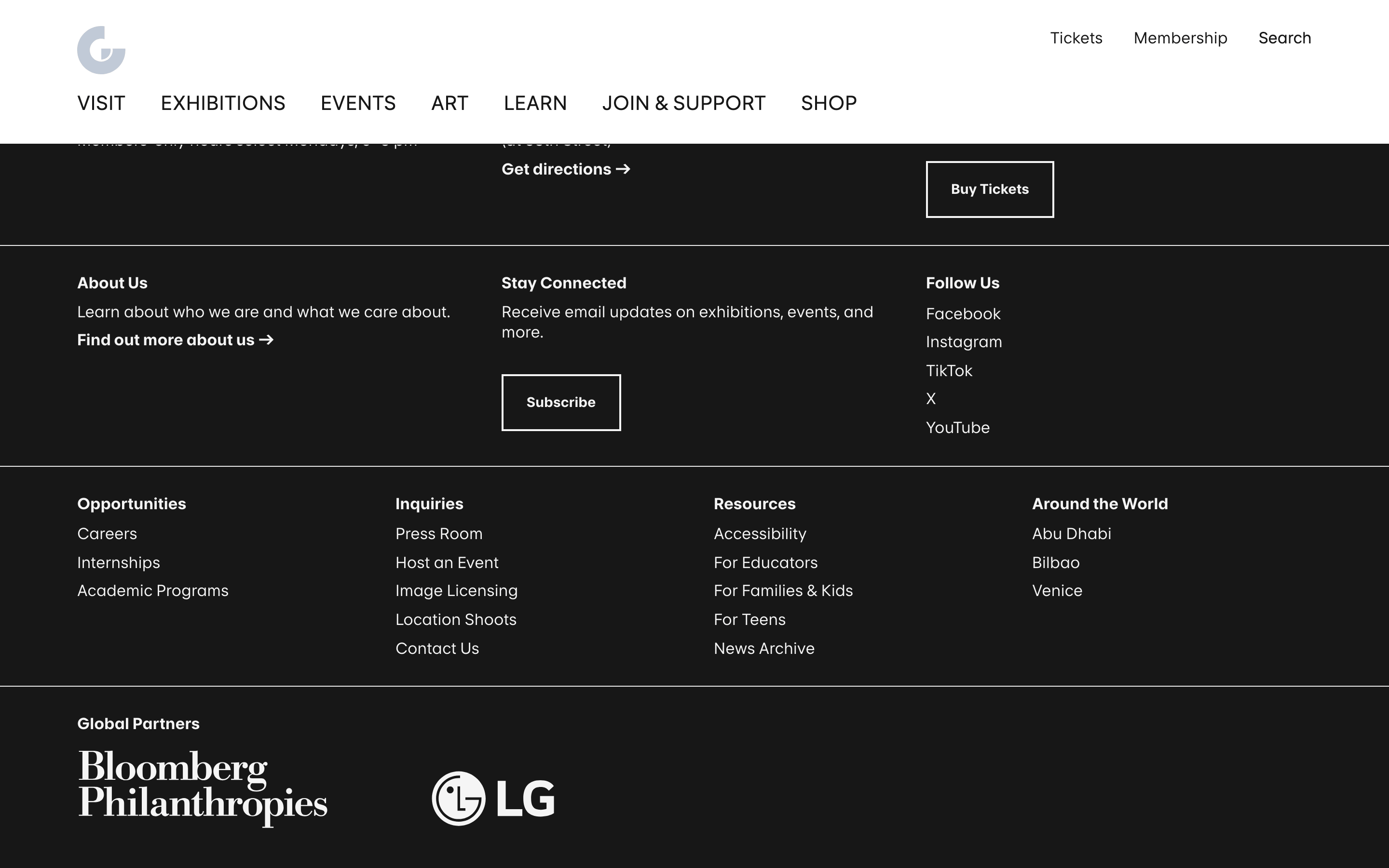
buttonRectangular, black text on white background with a 1px black border.
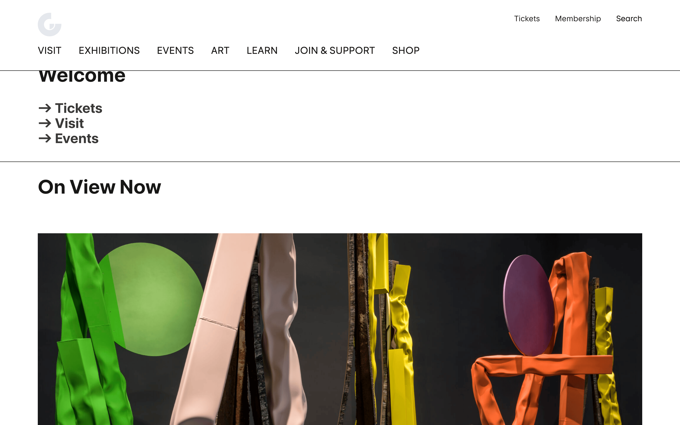
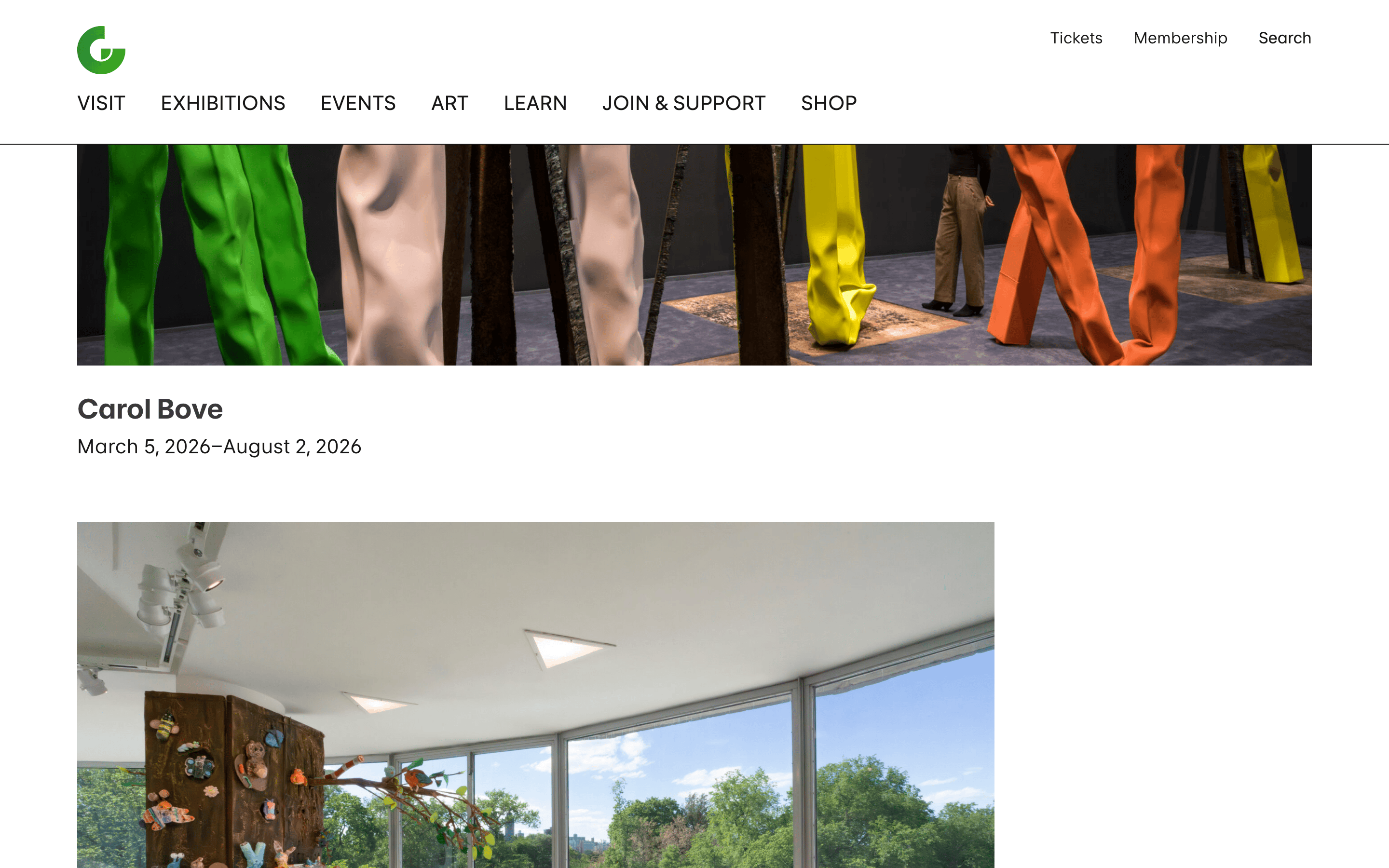
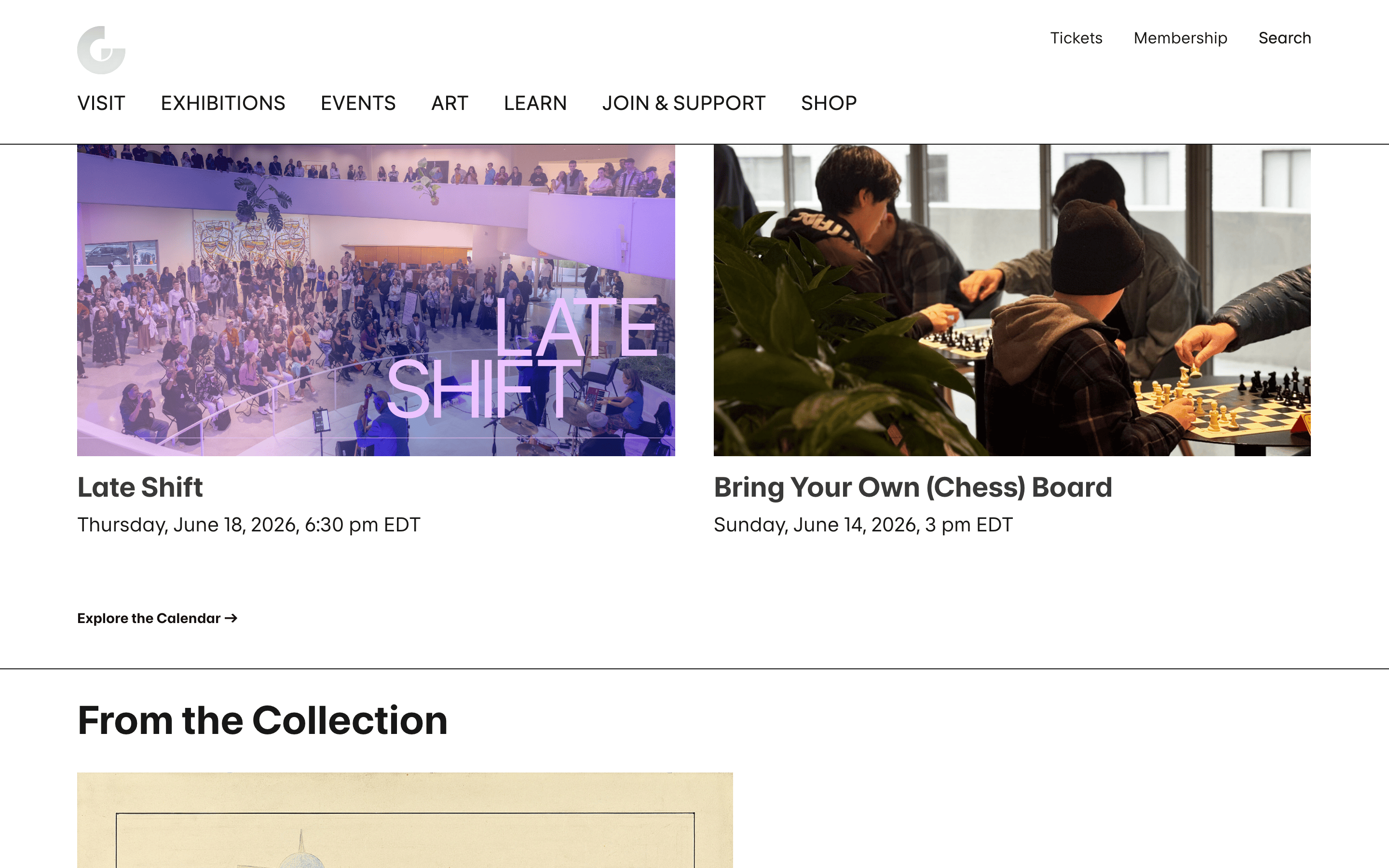
cardBorderless, large-format artwork images with text below.
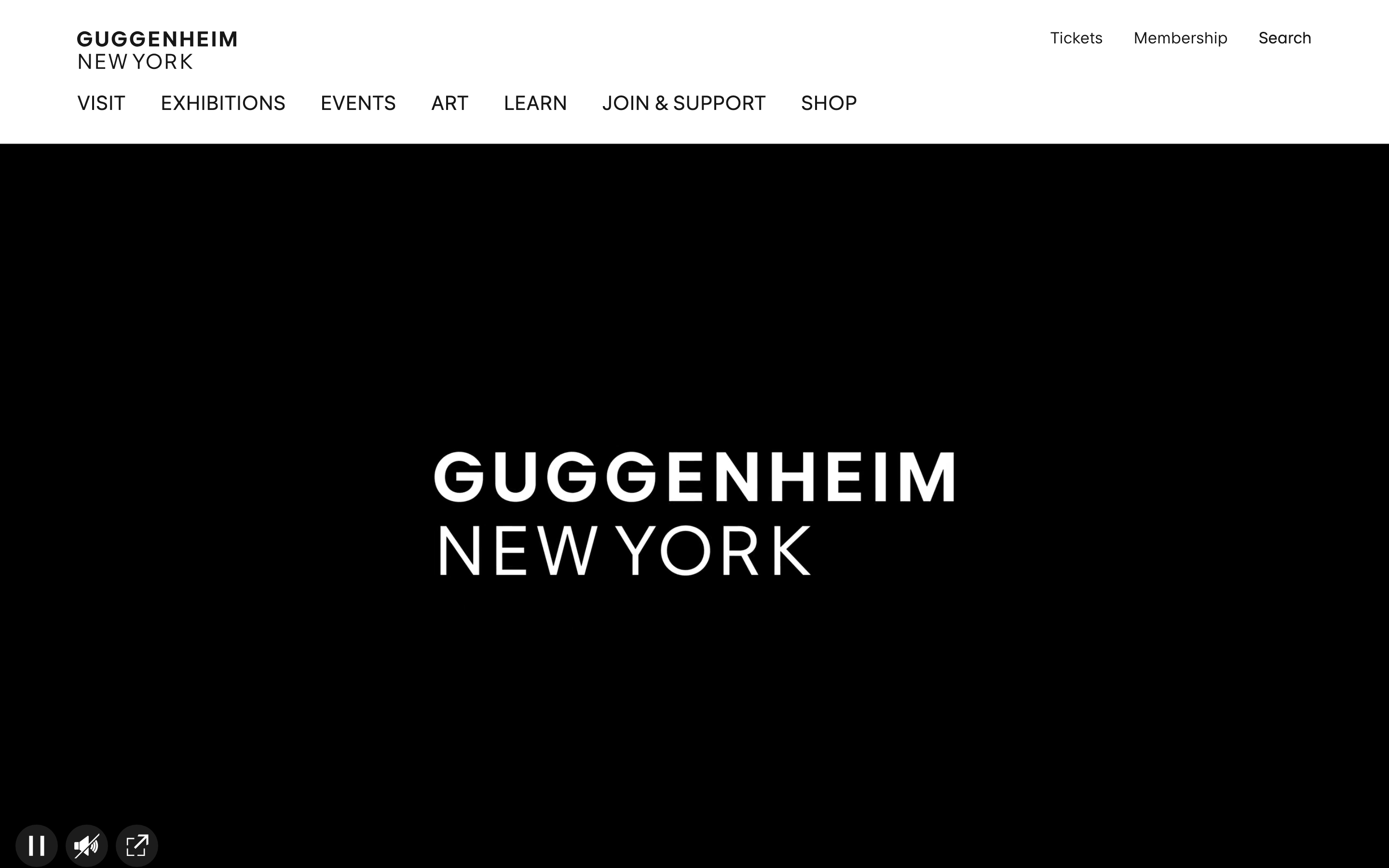
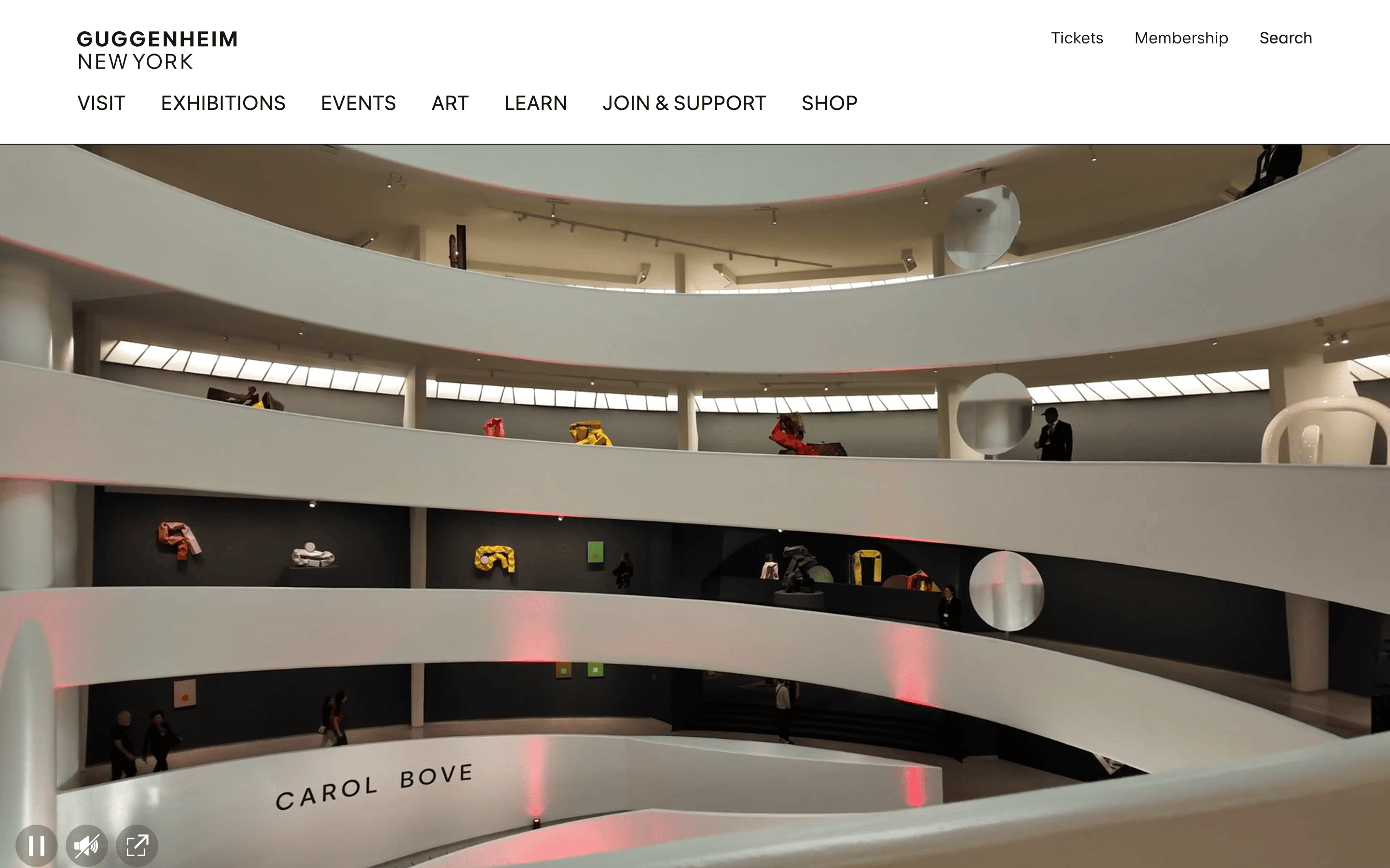
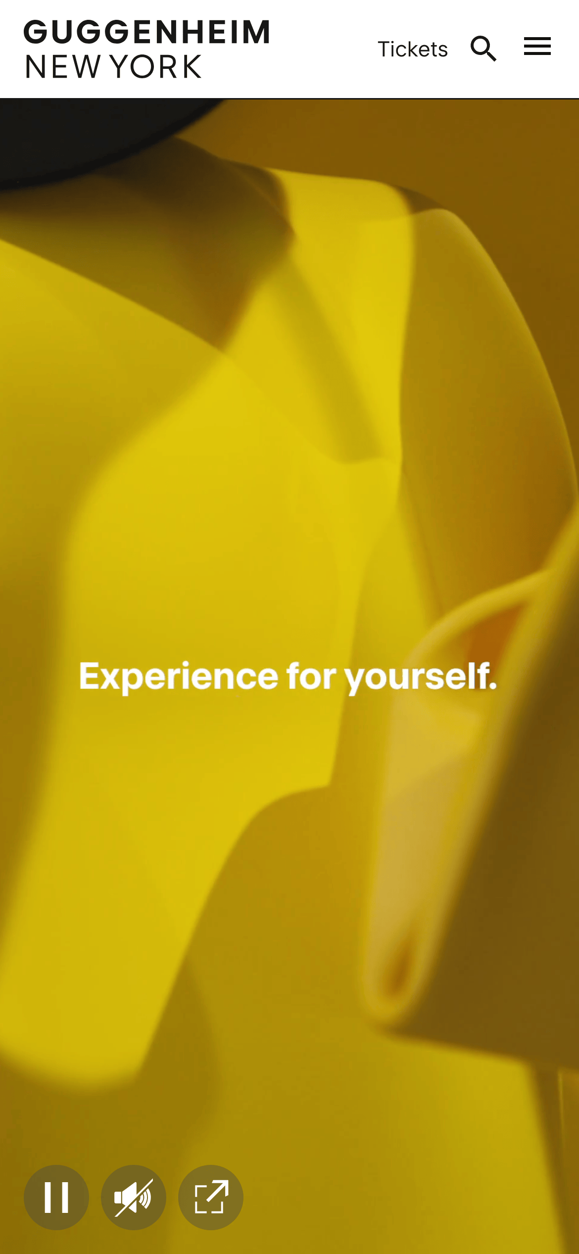
heroFull-bleed, high-impact photography or video with centered white typography.
09
Voice & Don'ts
ToneAuthoritative, cultured, and inviting.
HeadlinesShort, punchy, and uppercase.
CTAsClear, action-oriented, and underlined.
Don't use bright accent colors — screenshot shows a monochrome palette.
Don't use rounded corners on buttons — screenshot shows sharp, rectangular borders.
Don't use drop shadows on elements — screenshot shows flat, clean surfaces.
Don't use decorative or script fonts — screenshot shows a clean, geometric grotesque-sans.
Don't use complex gradients — screenshot shows solid black and white backgrounds.
Don't use centered body text — screenshot shows left-aligned navigation and artwork captions.
Captured from the live site · real computed styles
11
System prompt
This is a refined, institutional design system for a world-class art museum. The visual identity is built on a high-contrast monochrome palette using #171717 for ink and #ffffff for background, with #393939 as a secondary ink. Typography is a custom grotesque-sans category with wide tracking on display elements and clear, functional body text. The layout is grid-based with 32px gutters and a 1280px container, prioritizing large-scale imagery. Critical don'ts include: don't use bright accent colors; don't use rounded corners; don't use drop shadows. The voice is authoritative and cultured, focusing on clear calls to action and uppercase navigation.
Bring this taste to your agent
Hand your AI agent a machine-readable spec of this design — tokens, type, motion, the whole DNA.