← OpenDesign CURATED · OPEN · FREE
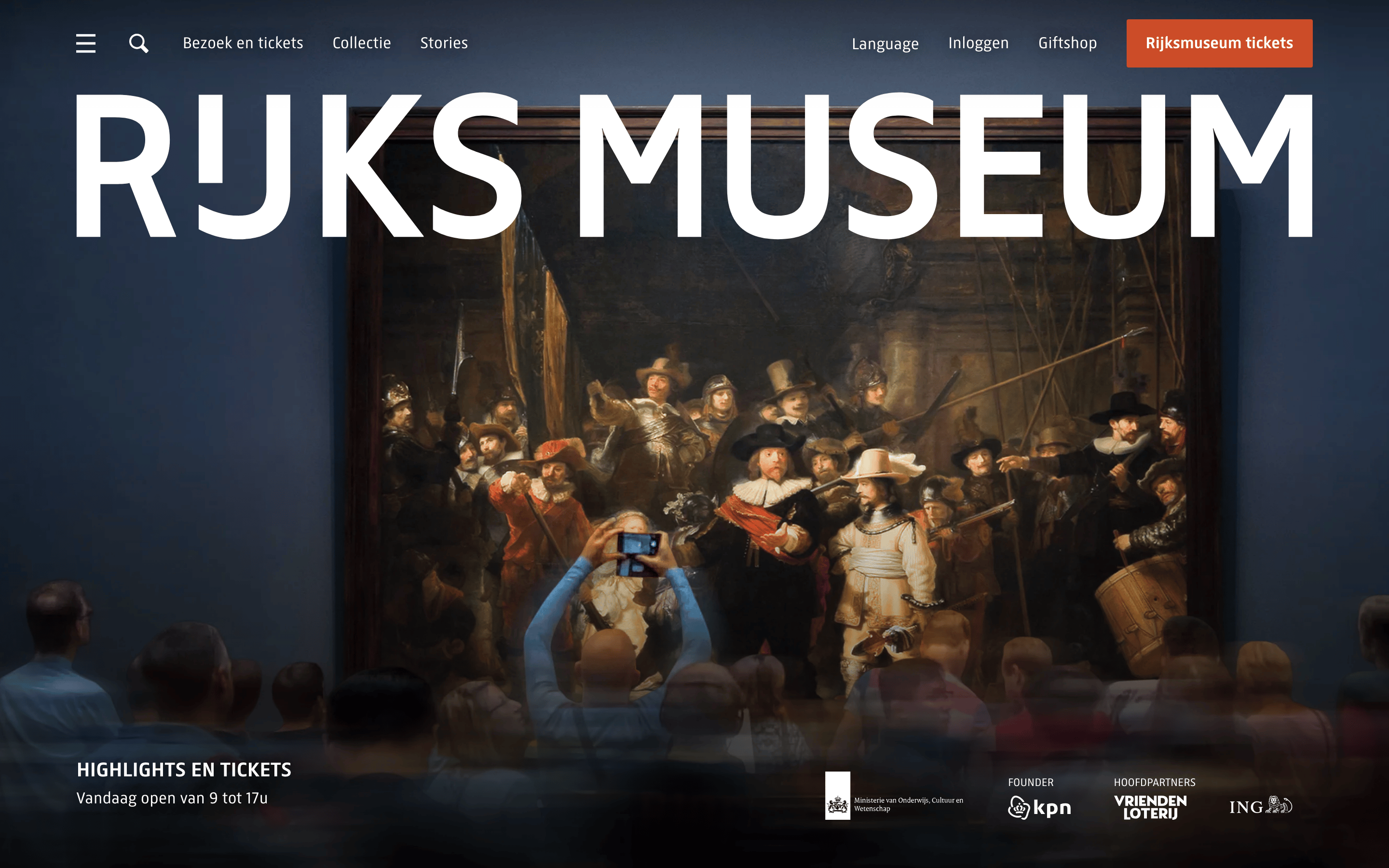
Rijksmuseum
A premium cultural heritage site showcasing classical art through high-impact photography and bold typographic branding.
museum art
01
Identity DNA
museum heritage art culture premium
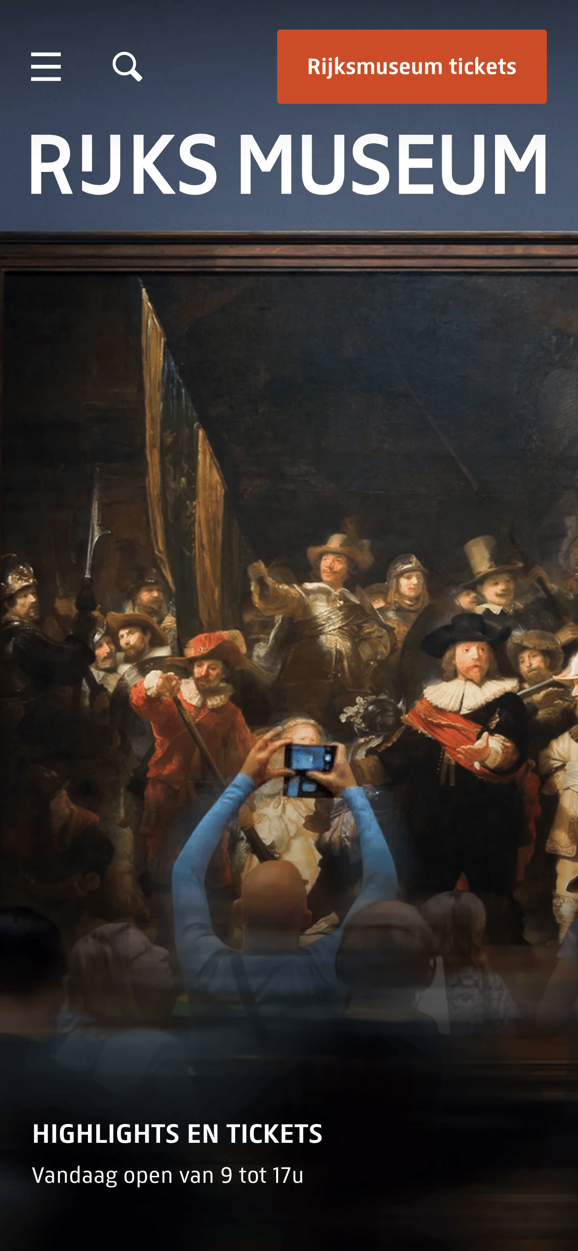
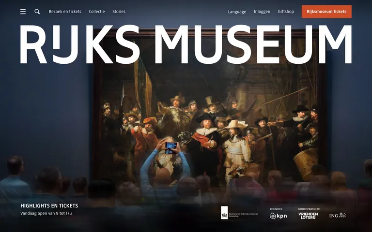
A prestigious national gallery entrance.
02
Color
#CC4C28Accent
#000000Ink
#FFFFFFBG
#C2CCCEMuted
rgba(194, 204, 206, 1)Line
High-contrast monochrome with a single warm accent, relying on photographic overlays for visual richness.
03
Typography
humanist-sans
display 120px · 700headline 24px · 700body 17px · 400Uppercase for navigation and section labels · Bold weights for headlines and primary actions
04
Spacing
4px
8px
16px
24px
32px
48px
64px
96px
Generous padding within containers to allow photography to breathe.
05
Surfaces
sm · 2px
md · 4px
lg · 8px
pill · 999px
Minimal, typically 1px solid borders on form elements or subtle dividers.
06
Layout
1280 container
12 columns
24px gutter
768 / 1024 breakpoints
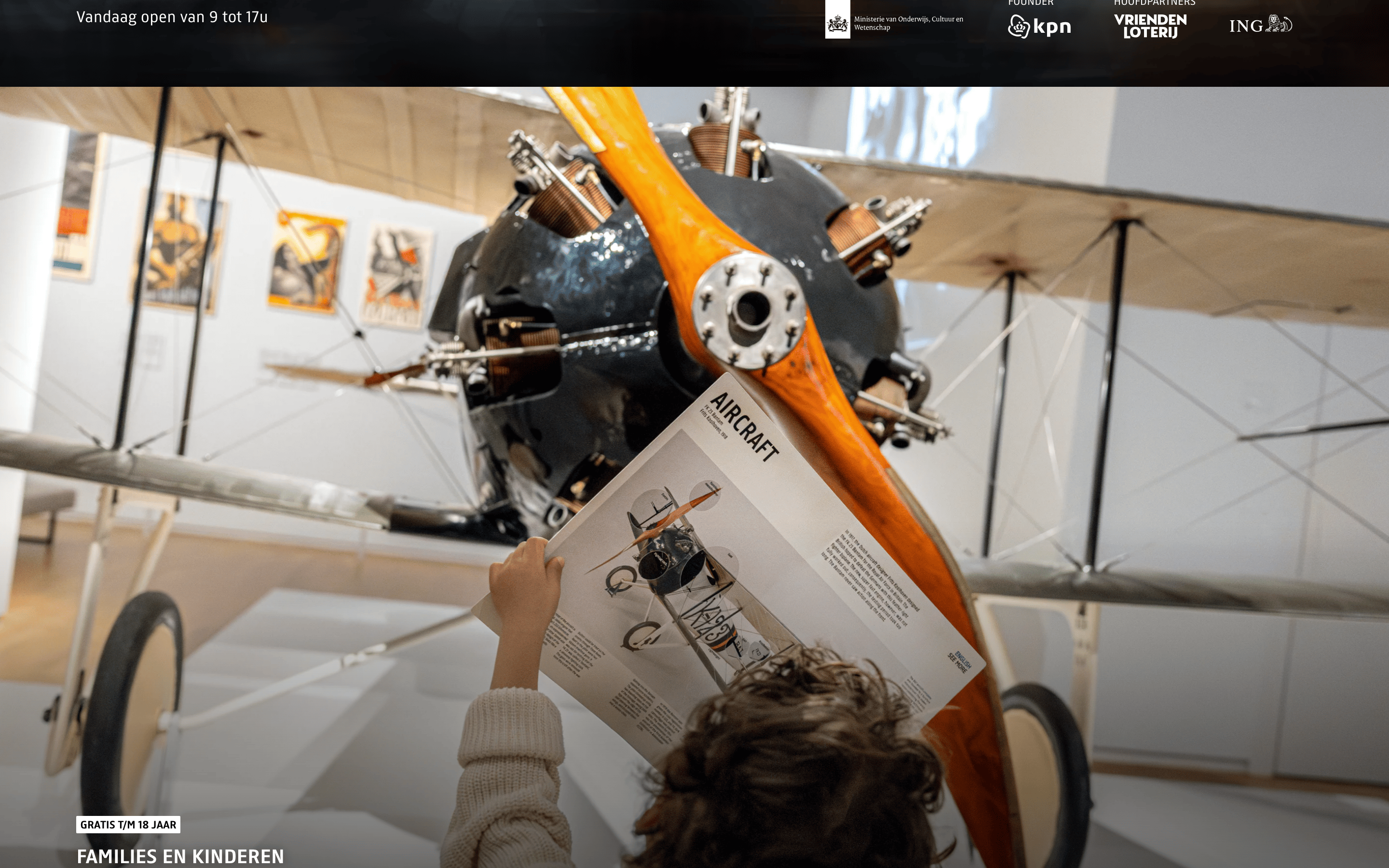
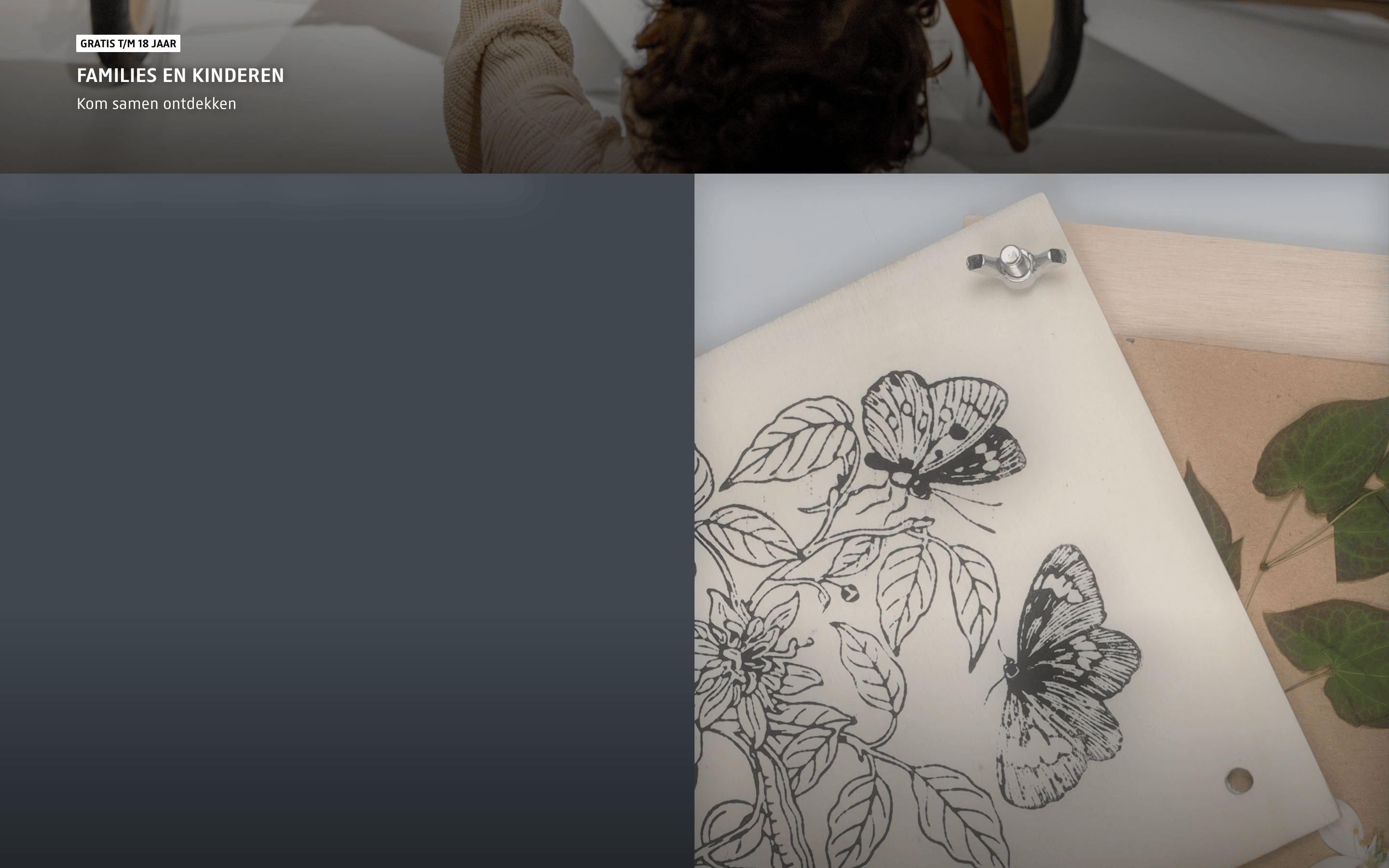
Full-bleed hero sections with overlaid typography, transitioning to structured content grids.
07
Motion & Interaction
220ms micro
400ms small
800ms medium
cubic-bezier(0.4, 0, 0.2, 1) easing
Subtle background-size transitions on hover · Fade-in/out for content loading · Smooth color transitions for interactive states
Background-color transitions and slight background-size scaling. · Immediate visual feedback.
08
Components
button Solid block color with uppercase text, sharp or slightly rounded corners. card Image-heavy with text overlaid directly on the photography. chip Small uppercase tags with solid backgrounds. input Minimal underlined or lightly bordered fields. hero Massive full-width photography with large-scale typographic branding overlaid. 09
Voice & Don'ts
Tone Authoritative, elegant, and inviting. Headlines Direct and impactful, often using uppercase. CTAs Action-oriented, uppercase, and highly visible. Don't use playful or rounded fonts — screenshot shows a structured, humanist sans-serif. Don't use a multi-color palette — screenshot shows a restrained palette of white, black, and a single orange accent. Don't use decorative borders or complex shadows — screenshot shows a flat, clean surface style. Don't use small, cramped typography — screenshot shows large, legible type with generous spacing. Don't use abstract patterns — screenshot shows high-quality photographic imagery as the primary visual element. Don't use lowercase for navigation — screenshot shows uppercase navigation links. Avoid: Slang Avoid: Overly casual phrasing Avoid: Complex academic jargon 10
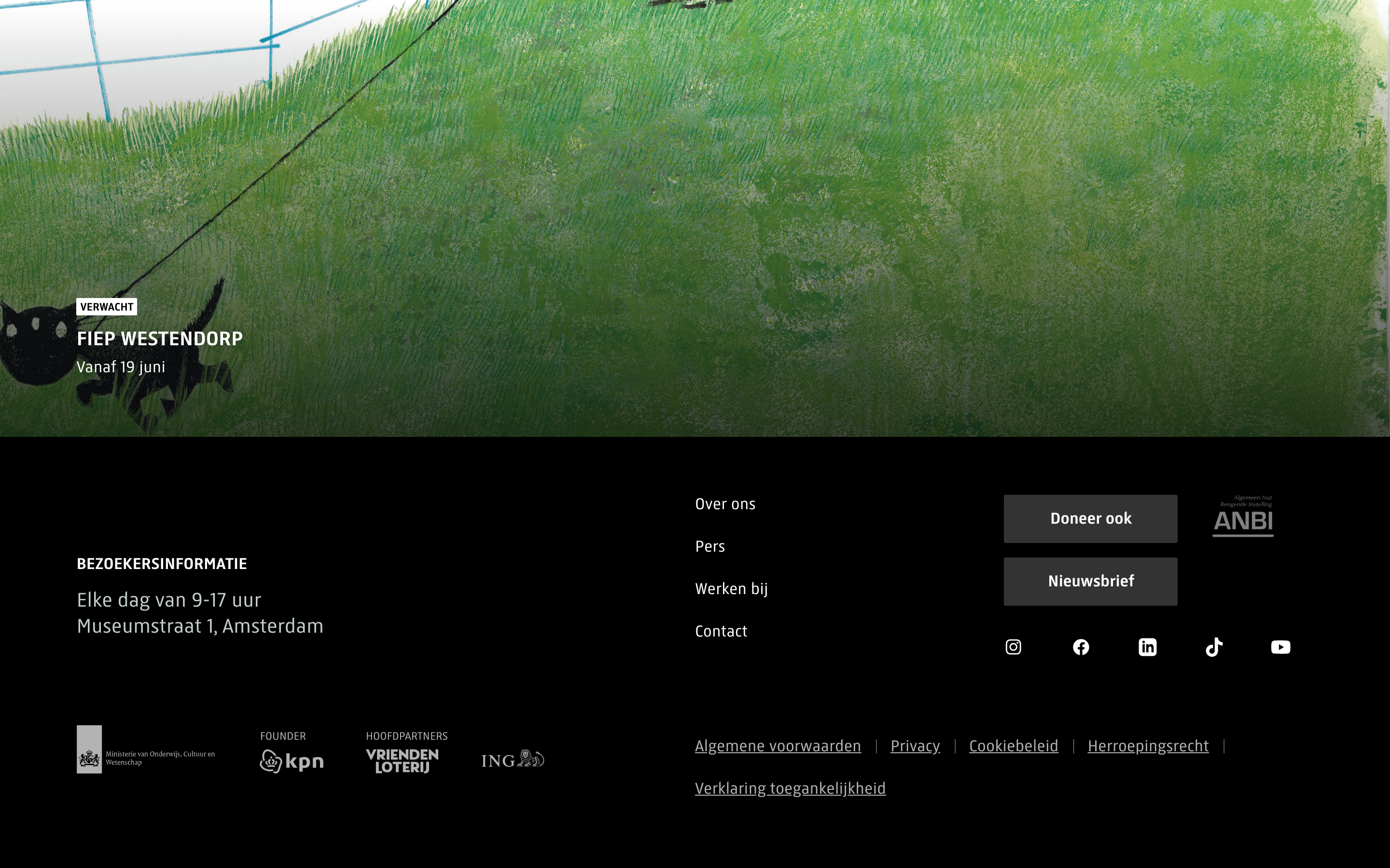
Inside the pack — real screenshots
桌面首屏(hero) 桌面滚动分段(90% viewport 步进,作为视觉证据) 桌面滚动分段(90% viewport 步进,作为视觉证据) 桌面滚动分段(90% viewport 步进,作为视觉证据) 桌面滚动分段(90% viewport 步进,作为视觉证据) 桌面滚动分段(90% viewport 步进,作为视觉证据) 移动首屏 Captured from the live site · real computed styles
11
System prompt
Rijksmuseum is a premium cultural heritage website positioning itself as an authoritative gateway to world-class art. It features a high-contrast palette dominated by white (#FFFFFF) and black (#000000), with a single warm orange accent (#CC4C28) for primary calls to action. The typography uses a humanist-sans-serif (RijksText) with bold, uppercase headlines. Critical donts: Do not use playful fonts or rounded UI elements; avoid multi-color gradients or decorative borders; never use small, cramped typography. The layout relies on massive, full-bleed photographic heroes with large-scale branding overlaid, transitioning into clean content grids.
More from the library en · zh-CN · zh-TW · ja · ko
OpenDesign · curated web aesthetics for AI-readable design DNA · opendesign.cc
Why we curated this: The site serves as an excellent example of how bold typography and high-quality photography can create a premium, authoritative digital presence for a cultural institution.