← OpenDesign CURATED · OPEN · FREE
Cooper Hewitt
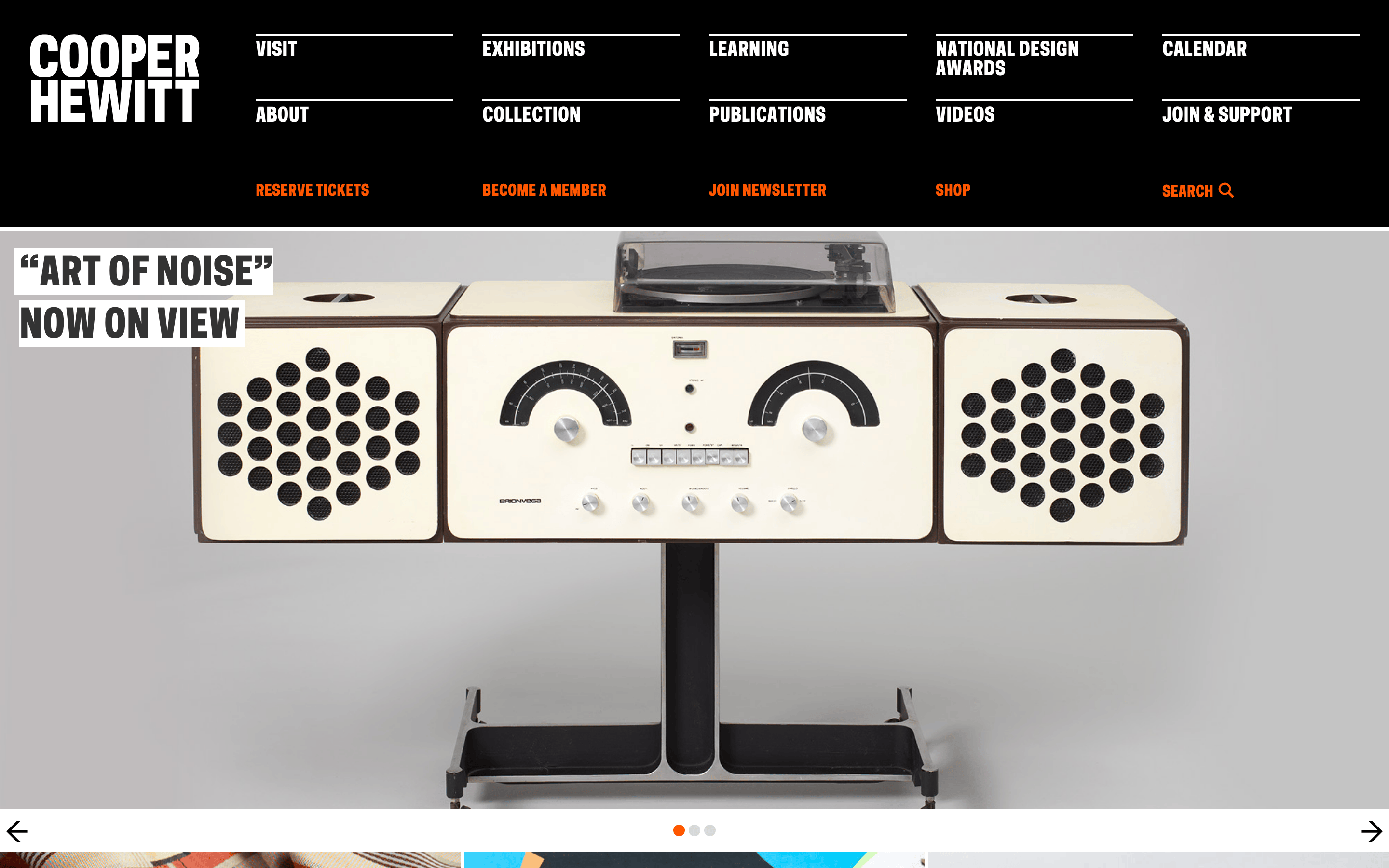
A bold, institutional design museum site that uses heavy typography and immersive imagery to present exhibitions and programs.
museum design
01
Identity DNA
museum design culture education exhibition
A prestigious design museum acting as a cultural anchor, using bold typography and immersive photography to showcase design excellence.
02
Color
#FF5700Accent
#FFFFFFInk
#000000BG
#797B79Muted
rgba(255,255,255,0.5)Line
High-contrast institutional palette with a signature vibrant orange accent.
03
Typography
grotesque-sans
display 40px · 500body 18px · 400All primary text is uppercase. · Tight line-heights are used for headlines.
04
Spacing
4px
8px
16px
24px
32px
48px
64px
96px
Generous padding and margins within a rigid grid system.
05
Surfaces
sm · 0px
md · 0px
lg · 0px
pill · 999px
1px solid rgba(255,255,255,0.5)
rgb(255, 255, 255) 5px 0px 0px 0px · rgb(255, 255, 255) -5px 0px 0px 0px
06
Layout
1280 container
12 columns
24px gutter
768 / 1024 breakpoints
Full-width photographic hero sections followed by multi-column grids.
07
Motion & Interaction
150ms micro
200ms small
400ms medium
ease-in-out easing
Color and border-color transitions on hover. · Simple carousel sliding animations.
Color transitions on text links and borders. · Standard pointer cursor for interactive elements.
08
Components
button Bold uppercase text links, some with white text on colored backgrounds (purple, blue). card Full-bleed photographic blocks with large, white-background text labels. chip Small circular carousel indicators (orange/grey). input Minimal search bar with text and icon. hero Full-width cinematic image with a large, uppercase, white-background headline overlay. 09
Voice & Don'ts
Tone Institutional, authoritative, yet accessible and engaging. Headlines Bold, uppercase, sans-serif, often displayed over photographic backgrounds. CTAs Direct and action-oriented, frequently using orange for emphasis. Don't use lowercase for primary navigation — the screenshot shows all-caps, bold text for menu items. Don't use a complex gradient background — the screenshot shows a solid black background for the header. Don't use a wide, open layout without heavy imagery — the screenshot shows full-width photographic heroes and tight grids. Don't use thin, delicate typography — the screenshot shows a heavy, bold grotesque-sans font for display text. Don't avoid white-background text overlays — the screenshot shows headlines placed directly over busy photos on white rectangles. Don't use a muted, monochrome-only palette — the screenshot shows a high-contrast black and white scheme with a vibrant orange accent. Avoid: Cursive fonts Avoid: Muted or pastel color palettes Avoid: Low-contrast text 10
Inside the pack — real screenshots
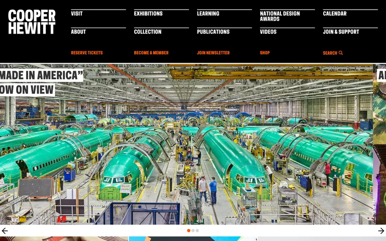
桌面首屏(hero) 桌面滚动分段(90% viewport 步进,作为视觉证据) 桌面滚动分段(90% viewport 步进,作为视觉证据) 桌面滚动分段(90% viewport 步进,作为视觉证据) 移动首屏 Captured from the live site · real computed styles
11
System prompt
Design a robust museum and cultural institution website with a strong editorial focus. The identity is bold, institutional, and authoritative, featuring a black-and-white core palette with a signature orange accent. Typography consists of bold, uppercase grotesque-sans categories for both display and body text, creating a high-impact visual hierarchy. Critical constraints: maintain all primary text in uppercase, use full-width immersive photographic heroes with white-background text overlays for maximum readability, and ensure a rigid grid-based layout that balances large imagery with clear navigation. The aesthetic should be sophisticated yet accessible, reflecting a world-class design museum.
More from the library en · zh-CN · zh-TW · ja · ko
OpenDesign · curated web aesthetics for AI-readable design DNA · opendesign.cc
Why we curated this: This site is an excellent example of institutional editorial design, using bold typography and immersive imagery to convey authority and cultural significance.
浙ICP备2021038972号-5