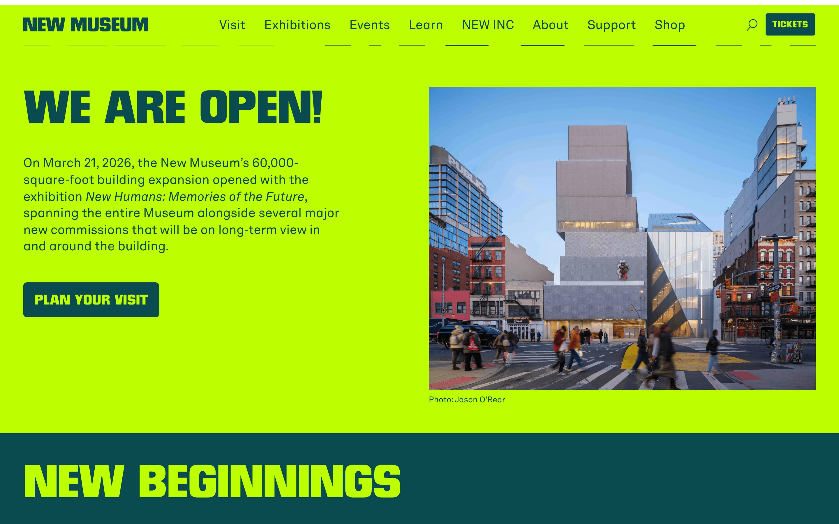
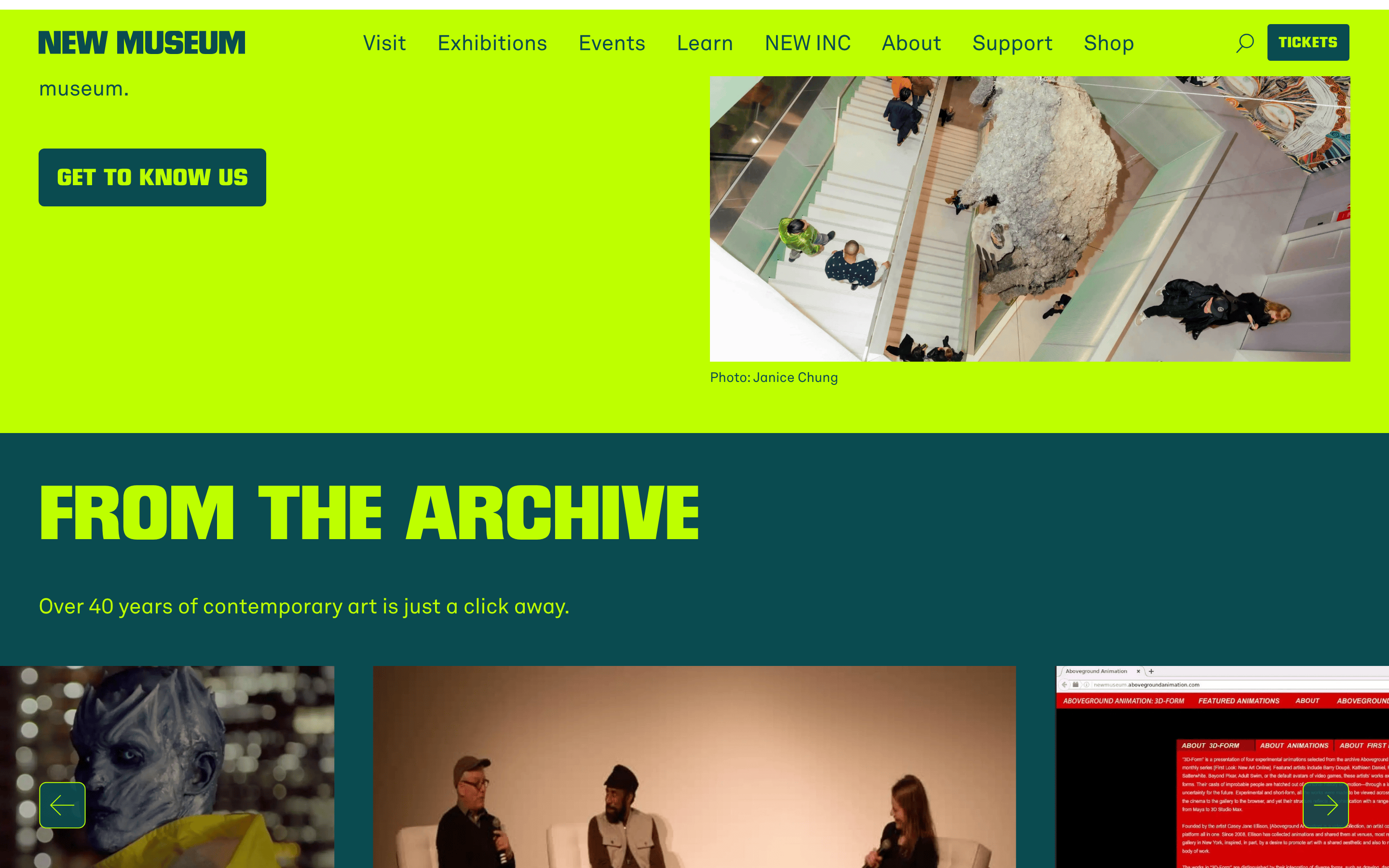
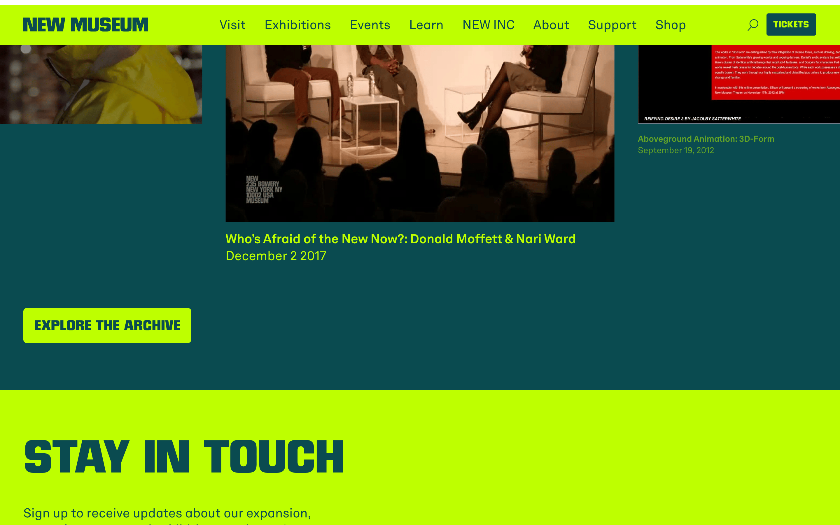
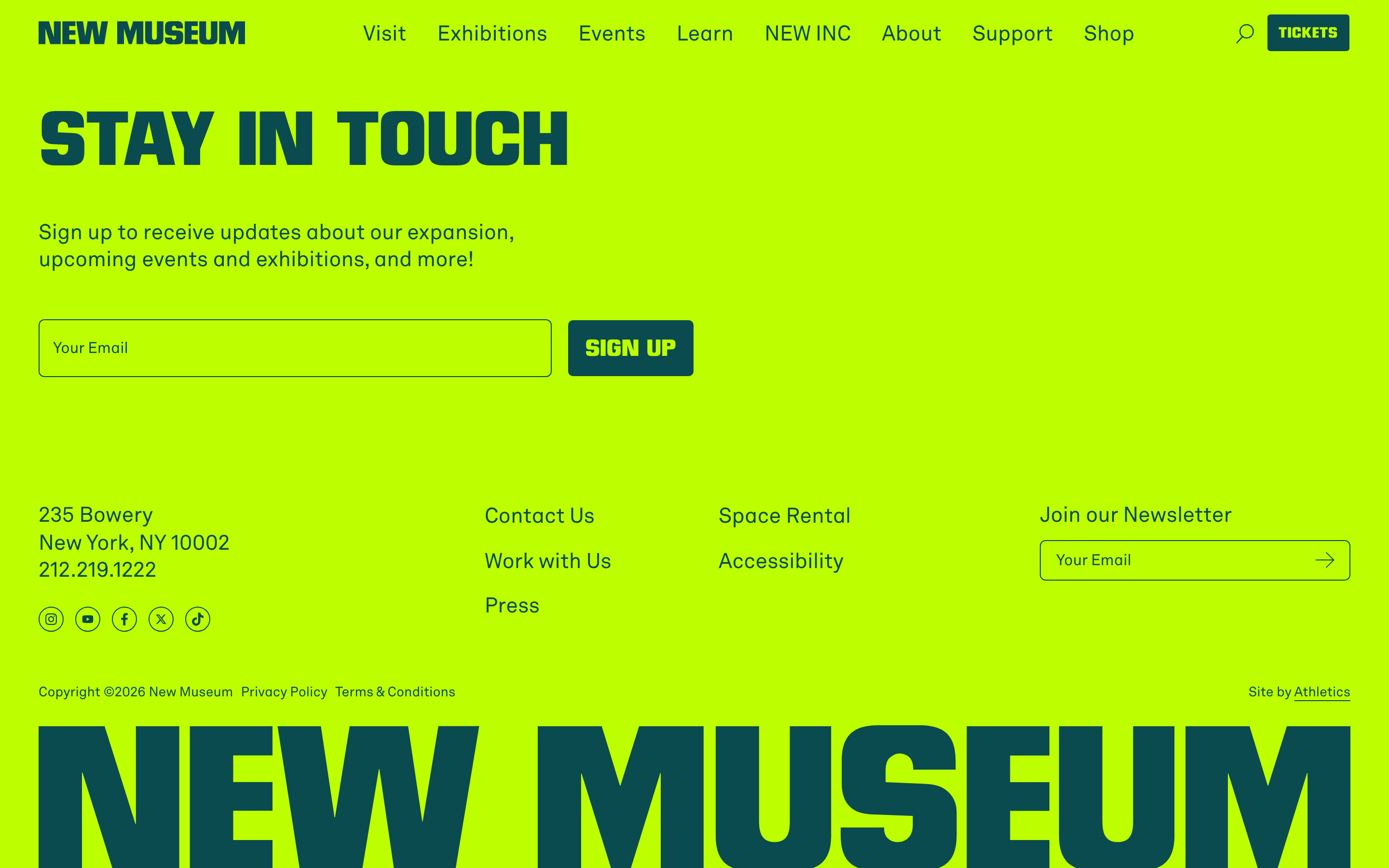
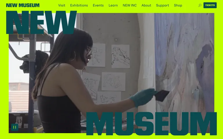
An aggressive lime-green canvas for institutional experimentation.
02
Color
#BEFF00Accent
#0A4B50Ink
#E5E7EBMuted
rgba(10, 75, 80, 1)Line
High-voltage acid green paired with deep teal for maximum visual tension.
03
Typography
grotesque-sans · geometric-sans
display72px · 700
h156px · 700
body16px · 400
small14px · 400
Use display font (Neographik) exclusively for massive section headers and the logo. · Use body font (Akkurat) for navigation, event details, and standard copy. · Maintain tight negative letter spacing on display text for a dense, architectural feel.
04
Spacing
4px
8px
12px
16px
24px
32px
40px
48px
96px
120px
Generous whitespace around massive typography and image blocks to allow the bold colors to breathe.
05
Surfaces
sm · 4px
md · 6px
lg · 9999px
pill · 9999px
Minimal use of borders; color blocks are defined by solid background transitions.
06
Layout
1440container
12columns
24pxgutter
768 / 1024breakpoints
Full-width color blocks containing 4-column grid layouts for events and video cards.
07
Motion & Interaction
100msmicro
220mssmall
400msmedium
cubic-bezier(0, 0, 0.2, 1)easing
Smooth transitions for color and background changes. · Subtle opacity fades for interactive elements. · Clip-path animations for image reveals.
Color shifts on navigation links and subtle opacity changes on interactive elements. · Immediate visual feedback with smooth micro-interactions.
08
Components
buttonHigh-contrast dark teal pill-shaped buttons for primary actions like TICKETS.
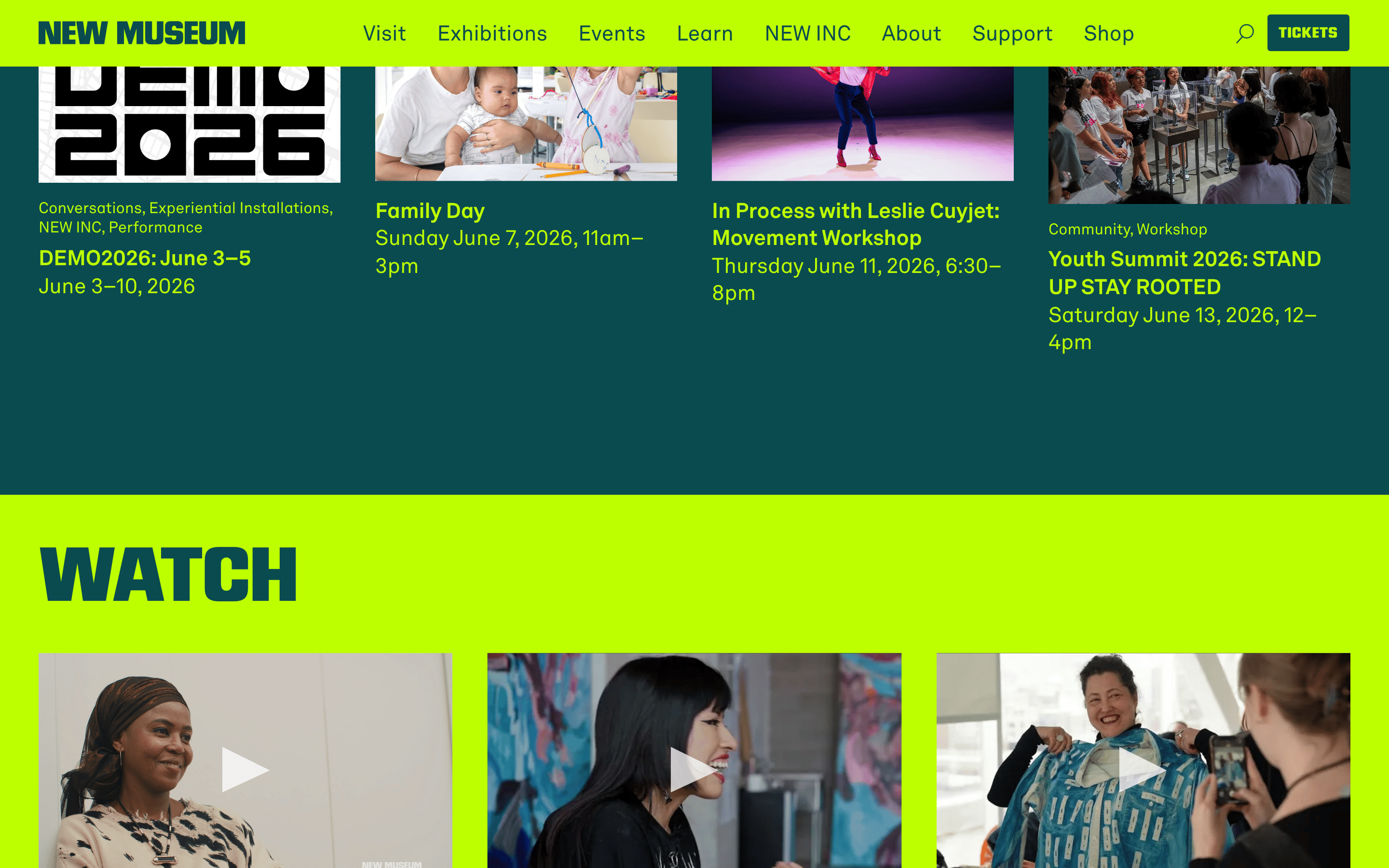
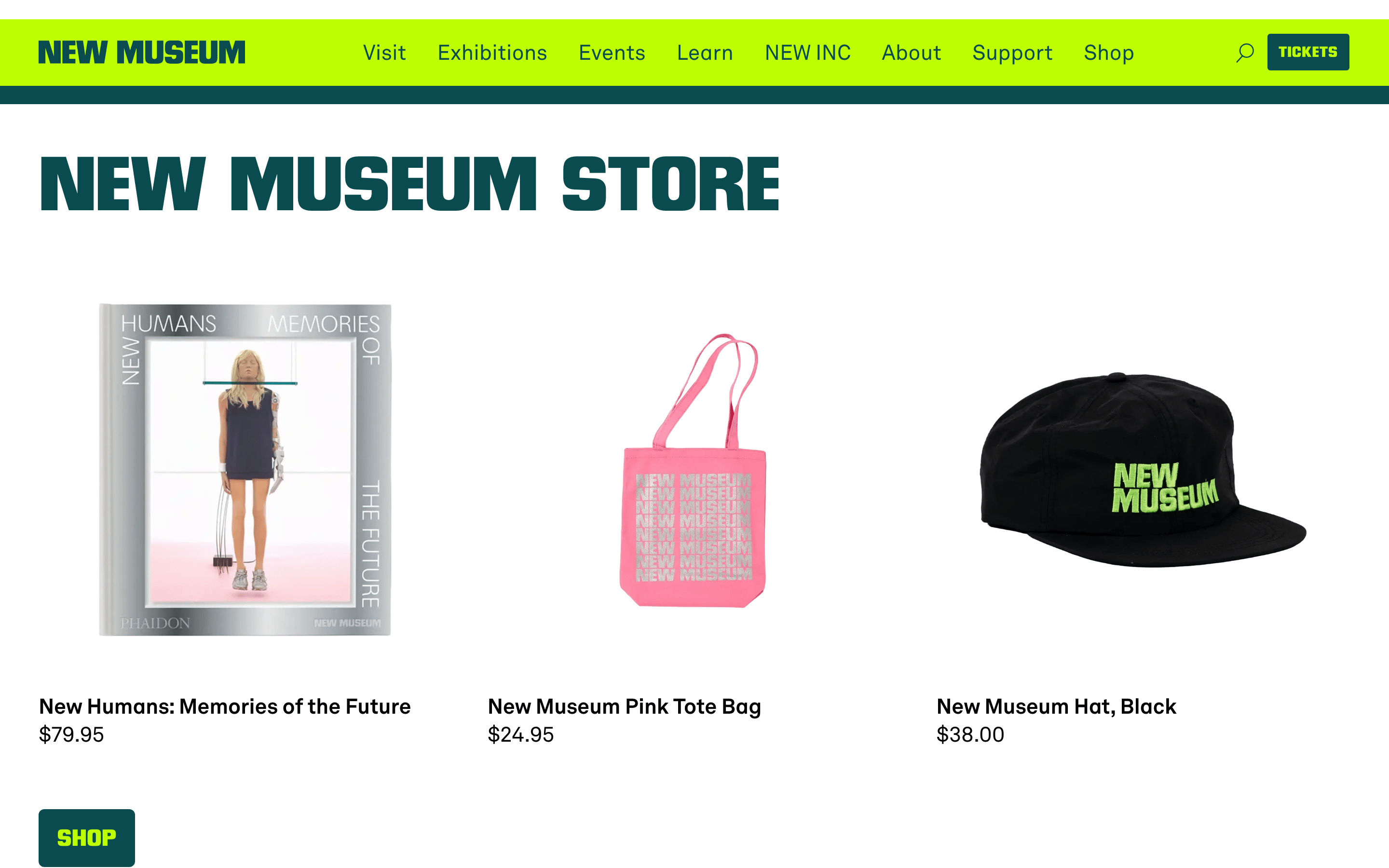
cardSimple image-and-text grid cards for events and videos without visible containers.
chipSmall uppercase text labels for event categories (e.g., Community, Workshop).
inputMinimalist search functionality integrated into the top navigation bar.
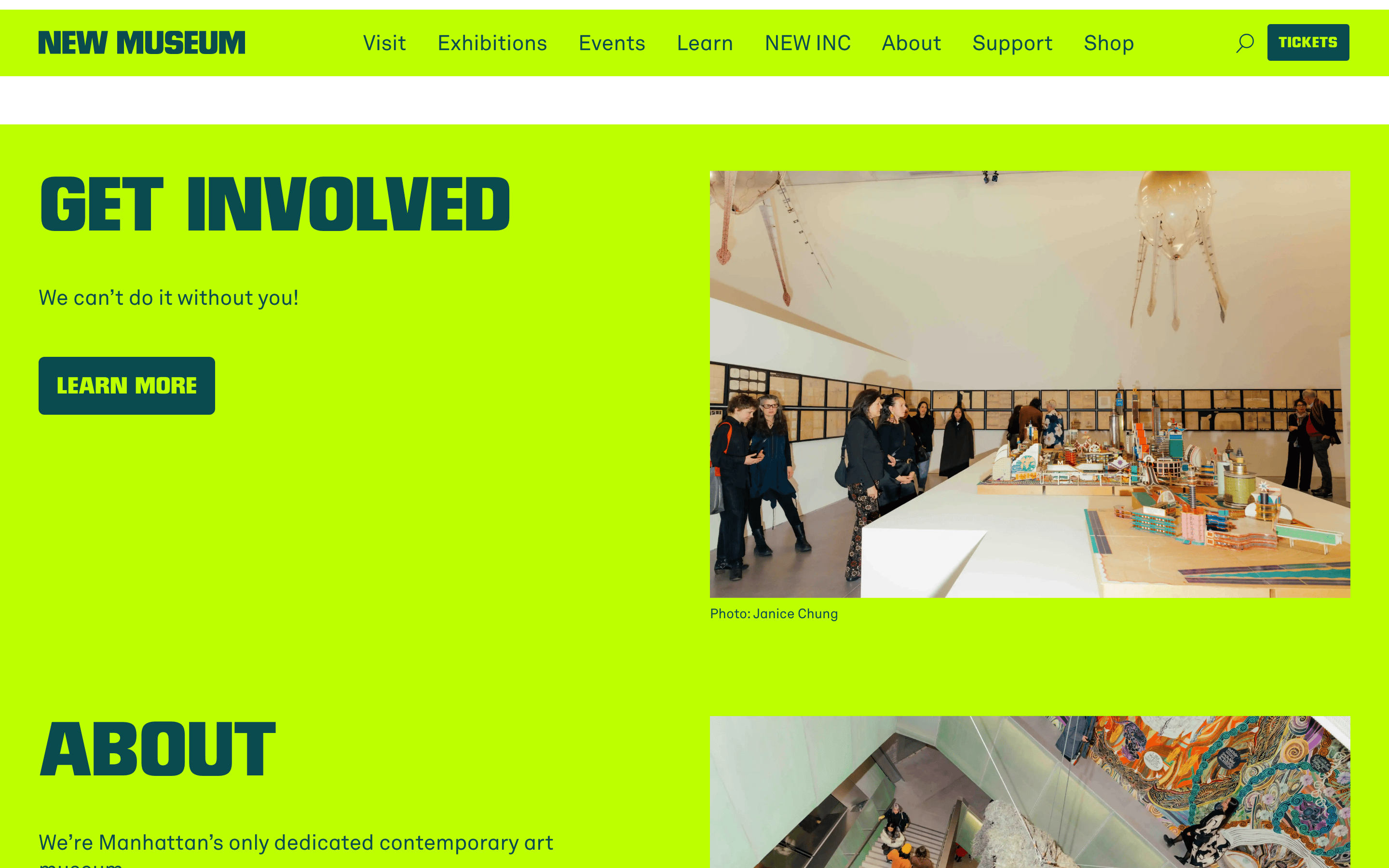
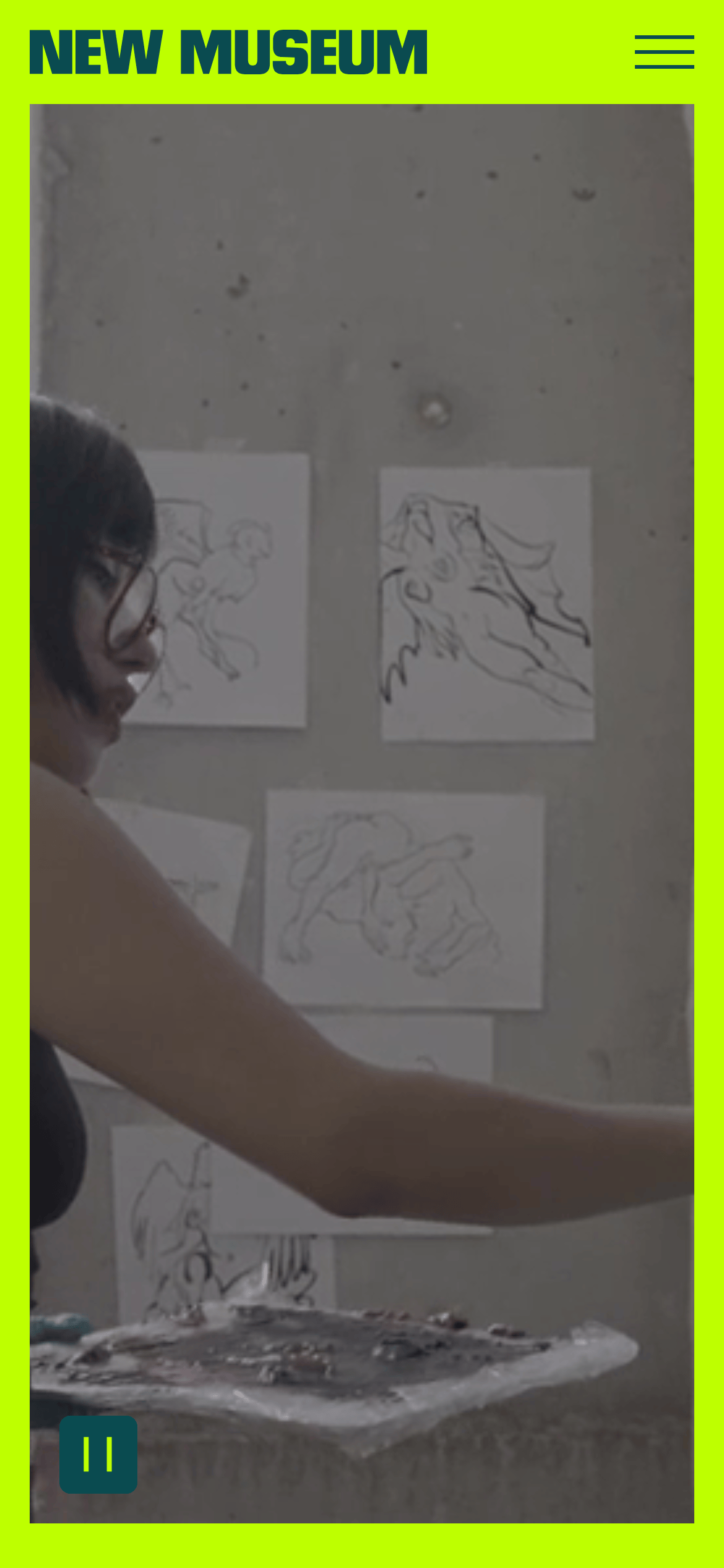
heroFull-bleed background video or image with massive, screen-filling typography overlaid.
09
Voice & Don'ts
ToneBold, avant-garde, and culturally confident.
HeadlinesShort, punchy, all-caps display text that demands attention.
CTAsDirect and actionable, often using single words like TICKETS.
Don't use muted or pastel colors — screenshot shows vibrant acid green (#BEFF00) as the primary brand color.
Don't use standard serif typography — screenshot shows bold, all-caps grotesque display fonts.
Don't use subtle background textures or gradients — screenshot shows solid, flat color blocks.
Don't use heavy drop shadows or 3D effects — screenshot shows flat, graphic composition.
Don't use standard left-aligned, small-margin text — screenshot shows massive text overlays that break standard grid boundaries.
Don't use complex container borders — screenshot shows clean, borderless separation between color sections.
Avoid: Don't use traditional serif fonts.
Avoid: Don't use soft pastels or subtle gradients.
Avoid: Don't use rounded corners on large containers.
Captured from the live site · real computed styles
11
System prompt
Design a bold, contemporary cultural institution website. Use a high-voltage acid green (#BEFF00) as the primary background and a deep teal (#0A4B50) for primary text and dark sections. Typography must be heavy, all-caps grotesque-sans for massive display headings with tight letter spacing, paired with a clean geometric sans-serif for body text. Layout should be full-bleed and grid-based, featuring oversized text overlays on top of high-quality photography or video. CRITICAL: Never use subtle colors or traditional serifs; avoid rounded containers and drop shadows; ensure text is large, bold, and unapologetic.
Bring this taste to your agent
Hand your AI agent a machine-readable spec of this design — tokens, type, motion, the whole DNA.