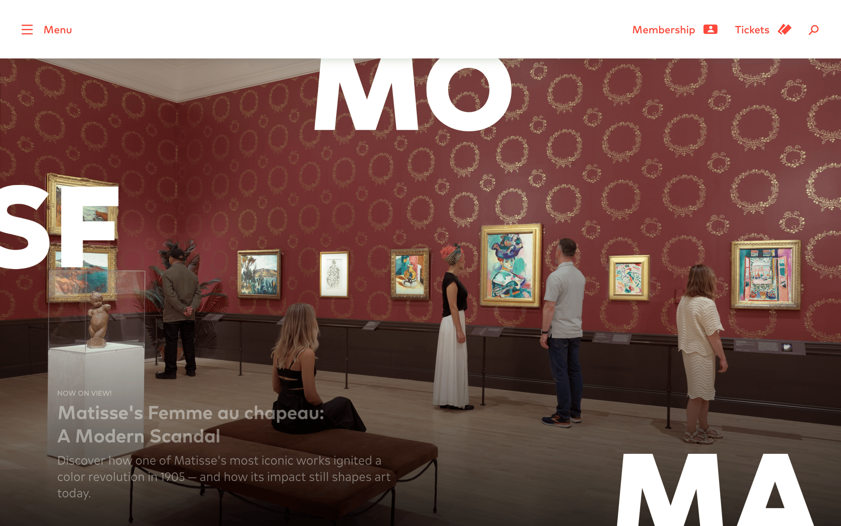
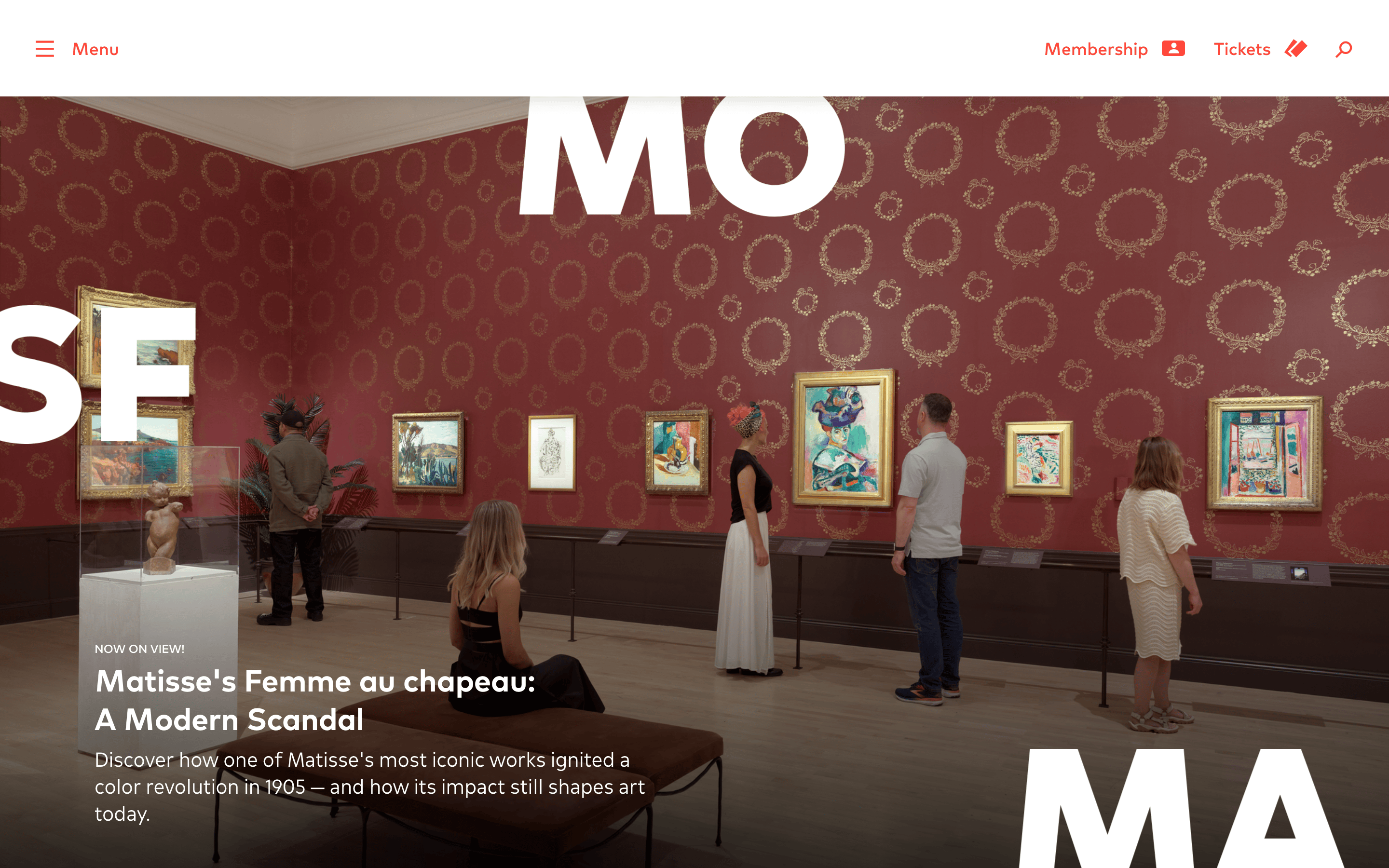
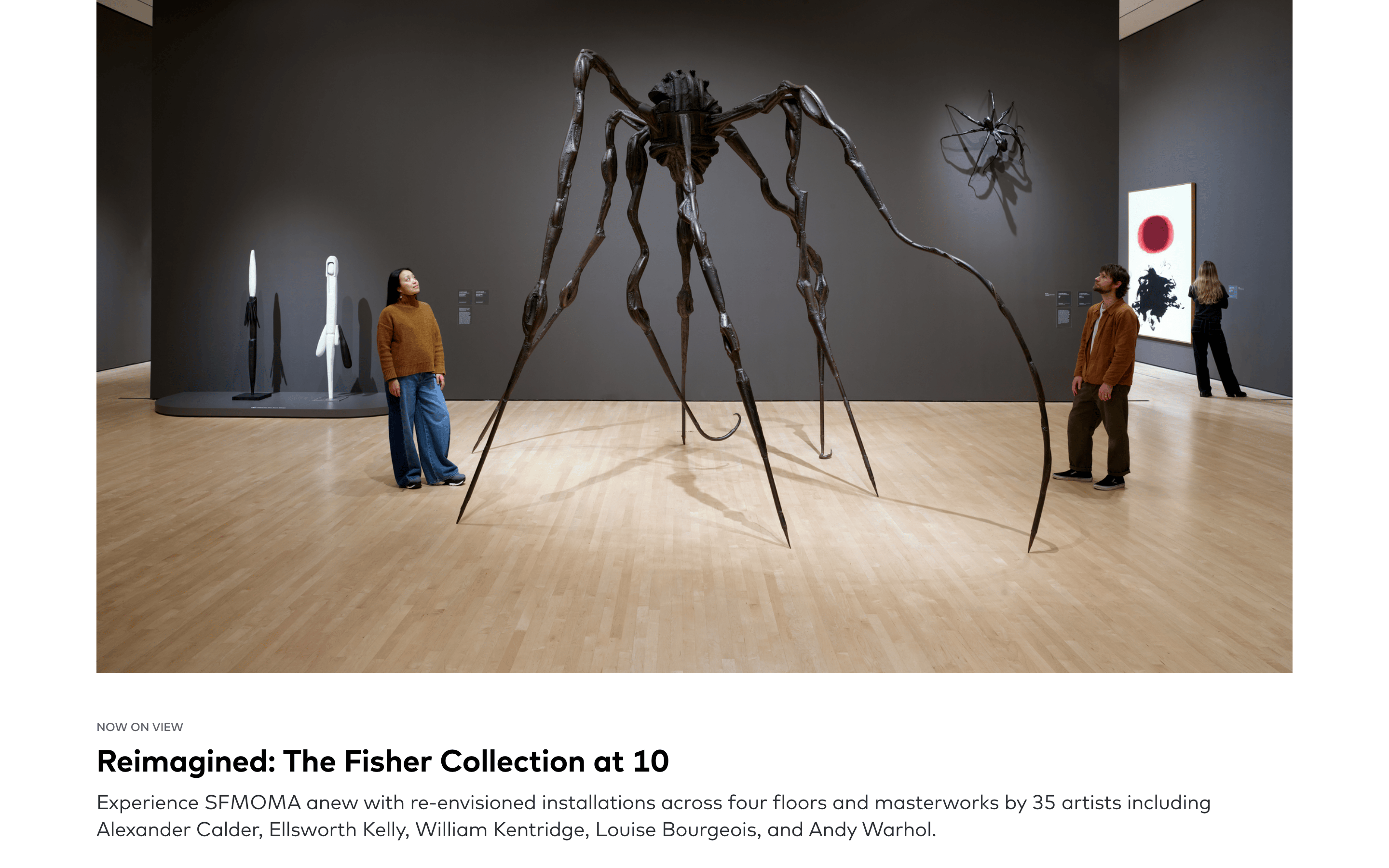
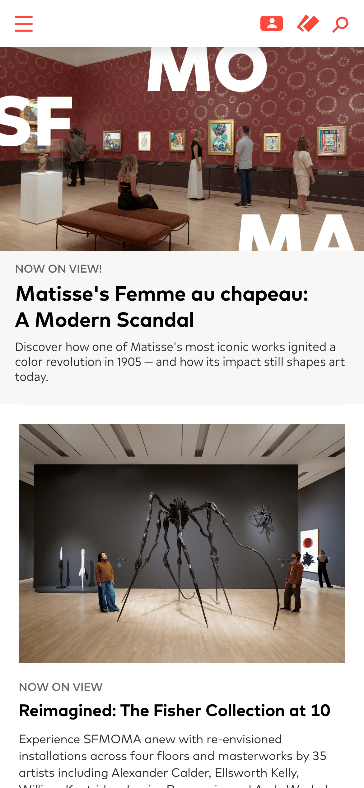
A modern art gallery's digital foyer, prioritizing large-scale photography and bold typography to evoke a physical gallery experience.
02
Color
#FF483BAccent
#2D3033Ink
#FFFFFFBG
#F7F7F7BG soft
#636666Muted
rgba(45, 48, 51, 1.0)Line
A restrained, high-contrast palette using a stark white base and deep charcoal ink, with a singular, vibrant red accent reserved strictly for interactive and membership elements.
03
Typography
geometric-sans · humanist-sans
display32px · 500
body16px · 400
caption14px · 400
overline12px · 400
Headings use a display sans-serif with heavy weights and tight leading. · Body text uses a highly legible humanist sans-serif. · Labels and tags are consistently uppercase and tracked out.
04
Spacing
4px
8px
12px
16px
24px
32px
48px
64px
120px
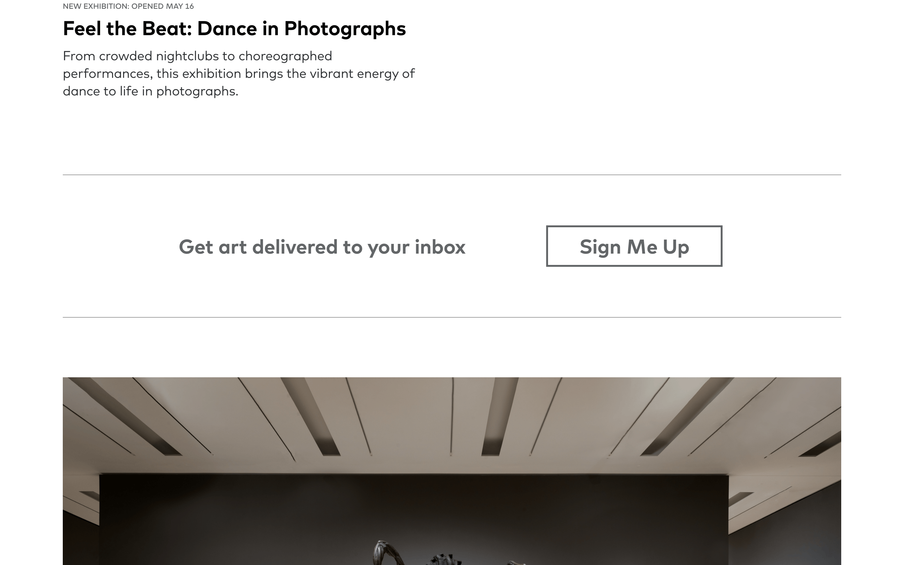
Generous vertical spacing, with large 120px top padding for major content blocks to create a sense of openness and physical gallery space.
05
Surfaces
sm · 0px
md · 0px
lg · 0px
pill · 999px
1px solid rgba(45, 48, 51, 1.0)
rgba(68, 73, 76, 0.2) 0px 3px 15px 0px
06
Layout
1280container
12columns
24pxgutter
768 / 1024breakpoints
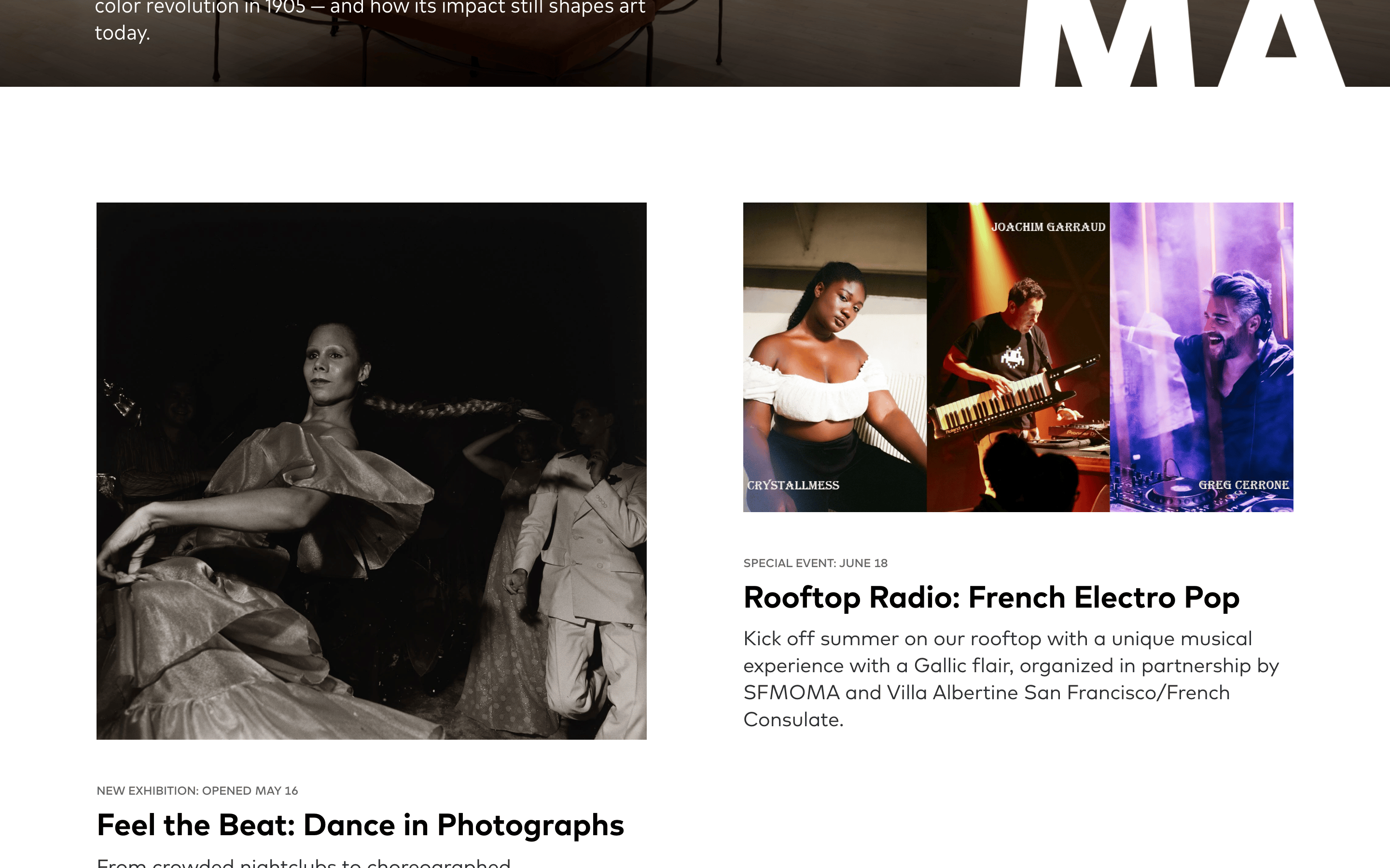
A single-column, full-width layout for primary content, utilizing massive imagery that spans the entire viewport width.
07
Motion & Interaction
200msmicro
400mssmall
800msmedium
cubic-bezier(0.25, 0.1, 0.25, 1)easing
Smooth transitions on transform and box-shadow for interactive elements (0.4s). · General 0.2s transitions for state changes.
Color shifts or subtle transforms on interactive elements, indicated by pointer cursors. · Immediate response with standard link behavior.
08
Components
buttonGhost buttons or text links with a vibrant red accent color and standard pointer cursor.
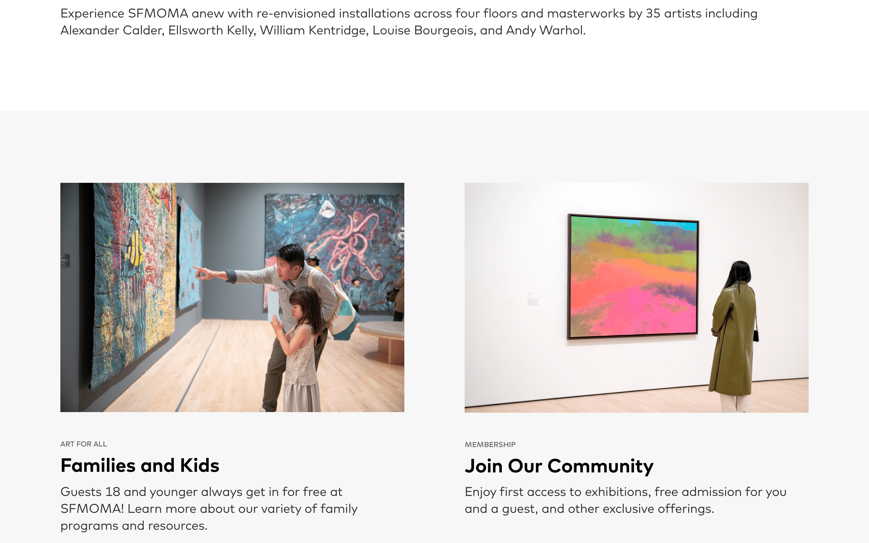
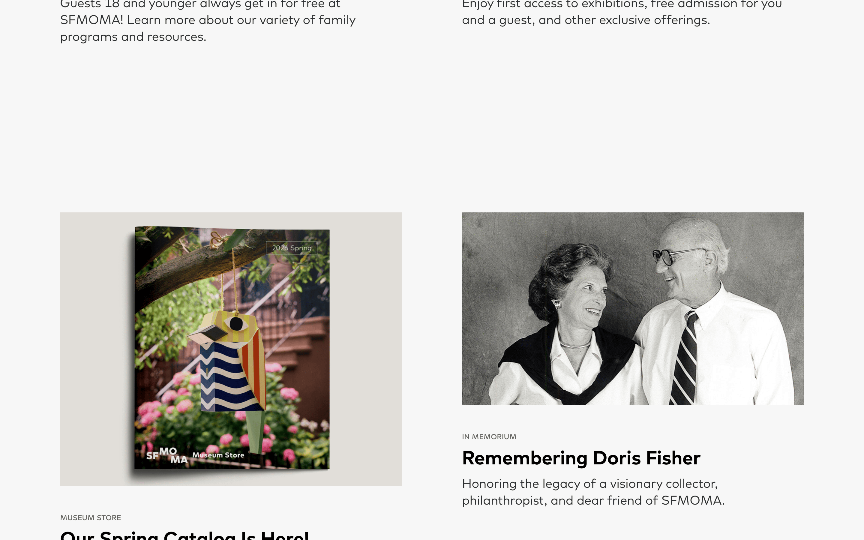
cardContent blocks consisting of a large, full-width image followed by a text block, with no visible borders or background containers.
chipUppercase text labels used as tags or categories.
inputSearch icon trigger with no visible input field until activated.
heroA full-bleed photographic hero with massive, semi-transparent white display typography overlaid.
09
Voice & Don'ts
ToneInstitutional, authoritative, yet inviting and accessible.
HeadlinesBold, concise, and punchy, often using display weights to grab immediate attention.
CTAsAction-oriented and clear, typically using standard verbs like 'Membership' or 'Tickets'.
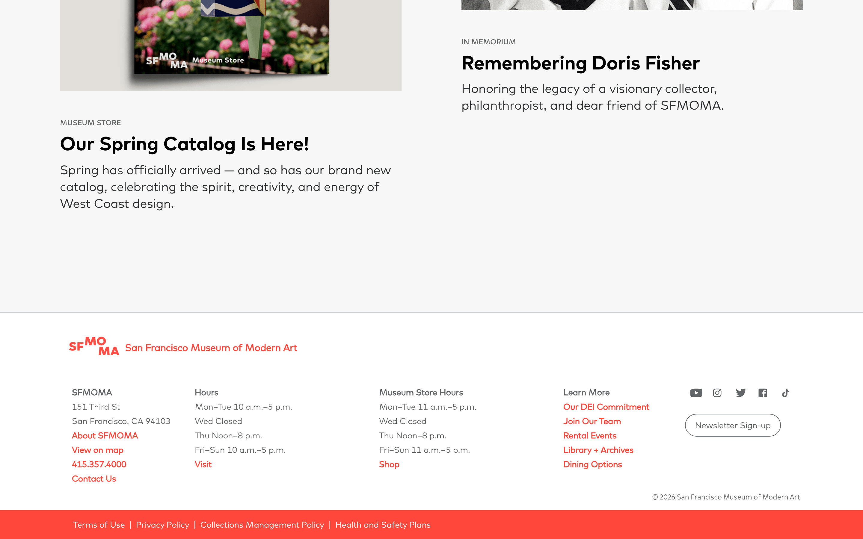
Don't use rounded corners on containers or images — screenshot shows sharp, square edges.
Don't use drop caps or decorative fonts — screenshot uses a clean, modern display sans-serif.
Don't overuse the red accent color — screenshot restricts it strictly to primary navigation and interactive elements.
Don't use dense, multi-column text layouts — screenshot relies on generous white space and single-column reading paths.
Don't use complex card styles with shadows or borders — screenshot uses borderless, image-forward blocks.
Don't use dark mode or dark backgrounds — screenshot shows a predominantly bright, white-background interface.
Captured from the live site · real computed styles
11
System prompt
This design system is for a world-class modern art museum website, positioning itself as a premium, photography-driven editorial experience. Key colors are a stark white (#FFFFFF) base, deep charcoal ink (#2D3033), and a vibrant red (#FF483B) accent for interactive elements. Typography relies on bold geometric-sans for display and humanist-sans for body text. Critical donts: never use rounded corners or soft borders, avoid cluttering the layout with dense text, and do not apply the red accent color broadly—it is strictly for navigation and calls to action. The layout prioritizes massive imagery and generous whitespace to evoke the physical space of a gallery.
Bring this taste to your agent
Hand your AI agent a machine-readable spec of this design — tokens, type, motion, the whole DNA.