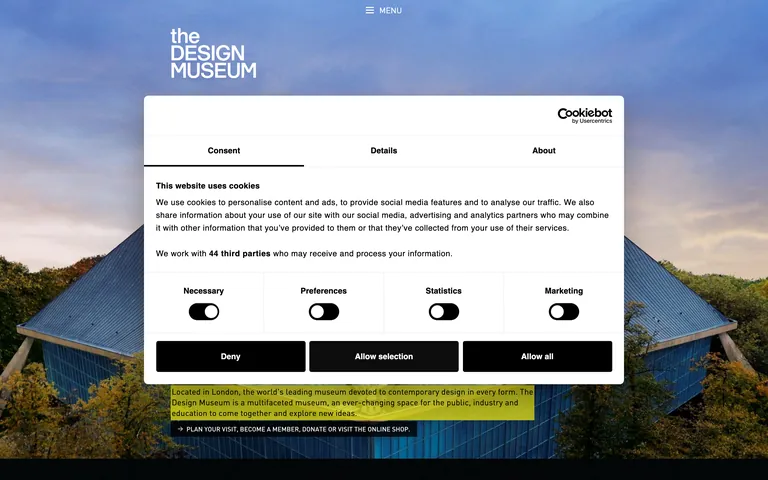
A bold, architectural gallery entrance translated into a digital interface.
02
Color
#E8E316Accent
#000000Ink
#FFFFFFBG
rgba(0,0,0,0.1)Line
High-contrast monochrome with architectural yellow accents and immersive photography.
03
Typography
geometric-sans · grotesque-sans
display50px · 700
heading30px · 700
body15px · 400
small12px · 500
Use tight letter-spacing for large display type to create architectural tension. · Prioritize uppercase styling for navigation and action labels. · Maintain high contrast between display and body weights for clear hierarchy.
04
Spacing
4px
8px
16px
24px
32px
48px
64px
96px
4px base grid with generous whitespace between major content blocks to allow photography to breathe.
05
Surfaces
sm · 0px
md · 4px
lg · 0px
pill · 999px
1px solid black for UI elements, 2px solid for active states.
0px 32px 68px 0px rgba(0,0,0,0.3)
06
Layout
1440container
12columns
24pxgutter
768 / 1024breakpoints
Full-width photographic hero with centered content and a grid-based informational layout.
07
Motion & Interaction
100msmicro
500mssmall
800msmedium
cubic-bezier(0.25, 0.1, 0.25, 1.0)easing
Staggered fade-in and slide-up for text elements on scroll. · Smooth hover transitions for interactive elements. · Subtle parallax effects on hero imagery.
Color inversion or sharp background shift. · Immediate visual feedback with slight scaling or opacity change.
08
Components
buttonHigh-contrast solid blocks (black/white/yellow) with sharp corners and uppercase text.
cardClean containers defined by sharp borders or minimal padding.
chipSimple text-based tags with optional borders.
inputMinimal form elements with clean borders and standard padding.
heroLarge-format photographic background with bold typographic overlay.
09
Voice & Don'ts
ToneInstitutional, authoritative, yet welcoming and forward-thinking.
HeadlinesBold, concise, and often architectural in its phrasing.
CTAsDirect, action-oriented, and often uses uppercase for emphasis.
Don't use rounded corners on primary buttons — screenshot shows sharp, rectangular button shapes.
Don't use low-contrast colors for text — screenshot shows high-contrast black text on white or yellow backgrounds.
Don't use decorative or serif fonts — screenshot shows geometric and grotesque sans-serif families.
Don't use soft, pastel accent colors — screenshot shows a bold, high-chroma yellow accent.
Don't use centered navigation for all elements — screenshot shows left-aligned text with a centered hamburger menu.
Don't use generous border-radius on cards — screenshot shows sharp corners or very minimal rounding.
Avoid: Avoid overly decorative or script fonts.
Avoid: Avoid soft, pastel color palettes.
Avoid: Avoid rounded corners on primary buttons.
Avoid: Avoid cluttered layouts with insufficient white space.
Avoid: Avoid generic stock photography.
Avoid: Avoid low-contrast text for critical information.
Captured from the live site · real computed styles
11
System prompt
This is a sophisticated cultural institution website for the Design Museum in London. It uses a high-contrast monochrome palette (black #000000, white #FFFFFF) with a bold architectural yellow (#E8E316) as the primary accent. Typography is strictly geometric and grotesque sans-serif, likely from the DIN Pro family, with tight letter-spacing on large headlines and a clear hierarchy from 50px down to 12px. Layout is grid-based and generous with whitespace, prioritizing large-format photography and bold text overlays. Critical dons: never use rounded corners on primary buttons, never use low-contrast text, and never use decorative or serif fonts. The overall feel is institutional, authoritative, and architecturally precise.
Bring this taste to your agent
Hand your AI agent a machine-readable spec of this design — tokens, type, motion, the whole DNA.