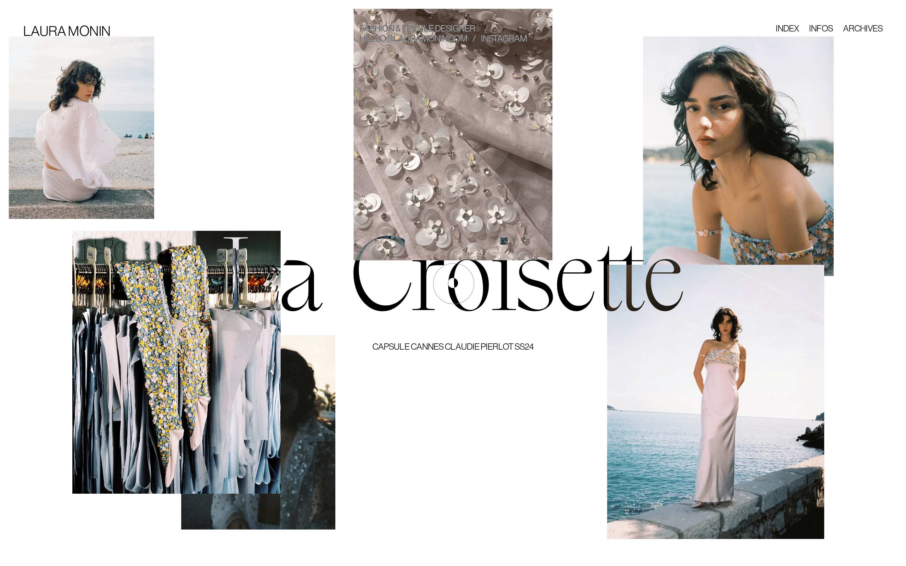
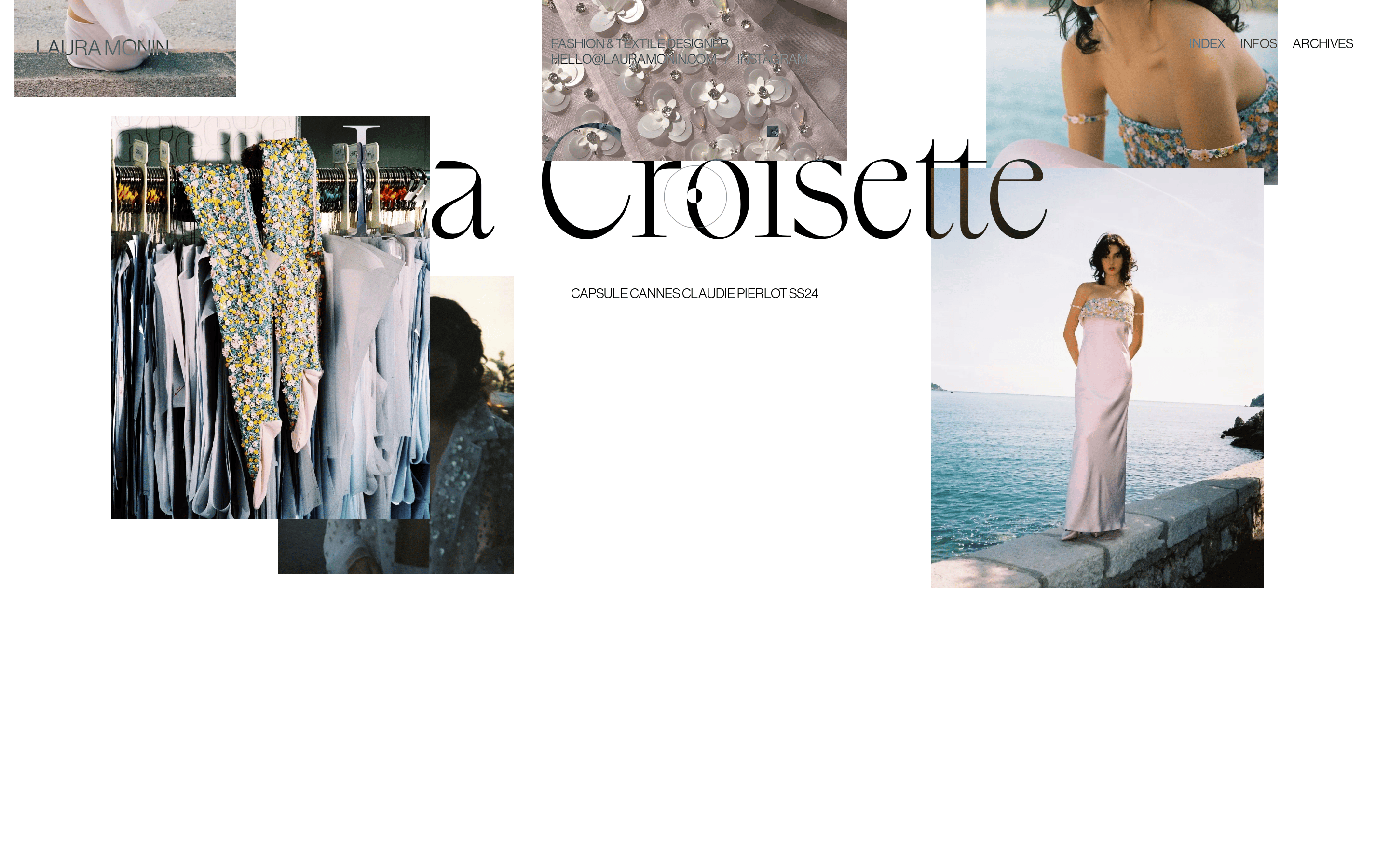
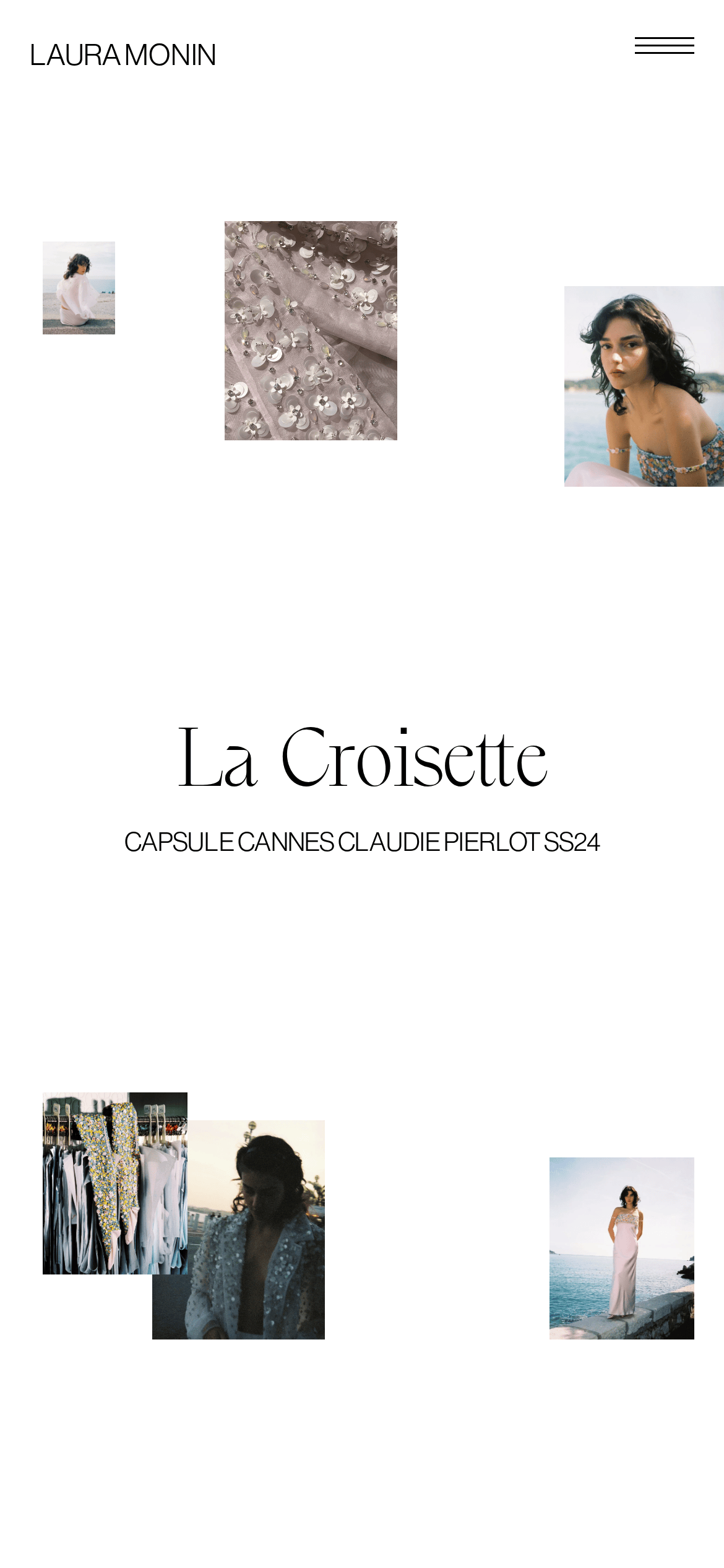
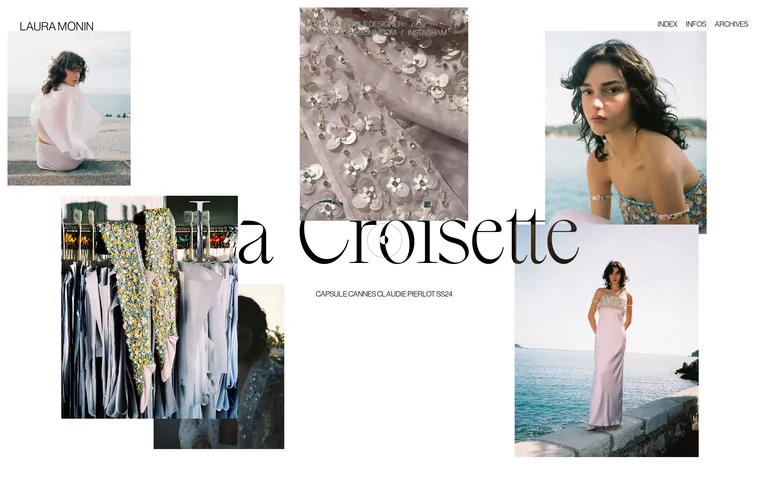
A curated gallery wall for a fashion designer's latest collection
02
Color
#000000Ink
#FFFFFFBG
#666666Muted
rgba(0, 0, 0, 0.1)Line
High-contrast monochrome base to let photography dominate.
03
Typography
transitional-serif · grotesque-sans
display158px · 400
heading14px · 400
body12px · 400
Use a serif font for large, expressive project titles. · Use a grotesque sans-serif for all functional and navigational text. · Apply uppercase transformation to small labels and navigation links.
04
Spacing
4px
8px
16px
24px
32px
48px
64px
96px
Generous vertical padding between sections, creating an airy, unhurried feel.
05
Surfaces
sm · 0px
md · 0px
lg · 0px
pill · 0px
No visible borders; separation is achieved through generous white space and overlapping image compositions.
06
Layout
1440container
12columns
24pxgutter
768 / 1024breakpoints
A free-form, overlapping grid of images with a central, large title element. Navigation is placed at the top edges.
07
Motion & Interaction
240msmicro
400mssmall
1000msmedium
cubic-bezier(0.86, 0, 0.07, 1)easing
Slow, smooth page transitions and element entrances
Subtle opacity or transform changes on interactive elements. · Standard link navigation.
08
Components
buttonNo distinct button components; navigation is text-based links.
cardImages act as the primary content units, overlapping in a collage style.
chipNone visible.
inputNone visible.
heroA dynamic composition of overlapping photographs with a large, centrally placed title.
09
Voice & Don'ts
ToneSophisticated, artistic, and understated.
HeadlinesLarge, expressive serif titles that contrast with the sans-serif body.
CTAsSimple, unadorned text links, often in uppercase.
Don't use a grid with visible borders or cards — screenshot shows an overlapping, free-form collage.
Don't use multiple accent colors — screenshot shows a strict monochrome palette for text and UI.
Don't use a bold sans-serif for titles — screenshot uses a refined serif for display typography.
Don't add drop shadows to images — screenshot uses flat, overlapping photographs.
Don't clutter the interface with many UI elements — screenshot shows vast white space and minimal controls.
Don't use heavy borders or separators — screenshot relies on spacing and overlap for visual hierarchy.
Captured from the live site · real computed styles
11
System prompt
This is a portfolio site for a fashion and textile designer. The design DNA is minimalist, editorial, and photography-centric. Key colors are a pure white background (#FFFFFF) and deep black ink (#000000), creating a high-contrast monochrome base. Typography features a large, expressive transitional-serif for display titles and a clean grotesque-sans for all functional text. Critical donts: Do not use visible grids or card components; use an overlapping collage layout instead. Do not introduce accent colors; maintain the strict black-and-white palette. Do not use bold sans-serif fonts for headlines; use refined serif typography. The layout is expansive, with generous white space and smooth, long-duration transitions that create an unhurried, premium feel.
Bring this taste to your agent
Hand your AI agent a machine-readable spec of this design — tokens, type, motion, the whole DNA.