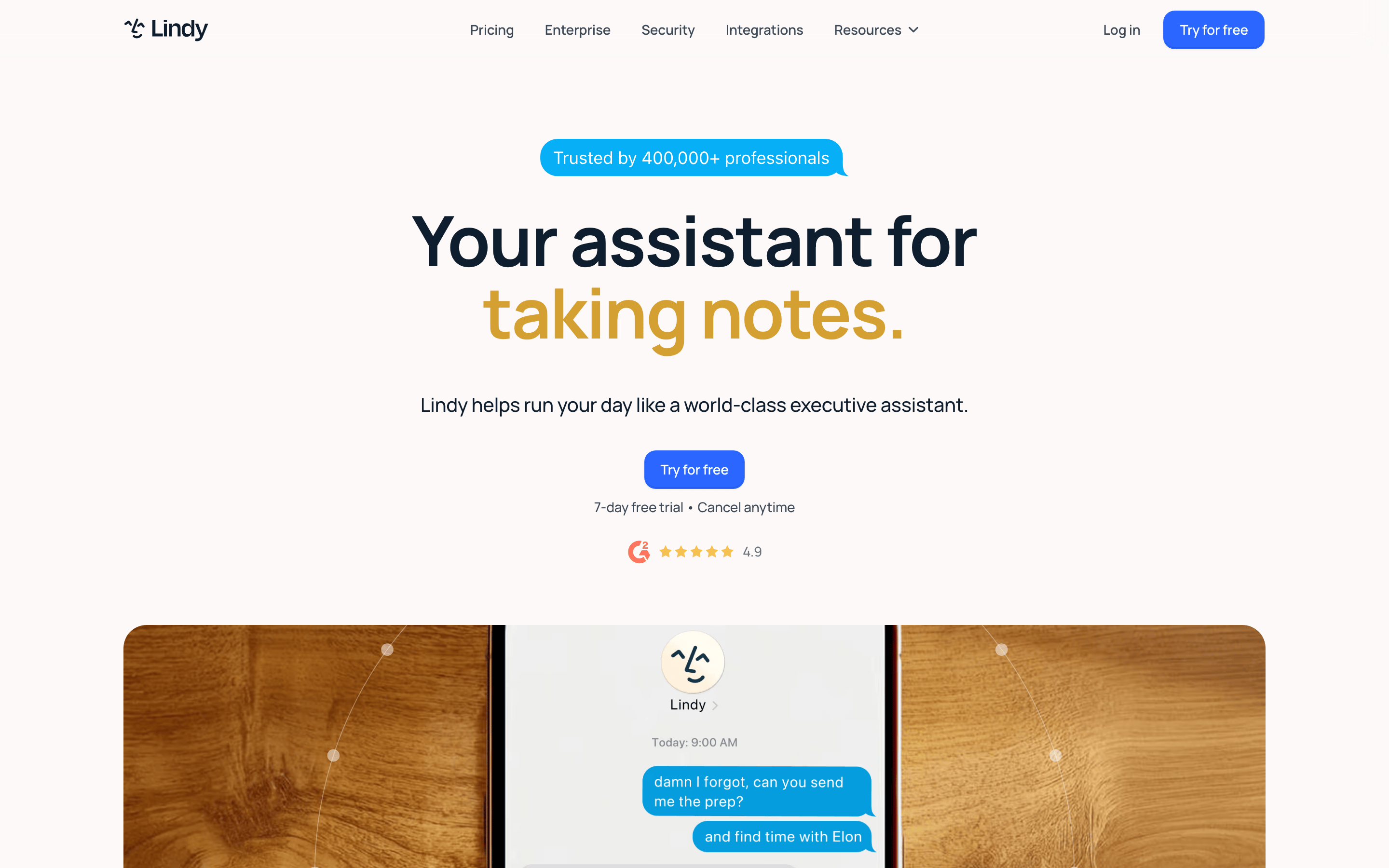
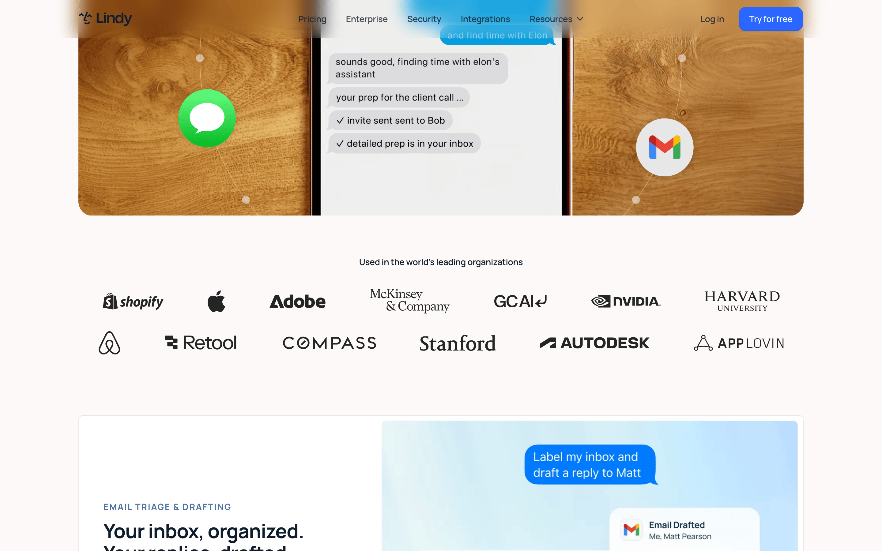
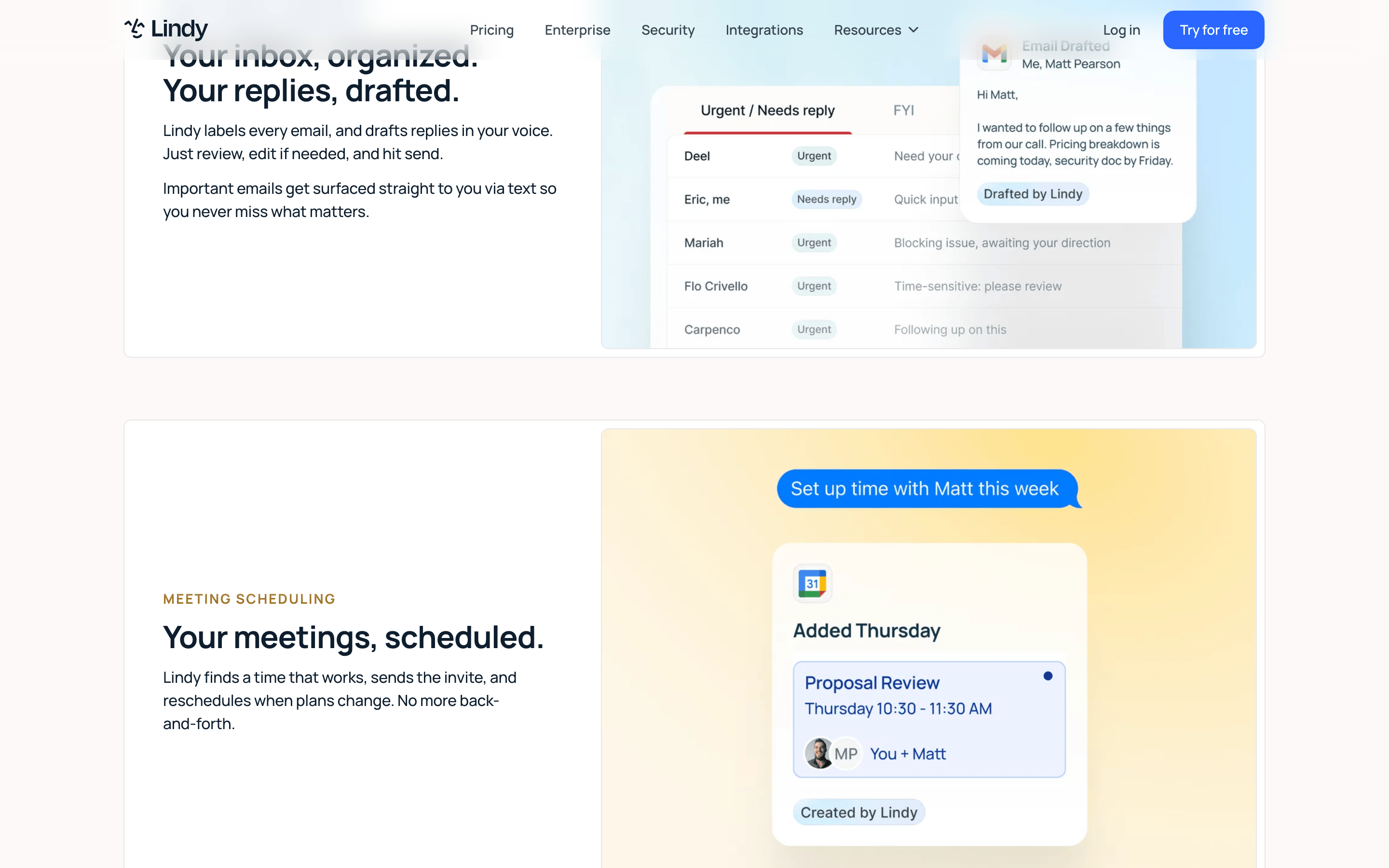
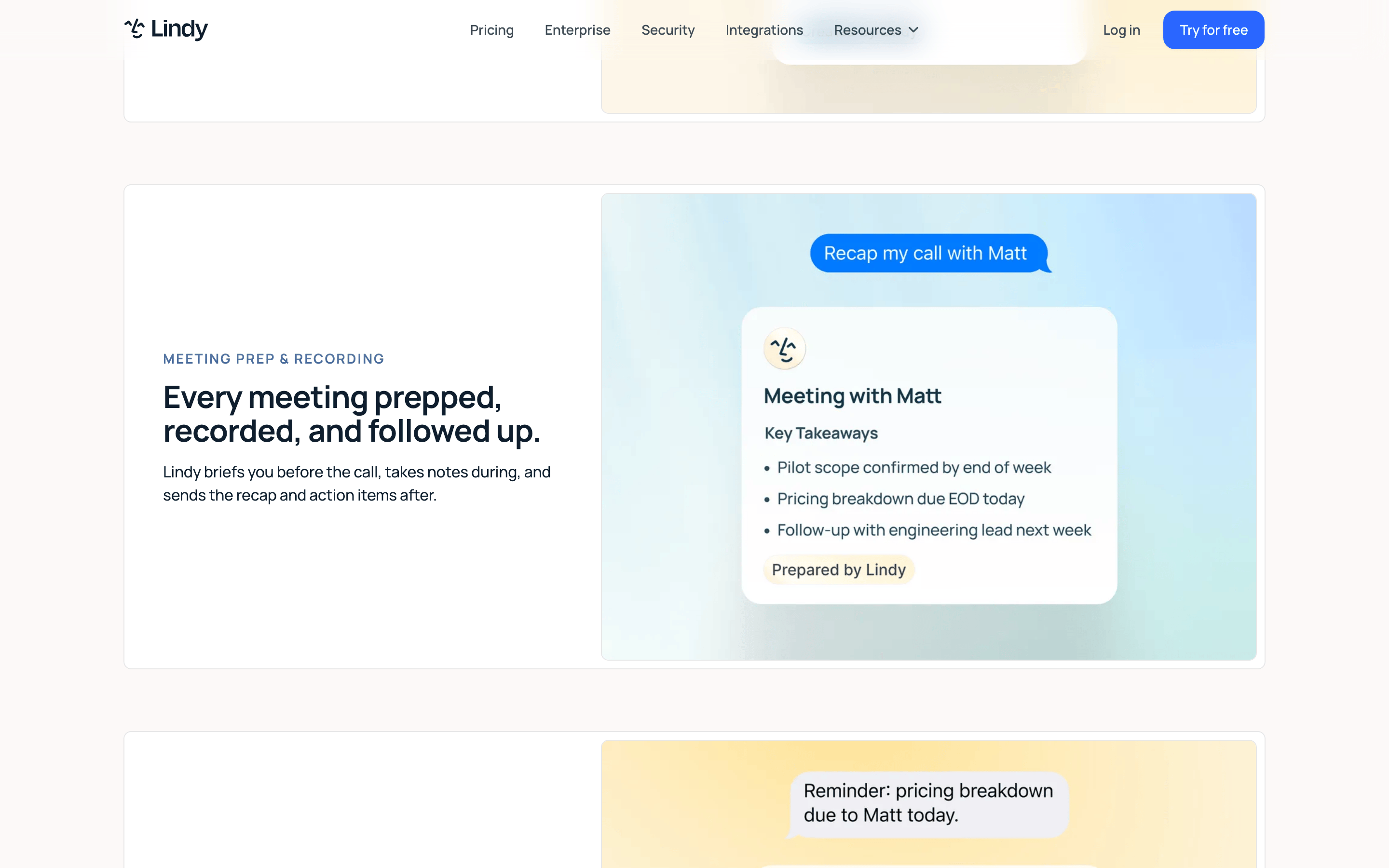
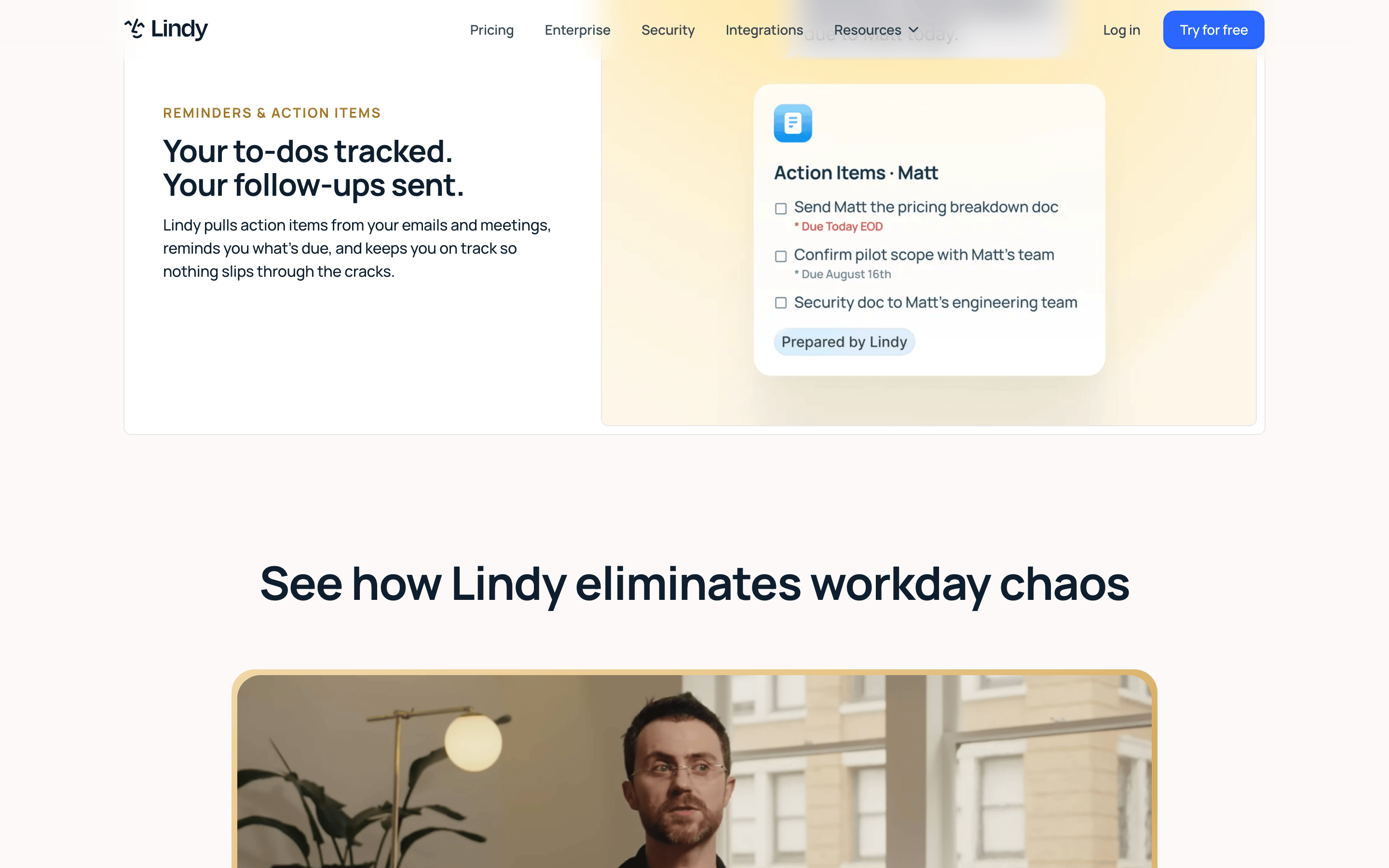
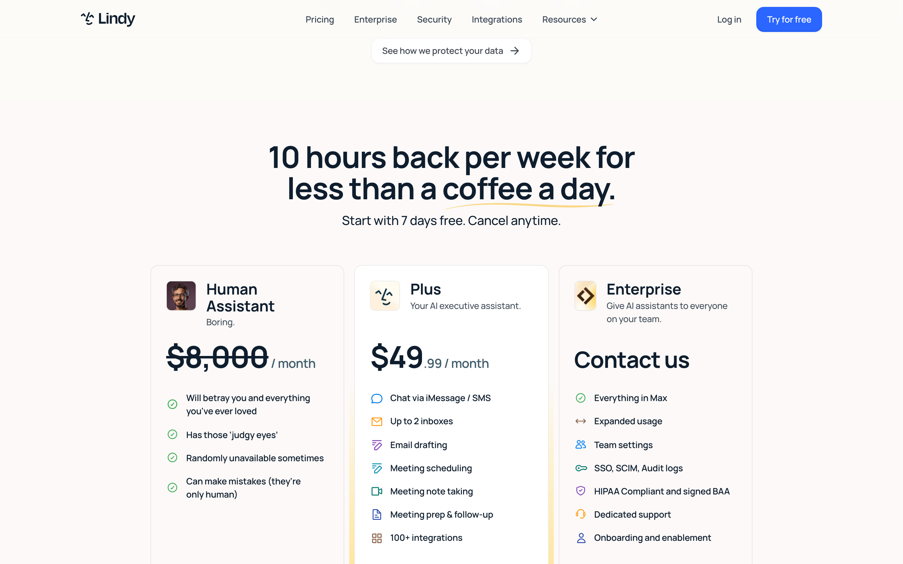
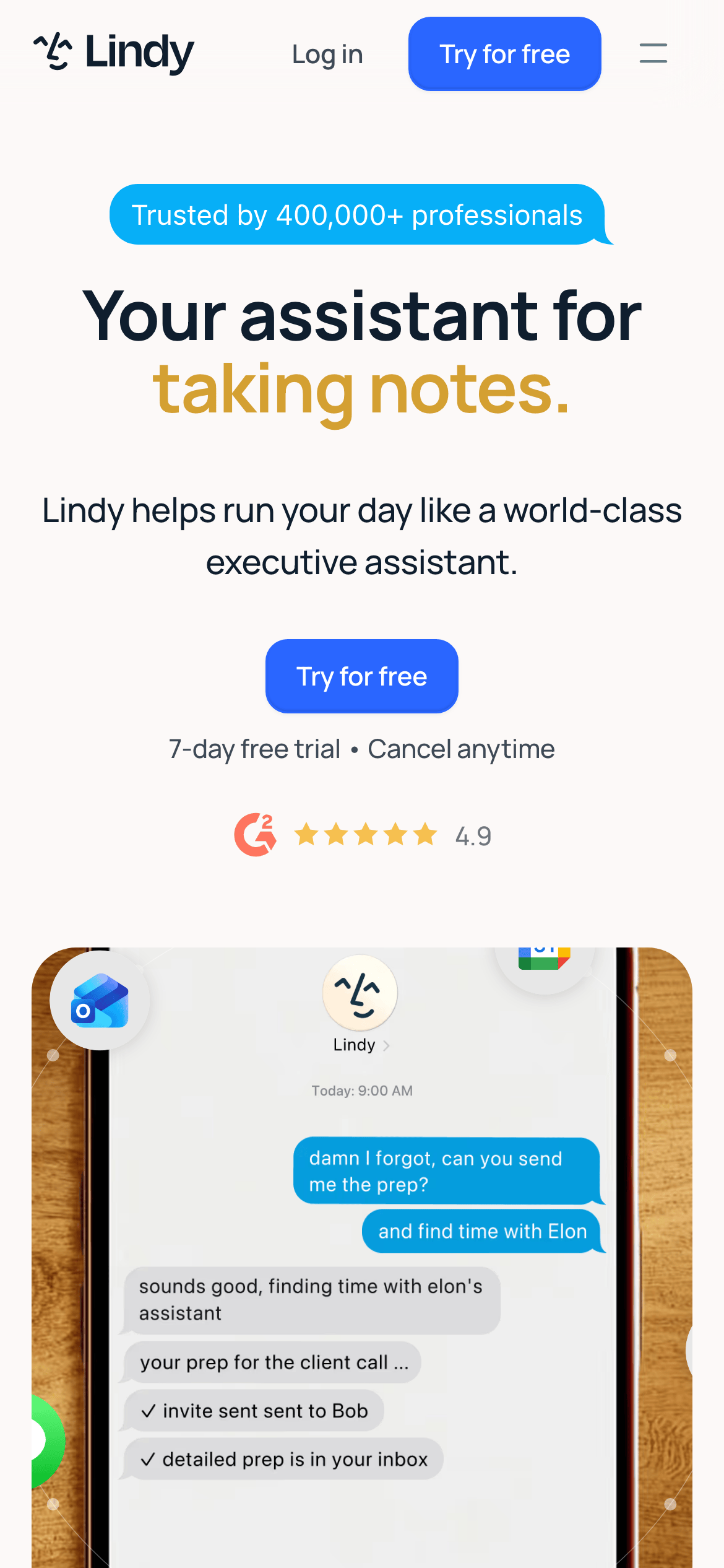
A world-class executive assistant that handles your daily tasks so you can focus on what matters.
02
Color
#2A66FFAccent
#0F1E2EInk
#FCF9F8BG
#474A55Muted
rgba(0, 0, 0, 0.08)Line
Professional clarity with a warm off-white canvas and strategic blue/gold accents.
03
Typography
grotesque-sans · humanist-sans
display72px · 500
h248px · 500
body16px · 500
body-lg20px · 500
Headlines use tight tracking and sentence-case capitalization. · Body text maintains a consistent 1.5 line-height for readability. · Bold weight (500) is standard for most text, with 700 reserved for accents.
04
Spacing
4px
8px
12px
16px
20px
24px
32px
48px
64px
96px
Consistent 64px vertical rhythm for major sections, with 24px gutters for grid elements.
05
Surfaces
sm · 8px
md · 12px
lg · 24px
pill · 1440px
Thin 1px borders using a subtle rgba(0, 0, 0, 0.08) for card separation.
Centered single-column hero flowing into a 12-column grid for features.
07
Motion & Interaction
220msmicro
300mssmall
450msmedium
cubic-bezier(0.22, 1, 0.36, 1)easing
Smooth transitions for hover states on buttons and links (0.2s). · Transform-based movement for interactive elements (0.45s). · Subtle opacity fades for content reveals (0.3s).
Subtle background color changes or shadow elevations on interactive elements. · Immediate feedback with slight scale or color shifts.
08
Components
buttonRounded pill shapes with solid fill (blue) or text-only styling.
cardClean white cards with subtle shadows and 12px border radius.
chipSmall rounded badges (like 'Trusted by 400,000+') with solid background.
inputStandard form fields with clean borders and rounded corners.
heroLarge-scale typography with a single-line colored accent and centered layout.
09
Voice & Don'ts
ToneProfessional, helpful, and efficient.
HeadlinesDirect and benefit-oriented, using sentence-case with a touch of color for emphasis.
CTAsClear and action-oriented, like 'Try for free'.
Don't use a pure white (#FFFFFF) background — screenshot shows a warm off-white (#FCF9F8) instead.
Don't use heavy black (#000000) for text — screenshot uses a deep navy (#0F1E2E) instead.
Don't use sharp corners on all elements — screenshot uses rounded rectangles and pill shapes (up to 1440px radius) instead.
Don't use thin, light-weight typography for headlines — screenshot uses bold (500-700 weight) grotesque-sans fonts instead.
Don't use a multi-colored or busy background pattern — screenshot maintains a clean, mostly monochromatic background with a single accent color instead.
Don't use small, cramped spacing — screenshot utilizes generous 64px section padding and clear 24px gutters instead.
Captured from the live site · real computed styles
11
System prompt
Lindy is a premium AI productivity tool for professionals, presented on a warm off-white (#FCF9F8) canvas. The design DNA centers on a deep navy (#0F1E2E) for primary text and a vibrant blue (#2A66FF) as the dominant accent, with secondary gold highlights. Typography relies on a clean, modern humanist-sans (Manrope) for body text and a slightly more structured grotesque-sans for headlines, with heavy use of 500-700 weight. The layout is spacious and centered, prioritizing clarity. Key critical donts: never use pure white for the main background, avoid sharp corners on primary UI elements, and never use thin or low-contrast text for headlines. The voice is professional and helpful, focusing on the core value proposition of saving time through automation.
Bring this taste to your agent
Hand your AI agent a machine-readable spec of this design — tokens, type, motion, the whole DNA.