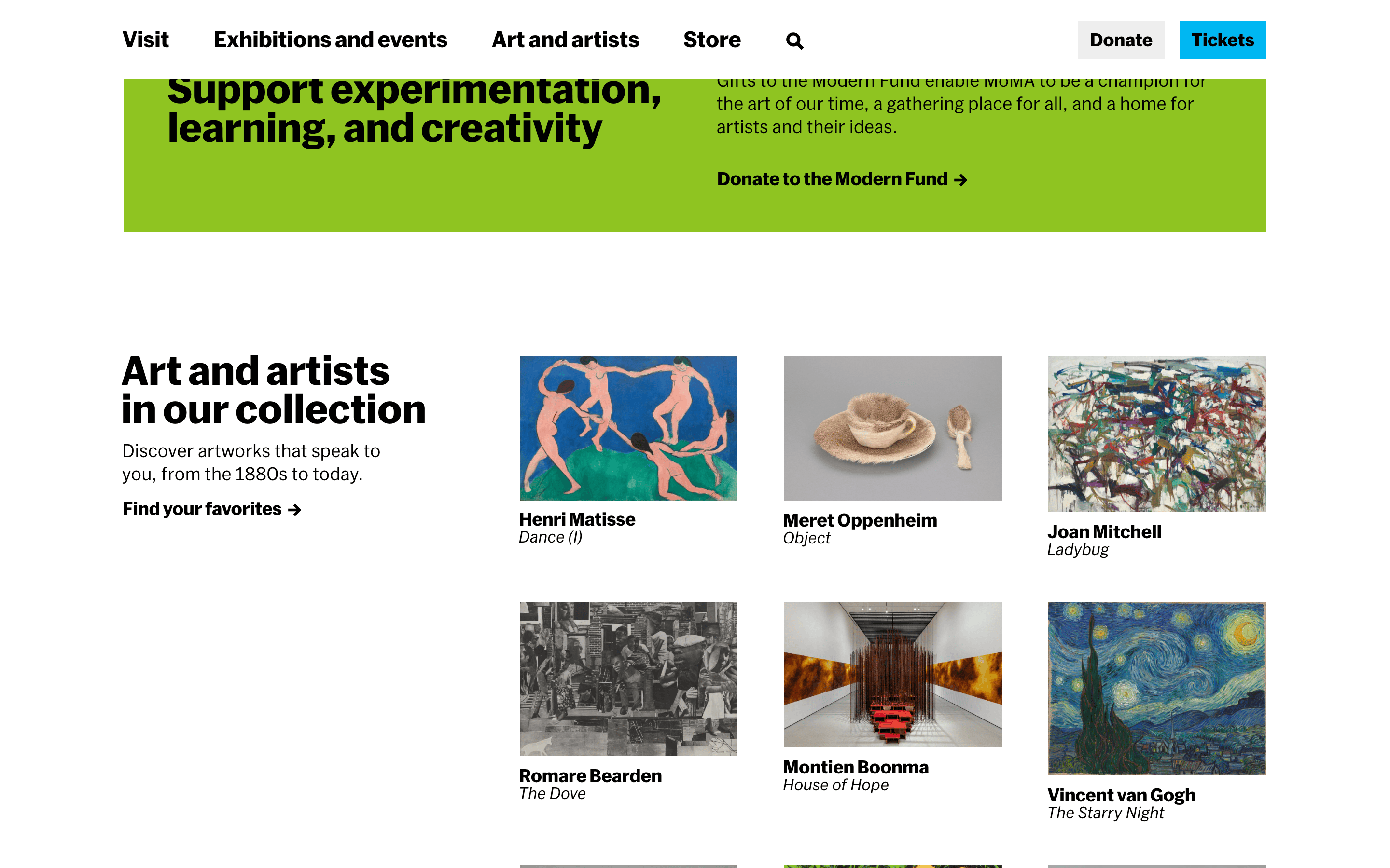
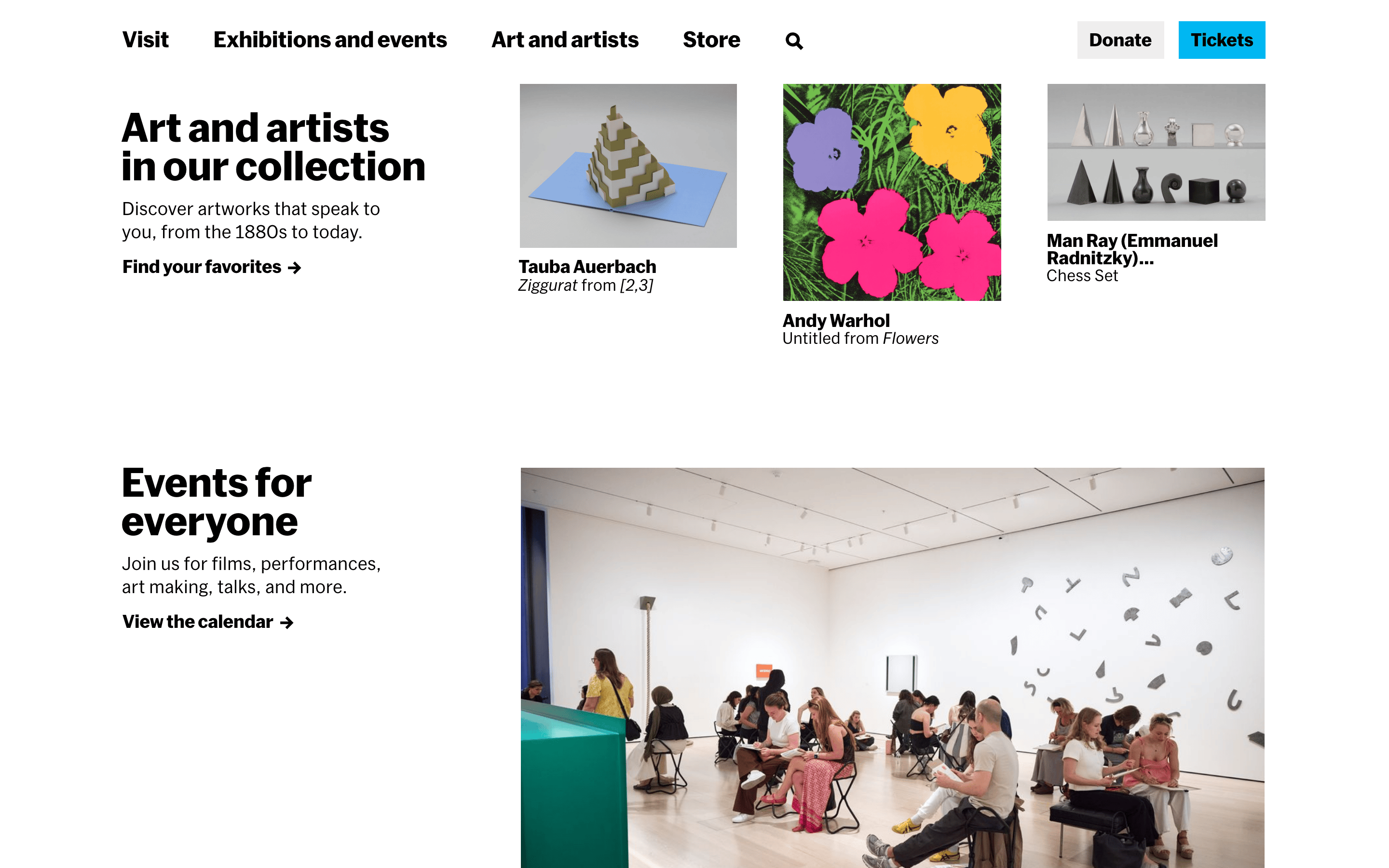
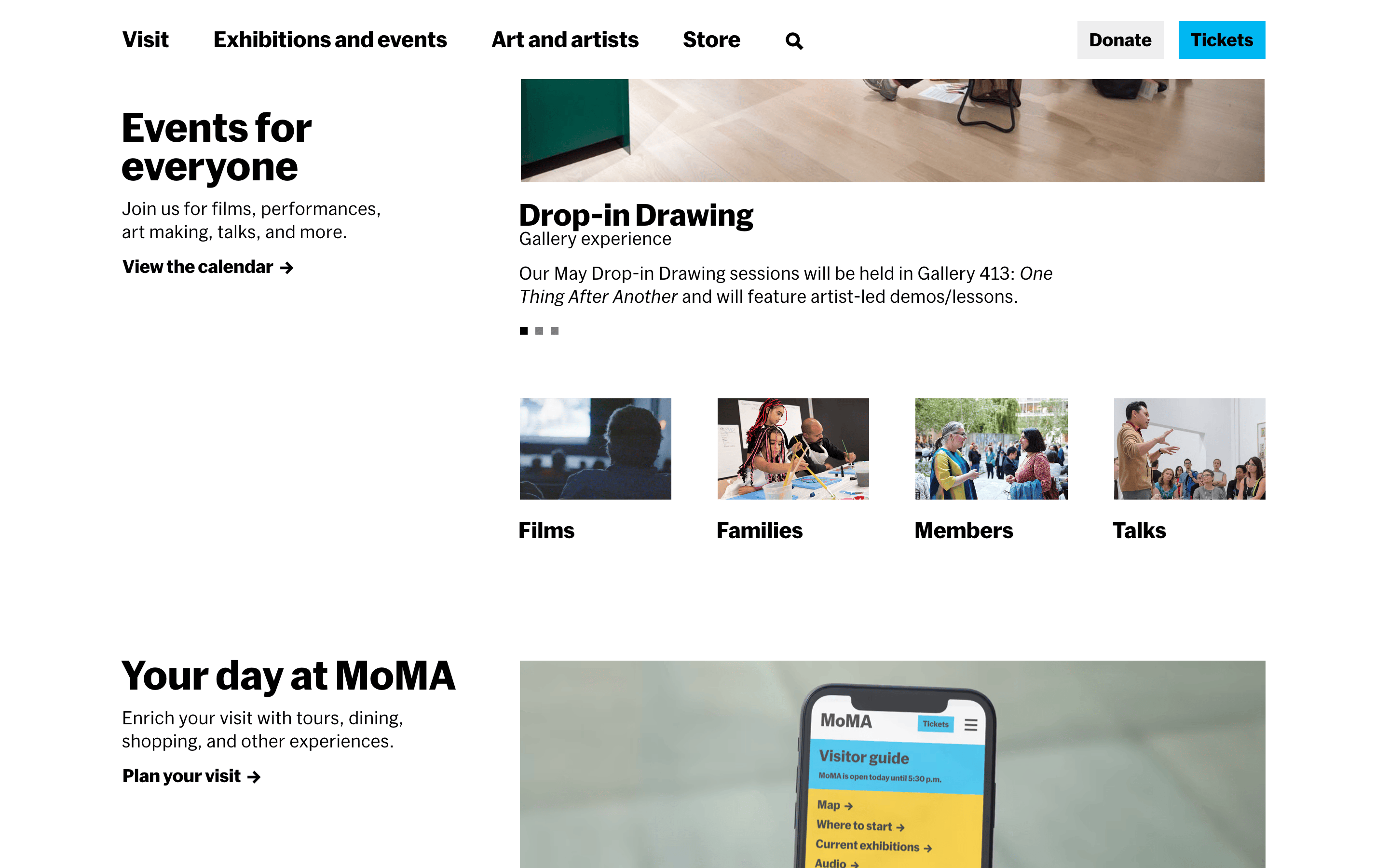
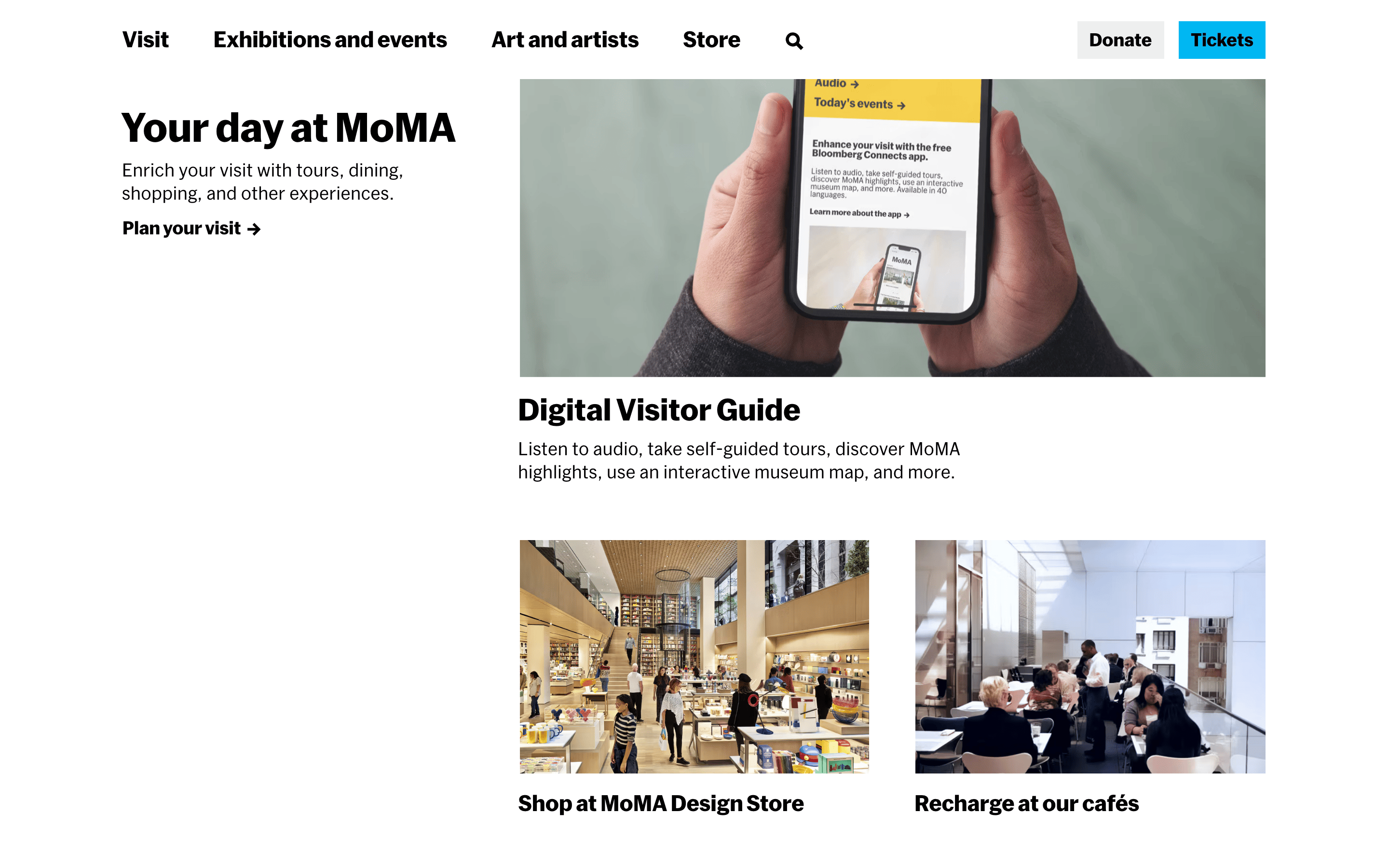
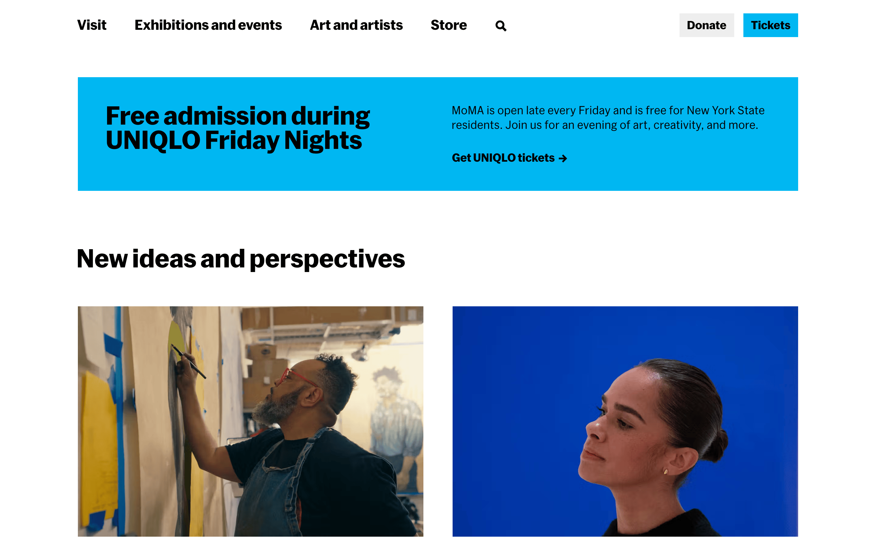
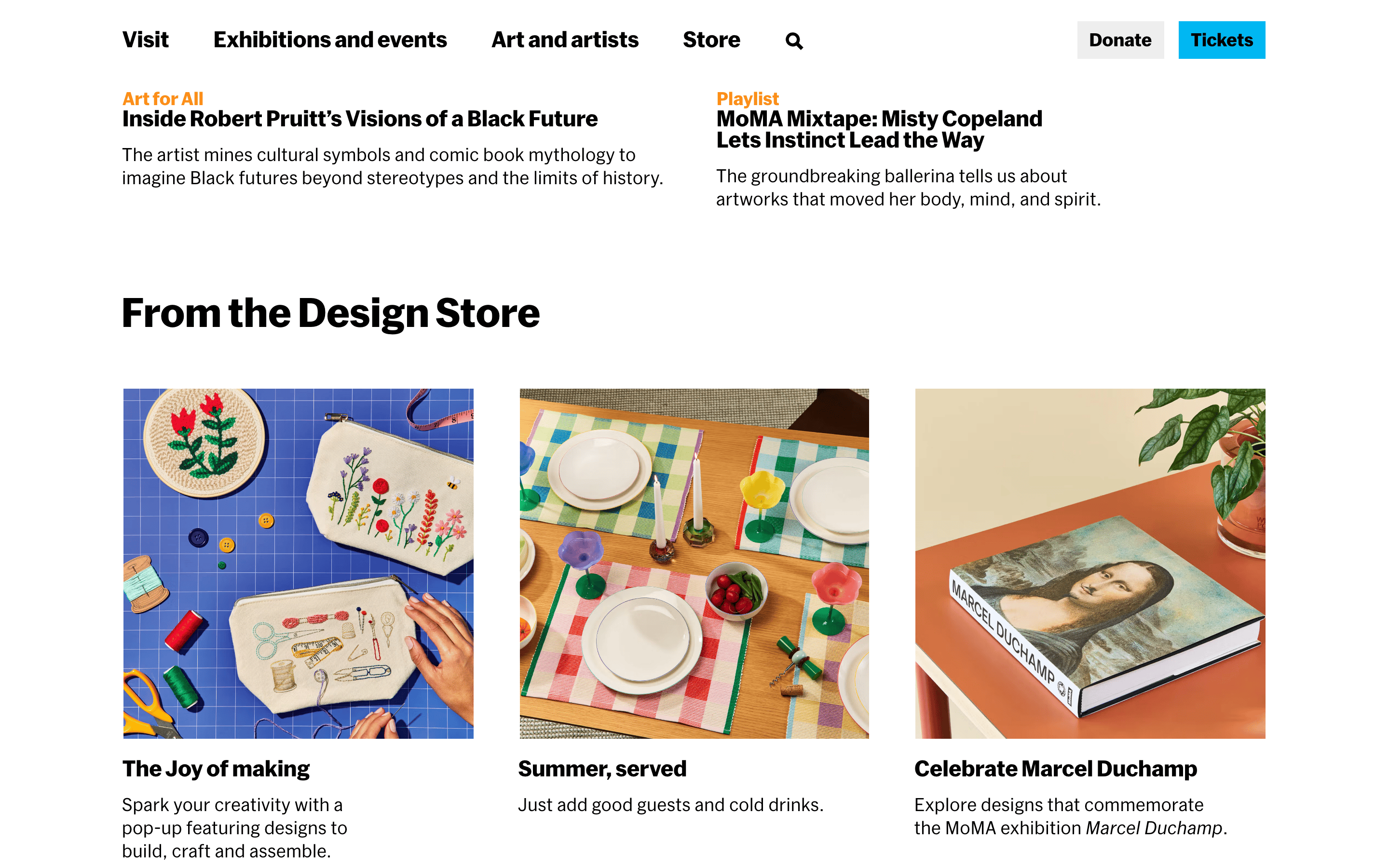
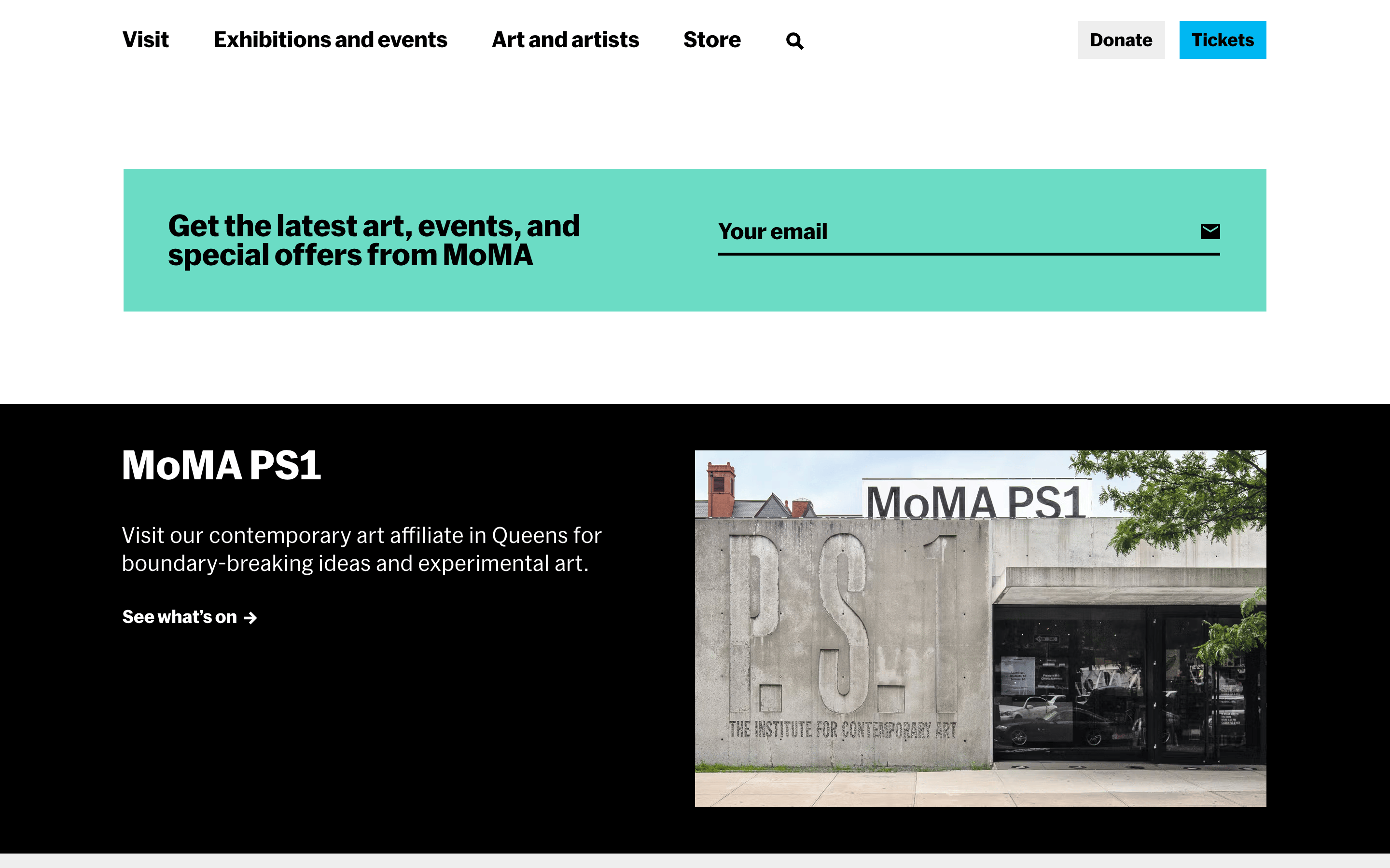
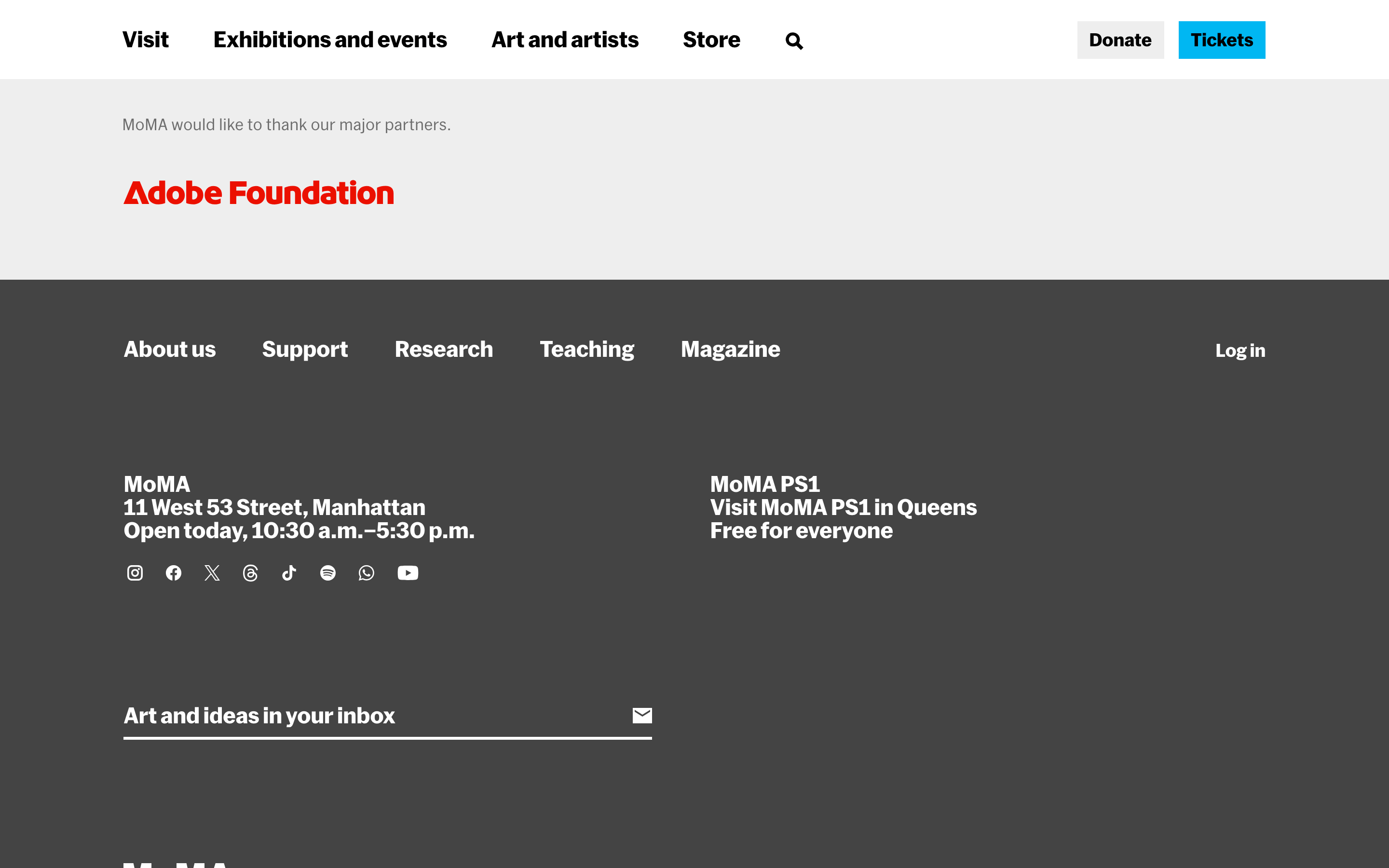
A clean, authoritative institutional voice for the world's premier modern art museum.
02
Color
#00B7F2Accent
#000000Ink
#767676Ink soft
#FFFFFFBG
#EEEEEEBG soft
rgba(0,0,0,1)Line
High-contrast black and white creates a neutral, gallery-like canvas for colorful photography.
03
Typography
grotesque-sans
display56px · 900
heading40px · 900
subhead30px · 900
body18px · 400
Use MoMA Sans (grotesque-sans) for all primary text. · Use tight negative letter-spacing on large display text to emphasize institutional authority. · Maintain high contrast between heavy weight headings and regular body text.
04
Spacing
4px
8px
16px
24px
32px
48px
64px
96px
A structured 4px base grid ensures consistent alignment for a multi-column layout.
05
Surfaces
sm · 0px
md · 0px
lg · 0px
pill · 0px
Minimal borders; used only as thick horizontal rules for section dividers.
06
Layout
1280container
12columns
24pxgutter
768 / 1024breakpoints
A 12-column grid layout anchored by large, full-width hero photography and strict left-aligned text blocks.
07
Motion & Interaction
220msmicro
300mssmall
800msmedium
cubic-bezier(0.25, 0.1, 0.25, 1.0)easing
Subtle opacity transitions for hover states; simple linear reveals for image loading.
Text links and interactive elements change color or opacity on hover. · Standard interactive states; buttons press down slightly via transform.
08
Components
buttonSharp-edged, high-contrast rectangular buttons; primary CTAs are black with white text.
cardMinimal cards relying on strong photography and bold, unadorned typography.
chipNot prominently featured; relies on standard hyperlinks.
inputClean, minimalist inputs with bottom borders.
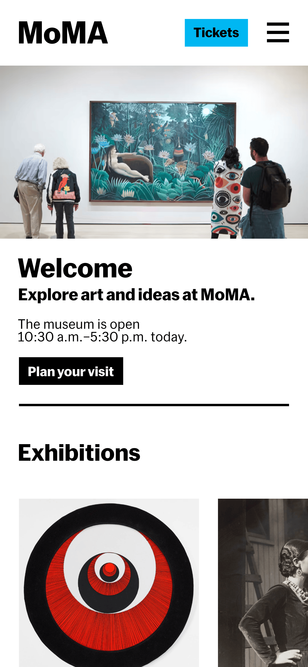
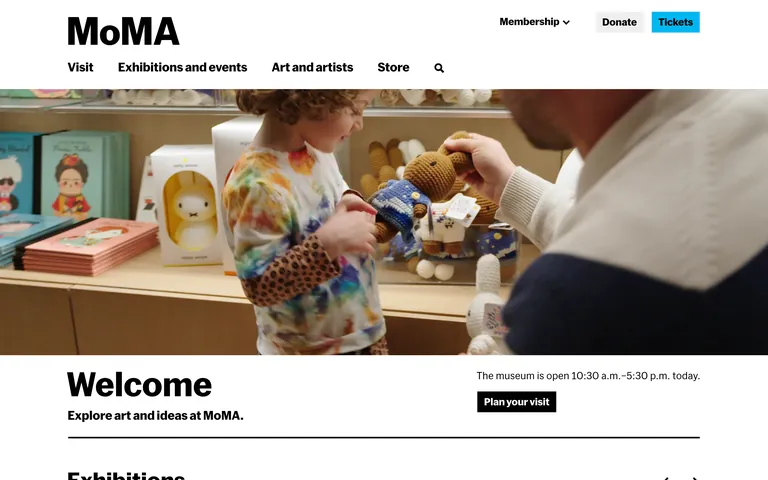
heroFull-bleed, edge-to-edge photographic hero section with overlapping text content.
09
Voice & Don'ts
ToneAuthoritative, welcoming, and culturally significant.
HeadlinesShort, punchy, and direct (e.g., 'Welcome', 'Your day at MoMA').
CTAsAction-oriented and helpful (e.g., 'Plan your visit', 'Tickets').
Captured from the live site · real computed styles
11
System prompt
MoMA.org is the digital home of the Museum of Modern Art, utilizing a minimal, authoritative, and photography-led editorial design. The palette is strictly high-contrast, utilizing a primary white background (#FFFFFF) and deep black text (#000000), with a single bright cyan-blue accent (#00B7F2) for ticketing. Typography is set in a custom grotesque-sans font family, featuring heavy weight, large display headlines with tight negative letter-spacing (-1.2px for display). The layout is a clean, unadorned 12-column grid with sharp edges, zero border-radius, and an absence of drop shadows, creating a gallery-like atmosphere. Key critical donts: Do not use rounded corners on any elements. Do not use decorative or serif fonts for headings. Do not use drop shadows or complex gradients. Ensure all large typography uses negative letter-spacing for an institutional feel.
Bring this taste to your agent
Hand your AI agent a machine-readable spec of this design — tokens, type, motion, the whole DNA.