← OpenDesign CURATED · OPEN · FREE
Louisiana
A refined and calm museum website emphasizing typography and whitespace.
museum art
01
Identity DNA
museum art cultural institution gallery exhibitions
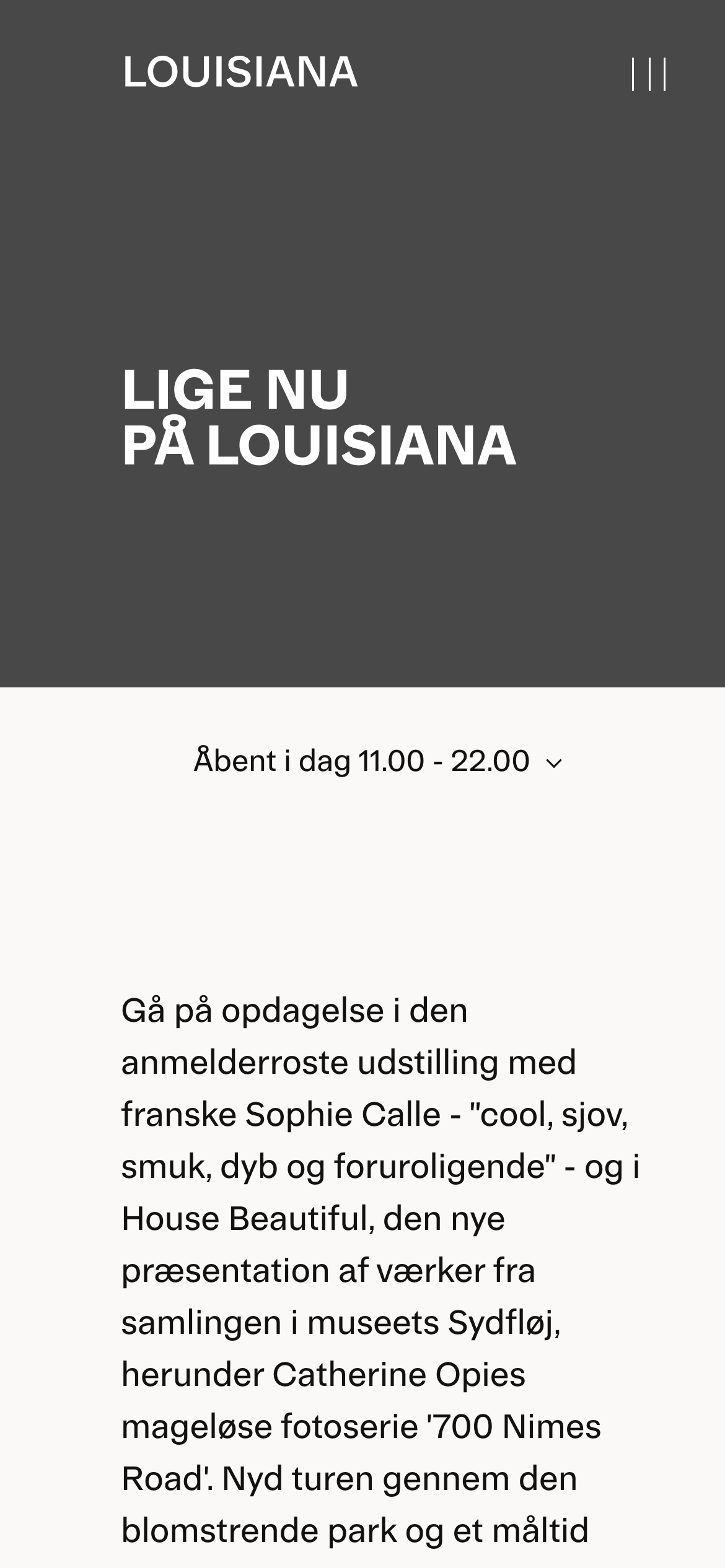
A serene, modern art gallery entrance
02
Color
#000000Ink
#FFFFFFBG
#B0E0E9BG soft
#226D7AMuted
rgba(0,0,0,1.0)Line
Stark, high-contrast black and white for content, accented with a calm, watery cyan.
03
Typography
transitional-serif · humanist-sans
Headings use a bold transitional serif for a classic, authoritative feel. · Body and UI text use Open Sans for a clean, humanist touch.
04
Spacing
4px
8px
16px
24px
32px
48px
64px
96px
Generous vertical rhythm with large top and bottom padding to create a sense of calm and focus.
05
Surfaces
sm · 0px
md · 0px
lg · 0px
pill · 0px
None visible in the main content area, maintaining a flat, clean aesthetic.
06
Layout
1280 container
12 columns
24px gutter
768 / 1024 breakpoints
Centered content column within a generous container, transitioning into a full-bleed colored block.
07
Motion & Interaction
220ms micro
400ms small
800ms medium
cubic-bezier(0.25, 0.1, 0.25, 1.0) easing
Transitions on hover states for interactive elements.
Subtle state changes on interactive elements. · Standard navigation and expansion of content sections.
08
Components
button Simple text-based interaction elements, often with a chevron for expansion. card Minimalist cards, primarily defined by text and spacing. chip Not observed. input Not observed. hero A large, full-bleed block with a solid background color and massive, bold serif typography. 09
Voice & Don'ts
Tone Informative, cultural, and slightly formal. Headlines Bold, uppercase, and large serif text to command attention. CTAs Subtle, integrated text links rather than prominent buttons. Don't use bright, saturated colors — screenshot shows a restrained palette of black, white, and a muted cyan. Don't apply rounded corners to elements — screenshot shows strictly rectangular shapes with sharp edges. Don't use multiple font families for body text — screenshot shows a consistent use of sans-serif for UI elements. Don't create a dense, cluttered layout — screenshot emphasizes generous whitespace and focused typography. Don't use heavy drop shadows or depth effects — screenshot shows a flat, clean design. Don't use sans-serif for main display headings — screenshot shows a bold transitional serif. Avoid: Loud colors Avoid: aggressive calls to action Avoid: visual clutter 10
Inside the pack — real screenshots
桌面首屏(hero) 桌面滚动分段(90% viewport 步进,作为视觉证据) 桌面滚动分段(90% viewport 步进,作为视觉证据) 移动首屏 Captured from the live site · real computed styles
11
System prompt
A refined, editorial museum website design that balances classic typography with a clean, modern layout. The palette is strictly black and white for content, with a signature muted cyan (#226D7A) used sparingly for accents or backgrounds. Typography is a mix of a bold transitional-serif for impactful headlines and a humanist-sans for clean body text. The layout prioritizes massive whitespace and a centered content column to create a calm, focused reading experience. Do not introduce bright, saturated colors, rounded corners, or drop shadows. Avoid cluttering the interface, and ensure that headlines remain bold and authoritative.
More from the library en · zh-CN · zh-TW · ja · ko
OpenDesign · curated web aesthetics for AI-readable design DNA · opendesign.cc
Why we curated this: This site is worth including as a prime example of a 'Refined' and 'Clean' design, demonstrating how minimal color and strong typography can create a powerful, high-end cultural experience.
浙ICP备2021038972号-5