A premium coffee roaster with a refined editorial aesthetic.
02
Color
#E82C2AAccent
#212529Ink
#FFFFFFBG
#F2F2F2BG soft
#6C757DMuted
rgba(232,44,42,0.5)Line
High-contrast pairing of a dominant brand red against a clean white and light grey foundation.
03
Typography
didone-serif · geometric-sans
display105px · 400
heading30px · 400
body20px · 400
Display typography uses a high-contrast Didone serif for elegant, traditional impact. · Body typography uses a clean geometric sans-serif for modern readability. · Navigation links and body text are set with standard weight for a refined feel.
04
Spacing
4px
8px
12px
16px
20px
24px
30px
48px
64px
96px
Based on a 4px grid with generous padding for an airy, premium feel.
05
Surfaces
sm · 4px
md · 12px
lg · 25px
pill · 999px
Thin 1px borders in brand red or light grey to define sections.
06
Layout
1280container
12columns
24pxgutter
768 / 1024breakpoints
A clean, grid-based layout with generous white space and alternating full-width sections.
07
Motion & Interaction
150msmicro
150mssmall
500msmedium
ease-in-outeasing
Smooth color and background transitions on interactive elements. · Gradual fade-in for dynamic content.
Subtle color or text-decoration changes on links. · Standard link navigation and product selection.
08
Components
buttonText-based navigation links in red; minimal or no solid button styles visible.
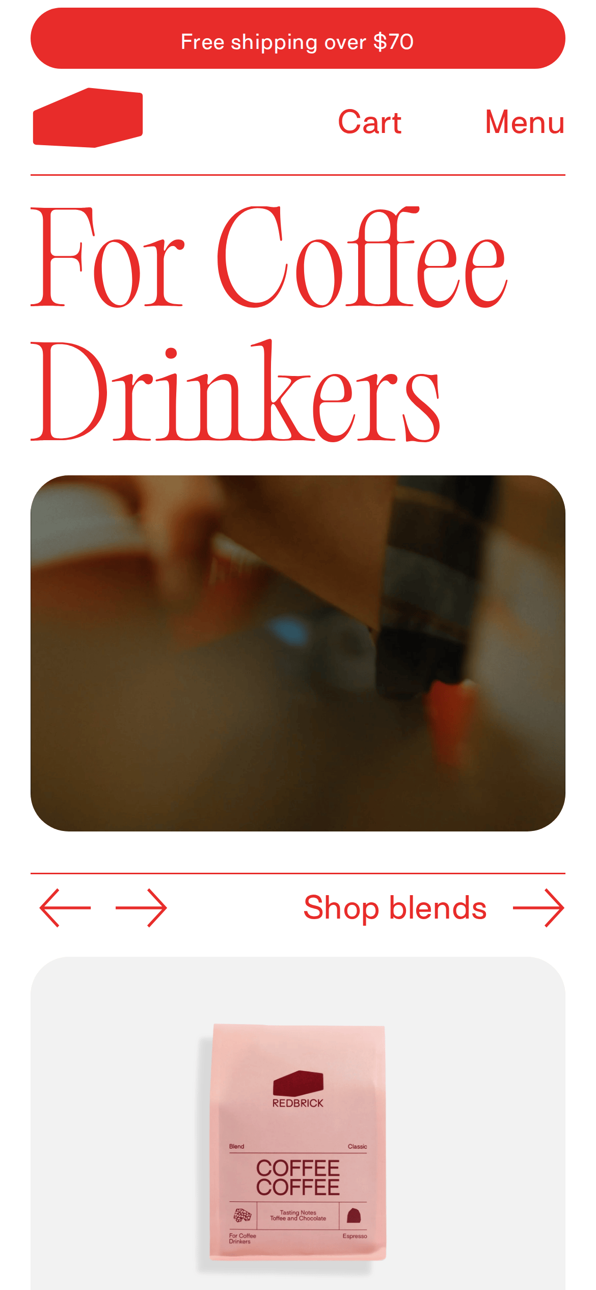
cardProduct cards with soft grey backgrounds and prominent rounded corners for images.
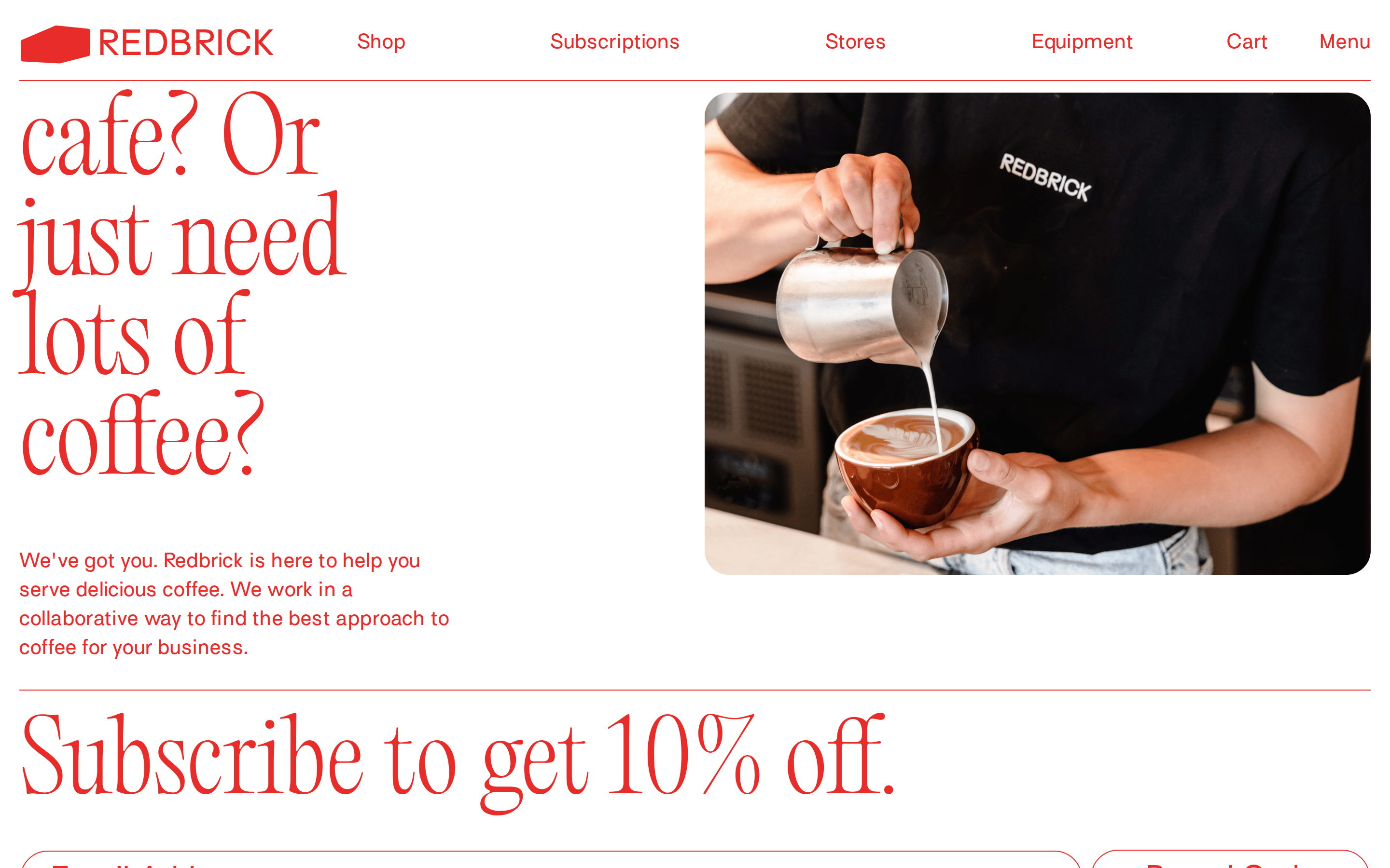
heroA bold split-screen hero with massive serif typography on one side and a rounded image on the other.
09
Voice & Don'ts
ToneConfident, approachable, and slightly artisanal.
HeadlinesLarge, elegant serif statements that define the brand's premium positioning.
CTAsSimple, direct text links that guide the user without overwhelming the design.
Don't use lowercase brand names — screenshot shows 'REDBRICK' in all caps.
Don't use neon or highly saturated accent colors — screenshot shows a controlled, traditional red.
Don't use overly complex geometric patterns — screenshot shows clean white space and simple solid backgrounds.
Don't use heavy box shadows on elements — screenshot shows flat, border-defined or background-defined surfaces.
Don't use casual, rounded sans-serif display fonts — screenshot shows an elegant Didone serif for headlines.
Don't clutter the interface with many small icons — screenshot shows a minimal, text-focused navigation.
Captured from the live site · real computed styles
11
System prompt
This design is for a premium, artisanal coffee brand. It uses a striking combination of a classic Didone serif for display text and a clean geometric sans-serif for body copy. The primary accent color is a bold, traditional red (#E82C2A) set against a clean white background (#FFFFFF) and soft light grey sections (#F2F2F2). The layout is generous with white space, featuring large typography and high-quality product imagery with soft rounded corners. Critical constraints: never use neon or highly saturated accent colors; always use all-caps for the main brand name; avoid heavy drop shadows to maintain the flat, editorial aesthetic. The overall feel should be refined, premium, and approachable.
Bring this taste to your agent
Hand your AI agent a machine-readable spec of this design — tokens, type, motion, the whole DNA.